library(tidyverse)
library(ggplot2)
library(summarytools)
library(car)

knitr::opts_chunk$set(echo = TRUE, warning=FALSE, message=FALSE)Challenge 5 Submission
challenge_5
cereal
CamNeedels
Introduction to Visualization
cereal <- read_csv("B:/Needels/Documents/DACCS 601/DACSS_601_New/posts/_data/cereal.csv")
cereal
# A tibble: 20 × 4
Cereal Sodium Sugar Type
<chr> <dbl> <dbl> <chr>
1 Frosted Mini Wheats 0 11 A
2 Raisin Bran 340 18 A
3 All Bran 70 5 A
4 Apple Jacks 140 14 C
5 Captain Crunch 200 12 C
6 Cheerios 180 1 C
7 Cinnamon Toast Crunch 210 10 C
8 Crackling Oat Bran 150 16 A
9 Fiber One 100 0 A
10 Frosted Flakes 130 12 C
11 Froot Loops 140 14 C
12 Honey Bunches of Oats 180 7 A
13 Honey Nut Cheerios 190 9 C
14 Life 160 6 C
15 Rice Krispies 290 3 C
16 Honey Smacks 50 15 A
17 Special K 220 4 A
18 Wheaties 180 4 A
19 Corn Flakes 200 3 A
20 Honeycomb 210 11 C Briefly describe the data
This is data about 20 different cereals with the amount of sodium and sugar allocated in each one.They’re also separated by the fact they are either type A or type C cereal.
#i heard in class people were having a tough time with sodium not being numeric so I did this in case
cereal%>%
  mutate(Sodium = as.numeric(Sodium))
# A tibble: 20 × 4
Cereal Sodium Sugar Type
<chr> <dbl> <dbl> <chr>
1 Frosted Mini Wheats 0 11 A
2 Raisin Bran 340 18 A
3 All Bran 70 5 A
4 Apple Jacks 140 14 C
5 Captain Crunch 200 12 C
6 Cheerios 180 1 C
7 Cinnamon Toast Crunch 210 10 C
8 Crackling Oat Bran 150 16 A
9 Fiber One 100 0 A
10 Frosted Flakes 130 12 C
11 Froot Loops 140 14 C
12 Honey Bunches of Oats 180 7 A
13 Honey Nut Cheerios 190 9 C
14 Life 160 6 C
15 Rice Krispies 290 3 C
16 Honey Smacks 50 15 A
17 Special K 220 4 A
18 Wheaties 180 4 A
19 Corn Flakes 200 3 A
20 Honeycomb 210 11 C Univariate Visualizations
I went with the bar graph for sodium because there are multiple different cereals with certain amount of sodium if they are rounded properly.
#I originally made this without chunking into 25 but after seeing the solution it makes way more sense and is way easier to observe. This is essentially rounding the maximum of the sodium. I also added a title and made the y variable more clear by renaming it
sodiumbins <- (round((max(cereal$Sodium))- min(cereal$Sodium))/25)


ggplot(cereal, aes(x=Sodium)) + geom_histogram(bins= sodiumbins) +labs(title = "Sodium Graph", y="Amount of cereals")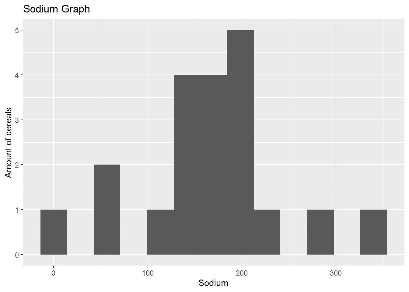
#this is a boxplot with sugar and sodium on x and y respectively. I also added a title to make it clearer
ggplot(cereal, aes(x=Sugar, y=Sodium)) + geom_boxplot() + labs(title = "Sugar/Sodium Boxplot")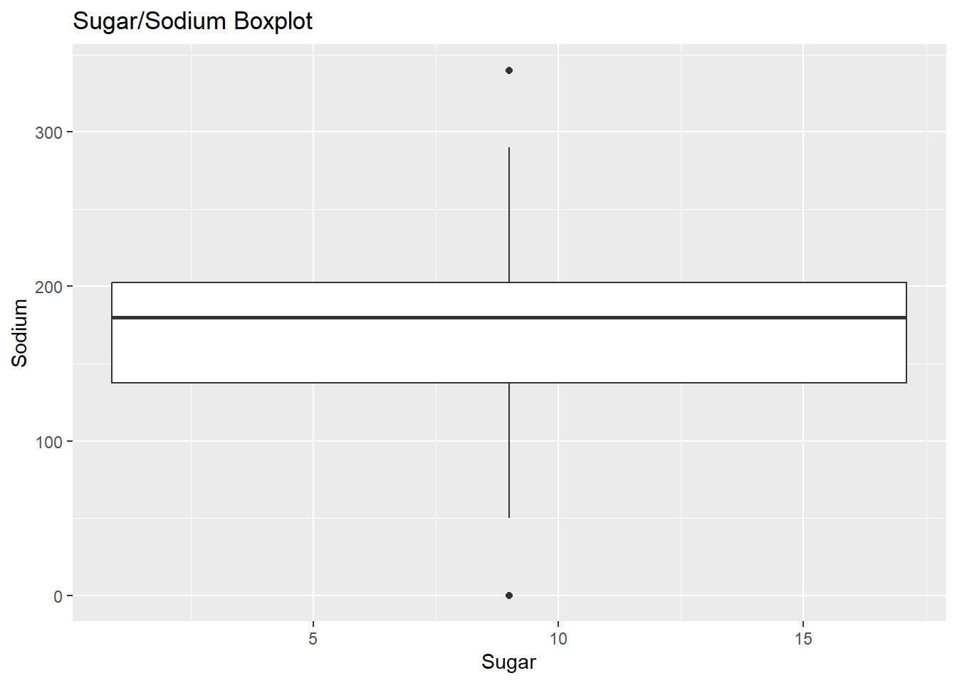
#this is a histogram that focuses on sugar only and i also added a title to this as well.
ggplot(cereal, aes(x=Sugar)) + geom_histogram() + labs(title = "Sugar Graph", y="Amount of cereals")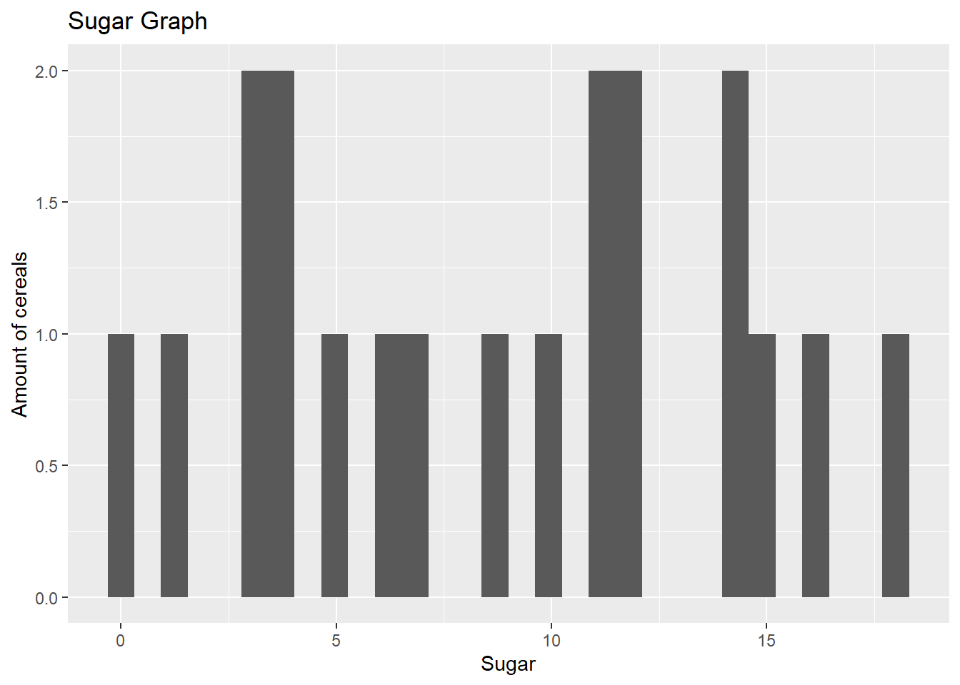
Bivariate Visualization(s)
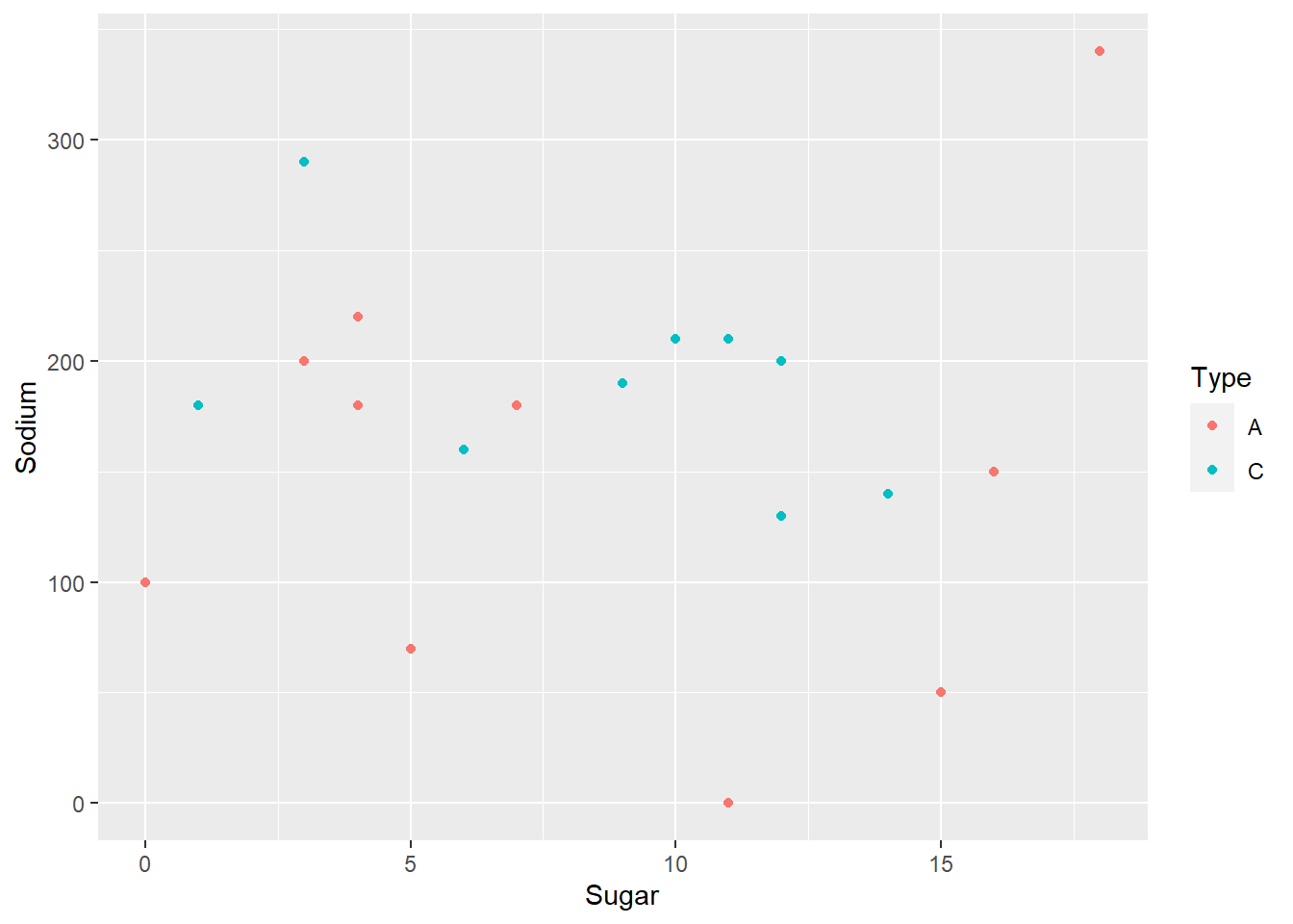
I chose this visualization because you can see where each individual cereal lies and you can see both their sodium and sugar easily. It also clearly shows the outliers and makes it easy to analyze. I did it for sugar too but it made a little less sense but it still gets the job done.
#We create a point graph with X axis being sugar and Y being sodium and making the column either type A or type C so we can see the different colored dots on the graph.
ggplot(cereal, aes(x=Sugar, y=Sodium, col=Type)) + geom_point()