Code
library(tidyverse)

knitr::opts_chunk$set(echo = TRUE, warning=FALSE, message=FALSE)library(tidyverse)
knitr::opts_chunk$set(echo = TRUE, warning=FALSE, message=FALSE)I analyzed the “birds.csv” data set for Challenge 1. By using R Commands to visualize and transform the data, I came to the conclusion that it is describing Global Poultry Production from 1960-2020. The following documentation shows my data exploration journey towards reaching this conclusion.
I read in the data set using the code below. Some of the column headers include countries (Area), birds (Item), bird quantity (Value), and years. It also shows a “Flag Description” column header with “FAO estimate” listed under it. FAO stands for the “Food and Agriculture Organization”. This gives me my first indication that this is a global report about birds.
library(readr)
birds <- read_csv("_data/birds.csv")To get an idea of how many types of birds are in this data, I performed the following R Command. This created a plot point graph of all bird categories against their (presumed) quantity.
ggplot(data = birds) +
geom_point(mapping = aes(x = Item, y = Value))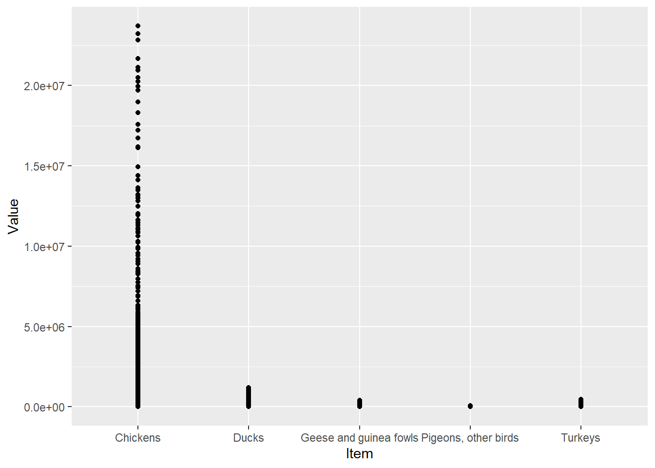
From this plot point graph, I know: 1) There are five categories of birds: chickens, ducks, geese and guinea fowls, pigeons/other birds, and turkeys. 2) There are far more chickens than any other category of bird.
Next, I want to see the change of these bird quantities over time, so I performed another R Command as seen below.
ggplot(data = birds, aes(x = Year, y = Value, color = Item)) +
geom_line()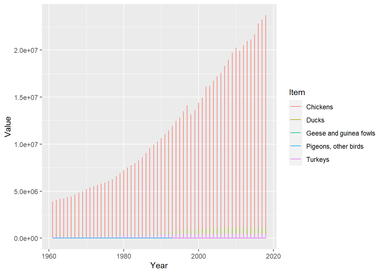
In this new plot line graph, I can see the quantity of all birds increased from 1960-2020 and the production of chickens rose faster and higher than the other bird categories.
It’s hard to see each bird category in this plot line graph when they are meshed together. So, I used this next R Command to fix that.
 ggplot(data = birds,
      mapping = aes(x = Year, y = Value, color = Item)) +
      geom_line() +
      facet_wrap(vars(Item)) +
      theme_bw()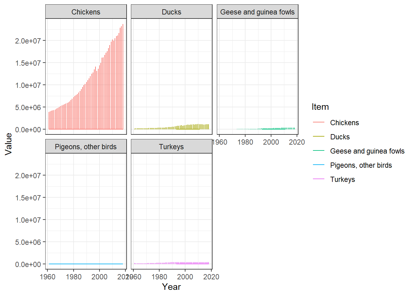
Now, I can see the individual quantities of each bird category increase over time.
Let’s make this new plot line graph neater.
ggplot(data = birds, mapping = aes(x = Year, y = Value, color = Item)) +
          geom_line() +
        facet_wrap(vars(Item)) +
       labs(title = "Global Poultry Production from 1960-2020",
                                     x = "Year",
                                     y = "Production") +
          theme_bw() +
          theme(axis.text.x = element_text(colour = "grey20", size = 8, angle = 90, hjust = 0.5, vjust = 0.5),
                                    axis.text.y = element_text(colour = "grey20", size = 8),
                                        strip.text = element_text(face = "italic"),
                                       text = element_text(size = 12))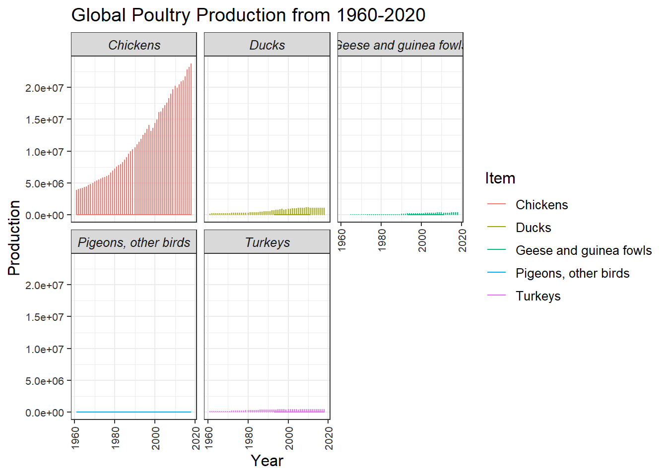
I propose that this data set is describing global poultry production from the years 1960-2020. The data set shows that chicken is the most produced chicken in the world compared to the other four bird categories: turkey, ducks, pigeons/other birds, and geese/guinea fowls. The data was collected mostly by the Food and Agriculture Organization (FAO).