Read in a data set, and describe the data set using both words and any supporting information (e.g., tables, etc)
Tidy data & mutate variables as needed (including sanity checks)
Create at least two univariate visualizations
try to make them “publication” ready
Explain why you choose the specific graph type
Create at least one bivariate visualization
try to make them “publication” ready
Explain why you choose the specific graph type
Read in data
Code
#simply read in the data (untouched)library(readr)raw_NYCHousing_2019 <-read_csv("_data/AB_NYC_2019.csv")raw_NYCHousing_2019
Briefly describe the data
This data set is describing listing activities of Airbnb properties during 2019 in the five boroughs of New York City, New York. The property information includes geographical coordinates, rental type (entire home/apt, private room, or shared room), price breakdowns, reviews (last review, total number & per month), and how many days available in 2019. Specifically, there are 48,895 observations (each represents a listing). This data is tidy already, therefore I will not need to mutate any variables here.
Code
#summary of data set statisticsprint(summarytools::dfSummary(raw_NYCHousing_2019,varnumbers =FALSE,plain.ascii =FALSE, style ="grid", graph.magnif =0.70, valid.col =FALSE),method ='render',table.classes ='table-condensed')
Data Frame Summary
raw_NYCHousing_2019
Dimensions: 48895 x 16
Duplicates: 0
Variable
Stats / Values
Freqs (% of Valid)
Graph
Missing
id [numeric]
Mean (sd) : 19017143 (10983108)
min ≤ med ≤ max:
2539 ≤ 19677284 ≤ 36487245
IQR (CV) : 19680234 (0.6)
48895 distinct values
0 (0.0%)
name [character]
1. Hillside Hotel
2. Home away from home
3. New york Multi-unit build
4. Brooklyn Apartment
5. Loft Suite @ The Box Hous
6. Private Room
7. Artsy Private BR in Fort
8. Private room
9. Beautiful Brooklyn Browns
10. Cozy Brooklyn Apartment
[ 47884 others ]
18
(
0.0%
)
17
(
0.0%
)
16
(
0.0%
)
12
(
0.0%
)
11
(
0.0%
)
11
(
0.0%
)
10
(
0.0%
)
10
(
0.0%
)
8
(
0.0%
)
8
(
0.0%
)
48758
(
99.8%
)
16 (0.0%)
host_id [numeric]
Mean (sd) : 67620011 (78610967)
min ≤ med ≤ max:
2438 ≤ 30793816 ≤ 274321313
IQR (CV) : 99612390 (1.2)
37457 distinct values
0 (0.0%)
host_name [character]
1. Michael
2. David
3. Sonder (NYC)
4. John
5. Alex
6. Blueground
7. Sarah
8. Daniel
9. Jessica
10. Maria
[ 11442 others ]
417
(
0.9%
)
403
(
0.8%
)
327
(
0.7%
)
294
(
0.6%
)
279
(
0.6%
)
232
(
0.5%
)
227
(
0.5%
)
226
(
0.5%
)
205
(
0.4%
)
204
(
0.4%
)
46060
(
94.2%
)
21 (0.0%)
neighbourhood_group [character]
1. Bronx
2. Brooklyn
3. Manhattan
4. Queens
5. Staten Island
1091
(
2.2%
)
20104
(
41.1%
)
21661
(
44.3%
)
5666
(
11.6%
)
373
(
0.8%
)
0 (0.0%)
neighbourhood [character]
1. Williamsburg
2. Bedford-Stuyvesant
3. Harlem
4. Bushwick
5. Upper West Side
6. Hell's Kitchen
7. East Village
8. Upper East Side
9. Crown Heights
10. Midtown
[ 211 others ]
3920
(
8.0%
)
3714
(
7.6%
)
2658
(
5.4%
)
2465
(
5.0%
)
1971
(
4.0%
)
1958
(
4.0%
)
1853
(
3.8%
)
1798
(
3.7%
)
1564
(
3.2%
)
1545
(
3.2%
)
25449
(
52.0%
)
0 (0.0%)
latitude [numeric]
Mean (sd) : 40.7 (0.1)
min ≤ med ≤ max:
40.5 ≤ 40.7 ≤ 40.9
IQR (CV) : 0.1 (0)
19048 distinct values
0 (0.0%)
longitude [numeric]
Mean (sd) : -74 (0)
min ≤ med ≤ max:
-74.2 ≤ -74 ≤ -73.7
IQR (CV) : 0 (0)
14718 distinct values
0 (0.0%)
room_type [character]
1. Entire home/apt
2. Private room
3. Shared room
25409
(
52.0%
)
22326
(
45.7%
)
1160
(
2.4%
)
0 (0.0%)
price [numeric]
Mean (sd) : 152.7 (240.2)
min ≤ med ≤ max:
0 ≤ 106 ≤ 10000
IQR (CV) : 106 (1.6)
674 distinct values
0 (0.0%)
minimum_nights [numeric]
Mean (sd) : 7 (20.5)
min ≤ med ≤ max:
1 ≤ 3 ≤ 1250
IQR (CV) : 4 (2.9)
109 distinct values
0 (0.0%)
number_of_reviews [numeric]
Mean (sd) : 23.3 (44.6)
min ≤ med ≤ max:
0 ≤ 5 ≤ 629
IQR (CV) : 23 (1.9)
394 distinct values
0 (0.0%)
last_review [Date]
min : 2011-03-28
med : 2019-05-19
max : 2019-07-08
range : 8y 3m 10d
1764 distinct values
10052 (20.6%)
reviews_per_month [numeric]
Mean (sd) : 1.4 (1.7)
min ≤ med ≤ max:
0 ≤ 0.7 ≤ 58.5
IQR (CV) : 1.8 (1.2)
937 distinct values
10052 (20.6%)
calculated_host_listings_count [numeric]
Mean (sd) : 7.1 (33)
min ≤ med ≤ max:
1 ≤ 1 ≤ 327
IQR (CV) : 1 (4.6)
47 distinct values
0 (0.0%)
availability_365 [numeric]
Mean (sd) : 112.8 (131.6)
min ≤ med ≤ max:
0 ≤ 45 ≤ 365
IQR (CV) : 227 (1.2)
366 distinct values
0 (0.0%)
Generated by summarytools 1.0.1 (R version 4.2.2) 2023-03-29
Univariate Visualizations
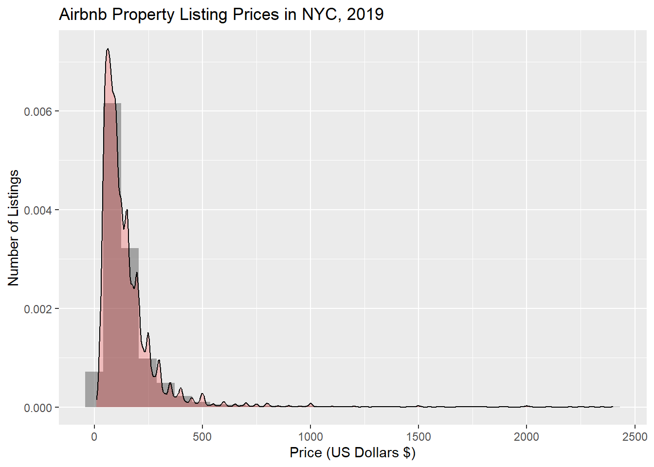
As I am scoping out this data set, the first thing that sticks out to me is the price for each unit. Visualized below is the price distrbution for all listings (right skewed, outliers are filtered out).
Code
#price distribution table. Not sure why my y-axis scaled so small, could it be my density map overlay?price_NYCHousing_2019 <- raw_NYCHousing_2019 %>%filter(price>0& price<2500)price_NYCHousing_2019 %>%ggplot(aes(price)) +labs(title ="Airbnb Property Listing Prices in NYC, 2019", x ="Price (US Dollars $)", y ="Number of Listings") +geom_histogram(aes(y = ..density..), alpha =0.5) +geom_density(alpha =0.2, fill="red")
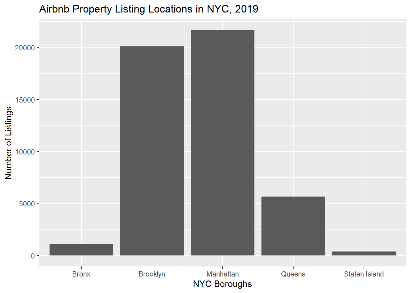
Now that I have an initial understanding of price, let’s explore the number of listings in each of the NYC boroughs. I can see that Manhattan leads the charge with the most amount of listings.
Code
#NYC boroughs tablelistings_NYCHousing_2019 <- raw_NYCHousing_2019 %>%ggplot(aes(neighbourhood_group)) +labs(title ="Airbnb Property Listing Locations in NYC, 2019", x ="NYC Boroughs", y ="Number of Listings") +geom_bar() listings_NYCHousing_2019
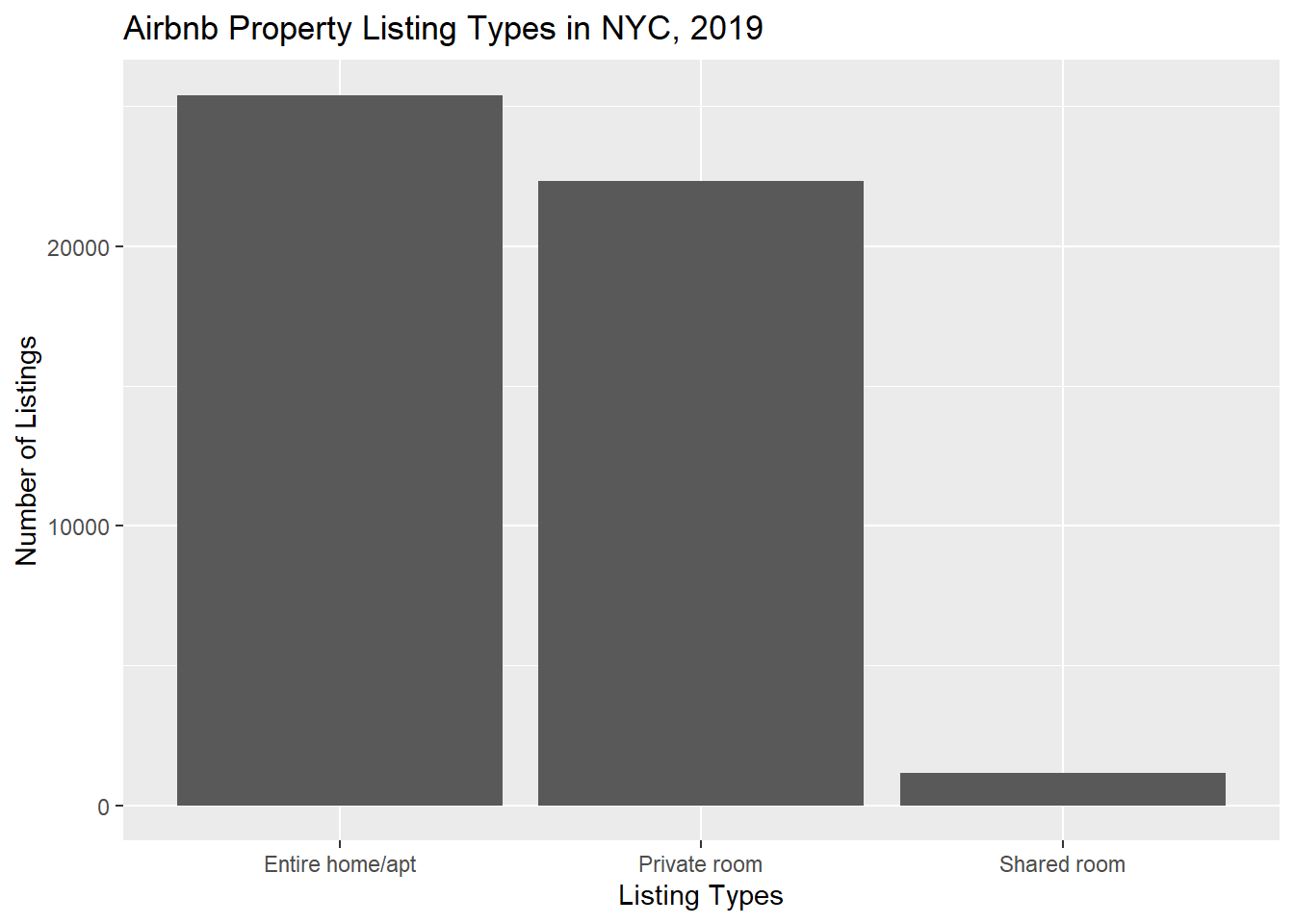
Finally, I want to understand the breakdown of the types of listings available (entire home/apt, private room, or shared room). Here, we can see that entire home/apt listings are the most prevelant.
Code
#listing types tabletype_NYCHousing_2019 <- raw_NYCHousing_2019 %>%ggplot(aes(room_type)) +labs(title ="Airbnb Property Listing Types in NYC, 2019", x ="Listing Types", y ="Number of Listings") +geom_bar() type_NYCHousing_2019
Bivariate Visualization(s)
Seeing these variables in separate tables can be helpful, but let’s combine some of them to get an even better idea of the data we are analyzing and the questions it can answer.
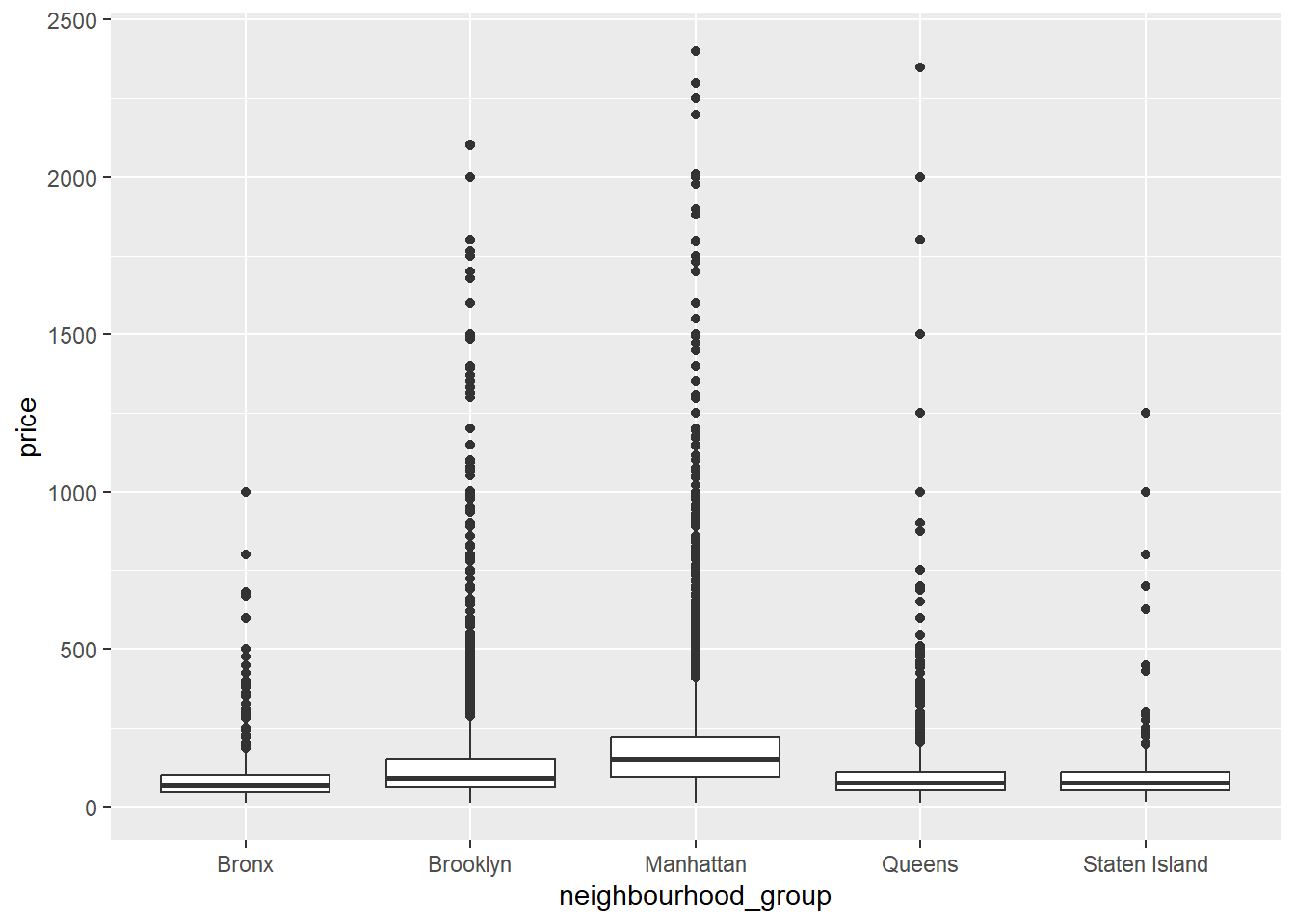
First, let’s look at the listing prices per NYC borough. From this table, I can infer that Manhattan is the most expensive/prevalent listings for NYC Airbnb in 2019.
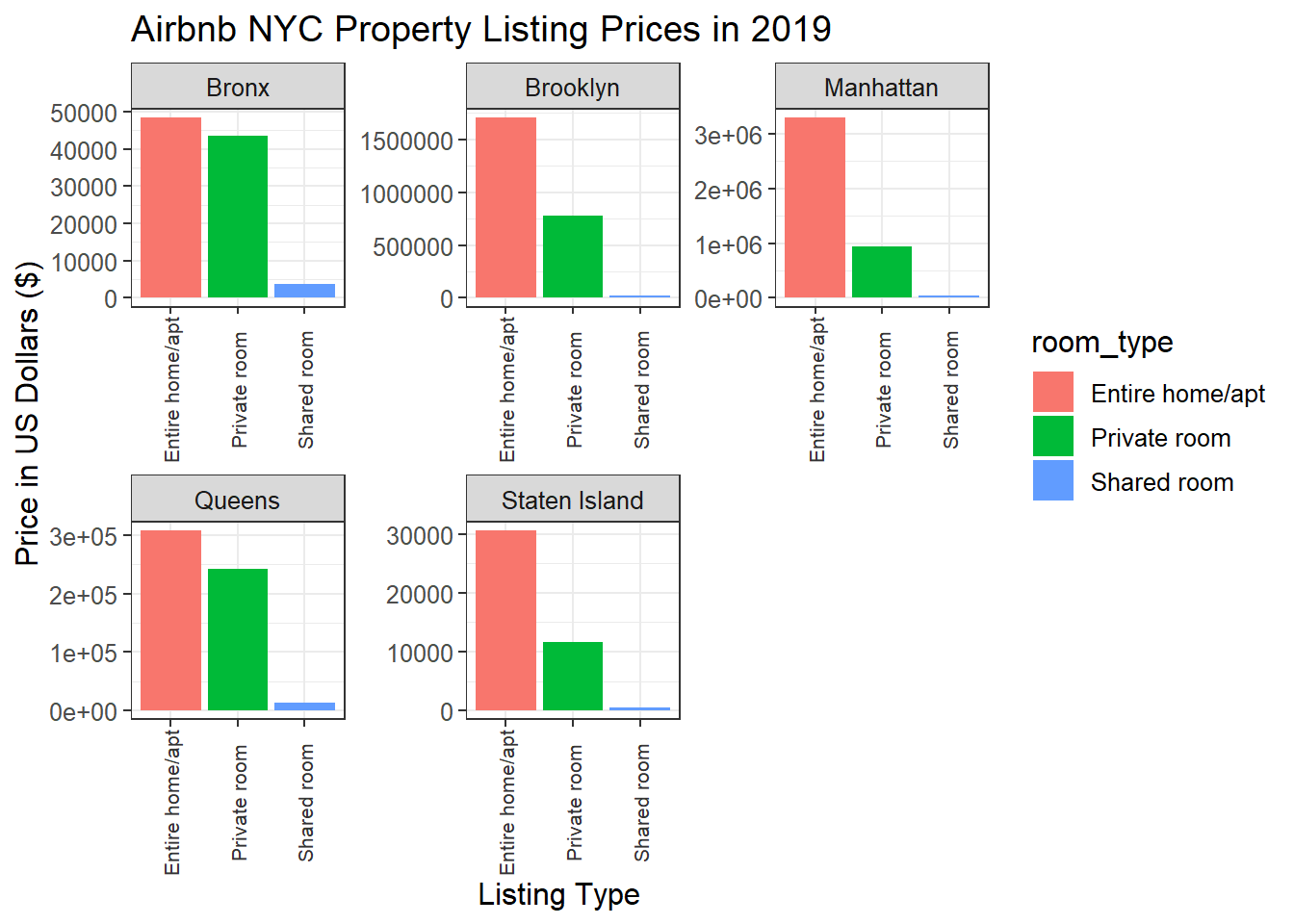
What if I put this all together? Below, all five boroughs are graphed against listing type and price for each. Here, entire home/apt listings in Manhattan, NYC are the most expensive on average for 2019.
Code
#struggled to correct y-axis. I believe it's totaling the prices per borough instead of averaging across the board.. final_NYCHousing_2019 <- raw_NYCHousing_2019 %>%filter (!is.na (price)) %>%filter (!is.na (neighbourhood_group)) %>%summarise(median_price=median(price)) %>%ggplot(data = raw_NYCHousing_2019, mapping =aes(x = room_type, y = price, fill = room_type)) +geom_col() +facet_wrap(vars(neighbourhood_group), scales ="free") +labs(title ="Airbnb NYC Property Listing Prices in 2019", y ="Price in US Dollars ($)", x ="Listing Type") +theme_bw() +theme(axis.text.x =element_text(colour ="grey20", size =8, angle =90, hjust =0.5, vjust =0.5), text =element_text(size =12))final_NYCHousing_2019
Source Code
---title: "Challenge 5 - AB_NYC_2019"author: "Megan Galarneau"description: "Introduction to Visualization"date: "03/29/2023"format: html: df-print: paged toc: true code-fold: true code-copy: true code-tools: true css: "style.css"categories: - challenge_5 - Megan Galarneau - AB_NYC_2019---```{r}#| label: setup#| warning: false#| message: falselibrary(tidyverse)library(ggplot2)library(dplyr)library(lubridate)library(patchwork)knitr::opts_chunk$set(echo =TRUE, warning=FALSE, message=FALSE)```## Challenge OverviewToday's challenge is to:1) Read in a data set, and describe the data set using both words and any supporting information (e.g., tables, etc)2) Tidy data & mutate variables as needed (including sanity checks)4) Create at least two univariate visualizations - try to make them "publication" ready - Explain why you choose the specific graph type5) Create at least one bivariate visualization - try to make them "publication" ready - Explain why you choose the specific graph type## Read in data```{r}#simply read in the data (untouched)library(readr)raw_NYCHousing_2019 <-read_csv("_data/AB_NYC_2019.csv")raw_NYCHousing_2019```### Briefly describe the dataThis data set is describing listing activities of Airbnb properties during 2019 in the five boroughs of New York City, New York. The property information includes geographical coordinates, rental type (entire home/apt, private room, or shared room), price breakdowns, reviews (last review, total number & per month), and how many days available in 2019. Specifically, there are 48,895 observations (each represents a listing). This data is tidy already, therefore I will not need to mutate any variables here.```{r}#summary of data set statisticsprint(summarytools::dfSummary(raw_NYCHousing_2019,varnumbers =FALSE,plain.ascii =FALSE, style ="grid", graph.magnif =0.70, valid.col =FALSE),method ='render',table.classes ='table-condensed')```## Univariate VisualizationsAs I am scoping out this data set, the first thing that sticks out to me is the price for each unit. Visualized below is the price distrbution for all listings (right skewed, outliers are filtered out).```{r}#price distribution table. Not sure why my y-axis scaled so small, could it be my density map overlay?price_NYCHousing_2019 <- raw_NYCHousing_2019 %>%filter(price>0& price<2500)price_NYCHousing_2019 %>%ggplot(aes(price)) +labs(title ="Airbnb Property Listing Prices in NYC, 2019", x ="Price (US Dollars $)", y ="Number of Listings") +geom_histogram(aes(y = ..density..), alpha =0.5) +geom_density(alpha =0.2, fill="red") ```Now that I have an initial understanding of price, let's explore the number of listings in each of the NYC boroughs. I can see that Manhattan leads the charge with the most amount of listings.```{r}#NYC boroughs tablelistings_NYCHousing_2019 <- raw_NYCHousing_2019 %>%ggplot(aes(neighbourhood_group)) +labs(title ="Airbnb Property Listing Locations in NYC, 2019", x ="NYC Boroughs", y ="Number of Listings") +geom_bar() listings_NYCHousing_2019```Finally, I want to understand the breakdown of the types of listings available (entire home/apt, private room, or shared room). Here, we can see that entire home/apt listings are the most prevelant. ```{r}#listing types tabletype_NYCHousing_2019 <- raw_NYCHousing_2019 %>%ggplot(aes(room_type)) +labs(title ="Airbnb Property Listing Types in NYC, 2019", x ="Listing Types", y ="Number of Listings") +geom_bar() type_NYCHousing_2019```## Bivariate Visualization(s)Seeing these variables in separate tables can be helpful, but let's combine some of them to get an even better idea of the data we are analyzing and the questions it can answer.First, let's look at the listing prices per NYC borough. From this table, I can infer that Manhattan is the most expensive/prevalent listings for NYC Airbnb in 2019.```{r}listingperprice_NYCHousing_2019 <- raw_NYCHousing_2019 %>%filter(price>0& price<2500)listingperprice_NYCHousing_2019 %>%ggplot(aes(neighbourhood_group,price))+geom_boxplot()```What if I put this all together? Below, all five boroughs are graphed against listing type and price for each. Here, entire home/apt listings in Manhattan, NYC are the most expensive on average for 2019.```{r}#struggled to correct y-axis. I believe it's totaling the prices per borough instead of averaging across the board.. final_NYCHousing_2019 <- raw_NYCHousing_2019 %>%filter (!is.na (price)) %>%filter (!is.na (neighbourhood_group)) %>%summarise(median_price=median(price)) %>%ggplot(data = raw_NYCHousing_2019, mapping =aes(x = room_type, y = price, fill = room_type)) +geom_col() +facet_wrap(vars(neighbourhood_group), scales ="free") +labs(title ="Airbnb NYC Property Listing Prices in 2019", y ="Price in US Dollars ($)", x ="Listing Type") +theme_bw() +theme(axis.text.x =element_text(colour ="grey20", size =8, angle =90, hjust =0.5, vjust =0.5), text =element_text(size =12))final_NYCHousing_2019```