library(tidyverse)
library(ggplot2)

knitr::opts_chunk$set(echo = TRUE, warning=FALSE, message=FALSE)

ab_NYC <-  read_csv("_data/AB_NYC_2019.csv")
Challenge 7 Paritosh
challenge_7
hotel_bookings
australian_marriage
air_bnb
eggs
abc_poll
faostat
usa_households
Visualizing Multiple Dimensions
Challenge Overview
Today’s challenge is to:
- read in a data set, and describe the data set using both words and any supporting information (e.g., tables, etc)
- tidy data (as needed, including sanity checks)
- mutate variables as needed (including sanity checks)
- Recreate at least two graphs from previous exercises, but introduce at least one additional dimension that you omitted before using ggplot functionality (color, shape, line, facet, etc) The goal is not to create unneeded chart ink (Tufte), but to concisely capture variation in additional dimensions that were collapsed in your earlier 2 or 3 dimensional graphs.
- Explain why you choose the specific graph type
- If you haven’t tried in previous weeks, work this week to make your graphs “publication” ready with titles, captions, and pretty axis labels and other viewer-friendly features
R Graph Gallery is a good starting point for thinking about what information is conveyed in standard graph types, and includes example R code. And anyone not familiar with Edward Tufte should check out his fantastic books and courses on data visualizaton.
(be sure to only include the category tags for the data you use!)
Read in data
Read in one (or more) of the following datasets, using the correct R package and command.
- eggs ⭐
- abc_poll ⭐⭐
- australian_marriage ⭐⭐
- hotel_bookings ⭐⭐⭐
- air_bnb ⭐⭐⭐
- us_hh ⭐⭐⭐⭐
- faostat ⭐⭐⭐⭐⭐
Visualization with Multiple Dimensions
ab_NYC %>%
  ggplot(aes(x = price, fill = room_type)) +
  geom_histogram() +
  labs(title = "Count of Airbnb Units in NYC by Price, Borough and Room Type",
       x = "Price per Unit", y = "units per borough", fill = "Room Type") +
  facet_wrap(vars(neighbourhood_group), scales = "free") +
theme_bw() 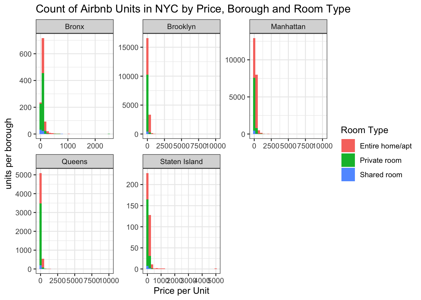
ab_NYC %>%
ggplot(aes(x = room_type, fill = room_type)) +
  geom_bar() +
  aes(color = neighbourhood_group, fill = neighbourhood_group) +
  theme_bw() +
  scale_fill_brewer(palette = "Set2") +
  xlab("Room Type") +
  ylab("Number of Units") +
  ggtitle("Number of Units of each Room type") +
  labs(color = "Neighbourhood Group") +
  guides(color = FALSE)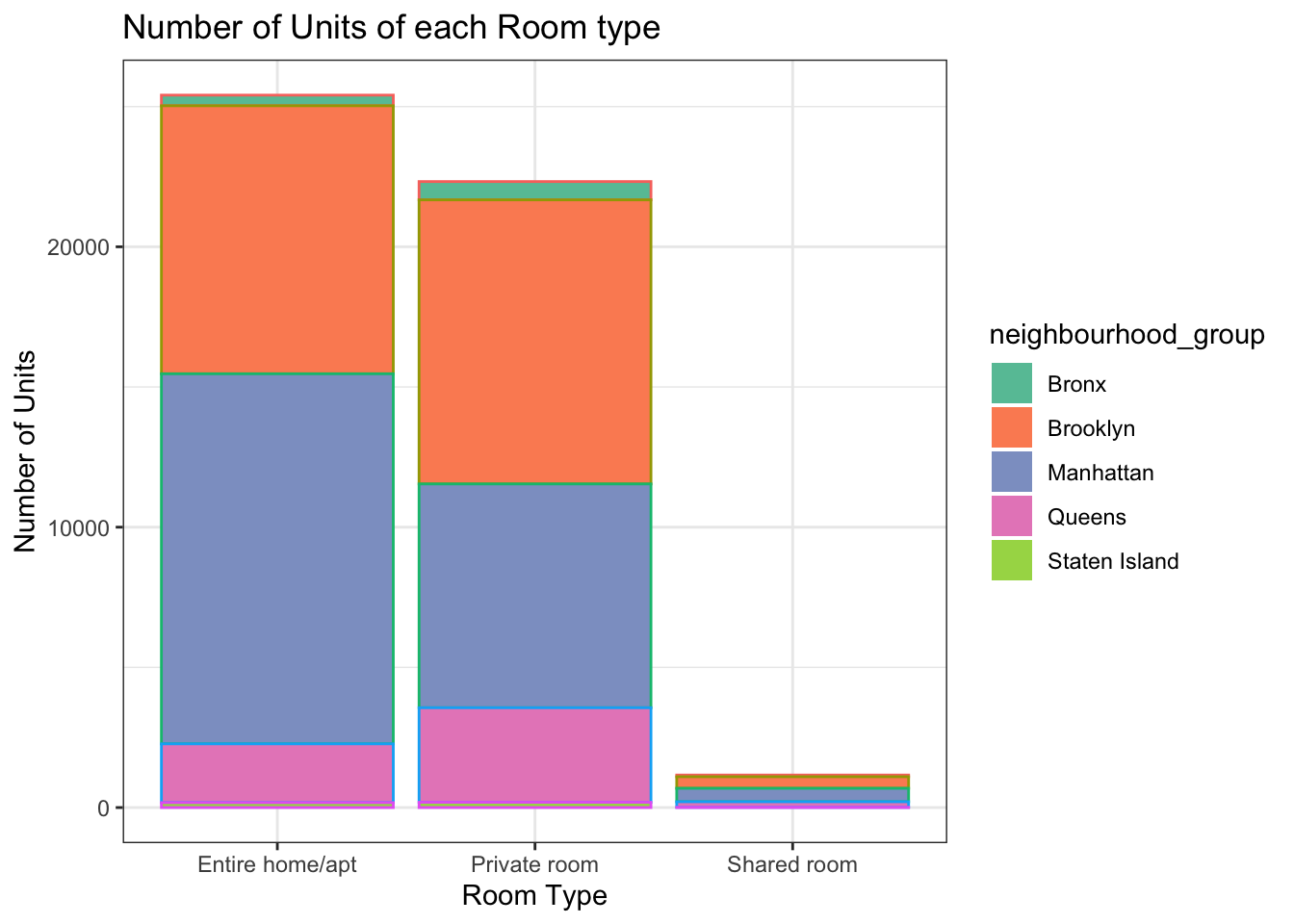
ab_NYC %>%
  group_by(neighbourhood_group, room_type, ) %>%
  summarise(mean = mean(price)) %>%
  ggplot(aes(neighbourhood_group,mean,)) +
  geom_col(fill = "blue") +
  labs(title = "Average Price of Airbnb Units by NYC Borough and Room Type",
       x = "Borough", y = "Average Price") +
  facet_wrap(vars(room_type)) +
  theme(axis.text.x = element_text(face = "bold", angle = 45, vjust = 0.5),
        axis.text.y = element_text(face = "bold"))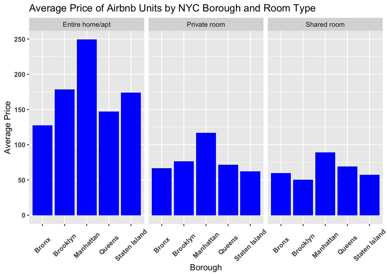
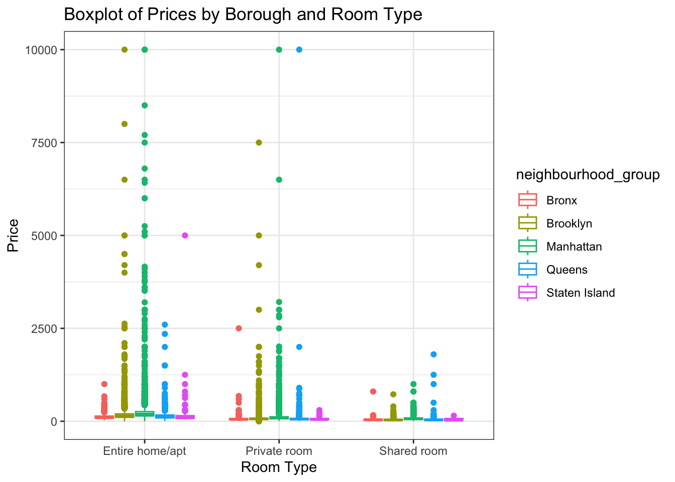
ab_NYC %>%
ggplot(aes(x = room_type, y = price, color = neighbourhood_group)) +
  geom_boxplot() +
  scale_fill_brewer(palette = "Dark2") +
  labs(title = "Boxplot of Prices by Borough and Room Type", x = "Room Type", y = "Price") +
  theme_bw()