library(tidyverse)
library(ggplot2)

knitr::opts_chunk$set(echo = TRUE)Final Project Assignment: Daniel Hannon
final_Project_assignment
spotify_youtube_data
Comparative analysis of YouTube and Spotify popularity metrics
Introduction
Music has always evolved alongside media and technology. From radio and cassets, to MTV and DVDs, to the present where streaming and internet music videos are the most common ways for people to enjoy their favorite artists. The dataset I am using connects these two mediums. It is a collection of data about songs on Spotify and the popularity of the most popular corresponding music video on YouTube. Each case is a unique song, with relevant data from both Spotify and YouTube. The data was collected on February 7th, 2023 using an API that interacted with both Spotify and YouTube. It was collected and edited by Kaggle users Salvatore Rastelli, Marco Guarisco, Marco Sallustio. It is in the public Domain and available for free download here on Kaggle.
I plan to use this dataset to try to answer questions about whether there are certain elements of a song that make it more likely to be more popular music on a given platform. To do this I will look at each attribute of the songs to see how that attribute effects overall popularity across both platforms.
Part 2. Describing the Data Set
The original dataset contains the ten most streamed songs from each artist, or in cases where there were not 10 songs on a given creators account, there are less. Each case in the dataset is a song from Spotify. Each observation is made up of identification data (a unique id, the track name, artist, album, URL on Spotify), then a section on descriptive data about the how the song sounds with measures that Spotify tracks such as the “dancability” of the song along with attributes such as the energy, key, tempo, duration, etc. The last part of the observation is information about the most popular video on Youtube when the title of the song is searched. It has identification data for the video (URL, title, description, channel name, and whether or not it is the official music video) as well as popularity measures (views, likes, comments). The final column of the data is the total number of streams that song has on Spotify, and will serve as the baseline popularity of the song.
For our purposes, we will filter all the identifiers of a song besides the Track name and Album type, leaving all of the song measures from Spotify and the Stream and View numbers, which will serve as our popularity measures.
Read in the data
spotify_yt_original <- read.csv("DanielHannon_FinalProjectData/Spotify_Youtube.csv")

#remove all the unnecessary information columns, as well as likes and comments
#for the purposes of this we will use views and Streams as our metrics of popularity because they are the most comparable
spotify_yt_data <- spotify_yt_original %>%
                  mutate(Duration = Duration_ms/1000) %>%  #change milisecods to seconds for later graph clarity
                  select(c(Track, Album_type, Danceability:Tempo, Duration, Views, Stream)) %>%
                  filter(!is.na(Views) & !is.na(Stream))

spotify_yt_data
#filter out any songs that don't have any data about views or streams
# Check the artists with < 10 songs, there are 30
# spotify_yt_original %>%
# group_by(Artist)%>%
# filter(n() < 10) %>%
# select(Artist) %>%
# table()
# Original dataset has dims 20718 x 28
dim(spotify_yt_data) # After removing NA datapoints dims are 19692 x 15[1] 19692 15Songs that have NA values in either the Stream count or the View are removed because they cannot be used for comparative analysis. There are slightly over a thousand songs with an NA value for either column, and within the NAs there is no pattern. Certain artists had no video for all of their tracks other artists it was just one or two of their songs, but conducting a Youtube search of my own showed valid videos with many views for the songs I checked. Of the songs with NA streams, I looked a sample of them on Spotify and found they had non-zero stream numbers. It is unclear as to why the API used had these errors, but they have no clear trend, and replacing them with 0 would be untrue and shift the data in an incorrect way. Therefore these tracks are being filtered out.
spotify_yt_data %>%
    select(Track) %>%
    n_distinct(.)  #16993 unique tracks
[1] 16993#an example of a problem with the dataset: repeat observations
spotify_yt_original %>%
filter(grepl("El Ultimo Adiós - Varios", Track)) #certain tracks featuring many artists are repeated because the tool that scraped for them took the top ten tracks from various artists. In this example 24 listings of the same song exist, but not all of them have the same Youtube video attached. They all contain the same name, and all of the song data is the same Right now the data has a lot of repeat tracks, about 2.7 thousand, and in order to clean the data we remove repeat tracks, without throwing away tracks that simply have the same name as another track.
Clean the Data
#|label: remove duplicate tracks
spotify_yt_data <- spotify_yt_data %>%
        group_by(Duration, Energy, Tempo, Danceability, Valence) %>%   #Group the songs that are duplicates
        arrange(desc(Views))%>%           #We want to study the highest viewed video
        slice(1) %>%                      #for each track so we slice one
        ungroup()                         #Ungroup for further analysis

dim(spotify_yt_data)
[1] 17960 15The above code chunk shows how I remove all the repeated songs in the data set. I saw that the tracks that were scrapped multiple times had identical Spotify reported values. I wanted to make sure I was removing as many duplicates as possible without removing any non-duplicate songs that happen to have the same name as another song. I experimented with different values to group the data by and reported the dimensions of the corresponding data frame. Many had the value of 17961.
| Value Paired with Track | # of Observations |
|---|---|
| None (Track Alone) | 16993 |
| Stream | 18110 |
| Energy | 17961 |
| Danceability | 17959 |
| Duration | 17961 |
| Valence | 17961 |
| Tempo | 17964 |
However, I found When using Duration, Valence, Danceability, Tempo and Energy without grouping by track we get 17960 observations. The one difference is most likely in the case of Taki Taki (with Selena Gomez, Ozuna & Cardi B) which is repeated with all the same values but with the track name Taki Taki (feat. Selena Gomez, Ozuna & Cardi B). The difference between feat. and with makes this register as two separate tracks when you group_by track. This song has enough views on it’s YouTube video (39th most in the dataset) that it should not be counted twice, so we will group_by using Duration, Valence, Danceability, Tempo and Energy without grouping by Track.
I kept the track with the highest corresponding viewed YouTube video for any songs that were repeated.
spotify_yt_data %>%
        select(Track) %>%
        summarytools::dfSummary(varnumbers = FALSE,
                        plain.ascii  = FALSE,
                        style        = "grid",
                        graph.magnif = 0.50,
                        valid.col    = FALSE)
#This shows that there are still duplicate tracks, but these might be different songs with the same name
spotify_yt_original %>%
filter(Track == "Heaven") %>%
select(Artist, Danceability:Duration_ms) # Quick sanity check: Heaven is the most repeated track now, but upon inpsecting the data, the values are different enough that they all appear to be unique songs.Above is a quick sanity check to see if any repeated track values are the same song scrapped twice, or different songs with the same title. My check showed the repeat tracks have very different song statistic values.
Analysis Plan
In order to compare what makes certain tracks more popular as songs or as videos, we can break the question down into smaller ones. Do videos of singles perform better than album songs? Are more energetic or faster tempo songs more likely to be popular on Youtube? Are there any trends that can be seen for songs that have more Youtube views than Spotify streams? I plan to compare the attributes of the songs to their popularity on each platform to see if there are certain qualities that perform better on each platform. I also plan to compare some of the song attributes of the most successful songs on each platform to see if there are any trends among just the highest performing songs.
The plan to compare how the different song attributes (Dancability, Energy, etc) correlate to higher or lower Youtube Views and Spotify streams by constructing a series of scatter plots for the attributes and color coding YouTube views to Spotify streams. A similar series of scatter plots will be made for the top performing 500 songs for each platform to look for trends there as well. A color coded bar chart will be used to compare Spotify streams and Youtube Views for Singles and Albums to see if there are any trends that make singles more likely to make popular videos.
These specific analyses will help to show the correlation between the different variables the popularity metrics we have recorded in order to show any trends in what makes certain music videos for songs more popular than others.For example, if we can see that certain values for a given measure have very high stream numbers, but disproportionately low view numbers, then we can see a distinct pattern in the data.
In order to do all the bivariate analyses, we will need to tidy the data. The first steps of this were to remove tracks with NA streams or views, and then remove duplicate tracks, or the same track that has been added to the dataset twice by the API. The next step to analyze the data will be to perform a pivot longer to have Youtube Views and Spotify Streams on separate observations, doubling the number of rows, and maintaining the number of columns.
Descriptive Statistics
#|label: general summary statistics on the dataset
get_stats <- function(dataset, cols){
  cols <- enquo(cols)
  dataset %>%
  select(!!cols)%>%
  summarytools::descr(transpose = TRUE, stats = c("Mean", "Med", "Min", "Max", "SD"))
}

dim(spotify_yt_data)
[1] 17960 15spotify_yt_data %>%
select(Danceability:Valence, -c(Loudness, Key))%>%
summarize_all(range, na.rm= TRUE)Warning: Returning more (or less) than 1 row per `summarise()` group was deprecated in
dplyr 1.1.0.
ℹ Please use `reframe()` instead.
ℹ When switching from `summarise()` to `reframe()`, remember that `reframe()`
always returns an ungrouped data frame and adjust accordingly.
ℹ The deprecated feature was likely used in the dplyr package.
Please report the issue at <https://github.com/tidyverse/dplyr/issues>.get_stats(spotify_yt_data, c(Loudness, Key, Tempo, Duration))At a baseline, our data has 17,960 tracks. Each observation has a set of measures assigned by Spotify: Danceability is a measure of how easy it is to dance to a song, Energy is how energetic the song is, Valence is a measure of how happy or positive a song is. All of these measure go from 0 to 1, where 1 is the highest value. There are a set of measure that return Spotify’s confidence measure of whether a song fits into a certain category of music. These tell about how likely a track is to be a speech, acoustic, an instrumental, or live performance and they also range from 0 to 1, where 1 is very sure it is, and 0 is very sure it is not. The last measures too look at are Duration, Key, Loudness, and Tempo. Duration, which is measured in seconds and has a very high maximum which means it probably has a few outliers. Key is a categorical variable with 12 options, each relating to a different key. Loudness is how loud a song is, measured in LUFS. Tempo is how fast or slow the beat of a song is. These measures will be what we look at when comparing Spotify streams to Youtube Views in an attempt to see if different values for each variable effect popularity for one platform more than the other.
#|label: album type analysis
get_top <- function(dataset, measure, num){  #a function to take the top number of elements from a dataset
  measure <- enquo(measure)
  dataset %>%
  select(Track, Album_type, Danceability:Duration, (!!measure)) %>%
  arrange(desc(!!measure)) %>%
  slice(1:num)
}

top_spotify <- get_top(spotify_yt_data, `Stream`, 500)
top_youtube <- get_top(spotify_yt_data, `Views`, 500)

prop.table(table(spotify_yt_data$Album_type)) #look at breakdown by album type for whole dataset
      album compilation      single
0.74420935 0.03496659 0.22082405 prop.table(table(top_spotify$Album_type)) # a breakdown by album type for the top YouTube
      album compilation      single
0.864 0.002 0.134 prop.table(table(top_youtube$Album_type)) # and top Spotify tracks
      album compilation      single
      0.808       0.032       0.160
Across the entire data set, lightly less than 74% of the songs in the are from albums, 22% of them are singles and only 3.5% are from a compilation. However for the top Spotify songs, 86% of them are albums, while for the top YouTube songs, only around 81% of them are from albums. This means that at the highest performing level, there is a slightly higher percentage of albums on Spotify, while singles and compilations make up a higher proportion of the highest performing YouTube videos.
#|label: base popularity analysis

get_stats(spotify_yt_data, c(Views, Stream)) get_stats(top_spotify, c(Stream))get_stats(top_youtube, c(Views))Across the whole data set, we can see that there are on average more Spotify streams per song than Youtube views in both the median and the mean, while YouTube views have a higher maximum and a higher standard deviation. Both popularity measures are also very skewed, having a considerably higher mean than median. However, when looking at the top 500 most streamed songs compared to the 500 most viewed songs, they have a very similar median and mean, with views having a slightly higher mean and streams having a slightly higher median with much less skew on both measures. The YouTube views however still has a much higher Max and a lower Min, leading it to having double the standard deviation of the Spotify streams.
Visualization
#|label : Graph trends in engagement
measures <- spotify_yt_data %>%
      select(Danceability : Duration) %>%
      colnames()

spotify_yt_long <- spotify_yt_data %>%
      filter(Duration < 1200) %>%  ##filter out 7 tracks that are outliers for duration
      rename("Spotify" = Stream, "YouTube"= Views) %>%
      pivot_longer(c(Spotify, YouTube), names_to = "Platform", values_to = "Count")

make_facet_plot<- function(data, x, y, color){
      x <- enquo(x)
      y <- enquo(y)
      color <- enquo(color)
      data %>%
      ggplot(aes(y= !!y, x= !!x)) +
      scale_y_continuous(trans='log10') +
      geom_point(alpha = 0.5, size = 0.5)+
      geom_smooth(aes(color = !!color))+
      theme_bw() +
      facet_wrap(~Measure, scale = "free", ncol=4)

}

spotify_yt_long %>%
      pivot_longer(measures, names_to = "Measure", values_to = "Value") %>%
      make_facet_plot(x= Value, y= Count, color= Platform) +
      labs(title= "Popularity Difference in YouTube and Spotify", subtitle = "Based on each of the Measures provided by Spotify", x= "Value of Each Measure", y= "Popularity", color= "Platform")
Warning: Using an external vector in selections was deprecated in tidyselect 1.1.0.
ℹ Please use `all_of()` or `any_of()` instead.
# Was:
data %>% select(measures)
# Now:
data %>% select(all_of(measures))
See <https://tidyselect.r-lib.org/reference/faq-external-vector.html>.`geom_smooth()` using method = 'gam' and formula = 'y ~ s(x, bs = "cs")'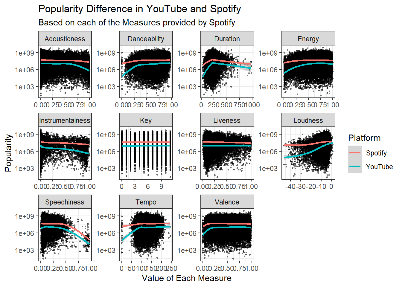
Above is the first set of graphs which look at the difference between Spotify streams and YouTube views to see if there are elements of the song that lend it to having a higher view count or stream count. There are some high outliers, so to account for that the y-axis has been scaled to log space. The common thread across all these graphs is that the Spotify data is slightly more popular than the Youtube line, but this is expected because Spotify streams had a higher average value. Most of these graphs have very similar lines for Spotify and Youtube. The areas where the difference is most noticeable between the platforms are near the lower bounds for Tempo, Valence, Energy, Duration and Danceability. Both lines are at a lower point, but YouTube views are much lower. This also occurs at the higher bound of Acousticness, where is appears a song being acoustic effects its YouTube views much more than it’s Spotify streams. The most interesting of all these graphs is the Loudness graph. Loudness appears to not effect Spotify views very much, but it seems to have a large effect on YouTube views.As a song get louder and Louder The Youtube views appear to catch up to the Spotify streams, and no-where else does this occur.
spotify_yt_long %>%
        group_by(Platform) %>%
        arrange(desc(Count))%>%
        slice(1:500) %>%        #Get the top 500 songs on each platform
        ungroup() %>%
        pivot_longer(measures, names_to = "Measure", values_to = "Value") %>%
        make_facet_plot(x= Value, y= Count, color = Platform) +
        coord_cartesian(ylim = c(600000000, 8100000000))+  #Fix the bounds because the graph for instramentalness is out of bounds
        labs(title= "Most Viewed and Streamed Songs", subtitle = "How each Measure effects Popularity for the 500 most popular of song on each Platform", x= "Value of Each Measure", y= "Popularity", color= "Platform")
`geom_smooth()` using method = 'loess' and formula = 'y ~ x'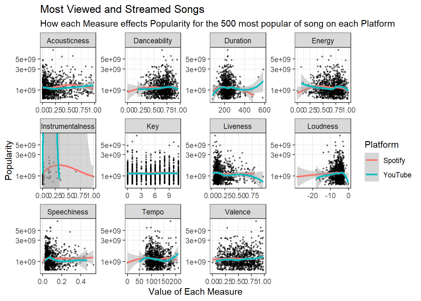
Looking at only the top 500 songs on each platform. There is almost no difference in any graph between Spotify and YouTube popularity across any of these metrics. It appears the all the increases to one to the popularity of one platform coincide with the popularity of the other platform.
spotify_yt_long %>%
  group_by(Album_type, Platform) %>%
  mutate(Mean = mean(Count), Median = median(Count)) %>%   #make a variable for the mean and median popularity based on album_type
  pivot_longer(c(Mean, Median), names_to = "Measure", values_to = "Average") %>%
  select(Album_type, Measure, Average, Platform) %>%
  ggplot(aes(x=Album_type, y= Average, fill= Platform))+
    geom_bar(position= "dodge", stat= "identity")+
    facet_wrap(~Measure, scale = "fixed") +
    theme_bw()+
    labs(title= "Average Song Popularity By Album Type and Platform", x= "Album Type", y= "Popularity", color= "Platform")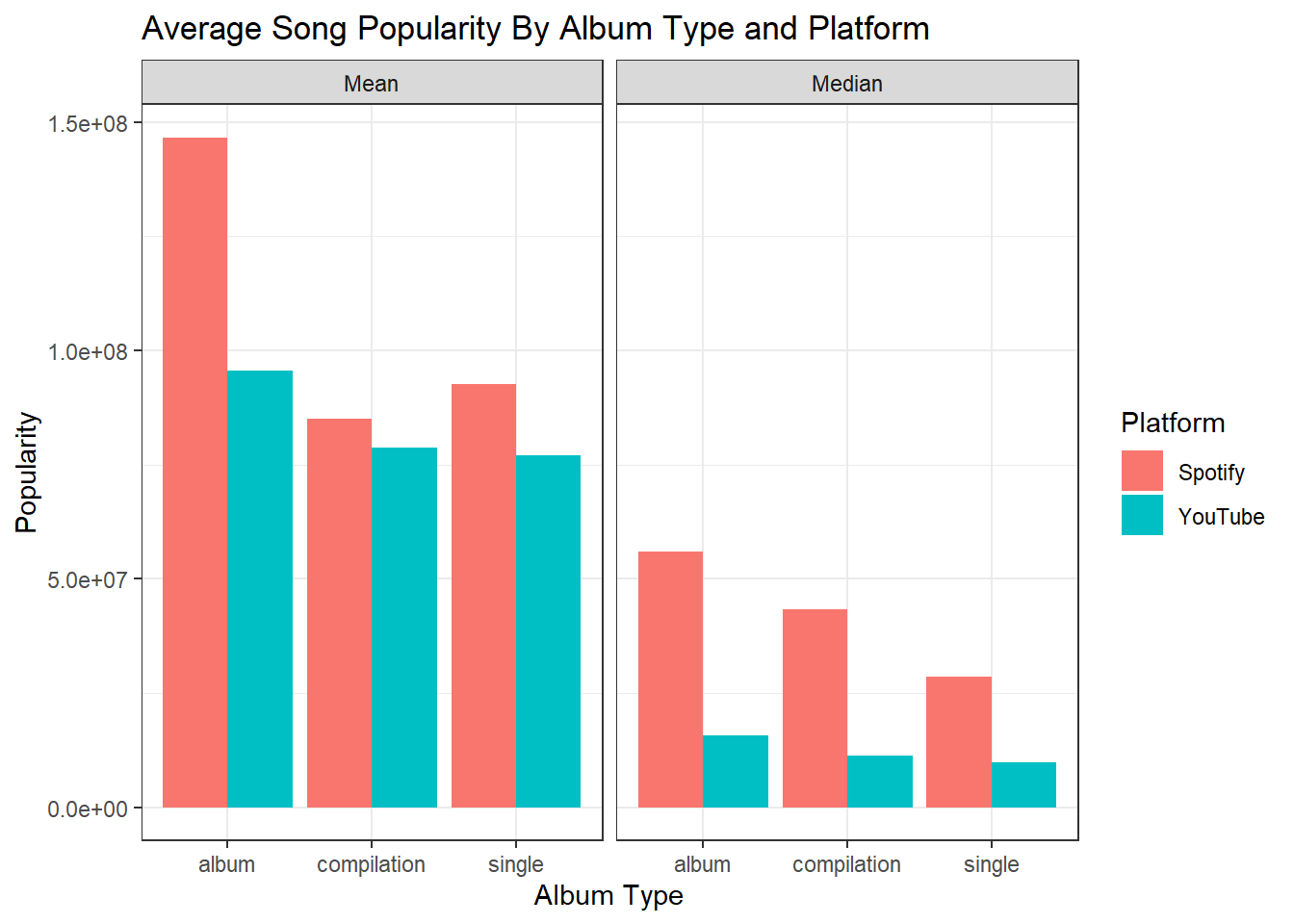
The final graph we have here breaks down the average popularity of song based on album type and popularity. We can see that the difference between the average popularity of a single on YouTube is much closer to the average popularity of a single on Spotify than is the case with albums. Though the number of views is still on average slightly lower for singles than for albums, it is still important to note that this means that singles might perform slightly better on YouTube then songs from albums when conditioned on their baseline Spotify popularity.
##Conclusion
In conclusion, there appears to be no specific aspect of a song that leads it to be more popular YouTube given it’s Spotify popularity. All of the tests showed that the popularity trends for both the entire dataset and the top 500 songs on each platform show no clear trend that is unique to one platform over the other in any meaningful way. Songs that are labeled as singles appear to do slightly better on YouTube given the popularity of it on Spotify, however further testing on this would be required. When artists release a single for a song, then later release that same song on an Album, it will often mark the song as an album song and add to it the streams it received when it was a single. This means that songs that were released as singles might be grouped in with the songs that were never singles in the album data. In order to see how significant a song being a single is to it’s comparative YouTube popularity, we would need a forth category for songs that were released as singles and then moved to albums. However this data does not organically exist on Spotify and a different API would need to be used to collect it. Further analysis could also be done to only specifically include songs that have an official music video. The dataset here had a flag for it, but upon manual inspection of the videos, many of them were incorrectly flagged, or there was an official video, but it had less views than a fan-made video, so the non-official video was recorded instead.
##Bibliography
- R Core Team (2021). R: A language and environment for statistical computing. R Foundation for Statistical Computing, Vienna, Austria, URL https://www.R-project.org/
- Wickham H, Averick M, Bryan J, Chang W, McGowan LD, François R, Grolemund G, Hayes A, Henry L, Hester J, Kuhn M, Pedersen TL, Miller E, Bache SM, Müller K, Ooms J, Robinson D, Seidel DP, Spinu V, Takahashi K, Vaughan D, Wilke C, Woo K, Yutani H (2019). “Welcome to the tidyverse.” Journal of Open Source Software, 4(43), 1686. doi:10.21105/joss.01686 https://doi.org/10.21105/joss.01686.
- H. Wickham. ggplot2: Elegant Graphics for Data Analysis. Springer-Verlag New York, 2016.
- Salvatore Rastelli, Marco Guarisco, Marco Sallustio. 02/06/2023. Spotify and Youtube: Statistics for the Top 10 songs of various spotify artists and their yt video. https://www.kaggle.com/datasets/salvatorerastelli/spotify-and-youtube?resource=download