Code
library(tidyverse)
library(lubridate)

knitr::opts_chunk$set(echo = TRUE)library(tidyverse)
library(lubridate)
knitr::opts_chunk$set(echo = TRUE)debt_data <- readxl::read_xlsx("_data/debt_in_trillions.xlsx")
debt_data# A tibble: 74 × 8
`Year and Quarter` Mortgage HE Revolvin…¹ Auto …² Credi…³ Stude…⁴ Other Total
<chr> <dbl> <dbl> <dbl> <dbl> <dbl> <dbl> <dbl>
1 03:Q1 4.94 0.242 0.641 0.688 0.241 0.478 7.23
2 03:Q2 5.08 0.26 0.622 0.693 0.243 0.486 7.38
3 03:Q3 5.18 0.269 0.684 0.693 0.249 0.477 7.56
4 03:Q4 5.66 0.302 0.704 0.698 0.253 0.449 8.07
5 04:Q1 5.84 0.328 0.72 0.695 0.260 0.446 8.29
6 04:Q2 5.97 0.367 0.743 0.697 0.263 0.423 8.46
7 04:Q3 6.21 0.426 0.751 0.706 0.33 0.41 8.83
8 04:Q4 6.36 0.468 0.728 0.717 0.346 0.423 9.04
9 05:Q1 6.51 0.502 0.725 0.71 0.364 0.394 9.21
10 05:Q2 6.70 0.528 0.774 0.717 0.374 0.402 9.49
# … with 64 more rows, and abbreviated variable names ¹`HE Revolving`,
# ²`Auto Loan`, ³`Credit Card`, ⁴`Student Loan`The data is a tibble of size 74 x 8, telling the amount of Various types of debt active in every quarter of every year from Q1 2003, to Q2 2021. The types of debt are Mortgage, HE Revolving, Auto Loan, Credit Card, Student Loan, Other, and Total.
In order to better graph the data we will create a data column using lubridate.
debt_data <- debt_data %>%
mutate(Date = yq(`Year and Quarter`))In the last assignment it was not always useful to have the data in a tidy format when graphing, so we will save it as a separate tibble
debt_tidy <- debt_data %>%
          pivot_longer(cols= !c(`Year and Quarter`, Date), names_to = "Debt Type", values_to = "Amount") %>%
          select(!`Year and Quarter`)
debt_tidy
# A tibble: 518 × 3
Date `Debt Type` Amount
<date> <chr> <dbl>
1 2003-01-01 Mortgage 4.94
2 2003-01-01 HE Revolving 0.242
3 2003-01-01 Auto Loan 0.641
4 2003-01-01 Credit Card 0.688
5 2003-01-01 Student Loan 0.241
6 2003-01-01 Other 0.478
7 2003-01-01 Total 7.23
8 2003-04-01 Mortgage 5.08
9 2003-04-01 HE Revolving 0.26
10 2003-04-01 Auto Loan 0.622
# … with 508 more rowsdebt_data %>%
select(!c(`Year and Quarter`, Date)) %>%
summarise_all(list("mean"= mean, "median"= median, "max"= max, "min" = min))# A tibble: 1 × 28
Mortgage_mean HE Rev…¹ Auto …² Credi…³ Stude…⁴ Other…⁵ Total…⁶ Mortg…⁷ HE Re…⁸
<dbl> <dbl> <dbl> <dbl> <dbl> <dbl> <dbl> <dbl> <dbl>
1 8.27 0.516 0.931 0.757 0.919 0.383 11.8 8.41 0.516
# … with 19 more variables: `Auto Loan_median` <dbl>,
# `Credit Card_median` <dbl>, `Student Loan_median` <dbl>,
# Other_median <dbl>, Total_median <dbl>, Mortgage_max <dbl>,
# `HE Revolving_max` <dbl>, `Auto Loan_max` <dbl>, `Credit Card_max` <dbl>,
# `Student Loan_max` <dbl>, Other_max <dbl>, Total_max <dbl>,
# Mortgage_min <dbl>, `HE Revolving_min` <dbl>, `Auto Loan_min` <dbl>,
# `Credit Card_min` <dbl>, `Student Loan_min` <dbl>, Other_min <dbl>, …debt_data %>%
ggplot(aes(y= Total, x= Date)) +
geom_line()+
geom_point()+
labs(title= "Total Debt by Quarter", y= "Total Debt (in trillions)", x= "Fiscal Quarter")+
theme_bw()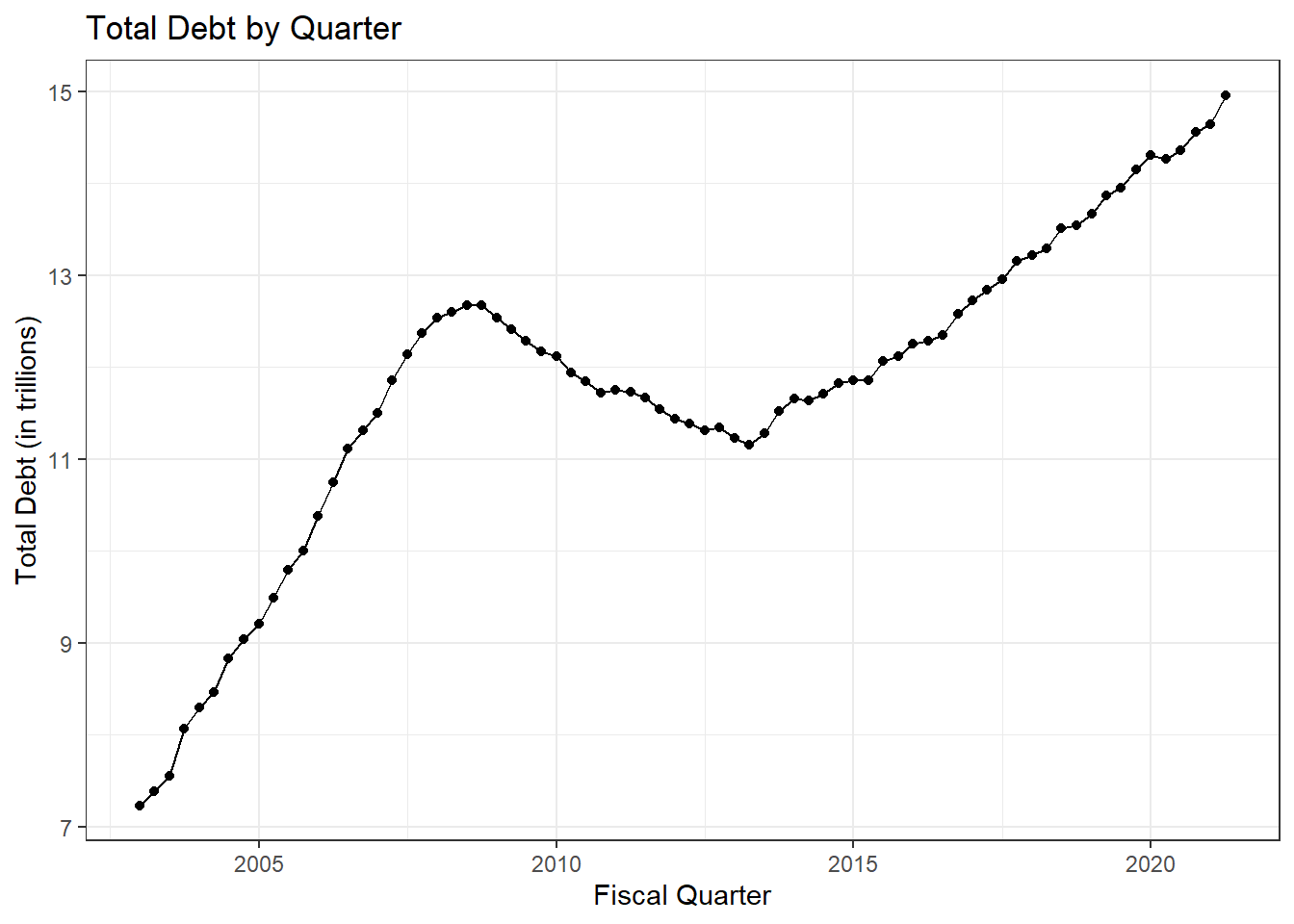
I chose to use a line graph and a point graph to make a connected scatter plot. I did this because the points are useful to know the exact points in time that represent the first date of each quarter, and the line helps to show the trend over time more clearly. If the points weren’t there it would almost look like a continuous variable, and it would be hard to see where the exact measurements are.
Here we will use the tidy version of our data set.
debt_tidy %>%
    filter(`Debt Type`!= "Total") %>%
    ggplot(aes(x= Date, y=Amount, color= `Debt Type`)) +
    geom_line(show.legend = TRUE) +
    geom_point()+
    theme_bw()+
    labs(title= "Debt Type Breakdown by Quarter", x= "Quarter", y= "Debt (in trillions)")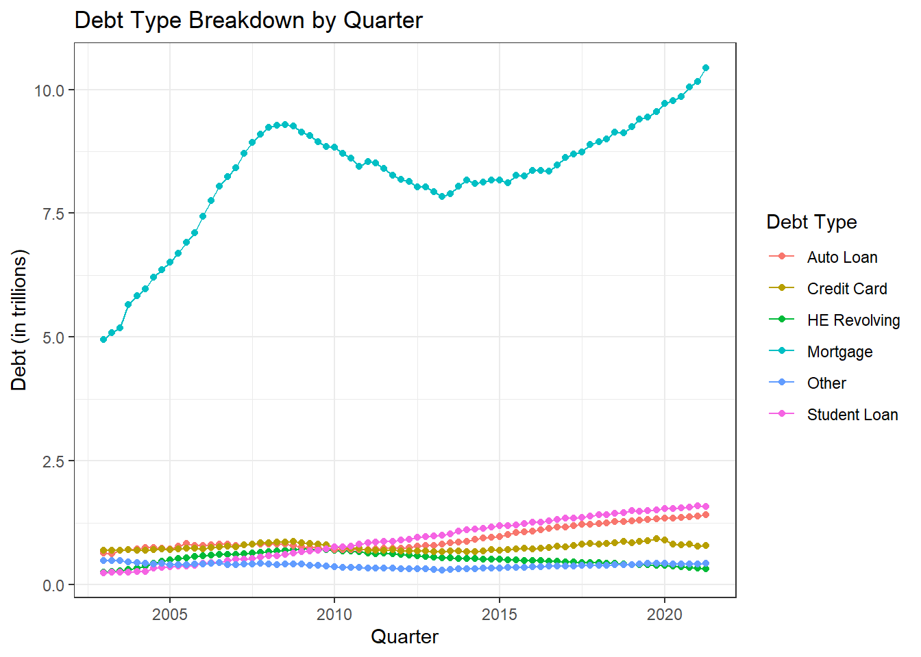
Using another line chart makes it hard to see all the non-mortgage debt, because they are all low and overlapping. For this reason the best graph to use seems to be a stacked graph.
debt_tidy %>%
    filter(`Debt Type`!= "Total") %>%
    mutate(`Debt Type` =  fct_relevel(`Debt Type`, "Mortgage", "Auto Loan", "Credit Card", "HE Revolving", "Other", "Student Loan"))%>%
    ggplot(aes(x= Date, y=Amount, fill= `Debt Type`)) +
    geom_bar(show.legend = TRUE, stat = "identity")+
    theme_bw()+
    labs(title= "Debt Type Breakdown by Quarter", x= "Quarter", y= "Debt (in trillions)")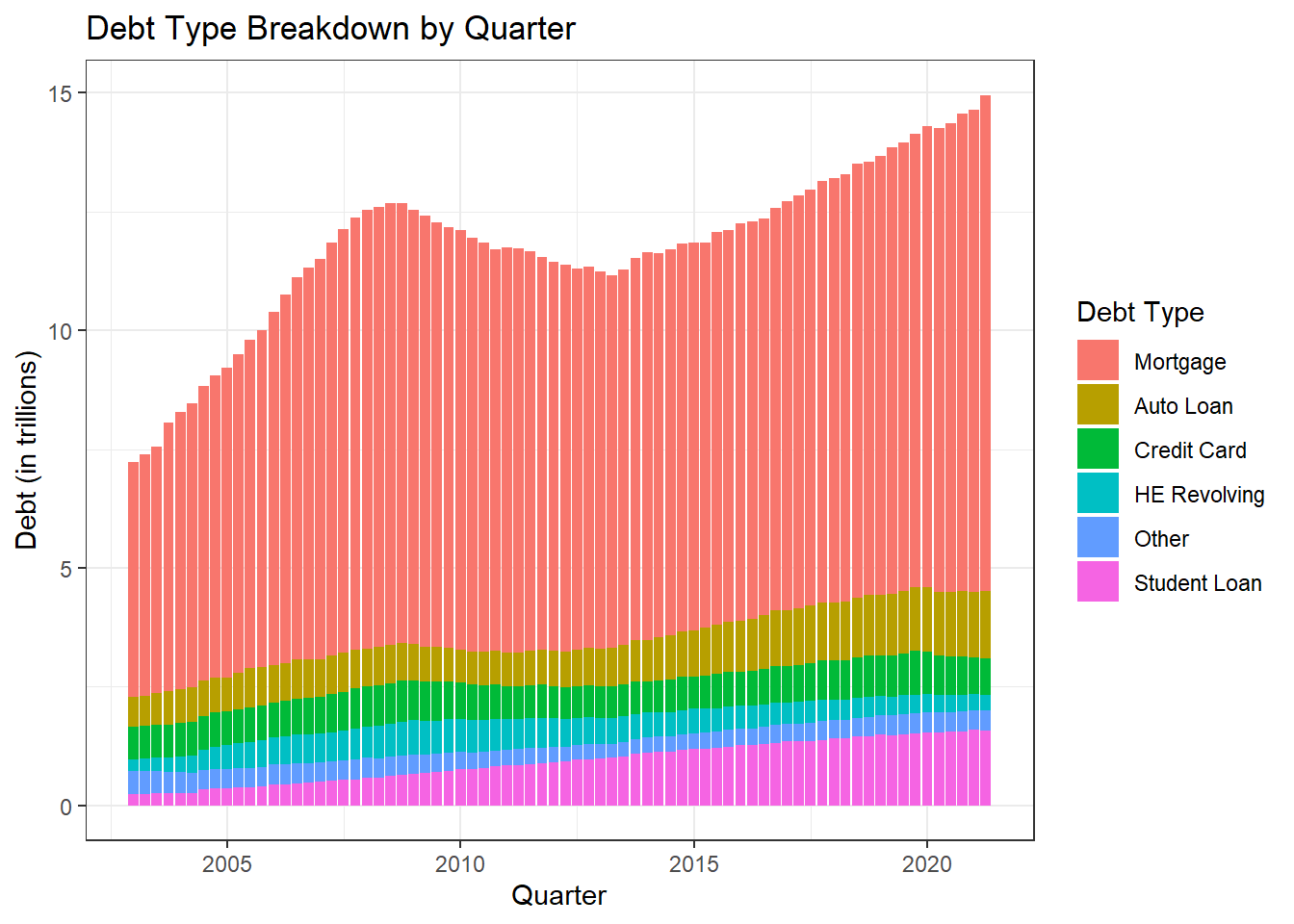
With a stacked bar chart we can see the trends across the different debt types very clearly as time goes on. We can see when certain type of debt increase compared to other debt and we can still see the total debt as the sum of the bars. Trying to do a grouped bar chart would be very hard to see with the smaller debt bars being dwarfed by the mortgage bars, and the graph would be too wide and the bars would be very skinny.