library(tidyverse)

knitr::opts_chunk$set(echo = TRUE, warning=FALSE, message=FALSE)Final Project Assignment#1: Megha Shishodia
final_Project_assignment_1
final_project_data_description
COVID-19 Postmortem
COVID-19 Postmortem Study
Introduction
In this project I study how COVID-19 affected each nation differently. Numerous individuals and families were affected by the pandemic and it is essential to have a thorough analysis of the COVID-19 data. The impact of the pandemic on each nation varied vastly and I intend to study this disparity to paint an overall picture of these differential outcomes. I study variables such as vaccinations, smoking prevalence in the nation and human development index to understand how they might have had a role to play in the number of people affected in a given country and the extent to which they are affected. I will analyse this data using heatmaps on the world map to visualise the disparities effectively. I also intend to use scatter plots and establish a correlation between variables determining the outcome of the pandemic(like death rate, number of confirmed cases) and variables that might be responsible for this outcome(like smoking prevalence, demographics). In the end, I will attempt to derive some interesting insights by visualising the top ten nations in terms of factors like vaccination per capita and deceased per capita. This analysis is meant to be useful in understanding the overall picture of the pandemic and its effects. It can be built upon further to serve as a means to correct and learn from the mistakes made by people and governments around the globe.
Dataset Introduction and Description:
I have used five datasets, the source of all datasets is the official data released by Google Health and is available on https://health.google.com/covid-19/open-data/. The data has been updated till September 15, 2022. The datasets are as follows:
- Index : The names and codes of nations, useful for joining with other datasets
- Demographics : The population statistics regarding the distribution of population
- Epidemiology : COVID-19 cases, deaths, recoveries and tests
- Vaccinations : Trends in persons vaccinated and population vaccination rate regarding various Covid-19 vaccines.
- Health : Health indicators for the region like smoking prevalence
We clean, preprocess and merge the datasets. We preserve relevant columns in each dataset and omit the columns we do not need for our analysis. We also remove the entries that are corrupt, by omitting rows with NA.
Index
index <- read_csv("MeghaShishodia_FinalProjectData/index.csv")
index = subset(index, select = c(location_key,country_name))
na.omit(index)
Epidemiology
The epidemiology dataset has entries for each person deceased and confirmed by date. We need cumulative data for our study so we pick the row with the latest/highest cumulative data.
library(data.table)

#Due to being unable to upload the raw data, the following two lines are commented
#epidemiology <- read_csv("MeghaShishodia_FinalProjectData/epidemiology_raw.csv")
#epidemiology <- epidemiology %>% group_by(location_key) %>% top_n(1, cumulative_confirmed)

#We are straightaway using the processed data
epidemiology <- read_csv("MeghaShishodia_FinalProjectData/epidemiology.csv")
epidemiology = subset(epidemiology, select = c(location_key,cumulative_confirmed, cumulative_deceased))
na.omit(epidemiology)
Demographics
demographics <- read_csv("MeghaShishodia_FinalProjectData/demographics.csv")
demographics = subset(demographics, select = c(location_key,population, population_rural, population_age_80_and_older, population_age_60_69,population_age_70_79, human_development_index))
na.omit(demographics)
Health
health <- read_csv("MeghaShishodia_FinalProjectData/health.csv")
health = subset(health, select = c(location_key,smoking_prevalence))
na.omit(health)
Vaccinations
The vaccination dataset, similar to the epidemiology, has entries for each person vaccinated by date. We need cumulative data for our study so we pick the row with the latest/highest cumulative data. This dataset also contains duplicated entries that we remove for cleaning our data.
#Due to being unable to upload the raw data, the following two lines are commented
#vaccinations <- read_csv("MeghaShishodia_FinalProjectData/vaccinations_raw.csv")
#vaccinations <- vaccinations %>% group_by(location_key) %>% top_n(1, cumulative_persons_fully_vaccinated)


#We are straightaway using the processed data
vaccinations <- read_csv("MeghaShishodia_FinalProjectData/vaccinations.csv")
vaccinations = subset(vaccinations, select = c(location_key,cumulative_persons_fully_vaccinated))
vaccinations = vaccinations[!duplicated(vaccinations), ]
na.omit(vaccinations)
The datasets contain information for not only countries but the regions within a country. For our study, we only focus on nations so I have removed the entries with information on specific regions. This is done by removing rows with underscore in location_key because the format for location_key of states and regions is like “US_CA” and for nations is like “US”.
index = filter(index, !str_detect(location_key, "_")) Next, we merge our datasets and omit duplicates and corrupt entries, if any.
list_df = list(index, health, vaccinations, epidemiology, demographics)
df <- list_df %>% reduce(inner_join, by='location_key')

df = df[!duplicated(df), ]
na.omit(df)
df <- df %>%
filter(across(everything(), ~ . > 0))
print(head(df))# A tibble: 6 × 12
location_key country_name smoking_prevalence cumulative_persons_full…¹
<chr> <chr> <dbl> <dbl>
1 AD Andorra 33.5 53478
2 AE United Arab Emirates 28.9 9792266
3 AL Albania 28.7 1261243
4 AM Armenia 24.1 985807
5 AR Argentina 21.8 37769105
6 AT Austria 29.6 6820650
# ℹ abbreviated name: ¹cumulative_persons_fully_vaccinated
# ℹ 8 more variables: cumulative_confirmed <dbl>, cumulative_deceased <dbl>,
# population <dbl>, population_rural <dbl>,
# population_age_80_and_older <dbl>, population_age_60_69 <dbl>,
# population_age_70_79 <dbl>, human_development_index <dbl>We add some more columns to our dataset in order to gain better insight into the data. We calculate and add columns like cumulative_deceased_per_capita which is a better parameter for comparison as compared to cumulative_deceased, which is not comparable due to the varying population in all nations.
df <- df%>%mutate(cumulative_persons_fully_vaccinated_per_capita = cumulative_persons_fully_vaccinated / population,
                  cumulative_deceased_per_capita = cumulative_deceased / population,
                  deceased_to_confirmed = cumulative_deceased / cumulative_confirmed,
                  cumulative_confirmed_per_capita = cumulative_confirmed / population,
                  older_per_capita = (population_age_60_69 + population_age_70_79 + population_age_80_and_older)/population,
                  eighty_or_older_per_capita = population_age_80_and_older / population,
                  population_rural_per_capita = population_rural / population)
Data Description:
The final dataset has 12 columns and the description of the columns is as follows:
- location_key : Nation that this row represents
- country_name : Name of the nation that the row represents
- smoking_prevalence : Percentage of smokers in population
- cumulative_persons_fully_vaccinated : Fully vaccinated population
- cumulative_deceased : Number of people that succumbed to the illness
- cumulative_confirmed : Number of confirmed cases
- population : Number of people in the country
- population_rural : Number of people in rural areas
- population_age_80_and_older : Population of the 80 and older people
- population_age_60_69 : Population of the 60-69 people
- population_age_70_79 : Population of the 70-79 people
- Human_development_index : Composite index of life expectancy, education, and per capita income indicators
The dataset contains 136 unique nations and they are as follows:
nations <- unique(df$country_name)
nations
[1] "Andorra" "United Arab Emirates"
[3] "Albania" "Armenia"
[5] "Argentina" "Austria"
[7] "Australia" "Azerbaijan"
[9] "Bosnia and Herzegovina" "Barbados"
[11] "Bangladesh" "Belgium"
[13] "Burkina Faso" "Bulgaria"
[15] "Bahrain" "Benin"
[17] "Brunei" "Brazil"
[19] "Bahamas" "Botswana"
[21] "Belarus" "Canada"
[23] "Republic of the Congo" "Switzerland"
[25] "Chile" "China"
[27] "Colombia" "Costa Rica"
[29] "Cuba" "Cape Verde"
[31] "Cyprus" "Czech Republic"
[33] "Germany" "Djibouti"
[35] "Denmark" "Dominican Republic"
[37] "Algeria" "Ecuador"
[39] "Estonia" "Egypt"
[41] "Spain" "Ethiopia"
[43] "Finland" "Fiji"
[45] "France" "United Kingdom"
[47] "Ghana" "Gambia"
[49] "Greece" "Honduras"
[51] "Croatia" "Haiti"
[53] "Hungary" "Indonesia"
[55] "Israel" "India"
[57] "Iran" "Iceland"
[59] "Italy" "Jamaica"
[61] "Japan" "Kenya"
[63] "Kyrgyzstan" "Cambodia"
[65] "Kiribati" "Comoros"
[67] "South Korea" "Kazakhstan"
[69] "Laos" "Lebanon"
[71] "Sri Lanka" "Liberia"
[73] "Lesotho" "Lithuania"
[75] "Luxembourg" "Latvia"
[77] "Morocco" "Moldova"
[79] "Montenegro" "Mali"
[81] "Myanmar" "Mongolia"
[83] "Malta" "Mauritius"
[85] "Maldives" "Malawi"
[87] "Mexico" "Malaysia"
[89] "Mozambique" "Niger"
[91] "Nigeria" "Netherlands"
[93] "Norway" "Nepal"
[95] "New Zealand" "Oman"
[97] "Panama" "Peru"
[99] "Papua New Guinea" "Philippines"
[101] "Pakistan" "Poland"
[103] "Portugal" "Palau"
[105] "Paraguay" "Qatar"
[107] "Romania" "Serbia"
[109] "Russia" "Rwanda"
[111] "Saudi Arabia" "Seychelles"
[113] "Sweden" "Slovenia"
[115] "Slovakia" "Sierra Leone"
[117] "Senegal" "Suriname"
[119] "El Salvador" "Swaziland"
[121] "Togo" "Thailand"
[123] "East Timor" "Tunisia"
[125] "Tonga" "Turkey"
[127] "Tanzania" "Ukraine"
[129] "Uganda" "United States of America"
[131] "Uruguay" "Uzbekistan"
[133] "Vietnam" "Vanuatu"
[135] "Samoa" "Yemen"
[137] "South Africa" "Zambia"
[139] "Zimbabwe" 3. Analysis and Visualization
Let us now visualize the data with graphs and plots.
We plot the deceased population on the world map.
library(tidyverse)
library(ggthemes)
WorldData <- map_data("world") %>% filter(region != "Antarctica") %>% fortify
world_map = map_data("world") %>% filter(! long > 180)

countries = world_map %>%
  distinct(region) %>%
  rowid_to_column()

countries %>%
  ggplot(aes(map_id = region)) +
  geom_map(map = world_map) +
  geom_map(data = df, map=WorldData,
           aes(fill=cumulative_deceased, map_id=country_name),
           colour="#7f7f7f", size=0.5) +
  expand_limits(x = world_map$long, y = world_map$lat) +
  labs(fill="cumulative deceased") +
  coord_map("moll") +
  theme_map()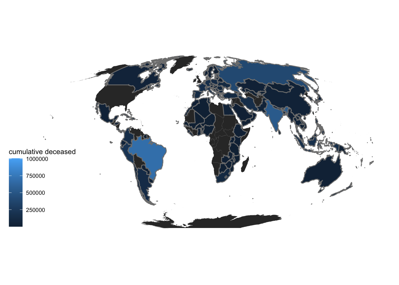
Now, we plot the deceased population per capita on the world map. We can see a clear difference in the two maps indicating that the first map may be biased against countries with huge population like India and China. So, deceased population per capita is a better indicator of covid impact
countries %>%
  ggplot(aes(map_id = region)) +
  geom_map(map = world_map) +
  geom_map(data = df, map=WorldData,
           aes(fill=cumulative_deceased_per_capita, map_id=country_name),
           colour="#7f7f7f", size=0.5) +
  expand_limits(x = world_map$long, y = world_map$lat) +
  coord_map("moll") +
  labs(fill="deceased per capita") +
  theme_map()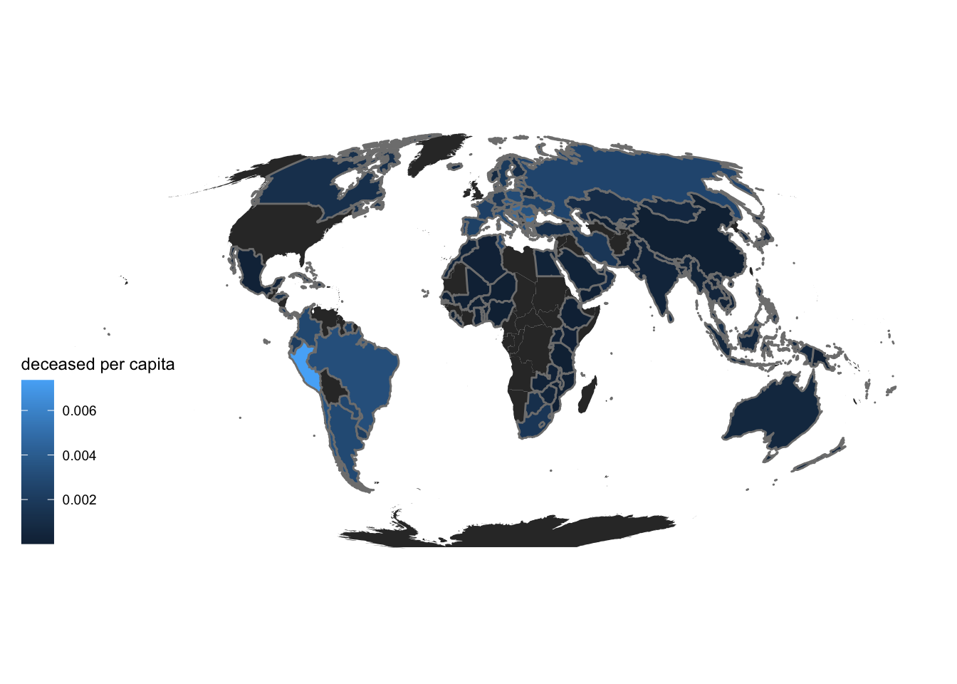
Next, we plot the vaccination status of the nations. This will help us gauge government response and general public response and awareness of the pandemic.
countries %>%
  ggplot(aes(map_id = region)) +
  geom_map(map = world_map) +
  geom_map(data = df, map=WorldData,
           aes(fill=cumulative_persons_fully_vaccinated_per_capita, map_id=country_name),
           colour="#7f7f7f", size=0.5) +
  expand_limits(x = world_map$long, y = world_map$lat) +
  coord_map("moll") +
  labs(fill="vaccinated per capita") +
  theme_map()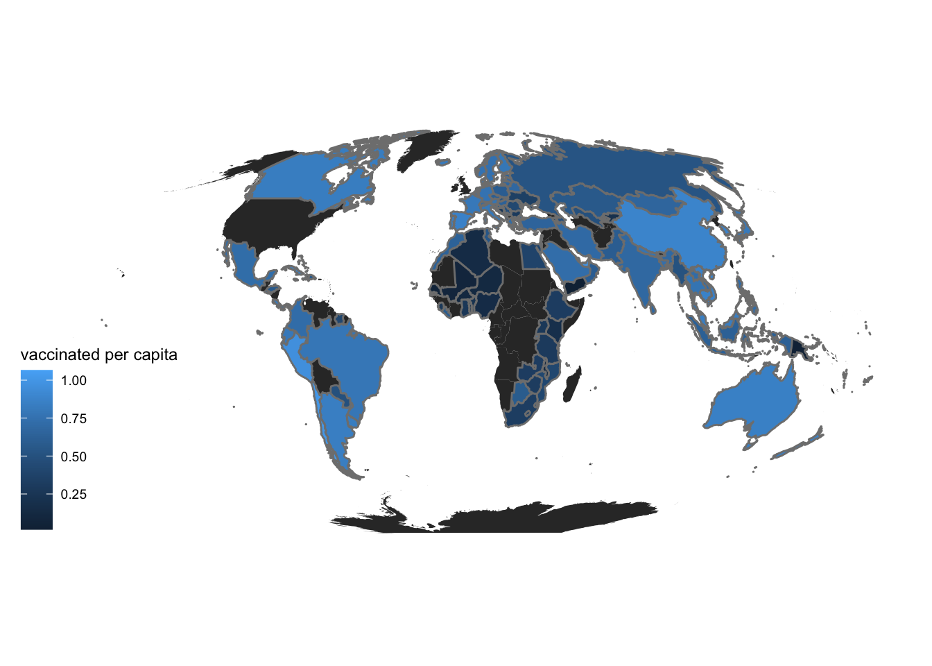
We can see a pattern in all the maps above for the regions which are colored darker or lighter, So, we should delve deep into the statistics of a few countries to be able to appreciate this pattern so we study two nations in depth (New Zealand and Mexico).
tempdf = subset(df, select = c(location_key, older_per_capita, smoking_prevalence, cumulative_persons_fully_vaccinated_per_capita, human_development_index, cumulative_deceased_per_capita) )
tempdf <- tempdf %>%
  rename("deceased" = "cumulative_deceased_per_capita",
         "HDI" = "human_development_index",
         "vaccinated" = "cumulative_persons_fully_vaccinated_per_capita",
         "older_people" = "older_per_capita",
         "smoking" = "smoking_prevalence")
We compute the mean of all the countries, so that we can use this mean to scale and compare the values better. We will filter on the countries after calculating mean.
mean <- colMeans(subset(tempdf, select = -c(location_key)))
meandf = as.data.frame.list(mean)
meandf$location_key <- c("AVG")
tempdf = tempdf[(tempdf$location_key == "NZ" | tempdf$location_key == "MX"),]

meandftempdfdf_merged <- rbind(tempdf, meandf)
df_mergeddf_two_nations <- data.frame(t(df_merged[-1]))
colnames(df_two_nations) <- as.matrix(df_merged[1])
df_two_nationsWe divide all the values by the average to scale the values better, otherwise it is difficult to plot and compare. Then we plot the
df_two_nations <- df_two_nations%>%mutate(MX = MX / AVG, NZ = NZ / AVG)

df_two_nations <- subset(df_two_nations, select = -c(AVG))
t(as.matrix(df_two_nations))
older_people smoking vaccinated HDI deceased
MX 0.6291372 0.6488397 1.237340 1.036894 0.1627424
NZ 1.5425257 0.7415311 1.471806 1.257714 0.4614893barplot(t(as.matrix(df_two_nations)), legend.text = colnames(df_two_nations), beside=TRUE, las=2, cex.names = 0.7)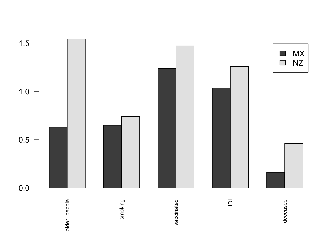
In the plot we can see that the deceased people per capita in Mexico is much higher than in New Zealand.
If we look at factors that describe the vulnerability of the population, we can consider smoking people and older people to make the population more vulnerable to the infection. We see that both these factors are higher in New Zealand, which means that the vulnerability of COVID is higher in the population of New Zealand.
Now, looking at factors that affect the response and preparedness of a nation to the pandemic. The first factor we can consider is vaccination rate per capita which clearly is higher in New Zealand than Mexico. We can also look at the Human Development Index, which would translate to better healthcare facilities and better education meaning awareness. The HDI is higher for New Zealand too. New Zealand’s response to the crisis was better, due to higher HDI and more vaccinated people.
We can see that the population of New Zealand was more vulnerable, but due to its better response and preparedness it was able to handle the pandemic better than Mexico. This led to fewer deaths.
Next, to get an overall effect of these factors on all the nations, we will be studying the correlation between various variables in the data. This will give us an idea of what factors impacted the outcomes of the pandemic.
Smoking
We plot the smoking prevalence against both confirmed cases and deceased cases to visualize the impact of smoking on lung health and thus causing more cases and deaths in nations that have a huge smoking population. From the two plots below we can see that for countries with more smokers, the number of confirmed cases as well as deaths increased.
y<-df%>%
  select(smoking_prevalence,cumulative_confirmed_per_capita)
ggplot(data=df, aes(x=smoking_prevalence, y=cumulative_confirmed_per_capita)) +
  geom_point()+
  xlab("Smoking Prevalence")+
  ylab("Cumulative Confirmed per capita")+
  labs(title="Smoking v Confirmed Cases")+
  theme_minimal()+
  theme(plot.title = element_text(hjust = 0.5))+
  stat_smooth()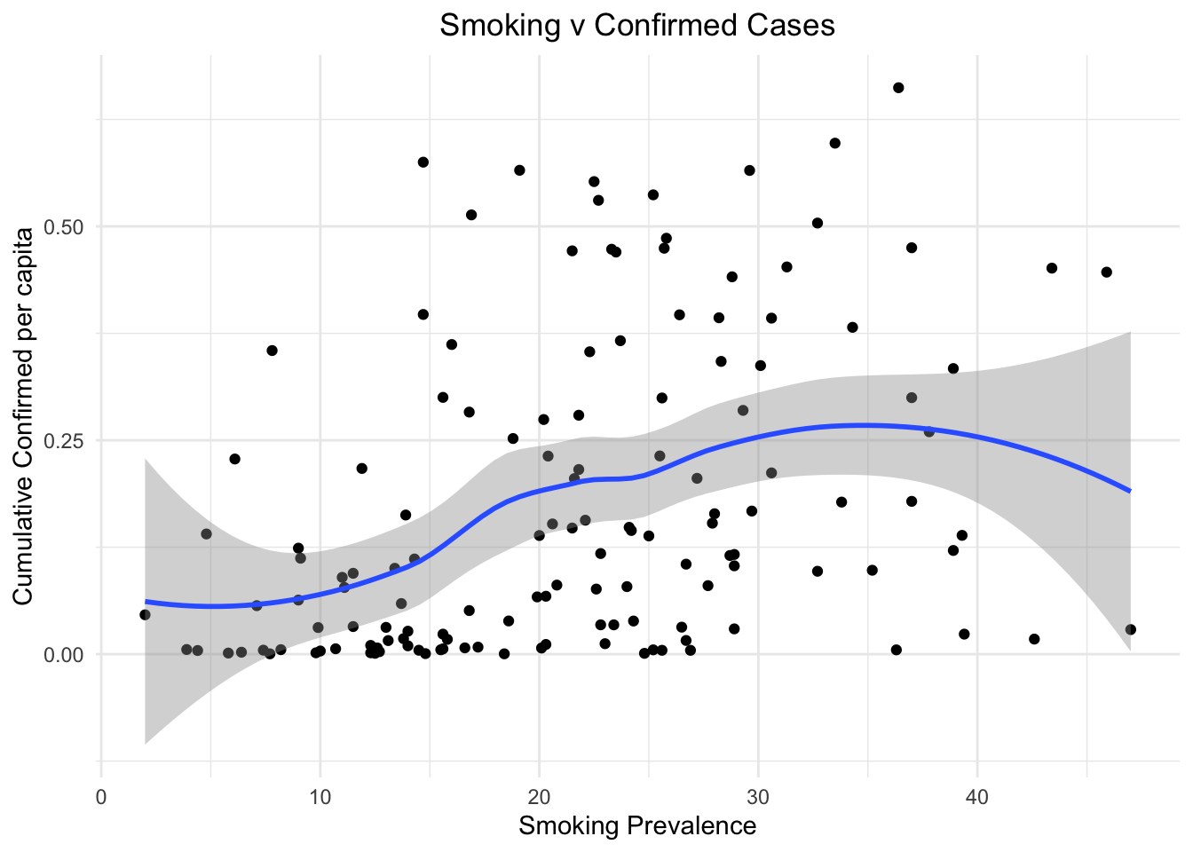
y<-df%>%
  select(smoking_prevalence,cumulative_deceased_per_capita)
ggplot(data=df, aes(x=smoking_prevalence, y=cumulative_deceased_per_capita)) +
  geom_point()+
  xlab("Smoking Prevalence")+
  ylab("Cumulative Deceased per capita")+
  labs(title="Smoking v Deceased Cases")+
  theme_minimal()+
  theme(plot.title = element_text(hjust = 0.5))+
  stat_smooth()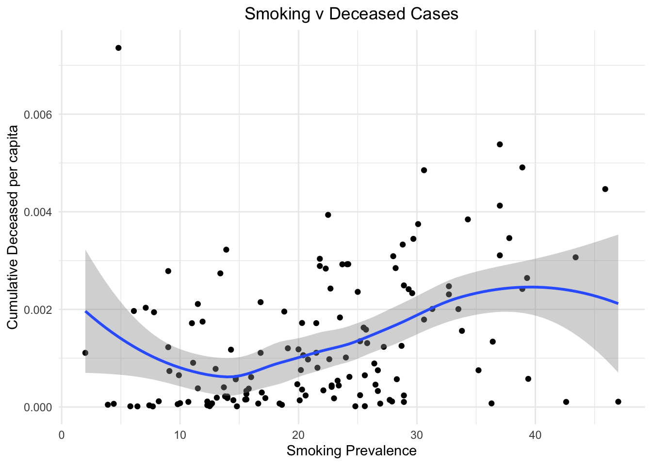
Age
Next, we study the imapct of age. We try to see if nations with more older people is affected more by the pandemic or not.
We plot the population of 80yrs and older people against the ratio of deceased to confirmed cases. We can see that clearly having more older people led to more chances of a person who contracted Covid to die.
y<-df%>%
  select(eighty_or_older_per_capita,cumulative_deceased_per_capita)
ggplot(data=df, aes(x=eighty_or_older_per_capita, y=cumulative_deceased_per_capita)) +
  geom_point()+
  xlab("Eighty years and older per capita")+
  ylab("Cumulative Deceased per capita")+
  labs(title="80 and older v Deceased")+
  theme_minimal()+
  theme(plot.title = element_text(hjust = 0.5))+
  stat_smooth()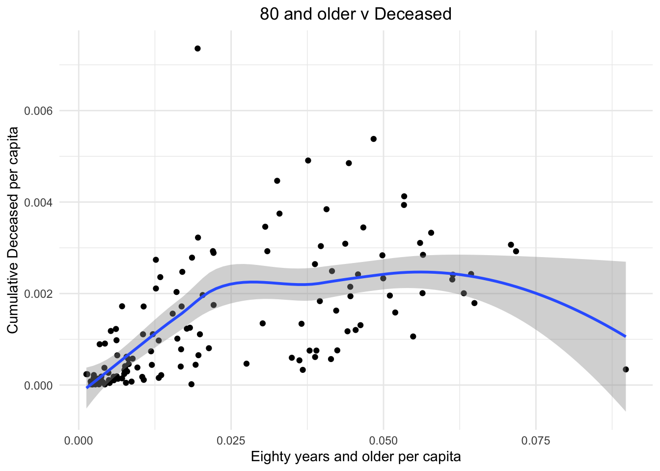
We can see a very similar trend when instead of 80 year olds we include all 60 years and older in the plot.
y<-df%>%
  select(older_per_capita,cumulative_deceased_per_capita)
ggplot(data=df, aes(x=older_per_capita, y=cumulative_deceased_per_capita)) +
  geom_point()+
  xlab("Sixty years and older per capita")+
  ylab("Cumulative Deceased per capita")+
  labs(title="60 and older v Deceased")+
  theme_minimal()+
  theme(plot.title = element_text(hjust = 0.5))+
  stat_smooth()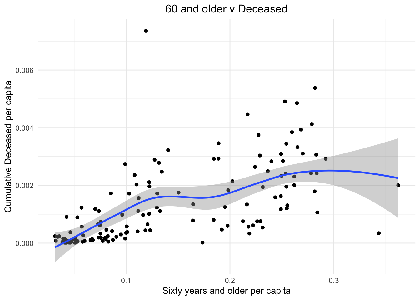
Development
Next, we try to check if there is a relationship between the level of development in a nation to the effects of the pandemic. First, let us see if having more of a rural population affects the number of people dying from the virus due to lack of facilities in rural areas. But we see no strong correlation between the two.
y<-df%>%
  select(population_rural_per_capita,deceased_to_confirmed)
ggplot(data=df, aes(x=population_rural_per_capita, y=deceased_to_confirmed)) +
  geom_point()+
  xlab("Population Rural per capita")+
  ylab("Deceased to Confirmed")+
  labs(title="Rural Population v Deaths")+
  theme_minimal()+
  theme(plot.title = element_text(hjust = 0.5))+
  stat_smooth()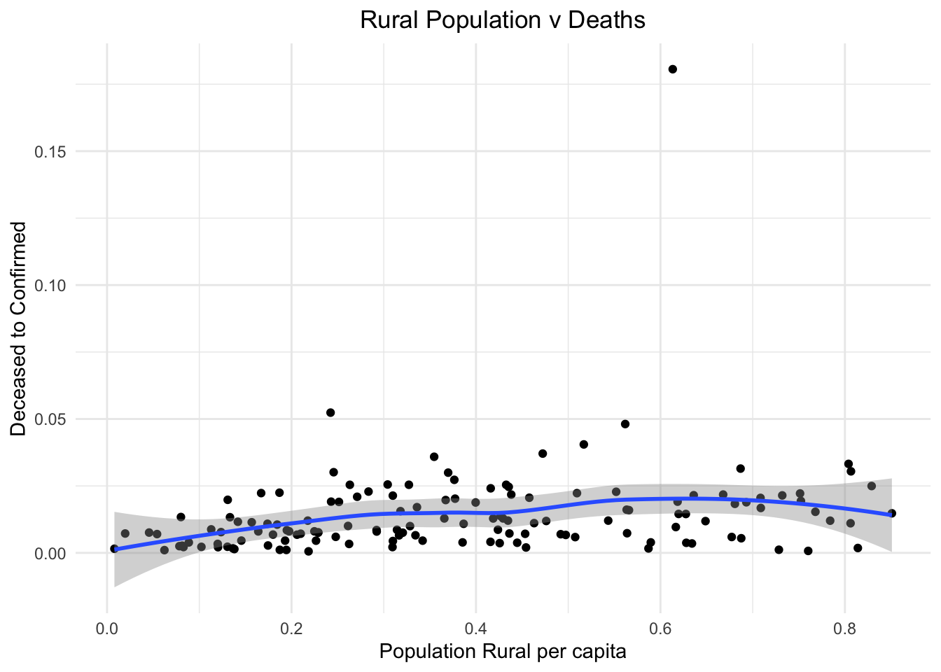
On the other hand, Human Development Index is a good indicator of the development of a nation. We see a strong correlation between the HDI and the number of people dying by contracting the virus. The infrastructure of nations with high HDI is able to support the ill people better.
y<-df%>%
  select(human_development_index,deceased_to_confirmed)
ggplot(data=df, aes(x=human_development_index, y=deceased_to_confirmed)) +
  geom_point()+
  xlab("Human Development Index")+
  ylab("Deceased to Confirmed")+
  labs(title="HDI v Deaths")+
  theme_minimal()+
  theme(plot.title = element_text(hjust = 0.5))+
  stat_smooth()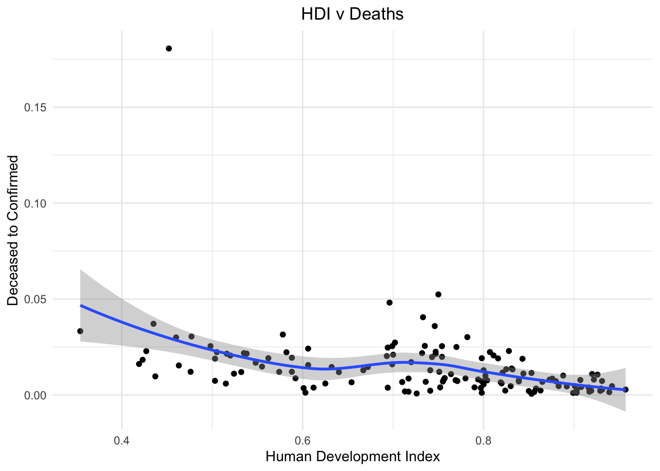
Vaccination
One of the most important factor that determined the differential outcomes in nations is the vaccine and its effectiveness. The nations where more people were vaccinated definitely saw a milder impact of the pandemic.
y<-df%>%
  select(cumulative_persons_fully_vaccinated_per_capita,deceased_to_confirmed)
ggplot(data=df, aes(x=cumulative_persons_fully_vaccinated_per_capita, y=deceased_to_confirmed)) +
  geom_point()+
  xlab("Cumulative Persons Vaccinated per capita")+
  ylab("Deceased to Confirmed")+
  labs(title="Vaccinated v Deceased to Confirmed")+
  theme_minimal()+
  theme(plot.title = element_text(hjust = 0.5))+
  stat_smooth()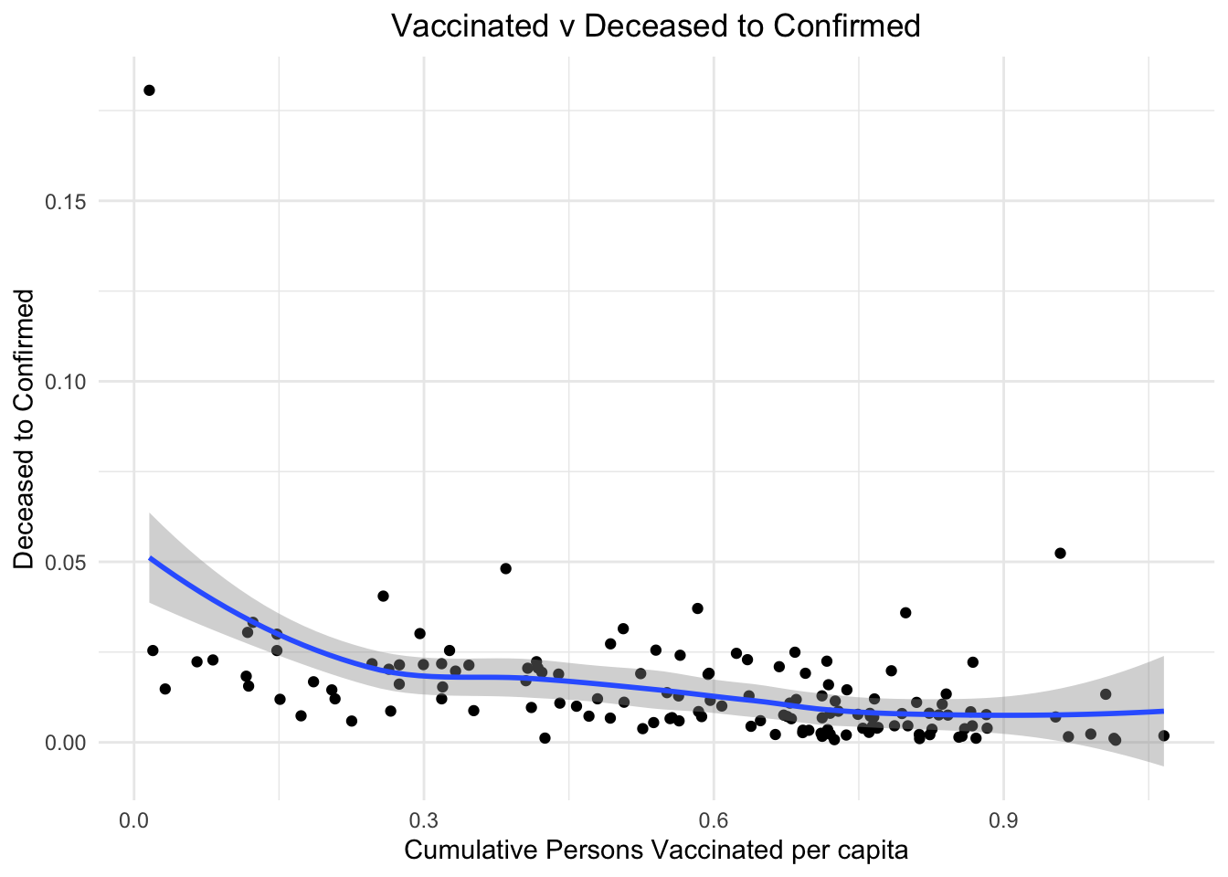
Now let us feed our curiosity, and find out some top ten nations in different categories.
We plot the nations that were hit the most by the pandemic. These are the top ten nations with the most people deceased.
ordered_df <- df[order(- df$cumulative_deceased),]
ordered_df <- top_n(ordered_df,10,cumulative_deceased)

ggplot(data = ordered_df, aes(x =reorder(country_name, cumulative_deceased),y=cumulative_deceased))+
  geom_bar(stat = "identity",fill="#CC5500")+
  coord_flip()+
  xlab("Cumulative Deceased")+
  ylab("Country Name")+
  labs(title="Most Affected Nations")+
  theme_minimal()+
  theme(plot.title = element_text(hjust = 0.5))+
  geom_text(aes(label = cumulative_deceased), vjust = 0 )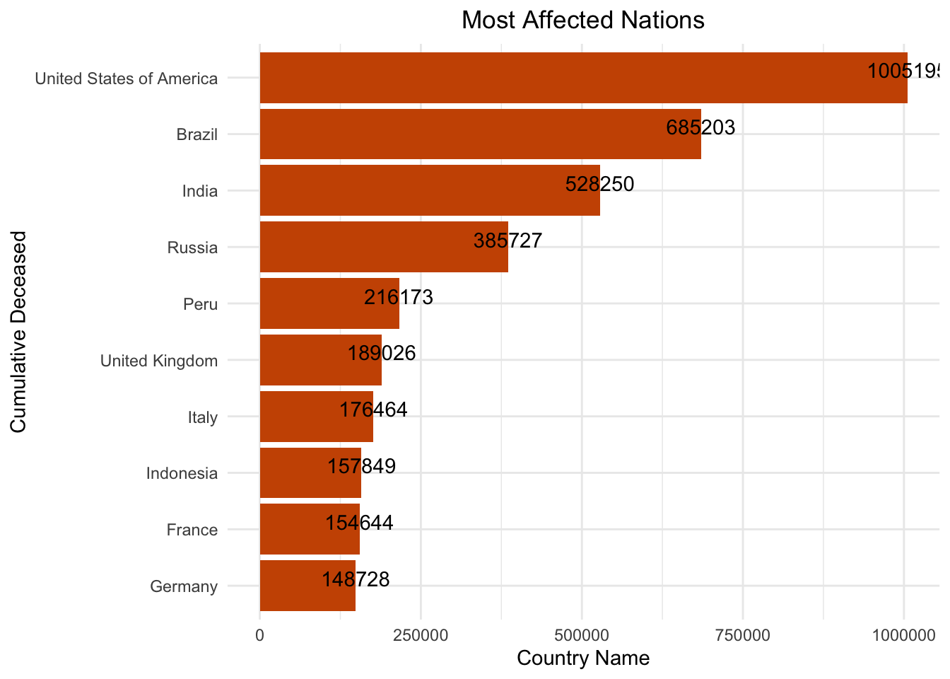
Finally, to end on a less grim note, we should appreciate the nations and people that were fighting for vaccination availability and making an effort to get as many vaccines administered as possible. To appreciate these nations, I plot the top 10 nations in terms of vaccine administration.
ordered_df <- df[order(- df$cumulative_persons_fully_vaccinated),]
ordered_df <- top_n(ordered_df,10,cumulative_persons_fully_vaccinated)

ggplot(data = ordered_df, aes(x = reorder(country_name, cumulative_persons_fully_vaccinated),y=cumulative_persons_fully_vaccinated))+
  geom_bar(stat = "identity",fill="#E30B5C")+
  coord_flip()+
  xlab("Cumulative Persons Fully Vaccinated")+
  ylab("Country Name")+
  labs(title="Vaccinated Nations!!")+
  theme_minimal()+
  theme(plot.title = element_text(hjust = 0.5))+
  geom_text(aes(label = cumulative_persons_fully_vaccinated), vjust = 0 )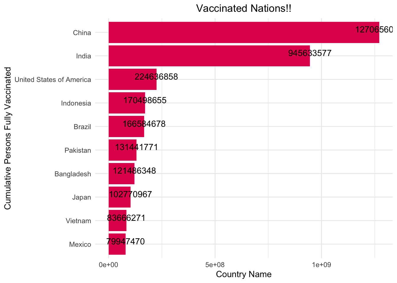
ordered_df <- df[order(- df$cumulative_persons_fully_vaccinated_per_capita),]
ordered_df <- top_n(ordered_df,10,cumulative_persons_fully_vaccinated_per_capita)

ggplot(data = ordered_df, aes(x =reorder(country_name, cumulative_persons_fully_vaccinated_per_capita), y=cumulative_persons_fully_vaccinated_per_capita))+
  geom_bar(stat = "identity",fill="#E30B5C")+
  coord_flip()+
  xlab("Cumulative Persons Vaccinated per capita")+
  ylab("Country Name")+
  labs(title="Vaccinated Nations!!")+
  theme_minimal()+
  theme(plot.title = element_text(hjust = 0.5))+
  geom_text(aes(label = cumulative_persons_fully_vaccinated_per_capita), vjust = 0 )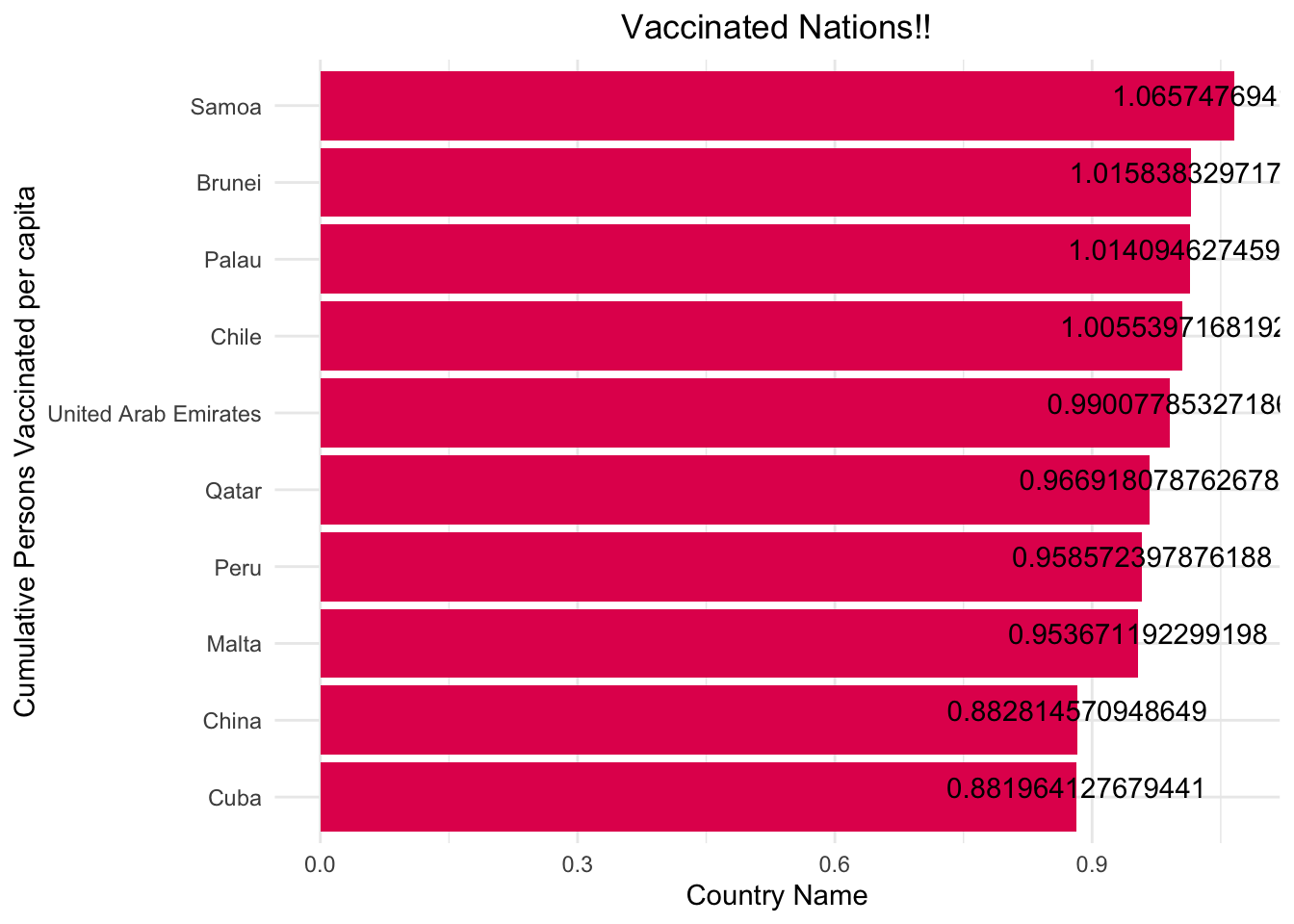
Conclusion
On studying this Covid-19 data, we were able to gain pretty interesting insights on how each nation operated differently during the pandemic. We were able to visualise the global impact with heat maps and also establish some strong correlations using scatter plots. For the most part, the correlations aligned with our intuition and helped bolster the premonitions we had during the pandemic. We can see that due to factors like smoking prevalence and Human Development Index each country had a very different level of impact. In conclusion I want to mention that each nation had its own unique set of problems during the pandemic and we are thankful to have gracefully emerged from the havoc that was created.
References
- https://github.com/GoogleCloudPlatform/covid-19-open-data#aggregated-table
- https://health.google.com/covid-19/open-data/
- https://www.rdocumentation.org/