library(tidyverse)
library(ggplot2)
knitr::opts_chunk$set(echo = TRUE, warning=FALSE, message=FALSE)Challenge 5
challenge_5
cereal
Harsha Kanakaeswar Gudipudi
Introduction to Visualization
Read in data
cereal_df <- read_csv("_data/cereal.csv")
head(cereal_df)
# A tibble: 6 × 4
Cereal Sodium Sugar Type
<chr> <dbl> <dbl> <chr>
1 Frosted Mini Wheats 0 11 A
2 Raisin Bran 340 18 A
3 All Bran 70 5 A
4 Apple Jacks 140 14 C
5 Captain Crunch 200 12 C
6 Cheerios 180 1 C colnames(cereal_df)[1] "Cereal" "Sodium" "Sugar" "Type" dim(cereal_df)[1] 20 4Briefly describe the data
The data set has information on different cereals and their nutritional values. The breakfast cereals include a lot of well known names that we find in grocery stores these days. Every row corresponds to cereal item while every column describes about one of it’s attribute. There are total of 20 rows and 4 columns.This data can be used to examine and determine which cereal is better for health in terms of nutrition. The analysis can be focused mainly around amounts of Sodium and Sugar as those two are the only attributes given in this dataset. cereals by analyzing their sodium and sugar content.
Tidy Data (as needed)
The count of occurences where entries are empty is 0. It implies that the data is 100% tidy.
#Check for missing values
sum(is.na(cereal_df))
[1] 0Univariate Visualizations
Obesity is a common thing these days. Unknowingly, we ignore the sugar contents in the common things we consume everyday like Cereals. This analysis gives information on sugar content in the famous cereals listed in the data set. The the histogram appropriately displays the important ones eliminating the extreme values when we choose a bin width of 8.
ggplot(cereal_df, aes(x = Sugar)) + geom_histogram(binwidth = 8) + ggtitle("Cereal Sugar content")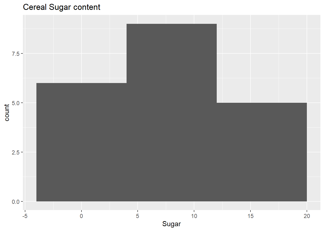
Histogram in general are useful when we want to look at the overall distribution of a numerical attribute. My histogram speaks about sugar content distribution in cereals.
I also would like to do a similar analysis for Sodium levels. High sodium levels cause excessive blood pressure which further has even worser implications than sugar.
ggplot(cereal_df, aes(x = Sodium)) + geom_histogram(binwidth = 8) + ggtitle("Cereal Sodium Content")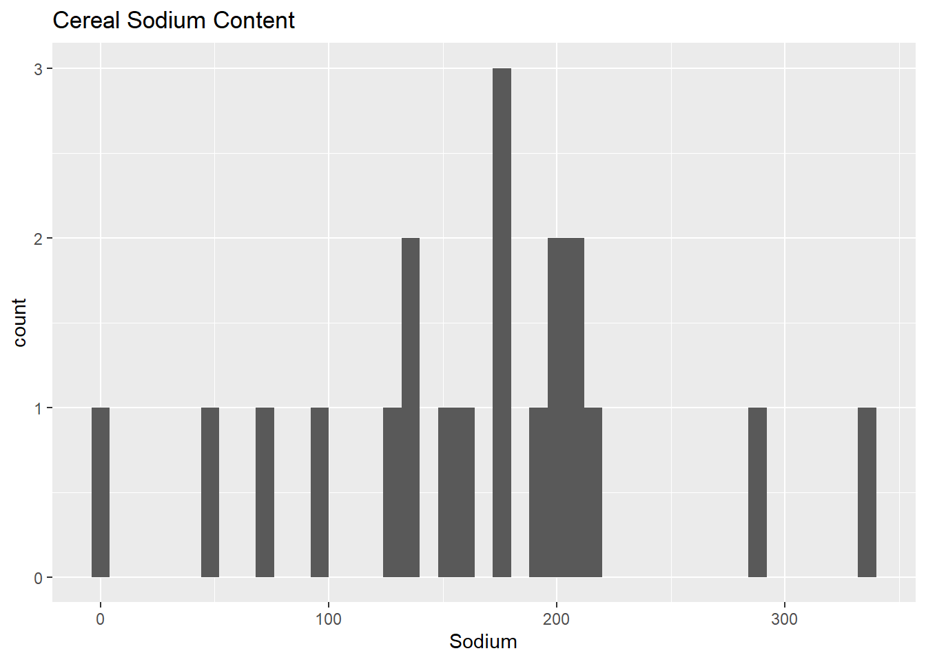
This histogram is showing the extreme values clearly. Outliers can be noticed easily in this histogram.
Bivariate Visualization(s)
Since there are only 3 attributes to analyse, I picked a scatterplot so that the distribution shows relationship among all three at one place.
ggplot(data = cereal_df)+ geom_point(mapping = aes(x = Sodium, y = Sugar,col=Type)) + ggtitle("Sodium vs Sugar Content")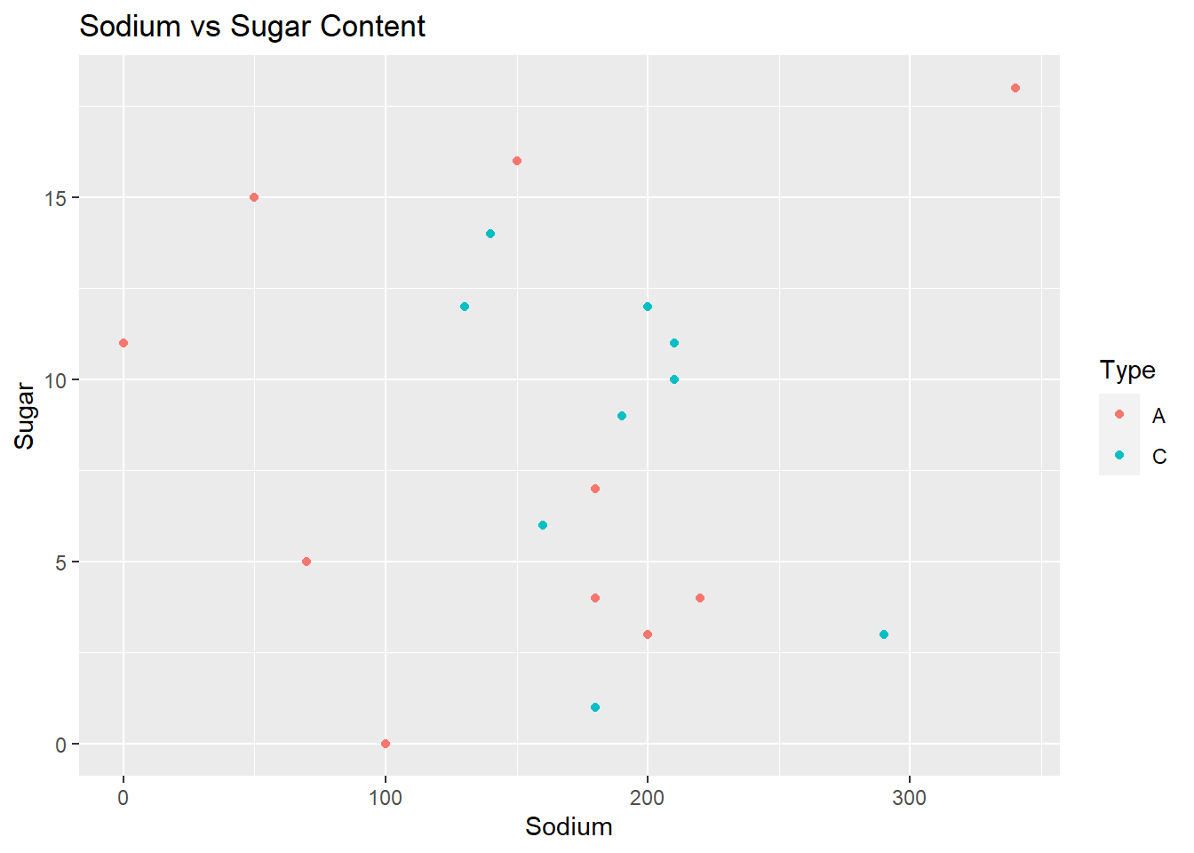
A scatter plot of sodium and sugar per cup in breakfast cereals provides correlation, patterns and relationship between sodium and sugar levels in the cereal data set.