library(tidyverse)
library(ggplot2)

knitr::opts_chunk$set(echo = TRUE, warning=FALSE, message=FALSE)
Challenge 5
challenge_5
Ishan Bhardwaj
air_bnb
Univariate and Bivariate visualizations
Challenge Overview
Today’s challenge is to:
- read in a data set, and describe the data set using both words and any supporting information (e.g., tables, etc)
- tidy data (as needed, including sanity checks)
- mutate variables as needed (including sanity checks)
- create at least two univariate visualizations
- try to make them “publication” ready
- Explain why you choose the specific graph type
- Create at least one bivariate visualization
- try to make them “publication” ready
- Explain why you choose the specific graph type
R Graph Gallery is a good starting point for thinking about what information is conveyed in standard graph types, and includes example R code.
(be sure to only include the category tags for the data you use!)
Read in data
Read in one (or more) of the following datasets, using the correct R package and command.
- cereal.csv ⭐
- Total_cost_for_top_15_pathogens_2018.xlsx ⭐
- Australian Marriage ⭐⭐
- AB_NYC_2019.csv ⭐⭐⭐
- StateCounty2012.xls ⭐⭐⭐
- Public School Characteristics ⭐⭐⭐⭐
- USA Households ⭐⭐⭐⭐⭐
ab_nyc <- read_csv("_data/AB_NYC_2019.csv")
ab_nyc
# A tibble: 48,895 × 16
id name host_id host_name neighbourhood_group neighbourhood latitude
<dbl> <chr> <dbl> <chr> <chr> <chr> <dbl>
1 2539 Clean & q… 2787 John Brooklyn Kensington 40.6
2 2595 Skylit Mi… 2845 Jennifer Manhattan Midtown 40.8
3 3647 THE VILLA… 4632 Elisabeth Manhattan Harlem 40.8
4 3831 Cozy Enti… 4869 LisaRoxa… Brooklyn Clinton Hill 40.7
5 5022 Entire Ap… 7192 Laura Manhattan East Harlem 40.8
6 5099 Large Coz… 7322 Chris Manhattan Murray Hill 40.7
7 5121 BlissArts… 7356 Garon Brooklyn Bedford-Stuy… 40.7
8 5178 Large Fur… 8967 Shunichi Manhattan Hell's Kitch… 40.8
9 5203 Cozy Clea… 7490 MaryEllen Manhattan Upper West S… 40.8
10 5238 Cute & Co… 7549 Ben Manhattan Chinatown 40.7
# ℹ 48,885 more rows
# ℹ 9 more variables: longitude <dbl>, room_type <chr>, price <dbl>,
# minimum_nights <dbl>, number_of_reviews <dbl>, last_review <date>,
# reviews_per_month <dbl>, calculated_host_listings_count <dbl>,
# availability_365 <dbl>Briefly describe the data
latest_dates <- select(arrange(ab_nyc, desc(last_review)), "last_review")
latest_dates
# A tibble: 48,895 × 1
last_review
<date>
1 2019-07-08
2 2019-07-08
3 2019-07-08
4 2019-07-08
5 2019-07-08
6 2019-07-08
7 2019-07-08
8 2019-07-08
9 2019-07-08
10 2019-07-08
# ℹ 48,885 more rowsThis dataset provides location, lodging, and review information for Airbnb residences in New York. The data seems to be relatively recent because the latest date of last review for an Airbnb was in the middle of 2019.
Tidy Data (as needed)
Is your data already tidy, or is there work to be done? Be sure to anticipate your end result to provide a sanity check, and document your work here.
This data is already tidy because each relevant variable has its own column, each case its own row, and each value its own cell.
Are there any variables that require mutation to be usable in your analysis stream? For example, do you need to calculate new values in order to graph them? Can string values be represented numerically? Do you need to turn any variables into factors and reorder for ease of graphics and visualization?
Document your work here.
For my analysis, all the required variables have the right data type and format, so there is no need for recoding or mutation.
Univariate Visualizations
ggplot(ab_nyc, aes(neighbourhood_group)) +
  geom_bar() +
  theme_minimal() +
  labs(title = "Airbnb count by neighborhood groups", x = "Area", y = "Airbnb residence count")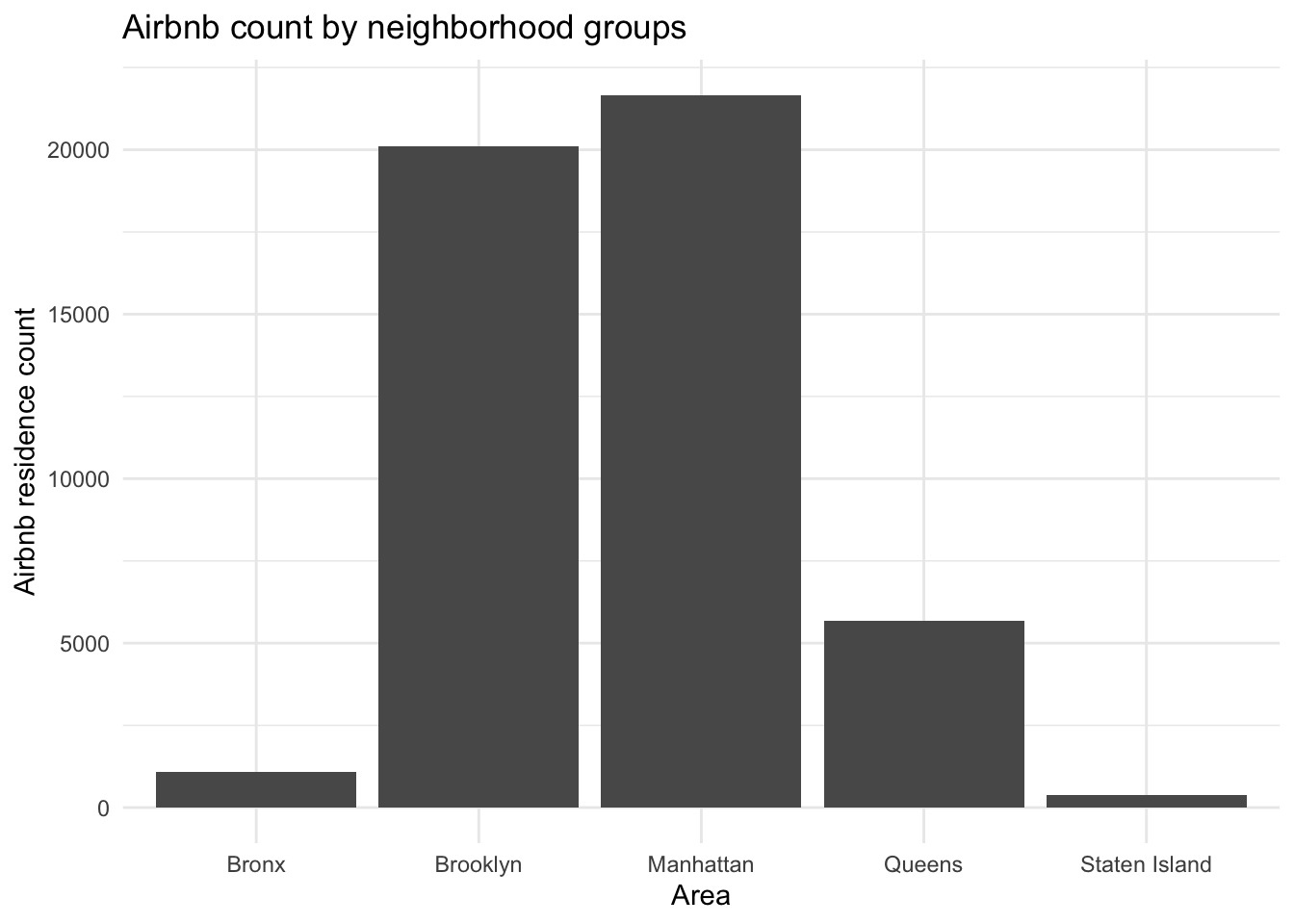
This graph tells us which neighborhood groups in New York have the highest number of Airbnb residences. As seen, Manhattan and Brooklyn far outweigh the other locations with respect to this variable. This is useful as it can hint us to which areas of New York are more tourist-centric. I chose a bar graph here because I am measuring one categorical variable.
ggplot(ab_nyc, aes(minimum_nights)) +
  geom_histogram(bins = 50) +
  scale_x_continuous(breaks = seq(0, 500, by = 100)) +
  theme_minimal() +
  labs(title = "Airbnb minimum nights counts", x = "Minimum no. of nights", y = "Airbnb residence count")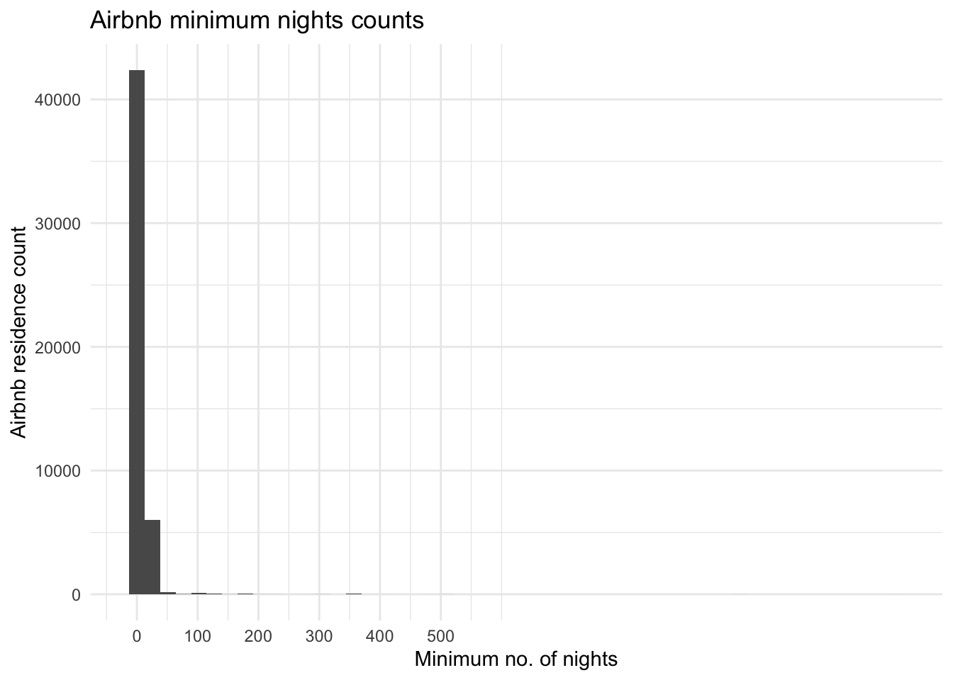
This graph tells us that most of the observations in this dataset are for relatively short-term stays, with an overwhelming majority of residences requiring a minimum stay of 0-25 nights, followed by 25-50 nights. This confirms that this data is targeted towards tourists/visitors. I chose a histogram plot here because I am measuring one continuous variable.
Bivariate Visualization(s)
ggplot(ab_nyc, aes(room_type, price)) +
  geom_boxplot() +
  theme_minimal() +
  labs(title = "Room type vs price", x = "Room type", y = "Price")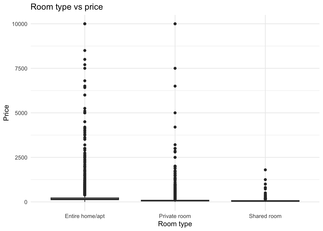
This plot tells us that while all the room types share a similar median, the variance in price range for entire homes/apartments is much more than that of private rooms and shared rooms. Most of the data points across all room types seem to fit under the 5000 price barrier, but for entire homes, there exists a non-negligible number of instances nearing the upper end of this barrier and going across it as well. Shared rooms have a relatively small price range, not going above the 2500 price barrier. This can give insights into what types of rooms are more common in New York and where the common price ranges for each category lie. I chose a box plot here because I am comparing a categorical and continuous variable.
ggplot(ab_nyc, aes(neighbourhood_group, number_of_reviews)) +
  geom_boxplot() +
  theme_minimal() +
  labs(title = "Area vs No. of reviews", x = "Area", y = "No. of reviews")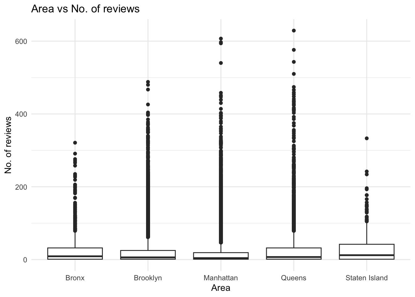
This plot tells us the trend of leaving reviews for each area, which indirectly tells us which areas had the most number of visits, as one review corresponds to a single stay at a residence. From here, we can see that Brooklyn, Manhattan, and Queens are all popular spots for stay as their range of review counts has the most population and variation. Their box plots are quite populated till the 400 reviews barrier, which is a considerably higher ceiling than that of The Bronx or Staten Island. I chose a box plot here because I am comparing a categorical and continuous variable.