Poor air quality has been shown to have a massively negative impact on human health. In particular, air pollution is known to worsen pulmonary and cardiovascular diseases [1]. Just In the past few weeks, researchers out of Boston University showed that air pollution caused by oil and gas production in the US resulted in over 7500 excess deaths and $77 billion in total health impacts in a single year [2].
The goal of my project is to assess whether there is a visual relationship between air quality trends and related causes of death in California for the decade of 2000-2010. My analysis does not attempt to make statistically significant claims about excess deaths or economic impacts, but rather looks at visual trends on a high level to see if the impact is noticeable. My findings are that, at both state-wide and intra-county levels, changes in air quality (particularly PM2.5 levels) and deaths per 100,000 seem to follow similar trends.
I’m using the CDC’s database for Air Quality Measures on the National Environmental Health Tracking Network. The most recent and complete historic data available contains per-county data on air quality between the years of 1999 and 2013, inclusive.
This data is collected by the Environmental Protection Agency’s network of more than 4,000 outdoor ambient air monitoring systems around the US, called the Air Quality System (AQS).
These systems collect two main types of data:
Ozone Concentrations
High concentrations of Ozone near the ground level can be harmful, causing irritation to the respiratory system and aggravating a variety of chronic lung diseases. This is often referred to as “smog” and is produced by things like car emissions and power plants.
Fine Particulate Matter (PM2.5) Concentrations
This refers to tiny particulate matter in the air measuring two and a half microns or less in width that originates from a variety of pollutants. Exposure to PM2.5 particles can cause both short and long term health effects. PM2.5 sources include wildfires and fossil fuel combustion.
While this data is of high quality, it is lacking in rural areas where monitors are not present. To account for this, the CDC and EPA developed statistical models to fill in gaps in data across regions and time. This allows for granular analysis of county air quality data.
Two important concepts used in my analysis are Ozone Days and PM2.5 Days.
A measure of “Ozone Days” for a particular county-year represents the number of days with the maximum 8-hour average ozone concentration over the National Ambient Air Quality Standard (NAAQS).
A measure of “PM2.5 Days” for a particular county-year represents the number of days with PM2.5 levels over the NAAQS.
In both cases, information about true severity of concentrations is not available, only the number of days above the standard.
In order to draw conclusions about air quality’s immediate impact on public health, I’m combining my air quality data with a dataset from the state of California’s Department of Health and Human Services (HHS) on annual number of deaths by county, including primary cause of death. This data also spans the years 1999-2013, but I will be using 2000-2010.
While the data includes a wide variety of causes, for my analysis I will be focusing on total deaths (ALL), chronic lower respiratory disease (CLD), and diseases of the heart (HTD), as these are the main relevant categories for air quality health impacts.
Finally, I’m also using per-county population data from the United States Census Bureau. While there are census packages out there for easy use within R, I required annual data by county, which only exists from 2005 onwards in most datasets. I’m instead using the County Intercensal Tables 2000-2010 for the state of California.
Part 2. Data Description
Reading, mutating, and combining data
Below I have provided a head sample of the three data sets.
The air quality data consists of measures of both ozone and PM2.5. Ozone levels are measured by number of days with higher than average Ozone levels, and also person-days by county by multiplying by the population for that year. PM2.5 levels are lacking raw number of days, but are recorded in percent of days, person days, and the annual average level for that county-year. I will be converting this to PM2.5 days (count) for my analysis.
Each row of the air quality data represents a specific air quality measure for a county-year.
Code
#reading in air quality dataairquality <-read_csv("JosephVincent_FinalProjectData/Air_Quality_Measures_on_the_National_Environmental_Health_Tracking_Network.csv")head(airquality)
Code
dim(airquality)
[1] 218635 14
As for the death data, each row contains a count of deaths in the “value” column for a county, year, stratification (demographically) and cause of death. This results in many rows for a given county-year.
Code
#reading in deaths datasetcalideaths <-read_csv("JosephVincent_FinalProjectData/2021-05-14_deaths_final_1999_2013_county_year_sup.csv") %>%#filtering for occurrence deaths (i.e. all deaths that occurred, disregarding residence)filter(Geography_Type =="Occurrence") %>%#de-selecting geography type as they are now all occurrenceselect(-Geography_Type)head(calideaths)
Code
dim(calideaths)
[1] 146160 9
The population data consists of rows that each represent a US county. The population estimates by year are listed in separate columns in a wide format.
Code
#reading in population datapopulations <-read_csv("JosephVincent_FinalProjectData/co-est00int-tot.csv")head(populations)
Code
dim(populations)
[1] 3194 20
My goal is to combine these data sets into the “deaths data” format, having each case represent a county, year, stratification and cause. I will combine the air quality measures as individual columns onto this data.
These can be pivoted longer as needed for visualization, but are easier kept seperately for visualizing the data set. Below, I’ve filtered the air quality data for California, then pivoted wider so that the air quality measures each are represented in a column.
One thing worth mentioning is that the air quality data consists of both “monitored” values and “modeled” values. As described on the CDC’s website, the CDC and EPA collaborated to develop statistical models for filling in missing data in regions without data. For my analysis, I will be using the modeled data to allow me to look at counties that would otherwise be missing data. You can see these mutations below.
Code
airqualitycali <- airquality %>%#arranging by yeararrange(`ReportYear`) %>%#filtering for california only and 2000-2010filter(StateName =="California"&`ReportYear`%in%c(2000:2010)) %>%#selecting only relevant columnsselect(CountyName, ReportYear, MeasureName, Value) %>%#renaming county and year to be consistent with deaths datasetrename("County"=`CountyName`, "Year"=`ReportYear`) %>%#pivoting so that each row is a year-county for merging datapivot_wider(names_from = MeasureName, values_from = Value) %>%#renaming Air Quality columnsrename("Ozone Days Delete"=`Number of days with maximum 8-hour average ozone concentration over the National Ambient Air Quality Standard`,"Ozone Person Days Delete"=`Number of person-days with maximum 8-hour average ozone concentration over the National Ambient Air Quality Standard`,"PM2.5 Percent of Days Delete"=`Percent of days with PM2.5 levels over the National Ambient Air Quality Standard (NAAQS)`,"PM2.5 Person Days Delete"=`Person-days with PM2.5 over the National Ambient Air Quality Standard`,"PM2.5 Annual Average Delete"=`Annual average ambient concentrations of PM2.5 in micrograms per cubic meter (based on seasonal averages and daily measurement)`,"Ozone Days"=`Number of days with maximum 8-hour average ozone concentration over the National Ambient Air Quality Standard (monitor and modeled data)`,"Ozone Person Days"=`Number of person-days with maximum 8-hour average ozone concentration over the National Ambient Air Quality Standard (monitor and modeled data)`,"PM2.5 Percent of Days"=`Percent of days with PM2.5 levels over the National Ambient Air Quality Standard (monitor and modeled data)`,"PM2.5 Person Days"=`Number of person-days with PM2.5 over the National Ambient Air Quality Standard (monitor and modeled data)`,"PM2.5 Annual Average"=`Annual average ambient concentrations of PM 2.5 in micrograms per cubic meter, based on seasonal averages and daily measurement (monitor and modeled data)`)#filling in modeled data for first year, where there is no modeled dataairqualitycali <- airqualitycali %>%mutate(`Ozone Days`=case_when(`Year`==2000~`Ozone Days Delete`,TRUE~as.numeric(as.character(`Ozone Days`)))) %>%mutate(`Ozone Person Days`=case_when(`Year`==2000~`Ozone Person Days Delete`,TRUE~as.numeric(as.character(`Ozone Person Days`)))) %>%mutate(`PM2.5 Percent of Days`=case_when(`Year`==2000~`PM2.5 Percent of Days Delete`,TRUE~as.numeric(as.character(`PM2.5 Percent of Days`)))) %>%mutate(`PM2.5 Person Days`=case_when(`Year`==2000~`PM2.5 Person Days Delete`,TRUE~as.numeric(as.character(`PM2.5 Person Days`)))) %>%mutate(`PM2.5 Annual Average`=case_when(`Year`==2000~`PM2.5 Annual Average Delete`,TRUE~as.numeric(as.character(`PM2.5 Annual Average`)))) %>%select(!contains("Delete"))
For prepping the deaths data, I’ve filtered for only the causes of death I believe may be relevant to air quality (ALL, CLD, and HTD).
Also, I’ve filled in some NA cells as 0 which were coded as “suppressed for small numbers”. These only apply when a specific stratification variable (i.e. race) has extremely low values for a county, and will likely not have any affect on my analysis, which I plan to mostly use the Total Population stratification.
Code
calideathsclean <- calideaths %>%#filtering for 2000-2010filter(`Year`%in%c(2000:2010)) %>%#filling in suppressed datamutate(Count =case_when( Annotation_Code ==1~0,TRUE~as.numeric(as.character(Count)))) %>%#de-selecting some unused columnsselect(-Cause_Desc, -Annotation_Code, -Annotation_Desc) %>%#focusing on relevant conditionsfilter(Cause %in%c("ALL", "CLD", "HTD")) %>%rename("Deaths"=`Count`) %>%rename("Strata Name"=`Strata_Name`)dim(calideathsclean)
[1] 28072 6
The population data needed a small bit of cleaning to pivot the estimates by year into a single column.
Finally, with the cleaning mostly complete, I’ll combine my data sets. Each time I’ll merge into the deaths data. I’ll expect my final data set to consist of 28,072 rows, which is the size of the original deaths dataset after filtering for 2000-2010. There are a total of 58 unique counties in CA. The populations of these
Code
#merging dataairqualityanddeaths <-left_join(calideathsclean, airqualitycali, by =c("County", "Year"))#merging dataairqualityanddeaths <-left_join(airqualityanddeaths, populationstidy, by =c("County", "Year"))dim(airqualityanddeaths)
[1] 28072 12
Mutation and NA replacement
It’s important to note that for some air quality data in 2000, NA were used for small counties where neither modeled nor monitored data was available. In these cases, I’ve replaced the NAs with 0 days. If not, the smaller, rural counties (with generally great air quality) would skew my averages later on. In checking the data for later years with available monitors, this seems to be a good approach, as days are (or are near to) 0.
I’ve also created a column for Deaths per 100,000 by using the population data I’ve collected. This will allow me to better compare deaths between counties with wildly varying populations. As we’ll see later, this isn’t a perfect fix as counties with small populations have a large varience in deaths per 100,000, but it’s still preferable to the raw counts.
I also have created a “raw” PM2.5 Days column that counts the number of days, instead of a percent.
Code
#For the remaining missing air quality data not filled in by models in 2000, replacing NAs with zero, as they are all small rural counties that will skew means higher for 2000airqualityanddeaths <- airqualityanddeaths %>%mutate(`Ozone Days`=replace_na(`Ozone Days`, 0),`Ozone Person Days`=replace_na(`Ozone Person Days`, 0),`PM2.5 Percent of Days`=replace_na(`PM2.5 Percent of Days`, 0),`PM2.5 Person Days`=replace_na(`PM2.5 Person Days`, 0),`PM2.5 Annual Average`=replace_na(`PM2.5 Annual Average`, 0)) %>%# Creating standardized deaths per 100,000 columnmutate("Deaths per 100,000"=`Deaths`/`Population`*100000) %>%# Creating a raw PM2.5 Days columnmutate("PM2.5 Days"=`PM2.5 Percent of Days`/100*365) %>%# Re-arrangingselect(Year, County, Population, Strata, `Strata Name`, Cause, Deaths, `Deaths per 100,000`, `Ozone Days`, `Ozone Person Days`, `PM2.5 Days`, `PM2.5 Person Days`, `PM2.5 Percent of Days`, `PM2.5 Annual Average`) %>%# Turning Year into a date for ease of plotting time series'mutate(Year =make_date(year=Year))head(airqualityanddeaths)
Analysis Plan
The goal of my project is to assess whether there is a visual relationship between air quality trends and related causes of death in California for the decade of 2000-2010.
My plan is as follows:
1) Descriptive Visualizations
Describe and summarize both the air quality and death trends data so that we can gain a baseline understanding of each before comparison.
2) Statewide Trend Comparison
Compare overall trends in air quality to deaths per 100,000 by type by taking the means of all counties over the years.
Plot deaths per 100,000 by type against each air quality measure to see if they correlate.
3) Intra-county Trend Comparison
Compare trends in air quality measures to trends in deaths per 100,000 by type for individual counties of either high or low air quality. This will allow me to reduce variance coming from county differences in hidden variables that could be influencing death rates (i.e. socio-economic variables).
A quick note that when I refer to the “decade”, I’ve actually included 11 years (2000-2010 inclusive) in my analysis.
Summary and Descriptive Visualizations
There are 58 counties in California. I’ll begin by describing air quality by county.
First, I will map each air quality measure by year, showing the trends across time.
Below, I’ve done some preparation by creating state and county maps using the “maps” package, which includes per county data with longitude and latitude coordinates.
Code
# Selecting state data from map datastates <-map_data("state")# Subsetting state data for California only for base mapcalifornia <-subset(states, region =="california")# Subsetting map data for California County dataca_counties <-subset(map_data("county"), region =="california") %>%# Changing county names to match my existing datamutate("County"=case_when(`subregion`=="alameda"~"Alameda",`subregion`=="alpine"~"Alpine",`subregion`=="amador"~"Amador",`subregion`=="butte"~"Butte",`subregion`=="calaveras"~"Calaveras",`subregion`=="colusa"~"Colusa",`subregion`=="contra costa"~"Contra Costa",`subregion`=="del norte"~"Del Norte",`subregion`=="el dorado"~"El Dorado",`subregion`=="fresno"~"Fresno",`subregion`=="glenn"~"Glenn",`subregion`=="humboldt"~"Humboldt",`subregion`=="imperial"~"Imperial",`subregion`=="inyo"~"Inyo",`subregion`=="kern"~"Kern",`subregion`=="kings"~"Kings",`subregion`=="lake"~"Lake",`subregion`=="lassen"~"Lassen",`subregion`=="los angeles"~"Los Angeles",`subregion`=="madera"~"Madera",`subregion`=="marin"~"Marin",`subregion`=="mariposa"~"Mariposa",`subregion`=="mendocino"~"Mendocino",`subregion`=="merced"~"Merced",`subregion`=="modoc"~"Modoc",`subregion`=="mono"~"Mono",`subregion`=="monterey"~"Monterey",`subregion`=="napa"~"Napa",`subregion`=="nevada"~"Nevada",`subregion`=="orange"~"Orange",`subregion`=="placer"~"Placer",`subregion`=="plumas"~"Plumas",`subregion`=="riverside"~"Riverside",`subregion`=="sacramento"~"Sacramento",`subregion`=="san benito"~"San Benito",`subregion`=="san bernardino"~"San Bernardino",`subregion`=="san diego"~"San Diego",`subregion`=="san francisco"~"San Francisco",`subregion`=="san joaquin"~"San Joaquin",`subregion`=="san luis obispo"~"San Luis Obispo",`subregion`=="san mateo"~"San Mateo",`subregion`=="santa barbara"~"Santa Barbara",`subregion`=="santa clara"~"Santa Clara",`subregion`=="santa cruz"~"Santa Cruz",`subregion`=="shasta"~"Shasta",`subregion`=="sierra"~"Sierra",`subregion`=="siskiyou"~"Siskiyou",`subregion`=="solano"~"Solano",`subregion`=="sonoma"~"Sonoma",`subregion`=="stanislaus"~"Stanislaus",`subregion`=="sutter"~"Sutter",`subregion`=="tehama"~"Tehama",`subregion`=="trinity"~"Trinity",`subregion`=="tulare"~"Tulare",`subregion`=="tuolumne"~"Tuolumne",`subregion`=="ventura"~"Ventura",`subregion`=="yolo"~"Yolo",`subregion`=="yuba"~"Yuba"))# Creating a base california mapca_base <-ggplot(data = california, mapping =aes(x = long, y = lat, group = group)) +coord_fixed(1.3) +geom_polygon(color ="black", fill ="white") +theme(panel.background =element_blank(),axis.text =element_blank(), axis.ticks =element_blank(), axis.title =element_blank(), panel.border =element_blank(), panel.grid =element_blank())# Using this for quickly removing axes later on when plotting mapsditch_the_axes <-theme(axis.text =element_blank(),axis.line =element_blank(),axis.ticks =element_blank(),panel.border =element_blank(),panel.grid =element_blank(),axis.title =element_blank() )
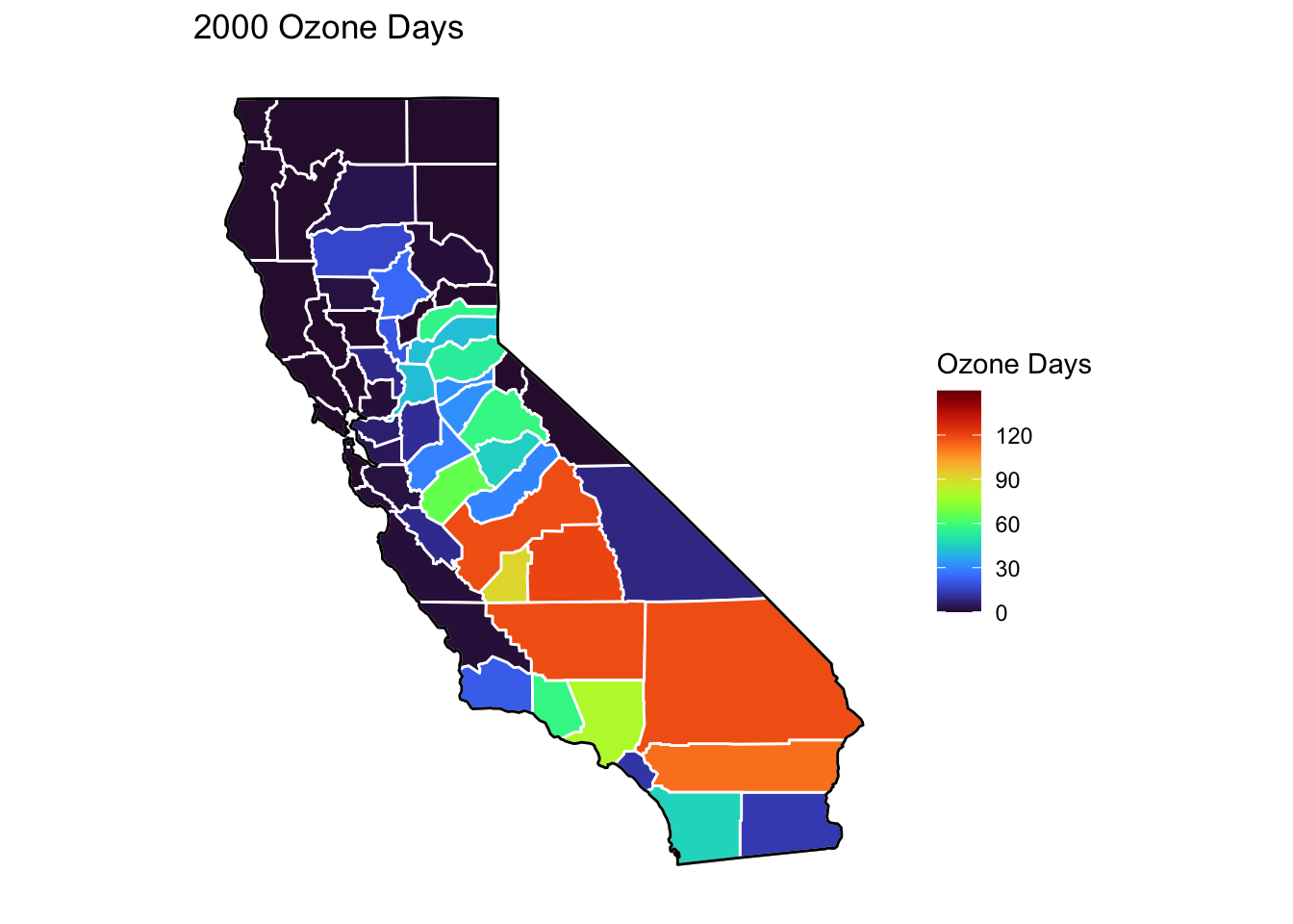
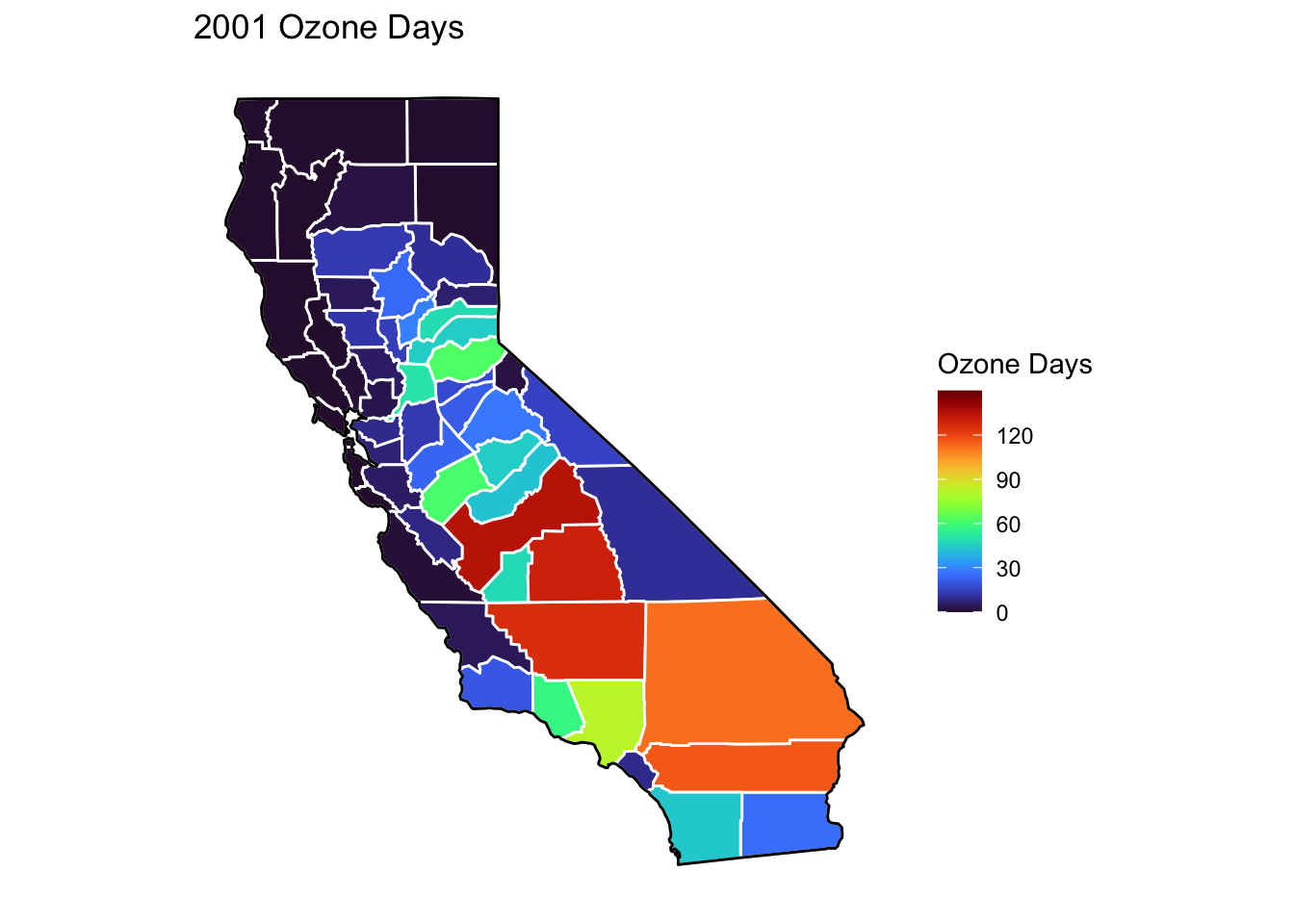
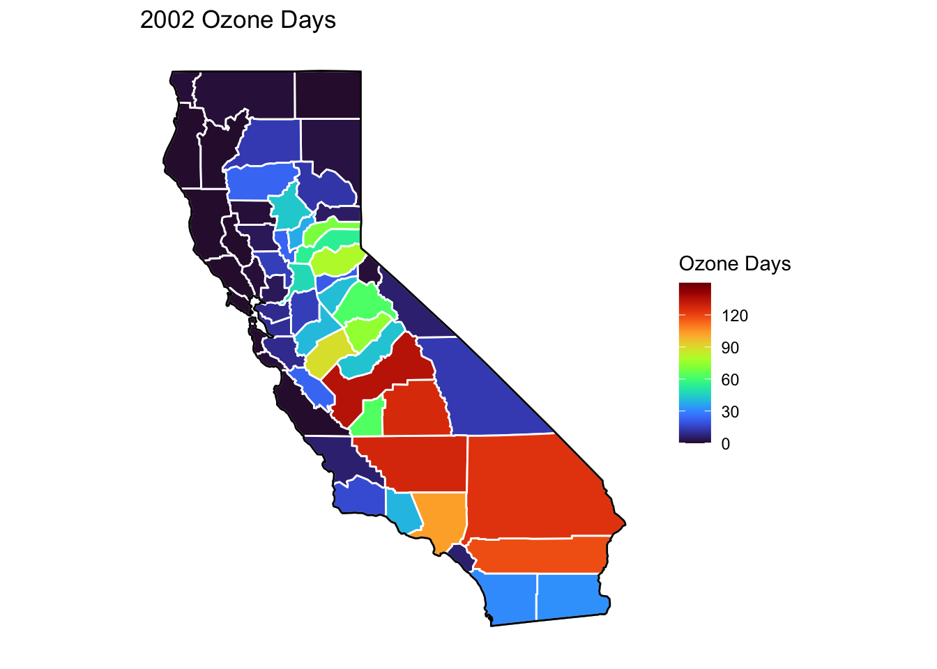
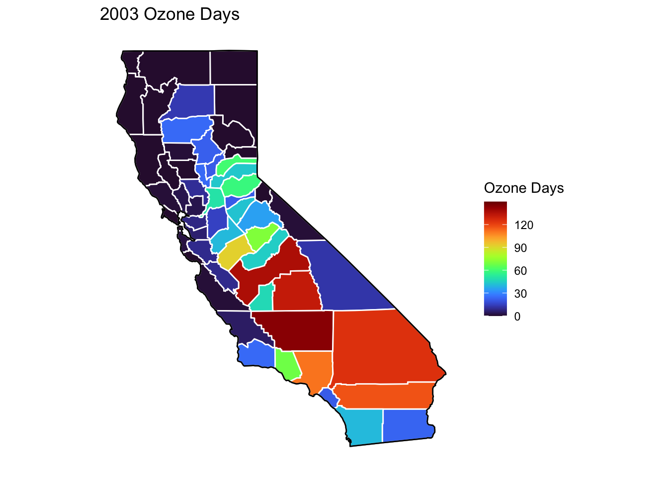
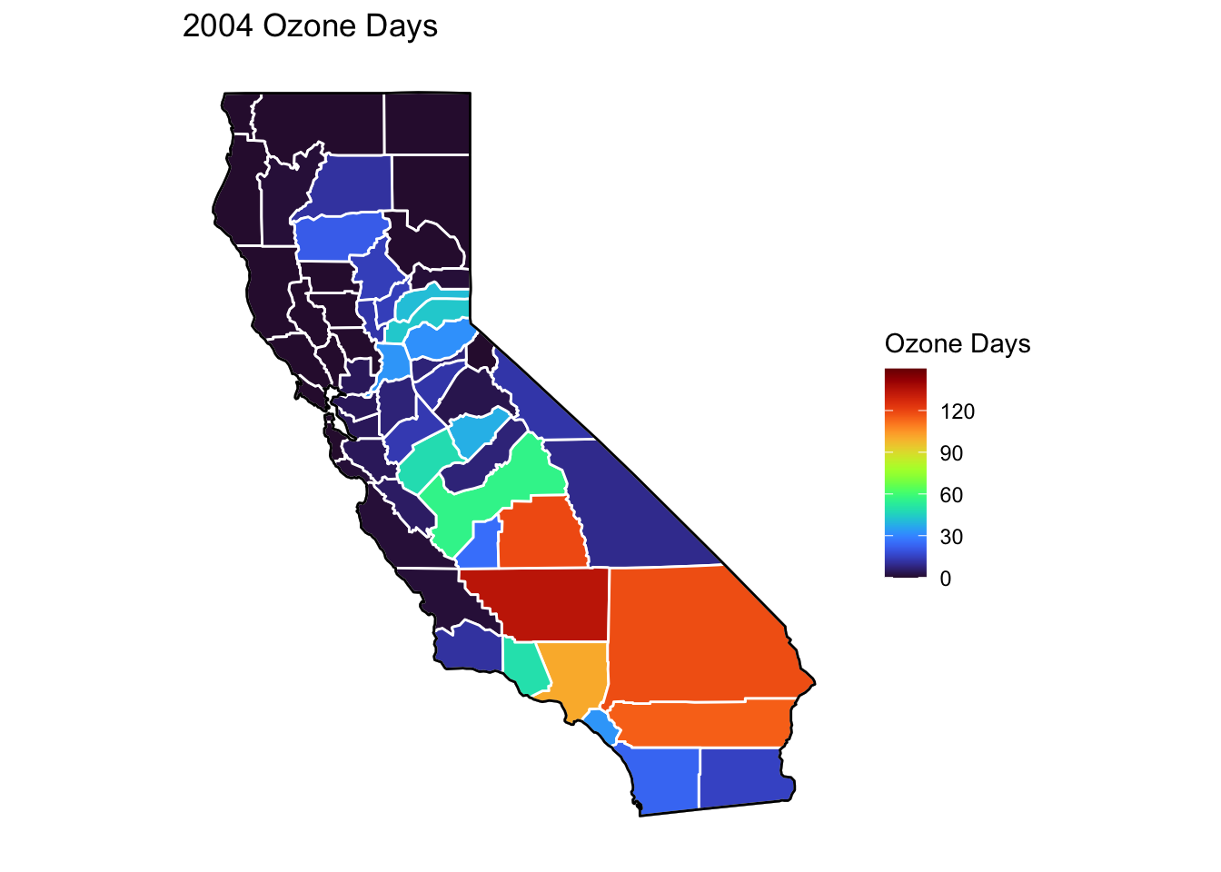
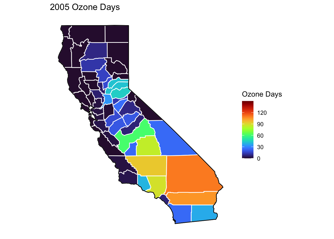
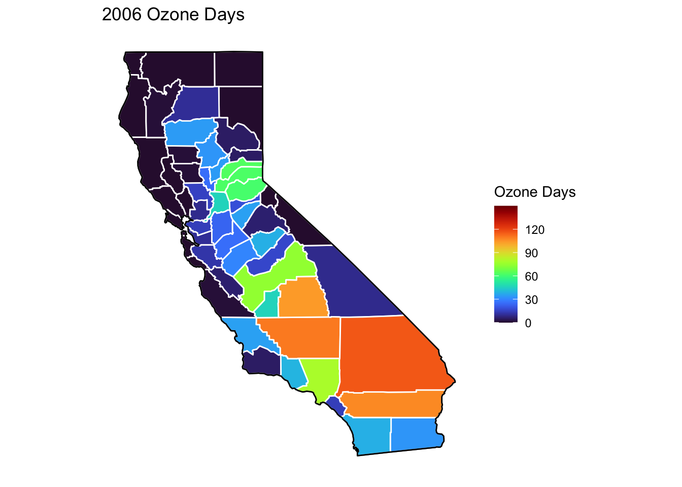
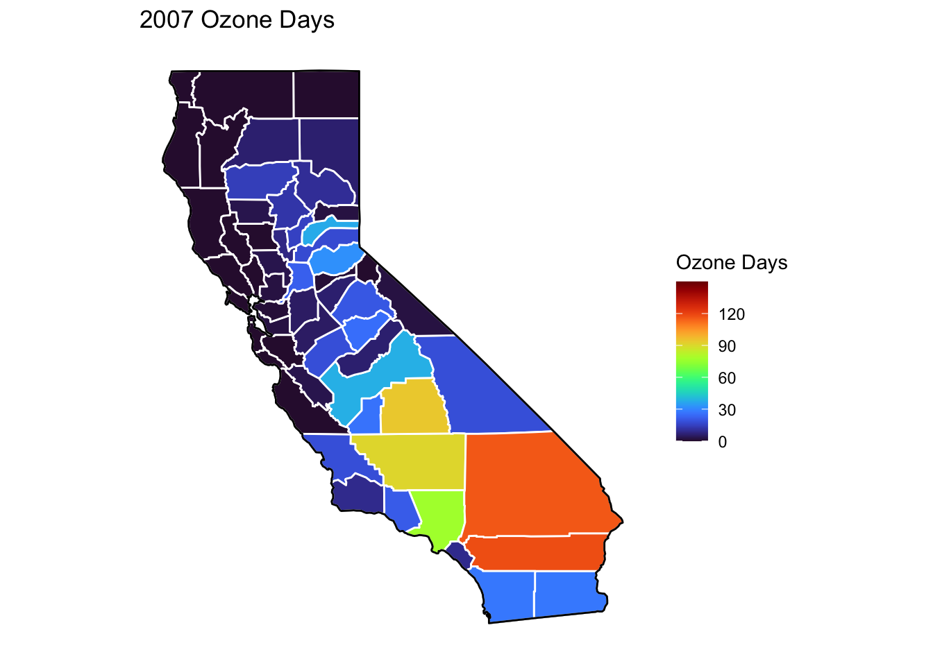
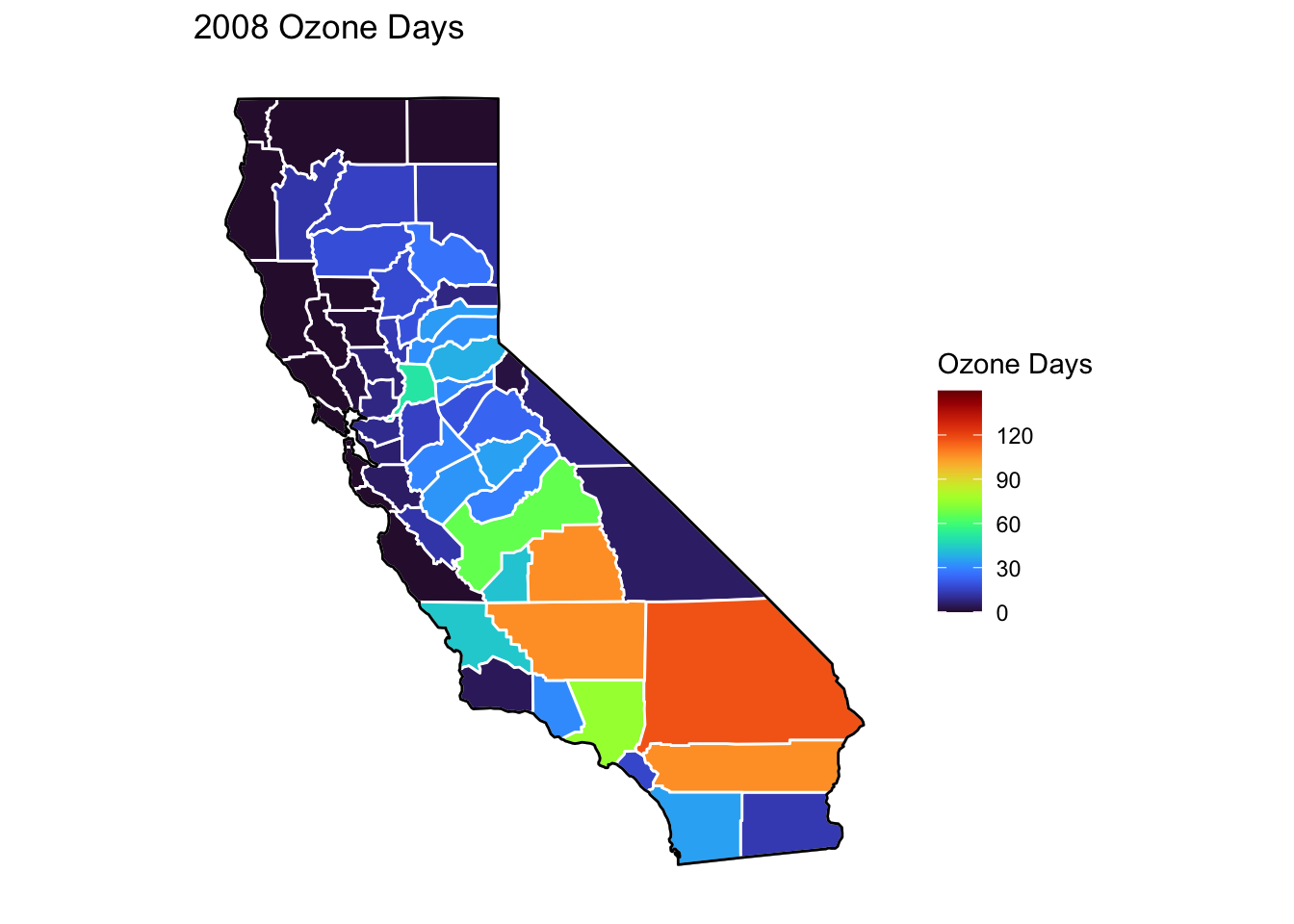
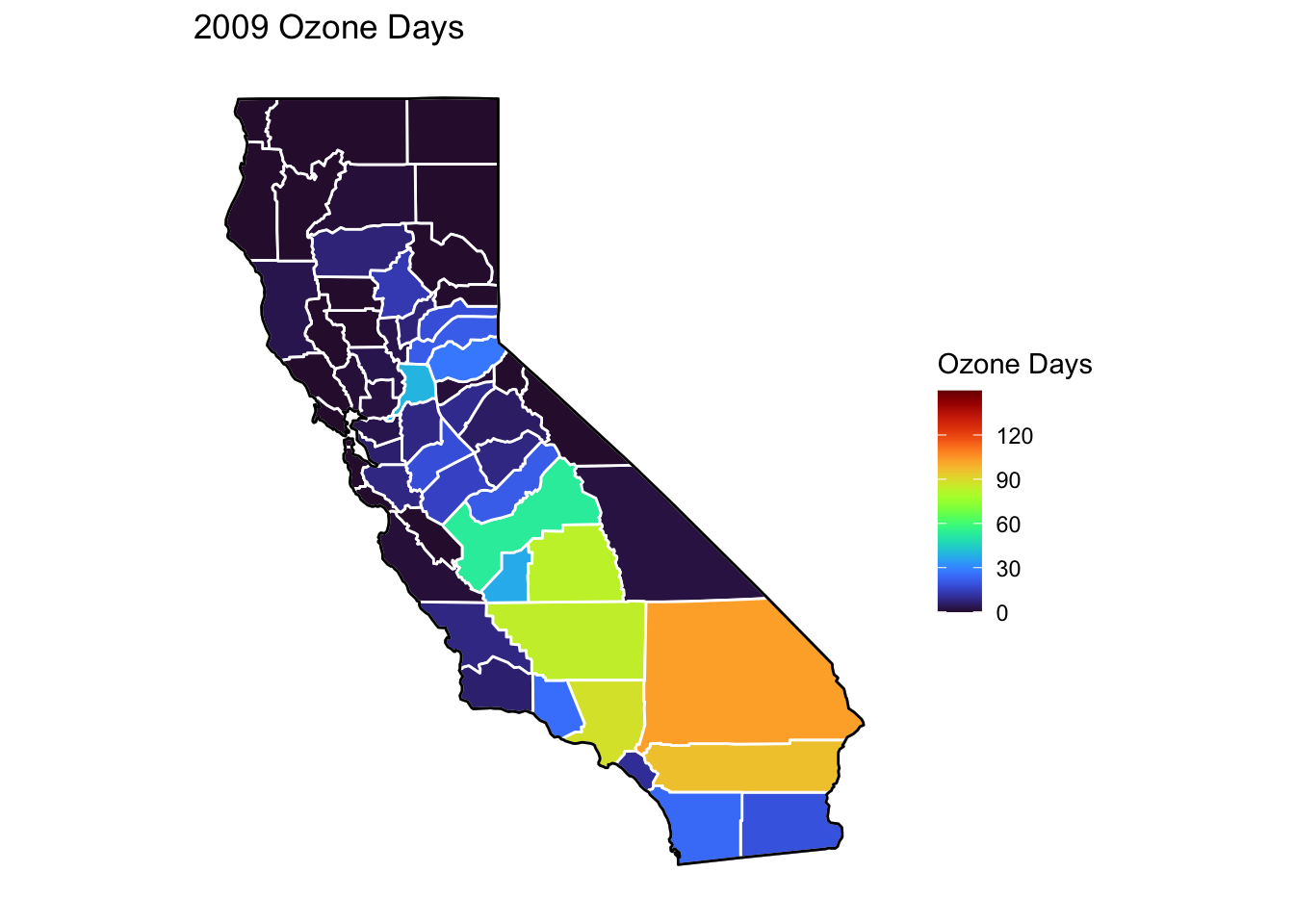
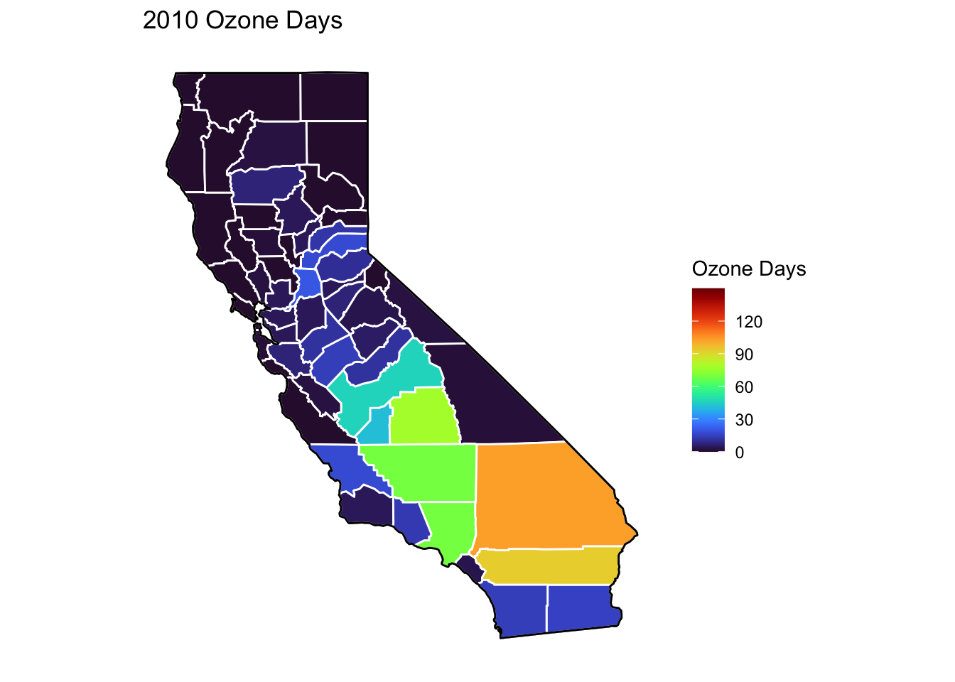
Ozone Days Maps
Below, I’ve plotted a map of Ozone Days over time (2000-2010) by county. An Ozone Day is a day in which ozone levels were greater than the national air quality standards.
It’s clear that Ozone-related air quality was worse during the early parts of the decade, particularly 2001-2003, and improved towards the end of the decade.
Another thing that is clear from these maps is that there is not a huge variance in Ozone days within counties. In other words, counties with high ozone days tend to stay counties with high ozone days. This is perhaps not surprising, as Ozone levels will tend to be higher in areas with big cities, where smog and air pollution originate.
A notable exception to this, is that the Bay Area (San Francisco) has low Ozone days throughout the decade. This is strange to me, and makes me question whether the data is accurately reported for that region.
Code
# Creating function to filter data by year and combining it with map data for creating mapsmapdatafunction <-function(x) {airqualityanddeaths %>%filter(year(Year) == x &`Strata Name`=="Total Population"& Cause =="ALL") %>%left_join(ca_counties, ., by ="County")}# Creating function to plot a map ozone days by county by yearmapozonefunction <-function(x) { ca_base +geom_polygon(data =mapdatafunction(x), aes(fill =`Ozone Days`), color ="white") +geom_polygon(color ="black", fill =NA) +theme_bw() + ditch_the_axes +scale_fill_viridis(option ="turbo", limits =c(0, 150), breaks=c(0,30,60,90,120)) +ggtitle(paste0(x, " Ozone Days"))}for (i inc(2000:2010)) {print(mapozonefunction(i))}
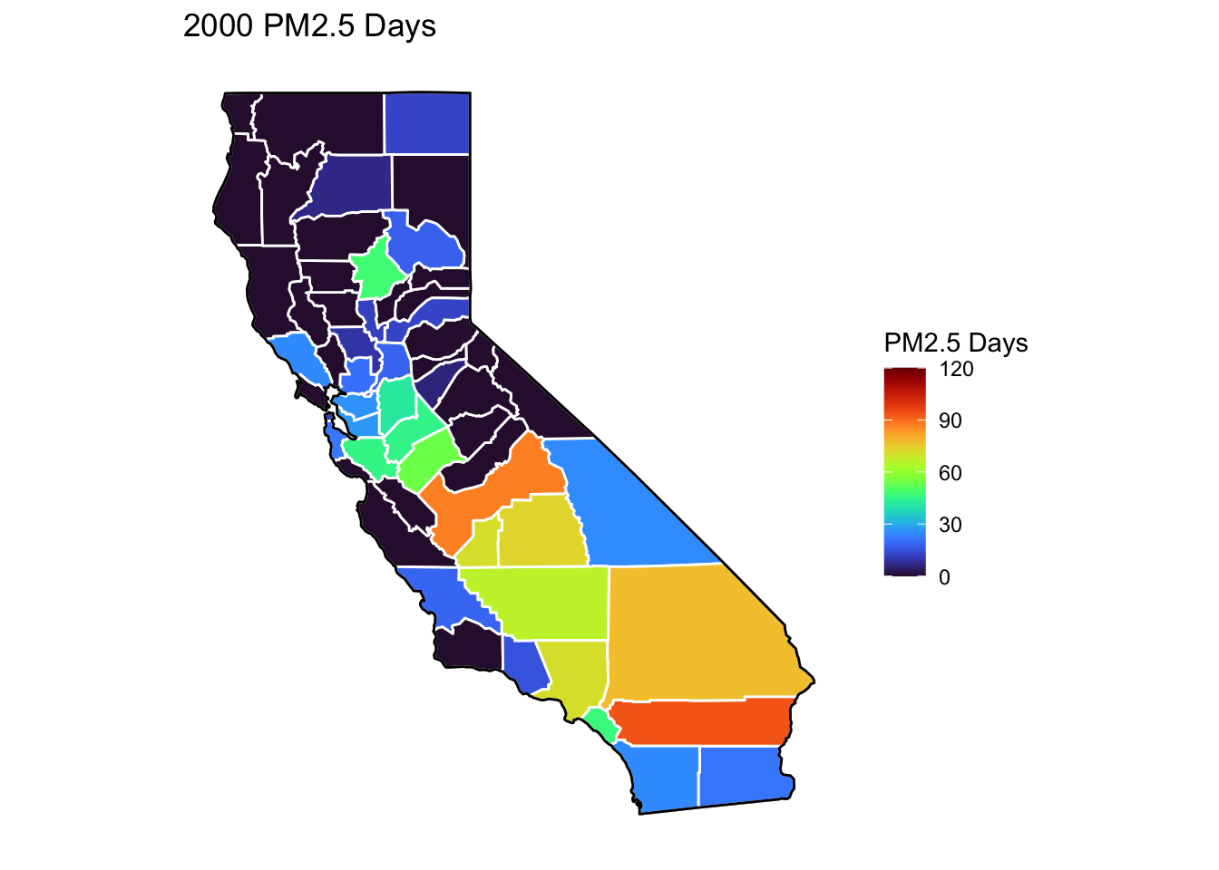
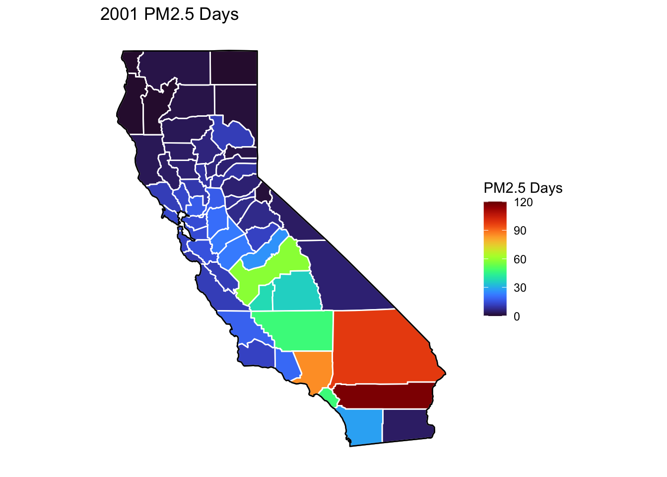
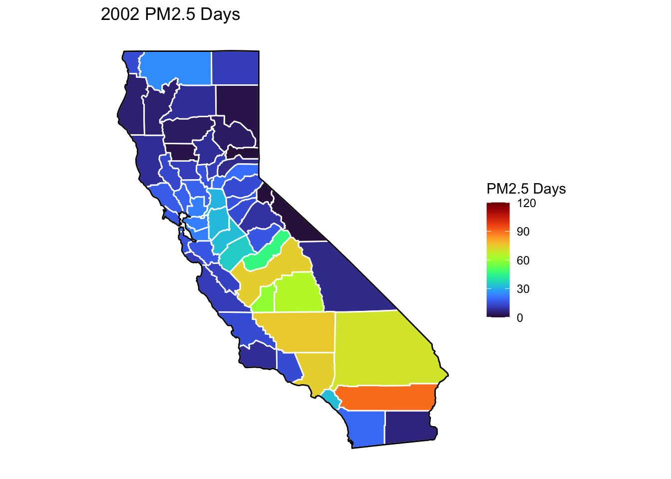
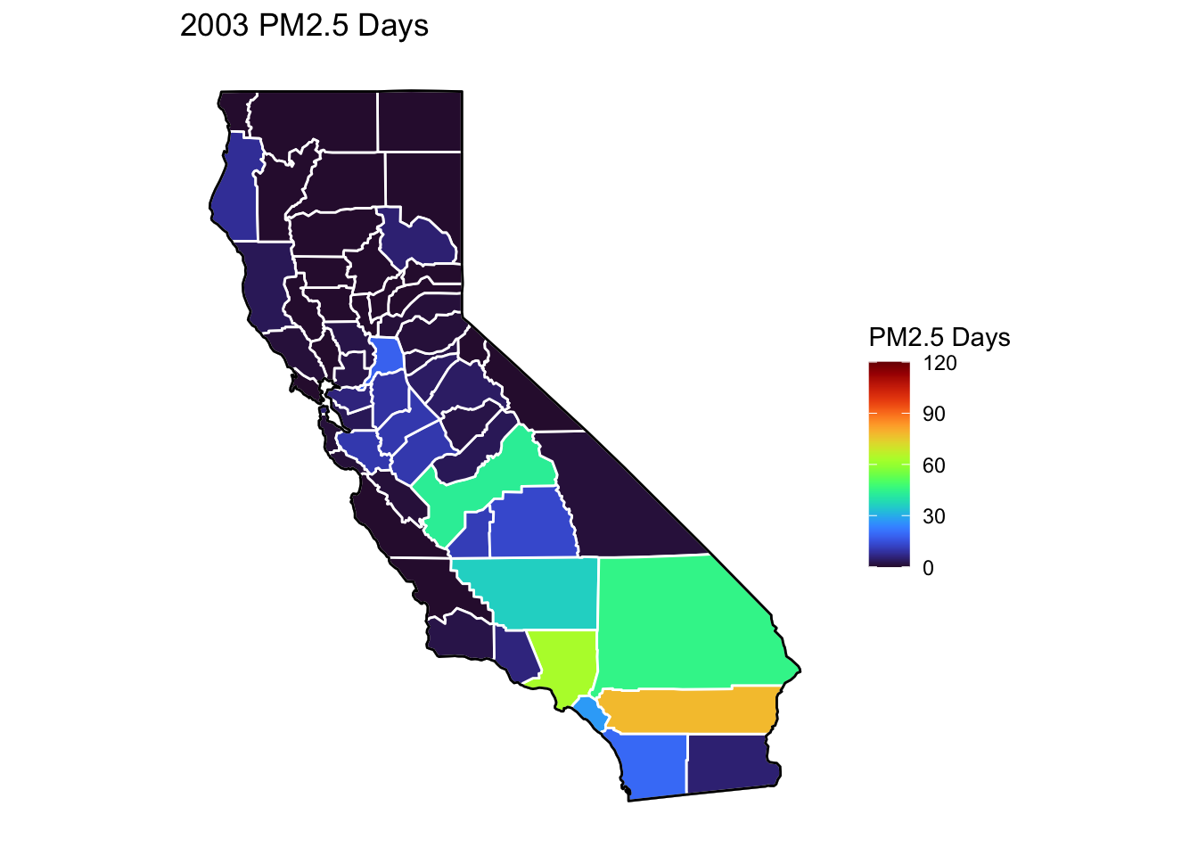
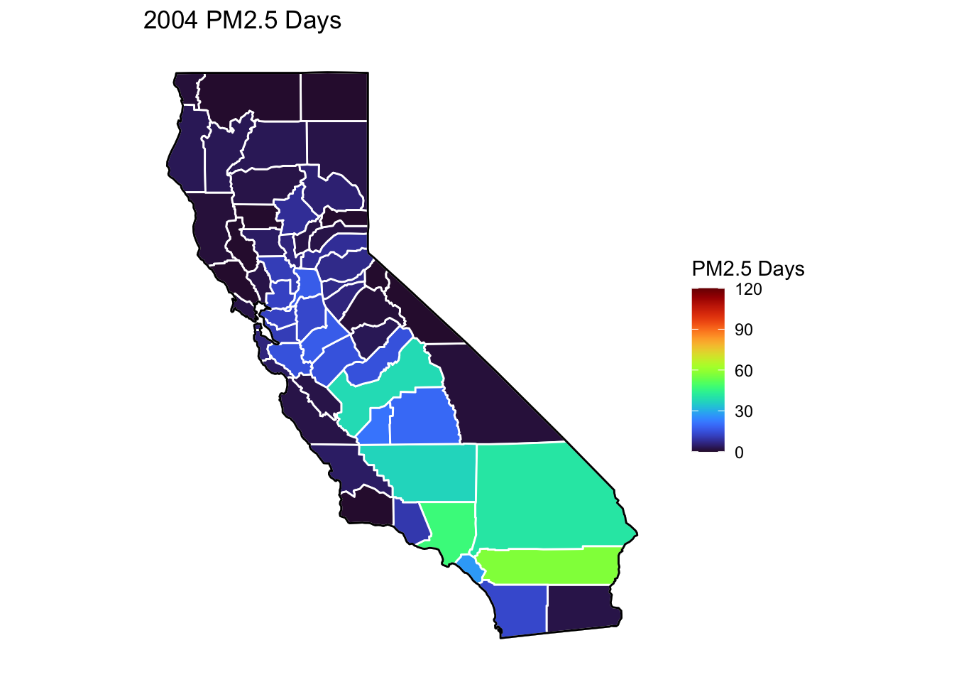
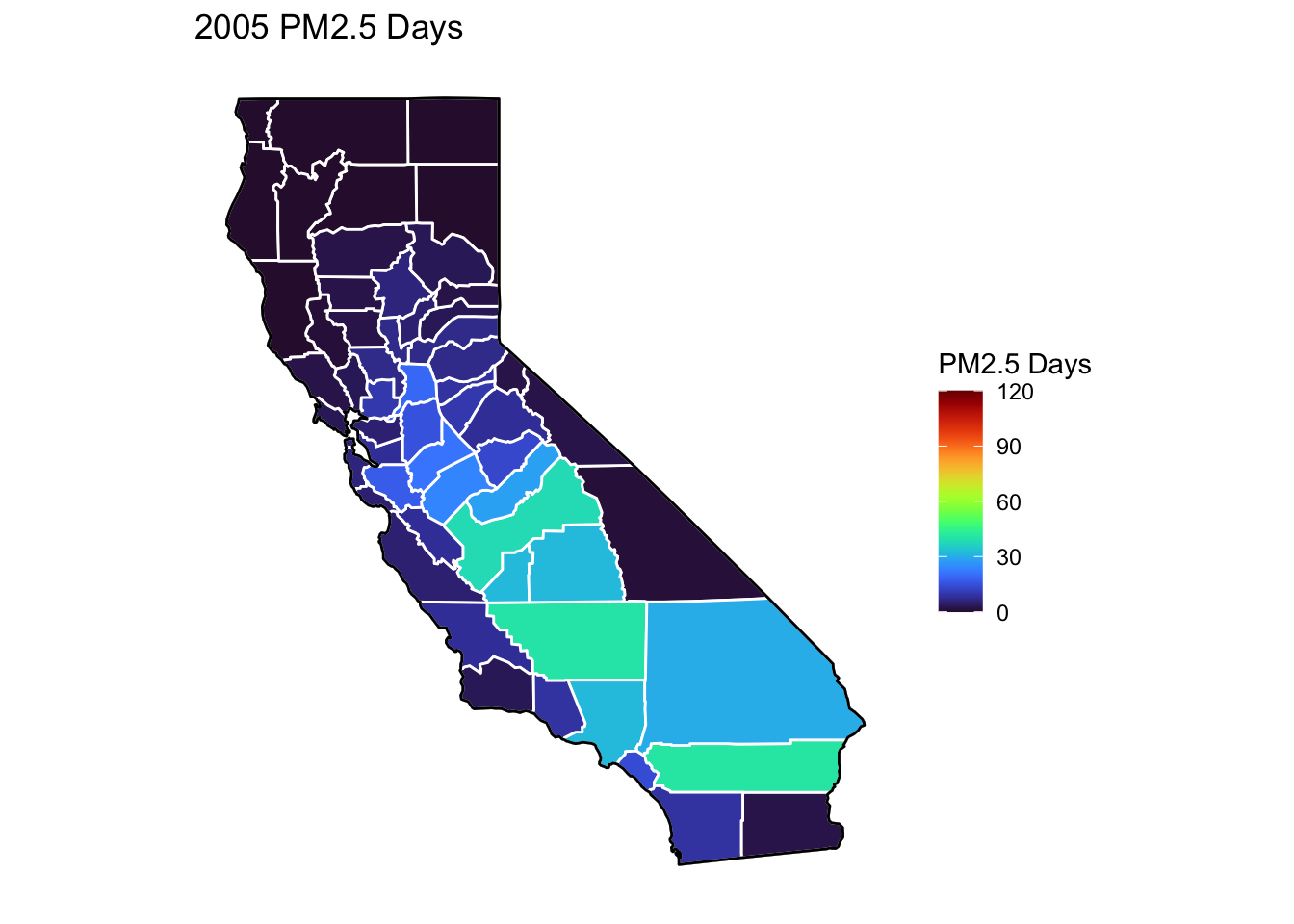
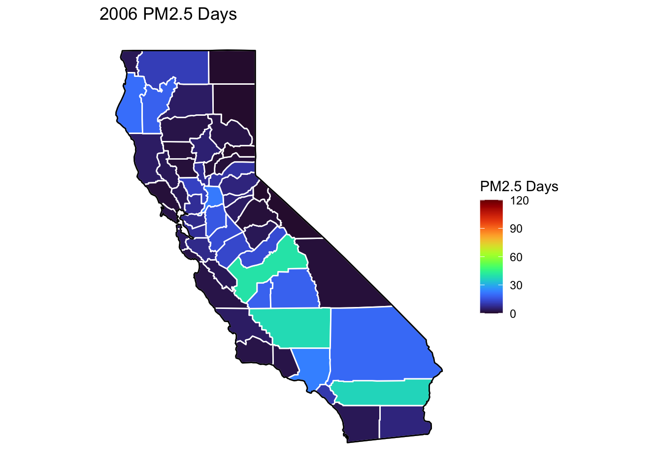
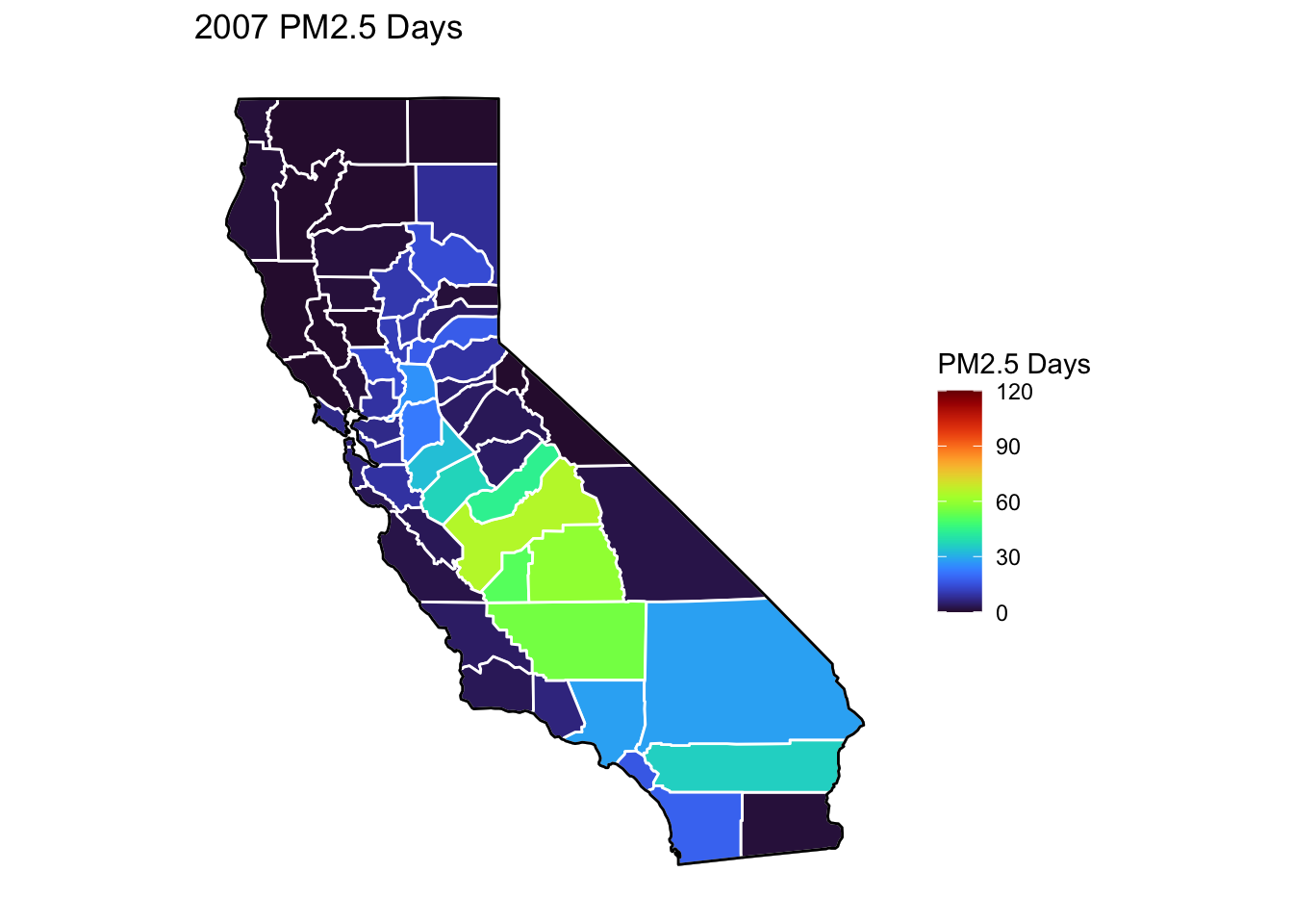
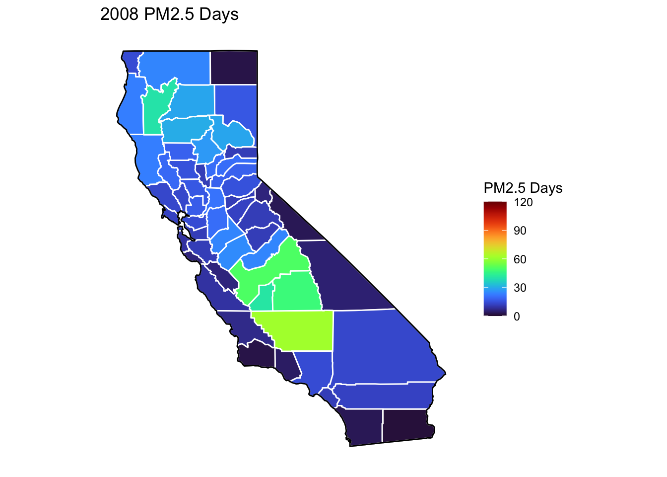
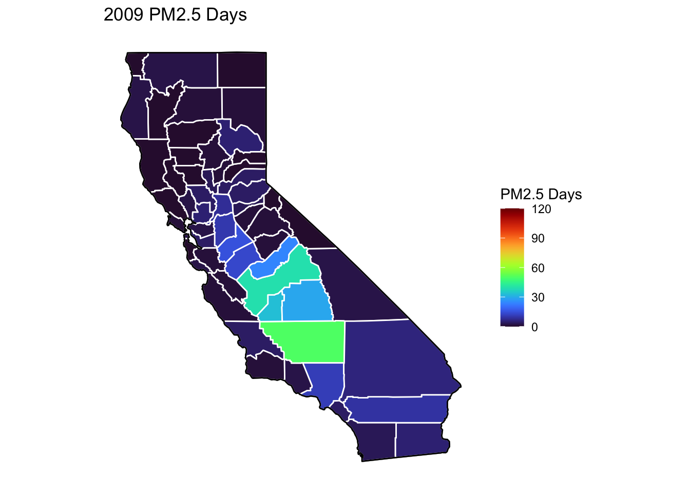
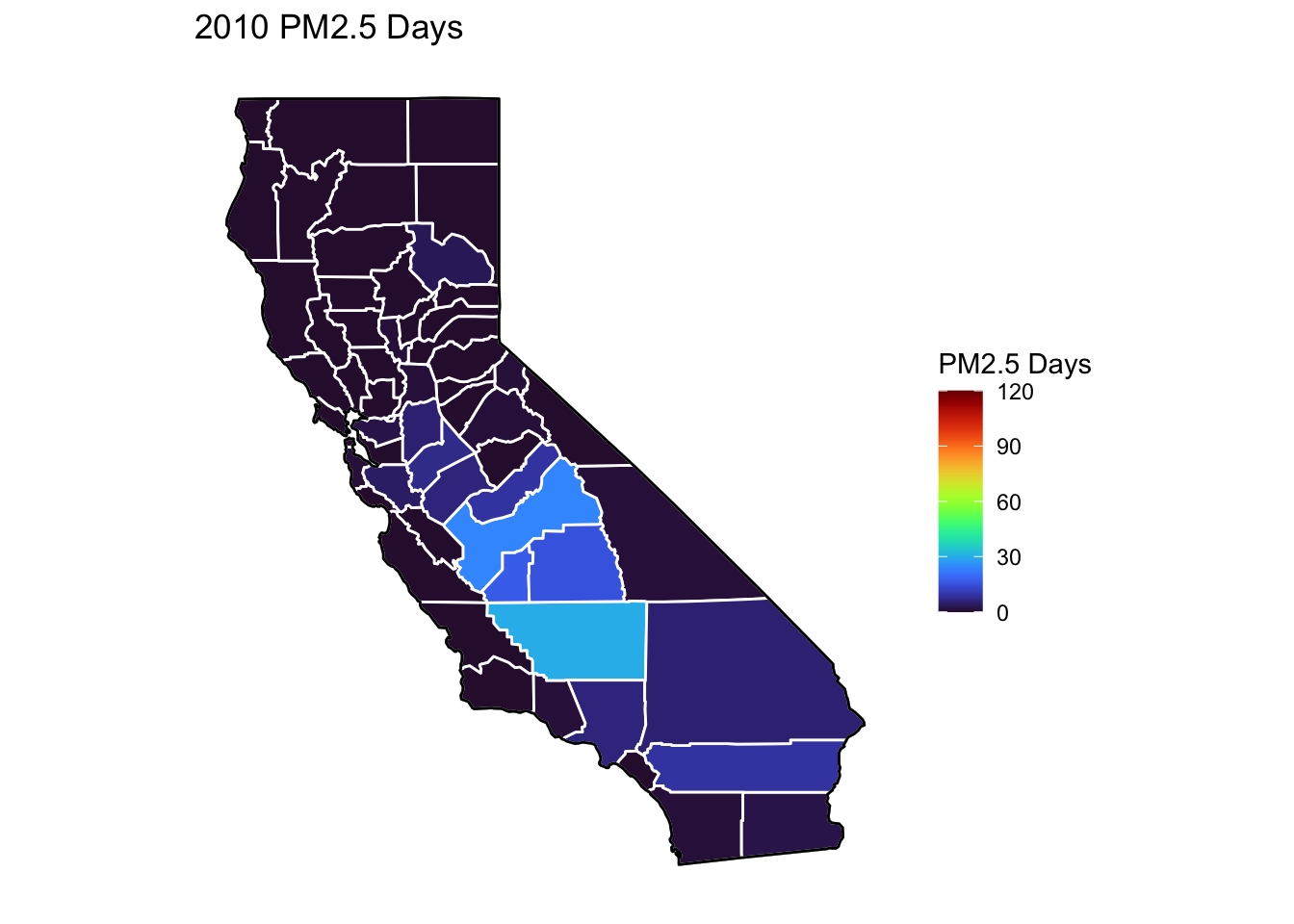
PM2.5 Days Maps
Next, I’ve plotted a map of PM2.5 Days over time by county. A PM2.5 Day is a day in which PM2.5 levels were greater than the national air quality standards.
It’s again clear that PM2.5-related air quality was worse during the early parts of the decade.
It’s also notable that overall, there are far fewer PM2.5 Days. I’ve color gradient accordingly, now maxing out at 120 instead of 150 in order to detect changes more easily.
There seems to be a greater intra-county change over time than with Ozone Days. I believe this is because PM2.5 levels can be caused by more acute events than, such as wildfires. For future research, I’d really like to look at more recent years, where wildfires have been quite bad in California.
Based on these maps, I would say that comparing cause of death to PM2.5 Days is probably going to be more interesting than Ozone for intra-county comparison over time, as the levels vary more by year.
Code
# Creating a function to map pm2.5 days by county and year mapsmapPM2.5function <-function(x) { ca_base +geom_polygon(data =mapdatafunction(x), aes(fill =`PM2.5 Days`), color ="white") +geom_polygon(color ="black", fill =NA) +theme_bw() + ditch_the_axes +scale_fill_viridis(option ="turbo", limits =c(0, 120), breaks=c(0,30,60,90,120)) +ggtitle(paste0(x, " PM2.5 Days"))}for (i inc(2000:2010)) {print(mapPM2.5function(i))}
Air Quality Summary and Descriptive Visualizations
Code
# Setting a custom color palette for air quality measuresairqualitycolors <-c("Ozone Days"="orange", "Mean Ozone Days"="orange", "PM2.5 Days"="plum", "Mean PM2.5 Days"="plum")# Creating labels for boxplot values (fivenum summarizes median, quartiles and min/max)AQfivenum <- airqualityanddeaths %>%filter(`Strata Name`=="Total Population"& Cause =="ALL") %>%select(Year, County, `Ozone Days`, `PM2.5 Days`) %>%pivot_longer(cols =c(`Ozone Days`, `PM2.5 Days`), names_to ="Measure", values_to ="Days") %>%group_by(Measure) %>%summarise(five =list(fivenum(Days))) %>%unnest(cols = five) %>%mutate_if(is.numeric, round) %>%filter(five !=0)
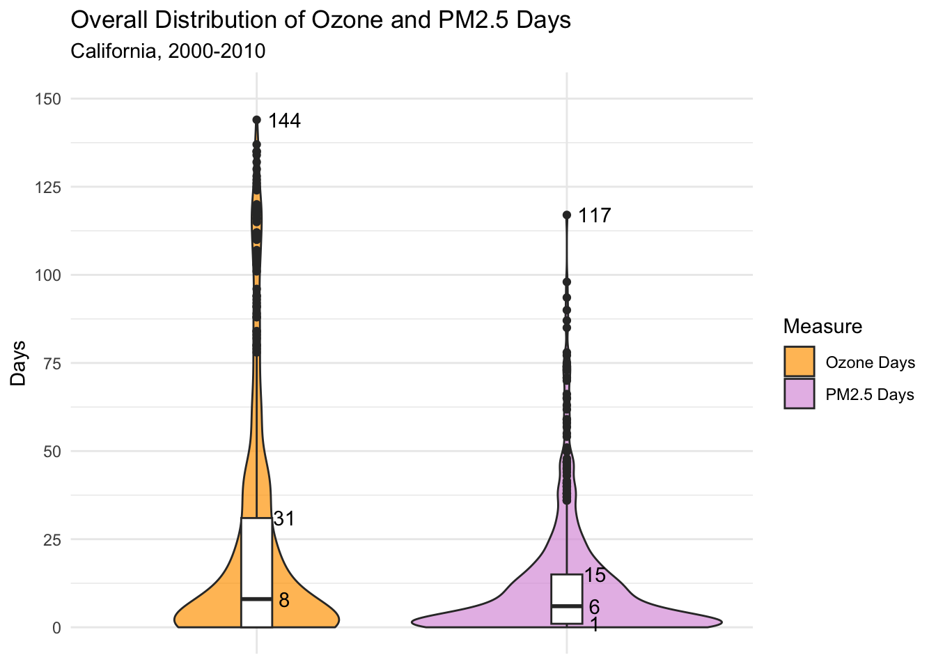
Below, I’ve plotted the distribution of air quality days by type (Ozone and PM2.5 Days). This includes all county-years, so 11 years x 58 counties for a total of 638 observations of each type.
Boxplot values are labeled below. Again, it’s clear that there are a lot more Ozone Days than PM2.5 Days, with a higher max (144 vs 117) and a greater interquartile range.
The violin plot - for PM2.5 Days especially - has a big clump of 0 day county-years, which we saw earlier in the map as dark blue counties.
What’s clear from both violin plots is that there are many high-extreme values, meaning that there are clearly several county-years with much worse air quality than average.
Code
# Creating a violin + box plot combination for comparing distributions of air quality days by measureairqualityanddeaths %>%# Filtering data and selecting columnsfilter(`Strata Name`=="Total Population"& Cause =="ALL") %>%select(Year, County, `Ozone Days`, `PM2.5 Days`) %>%#Pivoting to have air quality measures in a single column for groupingpivot_longer(cols =c(`Ozone Days`, `PM2.5 Days`), names_to ="Measure", values_to ="Days") %>%# Plottingggplot(aes(x = Measure, y = Days, fill = Measure)) +geom_violin(alpha = .7, width =1, na.rm =TRUE) +geom_boxplot(width = .1, fill ="white", na.rm =TRUE) +# Adding text labelsgeom_text(data = AQfivenum, aes(x =factor(Measure), y = five, label = five), nudge_x = .09) +# Setting theme, etc.theme_minimal() +scale_y_continuous(limits =c(0, 150), breaks =c(0,25,50,75,100,125,150)) +theme(axis.title.x =element_blank(), axis.text.x =element_blank()) +scale_fill_manual(values = airqualitycolors) +labs(title ="Overall Distribution of Ozone and PM2.5 Days",subtitle ="California, 2000-2010")
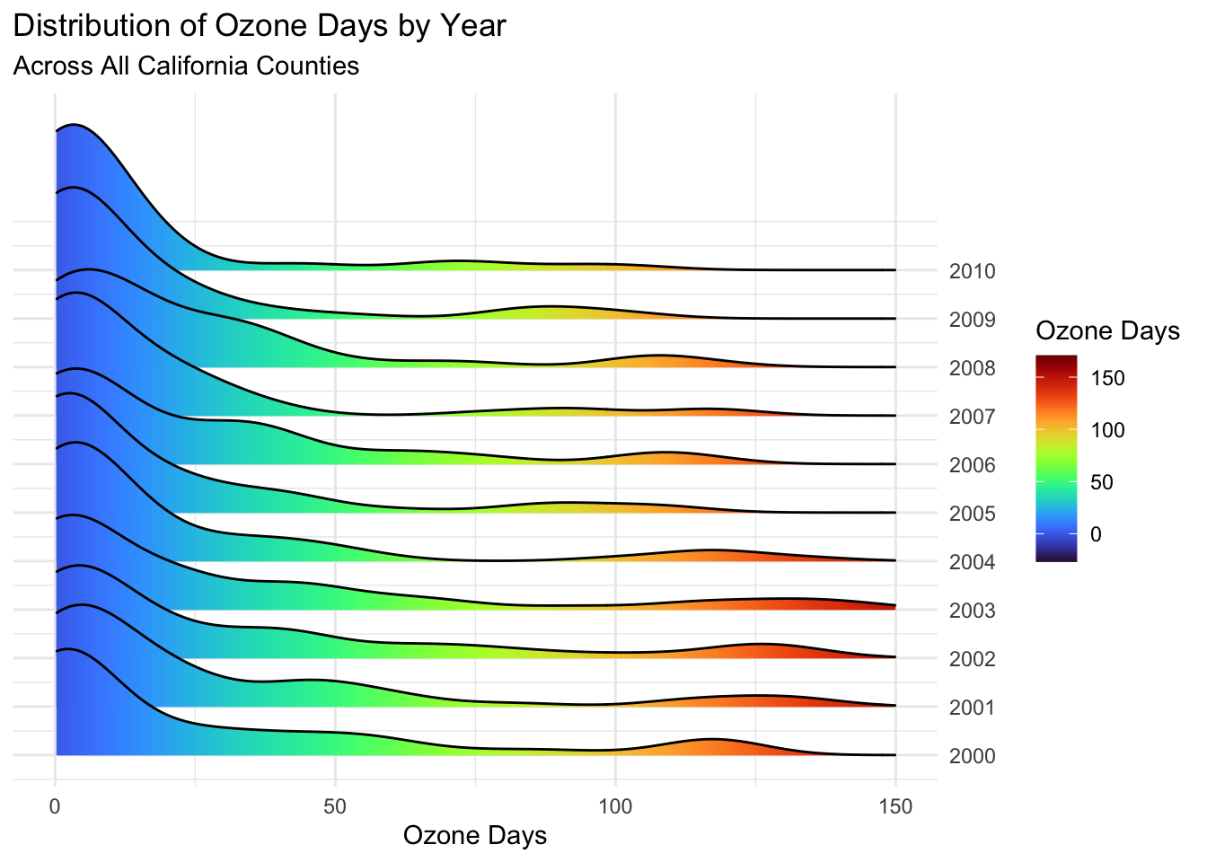
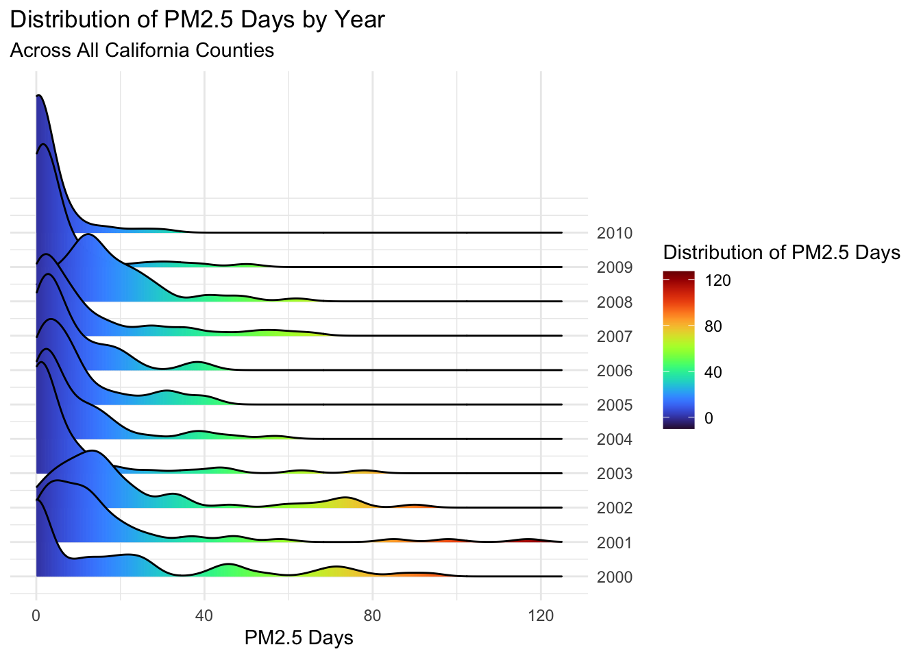
Next, I will plot these distributions by individual years using a ridgeplot.
While both air quality types have noticeable clumps around 0-10 days, these are more pronounced for the PM2.5 Day plot.
Not surprisingly, the Ozone Days plot has more high county-years than PM2.5.
PM2.5 Days are mostly distributed around 0, with the exceptions of 2001, 2002, and 2008 where the peaks are closer to 10 days. This is interesting, as while we expected the higher years of 2001 and 2002, 2008 is a bit of a surprise based on the previous maps. This suggests that 2008 had many counties with slightly higher PM2.5 Days, but few high peaks.
Code
# Plotting distribution of ozone days by year in a ridgeplotairqualityanddeaths %>%# Filtering and selecting datafilter(`Strata Name`=="Total Population"& Cause =="ALL") %>%mutate(Year =year(Year)) %>%select(Year, County, `Ozone Days`, `PM2.5 Days`) %>%# Plottingggplot(aes(x =`Ozone Days`, y =`Year`, group =`Year`, fill = ..x..)) +# Plottin gridges with a gradient scale for air quality levelsgeom_density_ridges_gradient(scale =3) +# Theme, etc.scale_fill_viridis(option ="turbo") +scale_x_continuous(limits =c(0,150)) +scale_y_continuous(position ="right", breaks =c(2000:2010)) +theme_minimal() +theme(axis.title.y =element_blank()) +labs(fill='Ozone Days',title ="Distribution of Ozone Days by Year",subtitle ="Across All California Counties")
Code
# Performing same steps for PM2.5 Daysairqualityanddeaths %>%filter(`Strata Name`=="Total Population"& Cause =="ALL") %>%mutate(Year =year(Year)) %>%select(Year, County, `Ozone Days`, `PM2.5 Days`) %>%ggplot(aes(x =`PM2.5 Days`, y =`Year`, group =`Year`, fill = ..x..)) +geom_density_ridges_gradient(scale =4) +scale_fill_viridis(option ="turbo", ) +scale_x_continuous(limits =c(0,125)) +scale_y_continuous(position ="right", breaks =c(2000:2010)) +theme_minimal() +theme(axis.title.y =element_blank()) +labs(fill='Distribution of PM2.5 Days',title ="Distribution of PM2.5 Days by Year",subtitle ="Across All California Counties")
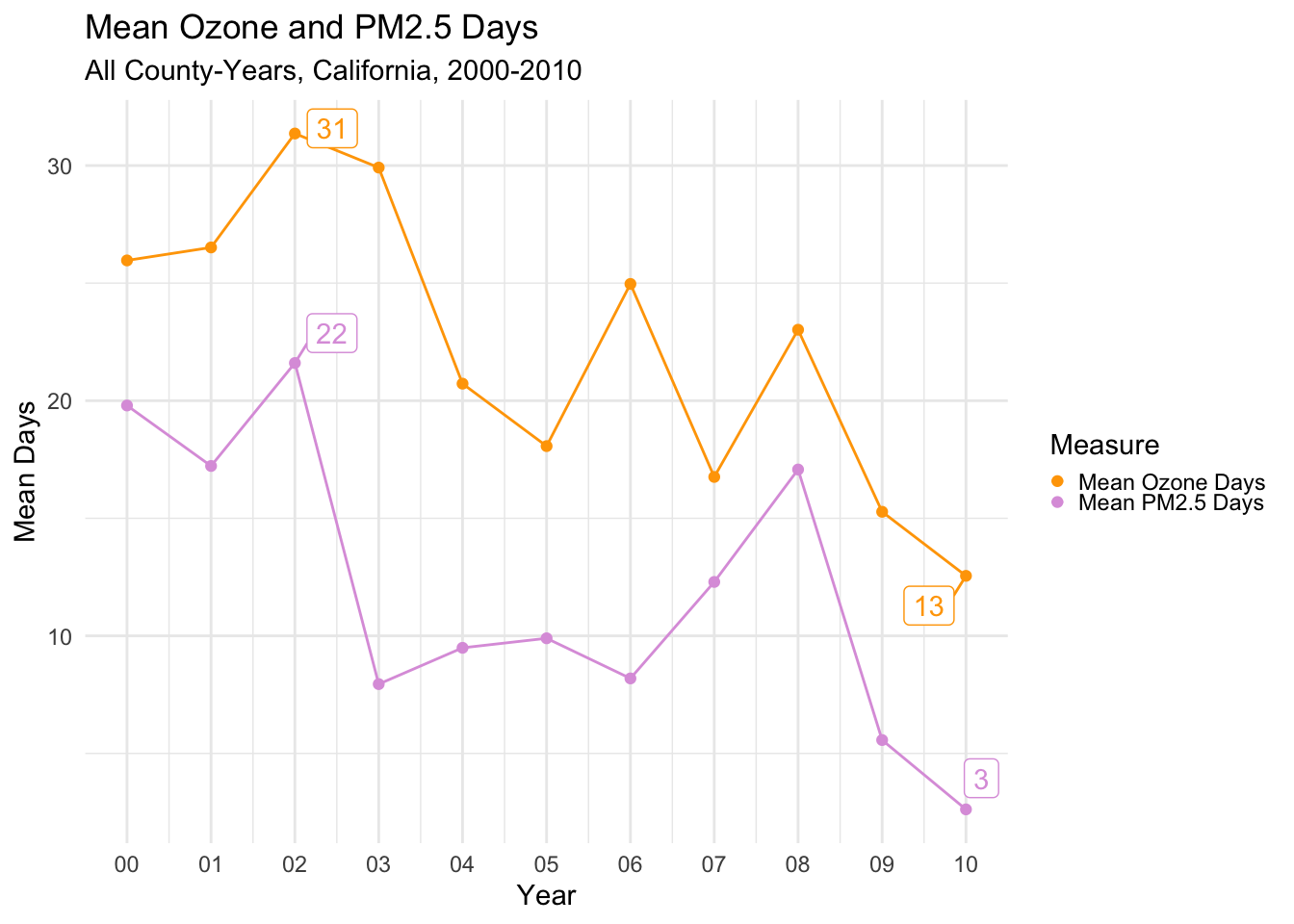
Finally, to cap off describing the air quality data, I’ll create trend lines of mean Ozone and PM2.5 Days over the years. It’s again clear that there was a general downward trend in poor air quality (in other words, air quality improved throughout the decade). You can again see the peak in both measures in 2002.
For the rest of my analysis, I’ve labeled the maximum and minimum values for line plots, both occuring here in 2002 and 2010 respectively.
Code
# Plotting lines for each air quality type showing mean days by yearAirqualitybyyearline <- airqualityanddeaths %>%# Filtering datafilter(`Strata Name`=="Total Population"&`Cause`=="ALL") %>%group_by(Year) %>%# Summarizing means by yearsummarize(`Mean Ozone Days`=mean(`Ozone Days`, na.rm=TRUE),`Mean PM2.5 Days`=mean(`PM2.5 Days`, na.rm=TRUE)) %>%# Pivoting to have air quality in a single column for groupingpivot_longer(cols =c(`Mean Ozone Days`, `Mean PM2.5 Days`), names_to ="Measure", values_to ="Mean Days") %>%# Adding column for labeling max and min valuesgroup_by(Measure) %>%mutate(label =ifelse(`Mean Days`%in%range(`Mean Days`), round(`Mean Days`, digits =0), '')) %>%# Plotting lines and pointsggplot(aes(x = Year, y =`Mean Days`, col = Measure, label = label)) +geom_line() +geom_point() +# Adding labels for min and max of each groupgeom_label_repel(show.legend =FALSE) +# Theme, etctheme_minimal() +scale_x_date(date_labels ="%y", date_breaks ="1 year", name ="Year") +theme(legend.key.size =unit(0.2, "cm")) +scale_color_manual(values = airqualitycolors)Airqualitybyyearline +labs(title ="Mean Ozone and PM2.5 Days",subtitle ="All County-Years, California, 2000-2010")
Death Data Summary and Descriptive Visualizations
Next, I will create similar descriptive visualizations for the death data.
Code
# Setting color palette for causes of deathdeathcolors =c("ALL"="navy","CLD"="darkgreen","HTD"="maroon")# Creating labels for box plotDeathsfivenum <- airqualityanddeaths %>%filter(`Strata Name`=="Total Population") %>%group_by(Cause) %>%summarise(five =list(fivenum(`Deaths per 100,000`))) %>%unnest(cols = five) %>%mutate_if(is.numeric, round) %>%filter(five !=0)
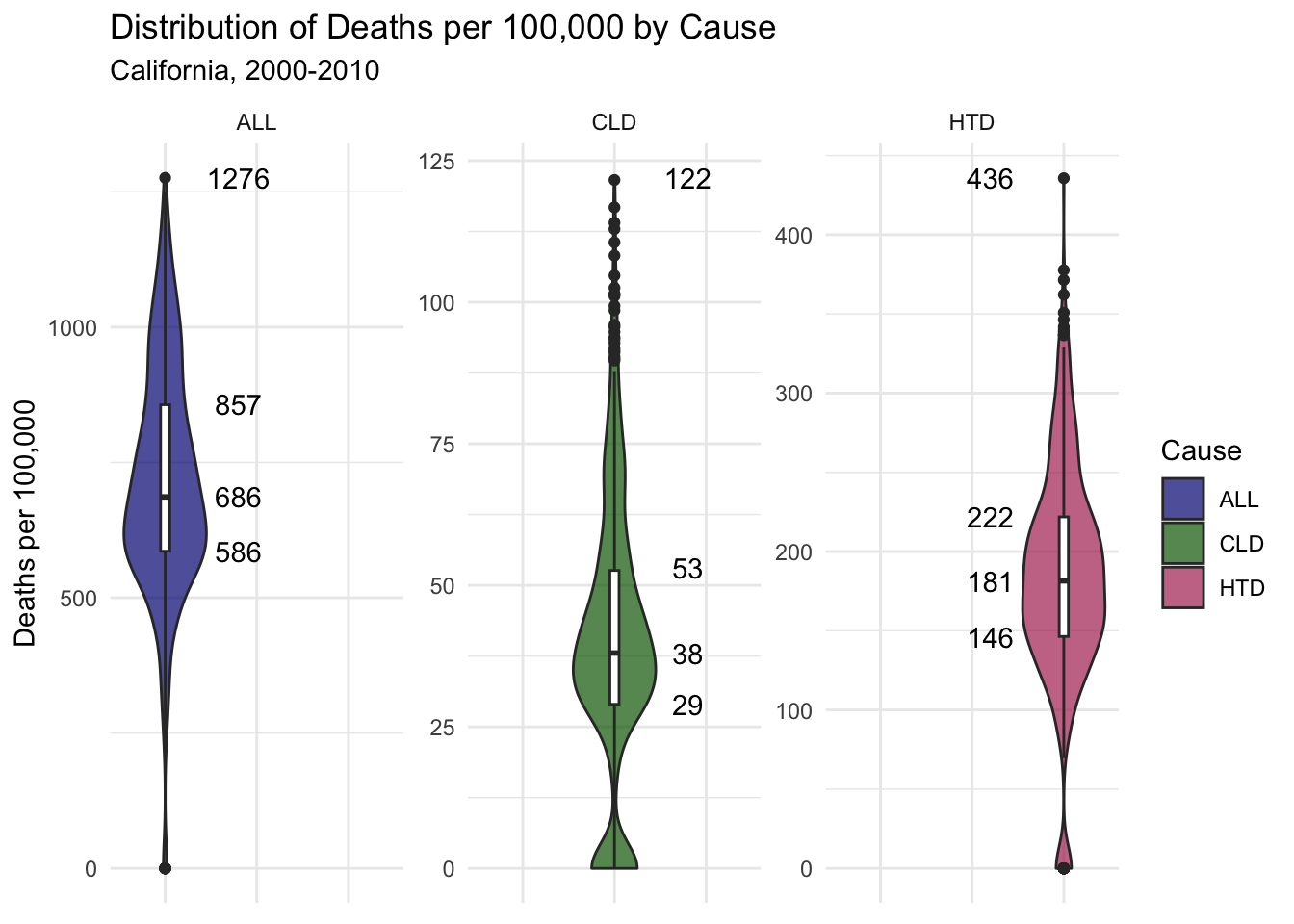
Below I’ve plotted the distribution of deaths per 100,000 by cause using data from all county-years. Note that the Y axis varies in each violin plot to allow for the figures to be more interpret-able.
Interquartile, median and max values are also labeled. The median deaths per 100,000 of all types for all county-years is 686, with a max of 1276.
You’ll notice that deaths by heart disease are much more prevalent than deaths by chronic lower respiratory diseases, with median deaths per 100,000 being 181 and 38 respectively.
This fact about CLD deaths may mean that the impact air quality has on CLD deaths per 100,000 will be harder to visualize, as the values are quite low.
Code
# creaating a violin plot for distribution of deaths per 100,000airqualityanddeaths %>%# filtering and grouping datafilter(`Strata Name`=="Total Population") %>%group_by(Cause) %>%# setting plot astheticsggplot(aes(x = Cause, y =`Deaths per 100,000`, fill = Cause)) +# creating violin plot, and box plot on topgeom_violin(alpha = .7, na.rm =TRUE) +geom_boxplot(width=.1, fill ="white", na.rm =TRUE) +# adding text labels of box plot values created previouslygeom_text(data =filter(Deathsfivenum, Cause !="HTD"), aes(x =factor(Cause), y = five, label = five), nudge_x = .8) +geom_text(data =filter(Deathsfivenum, Cause =="HTD"), aes(x =factor(Cause), y = five, label = five), nudge_x =-.8) +theme_minimal() +# grouping facets by cause of deathfacet_wrap(Cause ~., scales ="free_y") +# themes, titles, etc.theme(axis.title.x =element_blank(), axis.text.x =element_blank()) +scale_fill_manual(values = deathcolors) +labs(title ="Distribution of Deaths per 100,000 by Cause",subtitle ="California, 2000-2010")
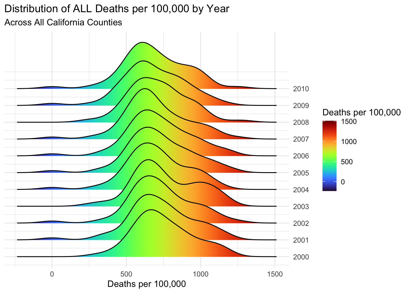
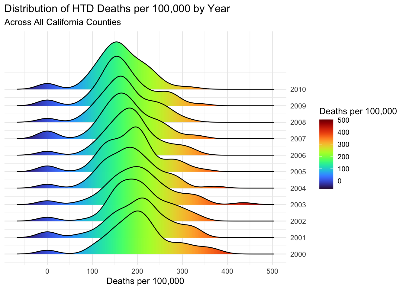
I’ve also plotted the yearly ridge line plots for deaths per 100,000 of all, chronic lower respiratory disease and heart disease types.
The distribution of all types is quite consistent across years, with a slight decrease in the peak value as the decade progresses.
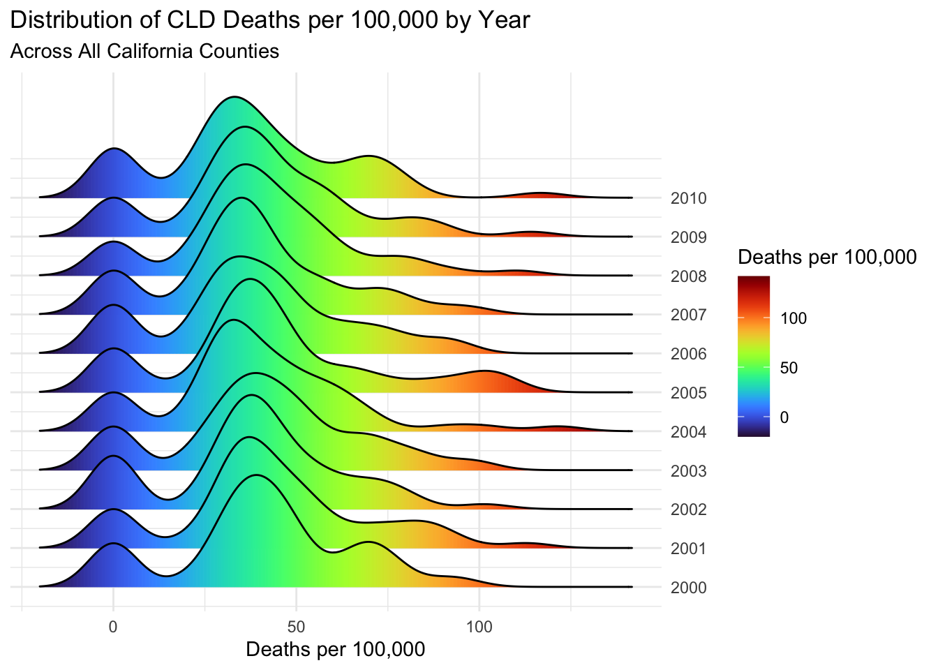
The CLD plot has some more noticable clumps around 0 deaths per 100,000 for each year. This will mostly be caused by counties with very small populations. Since CLD is in general a much rarer cause of death, there may be county-years with almost or 0 deaths per 100,000 of that type.
This may also raise the question of whether CLD deaths are being properly reported in small counties. This question might need more attention if I were to perform a more serious statistical analysis of the data.
Code
airqualityanddeaths %>%# filtering and mutating datafilter(`Strata Name`=="Total Population"& Cause =="ALL") %>%mutate(Year =year(Year)) %>%select(Year, County, `Deaths per 100,000`) %>%# setting asthetics for plot, fill of ..x.. allows for gradientggplot(aes(x =`Deaths per 100,000`, y =`Year`, group =`Year`, fill = ..x..)) +# adding ridgeplot with gradientsgeom_density_ridges_gradient(scale =3) +# themes etc.scale_fill_viridis(option ="turbo") +scale_y_continuous(position ="right", breaks =c(2000:2010)) +theme_minimal() +theme(axis.title.y =element_blank()) +labs(fill='Deaths per 100,000',title ="Distribution of ALL Deaths per 100,000 by Year",subtitle ="Across All California Counties")
Code
# perfoming same as above for CLD deathsairqualityanddeaths %>%filter(`Strata Name`=="Total Population"& Cause =="CLD") %>%mutate(Year =year(Year)) %>%select(Year, County, `Deaths per 100,000`) %>%ggplot(aes(x =`Deaths per 100,000`, y =`Year`, group =`Year`, fill = ..x..)) +geom_density_ridges_gradient(scale =3) +scale_fill_viridis(option ="turbo") +scale_y_continuous(position ="right", breaks =c(2000:2010)) +theme_minimal() +theme(axis.title.y =element_blank()) +labs(fill='Deaths per 100,000',title ="Distribution of CLD Deaths per 100,000 by Year",subtitle ="Across All California Counties")
Code
# perfoming same as above for HTD deathsairqualityanddeaths %>%filter(`Strata Name`=="Total Population"& Cause =="HTD") %>%mutate(Year =year(Year)) %>%select(Year, County, `Deaths per 100,000`) %>%ggplot(aes(x =`Deaths per 100,000`, y =`Year`, group =`Year`, fill = ..x..)) +geom_density_ridges_gradient(scale =3) +scale_fill_viridis(option ="turbo") +scale_y_continuous(position ="right", breaks =c(2000:2010)) +theme_minimal() +theme(axis.title.y =element_blank()) +labs(fill='Deaths per 100,000',title ="Distribution of HTD Deaths per 100,000 by Year",subtitle ="Across All California Counties")
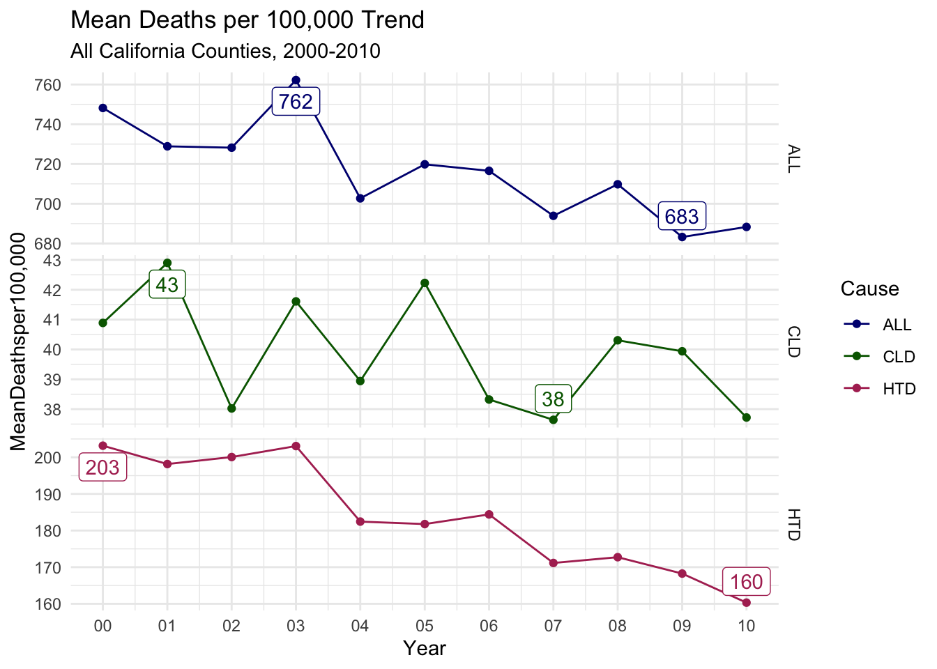
Finally, I’ll look at the trend lines for mean deaths per 100,000 for all county-years as a time series. Again, note the varied Y axes.
There is a general downward trend for all 3 cause types.
ALL and HTD deaths both peak early in the decade and have a clear decline for the rest of the decade.
While it is decreasing, CLD has the least smooth decent in deaths per 100,000. This again could largely be caused by the small values for deaths per 100,000, as the Y axis only ranges by 5 deaths per 100,000. So in general, the CLD trend is fairly inconclusive.
Code
airqualityanddeaths %>%# filtering, grouping and creating summary means for yearly trendsfilter(`Strata Name`=="Total Population") %>%group_by(Year, Cause) %>%summarize(`MeanDeathsper100,000`=mean(`Deaths per 100,000`, na.rm =TRUE)) %>%# adding labels column for max and min valuesgroup_by(Cause) %>%mutate(label =ifelse(`MeanDeathsper100,000`%in%range(`MeanDeathsper100,000`), round(`MeanDeathsper100,000`, digits =0), '')) %>%# setting astheticsggplot(aes(x = Year, y =`MeanDeathsper100,000`, label = label, col = Cause)) +geom_line() +geom_point() +# Adding labels for min and max of each groupgeom_label_repel(show.legend =FALSE) +facet_grid(Cause ~ ., scales ="free_y") +scale_x_date(date_labels ="%y", date_breaks ="1 year", name ="Year") +theme_minimal() +scale_color_manual(values = deathcolors) +labs(title ="Mean Deaths per 100,000 Trend",subtitle ="All California Counties, 2000-2010")
Before moving onto comparisons, I will create a function that plots the trends previously seen in their own plots for later use.
Code
# perfoming similar steps to previous code, but adding to function deathstrend, where x is the cause of deathdeathstrend <-function(x) {`overalldeathsper100,000`<- airqualityanddeaths %>%filter(`Strata Name`=="Total Population"& Cause == x) %>%group_by(Year, Cause) %>%summarize(`MeanDeathsper100,000`=mean(`Deaths per 100,000`, na.rm =TRUE)) %>%group_by(Cause) %>%mutate(label =ifelse(`MeanDeathsper100,000`%in%range(`MeanDeathsper100,000`), round(`MeanDeathsper100,000`, digits =0), '')) %>%ggplot(aes(x = Year, y =`MeanDeathsper100,000`, col = Cause, label = label)) +geom_line() +geom_point() +geom_label_repel(show.legend =FALSE) +scale_x_date(date_labels ="%y", date_breaks ="1 year", name ="Year") +theme_minimal() +scale_color_manual(values = deathcolors) +labs(title =paste0("Mean ",x," Deaths vs. Air Quality Trends"),subtitle ="All County-Years, California, 2000-2010") +ylab("Mean Deaths per 100,000")}ALLdeathstrend <-deathstrend("ALL")CLDdeathstrend <-deathstrend("CLD")HTDdeathstrend <-deathstrend("HTD")
Analysis of Air Quality’s Affect on Deaths
Time Series Trends of Mean Air Quality and Mean Deaths per 100,000
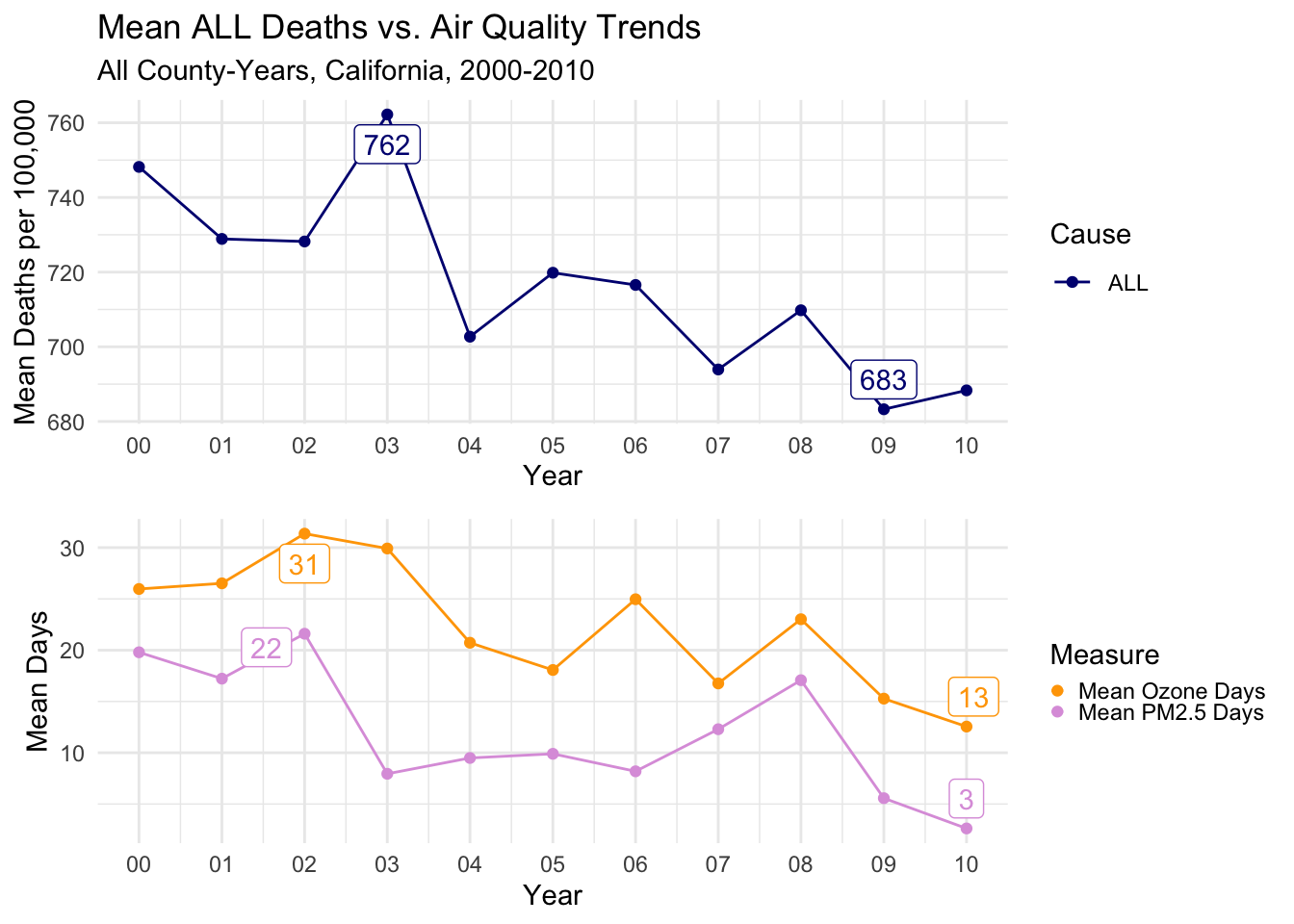
I will begin my analysis by comparing overall trends in air quality to trends in deaths.
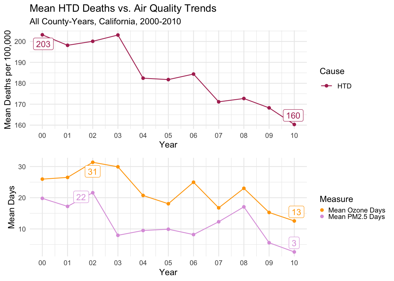
Below you’ll see a line graph combining two plots I have shown previously, a time series of Mean Deaths per 100,000 for all causes of death, verses a time series of mean Days of both air quality types.
The trends are reasonably similar to each other.
There is a notable peak in 2002 for both types of air quality. The peak for deaths occurs one year later in 2003.
Then, there is a drop all three measures in 2004.
The next notable year is 2008, where all three measures again have a similar uptick, followed by a noticable drop to finish the decade.
It’s maybe even a bit surprising how close the trends are to each other, as there should be a LOT of other factors causing deaths of any type.
Of course, we can’t make any causal, or even meaningful correlative conclusions from this, but it warrants further exploration.
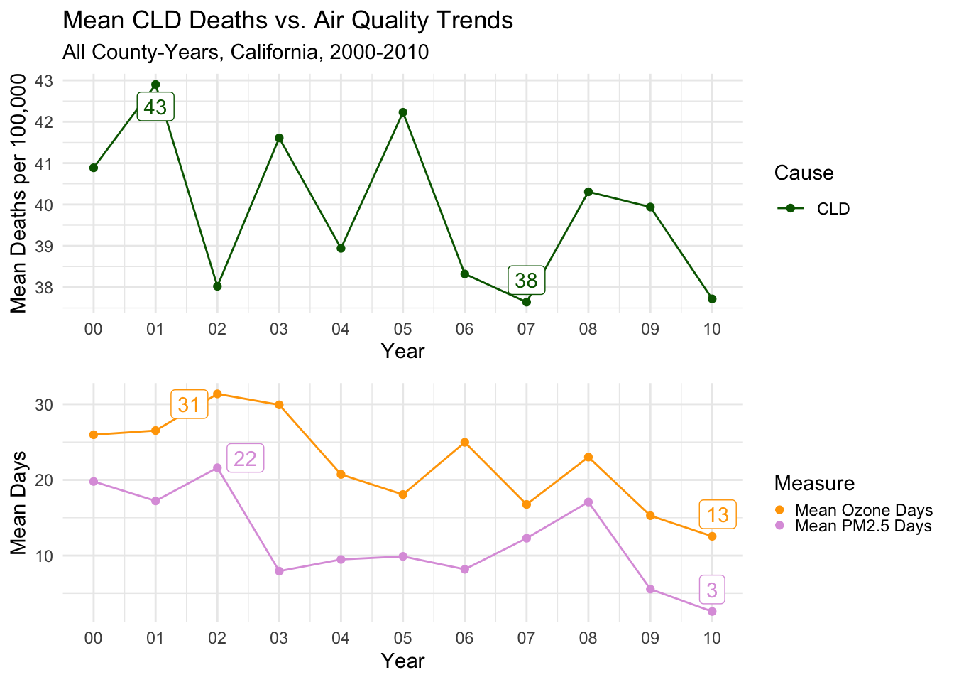
Finally, I’ve produced the plot for Heart Disease related deaths. The decline is quite consistent and pronounced from the beginning of the decade through to the end.
Despite the technical peak being in 2000, there is a clear second peak in 2002 when air quality of both types was at its worse.
Then the sharp decline in the last few years is apparent for all three measures.
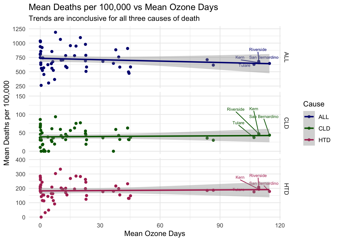
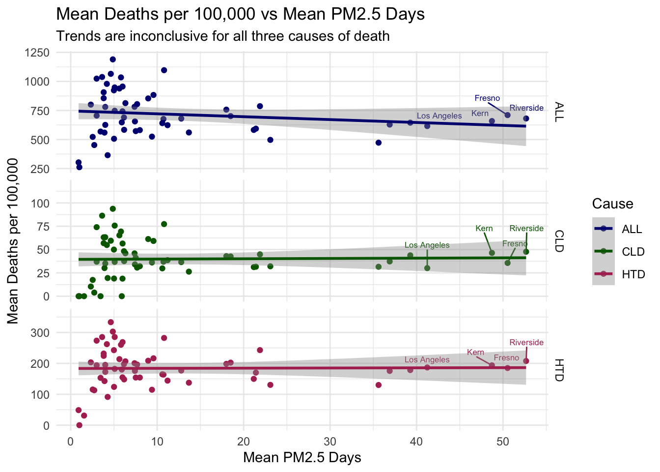
To test whether air quality and deaths per 100,000 are related in a maybe more reliable way than time-series trends alone, I’ve plotted two scatter plots below where air quality (on the X axis) is directly compared to Deaths per 100,000 (on the Y axis) of each type. I’ve also added a linear trend line to each plot.
Each point in this plot represents a county, where the air quality and deaths per 100,000 are calculated as the mean for that county over the 11 years.
The results here are quite inconclusive, with the trend lines being practically flat for all air quality-cause of death combinations.
In fact, there is even a slight decline in deaths per 100,000 as air quality gets worse in the ALL Causes plots.
While not great for my hypothesis, clearly there is more to this story that needs to be addressed.
Code
airqualityanddeaths %>%#filtering, grouping, and summarizing means for each countyfilter(`Strata Name`=="Total Population") %>%group_by(County, Cause) %>%summarize(`Mean Deaths per 100,000`=mean(`Deaths per 100,000`),`Mean Ozone Days`=mean(`Ozone Days`)) %>%# creating labels column for top air quality day countiesgroup_by(County) %>%mutate(label =ifelse(`Mean Ozone Days`>90, County, '')) %>%# setting aestheticsggplot(aes(x =`Mean Ozone Days`, y =`Mean Deaths per 100,000`, col = Cause, label = label)) +# creating scatterplotgeom_point(na.rm =TRUE) +# adding labelsgeom_text_repel(nudge_y =60, size =2.2, show.legend =FALSE) +# adding linear trend linegeom_smooth(method = lm, na.rm =TRUE) +# themes, etc.theme_minimal() +scale_color_manual(values = deathcolors) +facet_grid(Cause ~ ., scales ="free_y") +labs(title ="Mean Deaths per 100,000 vs Mean Ozone Days",subtitle ="Trends are inconclusive for all three causes of death")
Code
# same code as above, but for PM2.5 days instead of Ozoneairqualityanddeaths %>%filter(`Strata Name`=="Total Population") %>%group_by(County, Cause) %>%summarize(`Mean Deaths per 100,000`=mean(`Deaths per 100,000`),`Mean PM2.5 Days`=mean(`PM2.5 Days`)) %>%group_by(County) %>%mutate(label =ifelse(`Mean PM2.5 Days`>40, County, '')) %>%ggplot(aes(x =`Mean PM2.5 Days`, y =`Mean Deaths per 100,000`, col = Cause, label = label)) +geom_point(na.rm =TRUE) +geom_text_repel(nudge_y =25, size =2.2, show.legend =FALSE) +geom_smooth(method = lm, na.rm =TRUE) +theme_minimal() +scale_color_manual(values = deathcolors) +facet_grid(Cause ~ ., scales ="free_y") +labs(title ="Mean Deaths per 100,000 vs Mean PM2.5 Days",subtitle ="Trends are inconclusive for all three causes of death")
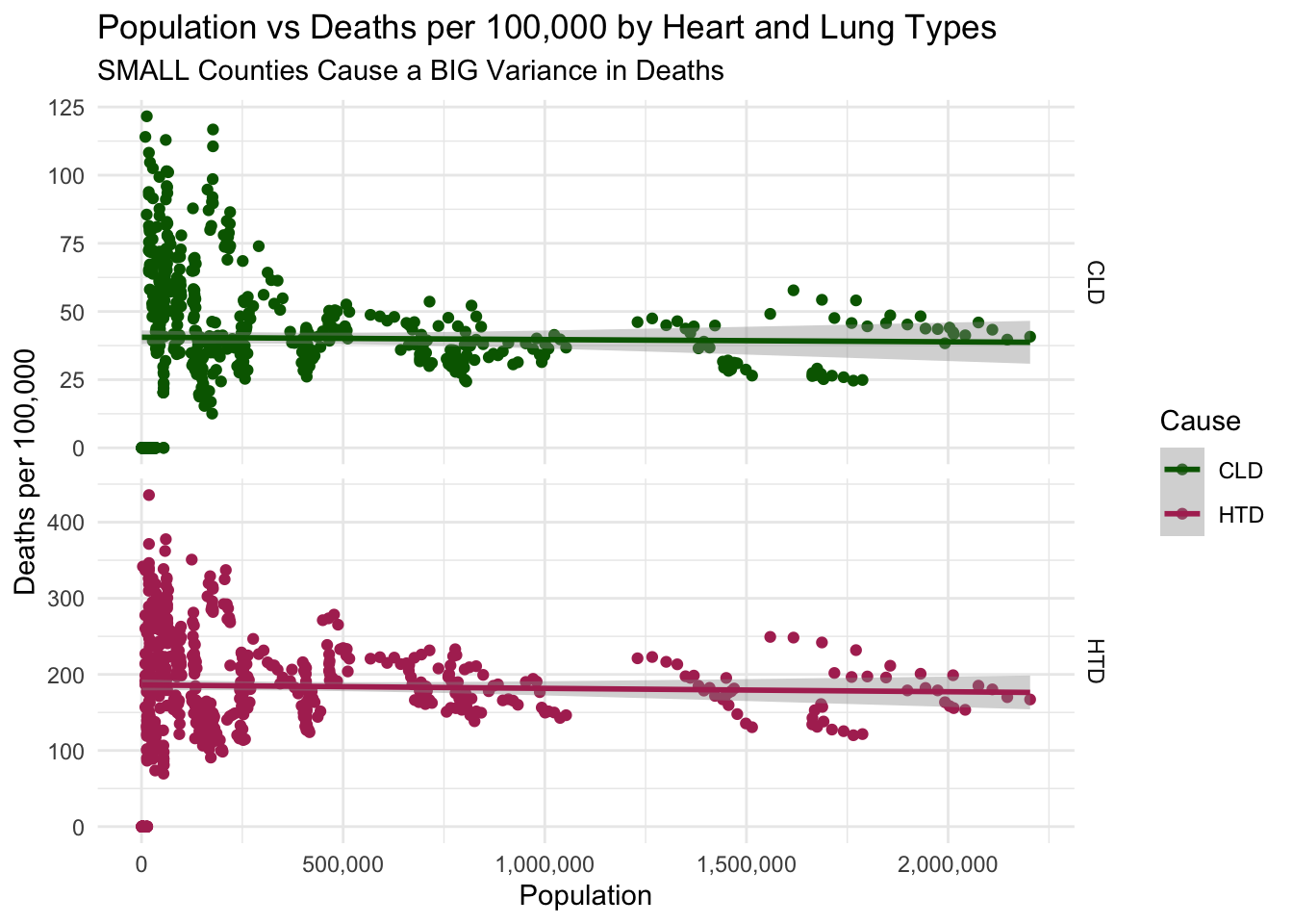
The Issue with Small Counties
I believe there is an issue with sparsely populated counties that is skewing the previous graphs (and all of the death trends we’ve seen so far).
As many small counties are rural, they will not suffer many of the same causes of poor air quality that more urban counties face. We saw this in the first maps, where the rural counties were relatively “blue-er” than their large counterparts.
At the same time, small, rural counties will tend to have highly varied or even higher deaths per 100,000. This is confirmed by the plots below, where there is clearly a very large overall variance in deaths per 100,000 for small counties.
In fact the linear trend line for all causes of deaths has a downward slope, suggesting that larger counties have lower death rates.
This could be do to a variety of factors, like less access to healthcare or lower income levels.
Another issue is that as the population gets smaller for a county, the deaths per 100,000 becomes less reliable due to a smaller sample size. This is very evident from the plots below.
Code
airqualityanddeaths %>%# filtering data for pop < 250k for better visibility of small countiesfilter(`Strata Name`=="Total Population"& Cause =="ALL") %>%filter(Population <2500000) %>%ggplot(aes(x =`Population`, y =`Deaths per 100,000`, col = Cause)) +# adding scatter plotgeom_point(na.rm =TRUE) +# adding linear trend linegeom_smooth(method = lm, na.rm =TRUE) +theme_minimal() +scale_x_continuous(labels =label_comma()) +scale_color_manual(values = deathcolors) +labs(title ="Population vs Deaths per 100,000",subtitle ="SMALL Counties Cause a BIG Variance in Deaths")
Code
# same code as above but for other causes of deathairqualityanddeaths %>%filter(`Strata Name`=="Total Population"& Cause !="ALL") %>%filter(Population <2500000) %>%ggplot(aes(x =`Population`, y =`Deaths per 100,000`, col = Cause)) +geom_point(na.rm =TRUE) +geom_smooth(method = lm, na.rm =TRUE) +theme_minimal() +facet_grid(Cause ~ ., scales ="free_y") +scale_x_continuous(labels =label_comma()) +scale_color_manual(values = deathcolors) +labs(title ="Population vs Deaths per 100,000 by Heart and Lung Types",subtitle ="SMALL Counties Cause a BIG Variance in Deaths")
Intra-county Exploration
In addition to the issue with small counties identified above, comparing deaths per 100,000 across all counties is probably not a good approach without a statistical process for controlling for other determinants of death.
In order to draw more meaningful conclusions about the correlation between air quality and death, I will next look at the time-series trends within some of the worst and best counties by mean air quality.
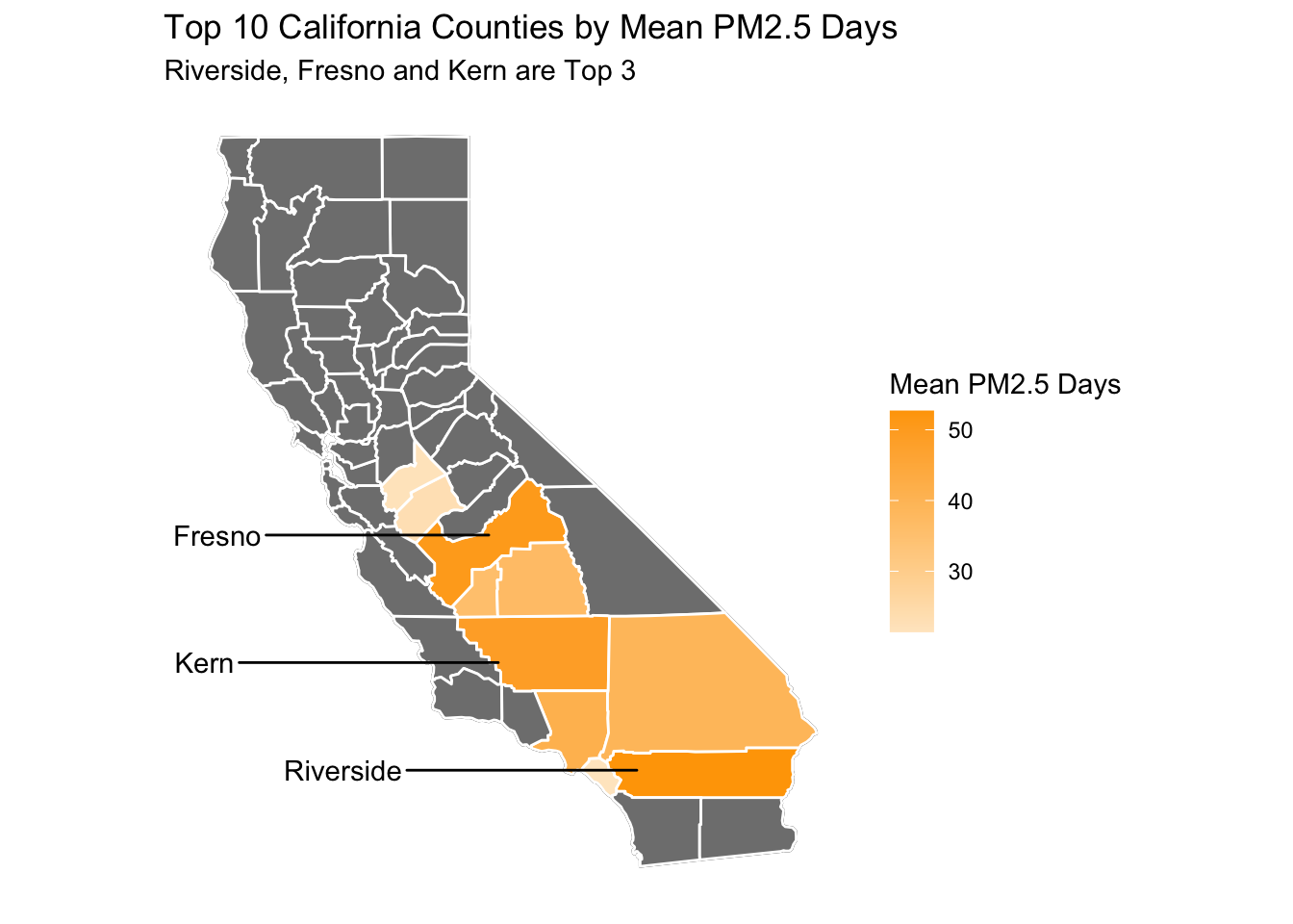
Top 3 Worst Counties for PM2.5 Days
First, I’ve identified the top 10 worst counties by PM2.5 days in the map below.
I’ve also labeled the 3 worst counties, which I will be exploring further.
These are Fresno, Riverside and Kern.
The mean population for all 3 counties is quite large as expected, all being over 750,000.
Code
# creating data frame for use in plots, summarizing mean air qualityozoneandpmdaysbycounty <- airqualityanddeaths %>%filter(`Strata Name`=="Total Population"&`Cause`=="ALL") %>%group_by(County) %>%summarize(`Mean Ozone Days`=mean(`Ozone Days`, na.rm=TRUE),`Mean PM2.5 Days`=mean(`PM2.5 Days`, na.rm=TRUE))# creating data frame that takes the top 10 counties for poor ozone days and combining it with county map datatop10data <- ozoneandpmdaysbycounty %>%slice_max(`Mean PM2.5 Days`, n =10) %>%mutate(County =fct_reorder(County, `Mean PM2.5 Days`)) %>%left_join(ca_counties, ., by ="County")# creating data frame for top 3 worse counties to be used as labelstop3labeldata <-filter(ca_counties, County %in%c("Riverside", "Fresno", "Kern")) %>%group_by(County) %>%summarise(long =median(long),lat =median(lat))# adding map to base california mapca_base +geom_polygon(data = top10data, aes(fill =`Mean PM2.5 Days`), color ="white") +# setting gradient to orange to represent high ozone daysscale_fill_gradient(low ="#ffe8c9", high ="orange") +geom_text_repel(data=top3labeldata, aes(label = County, x = long, y = lat), inherit.aes =FALSE, nudge_x =-5) +labs(title ="Top 10 California Counties by Mean PM2.5 Days",subtitle ="Riverside, Fresno and Kern are Top 3")
Code
# showing some county mean populationsairqualityanddeaths %>%filter(County %in%c("Fresno", "Riverside", "Kern")) %>%group_by(County) %>%summarise(`Mean Population`=round(mean(Population), digits =0))
Next, I’ve written a couple of functions in the code chunk below that will filter and mutate the data, and create the line plots we’ve seen previously for individual counties.
Code
#creating functions to look at trend lines for individual countiescountydays <-function(x) {airqualityanddeaths %>%# selecting, filtering and pivoting air quality data in order to make grouped linesselect(County, Year, `Strata Name`, `Deaths per 100,000`, Cause, `PM2.5 Days`, `Ozone Days`) %>%filter(County == x &`Strata Name`=="Total Population"& Cause =="ALL") %>%pivot_longer(cols =c(`PM2.5 Days`, `Ozone Days`), names_to ="Measure", values_to ="Days") %>%# creating data for labels of mins and maxesgroup_by(Measure) %>%mutate(label =ifelse(`Days`%in%range(`Days`, na.rm =TRUE), round(`Days`, digits =0), '')) %>%# creating plot, line, point, and labelsggplot(aes(x = Year, y = Days, col = Measure, label = label)) +geom_line() +geom_point() +geom_label_repel(show.legend =FALSE) +theme_minimal() +scale_color_manual(values = airqualitycolors) +scale_x_date(date_labels ="%y", date_breaks ="1 year", name ="Year")}# similar as above but for deaths instead of air qualitydeathstrendcounty <-function(x,y) {airqualityanddeaths %>%filter(`Strata Name`=="Total Population"& Cause == x & County == y) %>%group_by(Cause) %>%mutate(label =ifelse(`Deaths per 100,000`%in%range(`Deaths per 100,000`, na.rm =TRUE), round(`Deaths per 100,000`, digits =0), '')) %>%ggplot(aes(x = Year, y =`Deaths per 100,000`, col = Cause, label = label)) +geom_line() +geom_point() +geom_label_repel(show.legend =FALSE) +scale_x_date(date_labels ="%y", date_breaks ="1 year", name ="Year") +theme_minimal() +scale_color_manual(values = deathcolors) +labs(title =paste0(x, " Deaths per 100,000 and Air Quality Trends"),subtitle =paste0(y, " 2000-2010")) +ylab("Deaths per 100,000")}
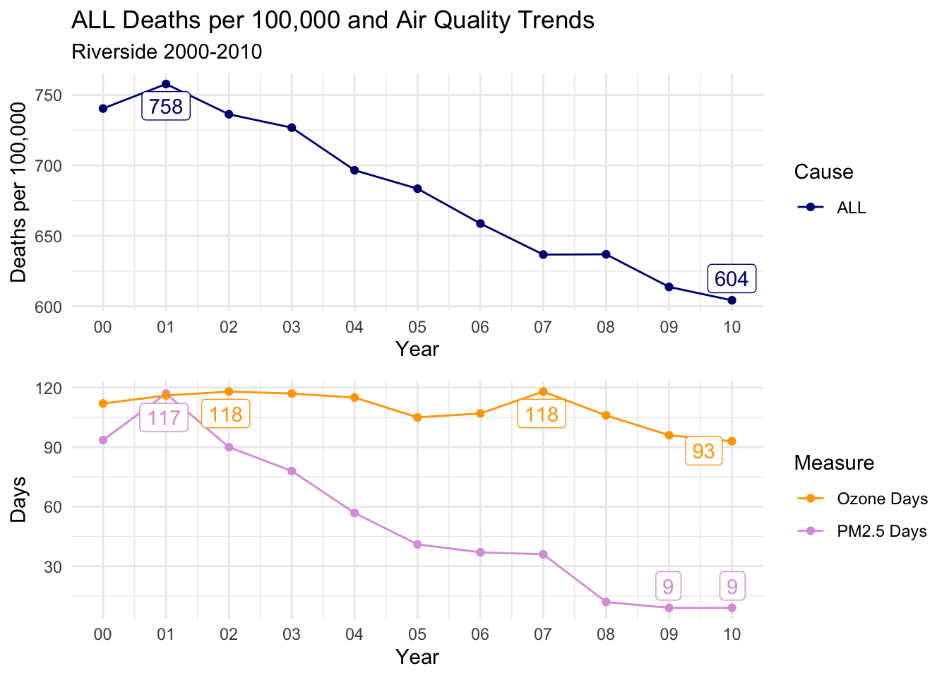
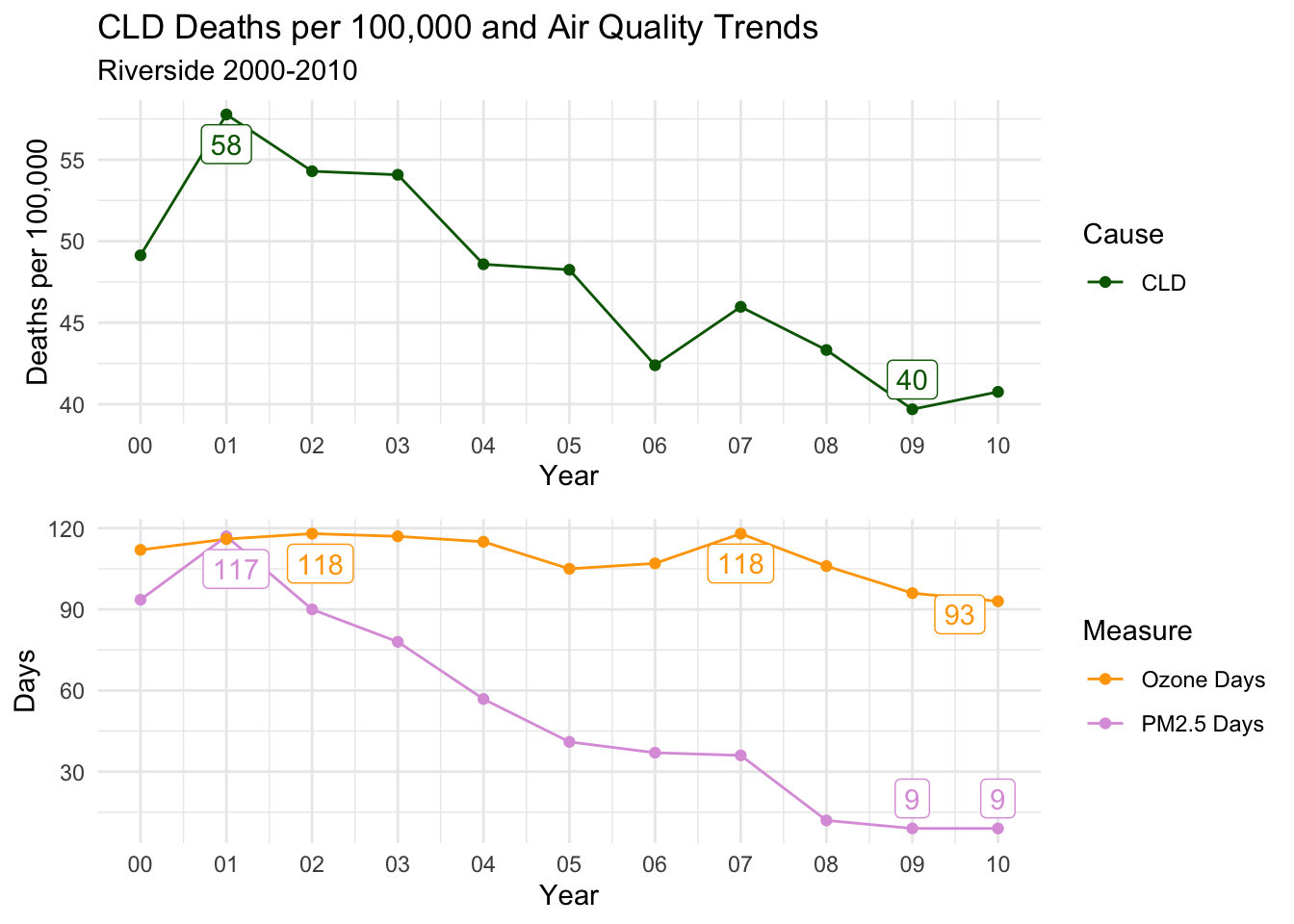
Below, I’ve created a function that will print out trends for each selected county for all death cause groups.
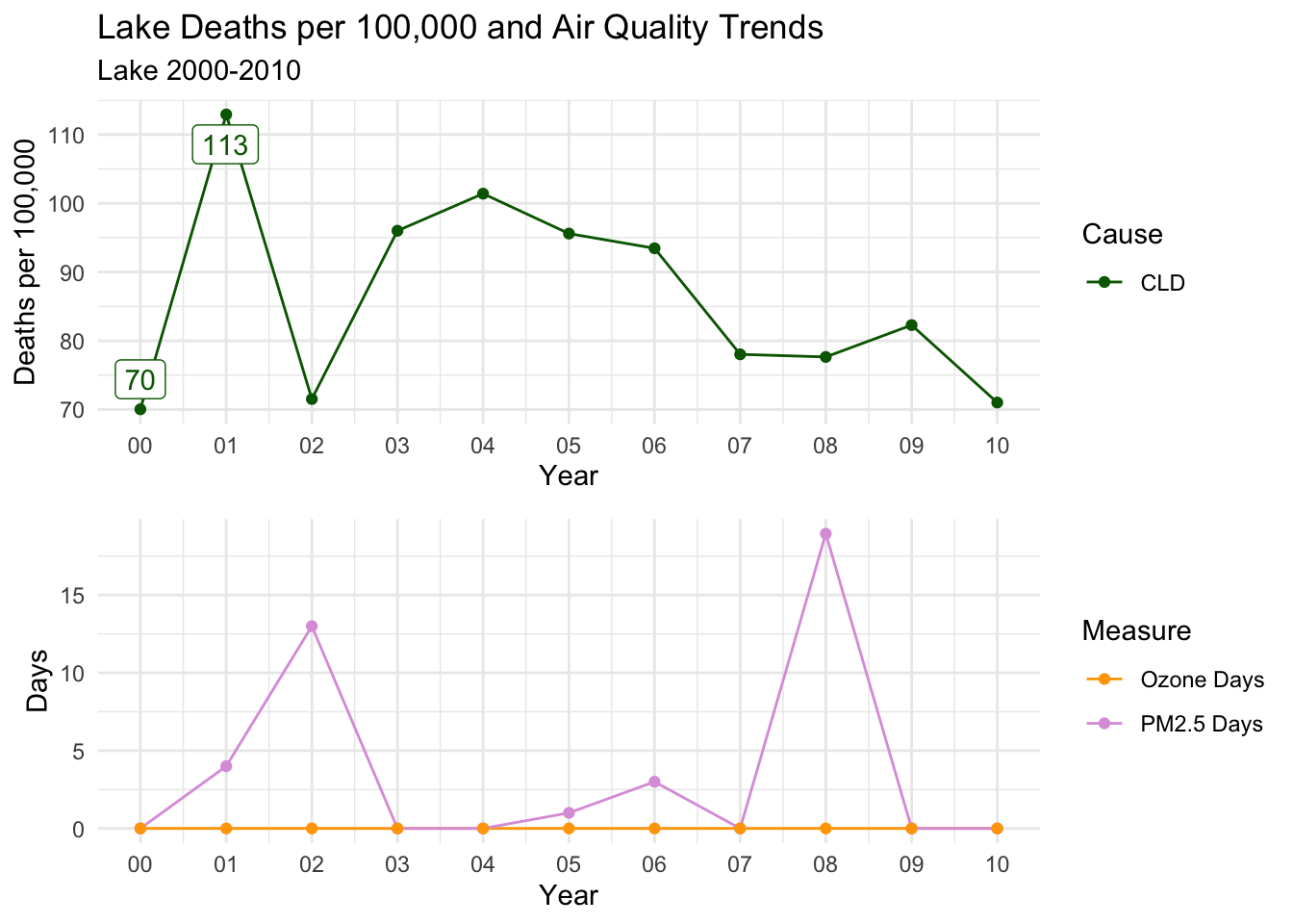
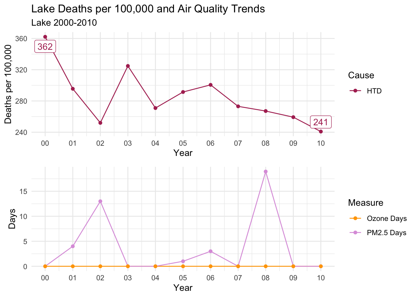
There is a distinct decline in deaths per 100,000 for ALL, CLD, and HTD causes.
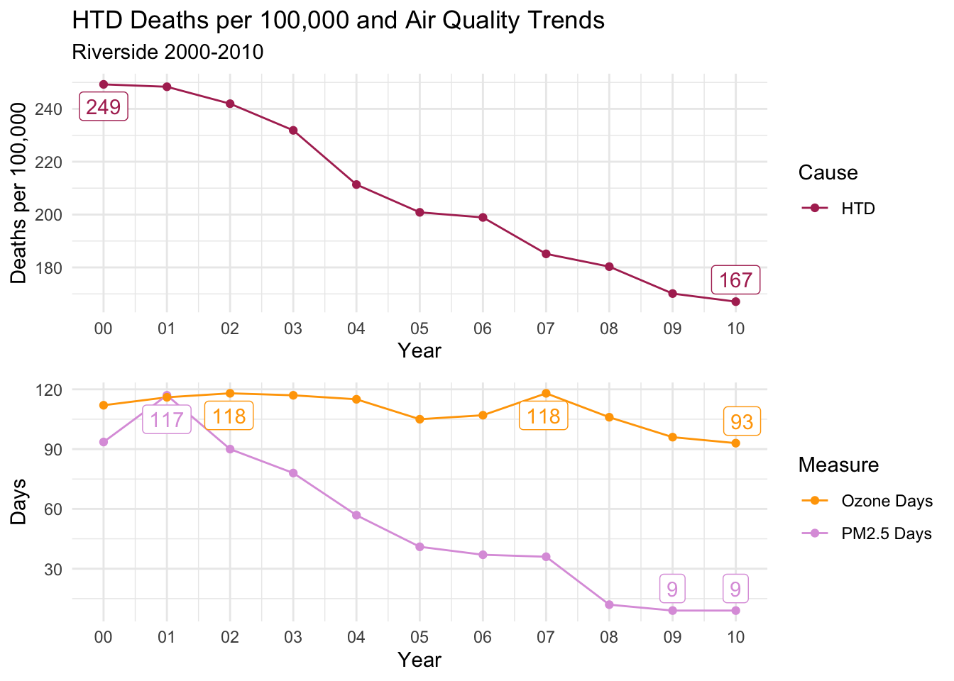
Ozone days is consistently high throughout the decade; However, PM2.5 Days follows almost an identical trend to all three causes of death.
This is a compelling instance to suggest that PM2.5 days may have an impact on deaths per 100,000, as Ozone days remaining relatively constant almost acts as a control variable.
Code
countytrendarrange("Riverside")
Fresno
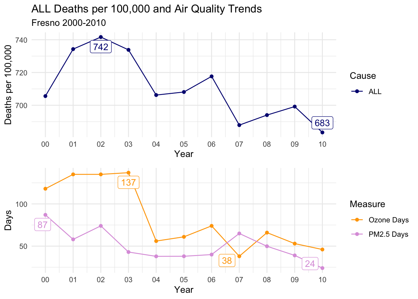
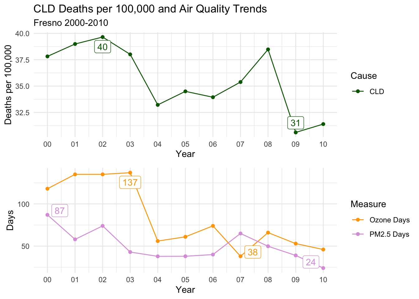
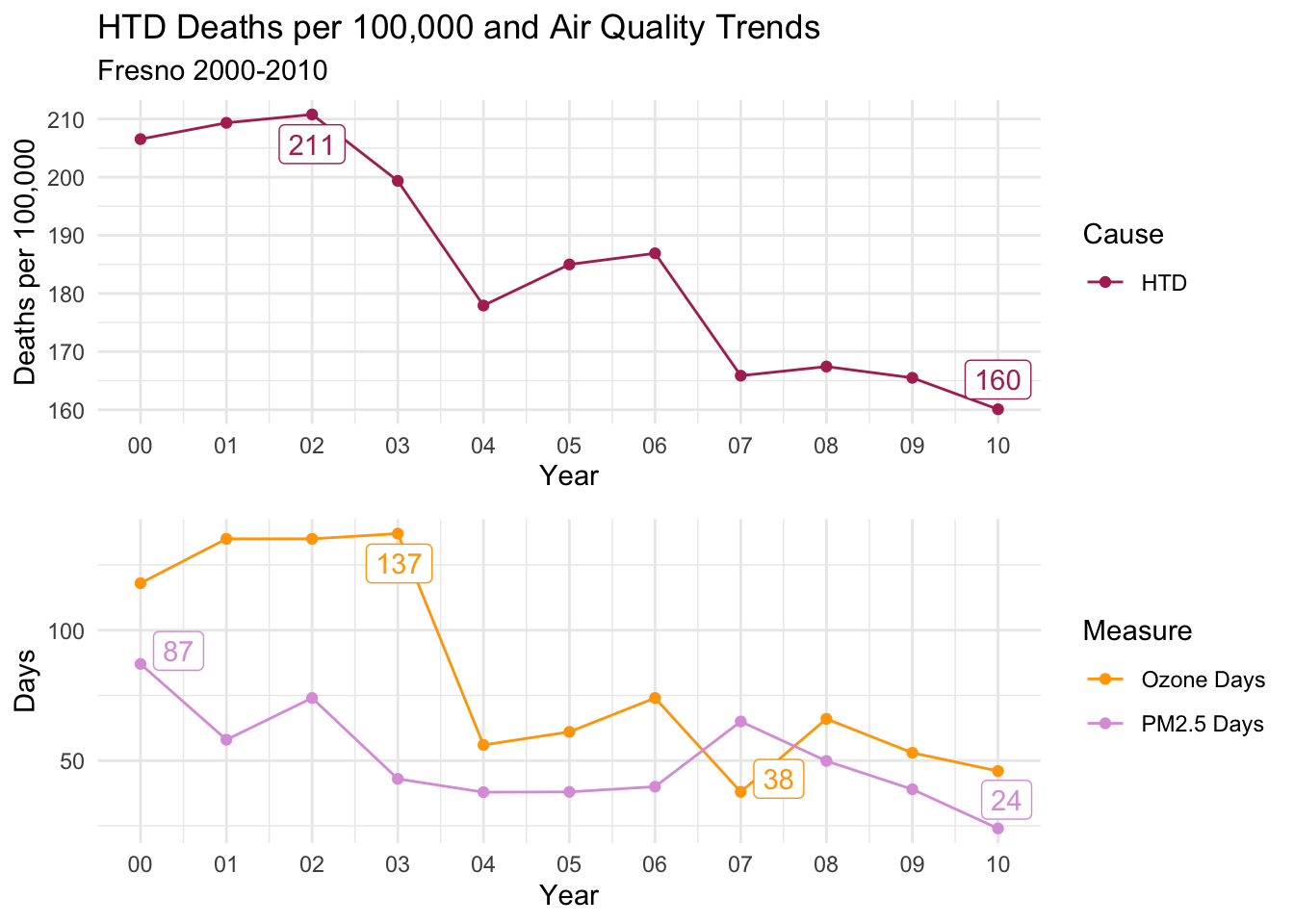
For Fresno, the story changes, as ALL Causes of death seems to track closely with Ozone Days more closely than PM2.5 Days. The distinct drop from 2003 to 2004, and subsequent rise before falling again after 2006 is present for all causes of death and Ozone Days.
Code
countytrendarrange("Fresno")
Kern
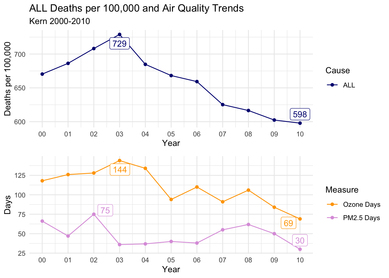
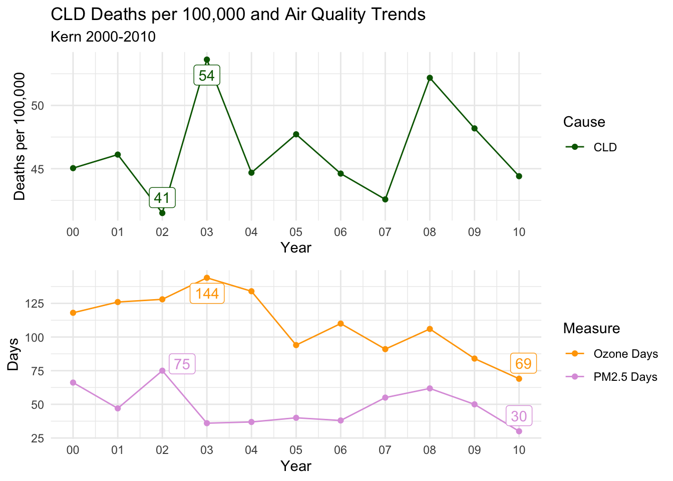
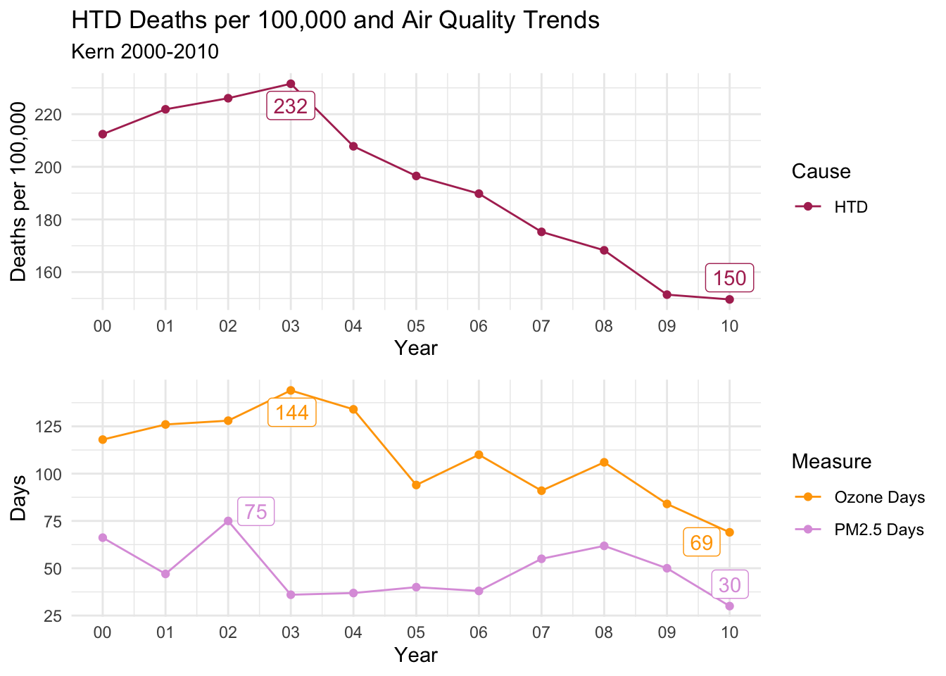
The trends for Kern are the lest convincing either way. However, there is still a distinct decline in ALL and HTD Causes of death that tracks with both air quality measures. CLD on the other hand is quite erratic and inconclusive.
Code
countytrendarrange("Kern")
Bottom 2 Worst (Top 2 Best) Counties for PM2.5 Days
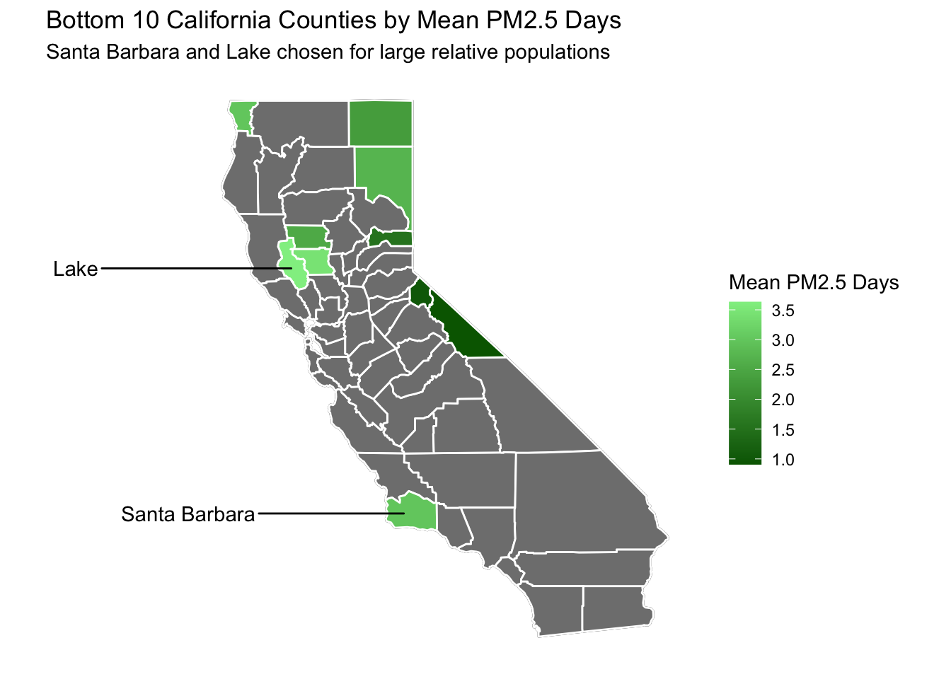
Below I’ve created a similar map to before, except I’ve highlighted the bottom 10 worst (or top 10 best depending on how you look at it) counties for mean PM2.5 Days.
However, instead of simply taking the bottom 3 counties for analysis, I’ve handpicked 2 counties, Santa Barbara and Lake, as these had decently high populations. Many of the bottom counties were extremely small and would be hard to reliably draw conclusions from in terms of deaths per 100,000.
Code
# creating data frame that takes the bottom 10 counties for poor ozone days and combining it with county map databottom10data <- ozoneandpmdaysbycounty %>%slice_min(`Mean PM2.5 Days`, n =10) %>%mutate(County =fct_reorder(County, `Mean PM2.5 Days`)) %>%left_join(ca_counties, ., by ="County")# creating data frame for bottom 2 counties to be used as labelsbottom2labeldata <-filter(ca_counties, County %in%c("Santa Barbara", "Lake")) %>%group_by(County) %>%summarise(long =median(long),lat =median(lat))# adding map to base california mapca_base +geom_polygon(data = bottom10data, aes(fill =`Mean PM2.5 Days`), color ="white") +# setting gradient to green to represent good air qualityscale_fill_gradient(low ="darkgreen", high ="lightgreen") +# adding text labels for chosen countiesgeom_text_repel(data=bottom2labeldata, aes(label = County, x = long, y = lat), inherit.aes =FALSE, nudge_x =-5) +labs(title ="Bottom 10 California Counties by Mean PM2.5 Days",subtitle ="Santa Barbara and Lake chosen for large relative populations")
Code
# printing some mean populationsairqualityanddeaths %>%filter(County %in%c("Santa Barbara", "Lake")) %>%group_by(County) %>%summarise(`Mean Population`=round(mean(Population), digits =0))
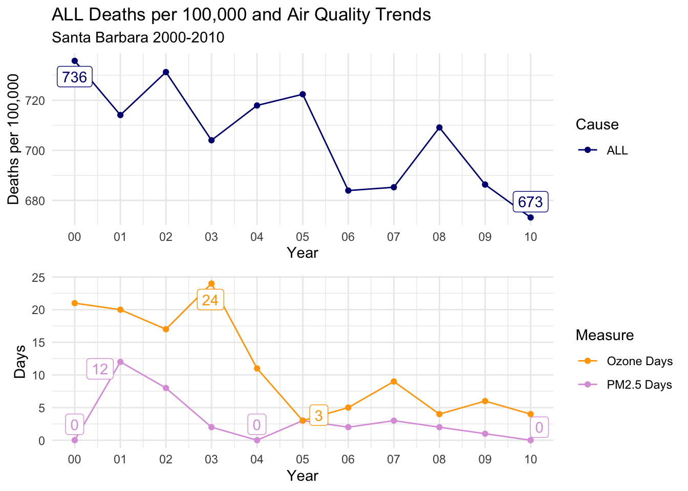
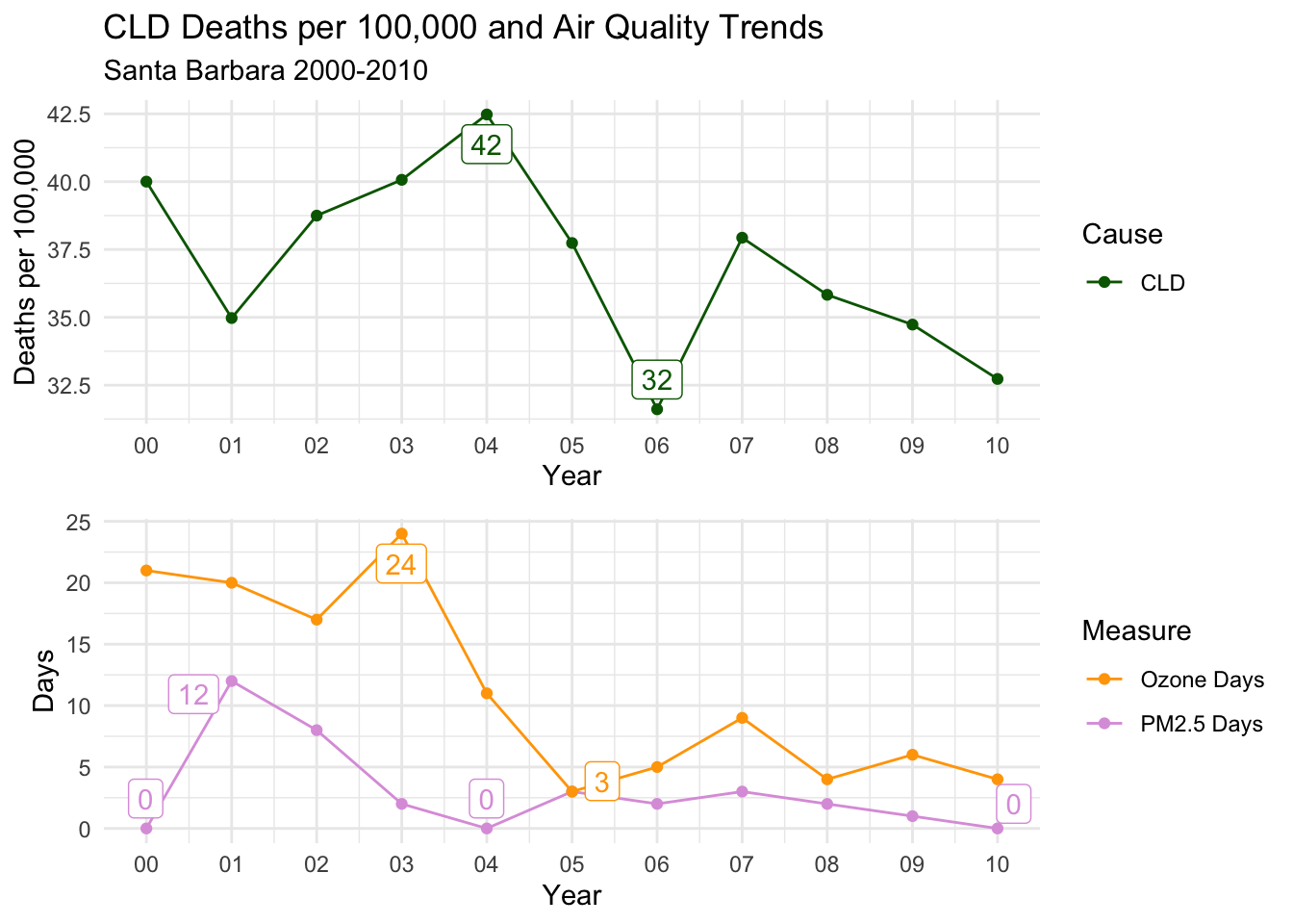
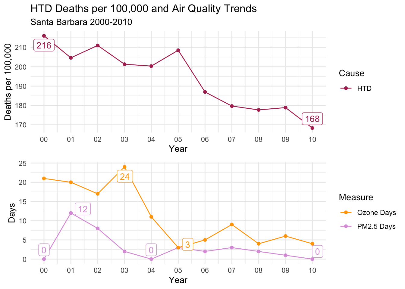
Santa Barbara
Looking at the trends for Santa Barbara, you can see that the days for both types of air quality were low, but there was a distinct peak in Ozone Days in the beginning fo the decade, declining sharply after 2003.
There is a general downward trend in deaths per 100,000 of all types, but it’s really not a convincing match to the air quality trends.
Code
countytrendarrange("Santa Barbara")
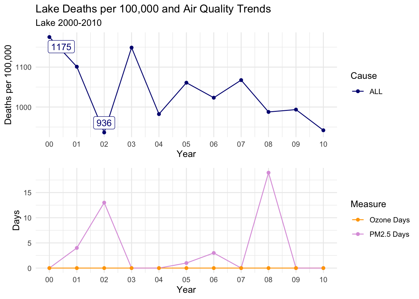
Lake
For Lake, I had to make some changes to my function, as the labels would not work with many 0 PM2.5 days.
As you can see below, there is pretty much no correlation between air quality and deaths per 100,000 for any cause of death in Lake County.
This might be a case of the county being too small (~60,000 people), causing too much variance in the deaths data.
Code
# had to create a new function that excluded labels, due to consistently 0 pm2.5 days, everything else is the same as previous functionslakedays <- airqualityanddeaths %>%select(County, Year, `Strata Name`, `Deaths per 100,000`, Cause, `PM2.5 Days`, `Ozone Days`) %>%filter(County =="Lake"&`Strata Name`=="Total Population"& Cause =="ALL") %>%pivot_longer(cols =c(`PM2.5 Days`, `Ozone Days`), names_to ="Measure", values_to ="Days") %>%ggplot(aes(x = Year, y = Days, col = Measure)) +geom_line() +geom_point() +theme_minimal() +scale_color_manual(values = airqualitycolors) +scale_x_date(date_labels ="%y", date_breaks ="1 year", name ="Year")deathttrendlake <-function(x, y) {airqualityanddeaths %>%filter(`Strata Name`=="Total Population"& Cause == x & County == y) %>%group_by(Cause) %>%mutate(label =ifelse(`Deaths per 100,000`%in%range(`Deaths per 100,000`, na.rm =TRUE), round(`Deaths per 100,000`, digits =0), '')) %>%ggplot(aes(x = Year, y =`Deaths per 100,000`, col = Cause, label = label)) +geom_line() +geom_point() +geom_label_repel(show.legend =FALSE) +scale_x_date(date_labels ="%y", date_breaks ="1 year", name ="Year") +theme_minimal() +scale_color_manual(values = deathcolors) +labs(title =paste0("Lake", " Deaths per 100,000 and Air Quality Trends"),subtitle =paste0(y, " 2000-2010")) +ylab("Deaths per 100,000")}laketrendarrange <-function(x) {ggarrange(deathttrendlake("ALL", x), lakedays, ncol =1)ggarrange(deathttrendlake("CLD", x), lakedays, ncol =1)ggarrange(deathttrendlake("HTD", x), lakedays, ncol =1)}laketrendarrange("Lake")
Conclusion
To reiterate, the goal of my project was to assess whether there is a visual relationship between air quality trends and related causes of death in California for the decade of 2000-2010. We attempted to answer this question in a couple of ways.
In my analysis of means across all counties, there is a strong visual suggestion that there is a relationship between the trends of air quality (both Ozone and PM2.5) and deaths per 100,000. This relationship is clearer for all causes of death and deaths by heart disease, and is less clear for chronic lower respiratory disease deaths.
I also identified some issues with comparing deaths per 100,000 across counties; Therefore, I looked at intra-county trends as well.
Within counties that had high air quality days (poor air quality), the trend between air quality and deaths per 100,000 was evident, but the more potent air quality type seemed to vary between counties. Within counties that had low air quality days (good air quality) there was seemingly very little correlation. I believe this is overall a positive finding for my hypothesis.
Much more work needs to be done to prove statistical correlation or causation between annual air quality and annual related deaths. For future analysis, I would hope to determine a way to calculate excess deaths per 100,000 that might be attributable to air quality. This will allow me to control for many of the “hidden” variables that are skewing the data.
Bibliography
[1] Kurt, O. K., Zhang, J., & Pinkerton, K. E. (2016). Pulmonary health effects of air pollution. Current opinion in pulmonary medicine, 22(2), 138–143. https://doi.org/10.1097/MCP.0000000000000248
[2] Jonathan J Buonocore et al (2023) Air pollution and health impacts of oil & gas production in the United States Environ. Res.: Health1 021006. https://iopscience.iop.org/article/10.1088/2752-5309/acc886
[3] Centers for Disease Control and Prevention (2018). Air Quality Measures on the National Environmental Health Tracking Network, 1999 - 2013, [https://data.cdc.gov/Environmental-Health-Toxicology/Air-Quality-Measures-on-the-National-Environmental/cjae-szjv].
[4] California Health and Human Services (2021). 1999-2013 Final Deaths by Year by County,[https://data.chhs.ca.gov/dataset/death-profiles-by-county/resource/e692e6a1-bddd-48ab-a0c8-fa0f1f43e9f4?i %20nner_span=True].
[5] United States Census Bureau (2021). County Intercensal Tables: 2000-2010,[https://www.census.gov/data/tables/time-series/demo/popest/intercensal-2000-2010-counties.html].
[6] R Core Team (2022). R: A language and environment for statistical computing. R Foundation for Statistical Computing, Vienna, Austria. URL https://www.R-project.org/.
[7] Wickham H, Averick M, Bryan J, Chang W, McGowan LD, François R, Grolemund G, Hayes A, Henry L, Hester J, Kuhn M, Pedersen TL, Miller E, Bache SM, Müller K, Ooms J, Robinson D, Seidel DP, Spinu V, Takahashi K, Vaughan D, Wilke C, Woo K, Yutani H (2019). “Welcome to the tidyverse.” _Journal of Open Source Software_, *4*(43), 1686. doi:10.21105/joss.01686 <https://doi.org/10.21105/joss.01686>.
[8] Becker OScbRA, Minka ARWRvbRBEbTP, Deckmyn. A (2022). _maps: Draw Geographical Maps_. R package version 3.4.1, <https://CRAN.R-project.org/package=maps>.
Source Code
---title: "Final Project - Air Quality and Deaths"author: "Joseph Vincent"description: "Comparing Air Quality to Death Trends in California, 2000-2010"date: "05/18/2023"format: html: df-print: paged toc: true code-fold: true code-copy: true code-tools: true css: styles.csscategories: - final_project - Joseph Vincenteditor_options: chunk_output_type: inlineeditor: markdown: wrap: sentence---```{r}#| label: setup#| warning: falselibrary(tidyverse)library(lubridate)library(scales)library(gridExtra)library(viridis)library(grid)library(ggrepel)library(gtable)library(ggridges)library(forcats)library(maps)library(mapproj)library(egg)library(summarytools)knitr::opts_chunk$set(echo =TRUE, warning=FALSE, message=FALSE)```## Part 1. Introduction### AbstractPoor air quality has been shown to have a massively negative impact on human health.In particular, air pollution is known to worsen pulmonary and cardiovascular diseases \[1\].Just In the past few weeks, researchers out of Boston University showed that air pollution caused by oil and gas production in the US resulted in over **7500 excess deaths and \$77 billion in total health impacts in a *single year* \[2\].****The goal of my project is to assess whether there is a visual relationship between air quality trends and related causes of death in California for the decade of 2000-2010.** My analysis does not attempt to make statistically significant claims about excess deaths or economic impacts, but rather looks at visual trends on a high level to see if the impact is noticeable.**My findings are that, at both state-wide and intra-county levels, changes in air quality (particularly PM2.5 levels) and deaths per 100,000 seem to follow similar trends.**### Data IntroductionMy data comes from three primary sources:1. **Air quality**[SOURCE](https://data.cdc.gov/Environmental-Health-Toxicology/Air-Quality-Measures-on-the-National-Environmental/cjae-szjv)\[3\]I'm using the CDC's database for Air Quality Measures on the National Environmental Health Tracking Network.The most recent and complete historic data available contains per-county data on air quality between the years of 1999 and 2013, inclusive.This data is collected by the Environmental Protection Agency's network of more than 4,000 outdoor ambient air monitoring systems around the US, called the Air Quality System (AQS).These systems collect two main types of data:- **Ozone Concentrations**High concentrations of Ozone near the ground level can be harmful, causing irritation to the respiratory system and aggravating a variety of chronic lung diseases.This is often referred to as "smog" and is produced by things like car emissions and power plants.- **Fine Particulate Matter (PM2.5) Concentrations**This refers to tiny particulate matter in the air measuring two and a half microns or less in width that originates from a variety of pollutants.Exposure to PM2.5 particles can cause both short and long term health effects.PM2.5 sources include wildfires and fossil fuel combustion.While this data is of high quality, it is lacking in rural areas where monitors are not present.To account for this, the CDC and EPA developed statistical models to fill in gaps in data across regions and time.This allows for granular analysis of county air quality data.**Two important concepts used in my analysis are Ozone Days and PM2.5 Days.***A measure of "Ozone Days" for a particular county-year represents the number of days with the maximum 8-hour average ozone concentration over the National Ambient Air Quality Standard (NAAQS).**A measure of "PM2.5 Days" for a particular county-year represents the number of days with PM2.5 levels over the NAAQS.*In both cases, information about true severity of concentrations is not available, only the number of days above the standard.2. **Deaths by Cause**[SOURCE](https://data.chhs.ca.gov/dataset/death-profiles-by-county/resource/e692e6a1-bddd-48ab-a0c8-fa0f1f43e9f4?i%20nner_span=True)\[4\]In order to draw conclusions about air quality's immediate impact on public health, I'm combining my air quality data with a dataset from the state of California's Department of Health and Human Services (HHS) on annual number of deaths by county, including primary cause of death.This data also spans the years 1999-2013, but I will be using 2000-2010.While the data includes a wide variety of causes, for my analysis I will be focusing on **total deaths (ALL), chronic lower respiratory disease (CLD), and diseases of the heart (HTD)**, as these are the main relevant categories for air quality health impacts.3. **Population**[SOURCE](https://www.census.gov/data/tables/time-series/demo/popest/intercensal-2000-2010-counties.html)\[5\]Finally, I'm also using per-county population data from the United States Census Bureau.While there are census packages out there for easy use within R, I required annual data by county, which only exists from 2005 onwards in most datasets.I'm instead using the County Intercensal Tables 2000-2010 for the state of California.## Part 2. Data Description### Reading, mutating, and combining dataBelow I have provided a head sample of the three data sets.The air quality data consists of measures of both ozone and PM2.5.Ozone levels are measured by number of days with higher than average Ozone levels, and also person-days by county by multiplying by the population for that year.PM2.5 levels are lacking raw number of days, but are recorded in percent of days, person days, and the annual average level for that county-year.I will be converting this to PM2.5 days (count) for my analysis.**Each row of the air quality data represents a specific air quality measure for a county-year.**```{r}#reading in air quality dataairquality <-read_csv("JosephVincent_FinalProjectData/Air_Quality_Measures_on_the_National_Environmental_Health_Tracking_Network.csv")head(airquality)dim(airquality)```**As for the death data, each row contains a count of deaths in the "value" column for a county, year, stratification (demographically) and cause of death.** This results in many rows for a given county-year.```{r}#reading in deaths datasetcalideaths <-read_csv("JosephVincent_FinalProjectData/2021-05-14_deaths_final_1999_2013_county_year_sup.csv") %>%#filtering for occurrence deaths (i.e. all deaths that occurred, disregarding residence)filter(Geography_Type =="Occurrence") %>%#de-selecting geography type as they are now all occurrenceselect(-Geography_Type)head(calideaths)dim(calideaths)```**The population data consists of rows that each represent a US county.** The population estimates by year are listed in separate columns in a wide format.```{r}#reading in population datapopulations <-read_csv("JosephVincent_FinalProjectData/co-est00int-tot.csv")head(populations)dim(populations)```My goal is to combine these data sets into the "deaths data" format, having each case represent a county, year, stratification and cause.I will combine the air quality measures as individual columns onto this data.These can be pivoted longer as needed for visualization, but are easier kept seperately for visualizing the data set.Below, I've filtered the air quality data for California, then pivoted wider so that the air quality measures each are represented in a column.One thing worth mentioning is that the air quality data consists of both "monitored" values and "modeled" values.As described on the CDC's website, the CDC and EPA collaborated to develop statistical models for filling in missing data in regions without data.For my analysis, I will be using the modeled data to allow me to look at counties that would otherwise be missing data.You can see these mutations below.```{r}airqualitycali <- airquality %>%#arranging by yeararrange(`ReportYear`) %>%#filtering for california only and 2000-2010filter(StateName =="California"&`ReportYear`%in%c(2000:2010)) %>%#selecting only relevant columnsselect(CountyName, ReportYear, MeasureName, Value) %>%#renaming county and year to be consistent with deaths datasetrename("County"=`CountyName`, "Year"=`ReportYear`) %>%#pivoting so that each row is a year-county for merging datapivot_wider(names_from = MeasureName, values_from = Value) %>%#renaming Air Quality columnsrename("Ozone Days Delete"=`Number of days with maximum 8-hour average ozone concentration over the National Ambient Air Quality Standard`,"Ozone Person Days Delete"=`Number of person-days with maximum 8-hour average ozone concentration over the National Ambient Air Quality Standard`,"PM2.5 Percent of Days Delete"=`Percent of days with PM2.5 levels over the National Ambient Air Quality Standard (NAAQS)`,"PM2.5 Person Days Delete"=`Person-days with PM2.5 over the National Ambient Air Quality Standard`,"PM2.5 Annual Average Delete"=`Annual average ambient concentrations of PM2.5 in micrograms per cubic meter (based on seasonal averages and daily measurement)`,"Ozone Days"=`Number of days with maximum 8-hour average ozone concentration over the National Ambient Air Quality Standard (monitor and modeled data)`,"Ozone Person Days"=`Number of person-days with maximum 8-hour average ozone concentration over the National Ambient Air Quality Standard (monitor and modeled data)`,"PM2.5 Percent of Days"=`Percent of days with PM2.5 levels over the National Ambient Air Quality Standard (monitor and modeled data)`,"PM2.5 Person Days"=`Number of person-days with PM2.5 over the National Ambient Air Quality Standard (monitor and modeled data)`,"PM2.5 Annual Average"=`Annual average ambient concentrations of PM 2.5 in micrograms per cubic meter, based on seasonal averages and daily measurement (monitor and modeled data)`)#filling in modeled data for first year, where there is no modeled dataairqualitycali <- airqualitycali %>%mutate(`Ozone Days`=case_when(`Year`==2000~`Ozone Days Delete`,TRUE~as.numeric(as.character(`Ozone Days`)))) %>%mutate(`Ozone Person Days`=case_when(`Year`==2000~`Ozone Person Days Delete`,TRUE~as.numeric(as.character(`Ozone Person Days`)))) %>%mutate(`PM2.5 Percent of Days`=case_when(`Year`==2000~`PM2.5 Percent of Days Delete`,TRUE~as.numeric(as.character(`PM2.5 Percent of Days`)))) %>%mutate(`PM2.5 Person Days`=case_when(`Year`==2000~`PM2.5 Person Days Delete`,TRUE~as.numeric(as.character(`PM2.5 Person Days`)))) %>%mutate(`PM2.5 Annual Average`=case_when(`Year`==2000~`PM2.5 Annual Average Delete`,TRUE~as.numeric(as.character(`PM2.5 Annual Average`)))) %>%select(!contains("Delete"))```For prepping the deaths data, I've filtered for only the causes of death I believe may be relevant to air quality (ALL, CLD, and HTD).Also, I've filled in some NA cells as 0 which were coded as "suppressed for small numbers".These only apply when a specific stratification variable (i.e. race) has extremely low values for a county, and will likely not have any affect on my analysis, which I plan to mostly use the Total Population stratification.```{r}calideathsclean <- calideaths %>%#filtering for 2000-2010filter(`Year`%in%c(2000:2010)) %>%#filling in suppressed datamutate(Count =case_when( Annotation_Code ==1~0,TRUE~as.numeric(as.character(Count)))) %>%#de-selecting some unused columnsselect(-Cause_Desc, -Annotation_Code, -Annotation_Desc) %>%#focusing on relevant conditionsfilter(Cause %in%c("ALL", "CLD", "HTD")) %>%rename("Deaths"=`Count`) %>%rename("Strata Name"=`Strata_Name`)dim(calideathsclean)```The population data needed a small bit of cleaning to pivot the estimates by year into a single column.```{r}populationstidy <- populations %>%filter(STNAME =="California"& CTYNAME !="California") %>%separate(CTYNAME, into =c("County", "Delete"), sep =" County") %>%select(County, POPESTIMATE2000:POPESTIMATE2010, -CENSUS2010POP) %>%rename("2000"= POPESTIMATE2000,"2001"= POPESTIMATE2001,"2002"= POPESTIMATE2002,"2003"= POPESTIMATE2003,"2004"= POPESTIMATE2004,"2005"= POPESTIMATE2005,"2006"= POPESTIMATE2006,"2007"= POPESTIMATE2007,"2008"= POPESTIMATE2008,"2009"= POPESTIMATE2009,"2010"= POPESTIMATE2010) %>%pivot_longer(col =c(`2000`:`2010`), names_to ="Year", values_to ="Population") %>%mutate(`Year`=as.numeric(Year))```Finally, with the cleaning mostly complete, I'll combine my data sets.Each time I'll merge into the deaths data.I'll expect my final data set to consist of 28,072 rows, which is the size of the original deaths dataset after filtering for 2000-2010.There are a total of 58 unique counties in CA.The populations of these```{r}#merging dataairqualityanddeaths <-left_join(calideathsclean, airqualitycali, by =c("County", "Year"))#merging dataairqualityanddeaths <-left_join(airqualityanddeaths, populationstidy, by =c("County", "Year"))dim(airqualityanddeaths)```### Mutation and NA replacementIt's important to note that for some air quality data in 2000, NA were used for small counties where neither modeled nor monitored data was available.In these cases, I've replaced the NAs with 0 days.If not, the smaller, rural counties (with generally great air quality) would skew my averages later on.In checking the data for later years with available monitors, this seems to be a good approach, as days are (or are near to) 0.I've also created a column for Deaths per 100,000 by using the population data I've collected.This will allow me to better compare deaths between counties with wildly varying populations.As we'll see later, this isn't a perfect fix as counties with small populations have a large varience in deaths per 100,000, but it's still preferable to the raw counts.I also have created a "raw" PM2.5 Days column that counts the number of days, instead of a percent.```{r}#For the remaining missing air quality data not filled in by models in 2000, replacing NAs with zero, as they are all small rural counties that will skew means higher for 2000airqualityanddeaths <- airqualityanddeaths %>%mutate(`Ozone Days`=replace_na(`Ozone Days`, 0),`Ozone Person Days`=replace_na(`Ozone Person Days`, 0),`PM2.5 Percent of Days`=replace_na(`PM2.5 Percent of Days`, 0),`PM2.5 Person Days`=replace_na(`PM2.5 Person Days`, 0),`PM2.5 Annual Average`=replace_na(`PM2.5 Annual Average`, 0)) %>%# Creating standardized deaths per 100,000 columnmutate("Deaths per 100,000"=`Deaths`/`Population`*100000) %>%# Creating a raw PM2.5 Days columnmutate("PM2.5 Days"=`PM2.5 Percent of Days`/100*365) %>%# Re-arrangingselect(Year, County, Population, Strata, `Strata Name`, Cause, Deaths, `Deaths per 100,000`, `Ozone Days`, `Ozone Person Days`, `PM2.5 Days`, `PM2.5 Person Days`, `PM2.5 Percent of Days`, `PM2.5 Annual Average`) %>%# Turning Year into a date for ease of plotting time series'mutate(Year =make_date(year=Year))head(airqualityanddeaths)```## Analysis Plan**The goal of my project is to assess whether there is a visual relationship between air quality trends and related causes of death in California for the decade of 2000-2010.**My plan is as follows:**1) Descriptive Visualizations**- Describe and summarize both the air quality and death trends data so that we can gain a baseline understanding of each before comparison.**2) Statewide Trend Comparison**- Compare overall trends in air quality to deaths per 100,000 by type by taking the means of all counties over the years.- Plot deaths per 100,000 by type against each air quality measure to see if they correlate.**3) Intra-county Trend Comparison**- Compare trends in air quality measures to trends in deaths per 100,000 by type for individual counties of either high or low air quality. This will allow me to reduce variance coming from county differences in hidden variables that could be influencing death rates (i.e. socio-economic variables).*A quick note that when I refer to the "decade", I've actually included 11 years (2000-2010 inclusive) in my analysis.*### Summary and Descriptive VisualizationsThere are 58 counties in California.I'll begin by describing air quality by county.```{r}unique(airqualityanddeaths$County)```First, I will map each air quality measure by year, showing the trends across time.Below, I've done some preparation by creating state and county maps using the "maps" package, which includes per county data with longitude and latitude coordinates.```{r}# Selecting state data from map datastates <-map_data("state")# Subsetting state data for California only for base mapcalifornia <-subset(states, region =="california")# Subsetting map data for California County dataca_counties <-subset(map_data("county"), region =="california") %>%# Changing county names to match my existing datamutate("County"=case_when(`subregion`=="alameda"~"Alameda",`subregion`=="alpine"~"Alpine",`subregion`=="amador"~"Amador",`subregion`=="butte"~"Butte",`subregion`=="calaveras"~"Calaveras",`subregion`=="colusa"~"Colusa",`subregion`=="contra costa"~"Contra Costa",`subregion`=="del norte"~"Del Norte",`subregion`=="el dorado"~"El Dorado",`subregion`=="fresno"~"Fresno",`subregion`=="glenn"~"Glenn",`subregion`=="humboldt"~"Humboldt",`subregion`=="imperial"~"Imperial",`subregion`=="inyo"~"Inyo",`subregion`=="kern"~"Kern",`subregion`=="kings"~"Kings",`subregion`=="lake"~"Lake",`subregion`=="lassen"~"Lassen",`subregion`=="los angeles"~"Los Angeles",`subregion`=="madera"~"Madera",`subregion`=="marin"~"Marin",`subregion`=="mariposa"~"Mariposa",`subregion`=="mendocino"~"Mendocino",`subregion`=="merced"~"Merced",`subregion`=="modoc"~"Modoc",`subregion`=="mono"~"Mono",`subregion`=="monterey"~"Monterey",`subregion`=="napa"~"Napa",`subregion`=="nevada"~"Nevada",`subregion`=="orange"~"Orange",`subregion`=="placer"~"Placer",`subregion`=="plumas"~"Plumas",`subregion`=="riverside"~"Riverside",`subregion`=="sacramento"~"Sacramento",`subregion`=="san benito"~"San Benito",`subregion`=="san bernardino"~"San Bernardino",`subregion`=="san diego"~"San Diego",`subregion`=="san francisco"~"San Francisco",`subregion`=="san joaquin"~"San Joaquin",`subregion`=="san luis obispo"~"San Luis Obispo",`subregion`=="san mateo"~"San Mateo",`subregion`=="santa barbara"~"Santa Barbara",`subregion`=="santa clara"~"Santa Clara",`subregion`=="santa cruz"~"Santa Cruz",`subregion`=="shasta"~"Shasta",`subregion`=="sierra"~"Sierra",`subregion`=="siskiyou"~"Siskiyou",`subregion`=="solano"~"Solano",`subregion`=="sonoma"~"Sonoma",`subregion`=="stanislaus"~"Stanislaus",`subregion`=="sutter"~"Sutter",`subregion`=="tehama"~"Tehama",`subregion`=="trinity"~"Trinity",`subregion`=="tulare"~"Tulare",`subregion`=="tuolumne"~"Tuolumne",`subregion`=="ventura"~"Ventura",`subregion`=="yolo"~"Yolo",`subregion`=="yuba"~"Yuba"))# Creating a base california mapca_base <-ggplot(data = california, mapping =aes(x = long, y = lat, group = group)) +coord_fixed(1.3) +geom_polygon(color ="black", fill ="white") +theme(panel.background =element_blank(),axis.text =element_blank(), axis.ticks =element_blank(), axis.title =element_blank(), panel.border =element_blank(), panel.grid =element_blank())# Using this for quickly removing axes later on when plotting mapsditch_the_axes <-theme(axis.text =element_blank(),axis.line =element_blank(),axis.ticks =element_blank(),panel.border =element_blank(),panel.grid =element_blank(),axis.title =element_blank() )```#### Ozone Days MapsBelow, I've plotted a map of Ozone Days over time (2000-2010) by county.An Ozone Day is a day in which ozone levels were greater than the national air quality standards.**It's clear that Ozone-related air quality was worse during the early parts of the decade, particularly 2001-2003, and improved towards the end of the decade.**Another thing that is clear from these maps is that there is not a huge variance in Ozone days within counties.In other words, counties with high ozone days tend to stay counties with high ozone days.This is perhaps not surprising, as Ozone levels will tend to be higher in areas with big cities, where smog and air pollution originate.A notable exception to this, is that the Bay Area (San Francisco) has low Ozone days throughout the decade.This is strange to me, and makes me question whether the data is accurately reported for that region.```{r}#| layout-ncol: 2# Creating function to filter data by year and combining it with map data for creating mapsmapdatafunction <-function(x) {airqualityanddeaths %>%filter(year(Year) == x &`Strata Name`=="Total Population"& Cause =="ALL") %>%left_join(ca_counties, ., by ="County")}# Creating function to plot a map ozone days by county by yearmapozonefunction <-function(x) { ca_base +geom_polygon(data =mapdatafunction(x), aes(fill =`Ozone Days`), color ="white") +geom_polygon(color ="black", fill =NA) +theme_bw() + ditch_the_axes +scale_fill_viridis(option ="turbo", limits =c(0, 150), breaks=c(0,30,60,90,120)) +ggtitle(paste0(x, " Ozone Days"))}for (i inc(2000:2010)) {print(mapozonefunction(i))}```#### PM2.5 Days MapsNext, I've plotted a map of PM2.5 Days over time by county.A PM2.5 Day is a day in which PM2.5 levels were greater than the national air quality standards.**It's again clear that PM2.5-related air quality was worse during the early parts of the decade.**It's also notable that overall, there are far fewer PM2.5 Days.I've color gradient accordingly, now maxing out at 120 instead of 150 in order to detect changes more easily.**There seems to be a greater intra-county change over time than with Ozone Days.** I believe this is because PM2.5 levels can be caused by more acute events than, such as wildfires.For future research, I'd really like to look at more recent years, where wildfires have been quite bad in California.Based on these maps, I would say that comparing cause of death to PM2.5 Days is probably going to be more interesting than Ozone for intra-county comparison over time, as the levels vary more by year.```{r}#| layout-ncol: 2# Creating a function to map pm2.5 days by county and year mapsmapPM2.5function <-function(x) { ca_base +geom_polygon(data =mapdatafunction(x), aes(fill =`PM2.5 Days`), color ="white") +geom_polygon(color ="black", fill =NA) +theme_bw() + ditch_the_axes +scale_fill_viridis(option ="turbo", limits =c(0, 120), breaks=c(0,30,60,90,120)) +ggtitle(paste0(x, " PM2.5 Days"))}for (i inc(2000:2010)) {print(mapPM2.5function(i))}```#### Air Quality Summary and Descriptive Visualizations```{r}# Setting a custom color palette for air quality measuresairqualitycolors <-c("Ozone Days"="orange", "Mean Ozone Days"="orange", "PM2.5 Days"="plum", "Mean PM2.5 Days"="plum")# Creating labels for boxplot values (fivenum summarizes median, quartiles and min/max)AQfivenum <- airqualityanddeaths %>%filter(`Strata Name`=="Total Population"& Cause =="ALL") %>%select(Year, County, `Ozone Days`, `PM2.5 Days`) %>%pivot_longer(cols =c(`Ozone Days`, `PM2.5 Days`), names_to ="Measure", values_to ="Days") %>%group_by(Measure) %>%summarise(five =list(fivenum(Days))) %>%unnest(cols = five) %>%mutate_if(is.numeric, round) %>%filter(five !=0)```Below, I've plotted the distribution of air quality days by type (Ozone and PM2.5 Days).This includes all county-years, so 11 years x 58 counties for a total of 638 observations of each type.Boxplot values are labeled below.Again, it's clear that there are a lot more Ozone Days than PM2.5 Days, with a higher max (144 vs 117) and a greater interquartile range.The violin plot - for PM2.5 Days especially - has a big clump of 0 day county-years, which we saw earlier in the map as dark blue counties.What's clear from both violin plots is that there are many high-extreme values, meaning that there are clearly several county-years with much worse air quality than average.```{r}# Creating a violin + box plot combination for comparing distributions of air quality days by measureairqualityanddeaths %>%# Filtering data and selecting columnsfilter(`Strata Name`=="Total Population"& Cause =="ALL") %>%select(Year, County, `Ozone Days`, `PM2.5 Days`) %>%#Pivoting to have air quality measures in a single column for groupingpivot_longer(cols =c(`Ozone Days`, `PM2.5 Days`), names_to ="Measure", values_to ="Days") %>%# Plottingggplot(aes(x = Measure, y = Days, fill = Measure)) +geom_violin(alpha = .7, width =1, na.rm =TRUE) +geom_boxplot(width = .1, fill ="white", na.rm =TRUE) +# Adding text labelsgeom_text(data = AQfivenum, aes(x =factor(Measure), y = five, label = five), nudge_x = .09) +# Setting theme, etc.theme_minimal() +scale_y_continuous(limits =c(0, 150), breaks =c(0,25,50,75,100,125,150)) +theme(axis.title.x =element_blank(), axis.text.x =element_blank()) +scale_fill_manual(values = airqualitycolors) +labs(title ="Overall Distribution of Ozone and PM2.5 Days",subtitle ="California, 2000-2010")```Next, I will plot these distributions by individual years using a ridgeplot.While both air quality types have noticeable clumps around 0-10 days, these are more pronounced for the PM2.5 Day plot.Not surprisingly, the Ozone Days plot has more high county-years than PM2.5.PM2.5 Days are mostly distributed around 0, with the exceptions of 2001, 2002, and 2008 where the peaks are closer to 10 days.This is interesting, as while we expected the higher years of 2001 and 2002, 2008 is a bit of a surprise based on the previous maps.This suggests that 2008 had many counties with slightly higher PM2.5 Days, but few high peaks.```{r}# Plotting distribution of ozone days by year in a ridgeplotairqualityanddeaths %>%# Filtering and selecting datafilter(`Strata Name`=="Total Population"& Cause =="ALL") %>%mutate(Year =year(Year)) %>%select(Year, County, `Ozone Days`, `PM2.5 Days`) %>%# Plottingggplot(aes(x =`Ozone Days`, y =`Year`, group =`Year`, fill = ..x..)) +# Plottin gridges with a gradient scale for air quality levelsgeom_density_ridges_gradient(scale =3) +# Theme, etc.scale_fill_viridis(option ="turbo") +scale_x_continuous(limits =c(0,150)) +scale_y_continuous(position ="right", breaks =c(2000:2010)) +theme_minimal() +theme(axis.title.y =element_blank()) +labs(fill='Ozone Days',title ="Distribution of Ozone Days by Year",subtitle ="Across All California Counties")# Performing same steps for PM2.5 Daysairqualityanddeaths %>%filter(`Strata Name`=="Total Population"& Cause =="ALL") %>%mutate(Year =year(Year)) %>%select(Year, County, `Ozone Days`, `PM2.5 Days`) %>%ggplot(aes(x =`PM2.5 Days`, y =`Year`, group =`Year`, fill = ..x..)) +geom_density_ridges_gradient(scale =4) +scale_fill_viridis(option ="turbo", ) +scale_x_continuous(limits =c(0,125)) +scale_y_continuous(position ="right", breaks =c(2000:2010)) +theme_minimal() +theme(axis.title.y =element_blank()) +labs(fill='Distribution of PM2.5 Days',title ="Distribution of PM2.5 Days by Year",subtitle ="Across All California Counties") ```Finally, to cap off describing the air quality data, I'll create trend lines of mean Ozone and PM2.5 Days over the years.It's again clear that there was a general downward trend in poor air quality (in other words, air quality improved throughout the decade).You can again see the peak in both measures in 2002.*For the rest of my analysis, I've labeled the maximum and minimum values for line plots, both occuring here in 2002 and 2010 respectively.*```{r}# Plotting lines for each air quality type showing mean days by yearAirqualitybyyearline <- airqualityanddeaths %>%# Filtering datafilter(`Strata Name`=="Total Population"&`Cause`=="ALL") %>%group_by(Year) %>%# Summarizing means by yearsummarize(`Mean Ozone Days`=mean(`Ozone Days`, na.rm=TRUE),`Mean PM2.5 Days`=mean(`PM2.5 Days`, na.rm=TRUE)) %>%# Pivoting to have air quality in a single column for groupingpivot_longer(cols =c(`Mean Ozone Days`, `Mean PM2.5 Days`), names_to ="Measure", values_to ="Mean Days") %>%# Adding column for labeling max and min valuesgroup_by(Measure) %>%mutate(label =ifelse(`Mean Days`%in%range(`Mean Days`), round(`Mean Days`, digits =0), '')) %>%# Plotting lines and pointsggplot(aes(x = Year, y =`Mean Days`, col = Measure, label = label)) +geom_line() +geom_point() +# Adding labels for min and max of each groupgeom_label_repel(show.legend =FALSE) +# Theme, etctheme_minimal() +scale_x_date(date_labels ="%y", date_breaks ="1 year", name ="Year") +theme(legend.key.size =unit(0.2, "cm")) +scale_color_manual(values = airqualitycolors)Airqualitybyyearline +labs(title ="Mean Ozone and PM2.5 Days",subtitle ="All County-Years, California, 2000-2010")```#### Death Data Summary and Descriptive VisualizationsNext, I will create similar descriptive visualizations for the death data.```{r}# Setting color palette for causes of deathdeathcolors =c("ALL"="navy","CLD"="darkgreen","HTD"="maroon")# Creating labels for box plotDeathsfivenum <- airqualityanddeaths %>%filter(`Strata Name`=="Total Population") %>%group_by(Cause) %>%summarise(five =list(fivenum(`Deaths per 100,000`))) %>%unnest(cols = five) %>%mutate_if(is.numeric, round) %>%filter(five !=0)```Below I've plotted the distribution of deaths per 100,000 by cause using data from all county-years.Note that the Y axis varies in each violin plot to allow for the figures to be more interpret-able.Interquartile, median and max values are also labeled.The median deaths per 100,000 of all types for all county-years is 686, with a max of 1276.You'll notice that deaths by heart disease are much more prevalent than deaths by chronic lower respiratory diseases, with median deaths per 100,000 being 181 and 38 respectively.This fact about CLD deaths may mean that the impact air quality has on CLD deaths per 100,000 will be harder to visualize, as the values are quite low.```{r}# creaating a violin plot for distribution of deaths per 100,000airqualityanddeaths %>%# filtering and grouping datafilter(`Strata Name`=="Total Population") %>%group_by(Cause) %>%# setting plot astheticsggplot(aes(x = Cause, y =`Deaths per 100,000`, fill = Cause)) +# creating violin plot, and box plot on topgeom_violin(alpha = .7, na.rm =TRUE) +geom_boxplot(width=.1, fill ="white", na.rm =TRUE) +# adding text labels of box plot values created previouslygeom_text(data =filter(Deathsfivenum, Cause !="HTD"), aes(x =factor(Cause), y = five, label = five), nudge_x = .8) +geom_text(data =filter(Deathsfivenum, Cause =="HTD"), aes(x =factor(Cause), y = five, label = five), nudge_x =-.8) +theme_minimal() +# grouping facets by cause of deathfacet_wrap(Cause ~., scales ="free_y") +# themes, titles, etc.theme(axis.title.x =element_blank(), axis.text.x =element_blank()) +scale_fill_manual(values = deathcolors) +labs(title ="Distribution of Deaths per 100,000 by Cause",subtitle ="California, 2000-2010")```I've also plotted the yearly ridge line plots for deaths per 100,000 of all, chronic lower respiratory disease and heart disease types.The distribution of all types is quite consistent across years, with a slight decrease in the peak value as the decade progresses.The CLD plot has some more noticable clumps around 0 deaths per 100,000 for each year.This will mostly be caused by counties with very small populations.Since CLD is in general a much rarer cause of death, there may be county-years with almost or 0 deaths per 100,000 of that type.This may also raise the question of whether CLD deaths are being properly reported in small counties.This question might need more attention if I were to perform a more serious statistical analysis of the data.```{r}airqualityanddeaths %>%# filtering and mutating datafilter(`Strata Name`=="Total Population"& Cause =="ALL") %>%mutate(Year =year(Year)) %>%select(Year, County, `Deaths per 100,000`) %>%# setting asthetics for plot, fill of ..x.. allows for gradientggplot(aes(x =`Deaths per 100,000`, y =`Year`, group =`Year`, fill = ..x..)) +# adding ridgeplot with gradientsgeom_density_ridges_gradient(scale =3) +# themes etc.scale_fill_viridis(option ="turbo") +scale_y_continuous(position ="right", breaks =c(2000:2010)) +theme_minimal() +theme(axis.title.y =element_blank()) +labs(fill='Deaths per 100,000',title ="Distribution of ALL Deaths per 100,000 by Year",subtitle ="Across All California Counties")# perfoming same as above for CLD deathsairqualityanddeaths %>%filter(`Strata Name`=="Total Population"& Cause =="CLD") %>%mutate(Year =year(Year)) %>%select(Year, County, `Deaths per 100,000`) %>%ggplot(aes(x =`Deaths per 100,000`, y =`Year`, group =`Year`, fill = ..x..)) +geom_density_ridges_gradient(scale =3) +scale_fill_viridis(option ="turbo") +scale_y_continuous(position ="right", breaks =c(2000:2010)) +theme_minimal() +theme(axis.title.y =element_blank()) +labs(fill='Deaths per 100,000',title ="Distribution of CLD Deaths per 100,000 by Year",subtitle ="Across All California Counties")# perfoming same as above for HTD deathsairqualityanddeaths %>%filter(`Strata Name`=="Total Population"& Cause =="HTD") %>%mutate(Year =year(Year)) %>%select(Year, County, `Deaths per 100,000`) %>%ggplot(aes(x =`Deaths per 100,000`, y =`Year`, group =`Year`, fill = ..x..)) +geom_density_ridges_gradient(scale =3) +scale_fill_viridis(option ="turbo") +scale_y_continuous(position ="right", breaks =c(2000:2010)) +theme_minimal() +theme(axis.title.y =element_blank()) +labs(fill='Deaths per 100,000',title ="Distribution of HTD Deaths per 100,000 by Year",subtitle ="Across All California Counties")```Finally, I'll look at the trend lines for mean deaths per 100,000 for all county-years as a time series.Again, note the varied Y axes.There is a general downward trend for all 3 cause types.ALL and HTD deaths both peak early in the decade and have a clear decline for the rest of the decade.While it is decreasing, CLD has the least smooth decent in deaths per 100,000.This again could largely be caused by the small values for deaths per 100,000, as the Y axis only ranges by 5 deaths per 100,000.So in general, the CLD trend is fairly inconclusive.```{r}airqualityanddeaths %>%# filtering, grouping and creating summary means for yearly trendsfilter(`Strata Name`=="Total Population") %>%group_by(Year, Cause) %>%summarize(`MeanDeathsper100,000`=mean(`Deaths per 100,000`, na.rm =TRUE)) %>%# adding labels column for max and min valuesgroup_by(Cause) %>%mutate(label =ifelse(`MeanDeathsper100,000`%in%range(`MeanDeathsper100,000`), round(`MeanDeathsper100,000`, digits =0), '')) %>%# setting astheticsggplot(aes(x = Year, y =`MeanDeathsper100,000`, label = label, col = Cause)) +geom_line() +geom_point() +# Adding labels for min and max of each groupgeom_label_repel(show.legend =FALSE) +facet_grid(Cause ~ ., scales ="free_y") +scale_x_date(date_labels ="%y", date_breaks ="1 year", name ="Year") +theme_minimal() +scale_color_manual(values = deathcolors) +labs(title ="Mean Deaths per 100,000 Trend",subtitle ="All California Counties, 2000-2010")```Before moving onto comparisons, I will create a function that plots the trends previously seen in their own plots for later use.```{r}# perfoming similar steps to previous code, but adding to function deathstrend, where x is the cause of deathdeathstrend <-function(x) {`overalldeathsper100,000`<- airqualityanddeaths %>%filter(`Strata Name`=="Total Population"& Cause == x) %>%group_by(Year, Cause) %>%summarize(`MeanDeathsper100,000`=mean(`Deaths per 100,000`, na.rm =TRUE)) %>%group_by(Cause) %>%mutate(label =ifelse(`MeanDeathsper100,000`%in%range(`MeanDeathsper100,000`), round(`MeanDeathsper100,000`, digits =0), '')) %>%ggplot(aes(x = Year, y =`MeanDeathsper100,000`, col = Cause, label = label)) +geom_line() +geom_point() +geom_label_repel(show.legend =FALSE) +scale_x_date(date_labels ="%y", date_breaks ="1 year", name ="Year") +theme_minimal() +scale_color_manual(values = deathcolors) +labs(title =paste0("Mean ",x," Deaths vs. Air Quality Trends"),subtitle ="All County-Years, California, 2000-2010") +ylab("Mean Deaths per 100,000")}ALLdeathstrend <-deathstrend("ALL")CLDdeathstrend <-deathstrend("CLD")HTDdeathstrend <-deathstrend("HTD")```### Analysis of Air Quality's Affect on Deaths#### Time Series Trends of Mean Air Quality and Mean Deaths per 100,000I will begin my analysis by comparing overall trends in air quality to trends in deaths.Below you'll see a line graph combining two plots I have shown previously, a time series of Mean Deaths per 100,000 for all causes of death, verses a time series of mean Days of both air quality types.The trends are reasonably similar to each other.There is a notable peak in 2002 for both types of air quality.The peak for deaths occurs one year later in 2003.Then, there is a drop all three measures in 2004.The next notable year is 2008, where all three measures again have a similar uptick, followed by a noticable drop to finish the decade.It's maybe even a bit surprising how close the trends are to each other, as there should be a LOT of other factors causing deaths of any type.Of course, we can't make any causal, or even meaningful correlative conclusions from this, but it warrants further exploration.```{r}ggarrange(ALLdeathstrend, Airqualitybyyearline, ncol =1)```Below, I've produced the same plot except for swapping ALL Causes for Chronic Lower Respiratory Caused deaths.As we saw before, mean CLD deaths per 100,000 are hard to make any reasonable conclusions about, largely due to the Y axis being so small.Even so, there is still a decline in CLD deaths when comparing the beginning and end of the decade.```{r}ggarrange(CLDdeathstrend, Airqualitybyyearline, ncol =1)```Finally, I've produced the plot for Heart Disease related deaths.The decline is quite consistent and pronounced from the beginning of the decade through to the end.Despite the technical peak being in 2000, there is a clear second peak in 2002 when air quality of both types was at its worse.Then the sharp decline in the last few years is apparent for all three measures.```{r}ggarrange(HTDdeathstrend, Airqualitybyyearline, ncol =1)```#### Direct Comparison of Air Quality to DeathsTo test whether air quality and deaths per 100,000 are related in a maybe more reliable way than time-series trends alone, I've plotted two scatter plots below where air quality (on the X axis) is directly compared to Deaths per 100,000 (on the Y axis) of each type.I've also added a linear trend line to each plot.Each point in this plot represents a county, where the air quality and deaths per 100,000 are calculated as the mean for that county over the 11 years.The results here are quite inconclusive, with the trend lines being practically flat for all air quality-cause of death combinations.In fact, there is even a slight decline in deaths per 100,000 as air quality gets worse in the ALL Causes plots.While not great for my hypothesis, clearly there is more to this story that needs to be addressed.```{r}airqualityanddeaths %>%#filtering, grouping, and summarizing means for each countyfilter(`Strata Name`=="Total Population") %>%group_by(County, Cause) %>%summarize(`Mean Deaths per 100,000`=mean(`Deaths per 100,000`),`Mean Ozone Days`=mean(`Ozone Days`)) %>%# creating labels column for top air quality day countiesgroup_by(County) %>%mutate(label =ifelse(`Mean Ozone Days`>90, County, '')) %>%# setting aestheticsggplot(aes(x =`Mean Ozone Days`, y =`Mean Deaths per 100,000`, col = Cause, label = label)) +# creating scatterplotgeom_point(na.rm =TRUE) +# adding labelsgeom_text_repel(nudge_y =60, size =2.2, show.legend =FALSE) +# adding linear trend linegeom_smooth(method = lm, na.rm =TRUE) +# themes, etc.theme_minimal() +scale_color_manual(values = deathcolors) +facet_grid(Cause ~ ., scales ="free_y") +labs(title ="Mean Deaths per 100,000 vs Mean Ozone Days",subtitle ="Trends are inconclusive for all three causes of death")# same code as above, but for PM2.5 days instead of Ozoneairqualityanddeaths %>%filter(`Strata Name`=="Total Population") %>%group_by(County, Cause) %>%summarize(`Mean Deaths per 100,000`=mean(`Deaths per 100,000`),`Mean PM2.5 Days`=mean(`PM2.5 Days`)) %>%group_by(County) %>%mutate(label =ifelse(`Mean PM2.5 Days`>40, County, '')) %>%ggplot(aes(x =`Mean PM2.5 Days`, y =`Mean Deaths per 100,000`, col = Cause, label = label)) +geom_point(na.rm =TRUE) +geom_text_repel(nudge_y =25, size =2.2, show.legend =FALSE) +geom_smooth(method = lm, na.rm =TRUE) +theme_minimal() +scale_color_manual(values = deathcolors) +facet_grid(Cause ~ ., scales ="free_y") +labs(title ="Mean Deaths per 100,000 vs Mean PM2.5 Days",subtitle ="Trends are inconclusive for all three causes of death")```#### The Issue with Small CountiesI believe there is an issue with sparsely populated counties that is skewing the previous graphs (and all of the death trends we've seen so far).As many small counties are rural, they will not suffer many of the same causes of poor air quality that more urban counties face.We saw this in the first maps, where the rural counties were relatively "blue-er" than their large counterparts.At the same time, small, rural counties will tend to have highly varied or even *higher* deaths per 100,000.This is confirmed by the plots below, where there is clearly a very large overall variance in deaths per 100,000 for small counties.In fact the linear trend line for all causes of deaths has a downward slope, suggesting that larger counties have lower death rates.This could be do to a variety of factors, like less access to healthcare or lower income levels.Another issue is that as the population gets smaller for a county, the deaths per 100,000 becomes less reliable due to a smaller sample size.This is very evident from the plots below.```{r}airqualityanddeaths %>%# filtering data for pop < 250k for better visibility of small countiesfilter(`Strata Name`=="Total Population"& Cause =="ALL") %>%filter(Population <2500000) %>%ggplot(aes(x =`Population`, y =`Deaths per 100,000`, col = Cause)) +# adding scatter plotgeom_point(na.rm =TRUE) +# adding linear trend linegeom_smooth(method = lm, na.rm =TRUE) +theme_minimal() +scale_x_continuous(labels =label_comma()) +scale_color_manual(values = deathcolors) +labs(title ="Population vs Deaths per 100,000",subtitle ="SMALL Counties Cause a BIG Variance in Deaths")# same code as above but for other causes of deathairqualityanddeaths %>%filter(`Strata Name`=="Total Population"& Cause !="ALL") %>%filter(Population <2500000) %>%ggplot(aes(x =`Population`, y =`Deaths per 100,000`, col = Cause)) +geom_point(na.rm =TRUE) +geom_smooth(method = lm, na.rm =TRUE) +theme_minimal() +facet_grid(Cause ~ ., scales ="free_y") +scale_x_continuous(labels =label_comma()) +scale_color_manual(values = deathcolors) +labs(title ="Population vs Deaths per 100,000 by Heart and Lung Types",subtitle ="SMALL Counties Cause a BIG Variance in Deaths")```### Intra-county ExplorationIn addition to the issue with small counties identified above, comparing deaths per 100,000 across all counties is probably not a good approach without a statistical process for controlling for other determinants of death.In order to draw more meaningful conclusions about the correlation between air quality and death, I will next look at the time-series trends within some of the worst and best counties by mean air quality.#### Top 3 Worst Counties for PM2.5 DaysFirst, I've identified the top 10 worst counties by PM2.5 days in the map below.I've also labeled the 3 worst counties, which I will be exploring further.These are Fresno, Riverside and Kern.The mean population for all 3 counties is quite large as expected, all being over 750,000.```{r}# creating data frame for use in plots, summarizing mean air qualityozoneandpmdaysbycounty <- airqualityanddeaths %>%filter(`Strata Name`=="Total Population"&`Cause`=="ALL") %>%group_by(County) %>%summarize(`Mean Ozone Days`=mean(`Ozone Days`, na.rm=TRUE),`Mean PM2.5 Days`=mean(`PM2.5 Days`, na.rm=TRUE))# creating data frame that takes the top 10 counties for poor ozone days and combining it with county map datatop10data <- ozoneandpmdaysbycounty %>%slice_max(`Mean PM2.5 Days`, n =10) %>%mutate(County =fct_reorder(County, `Mean PM2.5 Days`)) %>%left_join(ca_counties, ., by ="County")# creating data frame for top 3 worse counties to be used as labelstop3labeldata <-filter(ca_counties, County %in%c("Riverside", "Fresno", "Kern")) %>%group_by(County) %>%summarise(long =median(long),lat =median(lat))# adding map to base california mapca_base +geom_polygon(data = top10data, aes(fill =`Mean PM2.5 Days`), color ="white") +# setting gradient to orange to represent high ozone daysscale_fill_gradient(low ="#ffe8c9", high ="orange") +geom_text_repel(data=top3labeldata, aes(label = County, x = long, y = lat), inherit.aes =FALSE, nudge_x =-5) +labs(title ="Top 10 California Counties by Mean PM2.5 Days",subtitle ="Riverside, Fresno and Kern are Top 3")# showing some county mean populationsairqualityanddeaths %>%filter(County %in%c("Fresno", "Riverside", "Kern")) %>%group_by(County) %>%summarise(`Mean Population`=round(mean(Population), digits =0))```Next, I've written a couple of functions in the code chunk below that will filter and mutate the data, and create the line plots we've seen previously for individual counties.```{r}#creating functions to look at trend lines for individual countiescountydays <-function(x) {airqualityanddeaths %>%# selecting, filtering and pivoting air quality data in order to make grouped linesselect(County, Year, `Strata Name`, `Deaths per 100,000`, Cause, `PM2.5 Days`, `Ozone Days`) %>%filter(County == x &`Strata Name`=="Total Population"& Cause =="ALL") %>%pivot_longer(cols =c(`PM2.5 Days`, `Ozone Days`), names_to ="Measure", values_to ="Days") %>%# creating data for labels of mins and maxesgroup_by(Measure) %>%mutate(label =ifelse(`Days`%in%range(`Days`, na.rm =TRUE), round(`Days`, digits =0), '')) %>%# creating plot, line, point, and labelsggplot(aes(x = Year, y = Days, col = Measure, label = label)) +geom_line() +geom_point() +geom_label_repel(show.legend =FALSE) +theme_minimal() +scale_color_manual(values = airqualitycolors) +scale_x_date(date_labels ="%y", date_breaks ="1 year", name ="Year")}# similar as above but for deaths instead of air qualitydeathstrendcounty <-function(x,y) {airqualityanddeaths %>%filter(`Strata Name`=="Total Population"& Cause == x & County == y) %>%group_by(Cause) %>%mutate(label =ifelse(`Deaths per 100,000`%in%range(`Deaths per 100,000`, na.rm =TRUE), round(`Deaths per 100,000`, digits =0), '')) %>%ggplot(aes(x = Year, y =`Deaths per 100,000`, col = Cause, label = label)) +geom_line() +geom_point() +geom_label_repel(show.legend =FALSE) +scale_x_date(date_labels ="%y", date_breaks ="1 year", name ="Year") +theme_minimal() +scale_color_manual(values = deathcolors) +labs(title =paste0(x, " Deaths per 100,000 and Air Quality Trends"),subtitle =paste0(y, " 2000-2010")) +ylab("Deaths per 100,000")}```Below, I've created a function that will print out trends for each selected county for all death cause groups.```{r}countytrendarrange <-function(x) {ggarrange(deathstrendcounty("ALL", x), countydays(x), ncol =1)ggarrange(deathstrendcounty("CLD", x), countydays(x), ncol =1)ggarrange(deathstrendcounty("HTD", x), countydays(x), ncol =1)}```##### RiversideFirst I'll look at Riverside.There is a distinct decline in deaths per 100,000 for ALL, CLD, and HTD causes.Ozone days is consistently high throughout the decade; However, PM2.5 Days follows almost an identical trend to all three causes of death.This is a compelling instance to suggest that PM2.5 days may have an impact on deaths per 100,000, as Ozone days remaining relatively constant almost acts as a control variable.```{r}countytrendarrange("Riverside")```##### FresnoFor Fresno, the story changes, as ALL Causes of death seems to track closely with Ozone Days more closely than PM2.5 Days.The distinct drop from 2003 to 2004, and subsequent rise before falling again after 2006 is present for all causes of death and Ozone Days.```{r}countytrendarrange("Fresno")```##### KernThe trends for Kern are the lest convincing either way.However, there is still a distinct decline in ALL and HTD Causes of death that tracks with both air quality measures.CLD on the other hand is quite erratic and inconclusive.```{r}countytrendarrange("Kern")```#### Bottom 2 Worst (Top 2 Best) Counties for PM2.5 DaysBelow I've created a similar map to before, except I've highlighted the bottom 10 worst (or top 10 best depending on how you look at it) counties for mean PM2.5 Days.However, instead of simply taking the bottom 3 counties for analysis, I've handpicked 2 counties, Santa Barbara and Lake, as these had decently high populations.Many of the bottom counties were extremely small and would be hard to reliably draw conclusions from in terms of deaths per 100,000.```{r}# creating data frame that takes the bottom 10 counties for poor ozone days and combining it with county map databottom10data <- ozoneandpmdaysbycounty %>%slice_min(`Mean PM2.5 Days`, n =10) %>%mutate(County =fct_reorder(County, `Mean PM2.5 Days`)) %>%left_join(ca_counties, ., by ="County")# creating data frame for bottom 2 counties to be used as labelsbottom2labeldata <-filter(ca_counties, County %in%c("Santa Barbara", "Lake")) %>%group_by(County) %>%summarise(long =median(long),lat =median(lat))# adding map to base california mapca_base +geom_polygon(data = bottom10data, aes(fill =`Mean PM2.5 Days`), color ="white") +# setting gradient to green to represent good air qualityscale_fill_gradient(low ="darkgreen", high ="lightgreen") +# adding text labels for chosen countiesgeom_text_repel(data=bottom2labeldata, aes(label = County, x = long, y = lat), inherit.aes =FALSE, nudge_x =-5) +labs(title ="Bottom 10 California Counties by Mean PM2.5 Days",subtitle ="Santa Barbara and Lake chosen for large relative populations")# printing some mean populationsairqualityanddeaths %>%filter(County %in%c("Santa Barbara", "Lake")) %>%group_by(County) %>%summarise(`Mean Population`=round(mean(Population), digits =0))```##### Santa BarbaraLooking at the trends for Santa Barbara, you can see that the days for both types of air quality were low, but there was a distinct peak in Ozone Days in the beginning fo the decade, declining sharply after 2003.There is a general downward trend in deaths per 100,000 of all types, but it's really not a convincing match to the air quality trends.```{r}countytrendarrange("Santa Barbara")```##### Lake*For Lake, I had to make some changes to my function, as the labels would not work with many 0 PM2.5 days.*As you can see below, there is pretty much no correlation between air quality and deaths per 100,000 for any cause of death in Lake County.This might be a case of the county being too small (\~60,000 people), causing too much variance in the deaths data.```{r}# had to create a new function that excluded labels, due to consistently 0 pm2.5 days, everything else is the same as previous functionslakedays <- airqualityanddeaths %>%select(County, Year, `Strata Name`, `Deaths per 100,000`, Cause, `PM2.5 Days`, `Ozone Days`) %>%filter(County =="Lake"&`Strata Name`=="Total Population"& Cause =="ALL") %>%pivot_longer(cols =c(`PM2.5 Days`, `Ozone Days`), names_to ="Measure", values_to ="Days") %>%ggplot(aes(x = Year, y = Days, col = Measure)) +geom_line() +geom_point() +theme_minimal() +scale_color_manual(values = airqualitycolors) +scale_x_date(date_labels ="%y", date_breaks ="1 year", name ="Year")deathttrendlake <-function(x, y) {airqualityanddeaths %>%filter(`Strata Name`=="Total Population"& Cause == x & County == y) %>%group_by(Cause) %>%mutate(label =ifelse(`Deaths per 100,000`%in%range(`Deaths per 100,000`, na.rm =TRUE), round(`Deaths per 100,000`, digits =0), '')) %>%ggplot(aes(x = Year, y =`Deaths per 100,000`, col = Cause, label = label)) +geom_line() +geom_point() +geom_label_repel(show.legend =FALSE) +scale_x_date(date_labels ="%y", date_breaks ="1 year", name ="Year") +theme_minimal() +scale_color_manual(values = deathcolors) +labs(title =paste0("Lake", " Deaths per 100,000 and Air Quality Trends"),subtitle =paste0(y, " 2000-2010")) +ylab("Deaths per 100,000")}laketrendarrange <-function(x) {ggarrange(deathttrendlake("ALL", x), lakedays, ncol =1)ggarrange(deathttrendlake("CLD", x), lakedays, ncol =1)ggarrange(deathttrendlake("HTD", x), lakedays, ncol =1)}laketrendarrange("Lake")```### ConclusionTo reiterate, **the goal of my project was to assess whether there is a visual relationship between air quality trends and related causes of death in California for the decade of 2000-2010.** We attempted to answer this question in a couple of ways.**In my analysis of means across all counties, there is a strong visual suggestion that there is a relationship between the trends of air quality (both Ozone and PM2.5) and deaths per 100,000.** This relationship is clearer for all causes of death and deaths by heart disease, and is less clear for chronic lower respiratory disease deaths.I also identified some issues with comparing deaths per 100,000 across counties; Therefore, I looked at intra-county trends as well.**Within counties that had high air quality days (poor air quality), the trend between air quality and deaths per 100,000 was evident, but the more potent air quality type seemed to vary between counties.** Within counties that had low air quality days (good air quality) there was seemingly very little correlation.I believe this is overall a positive finding for my hypothesis.**Much more work needs to be done to prove statistical correlation or causation between annual air quality and annual related deaths.** For future analysis, I would hope to determine a way to calculate *excess* deaths per 100,000 that might be attributable to air quality.This will allow me to control for many of the "hidden" variables that are skewing the data.### Bibliography\[1\] Kurt, O. K., Zhang, J., & Pinkerton, K. E.(2016).Pulmonary health effects of air pollution.*Current opinion in pulmonary medicine*, *22*(2), 138--143.https://doi.org/10.1097/MCP.0000000000000248\[2\] Jonathan J Buonocore *et al* (2023) Air pollution and health impacts of oil & gas production in the United States *Environ. Res.: Health* **1** 021006.https://iopscience.iop.org/article/10.1088/2752-5309/acc886\[3\] Centers for Disease Control and Prevention (2018).*Air Quality Measures on the National Environmental Health Tracking Network, 1999 - 2013,* \[https://data.cdc.gov/Environmental-Health-Toxicology/Air-Quality-Measures-on-the-National-Environmental/cjae-szjv\].\[4\] California Health and Human Services (2021).*1999-2013 Final Deaths by Year by County*,\[https://data.chhs.ca.gov/dataset/death-profiles-by-county/resource/e692e6a1-bddd-48ab-a0c8-fa0f1f43e9f4?i%20nner_span=True\].\[5\] United States Census Bureau (2021).*County Intercensal Tables: 2000-2010*,\[https://www.census.gov/data/tables/time-series/demo/popest/intercensal-2000-2010-counties.html\].\[6\] R Core Team (2022).R: A language and environment for statistical computing.R Foundation for Statistical Computing, Vienna, Austria.URLhttps://www.R-project.org/.\[7\] Wickham H, Averick M, Bryan J, Chang W, McGowan LD, François R, Grolemund G, Hayes A, Henry L, Hester J, Kuhn M, Pedersen TL, Miller E, Bache SM, Müller K, Ooms J, Robinson D, Seidel DP, Spinu V, Takahashi K, Vaughan D, Wilke C, Woo K, Yutani H (2019)."Welcome to the tidyverse." \_Journal of Open Source Software\_, \*4\*(43), 1686.doi:10.21105/joss.01686 \<https://doi.org/10.21105/joss.01686\>.\[8\] Becker OScbRA, Minka ARWRvbRBEbTP, Deckmyn.A (2022).\_maps: Draw Geographical Maps\_.R package version 3.4.1,\<https://CRAN.R-project.org/package=maps\>.