library(tidyverse)
library(ggplot2)
library(lubridate)
library(dbplyr)


knitr::opts_chunk$set(echo = TRUE, warning=FALSE, message=FALSE)Challenge 5 Instructions
australian_marriage
Visualizing Voting Outcomes by Territory for Australian Same-Gender Marriage Law
Initial View of Data
We’ll take an initial look at the dataframe, and some basic statistics of the vote count and the vote percent within the dataframe.
am<-read.csv("_data/australian_marriage_tidy.csv")

am
territory resp count percent
1 New South Wales yes 2374362 57.8
2 New South Wales no 1736838 42.2
3 Victoria yes 2145629 64.9
4 Victoria no 1161098 35.1
5 Queensland yes 1487060 60.7
6 Queensland no 961015 39.3
7 South Australia yes 592528 62.5
8 South Australia no 356247 37.5
9 Western Australia yes 801575 63.7
10 Western Australia no 455924 36.3
11 Tasmania yes 191948 63.6
12 Tasmania no 109655 36.4
13 Northern Territory(b) yes 48686 60.6
14 Northern Territory(b) no 31690 39.4
15 Australian Capital Territory(c) yes 175459 74.0
16 Australian Capital Territory(c) no 61520 26.0dim(am)[1] 16 4summary(am) territory resp count percent
Length:16 Length:16 Min. : 31690 Min. :26.00
Class :character Class :character 1st Qu.: 159008 1st Qu.:37.23
Mode :character Mode :character Median : 524226 Median :50.00
Mean : 793202 Mean :50.00
3rd Qu.:1242588 3rd Qu.:62.77
Max. :2374362 Max. :74.00 sum(am$count,na.rm=TRUE)[1] 12691234In addition to viewing the dateframe itself, we find the some basic statistics for the dataset, including the 1st and 3rd quartile of the count and the percent, respectively, the mean and median of the count and percent, respectively, and the total count of all votes of all territories of 12,691,234.
The dataset has 16 rows and 4 columns.
Briefly describe the data
Australian Marriage dataset includes responses from eligible Australians on a law to allow same-sex couples to marry, across the named territories of the country. Responses from survey participants are in binary form of yes/no, and each response type also includes a percentage of the yes/no responses of each territory.
Univariate Visualizations:
Simple Bar Graph of Total Australian Yes and No Vote Counts
The dataset came in a tidied state to include the yes or no vote, by territory. The first graph is a very simple bar graph and shows the percent of yes and no votes for all of Australia.
am<-read.csv("_data/australian_marriage_tidy.csv")

ggplot(am, aes(x=resp, y=percent)) +
  geom_bar(stat = "identity")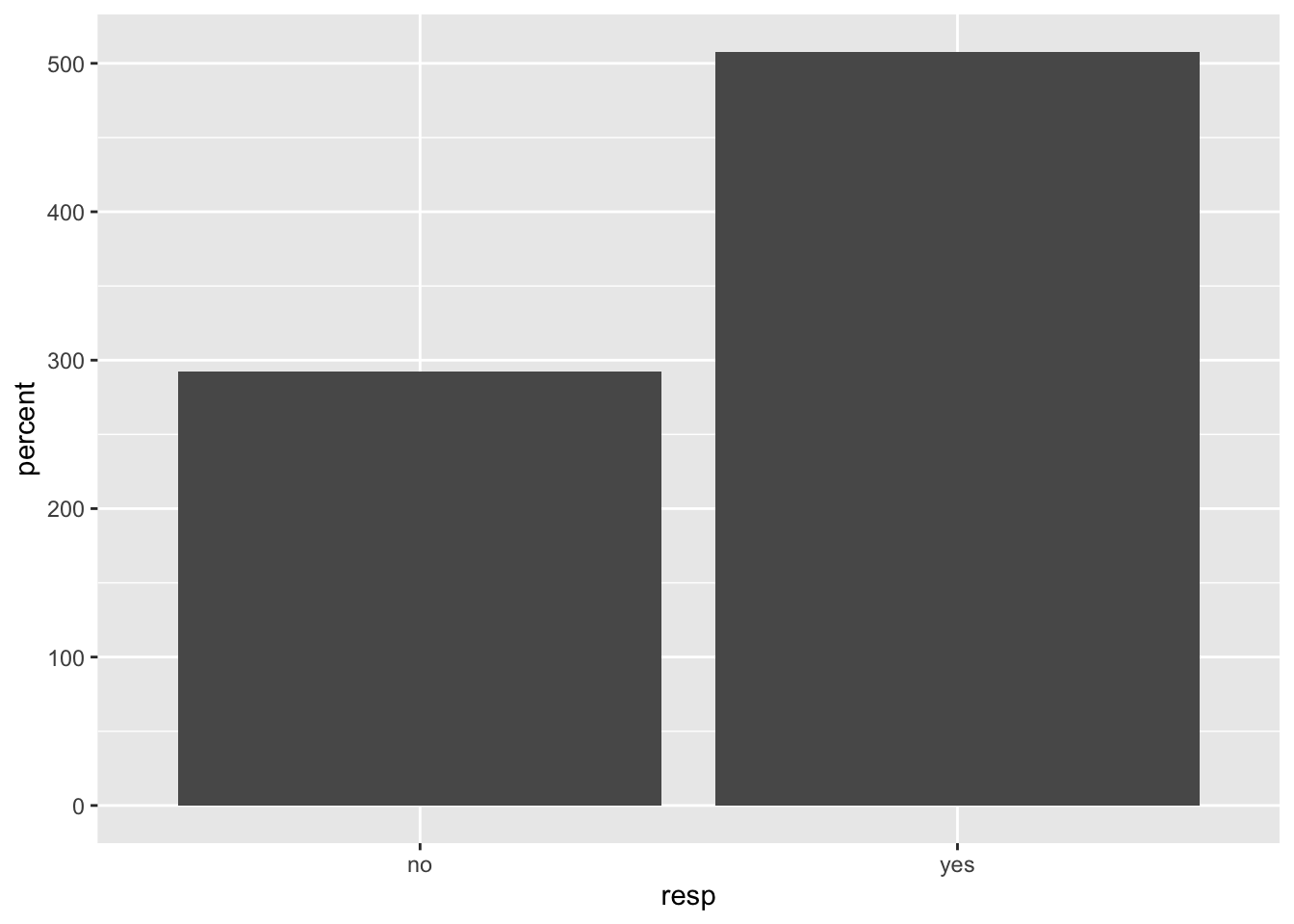
This graph type was chosen to illustrate the clear distinction between the total no votes and total yes votes. If the voting counts were closer in count and percent, a different graph would have been chosen to identify, with clarity, the difference of the voting counts and percentages. The winner of the vote is clear from this depiction, as the bar for the yes vote is taller than the bar for the no vote.
Scatterplot of Percent of Yes and No Votes by Territory
ggplot(am, aes(percent, territory)) + geom_point()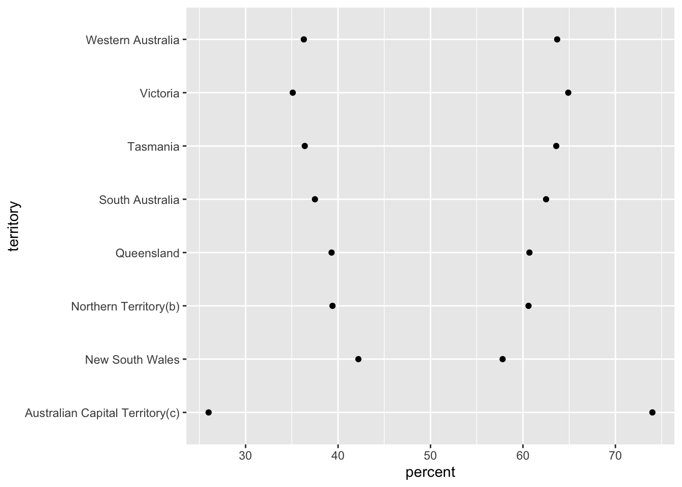
The scatterplot provides an interesting visual of the yes and notes votes by territory, and was chosen to illustrate how the voting behaviors among the territories on this topic can quickly and easily be understood through the depiction of the percentage votes in a scatterplot graph. We can easily see how closely some of the percentage of territories’ total yes and no votes were, such as New South Wales and Queensland. Said differently, the percent of voters of New South Wales and Queensland who voted yes or no vary the least in those two territories, while individual voters’ beliefs on the topic being voted upon may be exceptionally strong.
Australian Capital Territory has the lowest and highest percents of each vote. We know given the overall voting outcome of most votes occurring for yes for same sex marriage law, and the other plotted points on the graph that are above 50%, that the higher percent for the Australian Capital Territory is likely for the yes vote, so we can deduce that the lower percent is for the no vote. This graph isn’t labelled as to which percent represents which type of vote (yes/no), but likely can be for future challenges. If one of the territories had two percent voting that was near 50, we could say that territory had near parity on the topic being voted upon, because the percent scale will always total 100.
Bivariate Visualization(s)
Graphing the Percent of the Overall Australian Yes and No Votes by Territory
What we don’t have is the summed total of all votes of the entire country so as to calculate the percentage of the total yes and the total no votes for all territories combined, nor each territory’s percent contribution to total Australian yes votes or no votes.
Instead of translating the existing dataframe datapoints into percents, this can be accomplished through a calculation of each territory’s portion of the overall Australian percentage of yes or no vote in the graphing function and labeling aesthetics. So, this particular improvement or “tidying” of the data can be accomplished in the code to create the graph. So we will not have a “tidy data” section of this challenge post.
In the stacked bar charts below,the Y-Axis has a label naming it “count”. This is accurate, and we can see the scale is 0 to 1.0, reflecting a numeric spectrum of percentage. The stacked bars are labelled percent, whihc is also accurate, because the percent of total vote is calculated within the stacked bar graph coding.
The stacked bar graph reflects the percent of the total Australian yes and no votes by each territory. The stacked bar graph was chosen to easily illustrate each territory’s contribution to the yes vote and to the no vote, for example, New South Wales contributed approx 13.69% of the total no votes cast by voters in Australia on this topic, and Victoria contributed 16.9% of the total yes votes cast by voters in Australia on this topic.
ggplot(am, aes(fill=territory, y=count, x=resp))+
  geom_bar(position="fill", stat="identity")+
  geom_text(aes(label = paste0((count/sum(count)*100), "%")),
#"geom_text()":adding an in-graph label; "Count/sum(count)*100: calculating the % of each territory over the total Australia population in the given response group; "round": rounding up the percentage
#position_fill: specifying the positions of the labels in the middle of each part of the bar (0.5)
position = position_fill(vjust = 0.5)) 
The percent labels need some rounding, so rounding will be added for the following chart. The rounding is done to the whoel number. Two decimal points for the percent labels would be helpful in future graphs, so providing two decimal points will be investigated for future graphs.
ggplot(am, aes(fill=territory, y=count, x=resp))+
  geom_bar(position="fill", stat="identity")+
  geom_text(aes(label = paste0(round(count/sum(count)*100), "%")),

position = position_fill(vjust = 0.5)) 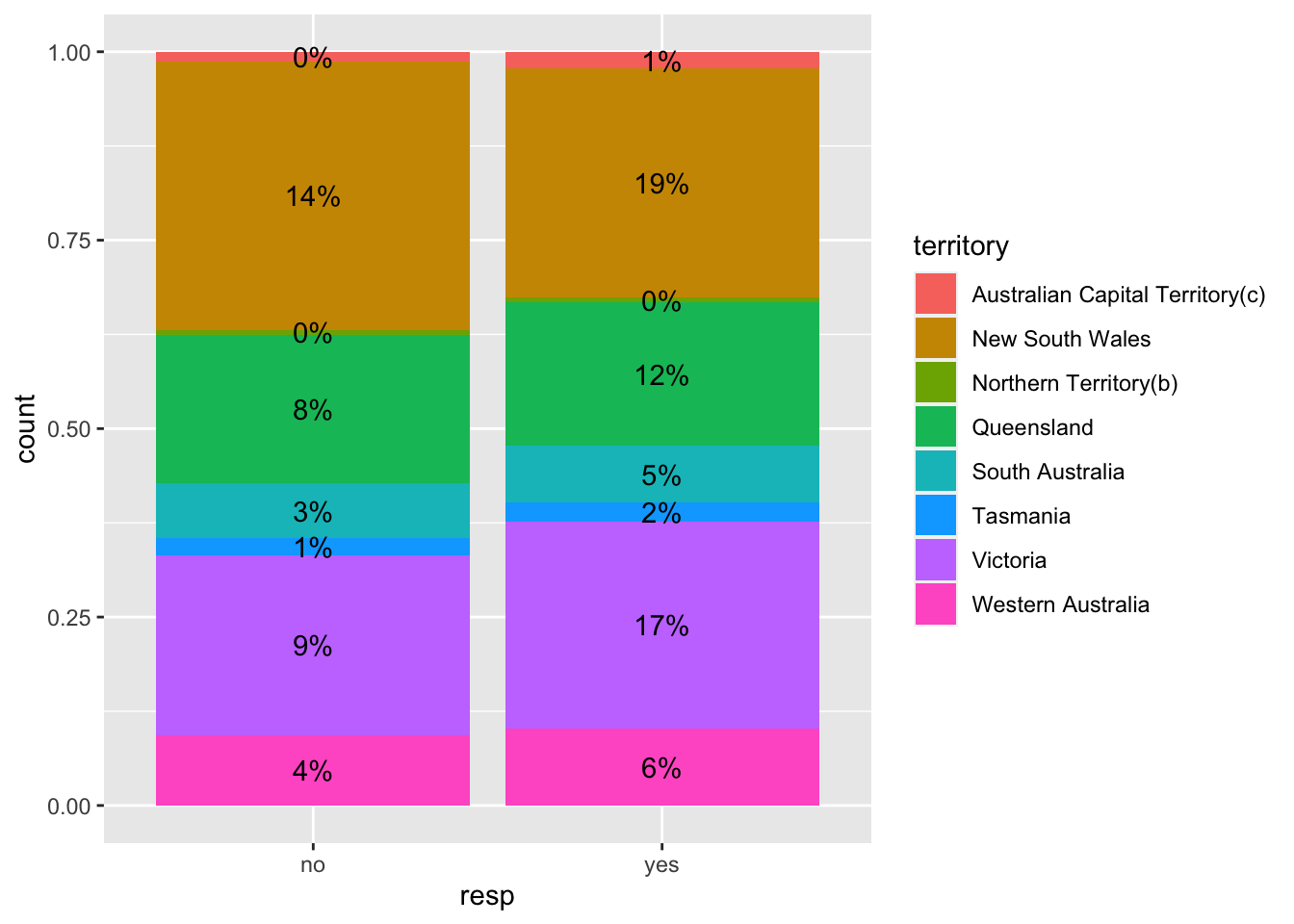
For this challenge, these two graphs are presented together to compliment one another given the value of seeing the decimal places in the first graph, and the less overwhelming view of the second graph. Using both graphs allows users to refer to the percentages with decimal places, especially for the percents that are labelled as “0%” in the second paragraph, which does not provide meaningful information to the audience. The graph without rounding is a bit overwhelming to read, as two decimnal places would provide sufficient detail. In future graphs of this dataset, rounding the percent labels to 2 decimal places will be the goal.
##CONCLUSION
Improvements will nearly always be possible with graphs and data. As my skills with R increase, I look forward to providing more detailed, complete, and easier to read graphs and charts.