library(tidyverse)
library(ggplot2)

knitr::opts_chunk$set(echo = TRUE, warning=FALSE, message=FALSE)
Challenge 5
challenge_5
maanusri balasubramanian
air_bnb
Introduction to Visualization
Challenge Overview
Today’s challenge is to:
- read in a data set, and describe the data set using both words and any supporting information (e.g., tables, etc)
- tidy data (as needed, including sanity checks)
- mutate variables as needed (including sanity checks)
- create at least two univariate visualizations
- try to make them “publication” ready
- Explain why you choose the specific graph type
- Create at least one bivariate visualization
- try to make them “publication” ready
- Explain why you choose the specific graph type
R Graph Gallery is a good starting point for thinking about what information is conveyed in standard graph types, and includes example R code.
(be sure to only include the category tags for the data you use!)
Read in data
Read in one (or more) of the following datasets, using the correct R package and command.
- cereal.csv ⭐
- Total_cost_for_top_15_pathogens_2018.xlsx ⭐
- Australian Marriage ⭐⭐
- AB_NYC_2019.csv ⭐⭐⭐
- StateCounty2012.xls ⭐⭐⭐
- Public School Characteristics ⭐⭐⭐⭐
- USA Households ⭐⭐⭐⭐⭐
# reading data from CSV
ab <- read_csv("_data/AB_NYC_2019.csv")

# peaking into the dataset
head(ab)
# A tibble: 6 × 16
id name host_id host_name neighbourhood_group neighbourhood latitude
<dbl> <chr> <dbl> <chr> <chr> <chr> <dbl>
1 2539 Clean & qu… 2787 John Brooklyn Kensington 40.6
2 2595 Skylit Mid… 2845 Jennifer Manhattan Midtown 40.8
3 3647 THE VILLAG… 4632 Elisabeth Manhattan Harlem 40.8
4 3831 Cozy Entir… 4869 LisaRoxa… Brooklyn Clinton Hill 40.7
5 5022 Entire Apt… 7192 Laura Manhattan East Harlem 40.8
6 5099 Large Cozy… 7322 Chris Manhattan Murray Hill 40.7
# ℹ 9 more variables: longitude <dbl>, room_type <chr>, price <dbl>,
# minimum_nights <dbl>, number_of_reviews <dbl>, last_review <date>,
# reviews_per_month <dbl>, calculated_host_listings_count <dbl>,
# availability_365 <dbl># number of rows in the dataset
nrow(ab)[1] 48895# number of columns in the dataset
ncol(ab)[1] 16# printing column names
colnames(ab) [1] "id" "name"
[3] "host_id" "host_name"
[5] "neighbourhood_group" "neighbourhood"
[7] "latitude" "longitude"
[9] "room_type" "price"
[11] "minimum_nights" "number_of_reviews"
[13] "last_review" "reviews_per_month"
[15] "calculated_host_listings_count" "availability_365" Briefly describe the data
The dataset contains information about Airbnbs in all boroughs in New York City. The dataset has 48895 entries and 16 columns. Each row gives us information about the particular airbnb like type information, location information, owner information, reviews, etc.
Tidy Data (as needed)
Is your data already tidy, or is there work to be done? Be sure to anticipate your end result to provide a sanity check, and document your work here.
Data is already tidy. No extra work needs to be done.
head(ab)# A tibble: 6 × 16
id name host_id host_name neighbourhood_group neighbourhood latitude
<dbl> <chr> <dbl> <chr> <chr> <chr> <dbl>
1 2539 Clean & qu… 2787 John Brooklyn Kensington 40.6
2 2595 Skylit Mid… 2845 Jennifer Manhattan Midtown 40.8
3 3647 THE VILLAG… 4632 Elisabeth Manhattan Harlem 40.8
4 3831 Cozy Entir… 4869 LisaRoxa… Brooklyn Clinton Hill 40.7
5 5022 Entire Apt… 7192 Laura Manhattan East Harlem 40.8
6 5099 Large Cozy… 7322 Chris Manhattan Murray Hill 40.7
# ℹ 9 more variables: longitude <dbl>, room_type <chr>, price <dbl>,
# minimum_nights <dbl>, number_of_reviews <dbl>, last_review <date>,
# reviews_per_month <dbl>, calculated_host_listings_count <dbl>,
# availability_365 <dbl>Are there any variables that require mutation to be usable in your analysis stream? For example, do you need to calculate new values in order to graph them? Can string values be represented numerically? Do you need to turn any variables into factors and reorder for ease of graphics and visualization?
Document your work here.
- Retrieving the count of each neighbourhood_group to use it in the bar graph
- Getting the percentage of each room_type to draw a pie chart and mutating the corresponding labels
# neighbourhood_group distribution
neighgroup_distri <- count(ab, neighbourhood_group)
neighgroup_distri
# A tibble: 5 × 2
neighbourhood_group n
<chr> <int>
1 Bronx 1091
2 Brooklyn 20104
3 Manhattan 21661
4 Queens 5666
5 Staten Island 373# room_type percentage calculation
roomtype_distri <- count(ab, room_type)
roomtype_distri <- mutate(roomtype_distri,
percentage = round(n*100/sum(n), 1),
angle = cumsum(percentage) - (0.5*percentage),
label = paste0(round(percentage), "%")) %>%
select(-n)
roomtype_distri# A tibble: 3 × 4
room_type percentage angle label
<chr> <dbl> <dbl> <chr>
1 Entire home/apt 52 26 52%
2 Private room 45.7 74.8 46%
3 Shared room 2.4 98.9 2% Univariate Visualizations
Drawing a bar graph to visualize the distribution of Airbnbs across NYC’s boroughs.
ggplot(neighgroup_distri, aes(x = neighbourhood_group, y = n/sum(n), fill = neighbourhood_group)) +
  geom_bar(stat = "identity") +
  labs(x = "Borough",
       y = "Percentage of airbnb",
       title = "Airbnb distribution across NYC's neighbourhoods")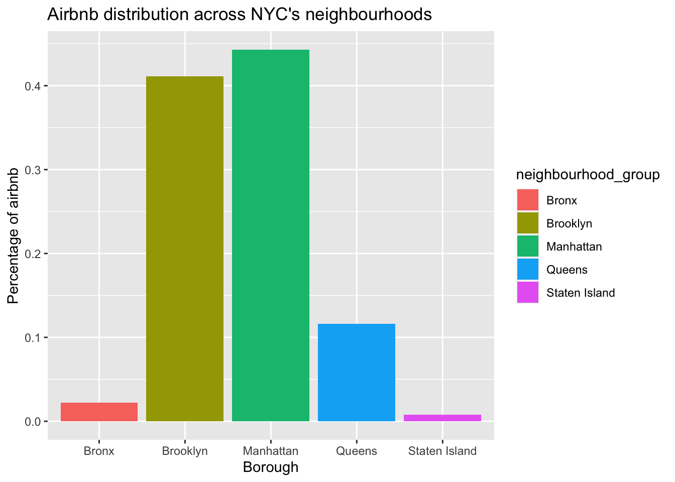
From the above bar graph, we can say that maximum proportion of Airbnbs in NYC are in Manhattan and Staten Island has the minimum proportion of Airbnbs. We can list the boroughs in order of proportion of Airbnbs as: Manhattan, Brooklyn, Queens, Bronx, Staten Island.
Visualizing proportions of each room type using pie chart:
ggplot(roomtype_distri, aes(x = "", y = percentage, fill = room_type)) +
  geom_bar(stat = "identity") +
  geom_text(aes(y = angle, label = label), color = "white") +
  coord_polar("y", start = 0, direction = -1) +
  theme_void() +
  labs(title = "Distibution of different room types across Airbnbs")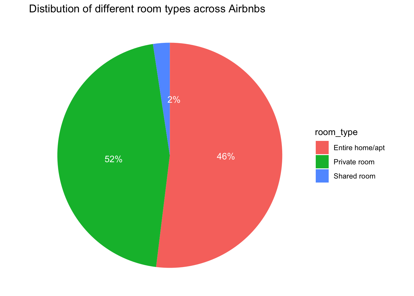
With this pie chart, we can visualize the distribution of different room types (Entire home/apt, Private room, Shared room). We can see that shared rooms are listed the least and most of the Airbnbs are private room listings.
Bivariate Visualization(s)
Using a bar graph to visualize the distribution of room_types in each borough.
ggplot(ab, aes(x = neighbourhood_group, fill = room_type)) +
  geom_bar(position = position_dodge(preserve = "single"))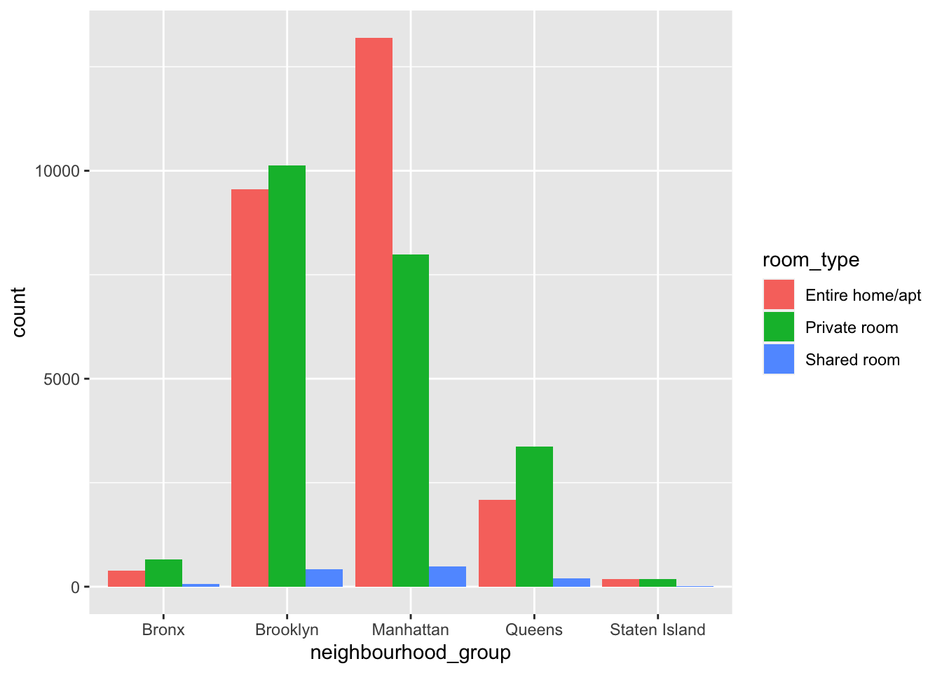
We can understand the type of Airbnbs listed in each borough. For example, in Manhattan most of the listings are entire homes/apt. We can also learn about the borough in which each room type exists the most. For example, most of the shared rooms are also listed in Manhattan.
Visualizing the distribution of prices of various room types using a boxplot.
ggplot(ab, aes(x = room_type, y = price, fill = room_type)) +
  geom_boxplot(fill = "green", alpha = 0.7) +
  theme_bw() +
  labs(title = "Distribution of price according to Room type")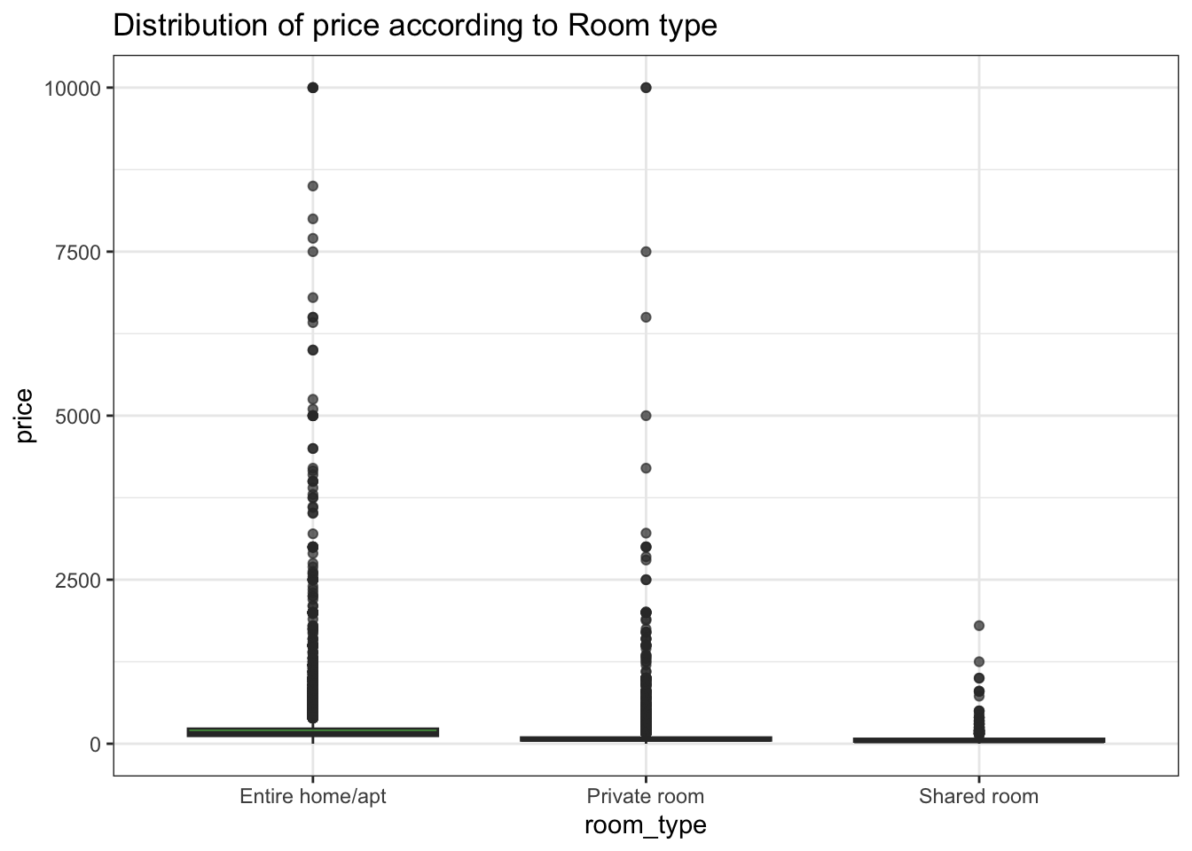
From the boxplot, we can understand the price points of each type of room.