library(tidyverse)
library(ggplot2)

knitr::opts_chunk$set(echo = TRUE, warning=FALSE, message=FALSE)Challenge 6
debt
Matt Eckstein
Visualizing Time and Relationships
Read in data
library(readxl)
debt <- read_xlsx("_data/debt_in_trillions.xlsx")
Briefly describe the data
This dataset contains the total amount of household debt of six types in the United States, as well as total household debt, for every quarter between quarter 1 of 2003 and quarter 2 of 2021 inclusive.
Tidy Data (as needed)
Is your data already tidy, or is there work to be done? Be sure to anticipate your end result to provide a sanity check, and document your work here.
These data are tidy.
#Nothing needed hereAre there any variables that require mutation to be usable in your analysis stream? For example, do you need to calculate new values in order to graph them? Can string values be represented numerically? Do you need to turn any variables into factors and reorder for ease of graphics and visualization?
Document your work here.
#I check the structure of the dataset; everything is numeric except for `Year and Quarter`.
str(debt)
tibble [74 x 8] (S3: tbl_df/tbl/data.frame)
$ Year and Quarter: chr [1:74] "03:Q1" "03:Q2" "03:Q3" "03:Q4" ...
$ Mortgage : num [1:74] 4.94 5.08 5.18 5.66 5.84 ...
$ HE Revolving : num [1:74] 0.242 0.26 0.269 0.302 0.328 0.367 0.426 0.468 0.502 0.528 ...
$ Auto Loan : num [1:74] 0.641 0.622 0.684 0.704 0.72 0.743 0.751 0.728 0.725 0.774 ...
$ Credit Card : num [1:74] 0.688 0.693 0.693 0.698 0.695 0.697 0.706 0.717 0.71 0.717 ...
$ Student Loan : num [1:74] 0.241 0.243 0.249 0.253 0.26 ...
$ Other : num [1:74] 0.478 0.486 0.477 0.449 0.447 ...
$ Total : num [1:74] 7.23 7.38 7.56 8.07 8.29 ...#Though I preserve the original dataset as well, since keeping the year and quarter variable together in the original form is useful in some circumstances for readability, here, I separate them into two variables to make calculations easier.
debt2 <- debt %>%
separate(`Year and Quarter`, into = c("Year", "Quarter"),sep = ":")
#Then, I drop the Q from the quarter variables by separating out the Q.
debt2 <- debt2 %>%
separate(Quarter, into = c("delete", "Quarter"),sep = "Q")
#Finally, I get rid of the blank variable created by this process, reunite the year and quarter, and change the variable type - it's now numeric! This
debt2 <- debt2 %>%
unite(`yearquarter`, Year:Quarter, sep = "", remove=TRUE)
debt2 <- debt2 %>%
mutate(yearquarter=as.numeric(yearquarter))
str(debt)tibble [74 x 8] (S3: tbl_df/tbl/data.frame)
$ Year and Quarter: chr [1:74] "03:Q1" "03:Q2" "03:Q3" "03:Q4" ...
$ Mortgage : num [1:74] 4.94 5.08 5.18 5.66 5.84 ...
$ HE Revolving : num [1:74] 0.242 0.26 0.269 0.302 0.328 0.367 0.426 0.468 0.502 0.528 ...
$ Auto Loan : num [1:74] 0.641 0.622 0.684 0.704 0.72 0.743 0.751 0.728 0.725 0.774 ...
$ Credit Card : num [1:74] 0.688 0.693 0.693 0.698 0.695 0.697 0.706 0.717 0.71 0.717 ...
$ Student Loan : num [1:74] 0.241 0.243 0.249 0.253 0.26 ...
$ Other : num [1:74] 0.478 0.486 0.477 0.449 0.447 ...
$ Total : num [1:74] 7.23 7.38 7.56 8.07 8.29 ...Time Dependent Visualization
ggplot(debt, aes(x=`Year and Quarter`, y=Total)) +
  theme_classic(base_size = 20) +
  geom_point(position=position_dodge(), stat="identity") +
  xlab("Year and Quarter") +
  ylab("Total All-Type Household Debt (trillions of $)") +
  theme(axis.text.x = element_text(angle=90)) +
  theme(axis.text.x = element_text(size = 6)) +
theme(axis.title = element_text(size = 10)) 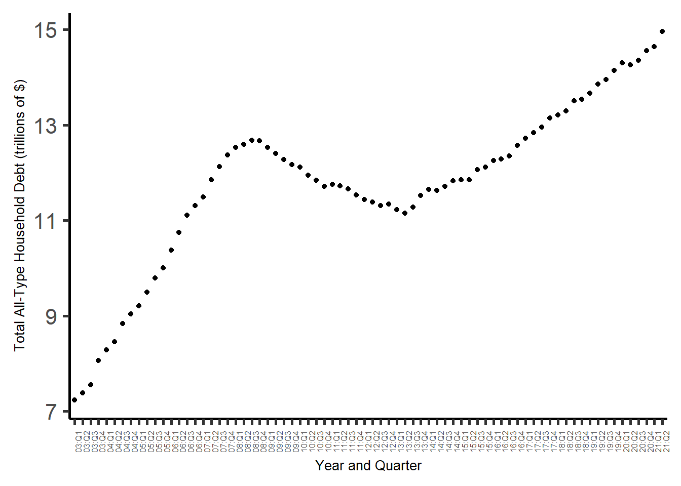
Visualizing Part-Whole Relationships
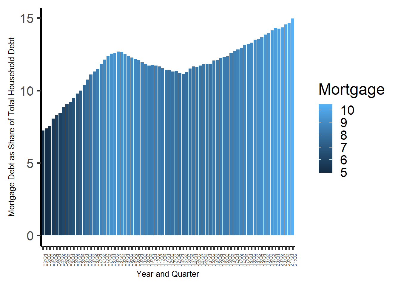
Here, I modify the above graph to display the relationship of mortgage debt to total debt, with the color indicating growth in mortgage debt and the line indicating growth in total debt. (I tried various approaches to making total debt bars that filled up to a certain point in a different color for the share of the total debt that was mortgage debt, but to no avail.)
ggplot(debt, aes(x=`Year and Quarter`, y=Total, fill=Mortgage)) +
  theme_classic(base_size = 20) +
  geom_bar(position=position_dodge(), stat="identity") +
  xlab("Year and Quarter") +
  ylab("Mortgage Debt as Share of Total Household Debt") +
  theme(axis.text.x = element_text(angle=90)) +
  theme(axis.text.x = element_text(size = 6)) +
  theme(axis.title = element_text(size = 10))