library(tidyverse)
library(ggplot2)

knitr::opts_chunk$set(echo = TRUE, warning=FALSE, message=FALSE)Challenge 7
australian_marriage
Visualizing Multiple Dimensions
Read in data
marriage <- read_csv("_data/australian_marriage_tidy.csv")

marriage <- mutate(marriage, territory = recode(territory, "Australian Capital Territory(c)" = "Australian Capital Territory", "Northern Territory(b)" = "Northern Territory"))
Briefly describe the data
These data are the percentages of “yes” and “no” votes by state and territory in Australia’s 2017 postal survey regarding the legalization of same-sex marriage.
Tidy Data (as needed)
Is your data already tidy, or is there work to be done? Be sure to anticipate your end result to provide a sanity check, and document your work here.
The dataset is already tidy.
#Nothing to show hereAre there any variables that require mutation to be usable in your analysis stream? For example, do you need to calculate new values in order to graph them? Can string values be represented numerically? Do you need to turn any variables into factors and reorder for ease of graphics and visualization?
Document your work here.
All variable types are suitable for use in graphs in their current state. (I considered recoding “no” and “yes” as 0 and 1, but decided against it because these are nominal values, and any calculations based on them could be misleading.)
str(marriage)tibble [16 x 4] (S3: tbl_df/tbl/data.frame)
$ territory: chr [1:16] "New South Wales" "New South Wales" "Victoria" "Victoria" ...
$ resp : chr [1:16] "yes" "no" "yes" "no" ...
$ count : num [1:16] 2374362 1736838 2145629 1161098 1487060 ...
$ percent : num [1:16] 57.8 42.2 64.9 35.1 60.7 39.3 62.5 37.5 63.7 36.3 ...Visualization with Multiple Dimensions
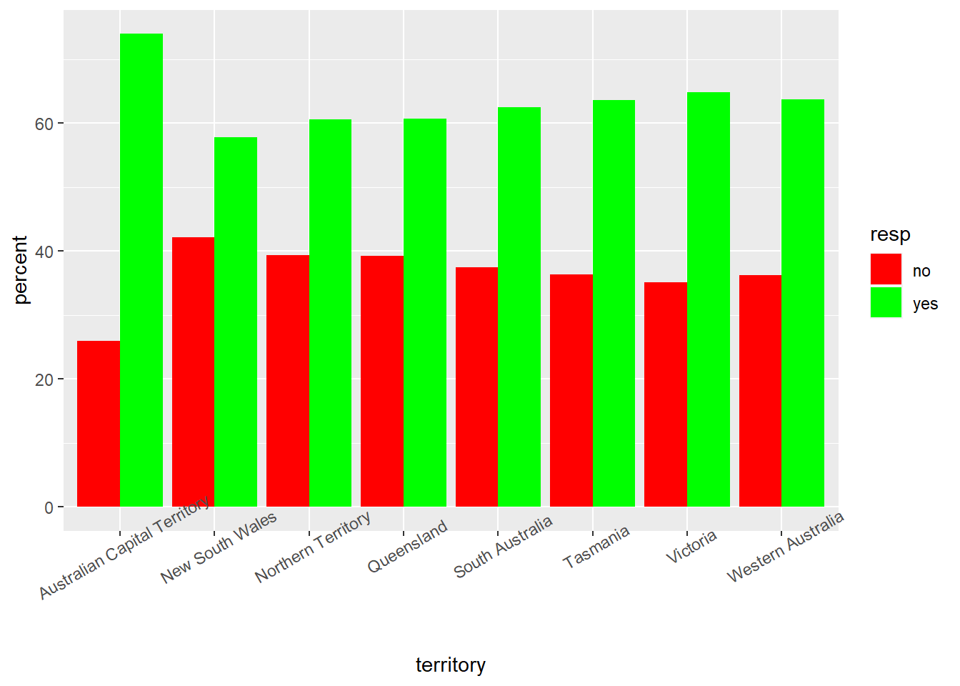
I chose a faceted bar graph because it is a clean way of displaying the results of the referendum broken out by state or territory.
This visualization displays the stark contrast between the Australian Capital Territory and New South Wales, the areas most and least supportive of the referendum. It is also apparent how similar the results breakdown is among Australia’s other six states/territories, each of which had a share of yes votes in a fairly tight band of roughly 61 to 65 percent.
I also display the overall results on a single bar graph for the sake of ease of comparison with the state-by-state results, and stacked and dodge bar graphs to explore the results by state/territory from other points of view. In particular, the stacked bar graphs are another neat display of the state-by-state differences in results.
summary(marriage) territory resp count percent
Length:16 Length:16 Min. : 31690 Min. :26.00
Class :character Class :character 1st Qu.: 159008 1st Qu.:37.23
Mode :character Mode :character Median : 524226 Median :50.00
Mean : 793202 Mean :50.00
3rd Qu.:1242589 3rd Qu.:62.77
Max. :2374362 Max. :74.00 ggplot(data = marriage, aes(x=resp, y=percent, fill = resp)) + geom_bar(stat="identity") + facet_wrap(~territory) + scale_fill_manual(values = c("yes" = "green", "no" = "red"))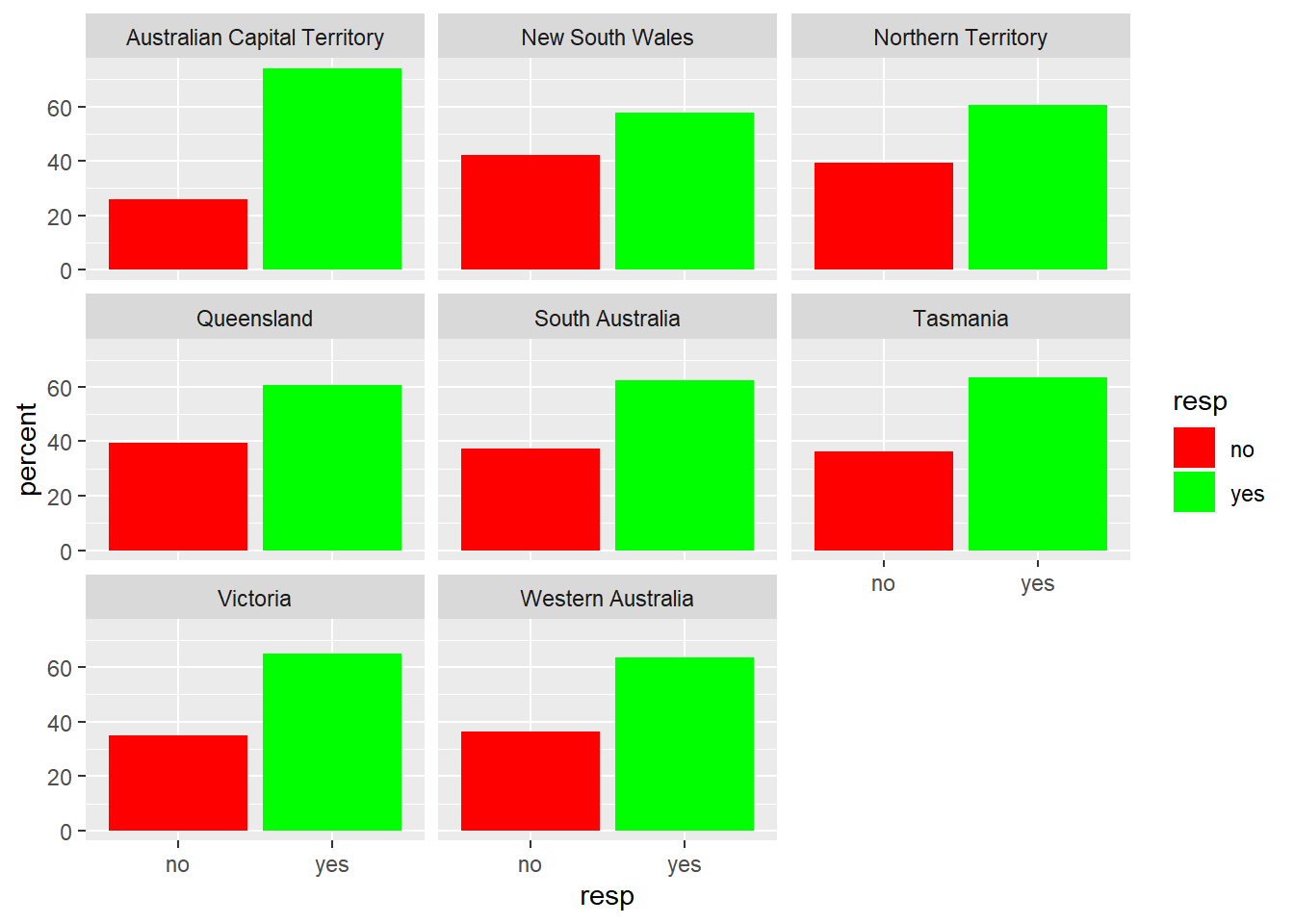
ggplot(data = marriage, aes(x=resp, y=percent, fill = resp)) + geom_bar(stat="identity", position="dodge") + scale_fill_manual(values = c("yes" = "green", "no" = "red"))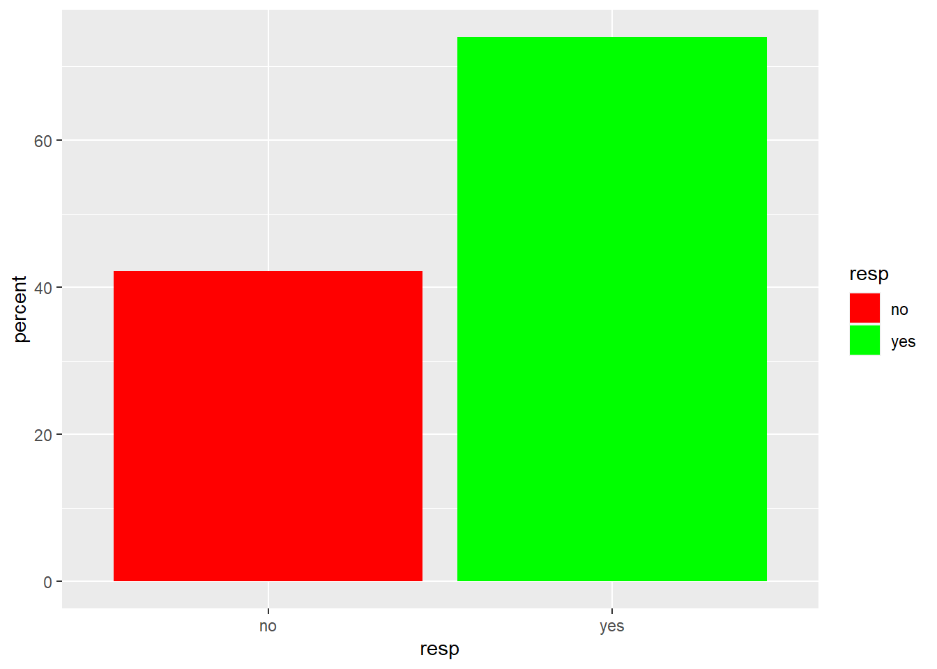
ggplot(data = marriage, aes(x=territory, y=percent, group = resp, fill = resp)) + geom_bar(stat="identity", position="stack") + theme(axis.text.x = element_text(angle=30)) + scale_fill_manual(values = c("yes" = "green", "no" = "red"))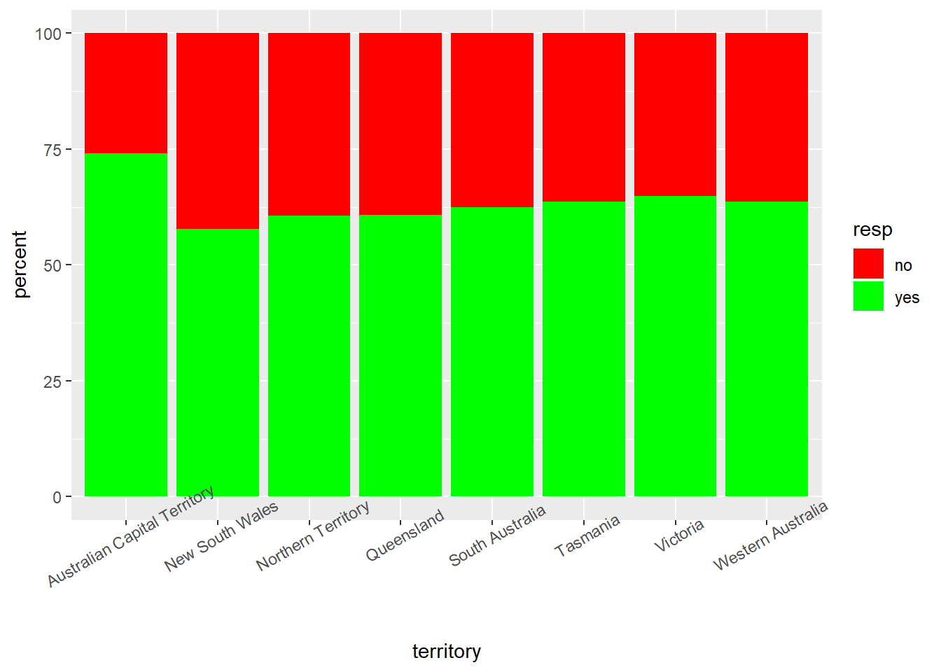
ggplot(data = marriage, aes(x=territory, y=percent, group = resp, fill = resp)) + geom_bar(stat="identity", position="dodge") + theme(axis.text.x = element_text(angle=30)) + scale_fill_manual(values = c("yes" = "green", "no" = "red"))