library(tidyverse)
library(summarytools)
library(dbplyr)
library(readr)
library(lubridate)
library(tidyr)
library(ggplot2)
library(scales)

knitr::opts_chunk$set(echo = TRUE, warning=FALSE, message=FALSE)Challenge 6 Instructions
challenge_6
Michele Carlin
fed_rate
Visualizing Time and Relationships
Read in and view summary of ‘FedFundsRate’ dataset.
FedRates <- read_csv ("_data/FedFundsRate.csv")
View(FedRates)
view(dfSummary(FedRates))
This dataset contains 904 rows and 10 columns. Each row contains various federal funds data points (e.g., the Effective Federal Funds Rate, including lower and upper targets, as well as unemployment and inflation rates). Monthly data is provided from 1954 to 2017.
Based on my review of the df summary, it appears that the majority of the data is from the 1st of each month, therefore I am going to run a frequency table to see how many rows are from dates other than the 1st of the month.
FedRates %>% count(Day)# A tibble: 29 × 2
Day n
<dbl> <int>
1 1 753
2 2 6
3 3 3
4 4 4
5 5 4
6 6 10
7 7 4
8 8 4
9 9 7
10 10 3
# … with 19 more rowsAfter reviewed the frequency table above of the ‘Day’ variable, you can see that the majority of the data is based on the 1st of each month, therefore I am going to filter out all rows that are not from the 1st of the month.
sum(FedRates$Day > 1, na.rm=TRUE)[1] 151nrow(FedRates)[1] 904FedRates <- FedRates %>%
filter(Day == 1)
nrow(FedRates)[1] 753FedRates <- FedRates%>%
mutate(date = make_date(Year, Month, Day))
select(FedRates, Year, Month, Day, date)# A tibble: 753 × 4
Year Month Day date
<dbl> <dbl> <dbl> <date>
1 1954 7 1 1954-07-01
2 1954 8 1 1954-08-01
3 1954 9 1 1954-09-01
4 1954 10 1 1954-10-01
5 1954 11 1 1954-11-01
6 1954 12 1 1954-12-01
7 1955 1 1 1955-01-01
8 1955 2 1 1955-02-01
9 1955 3 1 1955-03-01
10 1955 4 1 1955-04-01
# … with 743 more rowsview(dfSummary(FedRates))Summarise “umemployment rate” variable.
FedRates %>%
  group_by(Year) %>%
  summarise(Avg_UR = mean(`Unemployment Rate`),
            Min_UR = min(`Unemployment Rate`),
            Max_UR = max(`Unemployment Rate`))
# A tibble: 64 × 4
Year Avg_UR Min_UR Max_UR
<dbl> <dbl> <dbl> <dbl>
1 1954 5.65 5 6.1
2 1955 4.37 4 4.9
3 1956 4.12 3.9 4.4
4 1957 4.3 3.7 5.2
5 1958 6.84 5.8 7.5
6 1959 5.45 5 6
7 1960 5.54 4.8 6.6
8 1961 6.69 6 7.1
9 1962 5.57 5.4 5.8
10 1963 5.64 5.4 5.9
# … with 54 more rowsTime series graph.
FedRates %>%
 filter(!is.na(`Unemployment Rate`)) %>%
 ggplot(aes(x=date, y=`Unemployment Rate`)) +
   geom_line()+
   labs(title = "Unemployment Rates: 1954 - 2017", x = "Date", y = "Rate")+
  scale_x_date(date_breaks = "5 years")+
  theme(axis.text.x=element_text(angle=45,hjust=1))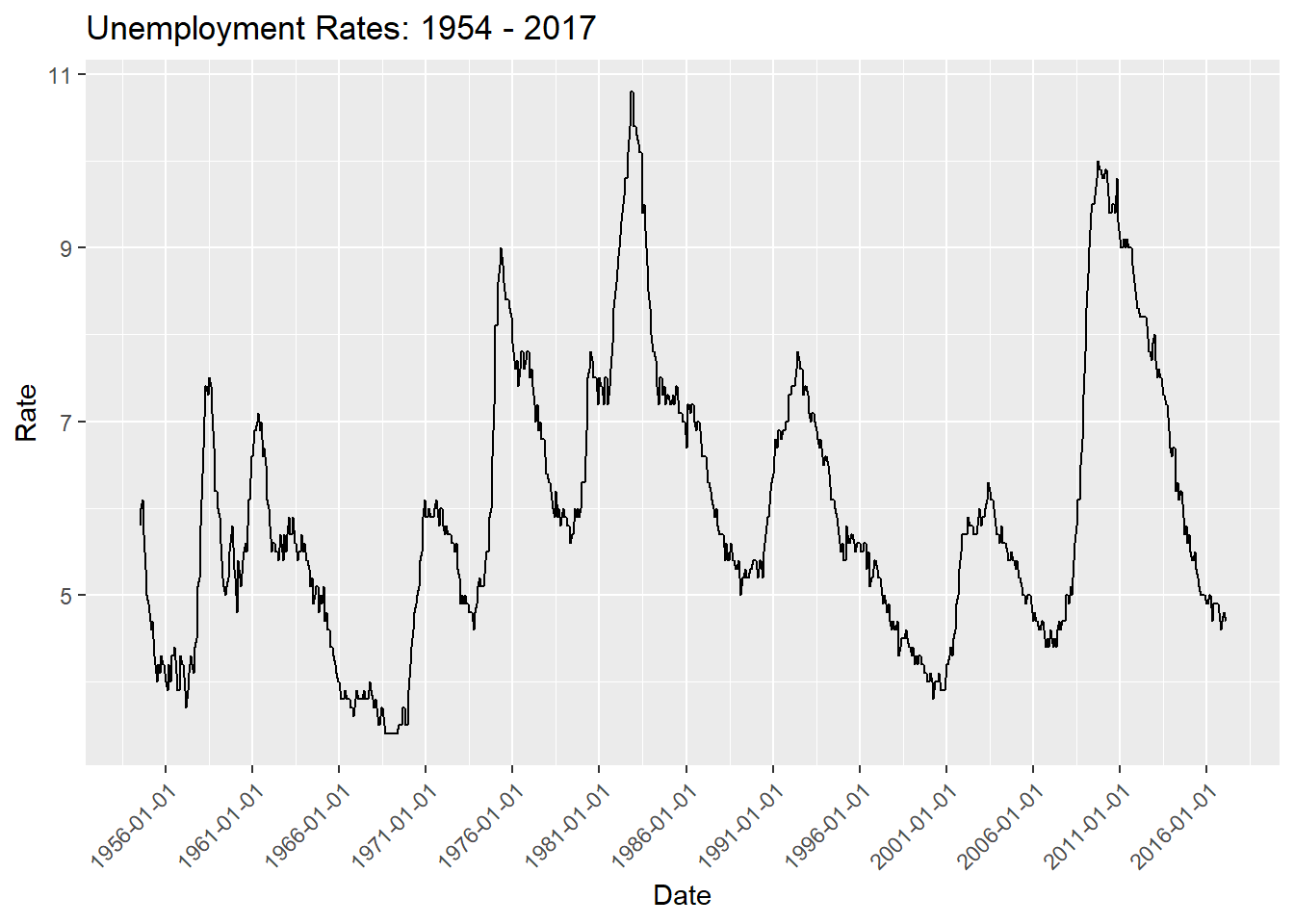
FedRates %>%
  filter(!is.na(`Unemployment Rate`) & !is.na(`Inflation Rate`)) %>%
ggplot(aes (date)) +
  geom_line(aes(y = `Unemployment Rate`, colour = "red", labels = "Unemployment")) +
  geom_line(aes(y = `Inflation Rate`, colour = "blue"))+
   labs(title = "Unemployment and Inflation Rates: 1954 - 2017", y = "Rate", x = "Year")+
  scale_x_date(date_breaks = "5 years", labels = date_format("%Y"))+
  theme(axis.text.x=element_text(angle=45,hjust=1))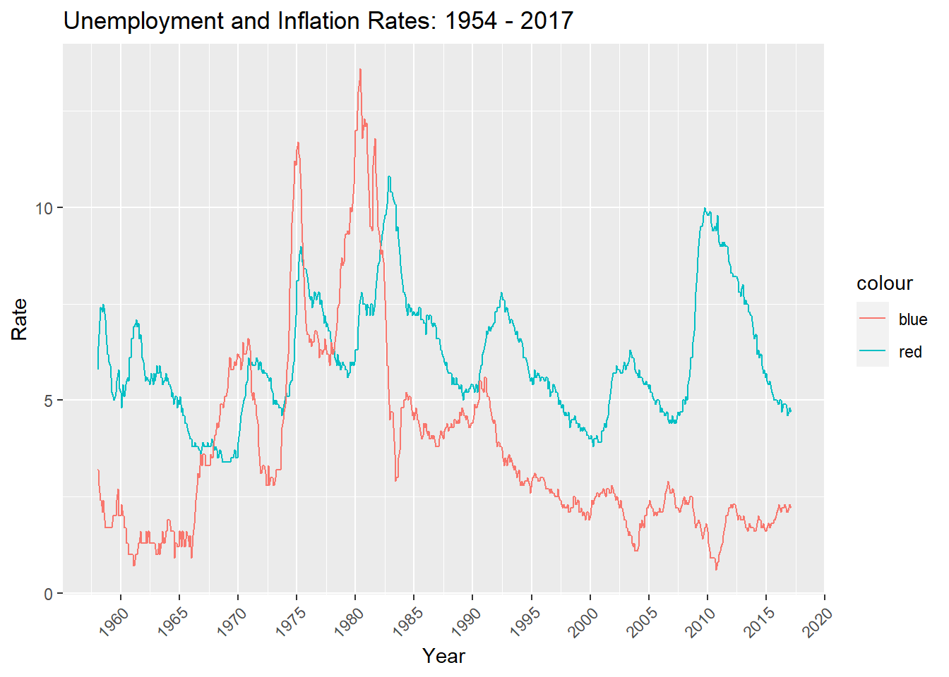
How do I change labels on legend?
Create new ‘Quarter’ variable using mutate and lubridate.
FedRates <- FedRates %>%
  mutate(Quarter = paste0(quarter(date)))
Create clustered bar graph using new ‘Quarter’ variable.
FedRates %>%
  filter(Year > 2009 & Year < 2018) %>%
  ggplot(aes(fill=Quarter, x=Year, y=`Unemployment Rate`)) +
  geom_bar(position="dodge", stat="summary") +
     labs(title = "Quarterly Unemployment Rate: 2010 - 2017 ", y = "Rate", x = "Year")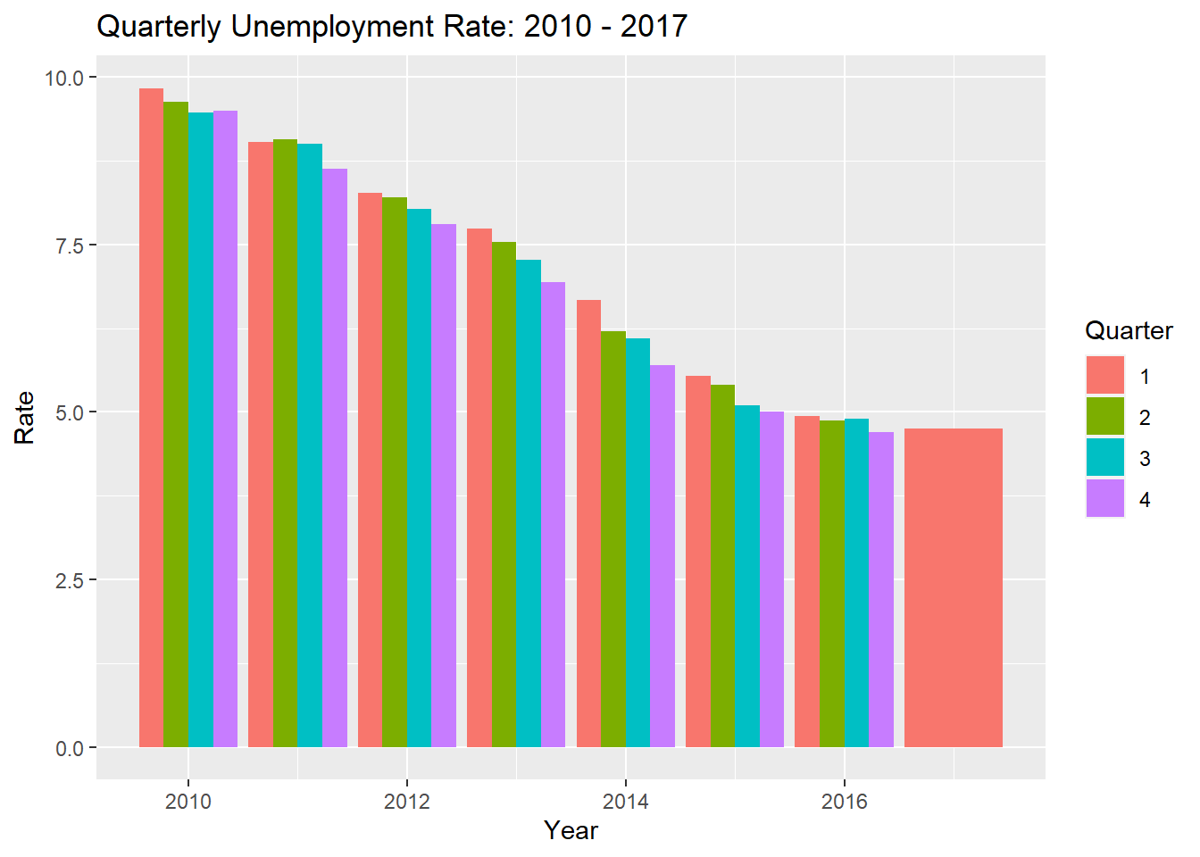
how do I get all x-axis labels to show on graph? there is only Q1 data available for 2017 - is there a way to make the red bar the same width as the other red bars?