 Total cost of foodborne illness estimates for 15 leading foodborne pathogens
 Length:27
 Class :character
 Mode  :character
     ...2               ...3
 Length:27          Length:27
 Class :character   Class :character
 Mode  :character   Mode  :character
Code
#The data shows the cost associated with foodborne diseases in 2018 for top 15 foodborne pathogens causing the disease.#extracting all the column namescolnames(cost_of_illness_data)
[1] "Total cost of foodborne illness estimates for 15 leading foodborne pathogens"
[2] "...2"
[3] "...3"
Code
#Changing the column names to make it more informative and effectivecolnames(cost_of_illness_data)[1] ="pathogens"colnames(cost_of_illness_data)[2] ="case"colnames(cost_of_illness_data)[3] ="cost"colnames(cost_of_illness_data)
[1] "pathogens" "case" "cost"
Code
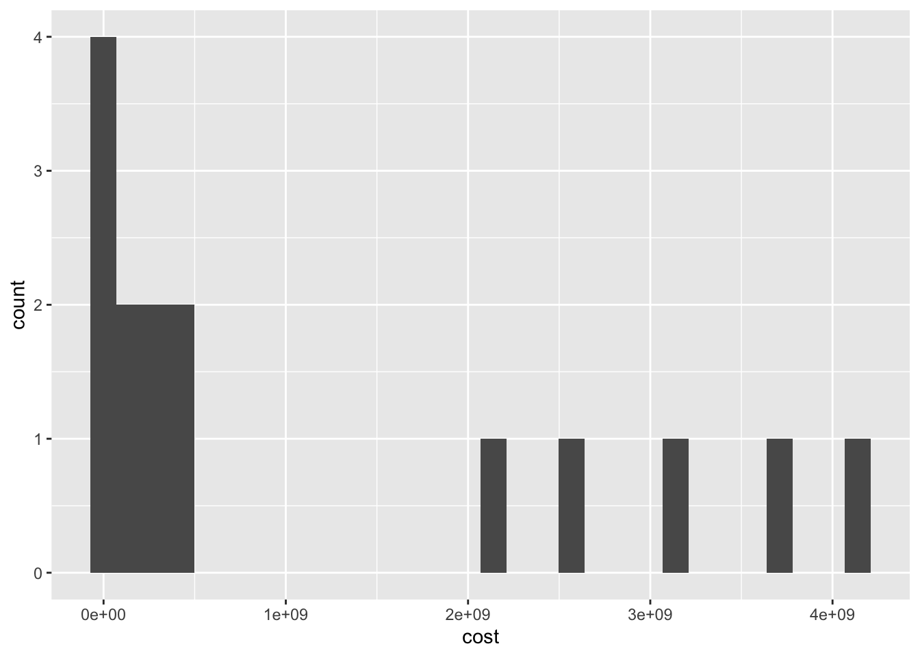
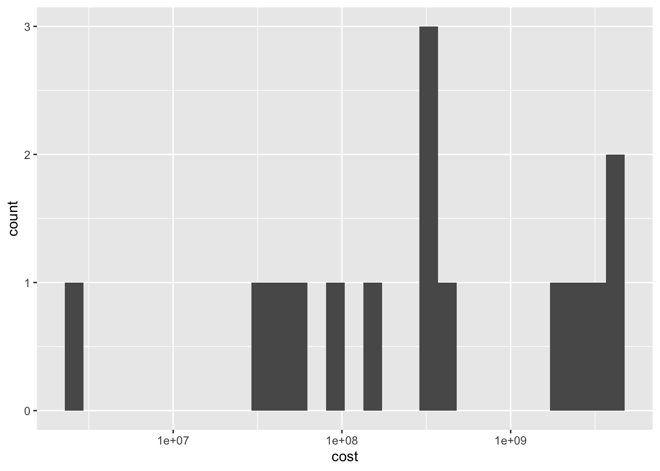
#Reading the dataset, shows that there are a lot of rows which don't contain any values or are NA, so, I am removing those rows. The last row is the total of the 15 pathogens, so we can remove that as well. cost_of_illness_data<-na.omit(cost_of_illness_data)cost_of_illness_data<- cost_of_illness_data[-16,]# Making the values numeric so that it can be plottedcost_of_illness_data$case<-as.numeric(cost_of_illness_data$case)cost_of_illness_data$cost<-as.numeric(cost_of_illness_data$cost)cost_of_illness_data
`stat_bin()` using `bins = 30`. Pick better value with `binwidth`.
Code
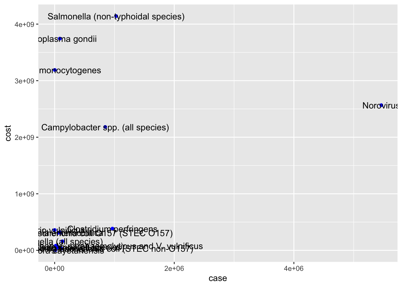
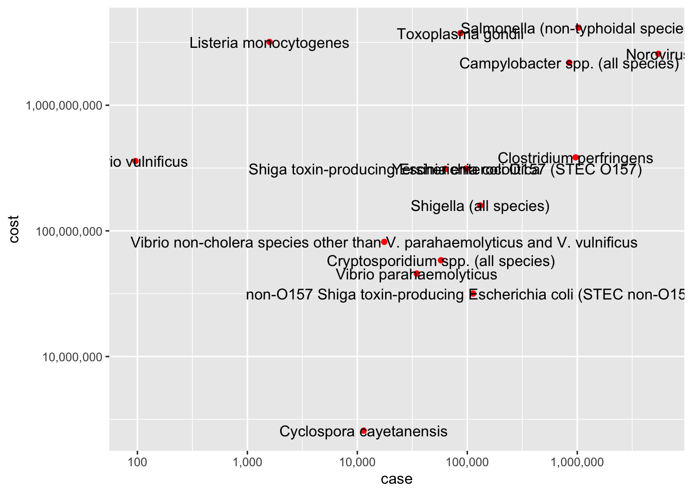
# Bivariate Visualization #x axis - number of cases, y axis - estimated costs, the points denotes the pathogens associated with it ggplot(cost_of_illness_data, aes(case,cost,label=pathogens)) +geom_point(color="blue")+geom_text()
Warning: Continuous x aesthetic
ℹ did you forget `aes(group = ...)`?
Source Code
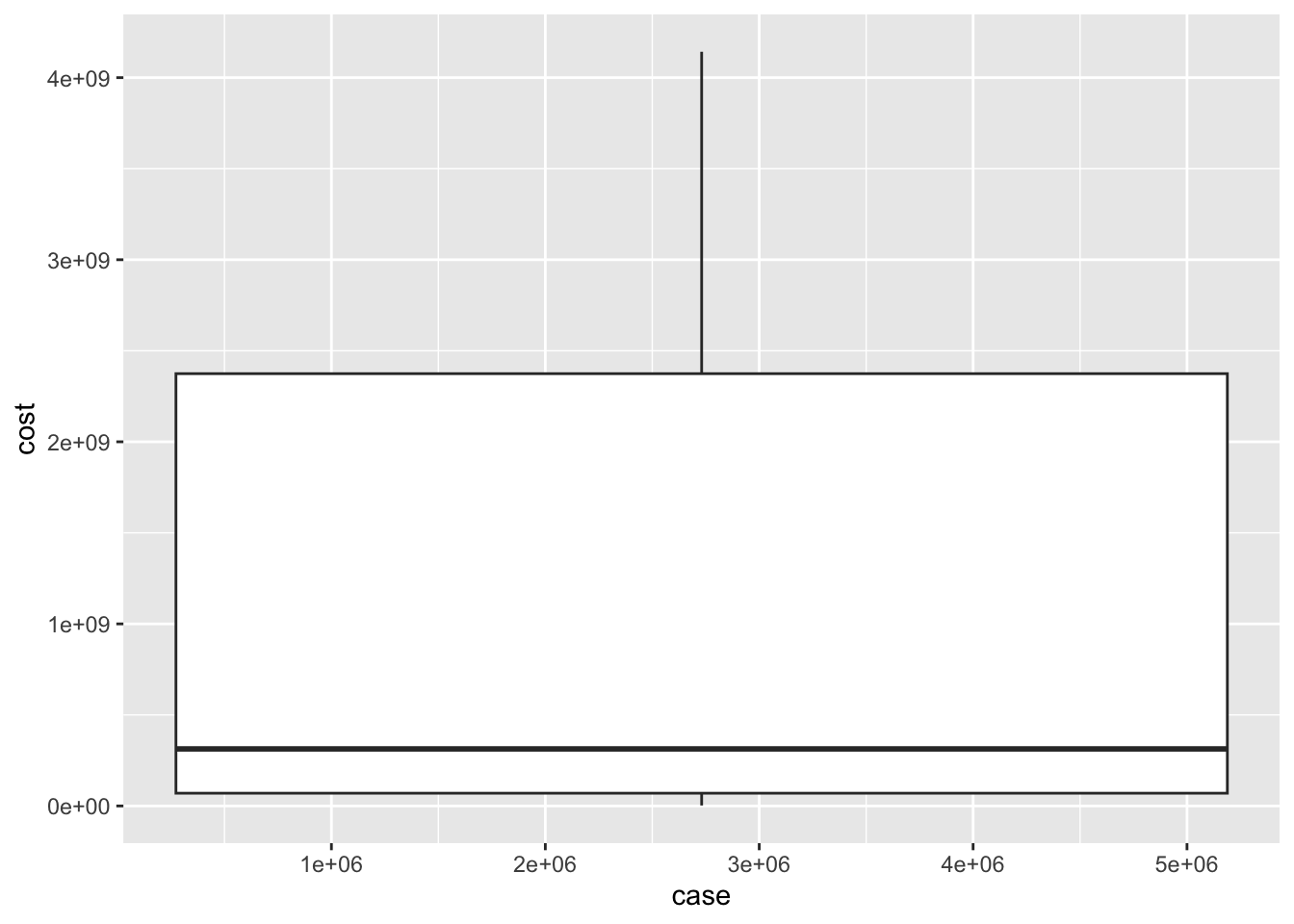
---title: "Visualizing a dataset"author: "Neha Jhurani"desription: "Using ggplot2 to visualize: Total_cost_for_top_15_pathogens_2018.xlsx"date: "04/12/2023"format: html: toc: true code-fold: true code-copy: true code-tools: truecategories: - challenge5 - Neha Jhurani - Total_cost_for_top_15_pathogens_2018.xlsx---```{r}#| label: setup#| warning: falselibrary(tidyverse)library(ggplot2)knitr::opts_chunk$set(echo =TRUE)```## Total_cost_for_top_15_pathogens_2018```{r}library(readxl)#reading Total_cost_for_top_15_pathogens_2018 csv datacost_of_illness_data <-read_excel("_data/Total_cost_for_top_15_pathogens_2018.xlsx")summary(cost_of_illness_data)#The data shows the cost associated with foodborne diseases in 2018 for top 15 foodborne pathogens causing the disease.#extracting all the column namescolnames(cost_of_illness_data)#Changing the column names to make it more informative and effectivecolnames(cost_of_illness_data)[1] ="pathogens"colnames(cost_of_illness_data)[2] ="case"colnames(cost_of_illness_data)[3] ="cost"colnames(cost_of_illness_data)#Reading the dataset, shows that there are a lot of rows which don't contain any values or are NA, so, I am removing those rows. The last row is the total of the 15 pathogens, so we can remove that as well. cost_of_illness_data<-na.omit(cost_of_illness_data)cost_of_illness_data<- cost_of_illness_data[-16,]# Making the values numeric so that it can be plottedcost_of_illness_data$case<-as.numeric(cost_of_illness_data$case)cost_of_illness_data$cost<-as.numeric(cost_of_illness_data$cost)cost_of_illness_data#Univariate Visualizations - Using the cost columnsggplot(cost_of_illness_data, aes(x=cost)) +geom_histogram()ggplot(cost_of_illness_data, aes(x=cost)) +geom_histogram()+scale_x_continuous(trans ="log10")# Bivariate Visualization #x axis - number of cases, y axis - estimated costs, the points denotes the pathogens associated with it ggplot(cost_of_illness_data, aes(case,cost,label=pathogens)) +geom_point(color="blue")+geom_text()ggplot(cost_of_illness_data, aes(x=case, y=cost, label=pathogens)) +geom_point(color ="red")+scale_x_continuous(trans ="log10", labels = scales::comma)+scale_y_continuous(trans ="log10", labels = scales::comma)+geom_text()ggplot(cost_of_illness_data, aes(case, cost)) +geom_boxplot()```