library(tidyverse)
library(ggplot2)

knitr::opts_chunk$set(echo = TRUE, warning = FALSE, message = FALSE)
Challenge 6
challenge_6
hotel_bookings
air_bnb
fed_rate
debt
usa_households
abc_poll
Visualizing Time and Relationships
Challenge Overview
Today’s challenge is to:
- read in a data set, and describe the data set using both words and any supporting information (e.g., tables, etc)
- tidy data (as needed, including sanity checks)
- mutate variables as needed (including sanity checks)
- create at least one graph including time (evolution)
- try to make them “publication” ready (optional)
- Explain why you choose the specific graph type
- Create at least one graph depicting part-whole or flow relationships
- try to make them “publication” ready (optional)
- Explain why you choose the specific graph type
R Graph Gallery is a good starting point for thinking about what information is conveyed in standard graph types, and includes example R code.
(be sure to only include the category tags for the data you use!)
Read in data
Read in one (or more) of the following datasets, using the correct R package and command.
- debt ⭐
- fed_rate ⭐⭐
- abc_poll ⭐⭐⭐
- usa_hh ⭐⭐⭐
- hotel_bookings ⭐⭐⭐⭐
- AB_NYC ⭐⭐⭐⭐⭐
df <- readxl::read_excel("./_data/debt_in_trillions.xlsx")
head(df)
# A tibble: 6 × 8
`Year and Quarter` Mortgage `HE Revolving` Auto …¹ Credi…² Stude…³ Other Total
<chr> <dbl> <dbl> <dbl> <dbl> <dbl> <dbl> <dbl>
1 03:Q1 4.94 0.242 0.641 0.688 0.241 0.478 7.23
2 03:Q2 5.08 0.26 0.622 0.693 0.243 0.486 7.38
3 03:Q3 5.18 0.269 0.684 0.693 0.249 0.477 7.56
4 03:Q4 5.66 0.302 0.704 0.698 0.253 0.449 8.07
5 04:Q1 5.84 0.328 0.72 0.695 0.260 0.446 8.29
6 04:Q2 5.97 0.367 0.743 0.697 0.263 0.423 8.46
# … with abbreviated variable names ¹`Auto Loan`, ²`Credit Card`,
# ³`Student Loan`Briefly describe the data
Tidy Data (as needed)
Is your data already tidy, or is there work to be done? Be sure to anticipate your end result to provide a sanity check, and document your work here.
the data is ready for analysis without further cleaning or reshaping.
Are there any variables that require mutation to be usable in your analysis stream? For example, do you need to calculate new values in order to graph them? Can string values be represented numerically? Do you need to turn any variables into factors and reorder for ease of graphics and visualization?
Document your work here.
df$date <- as.Date(paste0("01-",gsub(":Q", "-01-", df$"Year and Quarter")), format = "%d-%y-%m")

df[, 2:8] <- sapply(df[, 2:8], as.numeric)

df$Mortgage_pct <- df$Mortgage / df$Total * 100
df$HE_Revolving_pct <- df$"HE Revolving" / df$Total * 100
df$Auto_Loan_pct <- df$"Auto Loan" / df$Total * 100
df$Credit_Card_pct <- df$"Credit Card" / df$Total * 100
df$Student_Loan_pct <- df$"Student Loan" / df$Total * 100
df$Other_pct <- df$Other / df$Total * 100
Time Dependent Visualization
I chose a line chart because it is ideal for showing the trend or evolution of a variable over time. The x-axis shows the year, and the y-axis shows the total debt amount. Each point on the line represents the total debt amount for a specific quarter. By connecting the points with a line, we can see how the total debt amount has changed over time. The line chart is also useful for identifying any seasonal patterns or trends in the data.
library(ggplot2)
ggplot(df, aes(date, Total)) +
  geom_line() +
  labs(x = "Year", y = "Total Debt", title = "Evolution of Total Debt") +
  theme_minimal()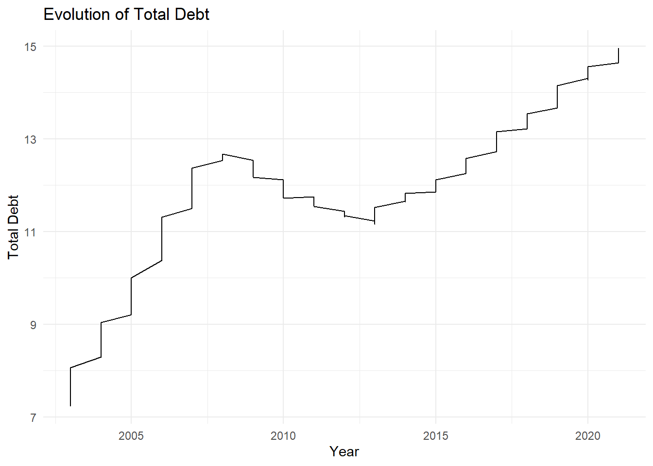
Visualizing Part-Whole Relationships
ggplot(debt_data, aes(x = Date, y = Total, fill = factor(substitute))) +
  geom_bar(stat = "identity") +
  labs(x = "Year", y = "Total Consumer Debt ($ trillions)",
       title = "Composition of Total Consumer Debt by Loan Type",
       fill = "Loan Type") +
  scale_fill_manual(values = c("#E69F00", "#56B4E9", "#009E73", "#F0E442", "#0072B2", "#D55E00")) +
  theme_minimal()
Error in ggplot(debt_data, aes(x = Date, y = Total, fill = factor(substitute))): object 'debt_data' not found