library(tidyverse)
library(ggplot2)

knitr::opts_chunk$set(echo = TRUE, warning = FALSE, message = FALSE)
Challenge 7
challenge_7
hotel_bookings
australian_marriage
air_bnb
eggs
abc_poll
faostat
usa_households
Visualizing Multiple Dimensions
Challenge Overview
Today’s challenge is to:
- read in a data set, and describe the data set using both words and any supporting information (e.g., tables, etc)
- tidy data (as needed, including sanity checks)
- mutate variables as needed (including sanity checks)
- Recreate at least two graphs from previous exercises, but introduce at least one additional dimension that you omitted before using ggplot functionality (color, shape, line, facet, etc) The goal is not to create unneeded chart ink (Tufte), but to concisely capture variation in additional dimensions that were collapsed in your earlier 2 or 3 dimensional graphs.
- Explain why you choose the specific graph type
- If you haven’t tried in previous weeks, work this week to make your graphs “publication” ready with titles, captions, and pretty axis labels and other viewer-friendly features
R Graph Gallery is a good starting point for thinking about what information is conveyed in standard graph types, and includes example R code. And anyone not familiar with Edward Tufte should check out his fantastic books and courses on data visualizaton.
(be sure to only include the category tags for the data you use!)
Read in data
Read in one (or more) of the following datasets, using the correct R package and command.
- eggs ⭐
- abc_poll ⭐⭐
- australian_marriage ⭐⭐
- hotel_bookings ⭐⭐⭐
- air_bnb ⭐⭐⭐
- us_hh ⭐⭐⭐⭐
- faostat ⭐⭐⭐⭐⭐
df<-read_csv("_data/eggs_tidy.csv")
head(df)
# A tibble: 6 × 6
month year large_half_dozen large_dozen extra_large_half_dozen extra_lar…¹
<chr> <dbl> <dbl> <dbl> <dbl> <dbl>
1 January 2004 126 230 132 230
2 February 2004 128. 226. 134. 230
3 March 2004 131 225 137 230
4 April 2004 131 225 137 234.
5 May 2004 131 225 137 236
6 June 2004 134. 231. 137 241
# … with abbreviated variable name ¹extra_large_dozenBriefly describe the data
Tidy Data (as needed)
Is your data already tidy, or is there work to be done? Be sure to anticipate your end result to provide a sanity check, and document your work here.
The data is already tidy. It has a clear structure where each row represents a unique observation (month and year), and each column represents a variable (large_half_dozen, large_dozen, extra_large_half_dozen, and extra_large_dozen) with its corresponding values.
Are there any variables that require mutation to be usable in your analysis stream? For example, do you need to calculate new values in order to graph them? Can string values be represented numerically? Do you need to turn any variables into factors and reorder for ease of graphics and visualization?
Document your work here.
there are no variables that require mutation to be usable in an analysis stream. The variables are already numerical, and no string values need to be converted into numerical values.
Visualization with Multiple Dimensions
ggplot(df, aes(x = large_half_dozen, y = extra_large_half_dozen)) +
  geom_point() +
  labs(x = "Large Half Dozen", y = "Extra Large Half Dozen")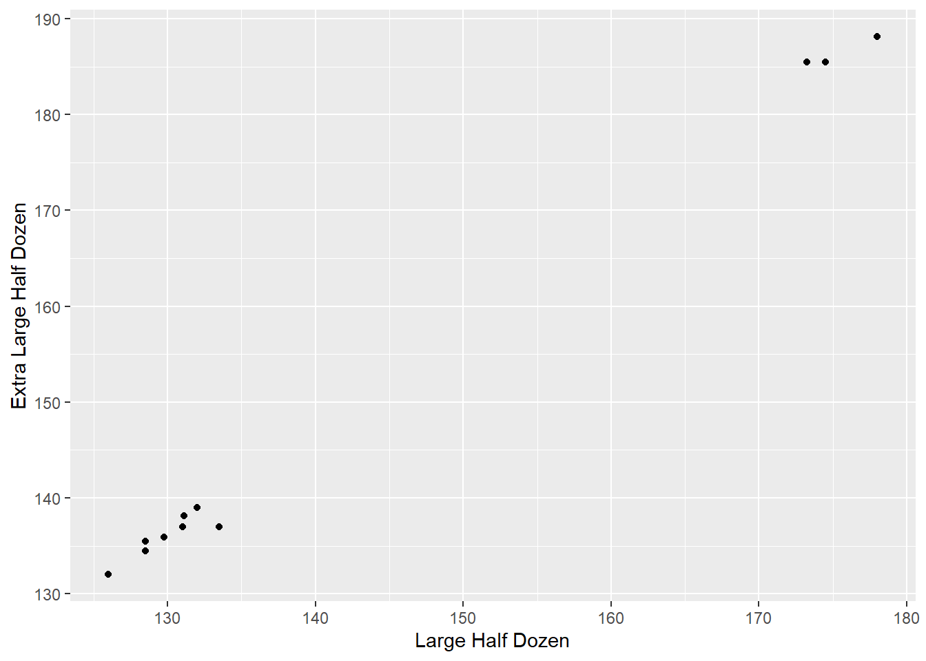
ggplot(df, aes(x = paste(month, year), y = extra_large_dozen)) +
  geom_line(color = "blue") +
  geom_point(color = "blue", size = 2) +
  labs(x = "Month", y = "Extra Large Dozen Sold",
       title = "Trend of Extra Large Dozens Sold") +
  theme_bw() +
  theme(plot.title = element_text(hjust = 0.5))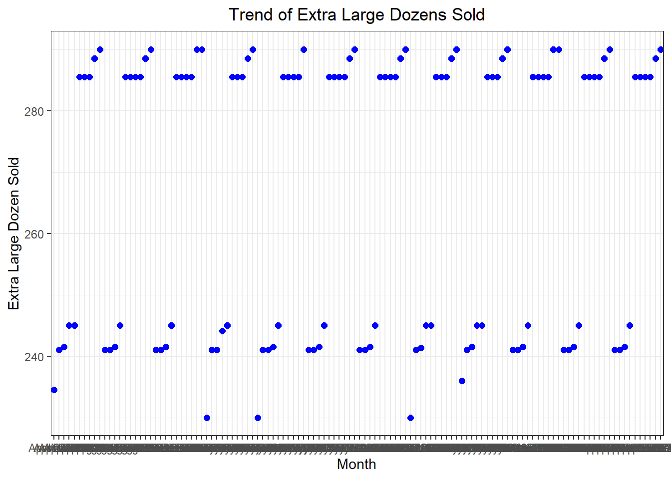
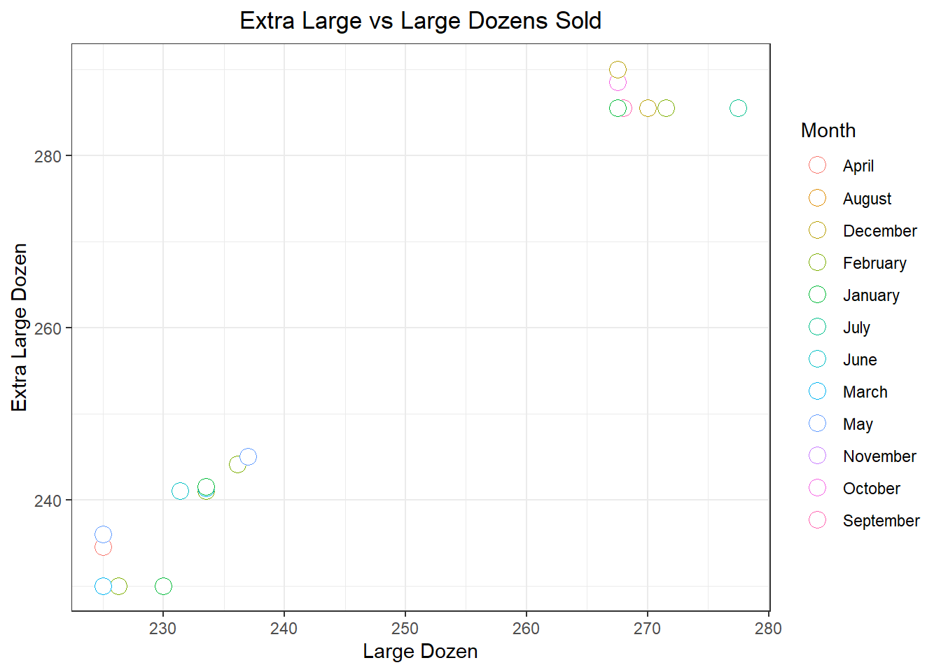
# Create a scatter plot with color indicating the month
ggplot(df, aes(x = large_dozen, y = extra_large_dozen)) +
  geom_point(aes(color = month), size = 4, shape = 21, fill = "white") +
  scale_color_discrete(name = "Month") +
  labs(x = "Large Dozen", y = "Extra Large Dozen",
       title = "Extra Large vs Large Dozens Sold") +
  theme_bw() +
  theme(plot.title = element_text(hjust = 0.5))