library(tidyverse)
library(ggplot2)
library(readxl)
library(lubridate)
knitr::opts_chunk$set(echo = TRUE, warning=FALSE, message=FALSE)
Challenge 6
challenge_6
PoChunYang
debt
Visualizing Time and Relationships
Challenge Overview
Today’s challenge is to:
- read in a data set, and describe the data set using both words and any supporting information (e.g., tables, etc)
- tidy data (as needed, including sanity checks)
- mutate variables as needed (including sanity checks)
- create at least one graph including time (evolution)
- try to make them “publication” ready (optional)
- Explain why you choose the specific graph type
- Create at least one graph depicting part-whole or flow relationships
- try to make them “publication” ready (optional)
- Explain why you choose the specific graph type
R Graph Gallery is a good starting point for thinking about what information is conveyed in standard graph types, and includes example R code.
(be sure to only include the category tags for the data you use!)
Read in data
Read in one (or more) of the following datasets, using the correct R package and command.
- debt ⭐
- fed_rate ⭐⭐
- abc_poll ⭐⭐⭐
- usa_hh ⭐⭐⭐
- hotel_bookings ⭐⭐⭐⭐
- AB_NYC ⭐⭐⭐⭐⭐
df<-read_excel("_data/debt_in_trillions.xlsx")
df2<- readxl::read_xlsx("_data/debt_in_trillions.xlsx")
head(df)
# A tibble: 6 × 8
`Year and Quarter` Mortgage `HE Revolving` Auto …¹ Credi…² Stude…³ Other Total
<chr> <dbl> <dbl> <dbl> <dbl> <dbl> <dbl> <dbl>
1 03:Q1 4.94 0.242 0.641 0.688 0.241 0.478 7.23
2 03:Q2 5.08 0.26 0.622 0.693 0.243 0.486 7.38
3 03:Q3 5.18 0.269 0.684 0.693 0.249 0.477 7.56
4 03:Q4 5.66 0.302 0.704 0.698 0.253 0.449 8.07
5 04:Q1 5.84 0.328 0.72 0.695 0.260 0.446 8.29
6 04:Q2 5.97 0.367 0.743 0.697 0.263 0.423 8.46
# … with abbreviated variable names ¹`Auto Loan`, ²`Credit Card`,
# ³`Student Loan`Briefly describe the data
Tidy Data (as needed)
First of all, I used two different method to read the data. The data is quite clean so we do not need a lot of changing. I used the first data for the Time Dependent Visualization. Then, I used second tidy data for Visualizing Part-Whole Relationships.
df1<-df%>%
  mutate(date = parse_date_time(`Year and Quarter`, orders="yq"))
df1
# A tibble: 74 × 9
`Year and Quarter` Mortgage HE Revolvin…¹ Auto …² Credi…³ Stude…⁴ Other Total
<chr> <dbl> <dbl> <dbl> <dbl> <dbl> <dbl> <dbl>
1 03:Q1 4.94 0.242 0.641 0.688 0.241 0.478 7.23
2 03:Q2 5.08 0.26 0.622 0.693 0.243 0.486 7.38
3 03:Q3 5.18 0.269 0.684 0.693 0.249 0.477 7.56
4 03:Q4 5.66 0.302 0.704 0.698 0.253 0.449 8.07
5 04:Q1 5.84 0.328 0.72 0.695 0.260 0.446 8.29
6 04:Q2 5.97 0.367 0.743 0.697 0.263 0.423 8.46
7 04:Q3 6.21 0.426 0.751 0.706 0.33 0.41 8.83
8 04:Q4 6.36 0.468 0.728 0.717 0.346 0.423 9.04
9 05:Q1 6.51 0.502 0.725 0.71 0.364 0.394 9.21
10 05:Q2 6.70 0.528 0.774 0.717 0.374 0.402 9.49
# … with 64 more rows, 1 more variable: date <dttm>, and abbreviated variable
# names ¹`HE Revolving`, ²`Auto Loan`, ³`Credit Card`, ⁴`Student Loan`df2<-df2%>%
mutate(Date = yq(`Year and Quarter`))%>%
pivot_longer(cols= !c(`Year and Quarter`, Date), names_to = "Debt Type", values_to = "Amount") %>%
select(!`Year and Quarter`)Are there any variables that require mutation to be usable in your analysis stream? For example, do you need to calculate new values in order to graph them? Can string values be represented numerically? Do you need to turn any variables into factors and reorder for ease of graphics and visualization?
Document your work here.
Time Dependent Visualization
In the time dependent visualization, I want to get the Mortgage changing from 2003 to 2021. Therefore, I used the ggplot command, add the point command, and the line. In addition, I want to add the unit for the y-axis.
ggplot(df1,aes(x=date, y=Mortgage))+
  geom_point()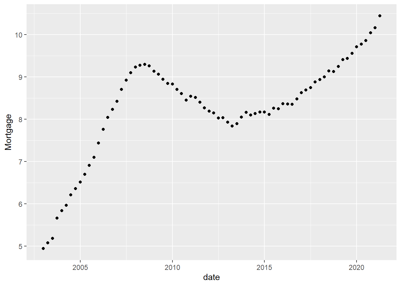
ggplot(df1, aes(x=date,y=Mortgage))+
  geom_point(size=.5,color="red")+
  geom_line()+
  scale_y_continuous(labels = scales::label_number(suffix = "Trillion"))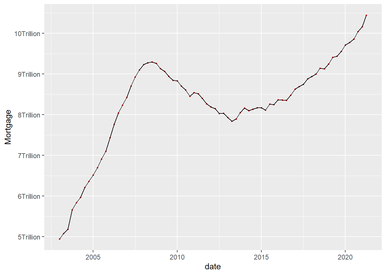
Visualizing Part-Whole Relationships
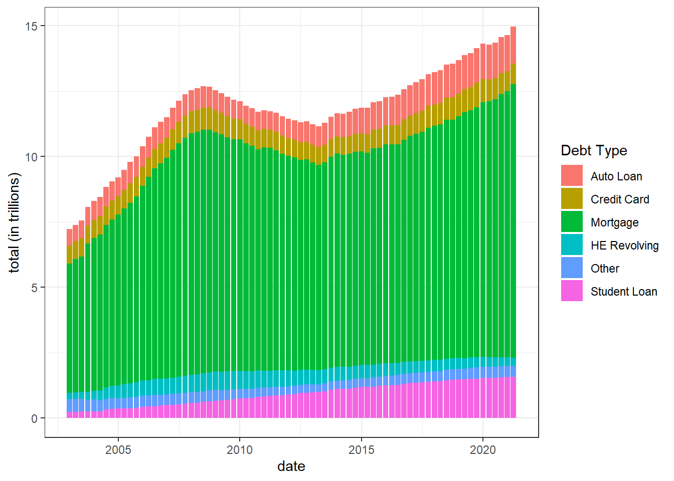
I used several commands to achieve multiple lines in the graph. We have to notice that the total in the date so we have to remove the total data. In the final, the graph looks pretty well. Moreover, the Mortgage line show clearly is the highest debt type for every year. In the second bar graph, it shows that the debt changing from 2003 to 2021 with all the type of debt.
df2%>%
    filter(`Debt Type`!= "Total") %>%
    ggplot(aes(x= Date, y=Amount, color= `Debt Type`)) +
    geom_line(show.legend = TRUE) +
    geom_point()+
    theme_bw()+
    labs( x= "date", y= "total (in trillions)")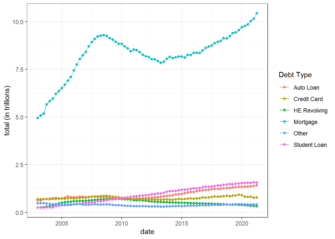
df2%>%
  filter(`Debt Type`!= "Total") %>%
    mutate(`Debt Type` =  fct_relevel(`Debt Type`, "Auto Loan", "Credit Card", "Mortgage", "HE Revolving", "Other", "Student Loan"))%>%
    ggplot(aes(x= Date, y=Amount, fill= `Debt Type`)) +
    geom_bar(show.legend = TRUE, stat = "identity")+
    theme_bw()+
    labs( x= "date", y= "total (in trillions)")