library(tidyverse)
library(ggplot2)
library(readxl)

knitr::opts_chunk$set(echo = TRUE, warning=FALSE, message=FALSE)
Challenge 5
challenge_5
PoChunYang
pathogen_cost
Introduction to Visualization
Challenge Overview
Today’s challenge is to:
- read in a data set, and describe the data set using both words and any supporting information (e.g., tables, etc)
- tidy data (as needed, including sanity checks)
- mutate variables as needed (including sanity checks)
- create at least two univariate visualizations
- try to make them “publication” ready
- Explain why you choose the specific graph type
- Create at least one bivariate visualization
- try to make them “publication” ready
- Explain why you choose the specific graph type
R Graph Gallery is a good starting point for thinking about what information is conveyed in standard graph types, and includes example R code.
(be sure to only include the category tags for the data you use!)
Read in data
Read in one (or more) of the following datasets, using the correct R package and command.
- Total_cost_for_top_15_pathogens_2018.xlsx ⭐
df<-read_excel("_data/Total_cost_for_top_15_pathogens_2018.xlsx ")Briefly describe the data
This data is talking about the foodborne illness estimates in 2018. Besides that, it give the value of 15 different types of pathogens which cause human to have a foodborne illness. In addition, give the cost and case of those pathogens.
Tidy Data (as needed)
As I use the read_excel to read the data files. There are a lot of the NA so I used na_omit to remove all the rows which have a NA. In addition, the column names are pretty difficult for people to understand easily. Therefore, I used the colnames this command to change all the words of the previous colnames. Notice that the final row is the total for 15 pathogons so I removed it.
df<- na.omit(df)
df<- df[-16,]
colnames(df)
[1] "Total cost of foodborne illness estimates for 15 leading foodborne pathogens"
[2] "...2"
[3] "...3" colnames(df)[1] ="pathogens"
colnames(df)[2] ="case"
colnames(df)[3] ="cost"
df$case<-as.numeric(df$case)
df$cost<-as.numeric(df$cost)
df# A tibble: 15 × 3
pathogens case cost
<chr> <dbl> <dbl>
1 Campylobacter spp. (all species) 8.45e5 2.18e9
2 Clostridium perfringens 9.66e5 3.84e8
3 Cryptosporidium spp. (all species) 5.76e4 5.84e7
4 Cyclospora cayetanensis 1.14e4 2.57e6
5 Listeria monocytogenes 1.59e3 3.19e9
6 Norovirus 5.46e6 2.57e9
7 Salmonella (non-typhoidal species) 1.03e6 4.14e9
8 Shigella (all species) 1.31e5 1.59e8
9 Shiga toxin-producing Escherichia coli O157 (STEC O157) 6.32e4 3.11e8
10 non-O157 Shiga toxin-producing Escherichia coli (STEC non-O157) 1.13e5 3.17e7
11 Toxoplasma gondii 8.67e4 3.74e9
12 Vibrio parahaemolyticus 3.47e4 4.57e7
13 Vibrio vulnificus 9.6 e1 3.59e8
14 Vibrio non-cholera species other than V. parahaemolyticus and … 1.76e4 8.17e7
15 Yersinia enterocolitica 9.77e4 3.13e8Univariate Visualizations
When I used the ggplot, I found that there are a lot of errors. Such as, I could not run the geom_histogram. The resaon is that I could not found the cost and case is char value. therefore, I add the as.numeric command to solve the problem. If I want to show the bar chart of the char value, I should use the geom_bar.
Document your work here.
#ggplot(df,aes(x=pathogens,y =cost))+
 # geom_bar()
ggplot(df, aes(x=case)) +
  geom_histogram()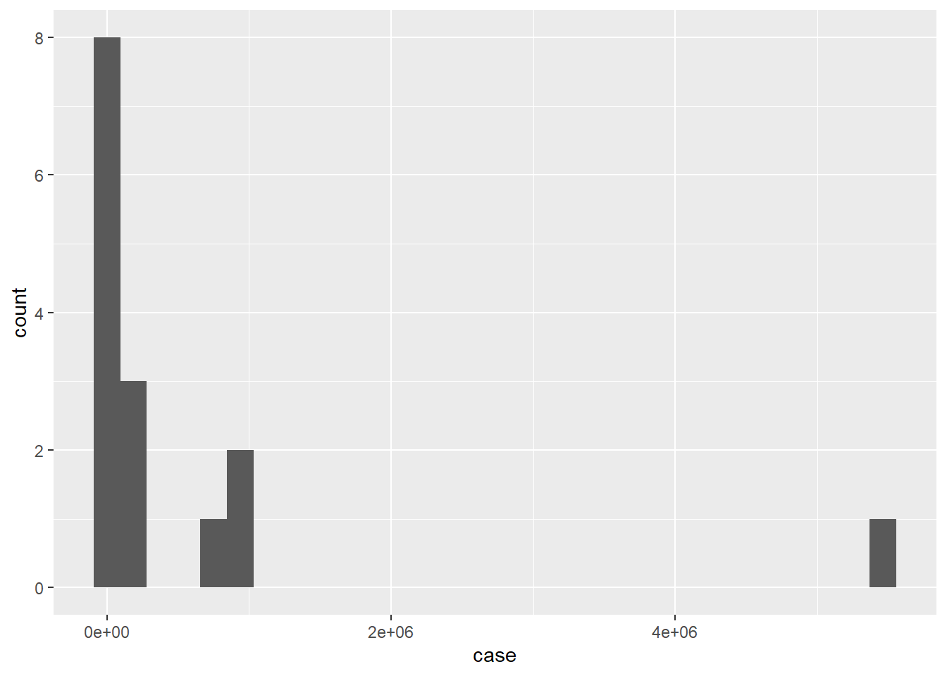
ggplot(df, aes(x=cost)) +
  geom_histogram()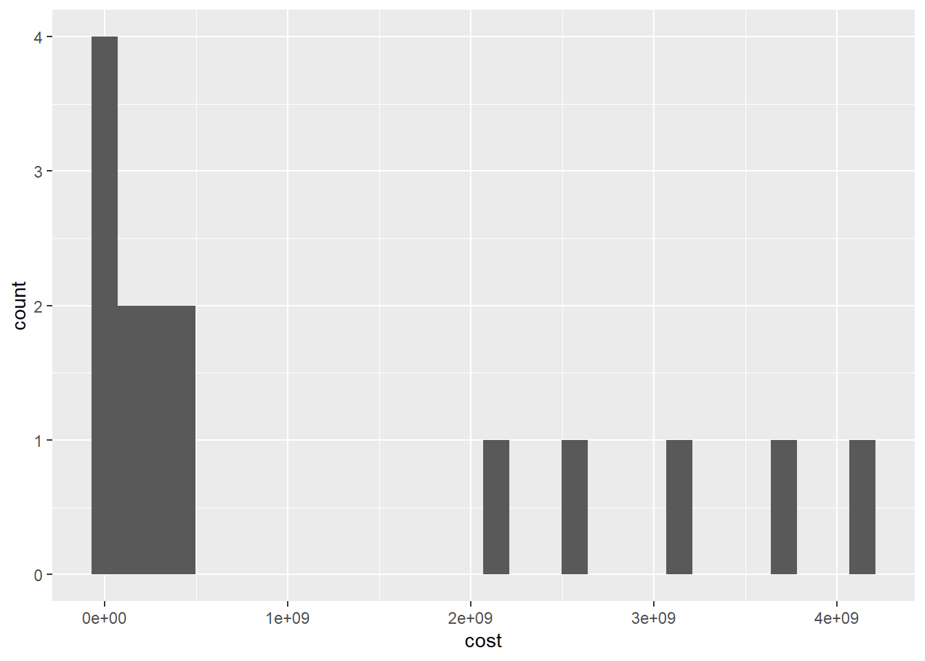
ggplot(df, aes(x=case)) +
  geom_histogram()+
  scale_x_continuous(trans = "log10")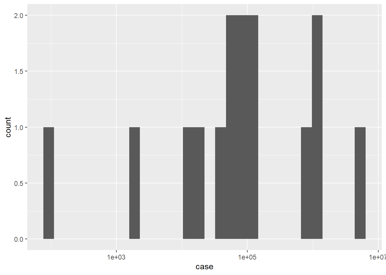
ggplot(df, aes(x=cost)) +
  geom_histogram()+
  scale_x_continuous(trans = "log10")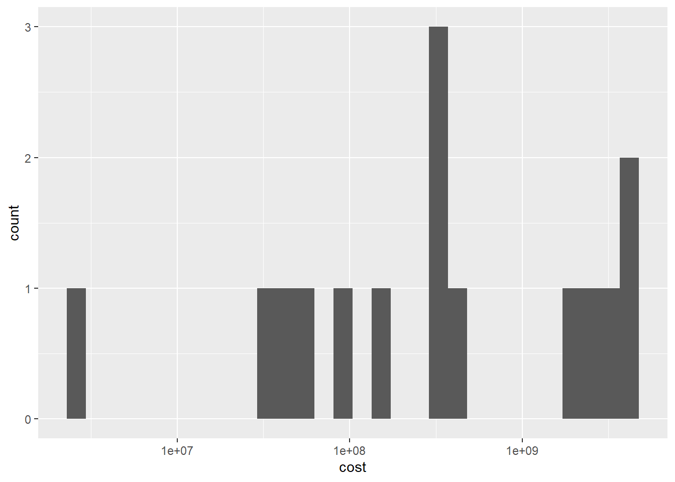
Bivariate Visualization(s)
ggplot(df, aes(case,cost,label=pathogens)) +
  geom_point(color="blue")+
  geom_text()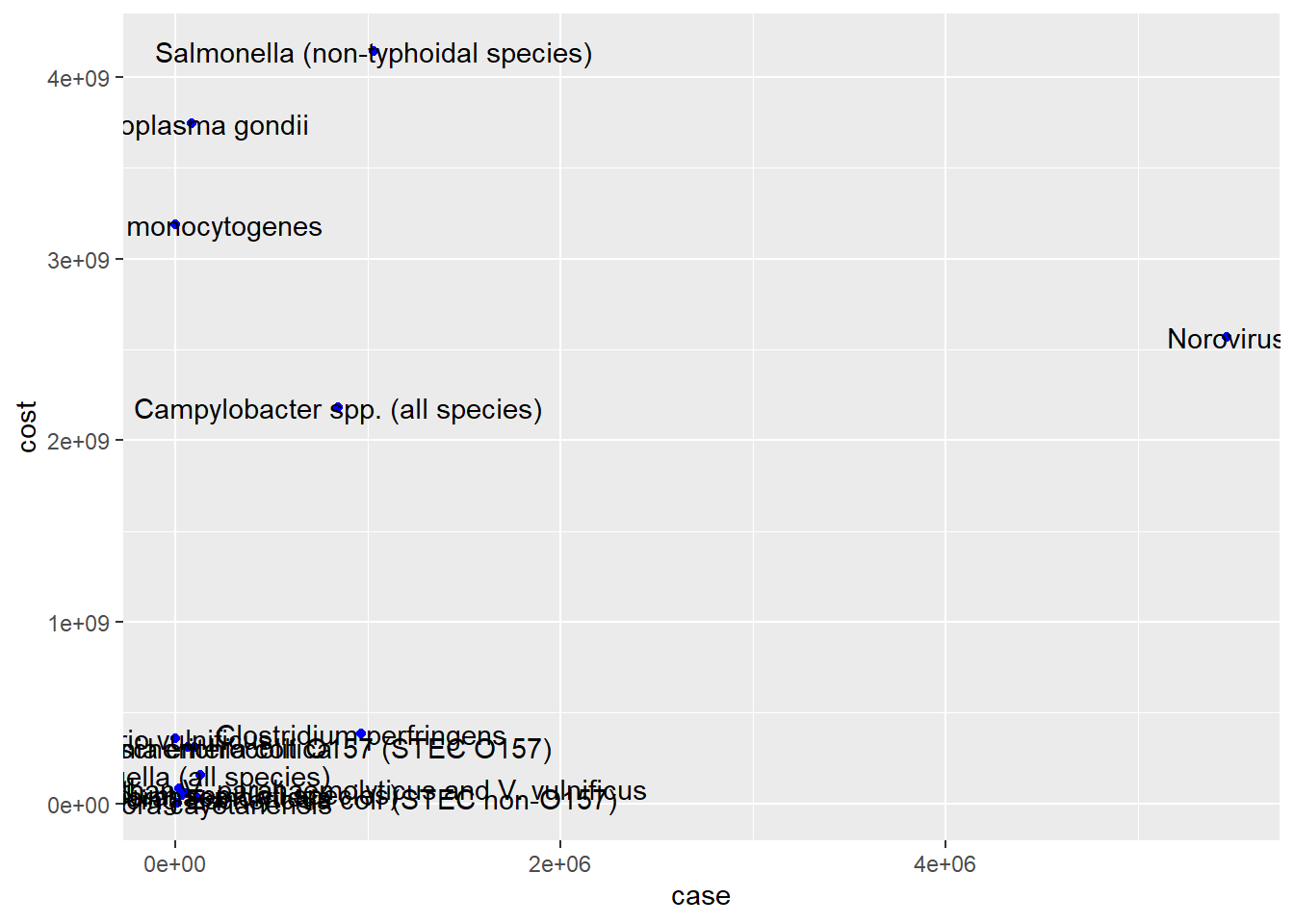
ggplot(df, aes(x=case, y=cost, label=pathogens)) +
  geom_point(color = "red")+
  scale_x_continuous(trans = "log10", labels = scales::comma)+
  scale_y_continuous(trans = "log10", labels = scales::comma)+
  geom_text()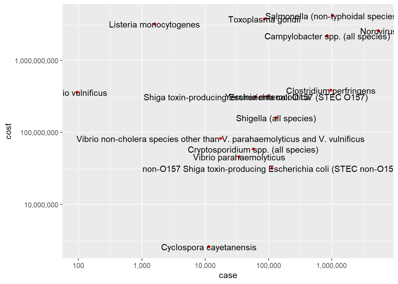
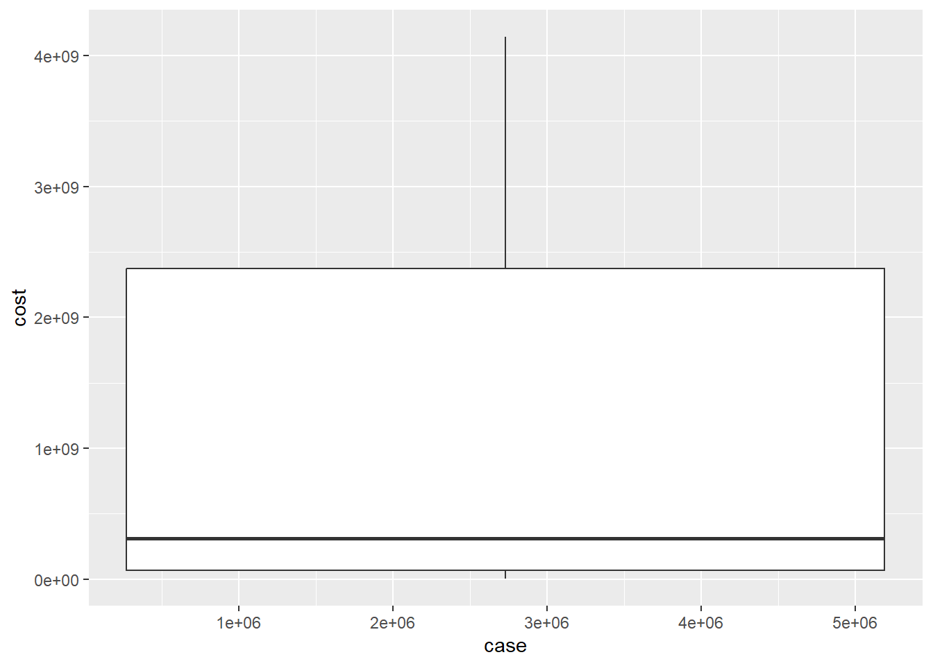
ggplot(df, aes(case, cost)) + geom_boxplot()