library(tidyverse)
library(ggplot2)

knitr::opts_chunk$set(echo = TRUE, warning=FALSE, message=FALSE)Challenge 5
challenge_5
cereal
poobigan murugesan
Introduction to Visualization
Read in data
df <- read_csv("_data/cereal.csv")
df
# A tibble: 20 × 4
Cereal Sodium Sugar Type
<chr> <dbl> <dbl> <chr>
1 Frosted Mini Wheats 0 11 A
2 Raisin Bran 340 18 A
3 All Bran 70 5 A
4 Apple Jacks 140 14 C
5 Captain Crunch 200 12 C
6 Cheerios 180 1 C
7 Cinnamon Toast Crunch 210 10 C
8 Crackling Oat Bran 150 16 A
9 Fiber One 100 0 A
10 Frosted Flakes 130 12 C
11 Froot Loops 140 14 C
12 Honey Bunches of Oats 180 7 A
13 Honey Nut Cheerios 190 9 C
14 Life 160 6 C
15 Rice Krispies 290 3 C
16 Honey Smacks 50 15 A
17 Special K 220 4 A
18 Wheaties 180 4 A
19 Corn Flakes 200 3 A
20 Honeycomb 210 11 C Briefly describe the data
The dataset includes the names of about 20 well-known cereal brands that are classified into two types: Adult Cereal (type A) and Children’s Cereal (type C). The data has information pertaining to the amount of sodium and sugar found in both types of cereal.
The data is already in a format that is suitable for visualization, so there is no need to perform any data tidying.
Univariate Visualizations
We create a histogram using the Sodium content as the basis. Next, we use a density function to refine the distribution. The majority of cereals are concentrated in the middle range of Sodium content, specifically around 200mg. However, as the Sodium content increases or decreases, the number of cereals gradually decreases. We use a histogram here as it shows the overall distribution of a numerical value with emphasis on the the most frequent values and lower attention to the infrequent extremes.
df <- read_csv("_data/Cereal.csv")
ggplot(df, aes(Sodium)) +
  geom_histogram(aes(y = ..density..), alpha = 0.6) +
  geom_density(alpha = 0.3, fill="red")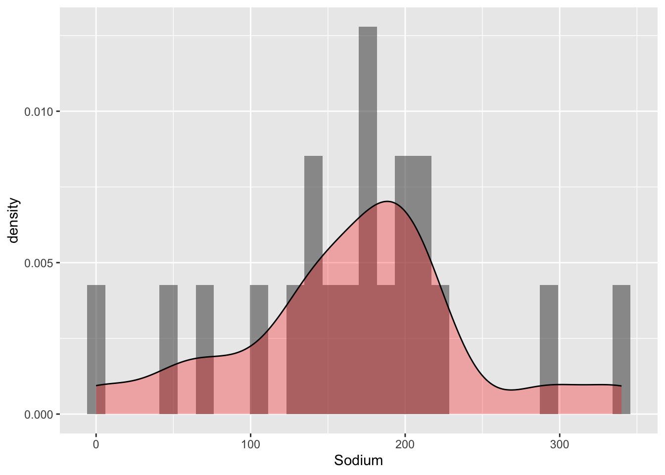
The density of this histogram appears significantly higher compared to the previous one. There don’t seem to be any notable outliers in terms of sugar content, as most cereals have a value around 10.
ggplot(df, aes(x = Sugar)) +
  geom_histogram(binwidth = 8) +
labs(title = "Sugar Content in Cereals") 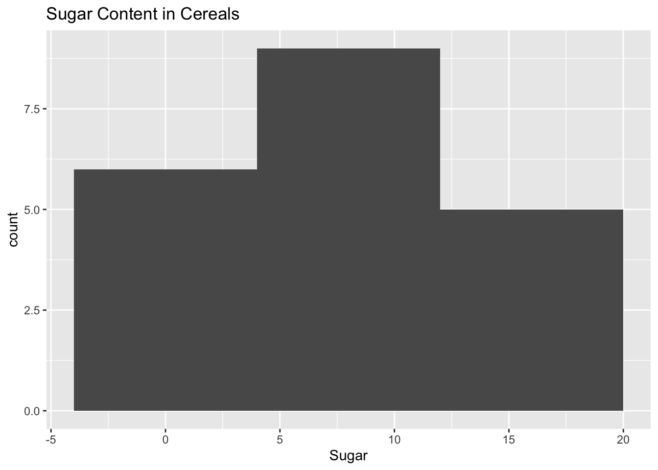
Bivariate Visualization(s)
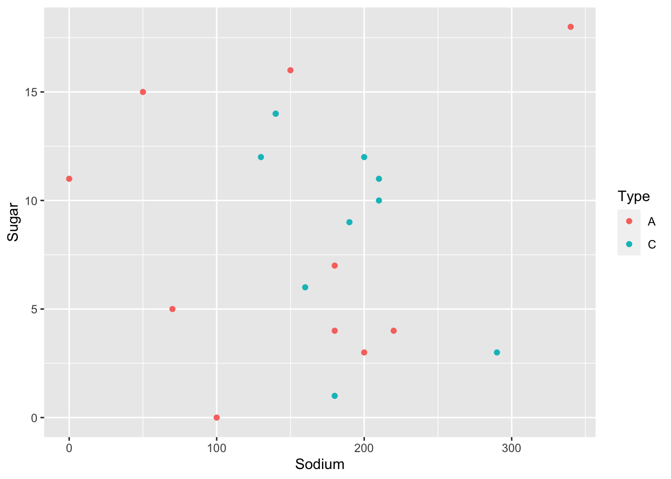
In the following bivariate graph, we observe the relationship between Sugar and Cereal. Fiber one and Cheerios have low Sugar levels, while Raisin Bran and Crackling Oat Bran have higher Sugar content, indicating they should be consumed sparingly. Additionally, we create a separate point graph representing Sugar and Sodium, using different colors to indicate the type of cereal.
df %>%
  arrange(Sugar) %>%
ggplot(aes(x=Cereal, y=Sugar)) + geom_segment(aes(xend=Cereal, yend=0)) + geom_point(color='red', fill='black',shape=20, size = 4) + coord_flip(expand = TRUE) + labs(title = "Sugar levels in cereals", y = "Sugar level", x = "Cereal") 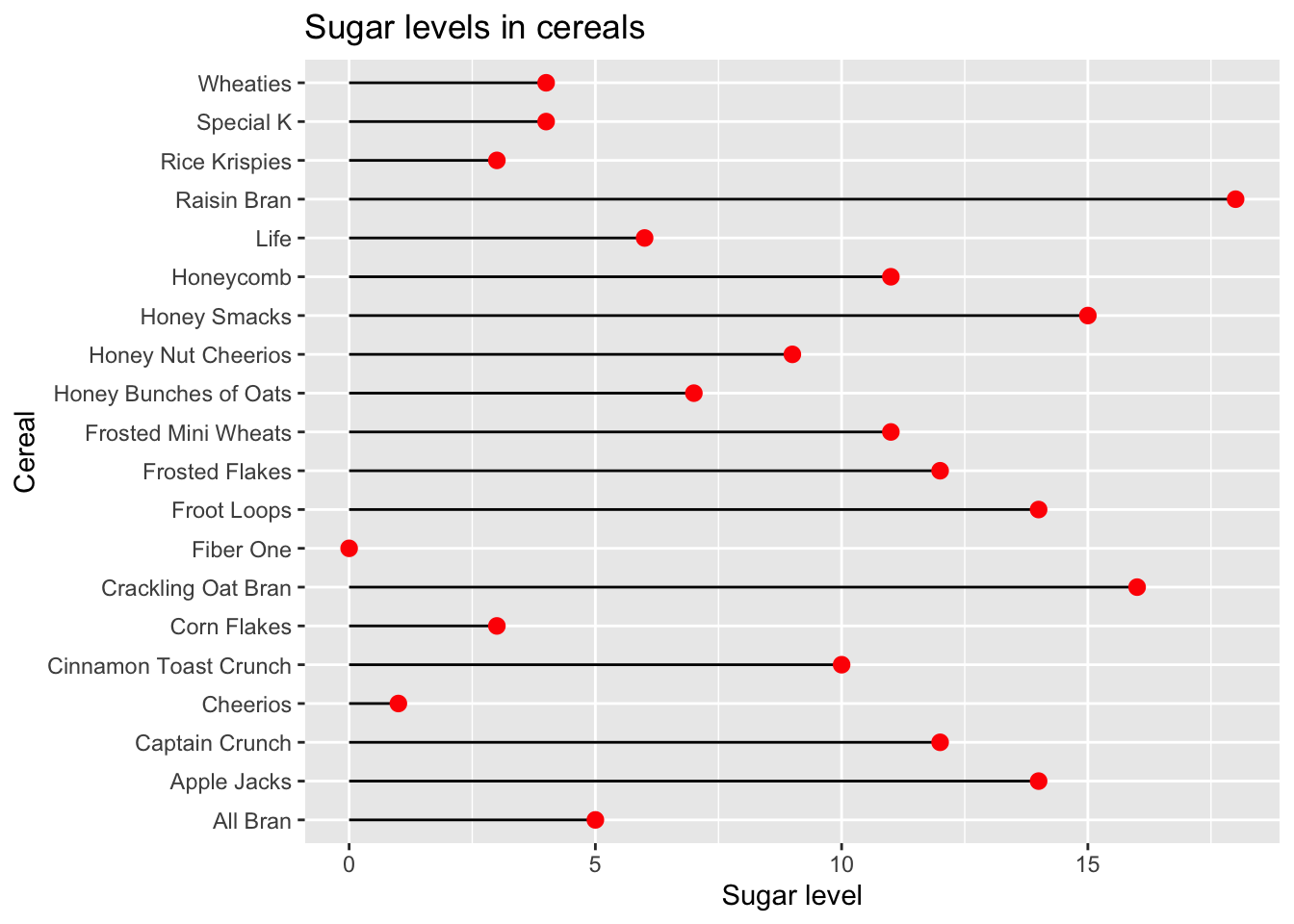
ggplot(df,aes(x=Sodium,y=Sugar,col=Type))+
  geom_point()