library(tidyverse)
library(ggplot2)
library(readxl)

knitr::opts_chunk$set(echo = TRUE, warning=FALSE, message=FALSE)
Challenge 5
challenge_5
railroads
Introduction to Visualization
Challenge Overview
Today’s challenge is to:
- read in a data set, and describe the data set using both words and any supporting information (e.g., tables, etc)
- tidy data (as needed, including sanity checks)
- mutate variables as needed (including sanity checks)
- create at least two univariate visualizations
- try to make them “publication” ready
- Explain why you choose the specific graph type
- Create at least one bivariate visualization
- try to make them “publication” ready
- Explain why you choose the specific graph type
R Graph Gallery is a good starting point for thinking about what information is conveyed in standard graph types, and includes example R code.
(be sure to only include the category tags for the data you use!)
Read in data
Read in one (or more) of the following datasets, using the correct R package and command.
- cereal.csv ⭐
- Total_cost_for_top_15_pathogens_2018.xlsx ⭐
- Australian Marriage ⭐⭐
- AB_NYC_2019.csv ⭐⭐⭐
- StateCounty2012.xls ⭐⭐⭐
- Public School Characteristics ⭐⭐⭐⭐
- USA Households ⭐⭐⭐⭐⭐
employ <- read_excel("_data/StateCounty2012.xls", skip=4, col_names = c("State", "B1", "County", "B2", "Total"))Briefly describe the data
Tidy Data (as needed)
Is your data already tidy, or is there work to be done? Be sure to anticipate your end result to provide a sanity check, and document your work here.
employment <- employ %>%
  select("State", "County", "Total")

employment
# A tibble: 2,990 × 3
State County Total
<chr> <chr> <dbl>
1 AE APO 2
2 AE Total1 <NA> 2
3 AK ANCHORAGE 7
4 AK FAIRBANKS NORTH STAR 2
5 AK JUNEAU 3
6 AK MATANUSKA-SUSITNA 2
7 AK SITKA 1
8 AK SKAGWAY MUNICIPALITY 88
9 AK Total <NA> 103
10 AL AUTAUGA 102
# ℹ 2,980 more rowsemployment <- employment %>%
drop_na()
employment# A tibble: 2,930 × 3
State County Total
<chr> <chr> <dbl>
1 AE APO 2
2 AK ANCHORAGE 7
3 AK FAIRBANKS NORTH STAR 2
4 AK JUNEAU 3
5 AK MATANUSKA-SUSITNA 2
6 AK SITKA 1
7 AK SKAGWAY MUNICIPALITY 88
8 AL AUTAUGA 102
9 AL BALDWIN 143
10 AL BARBOUR 1
# ℹ 2,920 more rowsAre there any variables that require mutation to be usable in your analysis stream? For example, do you need to calculate new values in order to graph them? Can string values be represented numerically? Do you need to turn any variables into factors and reorder for ease of graphics and visualization?
Document your work here.
#State and its total employees
total <- employment %>%
  group_by(State) %>%
  summarise(Employees = sum(Total)) %>%
  select(State, Employees)
total
# A tibble: 53 × 2
State Employees
<chr> <dbl>
1 AE 2
2 AK 103
3 AL 4257
4 AP 1
5 AR 3871
6 AZ 3153
7 CA 13137
8 CO 3650
9 CT 2592
10 DC 279
# ℹ 43 more rowsstate_count <- employment %>%
count(State)
state_count# A tibble: 53 × 2
State n
<chr> <int>
1 AE 1
2 AK 6
3 AL 67
4 AP 1
5 AR 72
6 AZ 15
7 CA 55
8 CO 57
9 CT 8
10 DC 1
# ℹ 43 more rowsUnivariate Visualizations
ggplot(employment, aes(Total)) + geom_histogram()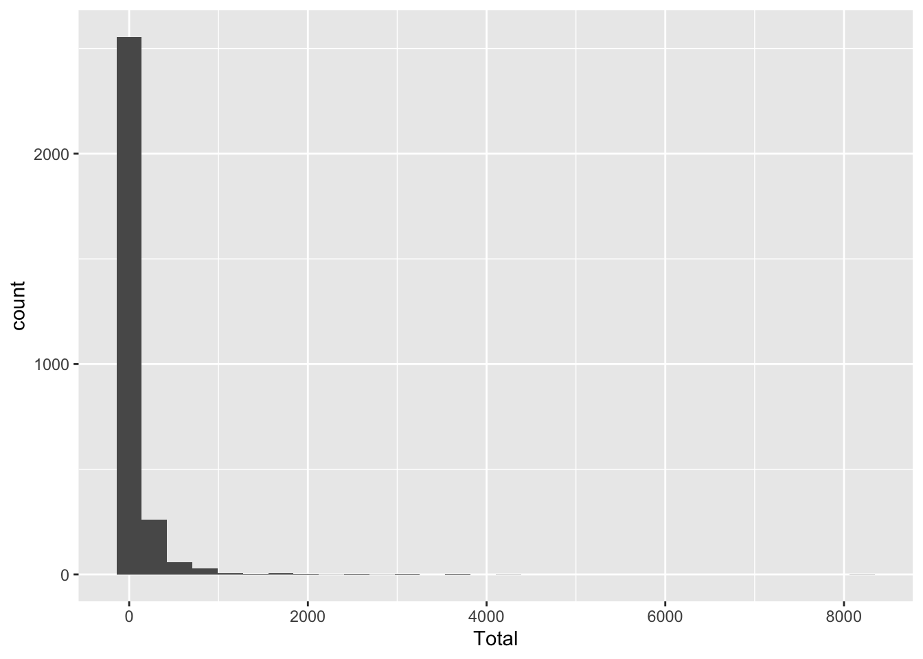
Bivariate Visualization(s)
#Graph for County vs Employees
ggplot(employment, aes(County, Total)) +
  geom_boxplot() +
  labs(title = "County vs Employess", y = "Employees", x = "County")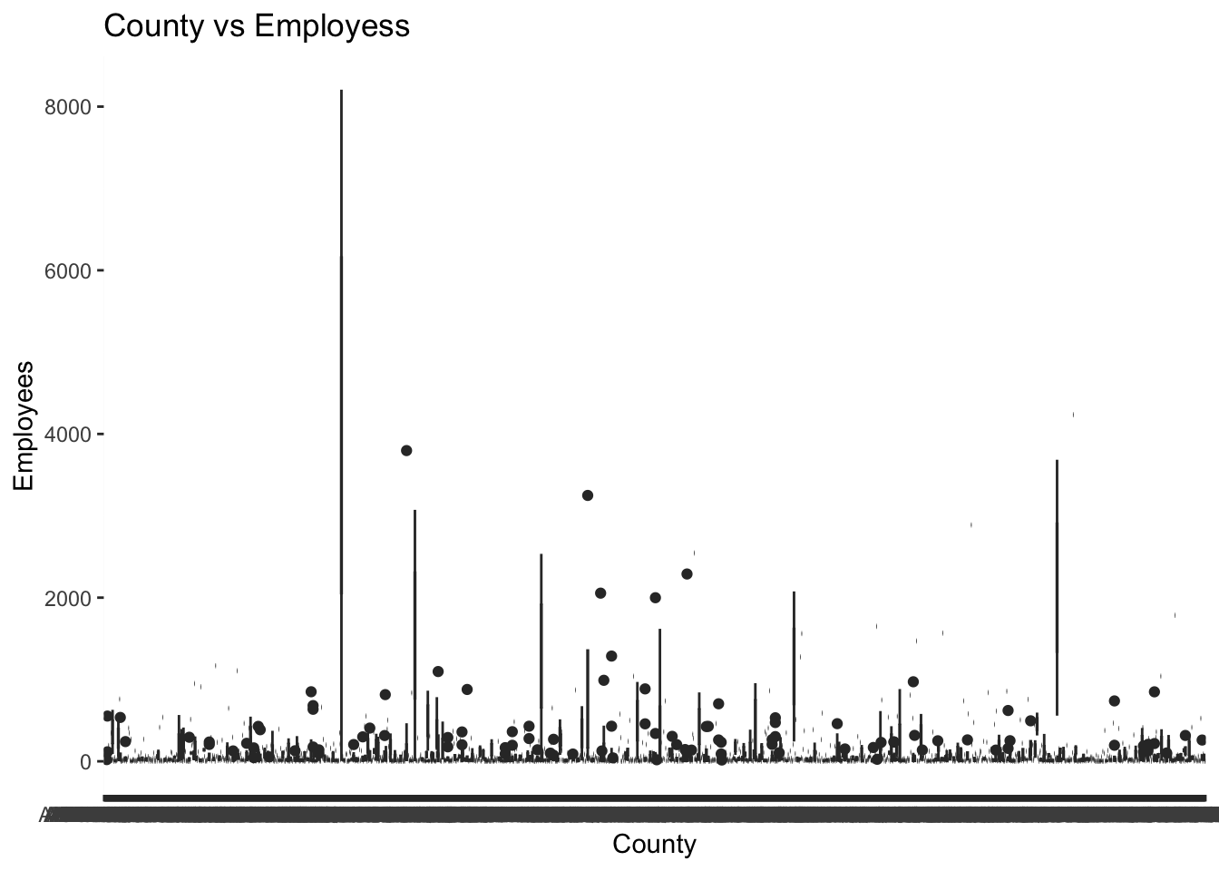
#Graph for State vs Employees
ggplot(total, aes(State, Employees)) +
  geom_boxplot() +
  labs(title = "State vs Employess", y = "Employees", x = "State")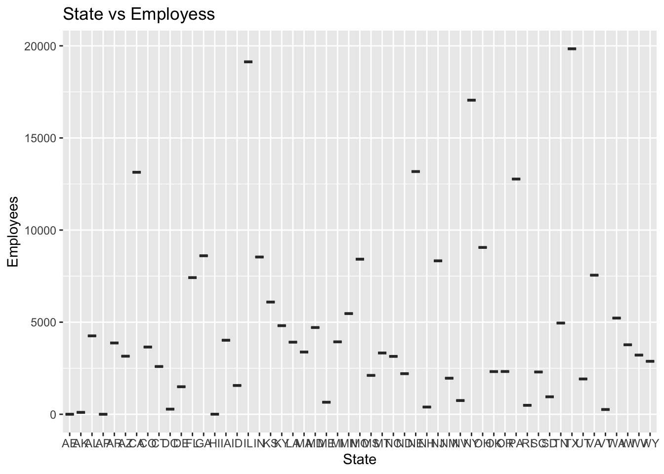
#Graph for No. of Counties per State
ggplot(state_count, aes(State, n)) +
  geom_boxplot() +
  labs(title = "Counties per State", y = "Count", x = "State")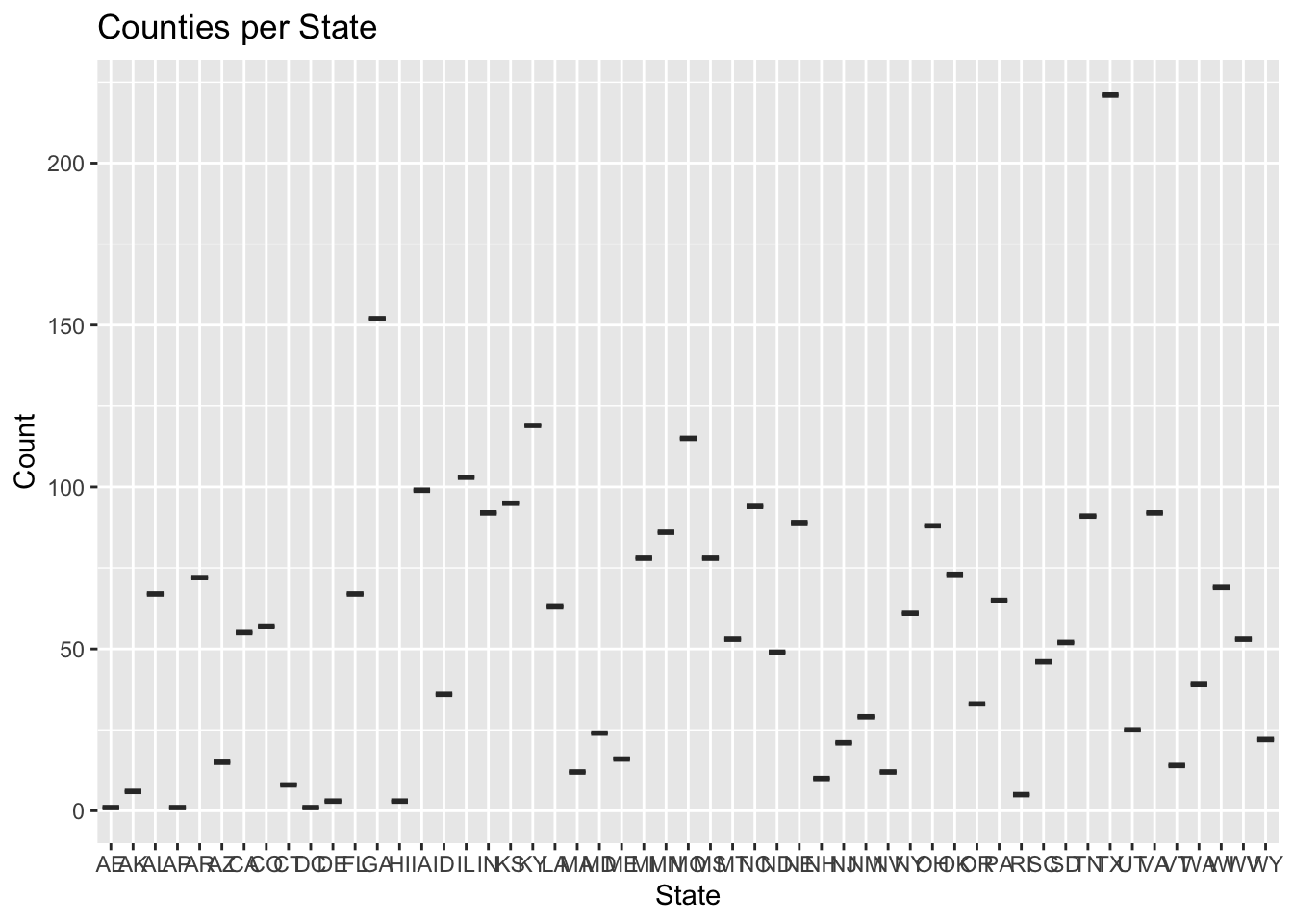
Any additional comments?