In today’s online world, sales keep on changing depending on the months and season for various products. And for any business to not run into loss, it is necessary for it to predict the amount of sales it will be doing on any particular product depending on the month/season. With help of these, the companies have at least an idea of how the sales for a product can be in the coming months. This is known as time series forecasting. Here, I will be using this prediction method on the sales data of a superstore to find out how the sales of products in each category is related by the month of the year, region of sales and such other attributes. This will help me gain insights into the patterns and trends that affect sales. This information can then be used for predicting future sales and making informed business decisions.
Background
Time series forecasting is a technique that utilizes historical and current data to predict future values over a period of time or a specific point in the future. We predict future values based on past observations in a time-dependent data set. It involves analyzing patterns, trends, and seasonality within the data to make predictions about future values.
This topic gained my interest because I was always eager to know how supermarkets and superstores always have items in stock that you may need depending on the month and season. For example, as soon as any of the festivals are coming near like Christmas, Easter, Thanksgiving or Halloween, the products available in the store match those needs. When the spring nears the product range available is different than when it is in the fall season. Not only this, even the products available are such that those that people like to buy. Which means the store is already making predictions on which products the customer likes to buy and orders only such stuff. My main aim behind choosing this project is understanding how a store decides on which items to have ordered and in stock, ready for sale. My main research question is how much is the sales of a product going to be to decide if I should be buying more of that product or not? I want to know which product to be kept ready for sale so that I have enough stock to supply to the customer and also not too much stock that my company goes into loss due to too much surplus stock.
This sales predictor will try and make prediction on what the sales would be for a product in a coming month and help the supermarkets know about which items to stock up and which items to not stock up to avoid losses.
Data Introduction
I will be using a kaggle data set, Superstore Sales Dataset, about Sales in a Superstore chain with data about sales in all of its branches, for Sales Forecasting. The data set has information about sales in a retail store and I will use that data to forecast sales pattern.
The data set has almost 10k rows of information about sales and their 18 attributes. Each row consists of information such as the ordered goods information, shipment information, customer information and sales information. This information provides details on the order, explaining how and for what basis is the each order made.
My main aim with this data set is to understand the trends within the data and predict on the amount of goods that will be sold in the nearby future. This will lead to knowing how much surplus amount of goods a company should have ready to make sure there isn’t a shortage in the stores in the future.
Dataset Description
loading the data
# loading the datadata <-read_csv("PoojaShah_FinalProjectData/_data/data.csv")data
The data consists of each row with 18 attributes describing the order information, shipment information, customer information, location of that particular order in terms of city, state, region and country. All the orders are from the same country only, i.e. United States and thus, this column can be considered as one of the unnecessary columns. The data also has further information about the product regarding the category and sub-category it belongs to. Just from a look on the data set, we can point out that a lot of data columns are repetitive. For example, when we are predicting sales for the regions, there is no need for the postal code, city or state columns. We will select the data as per our need and use only a subset of this data set for our prediction.
Desprictive Information about Data Set
Here is some information about our dataset such as the number of rows, number of columns calculated using dim() function and the name of those columns calculated using colnames() function.
# describing the data in terms of dimensions and column namesdim(data)
The data consists of 18 attributes pertaining to each row of data. Here, I have modified the column names to have the important column names without the spaces in between. This is just for more convenience as using the column names with a space in between is harder to access and thus I renamed them to names without space in between.
Tidy Data
My first step here is dividing up the order date to have access to the month and year of the order separately. I separated the date using separate_wider_delim() function, separating the date using the forward slash (/). This will help me with analyzing the data as per the month and the year of the sales. I have added 2 more columns to the data set namely Month and Year.
# Modifying data to split datesdateData <- data %>%separate_wider_delim(OrderDate, '/', names =c("Date", "Month", "Year"))dateData
Once I had my month and year columns, I made a new subset of the data set consisting only of the columns that deemed necessary for analysis. I chose the select() function to select the columns necessary and made a new data set from that to use for my analysis part.
# Making a new data frame with only necessary columnsnewData <- dateData %>%select(c("Month", "Year", "Segment", "State", "Region", "Category", "SubCategory", "Sales"))newData
Descriptive Statistics
summary statistics of data:
Now let’s do some statistical analysis on our data.
#descriptive summary stats of the datasummary(newData)
Month Year Segment State
Min. : 1.000 Min. :2015 Length:9800 Length:9800
1st Qu.: 5.000 1st Qu.:2016 Class :character Class :character
Median : 9.000 Median :2017 Mode :character Mode :character
Mean : 7.818 Mean :2017
3rd Qu.:11.000 3rd Qu.:2018
Max. :12.000 Max. :2018
Region Category SubCategory Sales
Length:9800 Length:9800 Length:9800 Min. : 0.444
Class :character Class :character Class :character 1st Qu.: 17.248
Mode :character Mode :character Mode :character Median : 54.490
Mean : 230.769
3rd Qu.: 210.605
Max. :22638.480
newData %>%select(Sales) %>%sapply(sd)
Sales
626.6519
Here, we are seeing the summary statistics of our data that is describing the mean, median, quartiles as well as min and max of our data. To make sure that we are not putting unnecessary load on our data, we are only performing statistics on the data we deemed necessary. We also have performed standard deviation on sales here to understand the deviation of data in the sales value.
Analysis Plan
On more detailed look at the data set, I felt the month and year of the order are necessary fields, but should be taken in consideration individually, and thus, I decided to divide those into two separate columns for consideration. The other columns I feel would be necessary for the analysis of data are the segment, region, category and sub-category. Thus, I will be using a subset of the data set with these information for all the analytical part. I aim to run a linear regression on the data available afterwards to predict on the sales values for different category of products . The goal here is to find that which columns of the data have a higher effect on the sales values and how much does sales amount differ on the basis of these columns.
Now we are going to plot some graphs to understand how the columns are co-related to each other and understand our data in a better manner.
Here, I am using 8 columns of the data that seemed important for my analysis. These columns are as under:
I tried cross-matching the different attributes and making graphs as below:
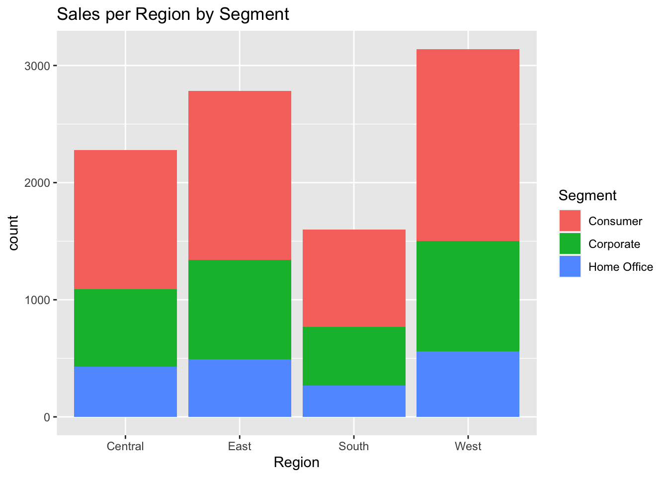
ggplot(data, aes(Region, fill = Segment)) +geom_bar() +labs(title ="Sales per Region by Segment")
The above graph shows the amount of occurrence of different types of segments such as consumer, corporate or home office as per each region. It can be seen that for each region, the consumer segment counted as almost 50% of the occurrence.
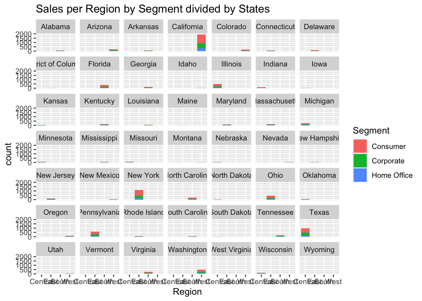
ggplot(data, aes(Region, fill = Segment)) +geom_bar() +labs(title ="Sales per Region by Segment divided by States") +facet_wrap(vars(State))
Now, I tried plotting the same data but depending on each state. It was clearly visible that only 4 states, California, New York, Texas and Washington counted for the most of the sales. While the other states did not have a lot of effect. This graphs made me feel like the state was not one of the important field to be considered and thus, I decided to drop it when performing the evaluations.
Now, I tried to cross-validate into deciding if the category and sub-category both had equal importance or not.
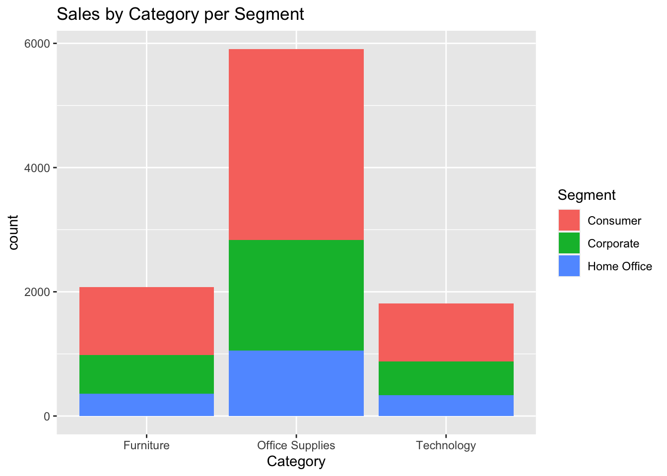
ggplot(data, aes(Category, fill = Segment)) +geom_bar() +labs(title ="Sales by Category per Segment")
I plotted the categories of the goods as per the segment. Similar to the case of the region, for categories too consumer counted as almost 50% of occurrences.
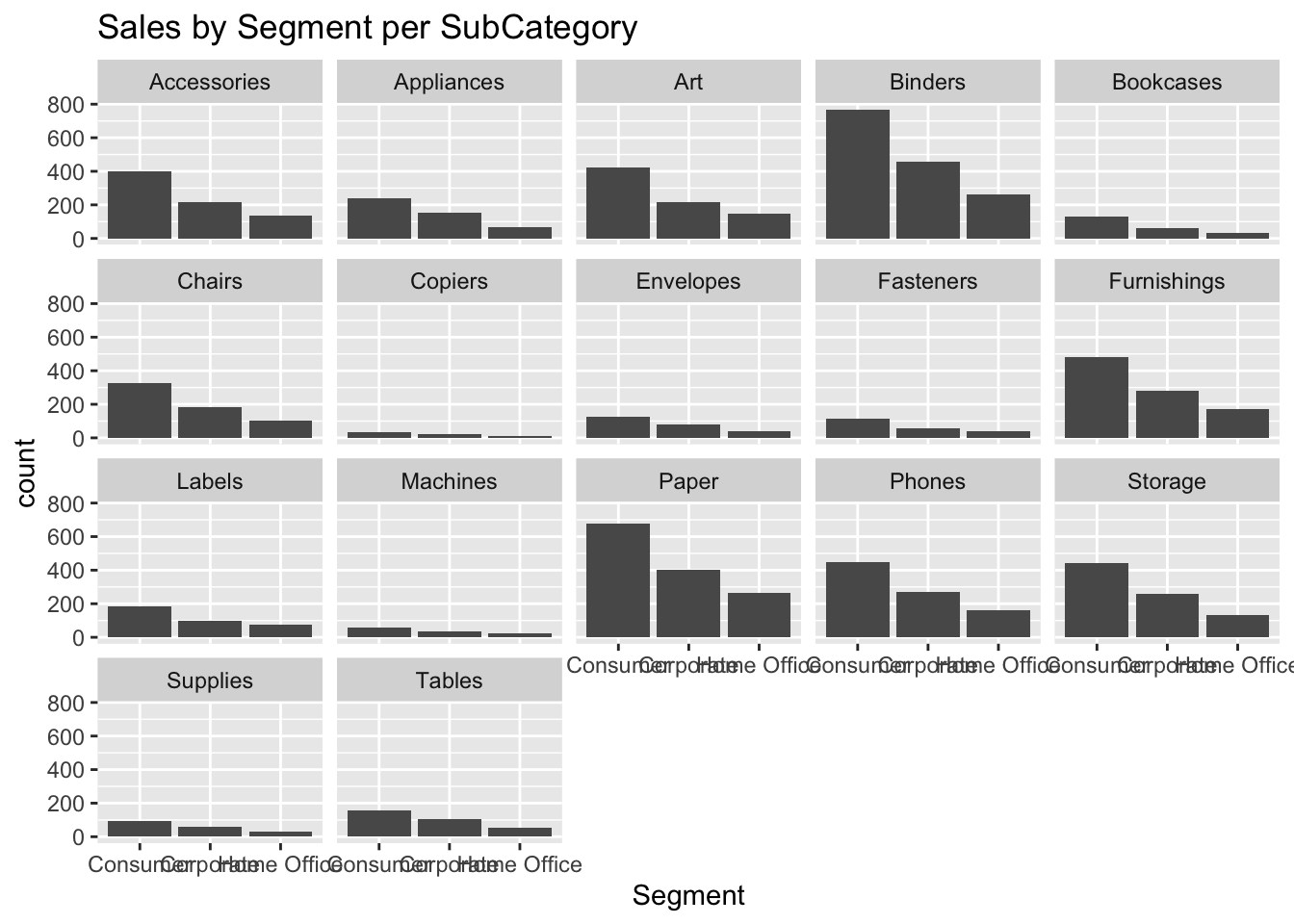
ggplot(data, aes(Segment)) +geom_bar() +labs(title ="Sales by Segment per SubCategory") +facet_wrap(vars(SubCategory))
Now, I tried to cross-match this data with information for each sub-category. And the data did not provide with too much data to understand the trends. Personally, I believed that the category graph gave more understanding in the trends and thus decided to consider the category column and drop the sub-category column.
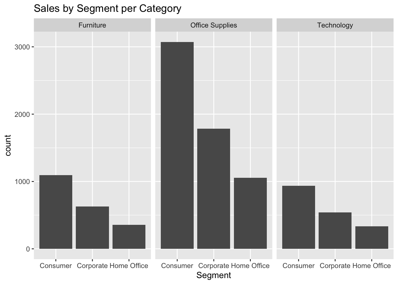
ggplot(data, aes(Segment)) +geom_bar() +labs(title ="Sales by Segment per Category") +facet_wrap(vars(Category))
Observing the Sales by Segment per every Category, the data provided with some insights such as office supplies were the highest bought category and for each category, the highest goods were bought in Consumer Segment. Due to this meaningful insights, using these both fields for the prediction deemed necessary.
All of these graphs were already providing details on the traits of data and thus making predictions on this was not going to answer the question about sales. To answer that question, we needed to use weighted scale on sales and make predictions accordingly for the product sales data.
Results: Analysis and Visualization
After looking at the above graphs, it seemed like a better approach to make prediction on the basis of the regions and thus we had to clean up the data a bit more to use the necessary information only. I am using the Month, Year, Segment, Region, Category and Sales columns for the analysis model. After selecting just these 6 columns I saw that there were many rows with multiple occurrences of the same data and thus decided to combine such rows to have a summed up sales value. I used the summarise() function for this. This resulted in a combined up sales values as per month, year region, category and segment.
#Creating new data frame with sales combined as per all other fieldstotalSales <- newData %>%select(Month, Year, Segment, Region, Category, Sales) %>%group_by(Month, Year, Region, Category, Segment) %>%summarise(across(c(Sales), sum))totalSales
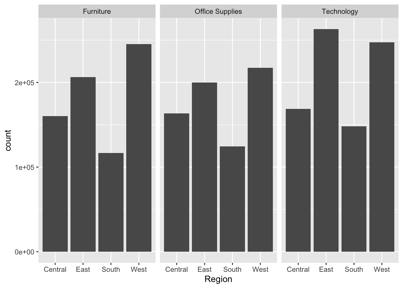
Below is a graph for the Sales as per the Region for each Category.
From just looking at the graph, it was not possible to make predictions on sales and thus using a linear model would prove correct in performing analysis for this model as it would be providing data that we are not able to predict just from looking at the graph and instead actually using summing statistics for obtaining that value of sales.
linear regression model
Here is my linear regression model that predicts sales based on the Month, Year, Segment, Region and the Category of the product. I am using the lm() function to fit the model and then printing the co-efficient of the model to see the trends. The model performs regression and gives out intercept values of bias and co-efficient of each term that can be used for our prediction.
#linear regression modelmodel <-lm(Sales~Month+Year+Segment+Region+Category, data = totalSales)print(model)
Call:
lm(formula = Sales ~ Month + Year + Segment + Region + Category,
data = totalSales)
Coefficients:
(Intercept) Month Year
-355712.3 141.1 176.8
SegmentCorporate SegmentHome Office RegionEast
-740.6 -1162.4 437.8
RegionSouth RegionWest CategoryOffice Supplies
-198.5 513.9 -106.1
CategoryTechnology
278.9
#printing the coefficients for bias and attributescat("# # # # The Coefficient Values # # # ","\n")
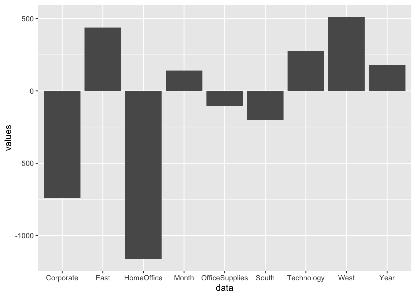
Below is a graph about co-relation between the co-efficient for different attributes of the model. This shows the scale of how much any attribute is considered important whether in positive or negative sense while calculating the prediction values.
#creating a new data frame storing the coefficients of each attributedf <-data.frame (data =c("Month", "Year", "Corporate", "HomeOffice", "East", "South", "West", "OfficeSupplies", "Technology"),values =c(XMonth, XYear, XSegmentCorporate, XSegmentHomeOffice, XRegionEast, XRegionSouth, XRegionWest, XCategoryOfficeSupplies, XCategoryTechnology))df
#plotting the coefficientsggplot(df, aes(data, values)) +geom_bar(stat="identity")
The graph above shows the weightage of co-efficient that is it shows how different attributes have different weightage on the value of predicting the sales. For example, you can see that goods which belong to category home office have a very high negative impact on the prediction values where as on contrast the regions East and West can be said to have a high positive impact on to the sales value prediction. Thus, we can see how much each attribute has an effect on the sales value and which attribute if even changed a little will provide higher change in the final sales value.
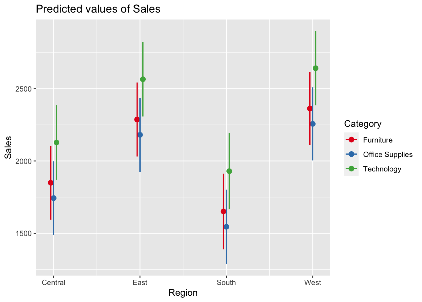
#plotting the marginal predicted values as per their region and categoryplot_model(model, type ="pred", terms =c("Region", "Category"))
The above graph plots marginal effects of terms on the model that is it computes predicted values for all possible levels and values from a model’s predictors. The graph shows all possible value of prediction for sales for different regions and categories. The graph plots out the range of sales for different region in different categories.
prediction
Now we will predict some values of sales for the month of July for different Region and Categories:
#predicting sales for year 2019 in the month of July for Corporate in Region East for Category TechnologyX1 =7X2 =2019X3 =1X4 =0X5 =1X6 =0X7 =0X8 =0X9 =1Y1 = a + XMonth*X1 + XYear*X2 + XSegmentCorporate*X3 + XSegmentHomeOffice*X4 + XRegionEast*X5 + XRegionSouth*X6 + XRegionWest*X7 + XCategoryOfficeSupplies*X8 + XCategoryTechnology*X9
sales for year 2019 in the month of July for Corporate in Region East for Category Technology:
print(Y1)
(Intercept)
2285.047
#predicting sales for year 2019 in the month of July for Corporate in Region East for Category Office SuppliesX1 =7X2 =2019X3 =1X4 =0X5 =1X6 =0X7 =0X8 =1X9 =0Y2 = a + XMonth*X1 + XYear*X2 + XSegmentCorporate*X3 + XSegmentHomeOffice*X4 + XRegionEast*X5 + XRegionSouth*X6 + XRegionWest*X7 + XCategoryOfficeSupplies*X8 + XCategoryTechnology*X9
sales for year 2019 in the month of July for Corporate in Region East for Category Office Supplies:
print(Y2)
(Intercept)
1900.07
#predicting sales for year 2019 in the month of July for Corporate in Region South for Category TechnologyX1 =7X2 =2019X3 =1X4 =0X5 =0X6 =1X7 =0X8 =0X9 =1Y3 = a + XMonth*X1 + XYear*X2 + XSegmentCorporate*X3 + XSegmentHomeOffice*X4 + XRegionEast*X5 + XRegionSouth*X6 + XRegionWest*X7 + XCategoryOfficeSupplies*X8 + XCategoryTechnology*X9
sales for year 2019 in the month of July for Corporate in Region South for Category Technology:
print(Y3)
(Intercept)
1648.761
#predicting sales for year 2019 in the month of July for Corporate in Region South for Category Office SuppliesX1 =7X2 =2019X3 =1X4 =0X5 =0X6 =1X7 =0X8 =1X9 =0Y4 = a + XMonth*X1 + XYear*X2 + XSegmentCorporate*X3 + XSegmentHomeOffice*X4 + XRegionEast*X5 + XRegionSouth*X6 + XRegionWest*X7 + XCategoryOfficeSupplies*X8 + XCategoryTechnology*X9
sales for year 2019 in the month of July for Corporate in Region South for Category Office Supplies:
print(Y4)
(Intercept)
1263.783
#predicting sales for year 2019 in the month of July for Corporate in Region West for Category TechnologyX1 =7X2 =2019X3 =1X4 =0X5 =0X6 =0X7 =1X8 =0X9 =1Y5 = a + XMonth*X1 + XYear*X2 + XSegmentCorporate*X3 + XSegmentHomeOffice*X4 + XRegionEast*X5 + XRegionSouth*X6 + XRegionWest*X7 + XCategoryOfficeSupplies*X8 + XCategoryTechnology*X9
sales for year 2019 in the month of July for Corporate in Region West for Category Technology:
print(Y5)
(Intercept)
2361.127
#predicting sales for year 2019 in the month of July for Corporate in Region East for Category Office SuppliesX1 =7X2 =2019X3 =1X4 =0X5 =0X6 =0X7 =1X8 =1X9 =0Y6 = a + XMonth*X1 + XYear*X2 + XSegmentCorporate*X3 + XSegmentHomeOffice*X4 + XRegionEast*X5 + XRegionSouth*X6 + XRegionWest*X7 + XCategoryOfficeSupplies*X8 + XCategoryTechnology*X9
sales for year 2019 in the month of July for Corporate in Region West for Category Office Supplies:
print(Y6)
(Intercept)
1976.149
results
The table below shows the predicted values of sales for the month of July in different Regions and for different Categories made using our linear regression model.
#visualization of the predicted values in a tabular formattab <-matrix(c(Y1, Y2, Y3, Y4, Y5, Y6), ncol=3, byrow=TRUE)colnames(tab) <-c('East','South','West')rownames(tab) <-c('OfficeSupplies','Technology')tab <-as.table(tab)tab
East South West
OfficeSupplies 2285.047 1900.070 1648.761
Technology 1263.783 2361.127 1976.149
Sales Forecast for July 2019
Conclusion and Discussion
Thus from above results we can conclude that we can predict the sales value for future months with just using a simple prediction model and some detailed data about the past sales. The model was successful for prognosis of sales giving values as requested. For a future scope on this project, we can also use other types of models such as logistic regression or neural network for more accurate prediction. Also, we can make prediction as per the product types or location too for more minute detailed answer to our question. This will help me know about which stock to keep ready for sales, which product to get off my hands to avoid any loss and which product to not buy as it is not going to sell.
Linear Regression Model https://www.rdocumentation.org/packages/stats/versions/3.6.2/topics/lm
Time Series Forecasting https://www.tableau.com/learn/articles/time-series-forecasting
Modern Data Science with R https://mdsr-book.github.io/mdsr2e/
Source Code
---title: "Final Project: Pooja Shah"author: "Pooja Shah"description: "Project & Data Description"date: "05/30/2023"format: html: df-print: paged toc: true code-copy: true code-tools: true css: styles.csscategories: - final_project - Pooja Shah - future sales forecast - supermarket sales dataeditor_options: chunk_output_type: console---```{r}#loading the libraries#| label: setup#| warning: false#| message: falselibrary(tidyverse)library(ggplot2)library(tidyr)library(dplyr)library(sjPlot)knitr::opts_chunk$set(echo =TRUE, warning=FALSE, message=FALSE)```## IntroductionIn today's online world, sales keep on changing depending on the months and season for various products. And for any business to not run into loss, it is necessary for it to predict the amount of sales it will be doing on any particular product depending on the month/season. With help of these, the companies have at least an idea of how the sales for a product can be in the coming months. This is known as time series forecasting. Here, I will be using this prediction method on the sales data of a superstore to find out how the sales of products in each category is related by the month of the year, region of sales and such other attributes. This will help me gain insights into the patterns and trends that affect sales. This information can then be used for predicting future sales and making informed business decisions.## BackgroundTime series forecasting is a technique that utilizes historical and current data to predict future values over a period of time or a specific point in the future. We predict future values based on past observations in a time-dependent data set. It involves analyzing patterns, trends, and seasonality within the data to make predictions about future values. This topic gained my interest because I was always eager to know how supermarkets and superstores always have items in stock that you may need depending on the month and season. For example, as soon as any of the festivals are coming near like Christmas, Easter, Thanksgiving or Halloween, the products available in the store match those needs. When the spring nears the product range available is different than when it is in the fall season. Not only this, even the products available are such that those that people like to buy. Which means the store is already making predictions on which products the customer likes to buy and orders only such stuff. My main aim behind choosing this project is understanding how a store decides on which items to have ordered and in stock, ready for sale. My main research question is how much is the sales of a product going to be to decide if I should be buying more of that product or not? I want to know which product to be kept ready for sale so that I have enough stock to supply to the customer and also not too much stock that my company goes into loss due to too much surplus stock.This sales predictor will try and make prediction on what the sales would be for a product in a coming month and help the supermarkets know about which items to stock up and which items to not stock up to avoid losses.## Data IntroductionI will be using a kaggle data set, [Superstore Sales Dataset](https://www.kaggle.com/datasets/rohitsahoo/sales-forecasting), about Sales in a Superstore chain with data about sales in all of its branches, for Sales Forecasting. The data set has information about sales in a retail store and I will use that data to forecast sales pattern.The data set has almost 10k rows of information about sales and their 18 attributes. Each row consists of information such as the ordered goods information, shipment information, customer information and sales information. This information provides details on the order, explaining how and for what basis is the each order made.My main aim with this data set is to understand the trends within the data and predict on the amount of goods that will be sold in the nearby future. This will lead to knowing how much surplus amount of goods a company should have ready to make sure there isn’t a shortage in the stores in the future.### Dataset Description#### loading the data```{r}# loading the datadata <-read_csv("PoojaShah_FinalProjectData/_data/data.csv")data```The data consists of each row with 18 attributes describing the order information, shipment information, customer information, location of that particular order in terms of city, state, region and country. All the orders are from the same country only, i.e. United States and thus, this column can be considered as one of the unnecessary columns. The data also has further information about the product regarding the category and sub-category it belongs to. Just from a look on the data set, we can point out that a lot of data columns are repetitive. For example, when we are predicting sales for the regions, there is no need for the postal code, city or state columns. We will select the data as per our need and use only a subset of this data set for our prediction.### Desprictive Information about Data SetHere is some information about our dataset such as the number of rows, number of columns calculated using dim() function and the name of those columns calculated using colnames() function.```{r}# describing the data in terms of dimensions and column namesdim(data)colnames(data)# Modifying Column Namescolnames(data)[3] ="OrderDate"colnames(data)[5] ="ShipMode"colnames(data)[16] ="SubCategory"colnames(data)```The data consists of 18 attributes pertaining to each row of data. Here, I have modified the column names to have the important column names without the spaces in between. This is just for more convenience as using the column names with a space in between is harder to access and thus I renamed them to names without space in between.### Tidy DataMy first step here is dividing up the order date to have access to the month and year of the order separately. I separated the date using separate_wider_delim() function, separating the date using the forward slash (/). This will help me with analyzing the data as per the month and the year of the sales. I have added 2 more columns to the data set namely Month and Year.```{r}# Modifying data to split datesdateData <- data %>%separate_wider_delim(OrderDate, '/', names =c("Date", "Month", "Year"))dateDatadateData$Month =as.numeric(as.character(dateData$Month))dateData$Year =as.numeric(as.character(dateData$Year)) ```Once I had my month and year columns, I made a new subset of the data set consisting only of the columns that deemed necessary for analysis. I chose the select() function to select the columns necessary and made a new data set from that to use for my analysis part.```{r}# Making a new data frame with only necessary columnsnewData <- dateData %>%select(c("Month", "Year", "Segment", "State", "Region", "Category", "SubCategory", "Sales"))newData```### Descriptive Statistics#### summary statistics of data:Now let's do some statistical analysis on our data.```{r}#descriptive summary stats of the datasummary(newData)newData %>%select(Sales) %>%sapply(sd)```Here, we are seeing the summary statistics of our data that is describing the mean, median, quartiles as well as min and max of our data. To make sure that we are not putting unnecessary load on our data, we are only performing statistics on the data we deemed necessary. We also have performed standard deviation on sales here to understand the deviation of data in the sales value.## Analysis PlanOn more detailed look at the data set, I felt the month and year of the order are necessary fields, but should be taken in consideration individually, and thus, I decided to divide those into two separate columns for consideration. The other columns I feel would be necessary for the analysis of data are the segment, region, category and sub-category. Thus, I will be using a subset of the data set with these information for all the analytical part. I aim to run a linear regression on the data available afterwards to predict on the sales values for different category of products . The goal here is to find that which columns of the data have a higher effect on the sales values and how much does sales amount differ on the basis of these columns.Now we are going to plot some graphs to understand how the columns are co-related to each other and understand our data in a better manner.Here, I am using 8 columns of the data that seemed important for my analysis. These columns are as under:```{r}colnames(newData)```I tried cross-matching the different attributes and making graphs as below:```{r}ggplot(data, aes(Region, fill = Segment)) +geom_bar() +labs(title ="Sales per Region by Segment") ```The above graph shows the amount of occurrence of different types of segments such as consumer, corporate or home office as per each region. It can be seen that for each region, the consumer segment counted as almost 50% of the occurrence.```{r}ggplot(data, aes(Region, fill = Segment)) +geom_bar() +labs(title ="Sales per Region by Segment divided by States") +facet_wrap(vars(State)) ```Now, I tried plotting the same data but depending on each state. It was clearly visible that only 4 states, California, New York, Texas and Washington counted for the most of the sales. While the other states did not have a lot of effect. This graphs made me feel like the state was not one of the important field to be considered and thus, I decided to drop it when performing the evaluations.Now, I tried to cross-validate into deciding if the category and sub-category both had equal importance or not.```{r}ggplot(data, aes(Category, fill = Segment)) +geom_bar() +labs(title ="Sales by Category per Segment")```I plotted the categories of the goods as per the segment. Similar to the case of the region, for categories too consumer counted as almost 50% of occurrences.```{r}ggplot(data, aes(Segment)) +geom_bar() +labs(title ="Sales by Segment per SubCategory") +facet_wrap(vars(SubCategory))```Now, I tried to cross-match this data with information for each sub-category. And the data did not provide with too much data to understand the trends. Personally, I believed that the category graph gave more understanding in the trends and thus decided to consider the category column and drop the sub-category column.```{r}ggplot(data, aes(Segment)) +geom_bar() +labs(title ="Sales by Segment per Category") +facet_wrap(vars(Category))```Observing the Sales by Segment per every Category, the data provided with some insights such as office supplies were the highest bought category and for each category, the highest goods were bought in Consumer Segment. Due to this meaningful insights, using these both fields for the prediction deemed necessary. All of these graphs were already providing details on the traits of data and thus making predictions on this was not going to answer the question about sales. To answer that question, we needed to use weighted scale on sales and make predictions accordingly for the product sales data.## Results: Analysis and VisualizationAfter looking at the above graphs, it seemed like a better approach to make prediction on the basis of the regions and thus we had to clean up the data a bit more to use the necessary information only. I am using the Month, Year, Segment, Region, Category and Sales columns for the analysis model. After selecting just these 6 columns I saw that there were many rows with multiple occurrences of the same data and thus decided to combine such rows to have a summed up sales value. I used the summarise() function for this. This resulted in a combined up sales values as per month, year region, category and segment.```{r}#Creating new data frame with sales combined as per all other fieldstotalSales <- newData %>%select(Month, Year, Segment, Region, Category, Sales) %>%group_by(Month, Year, Region, Category, Segment) %>%summarise(across(c(Sales), sum))totalSales```Below is a graph for the Sales as per the Region for each Category. ```{r}ggplot(totalSales, aes(Region, weight = Sales)) +geom_bar() +facet_wrap(vars(Category))```From just looking at the graph, it was not possible to make predictions on sales and thus using a linear model would prove correct in performing analysis for this model as it would be providing data that we are not able to predict just from looking at the graph and instead actually using summing statistics for obtaining that value of sales.### linear regression modelHere is my linear regression model that predicts sales based on the Month, Year, Segment, Region and the Category of the product. I am using the lm() function to fit the model and then printing the co-efficient of the model to see the trends. The model performs regression and gives out intercept values of bias and co-efficient of each term that can be used for our prediction.```{r}#linear regression modelmodel <-lm(Sales~Month+Year+Segment+Region+Category, data = totalSales)print(model)#printing the coefficients for bias and attributescat("# # # # The Coefficient Values # # # ","\n")a <-coef(model)[1]print(a)XMonth <-coef(model)[2]XYear <-coef(model)[3]XSegmentCorporate <-coef(model)[4]XSegmentHomeOffice <-coef(model)[5]XRegionEast <-coef(model)[6]XRegionSouth <-coef(model)[7]XRegionWest <-coef(model)[8]XCategoryOfficeSupplies <-coef(model)[9]XCategoryTechnology <-coef(model)[10]```Below is a graph about co-relation between the co-efficient for different attributes of the model. This shows the scale of how much any attribute is considered important whether in positive or negative sense while calculating the prediction values.```{r}#creating a new data frame storing the coefficients of each attributedf <-data.frame (data =c("Month", "Year", "Corporate", "HomeOffice", "East", "South", "West", "OfficeSupplies", "Technology"),values =c(XMonth, XYear, XSegmentCorporate, XSegmentHomeOffice, XRegionEast, XRegionSouth, XRegionWest, XCategoryOfficeSupplies, XCategoryTechnology))df#plotting the coefficientsggplot(df, aes(data, values)) +geom_bar(stat="identity")```The graph above shows the weightage of co-efficient that is it shows how different attributes have different weightage on the value of predicting the sales. For example, you can see that goods which belong to category home office have a very high negative impact on the prediction values where as on contrast the regions East and West can be said to have a high positive impact on to the sales value prediction. Thus, we can see how much each attribute has an effect on the sales value and which attribute if even changed a little will provide higher change in the final sales value.```{r}#plotting the marginal predicted values as per their region and categoryplot_model(model, type ="pred", terms =c("Region", "Category"))```The above graph plots marginal effects of terms on the model that is it computes predicted values for all possible levels and values from a model’s predictors. The graph shows all possible value of prediction for sales for different regions and categories. The graph plots out the range of sales for different region in different categories.### predictionNow we will predict some values of sales for the month of July for different Region and Categories:```{r}#predicting sales for year 2019 in the month of July for Corporate in Region East for Category TechnologyX1 =7X2 =2019X3 =1X4 =0X5 =1X6 =0X7 =0X8 =0X9 =1Y1 = a + XMonth*X1 + XYear*X2 + XSegmentCorporate*X3 + XSegmentHomeOffice*X4 + XRegionEast*X5 + XRegionSouth*X6 + XRegionWest*X7 + XCategoryOfficeSupplies*X8 + XCategoryTechnology*X9```sales for year 2019 in the month of July for Corporate in Region East for Category Technology:```{r}print(Y1)``````{r}#predicting sales for year 2019 in the month of July for Corporate in Region East for Category Office SuppliesX1 =7X2 =2019X3 =1X4 =0X5 =1X6 =0X7 =0X8 =1X9 =0Y2 = a + XMonth*X1 + XYear*X2 + XSegmentCorporate*X3 + XSegmentHomeOffice*X4 + XRegionEast*X5 + XRegionSouth*X6 + XRegionWest*X7 + XCategoryOfficeSupplies*X8 + XCategoryTechnology*X9```sales for year 2019 in the month of July for Corporate in Region East for Category Office Supplies:```{r}print(Y2)``````{r}#predicting sales for year 2019 in the month of July for Corporate in Region South for Category TechnologyX1 =7X2 =2019X3 =1X4 =0X5 =0X6 =1X7 =0X8 =0X9 =1Y3 = a + XMonth*X1 + XYear*X2 + XSegmentCorporate*X3 + XSegmentHomeOffice*X4 + XRegionEast*X5 + XRegionSouth*X6 + XRegionWest*X7 + XCategoryOfficeSupplies*X8 + XCategoryTechnology*X9```sales for year 2019 in the month of July for Corporate in Region South for Category Technology:```{r}print(Y3)``````{r}#predicting sales for year 2019 in the month of July for Corporate in Region South for Category Office SuppliesX1 =7X2 =2019X3 =1X4 =0X5 =0X6 =1X7 =0X8 =1X9 =0Y4 = a + XMonth*X1 + XYear*X2 + XSegmentCorporate*X3 + XSegmentHomeOffice*X4 + XRegionEast*X5 + XRegionSouth*X6 + XRegionWest*X7 + XCategoryOfficeSupplies*X8 + XCategoryTechnology*X9```sales for year 2019 in the month of July for Corporate in Region South for Category Office Supplies:```{r}print(Y4)``````{r}#predicting sales for year 2019 in the month of July for Corporate in Region West for Category TechnologyX1 =7X2 =2019X3 =1X4 =0X5 =0X6 =0X7 =1X8 =0X9 =1Y5 = a + XMonth*X1 + XYear*X2 + XSegmentCorporate*X3 + XSegmentHomeOffice*X4 + XRegionEast*X5 + XRegionSouth*X6 + XRegionWest*X7 + XCategoryOfficeSupplies*X8 + XCategoryTechnology*X9```sales for year 2019 in the month of July for Corporate in Region West for Category Technology:```{r}print(Y5)``````{r}#predicting sales for year 2019 in the month of July for Corporate in Region East for Category Office SuppliesX1 =7X2 =2019X3 =1X4 =0X5 =0X6 =0X7 =1X8 =1X9 =0Y6 = a + XMonth*X1 + XYear*X2 + XSegmentCorporate*X3 + XSegmentHomeOffice*X4 + XRegionEast*X5 + XRegionSouth*X6 + XRegionWest*X7 + XCategoryOfficeSupplies*X8 + XCategoryTechnology*X9```sales for year 2019 in the month of July for Corporate in Region West for Category Office Supplies:```{r}print(Y6)```### resultsThe table below shows the predicted values of sales for the month of July in different Regions and for different Categories made using our linear regression model.```{r}#visualization of the predicted values in a tabular formattab <-matrix(c(Y1, Y2, Y3, Y4, Y5, Y6), ncol=3, byrow=TRUE)colnames(tab) <-c('East','South','West')rownames(tab) <-c('OfficeSupplies','Technology')tab <-as.table(tab)tab```Sales Forecast for July 2019## Conclusion and Discussion Thus from above results we can conclude that we can predict the sales value for future months with just using a simple prediction model and some detailed data about the past sales. The model was successful for prognosis of sales giving values as requested. For a future scope on this project, we can also use other types of models such as logistic regression or neural network for more accurate prediction. Also, we can make prediction as per the product types or location too for more minute detailed answer to our question. This will help me know about which stock to keep ready for sales, which product to get off my hands to avoid any loss and which product to not buy as it is not going to sell.## Bibliography1. Sales Forecasting Dataset https://www.kaggle.com/datasets/rohitsahoo/sales-forecasting2. Linear Regression Model https://www.rdocumentation.org/packages/stats/versions/3.6.2/topics/lm3. Time Series Forecasting https://www.tableau.com/learn/articles/time-series-forecasting4. Modern Data Science with R https://mdsr-book.github.io/mdsr2e/