library(tidyverse)
library(ggplot2)
library(readxl)
library(tidyr)

knitr::opts_chunk$set(echo = TRUE, warning=FALSE, message=FALSE)
Challenge 6
challenge_6
hotel_bookings
air_bnb
fed_rate
debt
usa_households
abc_poll
Visualizing Time and Relationships
Challenge Overview
Today’s challenge is to:
- read in a data set, and describe the data set using both words and any supporting information (e.g., tables, etc)
- tidy data (as needed, including sanity checks)
- mutate variables as needed (including sanity checks)
- create at least one graph including time (evolution)
- try to make them “publication” ready (optional)
- Explain why you choose the specific graph type
- Create at least one graph depicting part-whole or flow relationships
- try to make them “publication” ready (optional)
- Explain why you choose the specific graph type
R Graph Gallery is a good starting point for thinking about what information is conveyed in standard graph types, and includes example R code.
(be sure to only include the category tags for the data you use!)
Read in data
Read in one (or more) of the following datasets, using the correct R package and command.
- debt ⭐
- fed_rate ⭐⭐
- abc_poll ⭐⭐⭐
- usa_hh ⭐⭐⭐
- hotel_bookings ⭐⭐⭐⭐
- AB_NYC ⭐⭐⭐⭐⭐
debt_data_og <- read_xlsx("_data/debt_in_trillions.xlsx")
debt_data <- debt_data_og
head(debt_data)
# A tibble: 6 × 8
`Year and Quarter` Mortgage `HE Revolving` Auto …¹ Credi…² Stude…³ Other Total
<chr> <dbl> <dbl> <dbl> <dbl> <dbl> <dbl> <dbl>
1 03:Q1 4.94 0.242 0.641 0.688 0.241 0.478 7.23
2 03:Q2 5.08 0.26 0.622 0.693 0.243 0.486 7.38
3 03:Q3 5.18 0.269 0.684 0.693 0.249 0.477 7.56
4 03:Q4 5.66 0.302 0.704 0.698 0.253 0.449 8.07
5 04:Q1 5.84 0.328 0.72 0.695 0.260 0.446 8.29
6 04:Q2 5.97 0.367 0.743 0.697 0.263 0.423 8.46
# … with abbreviated variable names ¹`Auto Loan`, ²`Credit Card`,
# ³`Student Loan`summary(debt_data) Year and Quarter Mortgage HE Revolving Auto Loan
Length:74 Min. : 4.942 Min. :0.2420 Min. :0.6220
Class :character 1st Qu.: 8.036 1st Qu.:0.4275 1st Qu.:0.7430
Mode :character Median : 8.412 Median :0.5165 Median :0.8145
Mean : 8.274 Mean :0.5161 Mean :0.9309
3rd Qu.: 9.047 3rd Qu.:0.6172 3rd Qu.:1.1515
Max. :10.442 Max. :0.7140 Max. :1.4150
Credit Card Student Loan Other Total
Min. :0.6590 Min. :0.2407 Min. :0.2960 Min. : 7.231
1st Qu.:0.6966 1st Qu.:0.5333 1st Qu.:0.3414 1st Qu.:11.311
Median :0.7375 Median :0.9088 Median :0.3921 Median :11.852
Mean :0.7565 Mean :0.9189 Mean :0.3831 Mean :11.779
3rd Qu.:0.8165 3rd Qu.:1.3022 3rd Qu.:0.4154 3rd Qu.:12.674
Max. :0.9270 Max. :1.5840 Max. :0.4860 Max. :14.957 dim(debt_data)[1] 74 8Briefly describe the data
There are 8 columns and 74 rows. The data shows the debt over period of year and quarters. The debt has various types - mortgage, HE Revolving, Auto Loan, Credit Card, Student Loan, Other accumulated to total debt in the last column.
Tidy Data (as needed)
Is your data already tidy, or is there work to be done? Be sure to anticipate your end result to provide a sanity check, and document your work here.
I believe it would be easier to perform visualizations if we divide the year and quarter into 2 separate columns.
Are there any variables that require mutation to be usable in your analysis stream? For example, do you need to calculate new values in order to graph them? Can string values be represented numerically? Do you need to turn any variables into factors and reorder for ease of graphics and visualization?
Document your work here.
debt_data <- debt_data %>%
  rename(year_quarter = `Year and Quarter`)

debt_data <- debt_data %>%
  separate(year_quarter, into = c("Year", "Quarter"), sep = ":Q")

head(debt_data)
# A tibble: 6 × 9
Year Quarter Mortgage `HE Revolving` `Auto Loan` Credit…¹ Stude…² Other Total
<chr> <chr> <dbl> <dbl> <dbl> <dbl> <dbl> <dbl> <dbl>
1 03 1 4.94 0.242 0.641 0.688 0.241 0.478 7.23
2 03 2 5.08 0.26 0.622 0.693 0.243 0.486 7.38
3 03 3 5.18 0.269 0.684 0.693 0.249 0.477 7.56
4 03 4 5.66 0.302 0.704 0.698 0.253 0.449 8.07
5 04 1 5.84 0.328 0.72 0.695 0.260 0.446 8.29
6 04 2 5.97 0.367 0.743 0.697 0.263 0.423 8.46
# … with abbreviated variable names ¹`Credit Card`, ²`Student Loan`Time Dependent Visualization
avg_debt <- debt_data %>%
  group_by(Year) %>%
  summarise(AvgTotal = mean(Total))

head(avg_debt)
# A tibble: 6 × 2
Year AvgTotal
<chr> <dbl>
1 03 7.56
2 04 8.66
3 05 9.62
4 06 10.9
5 07 12.0
6 08 12.6 ggplot(avg_debt,aes(x=Year, y=AvgTotal)) + geom_point() + ggtitle("Evolution of Average Debt over Years")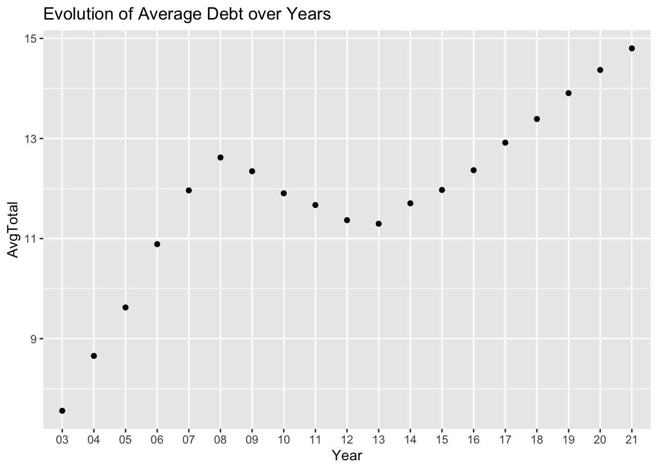
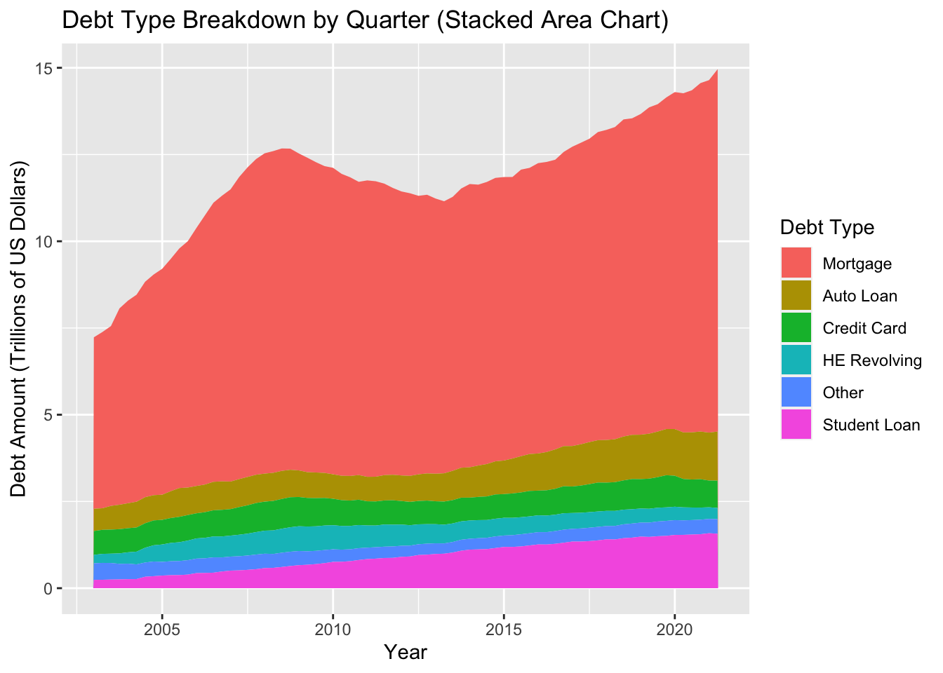
Visualizing Part-Whole Relationships
debt_data<-debt_data%>%
  mutate(Year = as.integer(Year)+2000,Quarter = as.integer(Quarter))%>%
  gather("debt_type", "amount", Mortgage:Total)

head(debt_data)
# A tibble: 6 × 4
Year Quarter debt_type amount
<dbl> <int> <chr> <dbl>
1 2003 1 Mortgage 4.94
2 2003 2 Mortgage 5.08
3 2003 3 Mortgage 5.18
4 2003 4 Mortgage 5.66
5 2004 1 Mortgage 5.84
6 2004 2 Mortgage 5.97debt_data %>%
filter(debt_type != "Total") %>%
mutate(debt_type = fct_relevel(debt_type, "Mortgage", "Auto Loan", "Credit Card", "HE Revolving", "Other", "Student Loan")) %>%
ggplot(aes(x = Year + (Quarter-1) / 4, y = amount, fill = debt_type)) +
geom_area() +
labs(title = "Debt Type Breakdown by Quarter (Stacked Area Chart)",
x = "Year",
y = "Debt Amount (Trillions of US Dollars)",
fill = "Debt Type")