    id                                             name host_id   host_name
1 2539               Clean & quiet apt home by the park    2787        John
2 2595                            Skylit Midtown Castle    2845    Jennifer
3 3647              THE VILLAGE OF HARLEM....NEW YORK !    4632   Elisabeth
4 3831                  Cozy Entire Floor of Brownstone    4869 LisaRoxanne
5 5022 Entire Apt: Spacious Studio/Loft by central park    7192       Laura
6 5099        Large Cozy 1 BR Apartment In Midtown East    7322       Chris
  neighbourhood_group neighbourhood latitude longitude       room_type price
1            Brooklyn    Kensington 40.64749 -73.97237    Private room   149
2           Manhattan       Midtown 40.75362 -73.98377 Entire home/apt   225
3           Manhattan        Harlem 40.80902 -73.94190    Private room   150
4            Brooklyn  Clinton Hill 40.68514 -73.95976 Entire home/apt    89
5           Manhattan   East Harlem 40.79851 -73.94399 Entire home/apt    80
6           Manhattan   Murray Hill 40.74767 -73.97500 Entire home/apt   200
  minimum_nights number_of_reviews last_review reviews_per_month
1              1                 9  2018-10-19              0.21
2              1                45  2019-05-21              0.38
3              3                 0                            NA
4              1               270  2019-07-05              4.64
5             10                 9  2018-11-19              0.10
6              3                74  2019-06-22              0.59
  calculated_host_listings_count availability_365
1                              6              365
2                              2              355
3                              1              365
4                              1              194
5                              1                0
6                              1              129
Describe Data
This dataset contains information on almost 49,000 Airbnb rental units in New York City during the year 2019. Each observation represents a single rental unit and includes 16 variables providing details about the unit, such as its id, name, location, host id and name, room type, price, minimum number of nights required for a reservation, number of reviews, date of the last review, average reviews per month, a calculated count of host listings with Airbnb, and availability.
Code
dim(df)
[1] 48895 16
Code
str(df)
'data.frame':   48895 obs. of  16 variables:
 $ id                            : int  2539 2595 3647 3831 5022 5099 5121 5178 5203 5238 ...
 $ name                          : chr  "Clean & quiet apt home by the park" "Skylit Midtown Castle" "THE VILLAGE OF HARLEM....NEW YORK !" "Cozy Entire Floor of Brownstone" ...
 $ host_id                       : int  2787 2845 4632 4869 7192 7322 7356 8967 7490 7549 ...
 $ host_name                     : chr  "John" "Jennifer" "Elisabeth" "LisaRoxanne" ...
 $ neighbourhood_group           : chr  "Brooklyn" "Manhattan" "Manhattan" "Brooklyn" ...
 $ neighbourhood                 : chr  "Kensington" "Midtown" "Harlem" "Clinton Hill" ...
 $ latitude                      : num  40.6 40.8 40.8 40.7 40.8 ...
 $ longitude                     : num  -74 -74 -73.9 -74 -73.9 ...
 $ room_type                     : chr  "Private room" "Entire home/apt" "Private room" "Entire home/apt" ...
 $ price                         : int  149 225 150 89 80 200 60 79 79 150 ...
 $ minimum_nights                : int  1 1 3 1 10 3 45 2 2 1 ...
 $ number_of_reviews             : int  9 45 0 270 9 74 49 430 118 160 ...
 $ last_review                   : chr  "2018-10-19" "2019-05-21" "" "2019-07-05" ...
 $ reviews_per_month             : num  0.21 0.38 NA 4.64 0.1 0.59 0.4 3.47 0.99 1.33 ...
 $ calculated_host_listings_count: int  6 2 1 1 1 1 1 1 1 4 ...
 $ availability_365              : int  365 355 365 194 0 129 0 220 0 188 ...
Code
#summary of data set statisticsprint(summarytools::dfSummary(df,varnumbers =FALSE,plain.ascii =FALSE, style ="grid", graph.magnif =0.70, valid.col =FALSE),method ='render',table.classes ='table-condensed')
Data Frame Summary
df
Dimensions: 48895 x 16
Duplicates: 0
Variable
Stats / Values
Freqs (% of Valid)
Graph
Missing
id [integer]
Mean (sd) : 19017143 (10983108)
min ≤ med ≤ max:
2539 ≤ 19677284 ≤ 36487245
IQR (CV) : 19680234 (0.6)
48895 distinct values
0 (0.0%)
name [character]
1. Hillside Hotel
2. Home away from home
3. (Empty string)
4. New york Multi-unit build
5. Brooklyn Apartment
6. Loft Suite @ The Box Hous
7. Private Room
8. Artsy Private BR in Fort
9. Private room
10. Beautiful Brooklyn Browns
[ 47896 others ]
18
(
0.0%
)
17
(
0.0%
)
16
(
0.0%
)
16
(
0.0%
)
12
(
0.0%
)
11
(
0.0%
)
11
(
0.0%
)
10
(
0.0%
)
10
(
0.0%
)
8
(
0.0%
)
48766
(
99.7%
)
0 (0.0%)
host_id [integer]
Mean (sd) : 67620011 (78610967)
min ≤ med ≤ max:
2438 ≤ 30793816 ≤ 274321313
IQR (CV) : 99612390 (1.2)
37457 distinct values
0 (0.0%)
host_name [character]
1. Michael
2. David
3. Sonder (NYC)
4. John
5. Alex
6. Blueground
7. Sarah
8. Daniel
9. Jessica
10. Maria
[ 11443 others ]
417
(
0.9%
)
403
(
0.8%
)
327
(
0.7%
)
294
(
0.6%
)
279
(
0.6%
)
232
(
0.5%
)
227
(
0.5%
)
226
(
0.5%
)
205
(
0.4%
)
204
(
0.4%
)
46081
(
94.2%
)
0 (0.0%)
neighbourhood_group [character]
1. Bronx
2. Brooklyn
3. Manhattan
4. Queens
5. Staten Island
1091
(
2.2%
)
20104
(
41.1%
)
21661
(
44.3%
)
5666
(
11.6%
)
373
(
0.8%
)
0 (0.0%)
neighbourhood [character]
1. Williamsburg
2. Bedford-Stuyvesant
3. Harlem
4. Bushwick
5. Upper West Side
6. Hell's Kitchen
7. East Village
8. Upper East Side
9. Crown Heights
10. Midtown
[ 211 others ]
3920
(
8.0%
)
3714
(
7.6%
)
2658
(
5.4%
)
2465
(
5.0%
)
1971
(
4.0%
)
1958
(
4.0%
)
1853
(
3.8%
)
1798
(
3.7%
)
1564
(
3.2%
)
1545
(
3.2%
)
25449
(
52.0%
)
0 (0.0%)
latitude [numeric]
Mean (sd) : 40.7 (0.1)
min ≤ med ≤ max:
40.5 ≤ 40.7 ≤ 40.9
IQR (CV) : 0.1 (0)
19048 distinct values
0 (0.0%)
longitude [numeric]
Mean (sd) : -74 (0)
min ≤ med ≤ max:
-74.2 ≤ -74 ≤ -73.7
IQR (CV) : 0 (0)
14718 distinct values
0 (0.0%)
room_type [character]
1. Entire home/apt
2. Private room
3. Shared room
25409
(
52.0%
)
22326
(
45.7%
)
1160
(
2.4%
)
0 (0.0%)
price [integer]
Mean (sd) : 152.7 (240.2)
min ≤ med ≤ max:
0 ≤ 106 ≤ 10000
IQR (CV) : 106 (1.6)
674 distinct values
0 (0.0%)
minimum_nights [integer]
Mean (sd) : 7 (20.5)
min ≤ med ≤ max:
1 ≤ 3 ≤ 1250
IQR (CV) : 4 (2.9)
109 distinct values
0 (0.0%)
number_of_reviews [integer]
Mean (sd) : 23.3 (44.6)
min ≤ med ≤ max:
0 ≤ 5 ≤ 629
IQR (CV) : 23 (1.9)
394 distinct values
0 (0.0%)
last_review [character]
1. (Empty string)
2. 2019-06-23
3. 2019-07-01
4. 2019-06-30
5. 2019-06-24
6. 2019-07-07
7. 2019-07-02
8. 2019-06-22
9. 2019-06-16
10. 2019-07-05
[ 1755 others ]
10052
(
20.6%
)
1413
(
2.9%
)
1359
(
2.8%
)
1341
(
2.7%
)
875
(
1.8%
)
718
(
1.5%
)
658
(
1.3%
)
655
(
1.3%
)
601
(
1.2%
)
580
(
1.2%
)
30643
(
62.7%
)
0 (0.0%)
reviews_per_month [numeric]
Mean (sd) : 1.4 (1.7)
min ≤ med ≤ max:
0 ≤ 0.7 ≤ 58.5
IQR (CV) : 1.8 (1.2)
937 distinct values
10052 (20.6%)
calculated_host_listings_count [integer]
Mean (sd) : 7.1 (33)
min ≤ med ≤ max:
1 ≤ 1 ≤ 327
IQR (CV) : 1 (4.6)
47 distinct values
0 (0.0%)
availability_365 [integer]
Mean (sd) : 112.8 (131.6)
min ≤ med ≤ max:
0 ≤ 45 ≤ 365
IQR (CV) : 227 (1.2)
366 distinct values
0 (0.0%)
Generated by summarytools 1.0.1 (R version 4.2.2) 2023-05-06
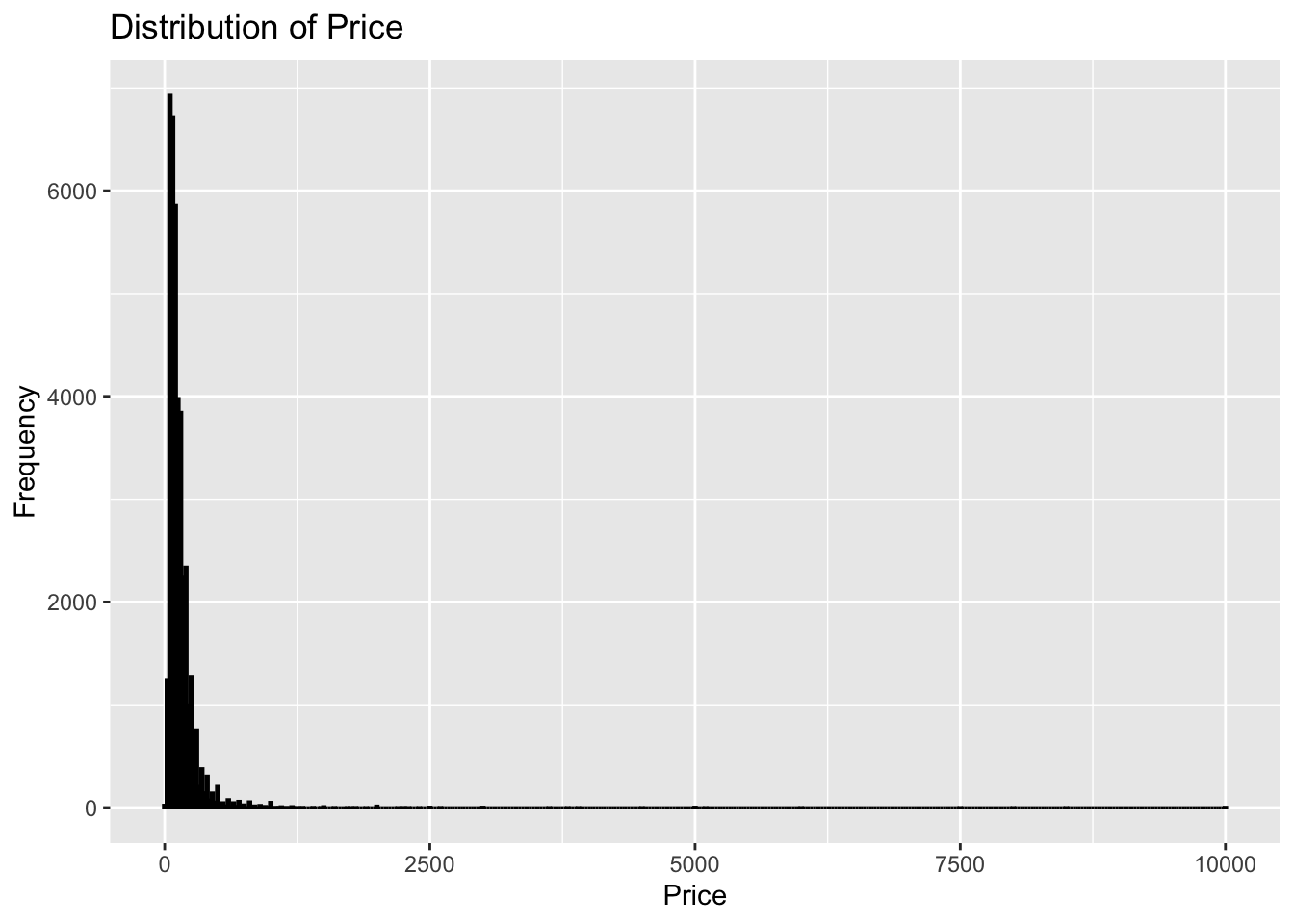
library(ggplot2)ggplot(df, aes(x=price)) +geom_histogram(binwidth=25, color="black", fill="blue") +labs(title="Distribution of Price", x="Price", y="Frequency")
Bivariate Visualization:
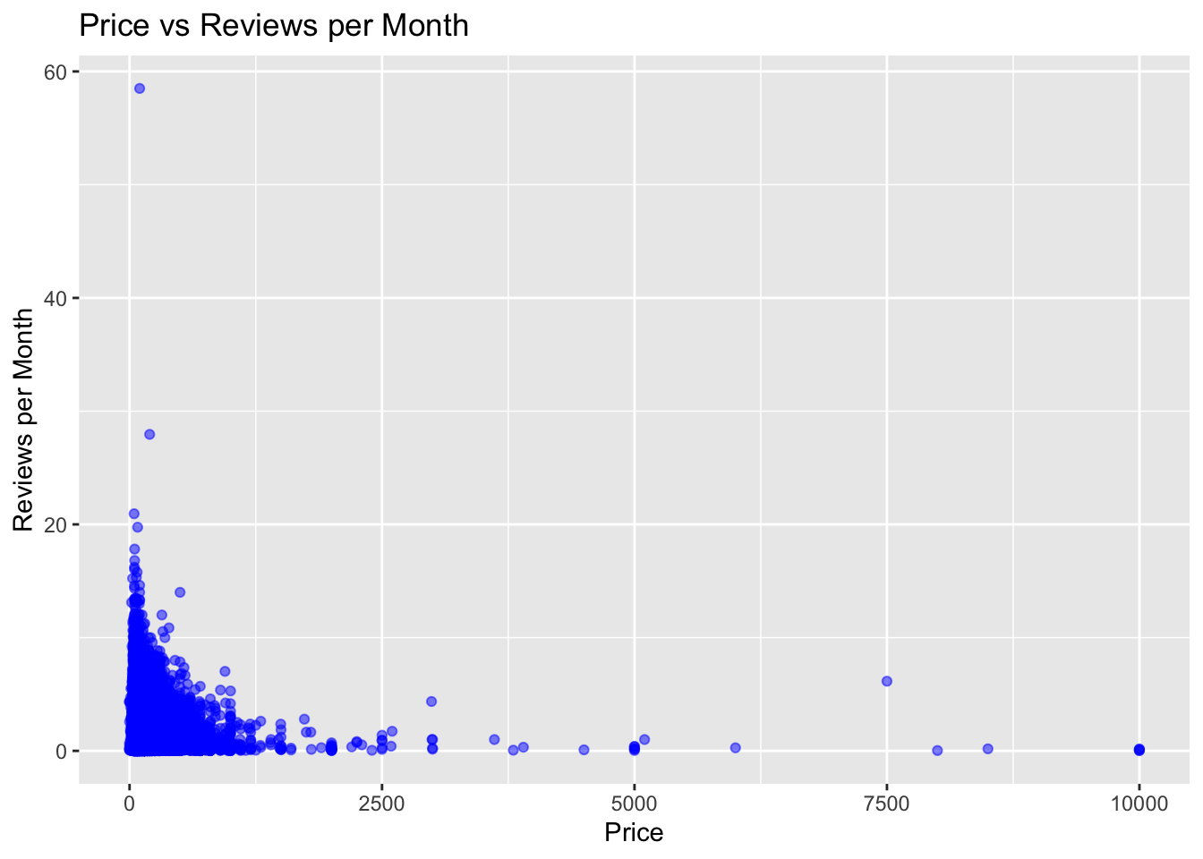
The first scatterplot is of price vs reviews_per_month for the entire dataset. The ggplot function is used to initialize the plot and aes is used to specify the variables for the x and y axis. geom_point is used to add points to the plot and labs is used to specify the title and axis labels.
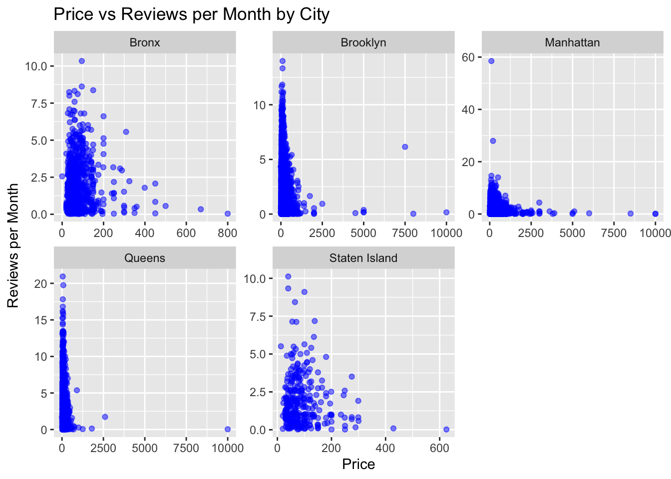
The second code visualization is similar to the first, but with the addition of facetting. facet_wrap is used to create a separate scatterplot for each neighbourhood_group, with the scales=“free” argument ensuring that the y-axis scales are independent for each plot. This allows us to see how the relationship between price and reviews_per_month varies across different neighbourhood_group in the dataset.
Code
ggplot(df, aes(x=price, y=reviews_per_month)) +geom_point(alpha=0.5, color="blue") +labs(title="Price vs Reviews per Month", x="Price", y="Reviews per Month")
Code
ggplot(df, aes(x=price, y=reviews_per_month)) +geom_point(alpha=0.5, color="blue") +labs(title="Price vs Reviews per Month by City", x="Price", y="Reviews per Month") +facet_wrap(~ neighbourhood_group, scales="free")
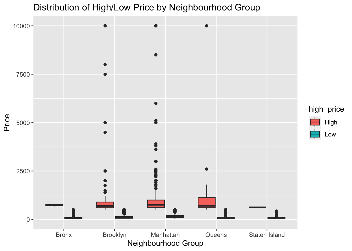
We first convert the “neighbourhood_group” column to a factor variable using the “as.factor()” function. Then, we create a box plot of “price” by “neighbourhood_group”, with the fill color indicating whether the price is high or low. This allows us to compare the distribution of high and low prices across different neighbourhood groups. The resulting plot shows the median, quartiles, and any outliers for each neighbourhood group, making it easy to identify any differences in price distribution.
ggplot(df, aes(x=neighbourhood_group, y=price, fill=high_price)) +geom_boxplot() +labs(title="Distribution of High/Low Price by Neighbourhood Group", x="Neighbourhood Group", y="Price")
Explain why you choose the specific graph type
I chose a box plot to visualize the distribution of high and low prices by neighbourhood group because it effectively displays the median, quartiles, and any outliers in the data, making it easy to compare the price distribution across different neighbourhood groups. It also allows us to see any differences in the distribution of high and low prices for each neighbourhood group.
I chose a scatter plot to visualize the relationship between price and reviews per month by city because it shows the individual data points and the overall trend in the data. It allows us to see if there is any relationship between price and reviews per month and if there are any outliers or patterns in the data. The use of different colors to indicate different cities helps to distinguish between the data points for each city.
Source Code
---title: "Challenge 7"author: "Pradhakshya Dhanakumar"desription: "Worked with Air Bnb Data "date: "05/05/2023"format: html: toc: true code-fold: true code-copy: true code-tools: truecategories: - Challenge 7 - Pradhakshya Dhanakumar - AIR_BNB - ggplot2---```{r}#| label: setup#| warning: falselibrary(tidyverse)library(ggplot2)library(dplyr)library(lubridate)knitr::opts_chunk$set(echo =TRUE, warning=FALSE, message=FALSE)```## Reading Data```{r}df <-read.csv("_data/AB_NYC_2019.csv")head(df)```## Describe DataThis dataset contains information on almost 49,000 Airbnb rental units in New York City during the year 2019. Each observation represents a single rental unit and includes 16 variables providing details about the unit, such as its id, name, location, host id and name, room type, price, minimum number of nights required for a reservation, number of reviews, date of the last review, average reviews per month, a calculated count of host listings with Airbnb, and availability.```{r}dim(df)``````{r}str(df)``````{r}#summary of data set statisticsprint(summarytools::dfSummary(df,varnumbers =FALSE,plain.ascii =FALSE, style ="grid", graph.magnif =0.70, valid.col =FALSE),method ='render',table.classes ='table-condensed')```## Tidy Data & Mutate Data```{r}df <-na.omit(df)``````{r}df <- df %>%mutate(high_price =ifelse(price >500, "High", "Low"))```## Visualization with Multiple DimensionsUnivariate Visulization:Histogram of price:```{r}library(ggplot2)ggplot(df, aes(x=price)) +geom_histogram(binwidth=25, color="black", fill="blue") +labs(title="Distribution of Price", x="Price", y="Frequency")```Bivariate Visualization:1. The first scatterplot is of price vs reviews_per_month for the entire dataset. The ggplot function is used to initialize the plot and aes is used to specify the variables for the x and y axis. geom_point is used to add points to the plot and labs is used to specify the title and axis labels.The second code visualization is similar to the first, but with the addition of facetting. facet_wrap is used to create a separate scatterplot for each neighbourhood_group, with the scales="free" argument ensuring that the y-axis scales are independent for each plot. This allows us to see how the relationship between price and reviews_per_month varies across different neighbourhood_group in the dataset.```{r}ggplot(df, aes(x=price, y=reviews_per_month)) +geom_point(alpha=0.5, color="blue") +labs(title="Price vs Reviews per Month", x="Price", y="Reviews per Month")``````{r}ggplot(df, aes(x=price, y=reviews_per_month)) +geom_point(alpha=0.5, color="blue") +labs(title="Price vs Reviews per Month by City", x="Price", y="Reviews per Month") +facet_wrap(~ neighbourhood_group, scales="free")```2. We first convert the "neighbourhood_group" column to a factor variable using the "as.factor()" function. Then, we create a box plot of "price" by "neighbourhood_group", with the fill color indicating whether the price is high or low. This allows us to compare the distribution of high and low prices across different neighbourhood groups. The resulting plot shows the median, quartiles, and any outliers for each neighbourhood group, making it easy to identify any differences in price distribution.```{r}df$neighbourhood_group <-as.factor(df$neighbourhood_group)``````{r}ggplot(df, aes(x=neighbourhood_group, y=price, fill=high_price)) +geom_boxplot() +labs(title="Distribution of High/Low Price by Neighbourhood Group", x="Neighbourhood Group", y="Price")```Q) Explain why you choose the specific graph typeI chose a box plot to visualize the distribution of high and low prices by neighbourhood group because it effectively displays the median, quartiles, and any outliers in the data, making it easy to compare the price distribution across different neighbourhood groups. It also allows us to see any differences in the distribution of high and low prices for each neighbourhood group.I chose a scatter plot to visualize the relationship between price and reviews per month by city because it shows the individual data points and the overall trend in the data. It allows us to see if there is any relationship between price and reviews per month and if there are any outliers or patterns in the data. The use of different colors to indicate different cities helps to distinguish between the data points for each city.