library(tidyverse)
library(ggplot2)
library(dplyr)
options(dplyr.summarise.inform = FALSE)
knitr::opts_chunk$set(echo = TRUE, warning=FALSE, message=FALSE)Challenge 6
challenge_6
hotel_bookings
Visualizing Time and Relationships
Data Description
Reading the data
data <- read_csv("_data/hotel_bookings.csv", show_col_types = FALSE)
head(data)
# A tibble: 6 × 32
hotel is_ca…¹ lead_…² arriv…³ arriv…⁴ arriv…⁵ arriv…⁶ stays…⁷ stays…⁸ adults
<chr> <dbl> <dbl> <dbl> <chr> <dbl> <dbl> <dbl> <dbl> <dbl>
1 Resort… 0 342 2015 July 27 1 0 0 2
2 Resort… 0 737 2015 July 27 1 0 0 2
3 Resort… 0 7 2015 July 27 1 0 1 1
4 Resort… 0 13 2015 July 27 1 0 1 1
5 Resort… 0 14 2015 July 27 1 0 2 2
6 Resort… 0 14 2015 July 27 1 0 2 2
# … with 22 more variables: children <dbl>, babies <dbl>, meal <chr>,
# country <chr>, market_segment <chr>, distribution_channel <chr>,
# is_repeated_guest <dbl>, previous_cancellations <dbl>,
# previous_bookings_not_canceled <dbl>, reserved_room_type <chr>,
# assigned_room_type <chr>, booking_changes <dbl>, deposit_type <chr>,
# agent <chr>, company <chr>, days_in_waiting_list <dbl>,
# customer_type <chr>, adr <dbl>, required_car_parking_spaces <dbl>, …Columns in the dataset:
colnames(data) [1] "hotel" "is_canceled"
[3] "lead_time" "arrival_date_year"
[5] "arrival_date_month" "arrival_date_week_number"
[7] "arrival_date_day_of_month" "stays_in_weekend_nights"
[9] "stays_in_week_nights" "adults"
[11] "children" "babies"
[13] "meal" "country"
[15] "market_segment" "distribution_channel"
[17] "is_repeated_guest" "previous_cancellations"
[19] "previous_bookings_not_canceled" "reserved_room_type"
[21] "assigned_room_type" "booking_changes"
[23] "deposit_type" "agent"
[25] "company" "days_in_waiting_list"
[27] "customer_type" "adr"
[29] "required_car_parking_spaces" "total_of_special_requests"
[31] "reservation_status" "reservation_status_date" The dimensions of the dataset are as follows:
dim(data)[1] 119390 32There are 32 columns and 119390 rows in the dataset.
Tidying the Data
I plan on visualizing the number of people who stayed in a hotel during each year so the dataset can be assumed to be tidy and can be used for visualization.
Time Dependent Visualization
First I want to analyse at which of these years the hotels had a maximum number of people staying at the hotel. To do that first I will have to filter out the people who cancelled from the dataset, then we can group the data on hotel and arrival_date_year and this data could be summarised to obtain the number of bookings in each of the hotels during different years. The command is as follows:
yearly_data <- data%>%
  filter(is_canceled == 0)%>%
  group_by(hotel, arrival_date_year)%>%
  summarise(yearly_count = n())
head(yearly_data)
# A tibble: 6 × 3
# Groups: hotel [2]
hotel arrival_date_year yearly_count
<chr> <dbl> <int>
1 City Hotel 2015 7678
2 City Hotel 2016 22733
3 City Hotel 2017 15817
4 Resort Hotel 2015 6176
5 Resort Hotel 2016 13637
6 Resort Hotel 2017 9125This data can be efficiently depicted using a histogram as it involves frequencies.
ggplot(yearly_data)+
  geom_bar(aes(x = arrival_date_year, y = yearly_count, fill= hotel), stat = "identity", position = "dodge")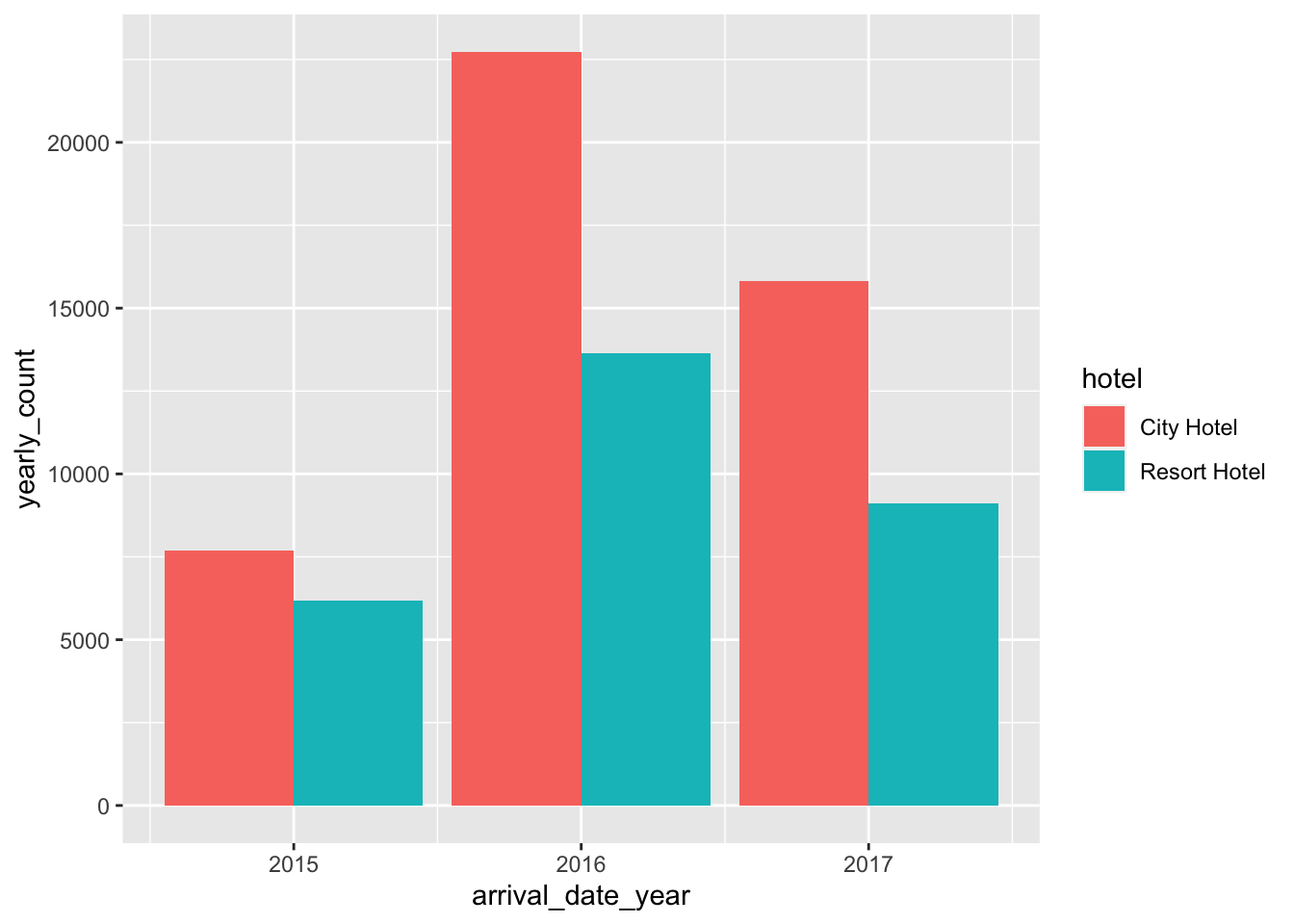
Therefore from the above bar plot both the hotels seem to perform well in the year 2016, hosting more number of guests than any other year.
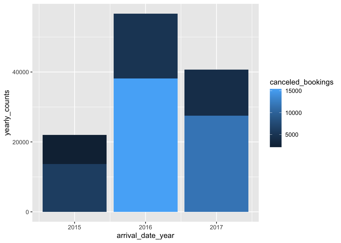
Visualizing Part-Whole Relationships
Since there are some cancelled bookings in the dataset we can plot the total bookings while depicting a part with canceled bookings. To get such a visualization the following command can be run:
total_yearly_data <- data%>%
                      group_by(hotel, arrival_date_year) %>%
                      summarise(yearly_counts = n(),
                                canceled_bookings = sum(is_canceled))
head(total_yearly_data)
# A tibble: 6 × 4
# Groups: hotel [2]
hotel arrival_date_year yearly_counts canceled_bookings
<chr> <dbl> <int> <dbl>
1 City Hotel 2015 13682 6004
2 City Hotel 2016 38140 15407
3 City Hotel 2017 27508 11691
4 Resort Hotel 2015 8314 2138
5 Resort Hotel 2016 18567 4930
6 Resort Hotel 2017 13179 4054Now the plot depicting the different parts of the data is as follows:
ggplot(total_yearly_data)+
  geom_col(aes(x = arrival_date_year, y = yearly_counts, fill = canceled_bookings))