library(tidyverse)
library(ggplot2)

knitr::opts_chunk$set(echo = TRUE, warning=FALSE, message=FALSE)
Challenge 5
challenge_5
air_bnb
Priyanka Perumalla
Introduction to Visualization
Challenge Overview
Today’s challenge is to:
- read in a data set, and describe the data set using both words and any supporting information (e.g., tables, etc)
- tidy data (as needed, including sanity checks)
- mutate variables as needed (including sanity checks)
- create at least two univariate visualizations
- try to make them “publication” ready
- Explain why you choose the specific graph type
- Create at least one bivariate visualization
- try to make them “publication” ready
- Explain why you choose the specific graph type
R Graph Gallery is a good starting point for thinking about what information is conveyed in standard graph types, and includes example R code.
(be sure to only include the category tags for the data you use!)
Read in data
Read in one (or more) of the following datasets, using the correct R package and command.
- cereal.csv ⭐
- Total_cost_for_top_15_pathogens_2018.xlsx ⭐
- Australian Marriage ⭐⭐
- AB_NYC_2019.csv ⭐⭐⭐
- StateCounty2012.xls ⭐⭐⭐
- Public School Characteristics ⭐⭐⭐⭐
- USA Households ⭐⭐⭐⭐⭐
airbnb_df <- read_csv("_data/AB_NYC_2019.csv")
print(airbnb_df)
# A tibble: 48,895 × 16
id name host_id host_name neighbourhood_group neighbourhood latitude
<dbl> <chr> <dbl> <chr> <chr> <chr> <dbl>
1 2539 Clean & q… 2787 John Brooklyn Kensington 40.6
2 2595 Skylit Mi… 2845 Jennifer Manhattan Midtown 40.8
3 3647 THE VILLA… 4632 Elisabeth Manhattan Harlem 40.8
4 3831 Cozy Enti… 4869 LisaRoxa… Brooklyn Clinton Hill 40.7
5 5022 Entire Ap… 7192 Laura Manhattan East Harlem 40.8
6 5099 Large Coz… 7322 Chris Manhattan Murray Hill 40.7
7 5121 BlissArts… 7356 Garon Brooklyn Bedford-Stuy… 40.7
8 5178 Large Fur… 8967 Shunichi Manhattan Hell's Kitch… 40.8
9 5203 Cozy Clea… 7490 MaryEllen Manhattan Upper West S… 40.8
10 5238 Cute & Co… 7549 Ben Manhattan Chinatown 40.7
# ℹ 48,885 more rows
# ℹ 9 more variables: longitude <dbl>, room_type <chr>, price <dbl>,
# minimum_nights <dbl>, number_of_reviews <dbl>, last_review <date>,
# reviews_per_month <dbl>, calculated_host_listings_count <dbl>,
# availability_365 <dbl>Briefly describe the data
dim(airbnb_df)[1] 48895 16colnames(airbnb_df) [1] "id" "name"
[3] "host_id" "host_name"
[5] "neighbourhood_group" "neighbourhood"
[7] "latitude" "longitude"
[9] "room_type" "price"
[11] "minimum_nights" "number_of_reviews"
[13] "last_review" "reviews_per_month"
[15] "calculated_host_listings_count" "availability_365" head(airbnb_df)# A tibble: 6 × 16
id name host_id host_name neighbourhood_group neighbourhood latitude
<dbl> <chr> <dbl> <chr> <chr> <chr> <dbl>
1 2539 Clean & qu… 2787 John Brooklyn Kensington 40.6
2 2595 Skylit Mid… 2845 Jennifer Manhattan Midtown 40.8
3 3647 THE VILLAG… 4632 Elisabeth Manhattan Harlem 40.8
4 3831 Cozy Entir… 4869 LisaRoxa… Brooklyn Clinton Hill 40.7
5 5022 Entire Apt… 7192 Laura Manhattan East Harlem 40.8
6 5099 Large Cozy… 7322 Chris Manhattan Murray Hill 40.7
# ℹ 9 more variables: longitude <dbl>, room_type <chr>, price <dbl>,
# minimum_nights <dbl>, number_of_reviews <dbl>, last_review <date>,
# reviews_per_month <dbl>, calculated_host_listings_count <dbl>,
# availability_365 <dbl>The data set on Air BnBs in NYC comprises 16 attributes, which include the aibnb name, host name and host id, neighbourhood group, neighbourhood name, latitude and longitude, room type, price, minimum number of nights, number of reviews, reviews_per_month and other columns. Every row corresponds to a unique Air Bnb and every column describes about an attribute of the Air BnB. This data is useful to draw booking patterns like which Air Bnbs are more preferred and what makes them more preferred etc.
Tidy Data (as needed)
Is your data already tidy, or is there work to be done? Be sure to anticipate your end result to provide a sanity check, and document your work here.
sum(is.na(airbnb_df))[1] 20141The data is not very tidy. It has a lot of missing values.
There are’nt any columns that can be mutated in the Air bnb dataset.
Univariate Visualizations
I wanted to observe the distribution of Air BNBs based on neighbour hood group.
ggplot(airbnb_df, aes(x = neighbourhood_group)) + geom_bar() + ggtitle("Air BNB Neighbourhood Distribution")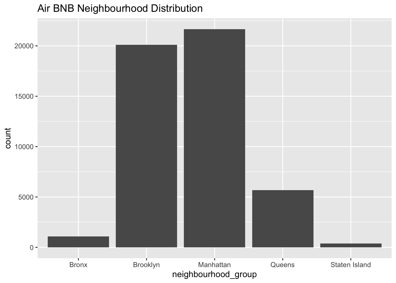
I have chosen a Bar chart to observe the distribution of Air BnBs in various neighbour hoods in New York to get an an overall understanding of the data distribution, which can be useful in identifying what are all the convinient places to stay in New York.
Upon analyzing the bar graph, we can observe a few neighbour hoods which have very few Air BnBs probably indicating that the places don’t attract tourists while others have extremely high count of Air BnBs.
To see if there is a similar trend in the preference for room type, we can do same analysis using a bar chart.
ggplot(airbnb_df, aes(x = room_type)) + geom_bar() + ggtitle("Prefered room type")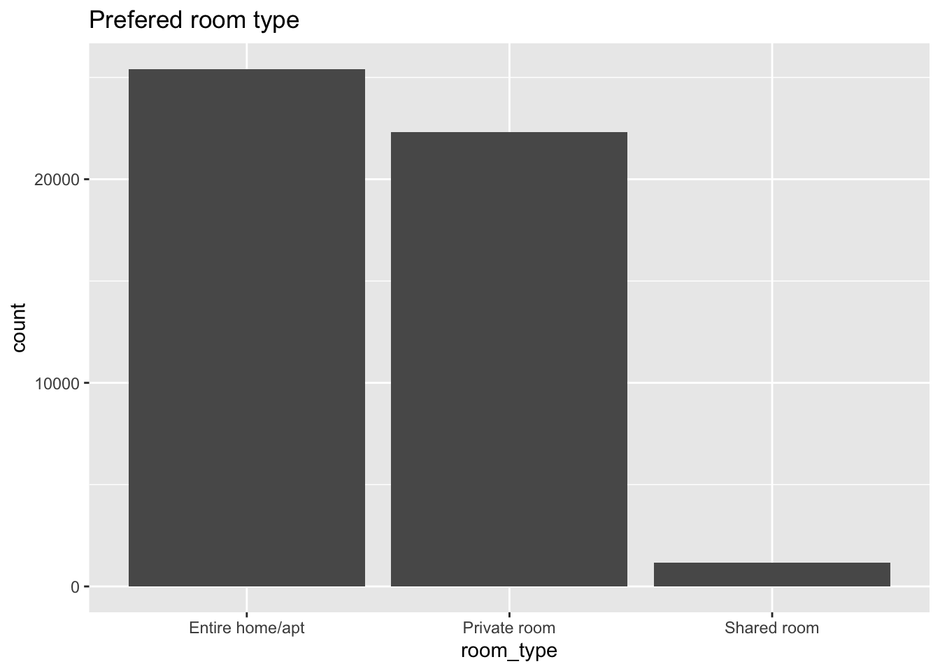
Since both are categorical variables we can see the distribution is very similar.
Bivariate Visualization(s)
ggplot(data = airbnb_df)+ geom_point(mapping = aes(x = price, y = number_of_reviews,col=room_type)) + ggtitle("Number of reviews vs Price")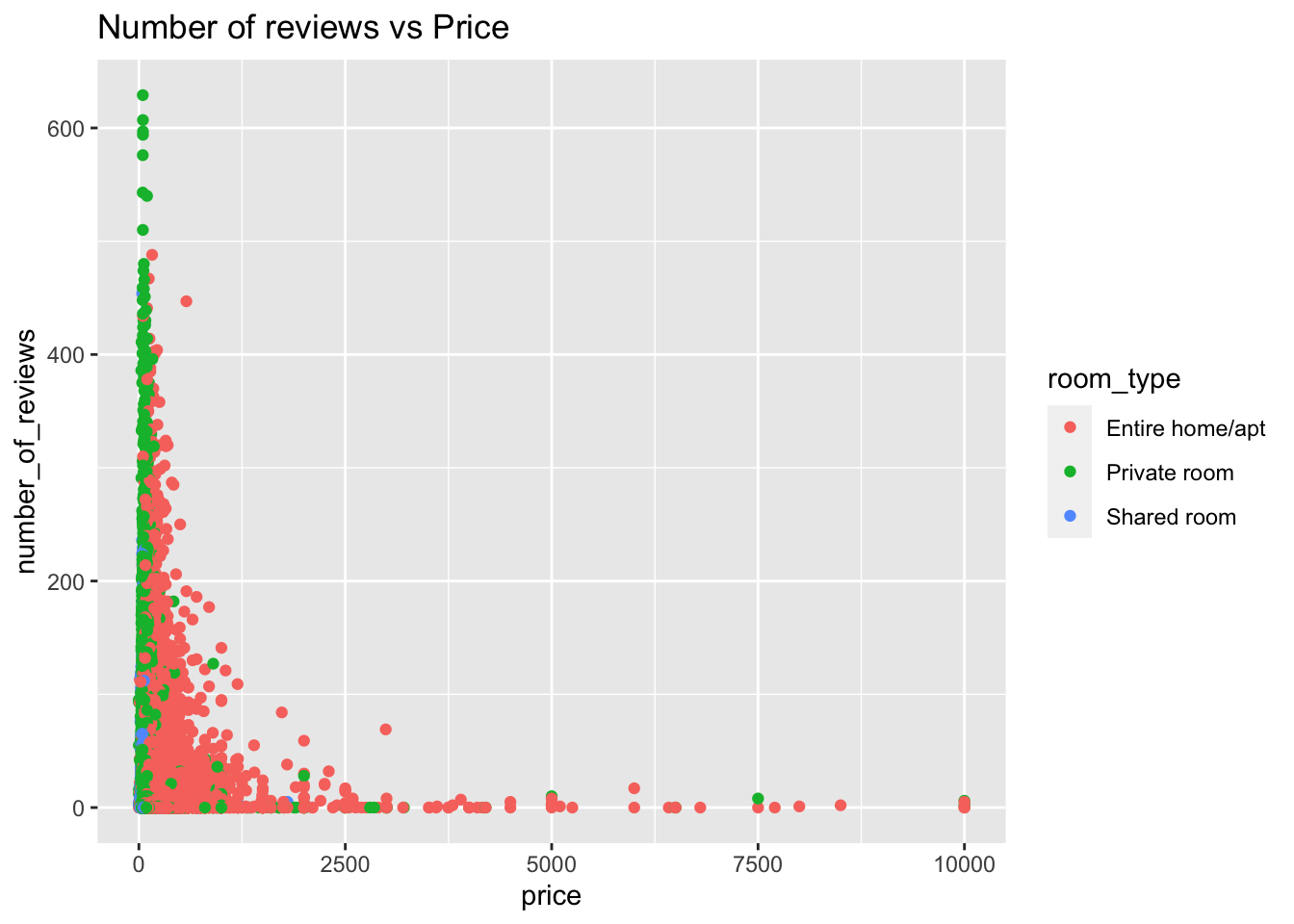
A scatter plot of Number of reviews and price by room type gives information on how the relationship between these two attributes is. It tells us that as price is increasing the number of reviews are decreasing. The reviews for entire apartment are relatively less even in lesser price range. Indicating entire apartments are usally less review or less preferred altogether.