library(tidyverse)
library(ggplot2)

knitr::opts_chunk$set(echo = TRUE, warning=FALSE, message=FALSE)
Challenge 5_PriyankaThatikonda
challenge_5
railroads
cereal
air_bnb
pathogen_cost
australian_marriage
public_schools
usa_households
Introduction to Visualization
Challenge Overview
Today’s challenge is to:
- read in a data set, and describe the data set using both words and any supporting information (e.g., tables, etc)
- tidy data (as needed, including sanity checks)
- mutate variables as needed (including sanity checks)
- create at least two univariate visualizations
- try to make them “publication” ready
- Explain why you choose the specific graph type
- Create at least one bivariate visualization
- try to make them “publication” ready
- Explain why you choose the specific graph type
R Graph Gallery is a good starting point for thinking about what information is conveyed in standard graph types, and includes example R code.
(be sure to only include the category tags for the data you use!)
Read in data
Read in one (or more) of the following datasets, using the correct R package and command.
- cereal.csv ⭐
- Total_cost_for_top_15_pathogens_2018.xlsx ⭐
- Australian Marriage ⭐⭐
- AB_NYC_2019.csv ⭐⭐⭐
- StateCounty2012.xls ⭐⭐⭐
- Public School Characteristics ⭐⭐⭐⭐
- USA Households ⭐⭐⭐⭐⭐
data <- read_csv("_data/cereal.csv")
dim(data)
[1] 20 4head(data)# A tibble: 6 × 4
Cereal Sodium Sugar Type
<chr> <dbl> <dbl> <chr>
1 Frosted Mini Wheats 0 11 A
2 Raisin Bran 340 18 A
3 All Bran 70 5 A
4 Apple Jacks 140 14 C
5 Captain Crunch 200 12 C
6 Cheerios 180 1 C Briefly describe the data
The selected dataset (“cereal.csv”) has 20 observations and 5 variables which contains the name of the cereal, amount of sodium and sugar it contains per serving, a variable that denotes the type of cereal along with a numerical variable that talks about the type of cereal’s health rating. It is a tabular data with each row denoting a different cereal and each column representing information about the cereal. The dataset also provides information on various types of cereals such as the popular brands such as Frosted Flakes, Cheerios etc and can be used to make analysis about the nutritional content of breakfast cereals and compare different types of cereals based on their sugar and sodium content.
Tidy Data (as needed)
Is your data already tidy, or is there work to be done? Be sure to anticipate your end result to provide a sanity check, and document your work here.
Data already looks tired, just checking for missing values.
# Check for missing values in the entire dataframe
any_missing <- any(is.na(data))
print(any_missing)
[1] FALSE# Check for missing values in each column
column_missing <- colSums(is.na(data)) > 0
print(column_missing)Cereal Sodium Sugar Type
FALSE FALSE FALSE FALSE # Check for missing values in each row
row_missing <- rowSums(is.na(data)) > 0
print(row_missing) [1] FALSE FALSE FALSE FALSE FALSE FALSE FALSE FALSE FALSE FALSE FALSE FALSE
[13] FALSE FALSE FALSE FALSE FALSE FALSE FALSE FALSE#Check for missing values
sum(is.na(df))[1] 0Are there any variables that require mutation to be usable in your analysis stream? For example, do you need to calculate new values in order to graph them? Can string values be represented numerically? Do you need to turn any variables into factors and reorder for ease of graphics and visualization?
Document your work here.
data <- data %>%
  mutate(sugar_per_cup = Sugar * 0.75,
         sodium_per_cup = Sodium * 0.75)
data
# A tibble: 20 × 6
Cereal Sodium Sugar Type sugar_per_cup sodium_per_cup
<chr> <dbl> <dbl> <chr> <dbl> <dbl>
1 Frosted Mini Wheats 0 11 A 8.25 0
2 Raisin Bran 340 18 A 13.5 255
3 All Bran 70 5 A 3.75 52.5
4 Apple Jacks 140 14 C 10.5 105
5 Captain Crunch 200 12 C 9 150
6 Cheerios 180 1 C 0.75 135
7 Cinnamon Toast Crunch 210 10 C 7.5 158.
8 Crackling Oat Bran 150 16 A 12 112.
9 Fiber One 100 0 A 0 75
10 Frosted Flakes 130 12 C 9 97.5
11 Froot Loops 140 14 C 10.5 105
12 Honey Bunches of Oats 180 7 A 5.25 135
13 Honey Nut Cheerios 190 9 C 6.75 142.
14 Life 160 6 C 4.5 120
15 Rice Krispies 290 3 C 2.25 218.
16 Honey Smacks 50 15 A 11.2 37.5
17 Special K 220 4 A 3 165
18 Wheaties 180 4 A 3 135
19 Corn Flakes 200 3 A 2.25 150
20 Honeycomb 210 11 C 8.25 158. Univariate Visualizations
ggplot(data, aes(x = "", y = Sodium)) +
  geom_boxplot() +
  labs(title = "Box Plot showing the sodium quantity present in Breakfast Cereals",
       y = "Sodium (mg)") +
  theme_minimal()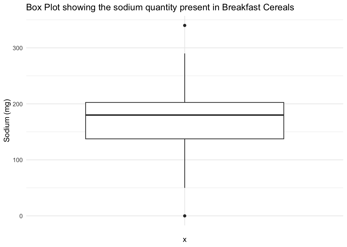
ggplot(data, aes(x = Sugar)) +
  geom_histogram(binwidth = 2, fill = "dodgerblue", color = "white") +
  labs(title = "Histogram showing the sugar quantity in Breakfast Cereals", x = "Sugar (g)", y = "Count") +
  theme_minimal()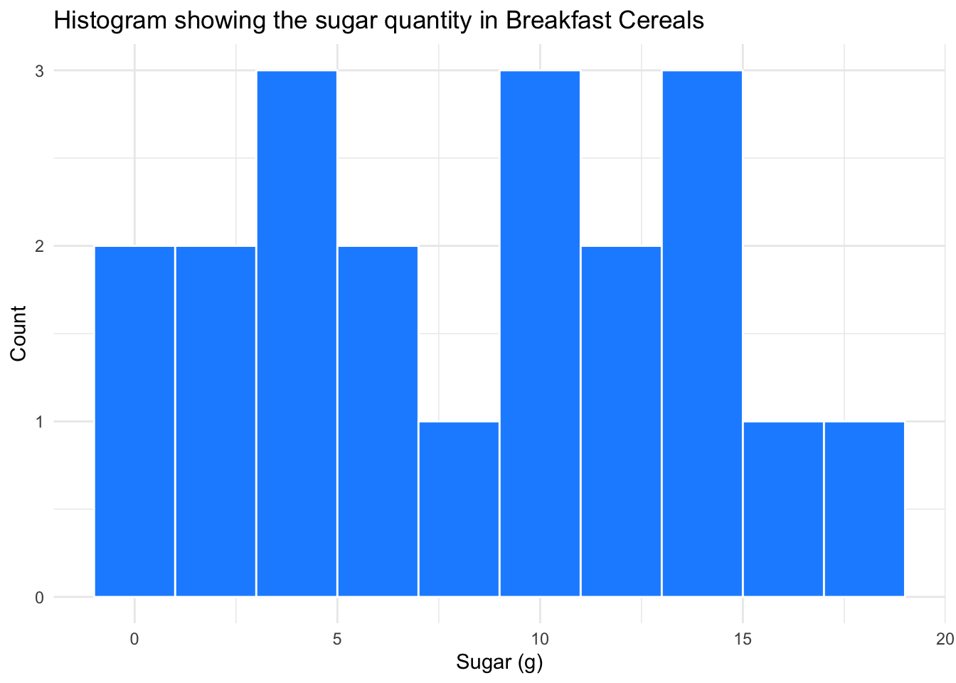
Box Plot showing the sodium quantity present in Breakfast Cereals - Using a box plot for sodium in this dataset can help us understand the levels of sodium in the cereals. The box plot can be interpreted as follows - the vertical axis represents the sodium values, the horizontal axis denotes the cereal variable. The box plot summarizes the sodium variable’s distribution, showing the IQR (interquartile range) with the box edges representing the 25th and 75th percentiles. The whiskers represent the data range, and any outliers are shown as individual points outside the whiskers. The median is depicted by the line inside the box. The box plot helps easily identify the sodium content in cereals and provides insights into sodium content variability and distribution across different cereal types.
Histogram showing the sugar quantity in Breakfast Cereals - The histogram provides a quick overview of the distribution of the sugar content in cereals. The histogram helps us identify the most common sugar content range and any outliers or unusual data patterns. The histogram’s shape can reveal the skewness or symmetry of the sugar content distribution, making it a valuable tool for examining the frequency and distribution of sugar content in breakfast cereals.
Bivariate Visualization(s)
data %>%
  arrange(Sugar) %>%
  ggplot(aes(x = Cereal, y = Sugar)) +
  geom_segment(aes(xend = Cereal, yend = 0)) +
  geom_point(color = 'blue', fill = 'black', shape = 20, size = 4) +
  coord_flip(expand = TRUE) +
  labs(title = "Content of Sugar in Cereal", y = "Sugar Quantity", x = "Cereal") +
  theme_minimal()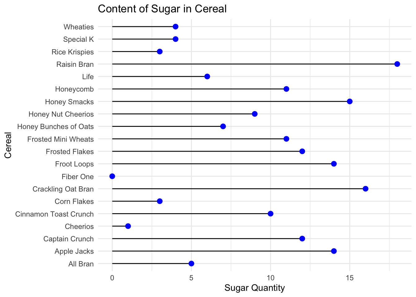
The above bivariate graph shows the relationship between Sugar and Cereal. On close observation we see how Crackling Oat and Raising Bran have the highest sugar content and Cheerios and fiber one have the lowest sugar levels. From this it helps the user realise how crackling oats and raising bran should be consumes less.
ggplot(data = data)+ geom_point(mapping = aes(x = Sodium, y = Sugar,col=Type)) + ggtitle("SugarvsSodium Content in Cereals")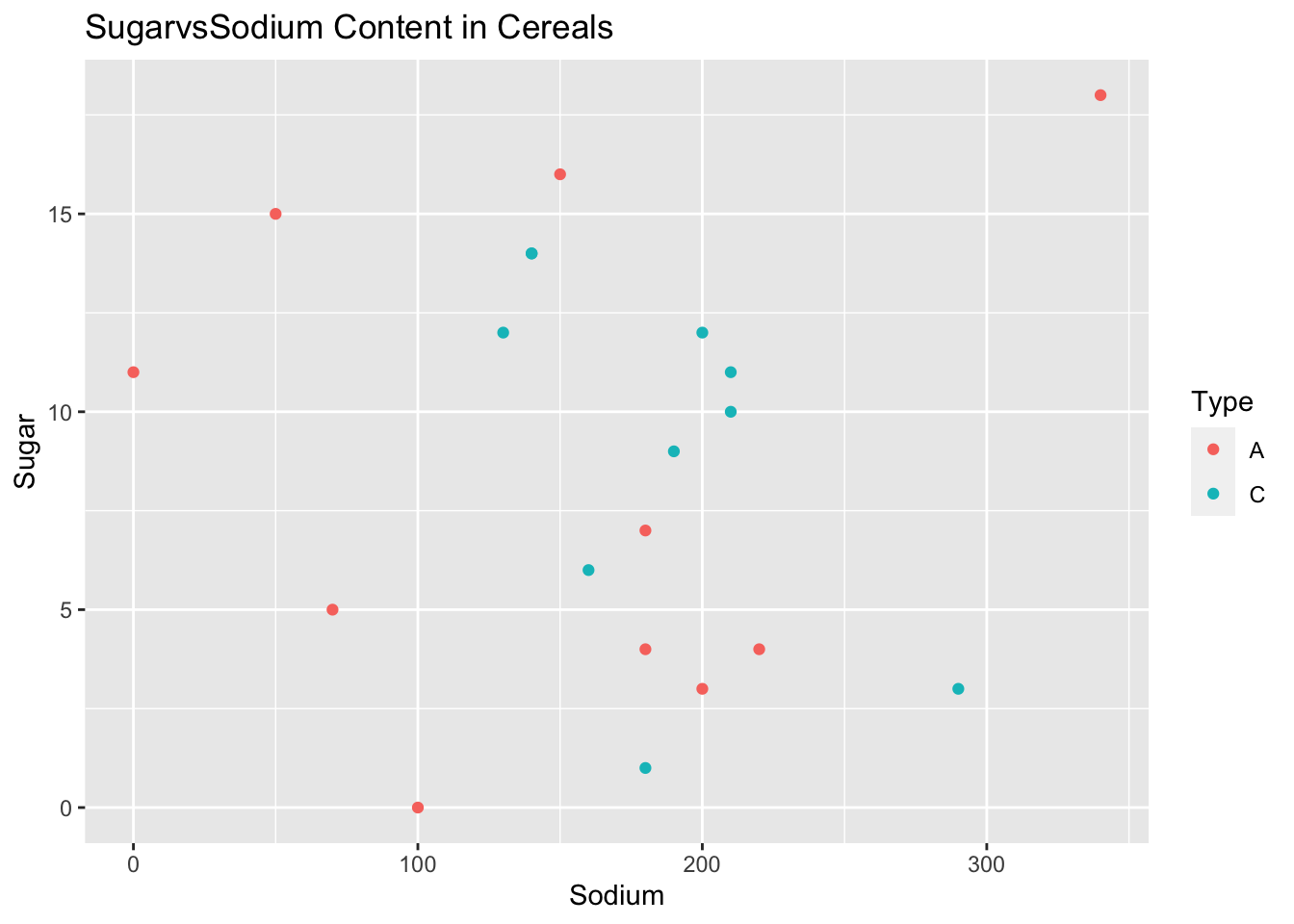
A scatter plot of sugar and sodium per cup in breakfast cereals is a useful visualization tool that can provide insights into the relationship between these two nutrient components in the cereal dataset. It can reveal patterns, correlations, and outliers, helping to determine the strength and direction of the relationship between sugar and sodium content in cereals.
Any additional comments?