library(tidyverse)
library(ggplot2)
library(readxl)
library(ggrepel)
library(here)

knitr::opts_chunk$set(echo = TRUE, warning=FALSE, message=FALSE)
setwd("D:/MyDocs/Class Slides/DACSS601/601_Spring_2023/posts/_data")Cereal Data Univariate and Bivariate Visualizations
challenge_5
cereal
Sahan Prasad Podduturi Reddy
Introduction to Visualization
Introduction
I was trying to analyze the ‘Cereal.csv’ dataset. This dataset compares the sugar and sodium content in different types of cereal. We first start by importing the necessary libraries and setting the working directory to point to the location where the spreadsheet is located. Then we read in the csv file.
Data Description
The dataset contains names of popular cereal brands classified into two different types - A and C referring to Adult Cereal and Children Cereal. We are trying to compare the Sodium and Sugar content present in both types of cereal. There is no need to tidy the data as it is already in a format that we can use for visualizations.
Univariate Visualizations
We create two univariate graphs. First we plot histogram based on Sodium content and then smooth the distribution with a density function. We find that the maximum number of cereal are in the middle where the Sodium content range is between 200mg. It falls down as the Sodium content becomes higher or lower. We plot another univariate bar graph which compares Sugar content between different Cereal and have color fill to represent number Cereal of Type A and C which have the same Sugar content. We then draw two side-by-side box plots to compare the fluctuation in values of both Sugar and Sodium per count and where the value peaks.
setwd("D:/MyDocs/Class Slides/DACSS601/601_Spring_2023/posts/_data")
cereal <- read_csv("Cereal.csv")
ggplot(cereal, aes(Sodium)) +
  geom_histogram(aes(y = ..density..), alpha = 0.5) +
  geom_density(alpha = 0.2, fill="blue")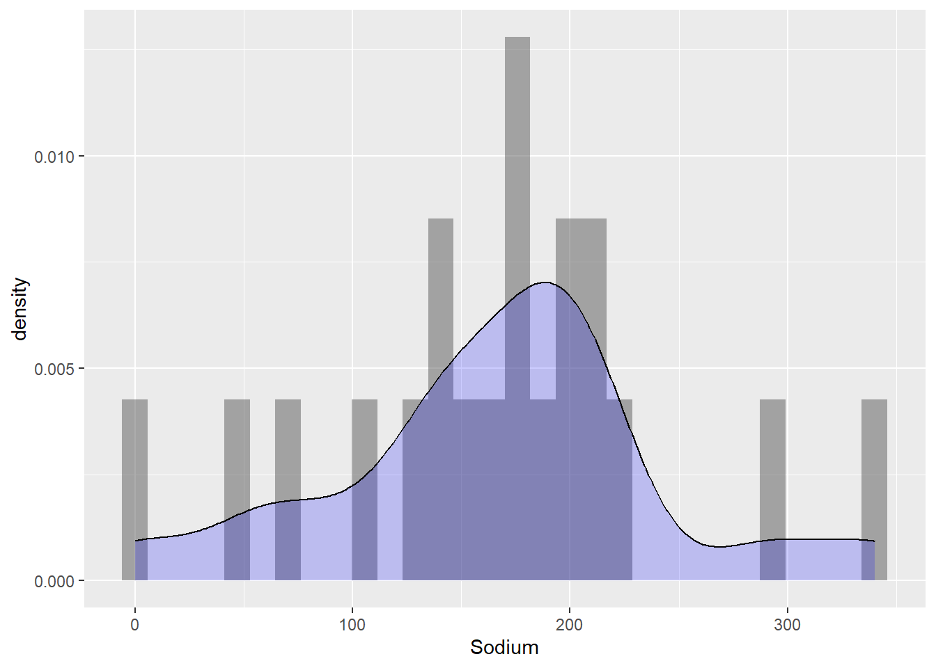
ggplot(cereal, aes(x=Sugar, fill=`Type`)) +
  geom_bar()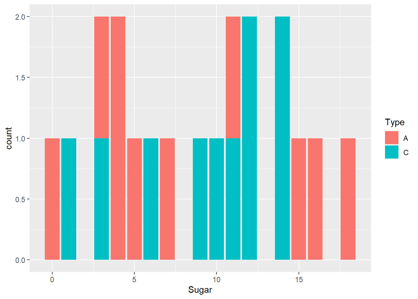
data1 <- cereal$Sodium
data2 <- cereal$Sugar

# Set up the plotting area with two side-by-side plots
par(mfrow = c(1, 2))

# Create the first boxplot
boxplot(data1, main = "Sodium", yaxt = "n")
axis(side = 2, at = pretty(range(data1)))

# Create the second boxplot
boxplot(data2, main = "Sugar")
axis(side = 4, at = pretty(range(data2)))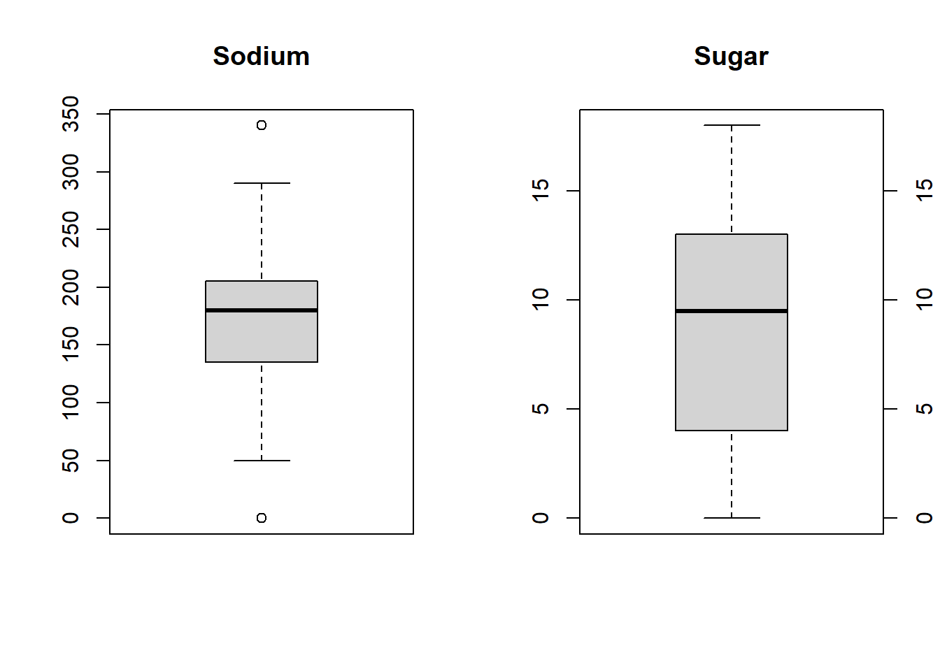
Bivariate Visualizations
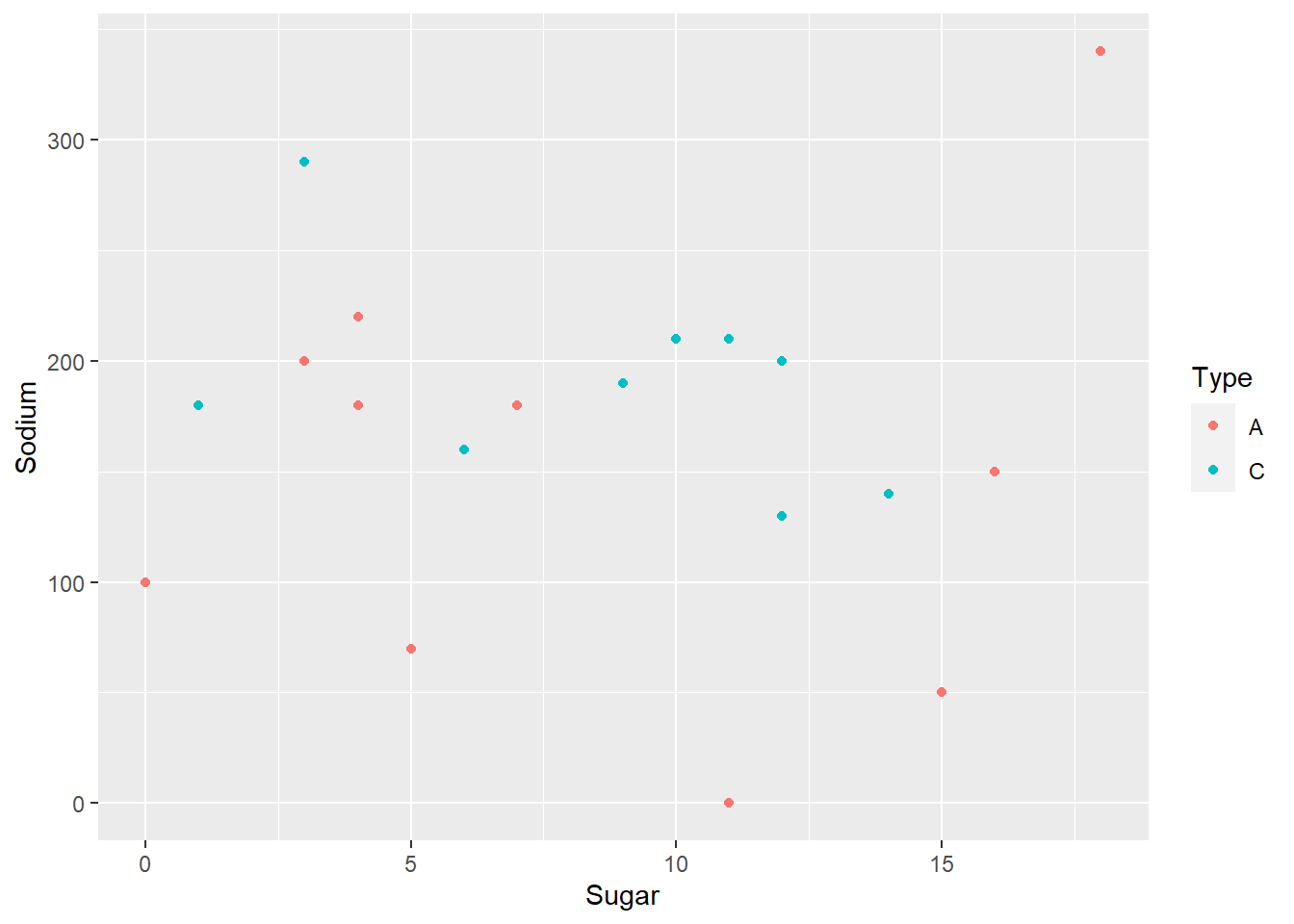
We have a bivariate graph which shows Sodium on the x-axis and Cereal on the y-axis. We see that Frosted Mini Wheats and Honey Smacks are on the lower end of the Sodium index while Raisin Bran and Rice Krispies higher up on the list and should be avoided if possible. We plot a separate point graph with Sodium and Sugar on either axes and we identify the Cereal type based on a filled in Color.
# create two sample datasets
ggplot(data = cereal) +
  geom_point(mapping = aes(x = Sodium, y = Cereal), position = "jitter")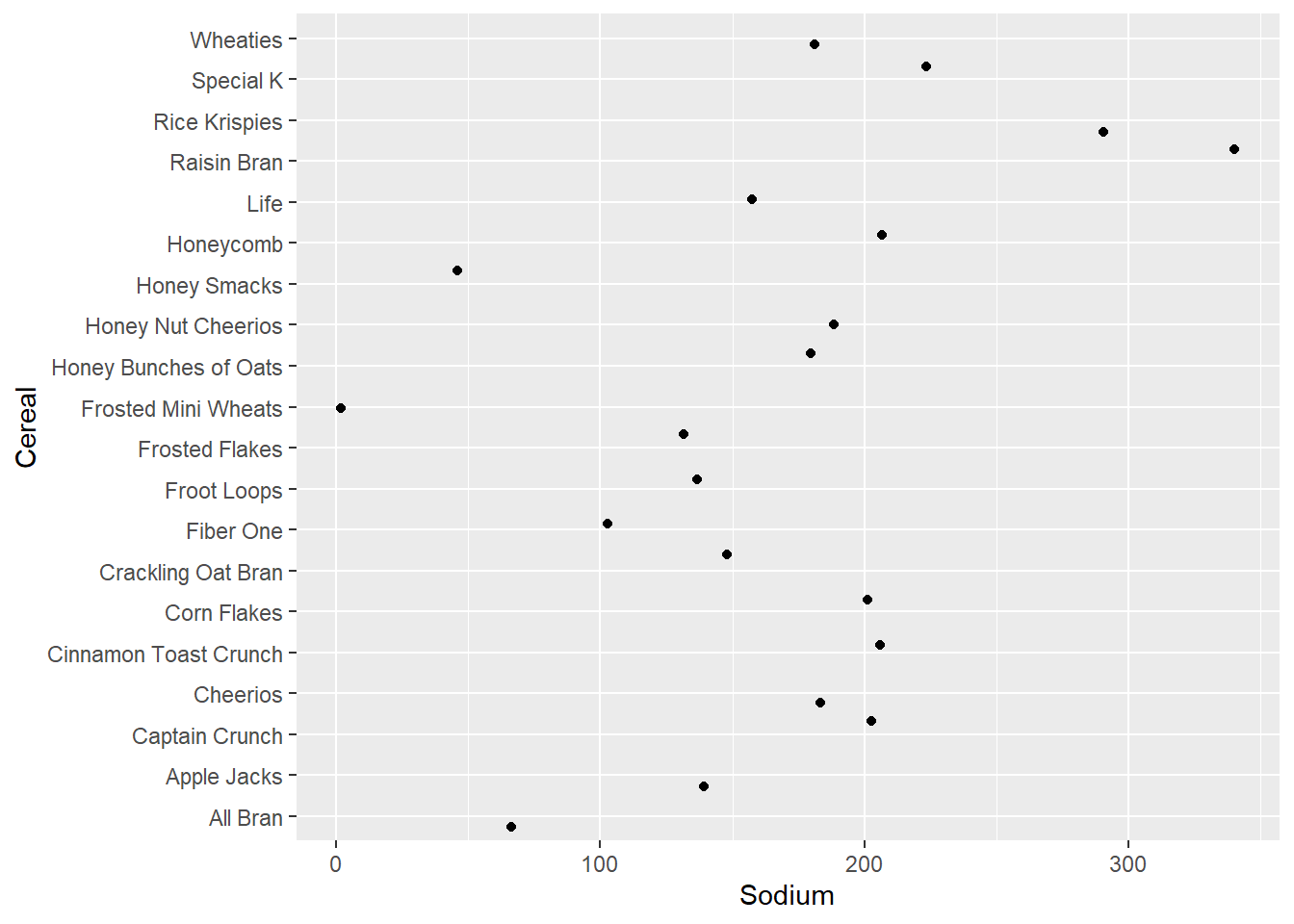
ggplot(cereal,aes(x=Sugar,y=Sodium,col=Type))+
  geom_point()