library(tidyverse)
library(ggplot2)
library(readxl)
library(lubridate)
knitr::opts_chunk$set(echo = TRUE, warning=FALSE, message=FALSE)
setwd("D:/MyDocs/Class Slides/DACSS601/601_Spring_2023/posts/_data")Analysis of Hotel Booking Numbers Over Time
challenge_6
hotel_bookings
Sahan Prasad Podduturi Reddy
Visualizing Time and Relationships
Introduction
I was trying to analyze the ‘hotel_bookings.csv’ dataset. This dataset contains information about hotel bookings and reservations from . We first start by importing the necessary libraries and setting the working directory to point to the location where the spreadsheet is located. Then we read in the csv file.
Read and Tidy Data
We first read in the csv file using read_csv(). We notice that there are 32 columns in the file. We are only trying to analyze the fluctuation in hotel bookings at different points in time. Since every column in our file corresponds to a hotel booking, we just need the arrival_date_year, arrival_date_month, arrival_date_day_of_month columns for our analysis. Since the month column in the dataset is a String, we write a simple function to convert it to the corresponding month number. We then use the resultant column to calculate a single column - arrival_date with (yyyy-mm-dd) format. We then group by this column and calculate Daily Bookings and cumulative Total Bookings.
setwd("D:/MyDocs/Class Slides/DACSS601/601_Spring_2023/posts/_data")
bookings <- read_csv("hotel_bookings.csv")

month_name_number <- function(month_name) {
  match(month_name, month.name)
}

bookings_one <- bookings %>%
  select("arrival_date_year", "arrival_date_month", "arrival_date_day_of_month") %>%
  mutate(arrival_month_number = month_name_number(arrival_date_month)) %>%
  mutate(arrival_date = as.Date(paste(arrival_date_year, arrival_month_number, arrival_date_day_of_month, sep = "-"))) %>%
  group_by(arrival_date) %>% summarize("Daily Bookings" = n()) %>% ungroup() %>%
  mutate("Total Bookings"=cumsum(`Daily Bookings`))
bookings_one
# A tibble: 793 × 3
arrival_date `Daily Bookings` `Total Bookings`
<date> <int> <int>
1 2015-07-01 122 122
2 2015-07-02 93 215
3 2015-07-03 56 271
4 2015-07-04 88 359
5 2015-07-05 53 412
6 2015-07-06 75 487
7 2015-07-07 54 541
8 2015-07-08 69 610
9 2015-07-09 80 690
10 2015-07-10 51 741
# … with 783 more rowsTime Series Graph
We first plot a double line time-series graph with Date of Arrival on the X-axis. The GREEEN line depicts the number of booking on a particular day while the “BLUE” line depicts the cumulative total number of bookings uptil that day. We notice a trend here - The number of bookings are lower at the start and end of the year and usually peak during some months in the middle. Specifically, we can see that there is a spike around the April-May and July-August time periods.
bookings_one %>% ggplot(aes(x = arrival_date)) +
  geom_line(aes(y = `Daily Bookings`), color="lightgreen") +
  geom_line(aes(y = `Total Bookings`/310), color="cyan") +
  scale_y_continuous(

    # Features of the first axis
    name = "Daily Bookings",

    # Add a second axis and specify its features
    sec.axis = sec_axis(~.*310, name="Total Bookings")
  ) +
  labs(title = "Hotel Bookings - July, 2015 to September, 2017", x="Year-Month")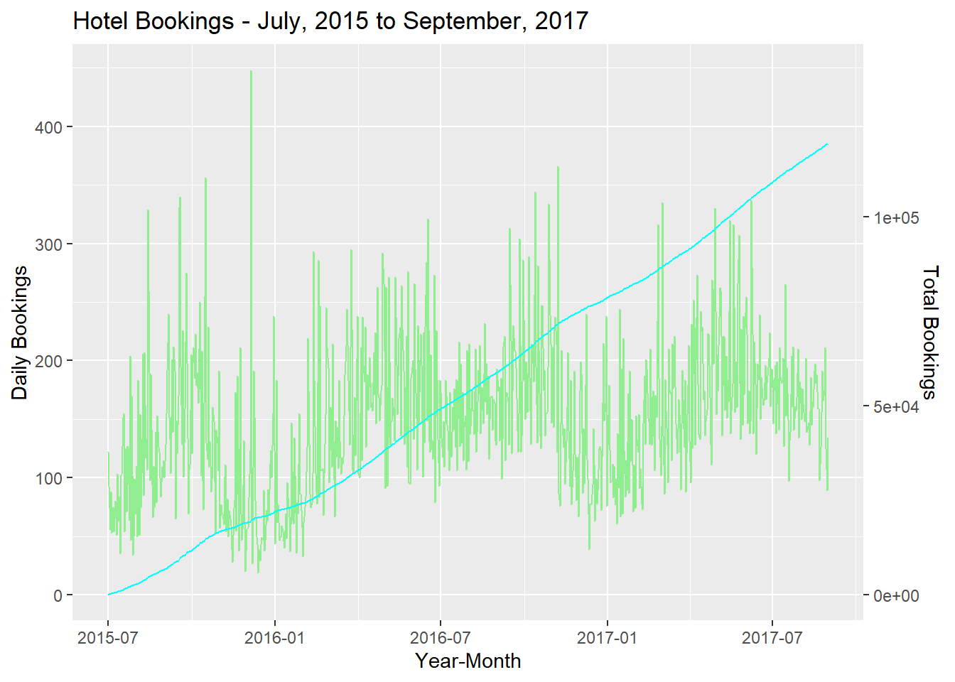
Part-Whole Graph
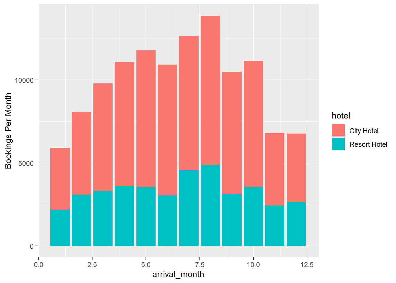
To confirm our analysis from the previous graph, we continue with our previous dataframe and group by hotel and arrival_date columns. Then, we will obtain month numbers from our arrival_date and group by the month number and summing up the Daily Bookings column so that we get total Booking numbers corresponding to every month number in our dataset. We use a grouped bar graph and fill in the color for every hotel category. So we get a stacked view of total number of city and resort hotel bookings per month. From the graph we confirm our initial analysis. We notice that the bookings are highest in the months of May, July and August.
bookings_two <- bookings %>%
  select("hotel", "arrival_date_year", "arrival_date_month", "arrival_date_day_of_month") %>%
  mutate(arrival_month_number = month_name_number(arrival_date_month)) %>%
  mutate(arrival_date = as.Date(paste(arrival_date_year, arrival_month_number, arrival_date_day_of_month, sep = "-"))) %>%
  group_by(hotel, arrival_date) %>% summarize("Daily Bookings" = n()) %>% ungroup() %>%
  mutate("Total Bookings"=cumsum(`Daily Bookings`)) %>%
  mutate(arrival_month = month(arrival_date)) %>%
  group_by(hotel, arrival_month) %>% arrange(arrival_month) %>% summarize("Bookings Per Month" = sum(`Daily Bookings`))
bookings_two
# A tibble: 24 × 3
# Groups: hotel [2]
hotel arrival_month `Bookings Per Month`
<chr> <dbl> <int>
1 City Hotel 1 3736
2 City Hotel 2 4965
3 City Hotel 3 6458
4 City Hotel 4 7480
5 City Hotel 5 8232
6 City Hotel 6 7894
7 City Hotel 7 8088
8 City Hotel 8 8983
9 City Hotel 9 7400
10 City Hotel 10 7605
# … with 14 more rowsggplot(bookings_two, aes(fill=hotel, y=`Bookings Per Month`, x=arrival_month)) +
geom_bar(position="stack", stat="identity")