I was trying to analyze the ‘hotel_bookings.csv’ dataset. This dataset contains information about quantity of eggs sold between 2004-2013. It lists 4 different package types - large_half_dozen, extra_large_half_dozen, large_dozen, extra_large_dozen . We first start by importing the necessary libraries and setting the working directory to point to the location where the spreadsheet is located. Then we read in the csv file.
     month year large_half_dozen large_dozen extra_large_half_dozen
1  January 2004            126.0     230.000                  132.0
2 February 2004            128.5     226.250                  134.5
3    March 2004            131.0     225.000                  137.0
4    April 2004            131.0     225.000                  137.0
5      May 2004            131.0     225.000                  137.0
6     June 2004            133.5     231.375                  137.0
  extra_large_dozen
1             230.0
2             230.0
3             230.0
4             234.5
5             236.0
6             241.0
Read and Tidy Data
We first read in the dataset into our dataframe and sort months by chronological order. Then we pivot the data such that package types are all in a single column while the Quantities are in a separate column. This makes it easier for us to meaningfully visualize our data. We also append a month_number column to our dataframe so that we can plot line graphs because they need continuous data.
# A tibble: 6 × 4
  month    size                   quantity month_number
  <fct>    <chr>                     <dbl>        <int>
1 January  large_half_dozen          1520.            1
2 January  extra_large_half_dozen    1608.            1
3 January  large_dozen               2519             1
4 January  extra_large_dozen         2630.            1
5 February large_half_dozen          1525.            2
6 February extra_large_half_dozen    1613.            2
Visualization with Multiple Dimensions
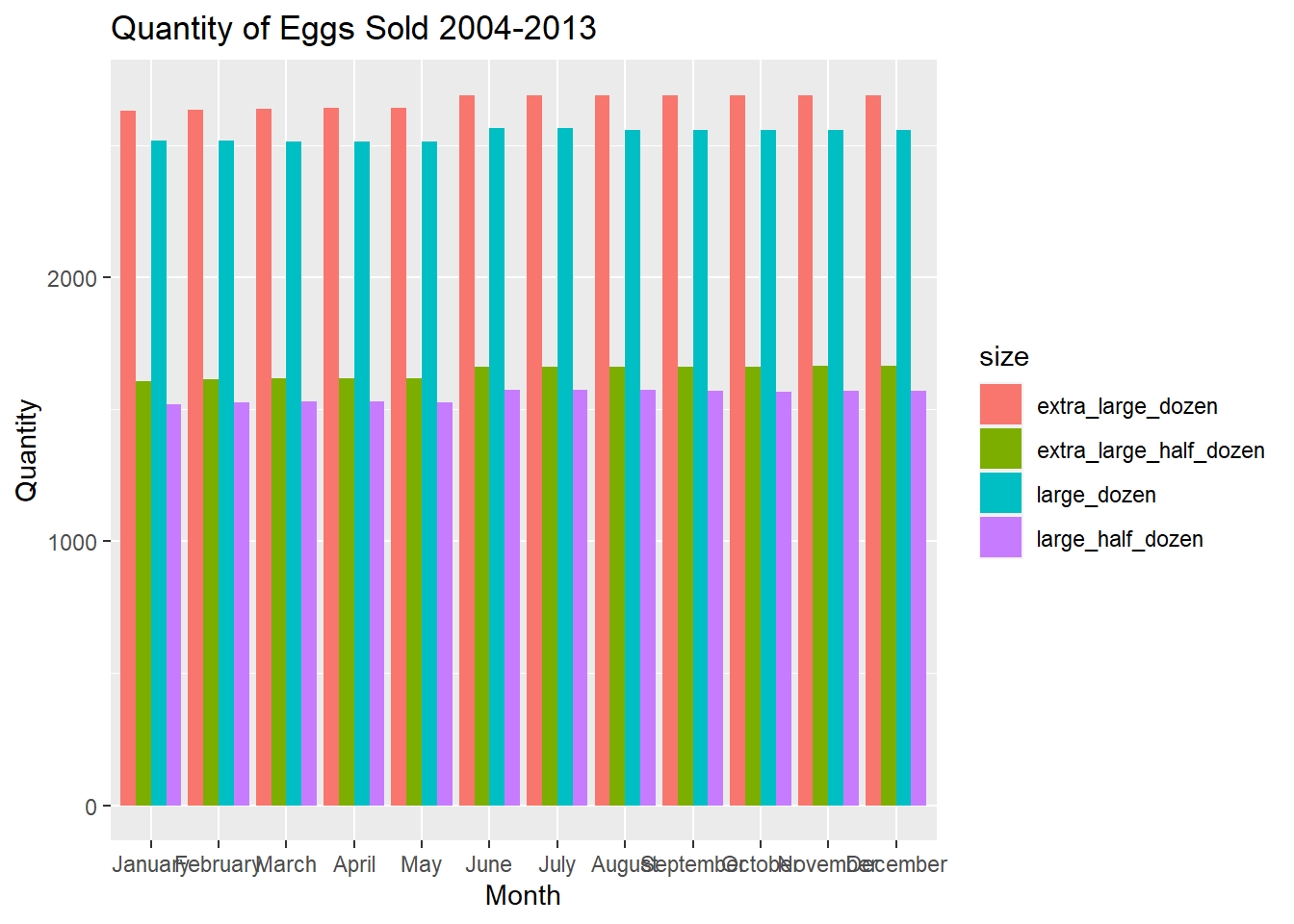
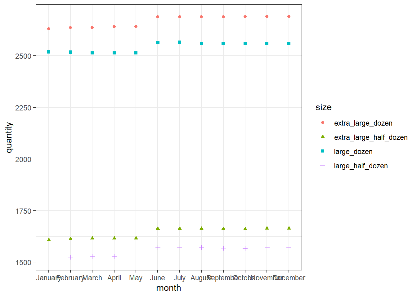
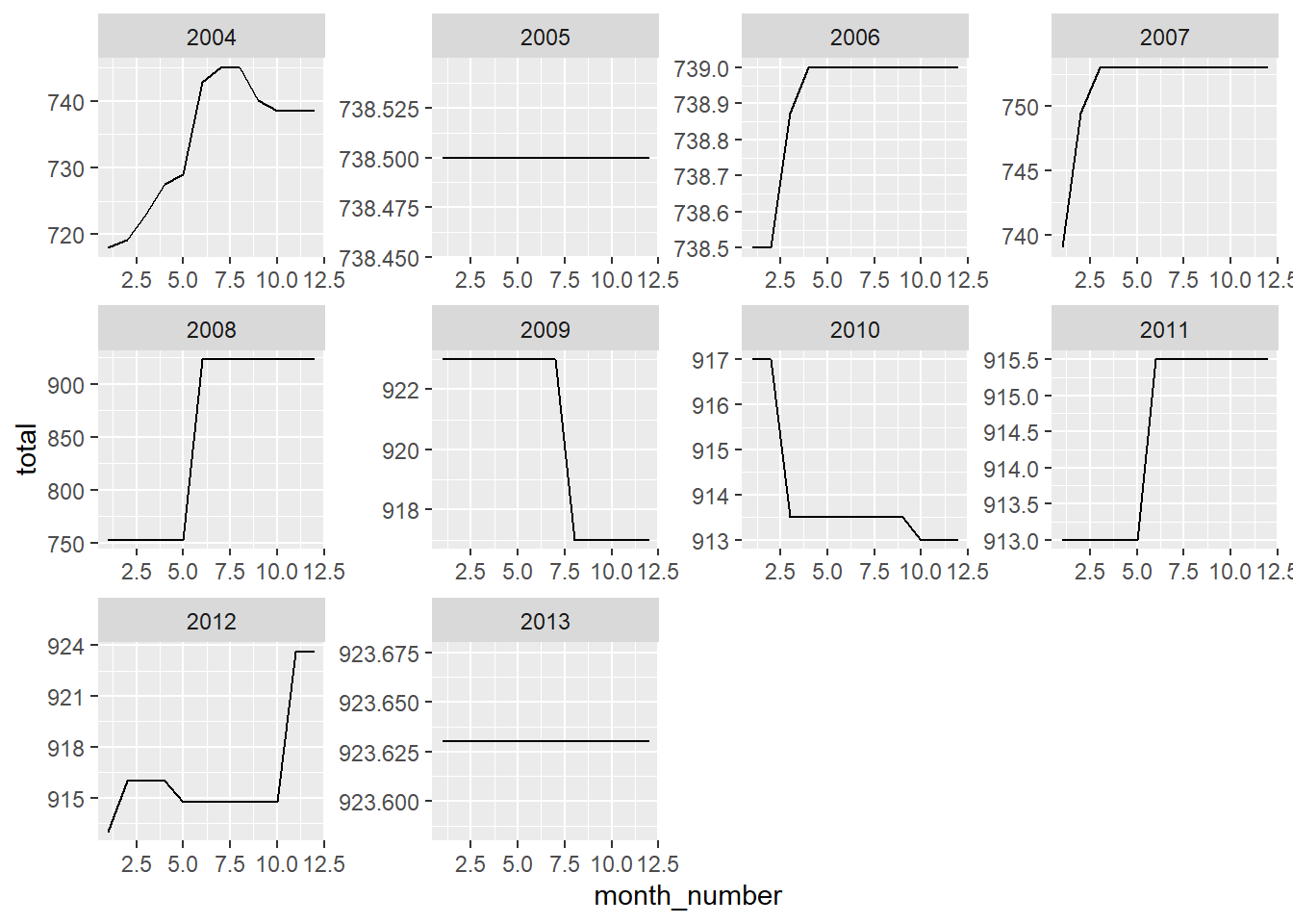
We first plot a grouped bar chart which indicates the quantities sold per month over all year values in our dataframe. We use the position=“dodge” attribute to plot bars side-by-side so that we can directly compare quantities sold for different packages types. We notice that the quantity sold for each package type doesn’t fluctuate much over the months of the year. We also plot a geom_point() graph which confirms our observations. “Dozen” size packages are much more in demand than “Half-Dozen” size packages. There is a slight increase in egg sales around June and then the sales remain the same till the end of the Year. We also do another visualization of the Quantity of Eggs sold over the Year by plotting graphs for different years in the dataset. On doing so, we notice how the current rate of Eggs sold was reached through the years.
eggs_one %>%ggplot(aes(y=`quantity`, x=month, fill=size)) +geom_bar(position="dodge", stat="identity") +labs(title ="Quantity of Eggs Sold 2004-2013", x ="Month", y ="Quantity")
# A tibble: 120 × 4
# Groups: month, year [120]
month year month_number total
<fct> <int> <int> <dbl>
1 January 2004 1 718
2 January 2005 1 738.
3 January 2006 1 738.
4 January 2007 1 739
5 January 2008 1 753
6 January 2009 1 923
7 January 2010 1 917
8 January 2011 1 913
9 January 2012 1 913
10 January 2013 1 924.
# … with 110 more rows
labs(title ="Quantity of Eggs Sold 2004-2013", x ="Month", y ="Quantity")
$x
[1] "Month"

$y
[1] "Quantity"

$title
[1] "Quantity of Eggs Sold 2004-2013"

attr(,"class")
[1] "labels"
Source Code
---title: "Eggs Sold Graph Visualizations"author: "Sahan Prasad Podduturi Reddy"description: "Visualizing Multiple Dimensions"date: "05/11/2023"format: html: toc: true code-copy: true code-tools: truecategories: - challenge_7 - eggs - Sahan Prasad Podduturi Reddy---## IntroductionI was trying to analyze the 'hotel_bookings.csv' dataset. This dataset contains information about quantity of eggs sold between 2004-2013. It lists 4 different package types - large_half_dozen, extra_large_half_dozen, large_dozen, extra_large_dozen . We first start by importing the necessary libraries and setting the working directory to point to the location where the spreadsheet is located. Then we read in the csv file.```{r}#| label: Setup#| warning: false#| message: falselibrary(tidyverse)library(ggplot2)library(readxl)library(lubridate)knitr::opts_chunk$set(echo =TRUE, warning=FALSE, message=FALSE)setwd("D:/MyDocs/Class Slides/DACSS601/601_Spring_2023/posts/_data")eggs <-read.csv("eggs_tidy.csv")head(eggs)```## Read and Tidy DataWe first read in the dataset into our dataframe and sort months by chronological order. Then we pivot the data such that package types are all in a single column while the Quantities are in a separate column. This makes it easier for us to meaningfully visualize our data. We also append a month_number column to our dataframe so that we can plot line graphs because they need continuous data.```{r}#| label: ReadFile#| warning: false#| message: falsemonth_order <-c("January", "February", "March", "April", "May", "June", "July", "August", "September", "October", "November", "December")eggs$month <-factor(eggs$month, levels = month_order)eggs_one <- eggs[order(eggs$month),] %>%group_by(month) %>%summarise("large_half_dozen"=sum(large_half_dozen), "large_dozen"=sum(large_dozen), "extra_large_half_dozen"=sum(extra_large_half_dozen), "extra_large_dozen"=sum(extra_large_dozen)) %>%pivot_longer(cols =c(large_half_dozen, extra_large_half_dozen, large_dozen, extra_large_dozen), names_to ="size", values_to ="quantity") %>%ungroup() %>%mutate(month_number =match(month, month.name))head(eggs_one)```## Visualization with Multiple DimensionsWe first plot a grouped bar chart which indicates the quantities sold per month over all year values in our dataframe. We use the position="dodge" attribute to plot bars side-by-side so that we can directly compare quantities sold for different packages types. We notice that the quantity sold for each package type doesn't fluctuate much over the months of the year. We also plot a geom_point() graph which confirms our observations. "Dozen" size packages are much more in demand than "Half-Dozen" size packages. There is a slight increase in egg sales around June and then the sales remain the same till the end of the Year. We also do another visualization of the Quantity of Eggs sold over the Year by plotting graphs for different years in the dataset. On doing so, we notice how the current rate of Eggs sold was reached through the years.```{r}#| label: Visualization#| warning: false#| message: falseeggs_one %>%ggplot(aes(y=`quantity`, x=month, fill=size)) +geom_bar(position="dodge", stat="identity") +labs(title ="Quantity of Eggs Sold 2004-2013", x ="Month", y ="Quantity")eggs_one %>%ggplot(aes(y=`quantity`, x=month, color=size, shape=size)) +geom_point() +theme_bw()labs(title ="Quantity of Eggs Sold 2004-2013", x ="Month", y ="Quantity")eggs_two <- eggs[order(eggs$month),] %>%group_by(month, year) %>%mutate(total =`large_half_dozen`+`large_dozen`+`extra_large_half_dozen`+`extra_large_dozen`) %>%mutate(month_number =match(month, month.name)) %>%select(month, year, month_number, total) eggs_two eggs_two %>%ggplot(aes(y=`total`, x=month_number)) +geom_line() +facet_wrap(vars(year), scales ="free")labs(title ="Quantity of Eggs Sold 2004-2013", x ="Month", y ="Quantity")```