library(tidyverse)
library(ggplot2)
library(readxl)

knitr::opts_chunk$set(echo = TRUE, warning=FALSE, message=FALSE)
Challenge 5
challenge_5
railroads
cereal
air_bnb
pathogen_cost
australian_marriage
public_schools
usa_households
Introduction to Visualization
Challenge Overview
Today’s challenge is to:
- read in a data set, and describe the data set using both words and any supporting information (e.g., tables, etc)
- tidy data (as needed, including sanity checks)
- mutate variables as needed (including sanity checks)
- create at least two univariate visualizations
- try to make them “publication” ready
- Explain why you choose the specific graph type
- Create at least one bivariate visualization
- try to make them “publication” ready
- Explain why you choose the specific graph type
R Graph Gallery is a good starting point for thinking about what information is conveyed in standard graph types, and includes example R code.
(be sure to only include the category tags for the data you use!)
Read in data
Read in one (or more) of the following datasets, using the correct R package and command.
- cereal.csv ⭐
- Total_cost_for_top_15_pathogens_2018.xlsx ⭐
- Australian Marriage ⭐⭐
- AB_NYC_2019.csv ⭐⭐⭐
- StateCounty2012.xls ⭐⭐⭐
- Public School Characteristics ⭐⭐⭐⭐
- USA Households ⭐⭐⭐⭐⭐
We are reading the State County data.
  state_county_data <- read_xls('_data/StateCounty2012.xls', skip=4,
                col_names= c("STATE", "Removed",  "COUNTY",
                          "Removed", "EMPLOYEES"))

  state_county_data <- state_county_data %>%
    select(STATE, COUNTY, EMPLOYEES) %>%
    filter(!str_detect(STATE, "Total"))

  state_county_data <- state_county_data %>%
    filter(!str_detect(STATE, "Excludes"))

  state_county_data <- state_county_data %>%
    filter(!str_detect(STATE, "designation"))

  state_county_data <- state_county_data %>%
    mutate(COUNTY = ifelse(STATE=="CANADA", "CANADA", COUNTY))

  # The Dimensions
  dim(state_county_data)
[1] 2931 3 # The Column Names
colnames(state_county_data)[1] "STATE" "COUNTY" "EMPLOYEES" head(state_county_data)# A tibble: 6 × 3
STATE COUNTY EMPLOYEES
<chr> <chr> <dbl>
1 AE APO 2
2 AK ANCHORAGE 7
3 AK FAIRBANKS NORTH STAR 2
4 AK JUNEAU 3
5 AK MATANUSKA-SUSITNA 2
6 AK SITKA 1 tail(state_county_data)# A tibble: 6 × 3
STATE COUNTY EMPLOYEES
<chr> <chr> <dbl>
1 WY SUBLETTE 3
2 WY SWEETWATER 196
3 WY UINTA 49
4 WY WASHAKIE 10
5 WY WESTON 37
6 CANADA CANADA 662 summary(state_county_data) STATE COUNTY EMPLOYEES
Length:2931 Length:2931 Min. : 1.00
Class :character Class :character 1st Qu.: 7.00
Mode :character Mode :character Median : 21.00
Mean : 87.37
3rd Qu.: 65.00
Max. :8207.00 Briefly describe the data
The data seems to be of the count of railroad employees split up across county and state in the United States. There are a total of 2931 counties with employee count numbers with the max county having 8207 employees.
Tidy Data (as needed)
We have tidied up the data in the previous step.
Are there any variables that require mutation to be usable in your analysis stream? For example, do you need to calculate new values in order to graph them? Can string values be represented numerically? Do you need to turn any variables into factors and reorder for ease of graphics and visualization?
Document your work here.
We are going to aggregate state employees count. This will be used in graphics below.
grouped_by_state <- state_county_data %>%
group_by(STATE) %>%
summarize(state_total = sum(EMPLOYEES),
state_counties = n_distinct(COUNTY)) %>%
select(STATE, state_total, state_counties) %>%
arrange(desc(state_total))
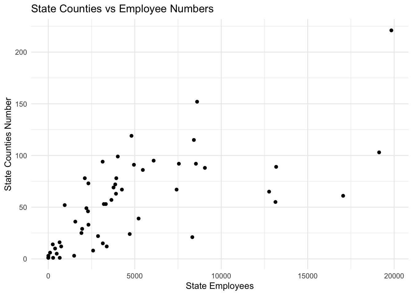
grouped_by_state# A tibble: 54 × 3
STATE state_total state_counties
<chr> <dbl> <int>
1 TX 19839 221
2 IL 19131 103
3 NY 17050 61
4 NE 13176 89
5 CA 13137 55
6 PA 12769 65
7 OH 9056 88
8 GA 8605 152
9 IN 8537 92
10 MO 8419 115
# … with 44 more rowsUnivariate Visualizations
  ggplot(state_county_data, aes(EMPLOYEES)) +
    geom_histogram(fill="red")  +
    theme_minimal() +
    labs(title = "Distribution of Employee Numbers of Counties", y = "Count", x = "County Employee Numbers")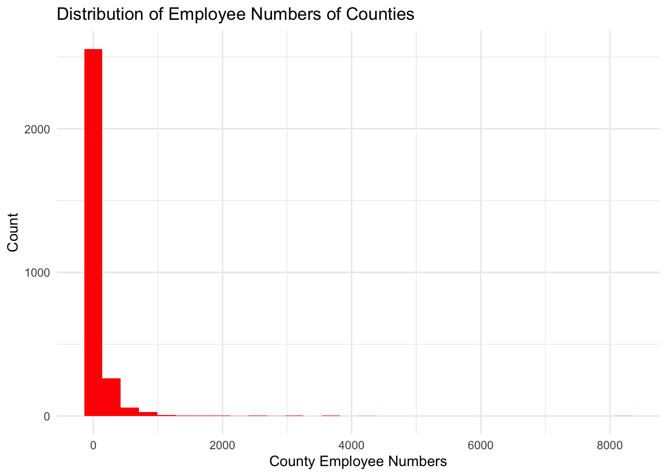
  ggplot(grouped_by_state, aes(state_total)) +
    geom_histogram(fill="blue")  +
    theme_minimal() +
    labs(title = "Distribution of Employee Numbers of States", y = "Count", x = "State Employee Numbers")
Bivariate Visualization(s)
  ggplot(grouped_by_state, aes(state_total, state_counties)) +
    geom_point()  +
    theme_minimal() +
    labs(title = "State Counties vs Employee Numbers", y = "State Counties Number", x = "State Employees")