DACSS 601 Fall 2022 Final Project - Attempts to see trends in AQI across the US and find a correlation between AQI and respiratory diseases
Author
Saksham Kumar
Published
May 19, 2023
Introduction
In this project, we look at the Air Quality Index (AQI), published by the United States Environmental Protection Agency. We look at annual AQIs for the different counties in the United States for the years 2018-2022. In this project, I try to visualize the trends in AQI across the years. I will then also try to investigate its relationship with respiratory diseases like COPD and Asthma rates in 2020. For this, I will use the PLACES dataset, published by the CDC, which covers various health risks, chronic diseases etc, for the entire United States at a County level.
I will attempt to visualize the AQI relationship using heat maps and graphs. The relationship will try to depict temporal and spatial variations in AQI.
Next by comparing the relationship between AQI and COPD and Asthma rates in 2020, I will try to shed light on any potential correlation between air quality and respiratory health conditions.
Hence my research questions:
How has the AQI changed across the United States? How does it change for a smaller geographical area like a state?
How does the AQI relate to respiratory diseases in an area?
This project might hope to serve as a template for any further study into these relationships, with its successes and failures setting down do’s and do-nots for more comprehensive studies.
Background
Air Quality is a critical factor that affects our daily lives and well-being. The Air Quality Index (AQI) is a standard measure to assess the quality of ambient air. Understanding it plays an important role in understanding public health, urban planning and environmental management.
Several studies have highlighted the importance of gaining insights into Air Quality trends. Dadvand et al. (2020) [1] conducted a systematic review and meta-analysis, revealing a consistent association between higher AQI and increased risks of developing chronic obstructive pulmonary disease (COPD) and asthma.
Hence I feel this project will build upon these relationships by examining the AQI in the United States. While the dataset I am using is nowhere as comprehensive as it should be for a study of this level, I still hope to gain some insight into how AQI affects health and housing prices.
Dataset Introduction and Description
The project utilizes three major datasets to investigate the impact of the Air Quality Index (AQI) on everyday life in the USA:
AQI by County (from EPA.GOV [2]): This dataset provides annual AQI values for different counties in the USA. Five csv files comprise the data set from 2018 to 2022. It contains information such as county names, state names, year, Max AQI values, number of hazardous days etc. The dataset allows us to analyze temporal variations in AQI and compare air quality across different counties. It also allows us to get a per cent hazardous days to compare the average days of hazardous air in the county.
PLACES: Local Data for Better Health, County Data 2022 release (from CDC [3]): This dataset contains county-level data on health indicators, including the prevalence of Chronic Obstructive Pulmonary Disease (COPD) and Asthma. It provides insights into the correlation between AQI and respiratory health conditions, for the year 2020.
Let us try to explore the datasets now and make any necessary adjustments to help ease our analysis and exploration.
AQI by County
Code
# Read the annual AQI datasetsaqi_2018 <-read_csv('SakshamKumar_FinalProjectData/annual_aqi_by_county_2018.csv')aqi_2019 <-read_csv('SakshamKumar_FinalProjectData/annual_aqi_by_county_2019.csv')aqi_2020 <-read_csv('SakshamKumar_FinalProjectData/annual_aqi_by_county_2020.csv')aqi_2021 <-read_csv('SakshamKumar_FinalProjectData/annual_aqi_by_county_2021.csv')aqi_2022 <-read_csv('SakshamKumar_FinalProjectData/annual_aqi_by_county_2022.csv')# Merge the datasetsaqi <-rbind(aqi_2018, aqi_2019, aqi_2020, aqi_2021, aqi_2022)
Displayed below is the combined dataframe representing AQI information across the years
As we are only concerned with the 50 states of the USA for this project, we will filter out rows that contain information for the “District Of Columbia”, “Country Of Mexico”, “Puerto Rico” and the “Virgin Islands”.
Also, we are concerned with the overall AQI of the areas. We do not possess the knowledge to infer information from individual pollutants like CO and Ozone. Hence we will filter those columns out too. Hence we are going to drop these variables.
Code
# Perform data cleaning and pre-processing as neededaqi_mod <-subset(aqi, !(aqi$State %in%c("District Of Columbia", "Country Of Mexico", "Puerto Rico", "Virgin Islands")))aqi_mod <- aqi_mod %>%rename("Total Days with AQI"="Days with AQI") %>%select(-starts_with("Days ")) %>%rename("Days with AQI"="Total Days with AQI")aqi_mod
Let us try to describe the dataset now. We have the following fields:
State: The state to which the county in this current row of data belongs to
County: The county to which this current row of data belongs
Year: The year of measurement for this row
Days with AQI: Total number of days in the year that AQI was calculated
Good Days: Total number of days the air was good
Moderate Days: Total number of days the air was moderate
Unhealthy for Sensitive Groups Days: Total number of days the air was unhealthy but only for sensitive groups
Unhealthy Days: Total number of days the air was unhealthy
Very Unhealthy Days: Total number of days the air was very unhealthy
Hazardous Days: Total number of days the air was hazardous
Max AQI: The max observed AQI
90th Percentile AQI: The 90th percentile observed AQI
Median AQI: The median observed AQI
Since the number of days AQI was calculated varies for counties, we cannot directly compare the number of good or unhealthy days. Instead, a better idea would be to convert it into “percentage of good days” or “percentage of unhealthy days”.
Also for simplification, let us coalesce the data for Good and Moderate days; Unhealthy for Sensitive Groups Days and Unhealthy Days; Very Unhealthy Days and Hazardous Days. We since we only wish to see trends in air quality. We can assume that Good is as bad as Moderate. Unhealthy for Sensitive is as bad as Unhealthy. And finally, Very Unhealthy means that the air is as bad as Hazardous. This only helps us simplify our analysis a little.
Code
aqi_mod$percent_moderate_days = (aqi_mod$`Good Days`+ aqi_mod$`Moderate Days`) *100/aqi_mod$`Days with AQI`aqi_mod$percent_unhealthy_days = (aqi_mod$`Unhealthy for Sensitive Groups Days`+ aqi_mod$`Unhealthy Days`) *100/aqi_mod$`Days with AQI`aqi_mod$percent_hazardous_days = (aqi_mod$`Very Unhealthy Days`+ aqi_mod$`Hazardous Days`) *100/aqi_mod$`Days with AQI`aqi_mod <- aqi_mod %>%select(-ends_with(" Days")) %>%select(!"Days with AQI")
Next we try to add FIPS code to the dataset.
Code
fips_custom <-function(a, b) {tryCatch({ fips_no <-fips(a, b)return(fips_no) }, error =function(e) {return(NA) })}aqi_mod$fips <-NAfor (i in1:nrow(aqi_mod)) { state <- aqi_mod$State[i] county <- aqi_mod$County[i]# Find the corresponding FIPS code in the lookup table fips_value =fips_custom(state, county) aqi_mod$fips[i] = fips_value}
We can that a lot of rows have NA in the FIPS column. This is due to several factors. For starters, the usmap module fails to provide FIPS codes for Alaska and Louisiana as they do not have Counties. Also, several Counties are abbreviated. Finally, when we look at the size of our dataset we see that we have data from roughly 1000 counties every year. However, there are in fact over 3000 counties in the US.
Hence, we decide to drop Data where FIPS is NA as they cannot be joined with other datasets or plotted on a Map.
percent_moderate_days: The percentage of good and moderate days out of the days AQI was measured.
percent_unhealthy_days: The percentage of unhealthy for sensitive groups and unhealthy days out of the days AQI was measured.
percent_hazardous_days: The percentage of very unhealthy and hazardous days out of the days AQI was measured.
This gives us the final AQI dataset we will be using in our project. We have no missing data in this final dataset.
PLACES: Local Data for Better Health, County Data 2022 release
Code
# Read the PLACES cost datasetplaces <-read_csv("SakshamKumar_FinalProjectData/PLACES__Local_Data_for_Better_Health__County_Data_2022_release.csv")# Inspect the raw datasetplaces
Code
print(head(places))
# A tibble: 6 × 21
Year StateAbbr StateDesc LocationName DataSource Category Measure
<dbl> <chr> <chr> <chr> <chr> <chr> <chr>
1 2020 US United States <NA> BRFSS Prevention Current…
2 2020 AL Alabama Colbert BRFSS Health Outcomes Arthrit…
3 2020 AL Alabama Coosa BRFSS Health Outcomes Arthrit…
4 2019 AL Alabama Dale BRFSS Prevention Cholest…
5 2020 AL Alabama Dale BRFSS Health Outcomes Stroke …
6 2020 AL Alabama DeKalb BRFSS Health Outcomes Arthrit…
# ℹ 14 more variables: Data_Value_Unit <chr>, Data_Value_Type <chr>,
# Data_Value <dbl>, Data_Value_Footnote_Symbol <lgl>,
# Data_Value_Footnote <lgl>, Low_Confidence_Limit <dbl>,
# High_Confidence_Limit <dbl>, TotalPopulation <dbl>, LocationID <chr>,
# CategoryID <chr>, MeasureId <chr>, DataValueTypeID <chr>,
# Short_Question_Text <chr>, Geolocation <chr>
Code
# Perform data cleaning and preprocessing as neededplaces_mod <-subset(places, places$MeasureId %in%c("CASTHMA", "COPD"))places_mod <-subset(places_mod, places_mod$DataValueTypeID =="AgeAdjPrv") %>%select(-c("Geolocation", "DataSource", "Category", "Data_Value_Type", "LocationID", "Data_Value_Footnote_Symbol", "Data_Value_Footnote", "StateAbbr", "Low_Confidence_Limit", "High_Confidence_Limit", "Short_Question_Text", "CategoryID", "Data_Value_Unit"))# Summarise the datasetplaces_mod <- places_mod[order(places_mod$MeasureId, places_mod$StateDesc, places_mod$LocationName, places_mod$DataValueTypeID), ]places_mod$fips <-NAfor (i in1:nrow(aqi_mod)) { state <- places_mod$StateDesc[i] county <- places_mod$LocationName[i]# Find the corresponding FIPS code in the lookup table fips_value =fips_custom(state, county) places_mod$fips[i] = fips_value}# check null valuesplaces_mod <-na.omit(places_mod)places_mod
Code
print(head(places_mod))
# A tibble: 6 × 9
Year StateDesc LocationName Measure Data_Value TotalPopulation MeasureId
<dbl> <chr> <chr> <chr> <dbl> <dbl> <chr>
1 2020 Alabama Autauga Current ast… 9.8 56145 CASTHMA
2 2020 Alabama Baldwin Current ast… 9.3 229287 CASTHMA
3 2020 Alabama Barbour Current ast… 11.1 24589 CASTHMA
4 2020 Alabama Bibb Current ast… 10 22136 CASTHMA
5 2020 Alabama Blount Current ast… 9.6 57879 CASTHMA
6 2020 Alabama Bullock Current ast… 11.1 9976 CASTHMA
# ℹ 2 more variables: DataValueTypeID <chr>, fips <chr>
Let us try to describe the dataset now. We have the following fields:
Year: The year this measurement was taken
StateDesc: The state to which the county in this current row of data belongs to
LocationName: The county to which this current row of data belongs
Measure: Description detailing the quantity being measured. Example value “Current asthma among adults aged >=18 years” describes that the measurement in Data_Value is the percentage of adults aged >=18 years, with current asthma
Data_Value: Percentage of people affected by this Measure
TotalPopulation: Total population in the State and County for this experiment
MeasureId: ID for the Measure variable. Value is CASTHMA for current asthmatic adults and COPD for current adults with COPD
DataValueTypeID: Is the measurement Age-Adjusted or Crude
fips: FIPS value for the county in the observation
Like with the AQI dataset, we can that a lot of rows have NA in the FIPS column.
Hence, we decide to drop Data where FIPS is NA as they cannot be joined with other datasets or plotted on a Map.
Analysis and Visualization
Now that we have our datasets ready, we will try to visualize the AQI across the US using a heat map. Then we will try to narrow down on a state and explore AQI trends there.
Finally, we will try to visualize a relationship between AQI and respiratory diseases.
AQI Across the USA
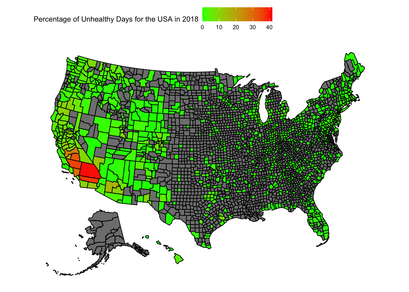
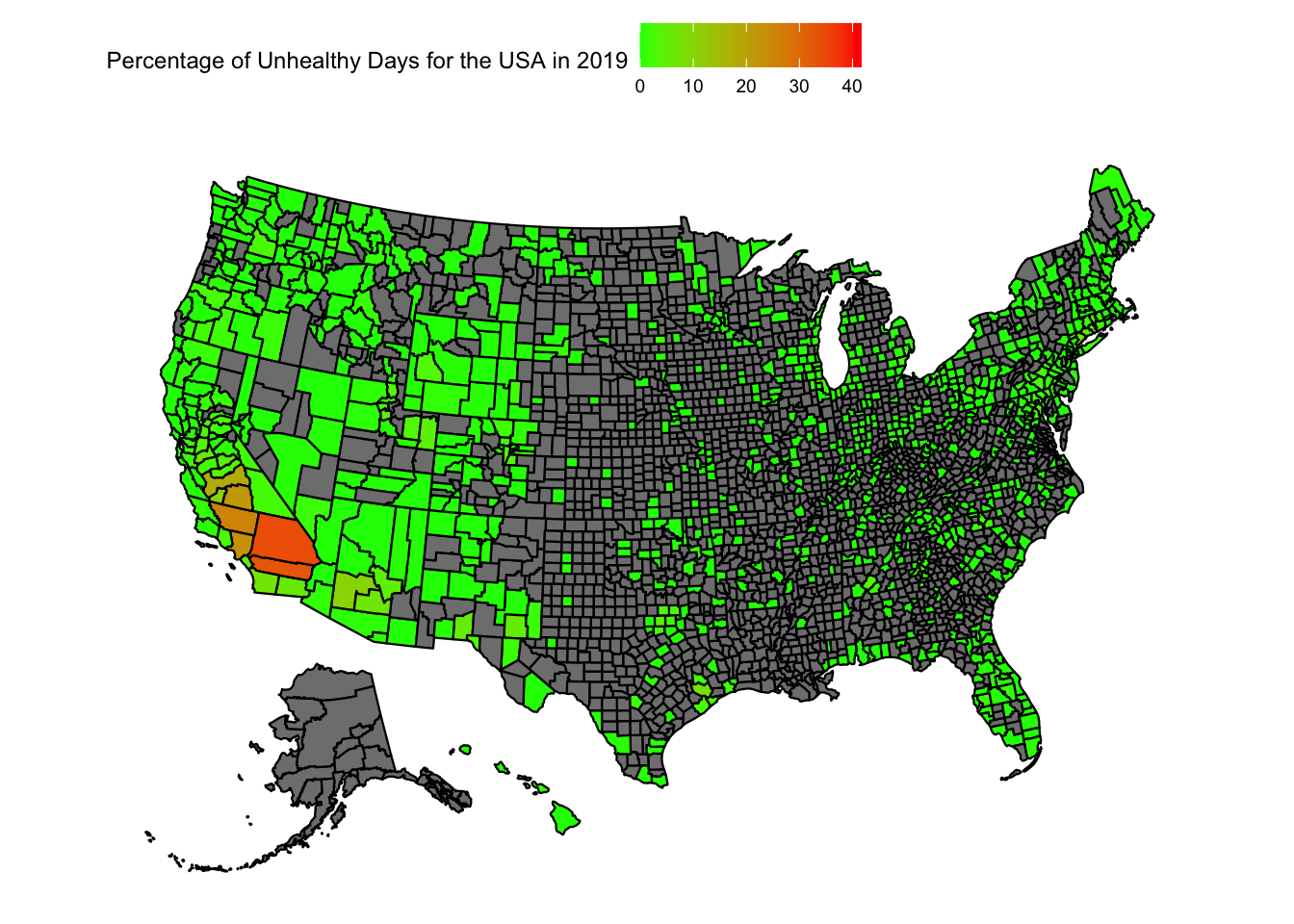
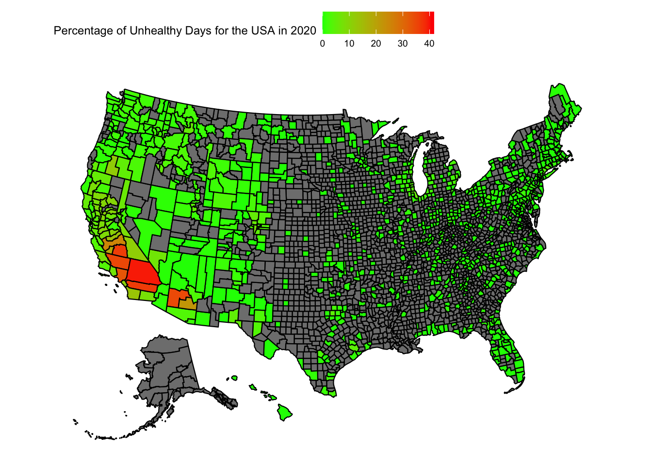
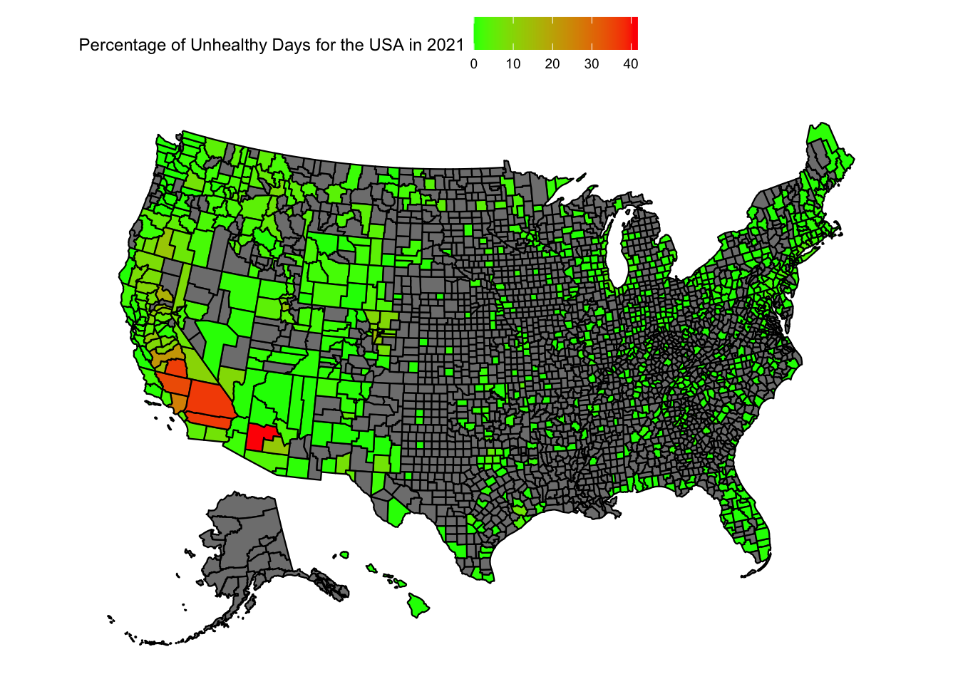
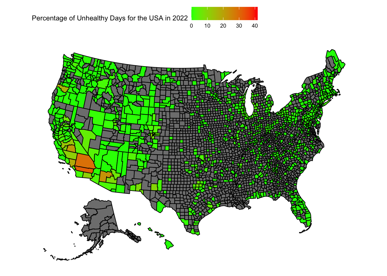
Let us try to plot the variation in the “Percentage of Unhealthy AQI days” in the US
Code
max_percent_unhealthy_days =max(aqi_mod_drop_NA$percent_unhealthy_days)plot_usmap(data =subset(aqi_mod_drop_NA, Year =="2018"), values ="percent_unhealthy_days") +scale_fill_continuous(low ="green", high ="red", limits =c(0,max_percent_unhealthy_days)) +theme(legend.position="top") +labs(fill ="Percentage of Unhealthy Days for the USA in 2018")
Code
plot_usmap(data =subset(aqi_mod_drop_NA, Year =="2019"), values ="percent_unhealthy_days") +scale_fill_continuous(low ="green", high ="red", limits =c(0,max_percent_unhealthy_days)) +theme(legend.position="top") +labs(fill ="Percentage of Unhealthy Days for the USA in 2019")
Code
plot_usmap(data =subset(aqi_mod_drop_NA, Year =="2020"), values ="percent_unhealthy_days") +scale_fill_continuous(low ="green", high ="red", limits =c(0,max_percent_unhealthy_days)) +theme(legend.position="top") +labs(fill ="Percentage of Unhealthy Days for the USA in 2020")
Code
plot_usmap(data =subset(aqi_mod_drop_NA, Year =="2021"), values ="percent_unhealthy_days") +scale_fill_continuous(low ="green", high ="red", limits =c(0,max_percent_unhealthy_days)) +theme(legend.position="top") +labs(fill ="Percentage of Unhealthy Days for the USA in 2021")
Code
plot_usmap(data =subset(aqi_mod_drop_NA, Year =="2022"), values ="percent_unhealthy_days") +scale_fill_continuous(low ="green", high ="red", limits =c(0,max_percent_unhealthy_days)) +theme(legend.position="top") +labs(fill ="Percentage of Unhealthy Days for the USA in 2022")
When we look at the heatmap of the USA for the unhealthiest AQI percentages, we can reach a few conclusions:
There is just too much data that is missing. A large number of counties do not have any recordings attached to them.
Florida, California, Arizona and New England seem to still have more dense readings of AQI
We can see a large fluctuation in California and Arizona over the years
From the data at hand, one conclusion is the unhealthiest AQI percentages are on the west coast, particularly in California and Arizona
AQI in California
Since we do not have a lot of data for the US, we try narrowing our search to the state of California. First let’s see the map of California to recognise the different counties.
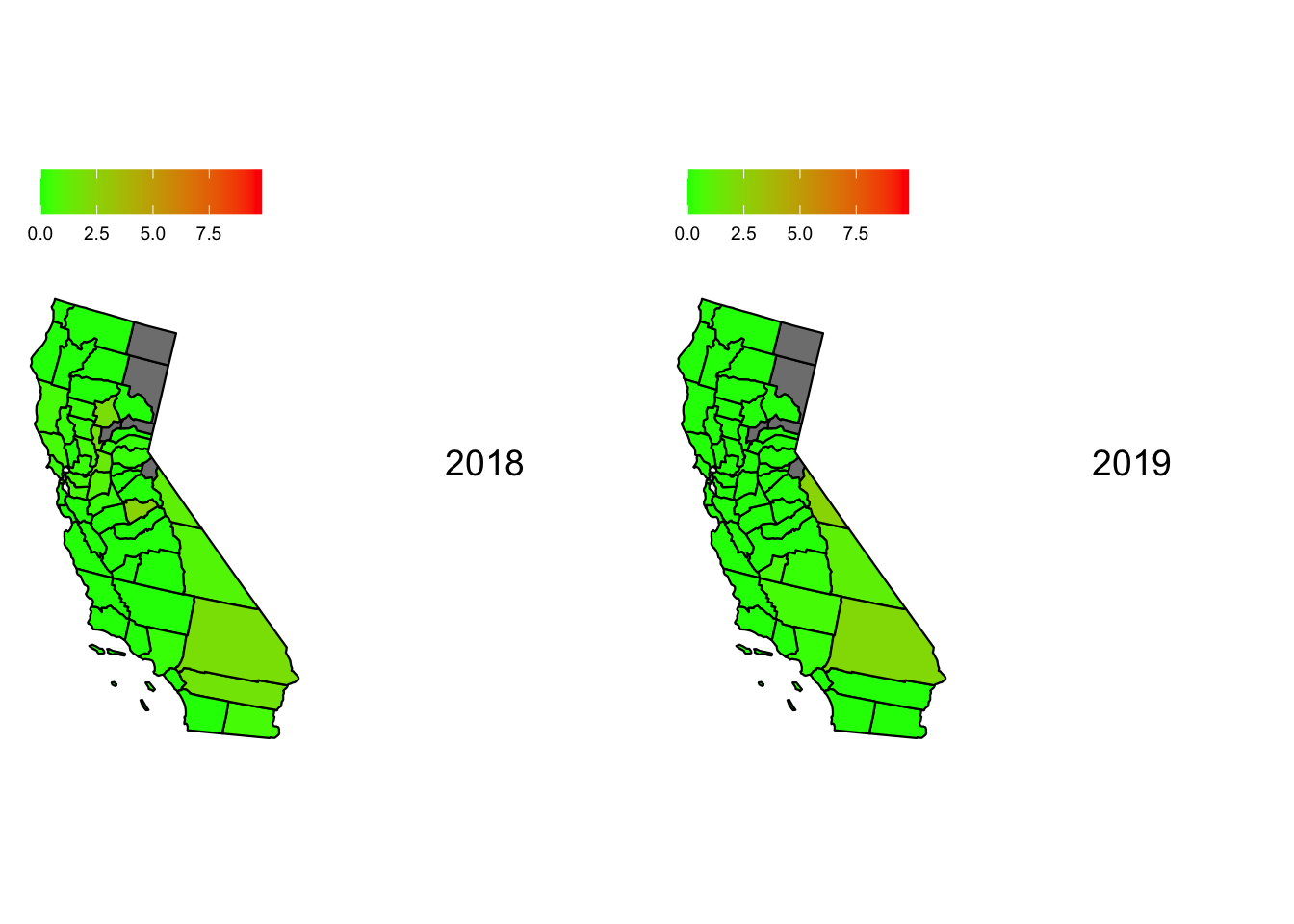
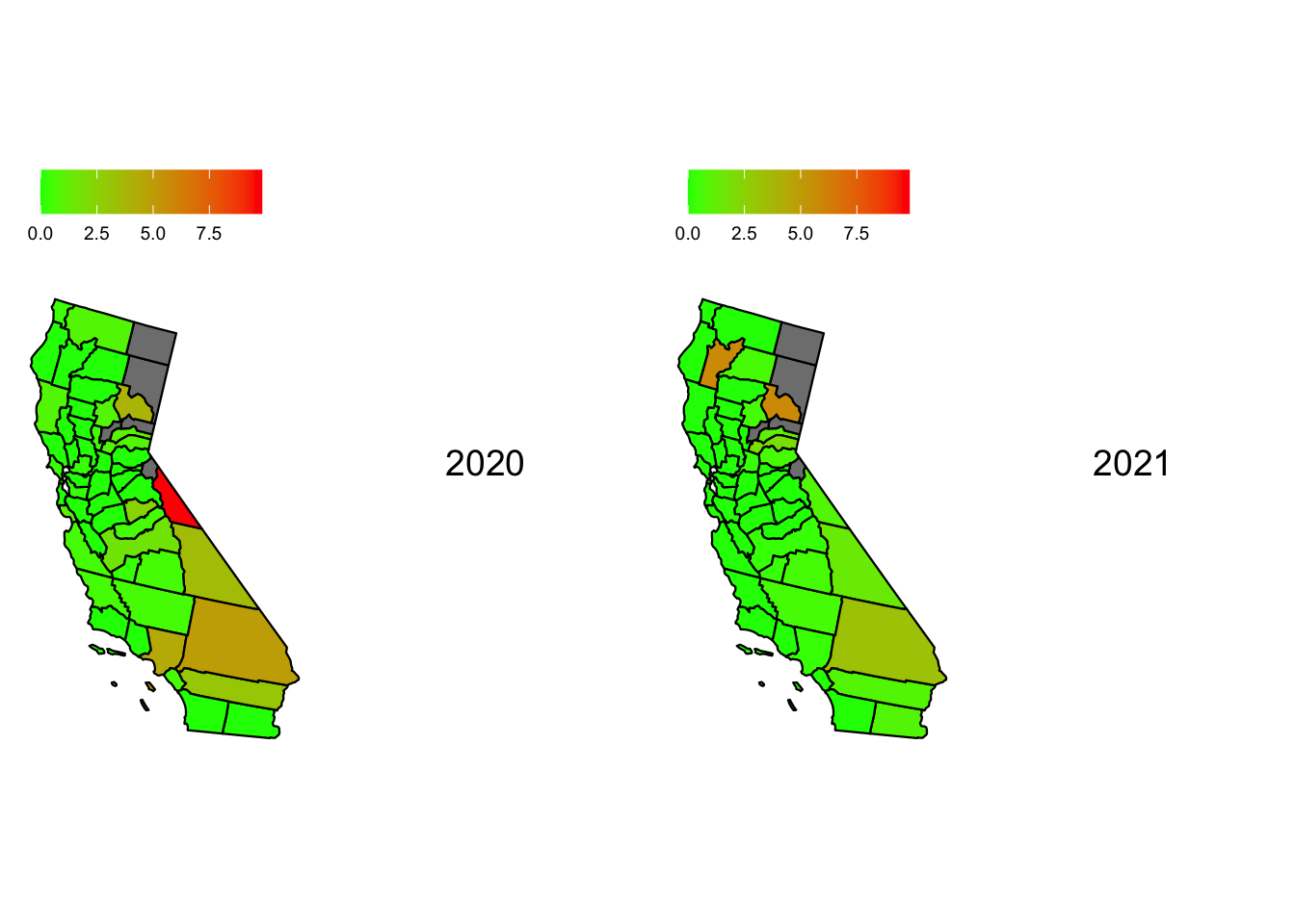
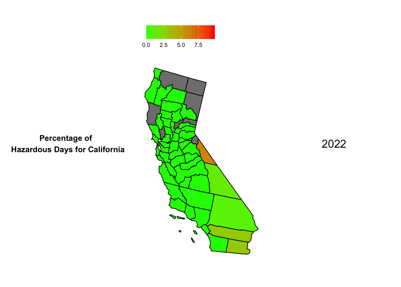
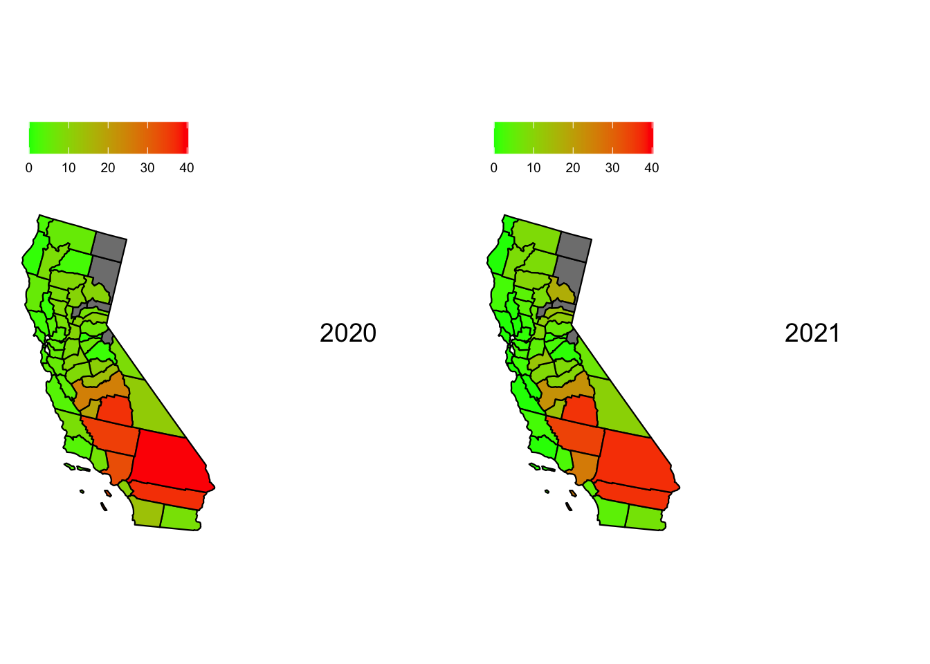
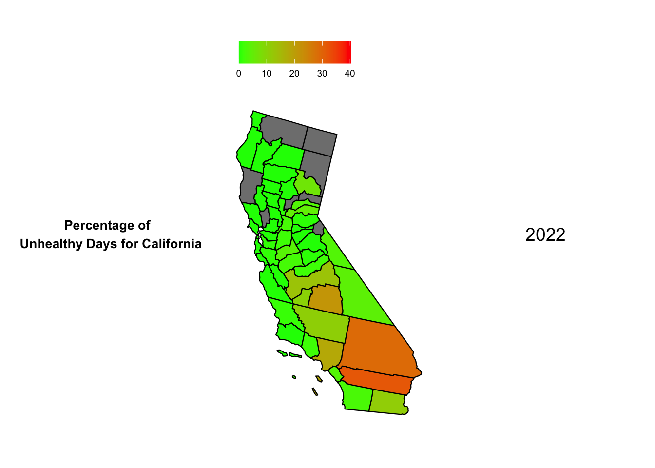
Now, we plot the heat maps for hazardous days in California through the year 2018 to 2022. To ensure that we can draw comparisons we ensure that the scale for each heat map is the same with the upper limit being the maximum percentage of hazardous days in California across all 5 years
Code
max_percent_hazardous_days_inCA =max(subset(aqi_mod_drop_NA, State =="California")$percent_hazardous_days)map1 <-plot_usmap("counties", data =subset(aqi_mod_drop_NA, Year =="2018"), include =c("CA"), values ="percent_hazardous_days") +scale_fill_continuous(low ="green", high ="red", limits =c(0,max_percent_hazardous_days_inCA)) +theme(legend.position="top") +labs(fill ="")map2 <-plot_usmap("counties", data =subset(aqi_mod_drop_NA, Year =="2019"), include =c("CA"), values ="percent_hazardous_days") +scale_fill_continuous(low ="green", high ="red", limits =c(0,max_percent_hazardous_days_inCA)) +theme(legend.position="top") +labs(fill ="")map3 <-plot_usmap("counties", data =subset(aqi_mod_drop_NA, Year =="2020"), include =c("CA"), values ="percent_hazardous_days") +scale_fill_continuous(low ="green", high ="red", limits =c(0,max_percent_hazardous_days_inCA)) +theme(legend.position="top") +labs(fill ="")map4 <-plot_usmap("counties", data =subset(aqi_mod_drop_NA, Year =="2021"), include =c("CA"), values ="percent_hazardous_days") +scale_fill_continuous(low ="green", high ="red", limits =c(0,max_percent_hazardous_days_inCA)) +theme(legend.position="top") +labs(fill ="")map5 <-plot_usmap("counties", data =subset(aqi_mod_drop_NA, Year =="2022"), include =c("CA"), values ="percent_hazardous_days") +scale_fill_continuous(low ="green", high ="red", limits =c(0,max_percent_hazardous_days_inCA)) +theme(legend.position="top") +labs(fill ="")label1 <-textGrob("2018", gp =gpar(fontsize =14))label2 <-textGrob("2019", gp =gpar(fontsize =14))label3 <-textGrob("2020", gp =gpar(fontsize =14))label4 <-textGrob("2021", gp =gpar(fontsize =14))label5 <-textGrob("2022", gp =gpar(fontsize =14))title <-textGrob("Percentage of \n Hazardous Days for California", gp =gpar(fontsize =10, fontface ="bold"))grid.arrange(map1, label1, map2, label2, nrow =1)
Code
grid.arrange(map3, label3, map4, label4, nrow =1)
Code
grid.arrange(title, map5, label5, nrow =1)
From the 5 maps, we can see that Mono, California had a significant fluctuation over the years. It had the highest percentage of Hazardous days in the year 2020 in California. We can also see Inyo and San Bernadino perform poorly when it comes to AQI when measuring the percentage of hazardous days in California. Surprisingly the bay area and the coastline fares well when compared to the inner counties. This seems anomalous given the large population density on the California coastline. Perhaps unknown factors like wind direction, state-wide garbage and sewage disposal etc. play a role in keeping the air on the coast much cleaner.
Code
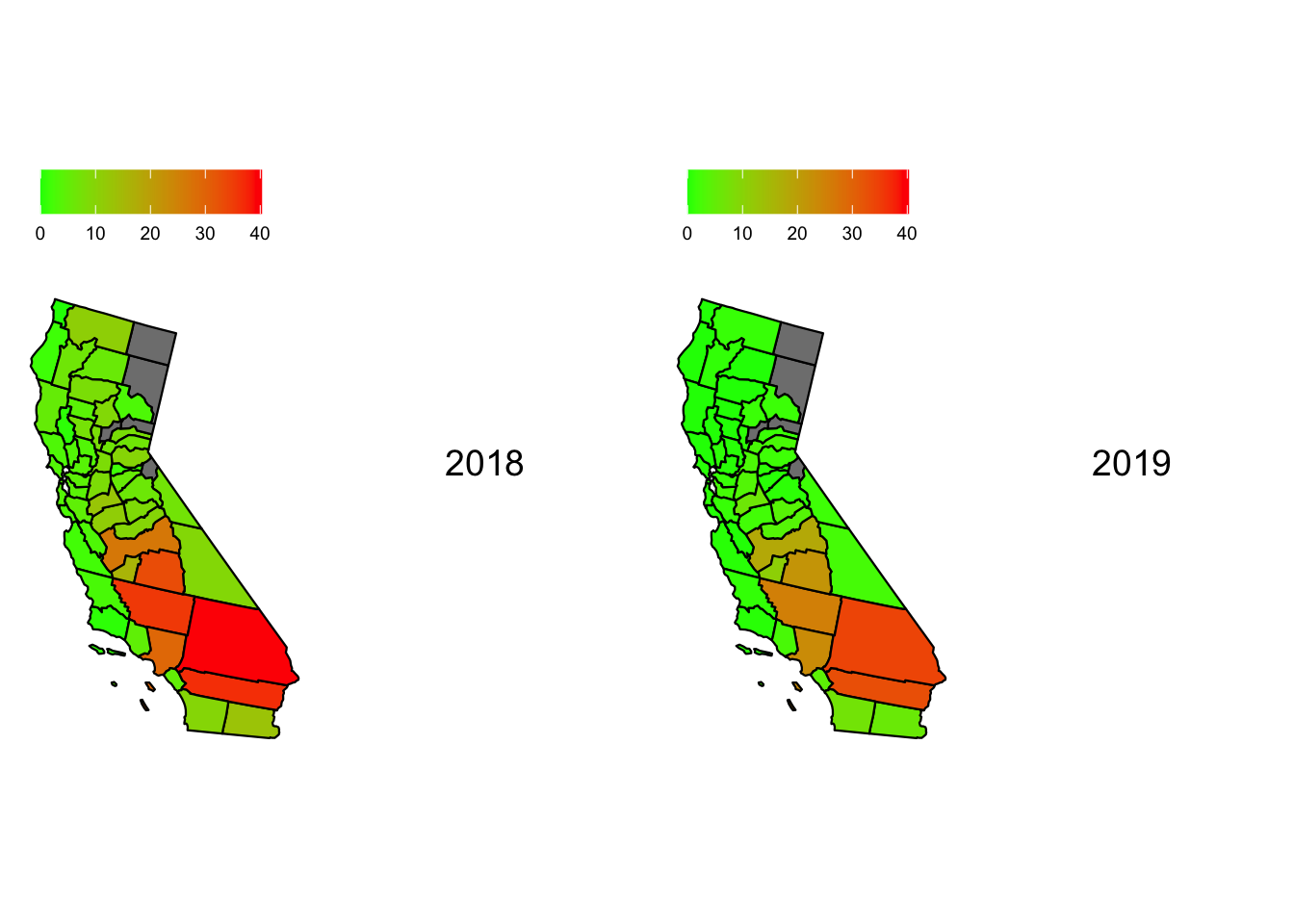
max_percent_unhealthy_days_inCA =max(subset(aqi_mod_drop_NA, State =="California")$percent_unhealthy_days)map1 <-plot_usmap("counties", data =subset(aqi_mod_drop_NA, Year =="2018"), include =c("CA"), values ="percent_unhealthy_days") +scale_fill_continuous(low ="green", high ="red", limits =c(0,max_percent_unhealthy_days_inCA)) +theme(legend.position="top") +labs(fill ="")map2 <-plot_usmap("counties", data =subset(aqi_mod_drop_NA, Year =="2019"), include =c("CA"), values ="percent_unhealthy_days") +scale_fill_continuous(low ="green", high ="red", limits =c(0,max_percent_unhealthy_days_inCA)) +theme(legend.position="top") +labs(fill ="")map3 <-plot_usmap("counties", data =subset(aqi_mod_drop_NA, Year =="2020"), include =c("CA"), values ="percent_unhealthy_days") +scale_fill_continuous(low ="green", high ="red", limits =c(0,max_percent_unhealthy_days_inCA)) +theme(legend.position="top") +labs(fill ="")map4 <-plot_usmap("counties", data =subset(aqi_mod, Year =="2021"), include =c("CA"), values ="percent_unhealthy_days") +scale_fill_continuous(low ="green", high ="red", limits =c(0,max_percent_unhealthy_days_inCA)) +theme(legend.position="top") +labs(fill ="")map5 <-plot_usmap("counties", data =subset(aqi_mod_drop_NA, Year =="2022"), include =c("CA"), values ="percent_unhealthy_days") +scale_fill_continuous(low ="green", high ="red", limits =c(0,max_percent_unhealthy_days_inCA)) +theme(legend.position="top") +labs(fill ="")label1 <-textGrob("2018", gp =gpar(fontsize =14))label2 <-textGrob("2019", gp =gpar(fontsize =14))label3 <-textGrob("2020", gp =gpar(fontsize =14))label4 <-textGrob("2021", gp =gpar(fontsize =14))label5 <-textGrob("2022", gp =gpar(fontsize =14))title <-textGrob("Percentage of \n Unhealthy Days for California", gp =gpar(fontsize =10, fontface ="bold"))grid.arrange(map1, label1, map2, label2, nrow =1)
Code
grid.arrange(map3, label3, map4, label4, nrow =1)
Code
grid.arrange(title, map5, label5, nrow =1)
From the 5 maps, we can see that San Bernadino, California has had almost constant bad Air quality when we consider the percentage of Unhealthy days with close to 30% of days having bad air quality. Riverside, Los-Angelas and Qern also perform poorly when compared to the rest of the state. Contradictory to our previous conclusion drawn from “percentage of Hazardous days”, Mono, California seems to have healthier air across the 5 years. This hints that Mono has had a large deviation in the years 2020 and 2022. This may be due to natural disasters, uncommon or rare natural or man-made phenomena or a sensor malfunction. Regardless, Mono seems to be an anomaly in the data.
Does AQI affect cases of respiratory diseases
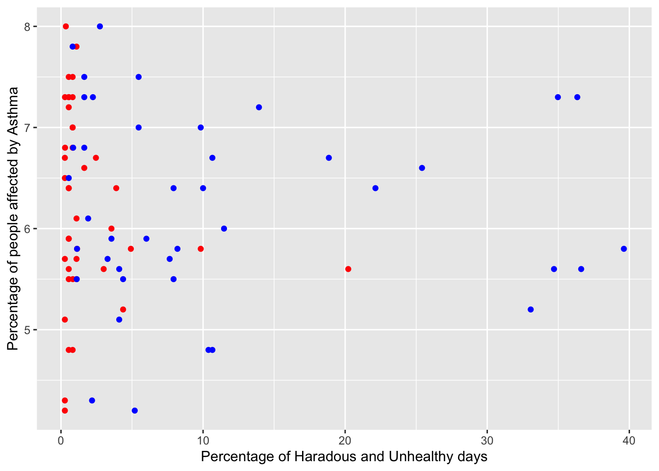
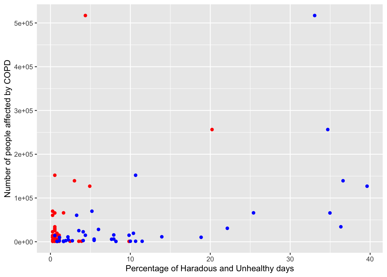
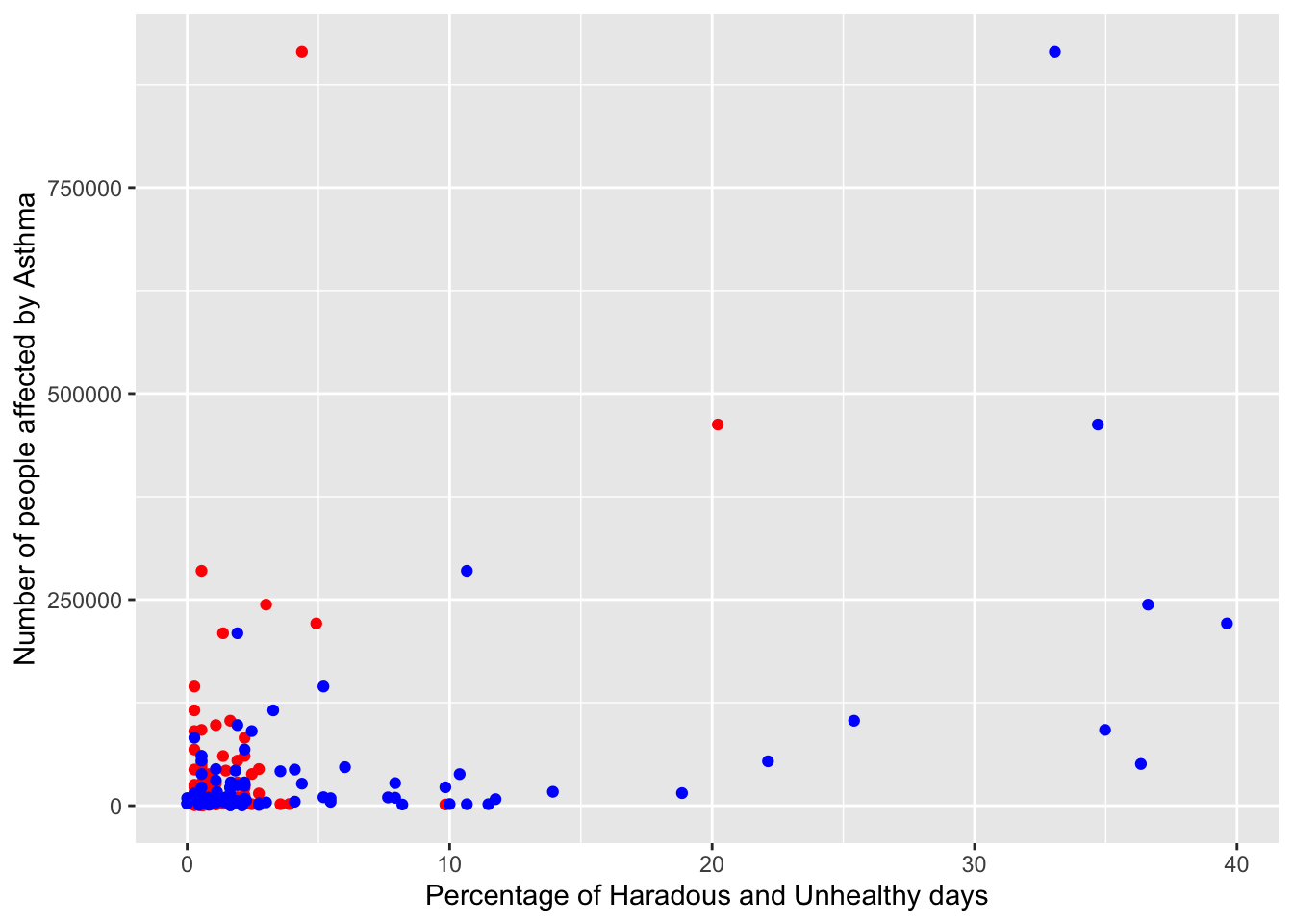
Lets start by plotting the percentage of unhealthy and hazardous days against the percentage of population diagnosed with COPD or Asthma. We start by creating two dataframes, one for COPD in the year 2020 and one for Asthma in the year 2020. Then we inner join this with the AQI data for the year 2020.
Finally for both dataframes we take the subset of data where “Percentage of Hazardous Days” > 0. We do this to avoid a clutter of “Percentage of Unhealthy Days” and only plot data for counties where “Percentage of Hazardous Days” > 0.
We plot both “Percentage of Hazardous Days” in Red and “Percentage of Unhealthy Days” in Blue on the x-axis against Percentage of people with COPD and Asthma.
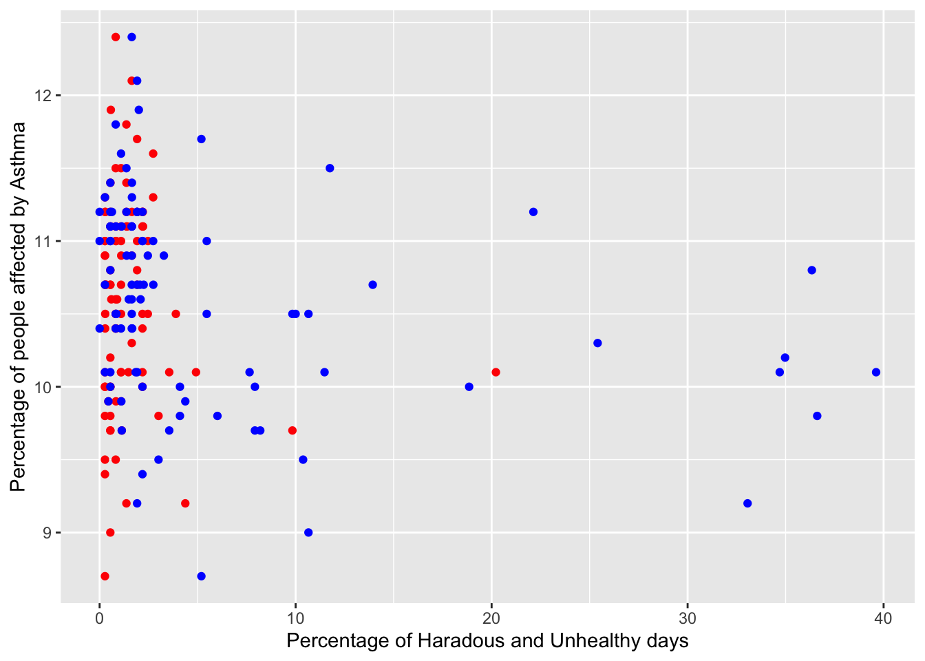
We also plot both “Percentage of Hazardous Days” in Red and “Percentage of Unhealthy Days” in Blue on the x-axis against absolute number of people with COPD and Asthma.
Code
places_copd <-subset(places_mod, MeasureId =="COPD")aqi_places_copd <-merge(x =subset(aqi_mod_drop_NA, Year =="2020"), y = places_copd, by ="fips") %>%select(-c("Year.y", "StateDesc", "LocationName"))aqi_places_copd_unhealthy_not_zero <-subset(aqi_places_copd, percent_hazardous_days >0)places_asthma =subset(places_mod, MeasureId =="CASTHMA")aqi_places_asthma =merge(x =subset(aqi_mod_drop_NA, Year =="2020"), y = places_asthma, by ="fips") %>%select(-c("Year.y", "StateDesc", "LocationName"))aqi_places_asthma_unhealthy_not_zero <-subset(aqi_places_asthma, percent_hazardous_days >0)aqi_places_asthma_unhealthy_not_zero$pop_affected = aqi_places_asthma_unhealthy_not_zero$TotalPopulation * aqi_places_asthma_unhealthy_not_zero$Data_Value /100aqi_places_copd_unhealthy_not_zero$pop_affected = aqi_places_copd_unhealthy_not_zero$TotalPopulation * aqi_places_copd_unhealthy_not_zero$Data_Value /100ggplot(aqi_places_copd_unhealthy_not_zero) +geom_point(aes(percent_hazardous_days, Data_Value), color="red") +geom_point(aes(percent_unhealthy_days, Data_Value), color="blue") +xlab("Percentage of Haradous and Unhealthy days") +ylab("Percentage of people affected by Asthma")
Code
ggplot(aqi_places_asthma_unhealthy_not_zero) +geom_point(aes(percent_hazardous_days, Data_Value), color="red") +geom_point(aes(percent_unhealthy_days, Data_Value), color="blue") +xlab("Percentage of Haradous and Unhealthy days") +ylab("Percentage of people affected by Asthma")
From the first two graphs, we see that we are not able to establish a correlation between the Air Quality in a place and the percentage of the population that suffers from a respiratory disease. This may be due to several factors:
There are other variables like Quality of Life, Income, and Proximity to the source of pollution that affects the prevalence of COPD or Asthma
Respiratory diseases like Asthma and COPD require years of exposure to poor air quality. We are only comparing the air quality of 2020 with cases in 2020
Code
ggplot(aqi_places_copd_unhealthy_not_zero) +geom_point(aes(percent_hazardous_days, pop_affected), color="red") +geom_point(aes(percent_unhealthy_days, pop_affected), color="blue") +xlab("Percentage of Haradous and Unhealthy days") +ylab("Number of people affected by COPD")
Code
ggplot(aqi_places_asthma_unhealthy_not_zero) +geom_point(aes(percent_hazardous_days, pop_affected), color="red") +geom_point(aes(percent_unhealthy_days, pop_affected), color="blue") +xlab("Percentage of Haradous and Unhealthy days") +ylab("Number of people affected by Asthma")
However when we see the graph between number of people affected by COPD and Asthma, we see that as the percentage of Unhealthy Days goes up, there is a weak correlation that the number of people affected by COPD and Asthma also goes up. We also see most counties with low percentage of hazardous days clustered around a lower number of people affected.
There might be several reasons for this.
One such can be that counties with more population will tend to be more polluting. Counties with more population might naturally have more people suffering from COPD and Asthma. Hence there might not be a correlation at all
We have not taken into account migratory information. Some counties with more influx of people might simply have more number of people suffering from COPD and Asthma
We may also have a disparity in demographics. Some counties might have more older people than younger people.
We might simply need more counties with hazardous air to draw a better conclusion
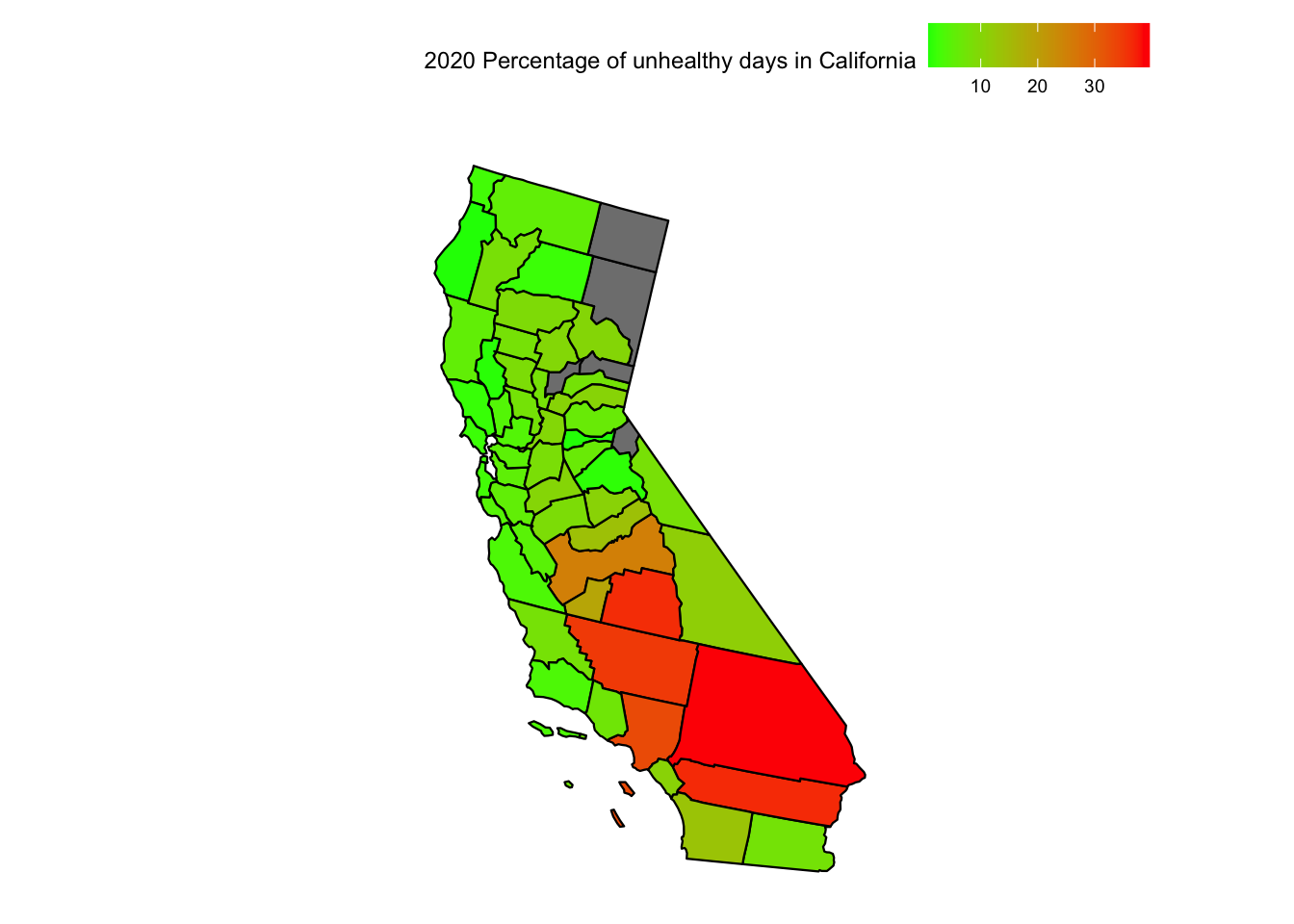
How does AQI in California compare to respiratory diseases
Code
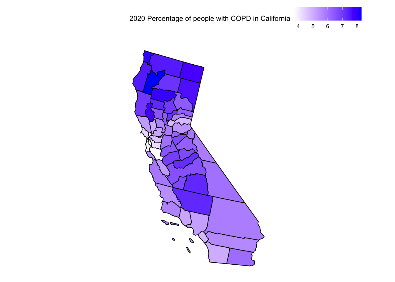
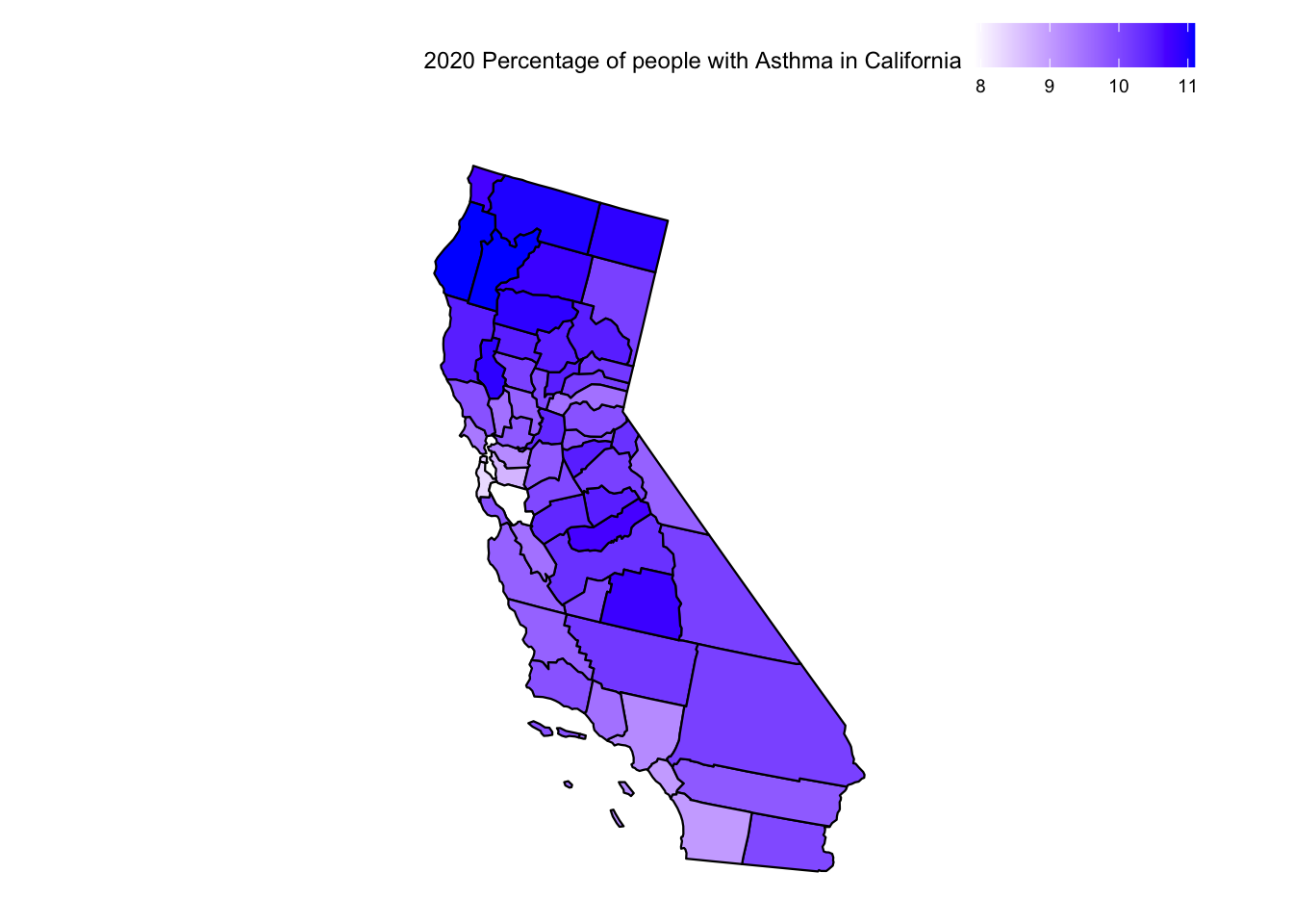
places_ca <-subset(places_mod, StateDesc ==c("California"))places_ca_copd <-subset(places_ca, MeasureId =="COPD")places_ca_asthma <-subset(places_ca, MeasureId =="CASTHMA")plot_usmap("counties", data =subset(places_ca_copd, Year =="2020"), include =c("CA"), values ="Data_Value") +scale_fill_continuous(low ="white", high ="blue") +theme(legend.position="top") +labs(fill ="2020 Percentage of people with COPD in California")
Code
plot_usmap("counties", data =subset(places_ca_asthma, Year =="2020"), include =c("CA"), values ="Data_Value") +scale_fill_continuous(low ="white", high ="blue") +theme(legend.position="top") +labs(fill ="2020 Percentage of people with Asthma in California")
Code
plot_usmap("counties", data =subset(aqi_mod_drop_NA, Year =="2020"), include =c("CA"), values ="percent_unhealthy_days") +scale_fill_continuous(low ="green", high ="red") +theme(legend.position="top") +labs(fill ="2020 Percentage of unhealthy days in California")
For California, we see that counties like San Bernardino, Kern, Tulare, and Fresno with high AQI have a higher percentage of respiratory diseases. We also see that coastal counties with lower AQI also tend to have healthier people. However, we also see a spike in respiratory diseases in the counties of Modoc, Siskiyou and Trinity. This again hints at all the unknown factors that might be affecting the number of cases of respiratory diseases.
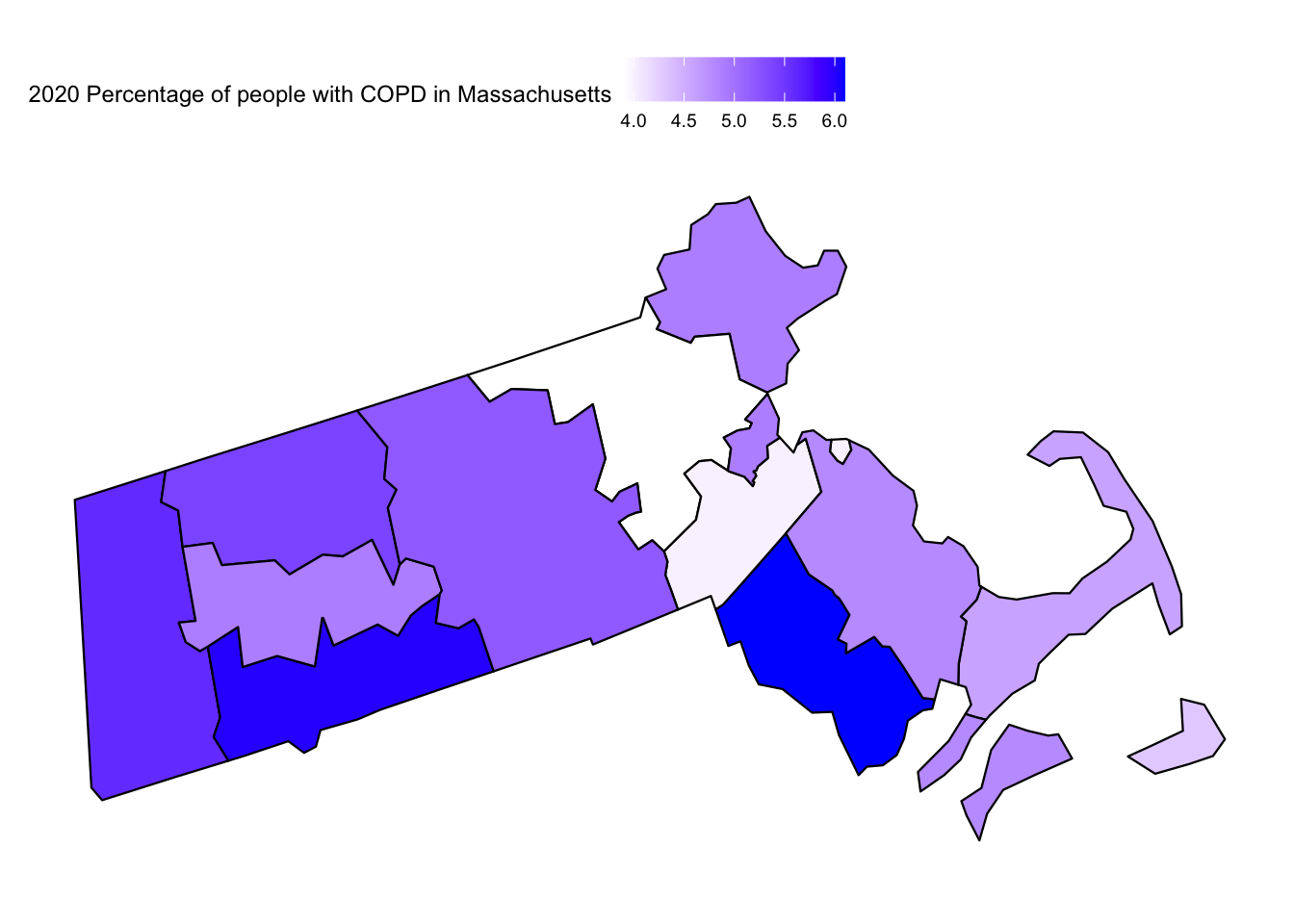
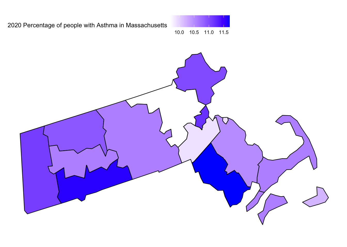
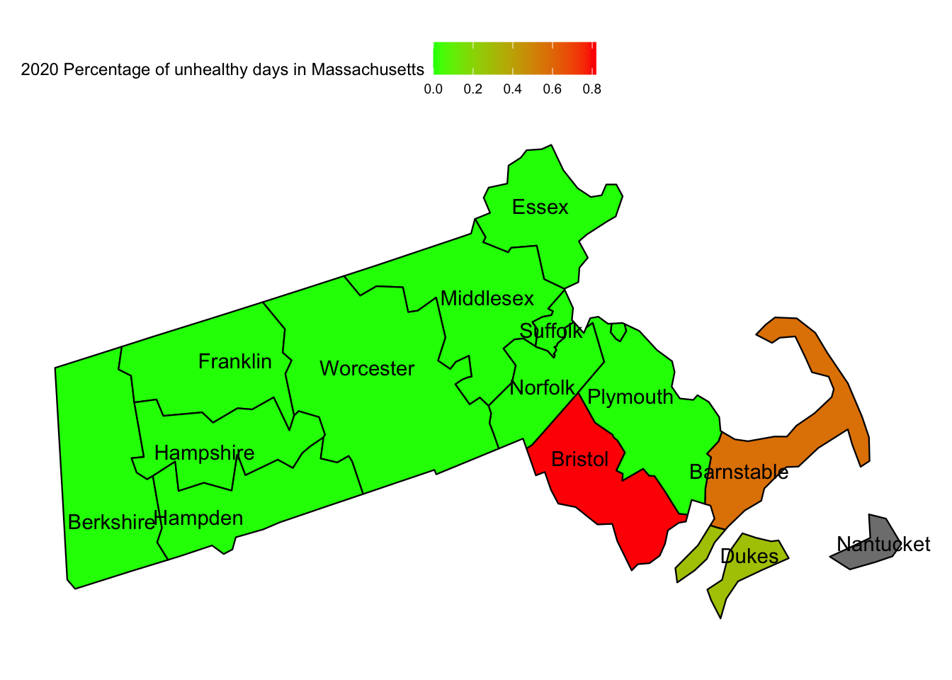
How does AQI in Massachusetts compare to respiratory diseases
Code
places_ma <-subset(places_mod, StateDesc =="Massachusetts")places_ma_copd <-subset(places_ma, MeasureId =="COPD")places_ma_asthma <-subset(places_ma, MeasureId =="CASTHMA")plot_usmap("counties", data =subset(places_ma_copd, Year =="2020"), include =c("MA"), values ="Data_Value") +scale_fill_continuous(low ="white", high ="blue") +theme(legend.position="top") +labs(fill ="2020 Percentage of people with COPD in Massachusetts")
Code
plot_usmap("counties", data =subset(places_ma_asthma, Year =="2020"), include =c("MA"), values ="Data_Value") +scale_fill_continuous(low ="white", high ="blue") +theme(legend.position="top") +labs(fill ="2020 Percentage of people with Asthma in Massachusetts")
Code
plot_usmap("counties", data =subset(aqi_mod_drop_NA, Year =="2020"), include =c("MA"), values ="percent_unhealthy_days", labels =TRUE) +scale_fill_continuous(low ="green", high ="red") +theme(legend.position="top") +labs(fill ="2020 Percentage of unhealthy days in Massachusetts")
For Massachusetts, we see that counties with high AQI have a higher percentage of respiratory diseases. We see that Bristol is the worst affected when it comes to AQI and also has the highest per cent population of COPD and Asthma Patients. Similarly, Barnstable has a higher AQI than the rest of the state and also a comparatively high amount of Asthma patients.
However, we also notice that states with lower AQI also have a moderate level of per cent population of COPD and Asthma Patients. This again hints at all the unknown factors that might be affecting the number of cases of respiratory diseases.
Conclusion
To conclude, this project aims to analyze the Air Quality Index (AQI) and its relationship with respiratory diseases in the United States by examining the AQI from 2018 to 2022. We also analysed respiratory health data for the year 2020. This allowed us to gain insights into air quality trends and potential correlations with conditions like COPD and asthma.
Our analysis revealed spatial and temporal variations in AQI across the United States and for the state of California. Furthermore, by comparing AQI with COPD and Asthma rates, we identified that there is an association between higher AQI and increased risks of these respiratory diseases. However, AQI is not the sole factor contributing to COPD and Asthma Rates as many states with lower AQI also have a large number of patients suffering from COPD or Asthma. Hence further exploration into the demographics and general trend of COPD and Asthma patients needs to be observed to identify the other factors
I acknowledge that limitations exist, such as the dataset’s coverage and the need for more comprehensive studies. However, I hope that this project will provide a template for future research in understanding the relationships between AQI, respiratory health and other factors. The results underscore the importance of monitoring and improving air quality to mitigate the adverse effects on public health and well-being.
References
[1] Dadvand, P., Bartoll, X., Basagaña, X., Dalmau-Bueno, A., Martinez, D., Ambros, A., … & Nieuwenhuijsen, M. J. (2020). Ambient Air Pollution and Respiratory Tract Infections in Children: Implications of Study Design and Exposure Assessment for Recent Research. Environment International, 134, 105281.
[2] U.S. Environmental Protection Agency. Air Quality System (AQS) Data Mart: Annual Data. Retrieved from: https://aqs.epa.gov/aqsweb/airdata/download_files.html#Annual
[3] Centers for Disease Control and Prevention. PLACES: Local Data for Better Health - County Data 2020. Retrieved from: https://chronicdata.cdc.gov/500-Cities-Places/PLACES-Local-Data-for-Better-Health-County-Data-20/swc5-untb
[4] https://cran.r-project.org/package=usmap
[5] https://cran.r-project.org/package=gridExtra
Source Code
---title: "Final Project: Analysis of AQI data and its effect on Respiratory Health"author: "Saksham Kumar"description: "DACSS 601 Fall 2022 Final Project - Attempts to see trends in AQI across the US and find a correlation between AQI and respiratory diseases"date: "05/19/2023"format: html: df-print: paged toc: true code-fold: true code-copy: true code-tools: true css: styles.csscategories: - final project - AQI Dataset - EPA.GOV - PLACES Dataset - CDC - Saksham Kumar---```{r, echo=FALSE}#| label: setup#| warning: false#| message: falselibrary(tidyverse)library(reshape2)library(maps)library(usmap)library(gridExtra)library(grid)knitr::opts_chunk$set(echo =TRUE, warning=FALSE, message=FALSE)```## IntroductionIn this project, we look at the Air Quality Index (AQI), published by the United States Environmental Protection Agency. We look at annual AQIs for the different counties in the United States for the years 2018-2022. In this project, I try to visualize the trends in AQI across the years. I will then also try to investigate its relationship with respiratory diseases like COPD and Asthma rates in 2020. For this, I will use the PLACES dataset, published by the CDC, which covers various health risks, chronic diseases etc, for the entire United States at a County level.- I will attempt to visualize the AQI relationship using heat maps and graphs. The relationship will try to depict temporal and spatial variations in AQI.- Next by comparing the relationship between AQI and COPD and Asthma rates in 2020, I will try to shed light on any potential correlation between air quality and respiratory health conditions.Hence my research questions: - How has the AQI changed across the United States? How does it change for a smaller geographical area like a state?- How does the AQI relate to respiratory diseases in an area?This project might hope to serve as a template for any further study into these relationships, with its successes and failures setting down do's and do-nots for more comprehensive studies.## BackgroundAir Quality is a critical factor that affects our daily lives and well-being. The Air Quality Index (AQI) is a standard measure to assess the quality of ambient air. Understanding it plays an important role in understanding public health, urban planning and environmental management.Several studies have highlighted the importance of gaining insights into Air Quality trends. Dadvand et al. (2020) [1] conducted a systematic review and meta-analysis, revealing a consistent association between higher AQI and increased risks of developing chronic obstructive pulmonary disease (COPD) and asthma.Hence I feel this project will build upon these relationships by examining the AQI in the United States. While the dataset I am using is nowhere as comprehensive as it should be for a study of this level, I still hope to gain some insight into how AQI affects health and housing prices.## Dataset Introduction and DescriptionThe project utilizes three major datasets to investigate the impact of the Air Quality Index (AQI) on everyday life in the USA:- **AQI by County** (from EPA.GOV [2]): This dataset provides annual AQI values for different counties in the USA. Five csv files comprise the data set from 2018 to 2022. It contains information such as county names, state names, year, Max AQI values, number of hazardous days etc. The dataset allows us to analyze temporal variations in AQI and compare air quality across different counties. It also allows us to get a per cent hazardous days to compare the average days of hazardous air in the county.- **PLACES: Local Data for Better Health, County Data 2022 release** (from CDC [3]): This dataset contains county-level data on health indicators, including the prevalence of Chronic Obstructive Pulmonary Disease (COPD) and Asthma. It provides insights into the correlation between AQI and respiratory health conditions, for the year 2020.Let us try to explore the datasets now and make any necessary adjustments to help ease our analysis and exploration.### AQI by County```{r}# Read the annual AQI datasetsaqi_2018 <-read_csv('SakshamKumar_FinalProjectData/annual_aqi_by_county_2018.csv')aqi_2019 <-read_csv('SakshamKumar_FinalProjectData/annual_aqi_by_county_2019.csv')aqi_2020 <-read_csv('SakshamKumar_FinalProjectData/annual_aqi_by_county_2020.csv')aqi_2021 <-read_csv('SakshamKumar_FinalProjectData/annual_aqi_by_county_2021.csv')aqi_2022 <-read_csv('SakshamKumar_FinalProjectData/annual_aqi_by_county_2022.csv')# Merge the datasetsaqi <-rbind(aqi_2018, aqi_2019, aqi_2020, aqi_2021, aqi_2022)```Displayed below is the combined dataframe representing AQI information across the years```{r}# Inspect the raw datasetaqiprint(head(aqi))``````{r}sum_aqi <-summary(aqi)uni_state_aqi <-unique(aqi$State)count_counties_aqi <-unique(aqi$County) %>%length()``````{r}print(paste("Number of counties in the dataset is", count_counties_aqi))print(paste("Number of states in the dataset is", uni_state_aqi %>%length()))print("The unique states mentioned are:")uni_state_aqi```As we are only concerned with the 50 states of the USA for this project, we will filter out rows that contain information for the "District Of Columbia", "Country Of Mexico", "Puerto Rico" and the "Virgin Islands".Also, we are concerned with the overall AQI of the areas. We do not possess the knowledge to infer information from individual pollutants like CO and Ozone. Hence we will filter those columns out too. Hence we are going to drop these variables.```{r}# Perform data cleaning and pre-processing as neededaqi_mod <-subset(aqi, !(aqi$State %in%c("District Of Columbia", "Country Of Mexico", "Puerto Rico", "Virgin Islands")))aqi_mod <- aqi_mod %>%rename("Total Days with AQI"="Days with AQI") %>%select(-starts_with("Days ")) %>%rename("Days with AQI"="Total Days with AQI")aqi_modprint(head(aqi_mod))```Let us try to describe the dataset now. We have the following fields:- State: The state to which the county in this current row of data belongs to- County: The county to which this current row of data belongs- Year: The year of measurement for this row- Days with AQI: Total number of days in the year that AQI was calculated - Good Days: Total number of days the air was good- Moderate Days: Total number of days the air was moderate- Unhealthy for Sensitive Groups Days: Total number of days the air was unhealthy but only for sensitive groups- Unhealthy Days: Total number of days the air was unhealthy- Very Unhealthy Days: Total number of days the air was very unhealthy- Hazardous Days: Total number of days the air was hazardous- Max AQI: The max observed AQI- 90th Percentile AQI: The 90th percentile observed AQI- Median AQI: The median observed AQISince the number of days AQI was calculated varies for counties, we cannot directly compare the number of good or unhealthy days. Instead, a better idea would be to convert it into "percentage of good days" or "percentage of unhealthy days". Also for simplification, let us coalesce the data for Good and Moderate days; Unhealthy for Sensitive Groups Days and Unhealthy Days; Very Unhealthy Days and Hazardous Days. We since we only wish to see trends in air quality. We can assume that Good is as bad as Moderate. Unhealthy for Sensitive is as bad as Unhealthy. And finally, Very Unhealthy means that the air is as bad as Hazardous. This only helps us simplify our analysis a little. ```{r}aqi_mod$percent_moderate_days = (aqi_mod$`Good Days`+ aqi_mod$`Moderate Days`) *100/aqi_mod$`Days with AQI`aqi_mod$percent_unhealthy_days = (aqi_mod$`Unhealthy for Sensitive Groups Days`+ aqi_mod$`Unhealthy Days`) *100/aqi_mod$`Days with AQI`aqi_mod$percent_hazardous_days = (aqi_mod$`Very Unhealthy Days`+ aqi_mod$`Hazardous Days`) *100/aqi_mod$`Days with AQI`aqi_mod <- aqi_mod %>%select(-ends_with(" Days")) %>%select(!"Days with AQI")```Next we try to add FIPS code to the dataset. ```{r}fips_custom <-function(a, b) {tryCatch({ fips_no <-fips(a, b)return(fips_no) }, error =function(e) {return(NA) })}aqi_mod$fips <-NAfor (i in1:nrow(aqi_mod)) { state <- aqi_mod$State[i] county <- aqi_mod$County[i]# Find the corresponding FIPS code in the lookup table fips_value =fips_custom(state, county) aqi_mod$fips[i] = fips_value}```We can that a lot of rows have `NA` in the FIPS column. This is due to several factors. For starters, the usmap module fails to provide FIPS codes for Alaska and Louisiana as they do not have Counties. Also, several Counties are abbreviated. Finally, when we look at the size of our dataset we see that we have data from roughly 1000 counties every year. However, there are in fact over 3000 counties in the US. Hence, we decide to drop Data where FIPS is NA as they cannot be joined with other datasets or plotted on a Map.```{r}# check null valuesaqi_mod_drop_NA <-na.omit(aqi_mod)aqi_mod_drop_NAprint(head(aqi_mod_drop_NA))```Here the new fields are:- percent_moderate_days: The percentage of good and moderate days out of the days AQI was measured.- percent_unhealthy_days: The percentage of unhealthy for sensitive groups and unhealthy days out of the days AQI was measured.- percent_hazardous_days: The percentage of very unhealthy and hazardous days out of the days AQI was measured.This gives us the final AQI dataset we will be using in our project. We have no missing data in this final dataset.### PLACES: Local Data for Better Health, County Data 2022 release```{r}# Read the PLACES cost datasetplaces <-read_csv("SakshamKumar_FinalProjectData/PLACES__Local_Data_for_Better_Health__County_Data_2022_release.csv")# Inspect the raw datasetplacesprint(head(places))``````{r}# Perform data cleaning and preprocessing as neededplaces_mod <-subset(places, places$MeasureId %in%c("CASTHMA", "COPD"))places_mod <-subset(places_mod, places_mod$DataValueTypeID =="AgeAdjPrv") %>%select(-c("Geolocation", "DataSource", "Category", "Data_Value_Type", "LocationID", "Data_Value_Footnote_Symbol", "Data_Value_Footnote", "StateAbbr", "Low_Confidence_Limit", "High_Confidence_Limit", "Short_Question_Text", "CategoryID", "Data_Value_Unit"))# Summarise the datasetplaces_mod <- places_mod[order(places_mod$MeasureId, places_mod$StateDesc, places_mod$LocationName, places_mod$DataValueTypeID), ]places_mod$fips <-NAfor (i in1:nrow(aqi_mod)) { state <- places_mod$StateDesc[i] county <- places_mod$LocationName[i]# Find the corresponding FIPS code in the lookup table fips_value =fips_custom(state, county) places_mod$fips[i] = fips_value}# check null valuesplaces_mod <-na.omit(places_mod)places_modprint(head(places_mod))```Let us try to describe the dataset now. We have the following fields:- Year: The year this measurement was taken- StateDesc: The state to which the county in this current row of data belongs to- LocationName: The county to which this current row of data belongs- Measure: Description detailing the quantity being measured. Example value "Current asthma among adults aged >=18 years" describes that the measurement in Data_Value is the percentage of adults aged >=18 years, with current asthma- Data_Value: Percentage of people affected by this Measure- TotalPopulation: Total population in the State and County for this experiment- MeasureId: ID for the Measure variable. Value is CASTHMA for current asthmatic adults and COPD for current adults with COPD- DataValueTypeID: Is the measurement Age-Adjusted or Crude- fips: FIPS value for the county in the observationLike with the AQI dataset, we can that a lot of rows have `NA` in the FIPS column. Hence, we decide to drop Data where FIPS is NA as they cannot be joined with other datasets or plotted on a Map.## Analysis and VisualizationNow that we have our datasets ready, we will try to visualize the AQI across the US using a heat map. Then we will try to narrow down on a state and explore AQI trends there. Finally, we will try to visualize a relationship between AQI and respiratory diseases.### AQI Across the USALet us try to plot the variation in the "Percentage of Unhealthy AQI days" in the US```{r}max_percent_unhealthy_days =max(aqi_mod_drop_NA$percent_unhealthy_days)plot_usmap(data =subset(aqi_mod_drop_NA, Year =="2018"), values ="percent_unhealthy_days") +scale_fill_continuous(low ="green", high ="red", limits =c(0,max_percent_unhealthy_days)) +theme(legend.position="top") +labs(fill ="Percentage of Unhealthy Days for the USA in 2018")plot_usmap(data =subset(aqi_mod_drop_NA, Year =="2019"), values ="percent_unhealthy_days") +scale_fill_continuous(low ="green", high ="red", limits =c(0,max_percent_unhealthy_days)) +theme(legend.position="top") +labs(fill ="Percentage of Unhealthy Days for the USA in 2019")plot_usmap(data =subset(aqi_mod_drop_NA, Year =="2020"), values ="percent_unhealthy_days") +scale_fill_continuous(low ="green", high ="red", limits =c(0,max_percent_unhealthy_days)) +theme(legend.position="top") +labs(fill ="Percentage of Unhealthy Days for the USA in 2020")plot_usmap(data =subset(aqi_mod_drop_NA, Year =="2021"), values ="percent_unhealthy_days") +scale_fill_continuous(low ="green", high ="red", limits =c(0,max_percent_unhealthy_days)) +theme(legend.position="top") +labs(fill ="Percentage of Unhealthy Days for the USA in 2021")plot_usmap(data =subset(aqi_mod_drop_NA, Year =="2022"), values ="percent_unhealthy_days") +scale_fill_continuous(low ="green", high ="red", limits =c(0,max_percent_unhealthy_days)) +theme(legend.position="top") +labs(fill ="Percentage of Unhealthy Days for the USA in 2022")```When we look at the heatmap of the USA for the unhealthiest AQI percentages, we can reach a few conclusions:- There is just too much data that is missing. A large number of counties do not have any recordings attached to them.- Florida, California, Arizona and New England seem to still have more dense readings of AQI- We can see a large fluctuation in California and Arizona over the yearsFrom the data at hand, one conclusion is the unhealthiest AQI percentages are on the west coast, particularly in California and Arizona### AQI in CaliforniaSince we do not have a lot of data for the US, we try narrowing our search to the state of California. First let's see the map of California to recognise the different counties..png)Now, we plot the heat maps for hazardous days in California through the year 2018 to 2022. To ensure that we can draw comparisons we ensure that the scale for each heat map is the same with the upper limit being the maximum percentage of hazardous days in California across all 5 years```{r}max_percent_hazardous_days_inCA =max(subset(aqi_mod_drop_NA, State =="California")$percent_hazardous_days)map1 <-plot_usmap("counties", data =subset(aqi_mod_drop_NA, Year =="2018"), include =c("CA"), values ="percent_hazardous_days") +scale_fill_continuous(low ="green", high ="red", limits =c(0,max_percent_hazardous_days_inCA)) +theme(legend.position="top") +labs(fill ="")map2 <-plot_usmap("counties", data =subset(aqi_mod_drop_NA, Year =="2019"), include =c("CA"), values ="percent_hazardous_days") +scale_fill_continuous(low ="green", high ="red", limits =c(0,max_percent_hazardous_days_inCA)) +theme(legend.position="top") +labs(fill ="")map3 <-plot_usmap("counties", data =subset(aqi_mod_drop_NA, Year =="2020"), include =c("CA"), values ="percent_hazardous_days") +scale_fill_continuous(low ="green", high ="red", limits =c(0,max_percent_hazardous_days_inCA)) +theme(legend.position="top") +labs(fill ="")map4 <-plot_usmap("counties", data =subset(aqi_mod_drop_NA, Year =="2021"), include =c("CA"), values ="percent_hazardous_days") +scale_fill_continuous(low ="green", high ="red", limits =c(0,max_percent_hazardous_days_inCA)) +theme(legend.position="top") +labs(fill ="")map5 <-plot_usmap("counties", data =subset(aqi_mod_drop_NA, Year =="2022"), include =c("CA"), values ="percent_hazardous_days") +scale_fill_continuous(low ="green", high ="red", limits =c(0,max_percent_hazardous_days_inCA)) +theme(legend.position="top") +labs(fill ="")label1 <-textGrob("2018", gp =gpar(fontsize =14))label2 <-textGrob("2019", gp =gpar(fontsize =14))label3 <-textGrob("2020", gp =gpar(fontsize =14))label4 <-textGrob("2021", gp =gpar(fontsize =14))label5 <-textGrob("2022", gp =gpar(fontsize =14))title <-textGrob("Percentage of \n Hazardous Days for California", gp =gpar(fontsize =10, fontface ="bold"))grid.arrange(map1, label1, map2, label2, nrow =1)grid.arrange(map3, label3, map4, label4, nrow =1)grid.arrange(title, map5, label5, nrow =1)```From the 5 maps, we can see that Mono, California had a significant fluctuation over the years. It had the highest percentage of Hazardous days in the year 2020 in California. We can also see Inyo and San Bernadino perform poorly when it comes to AQI when measuring the percentage of hazardous days in California. Surprisingly the bay area and the coastline fares well when compared to the inner counties. This seems anomalous given the large population density on the California coastline. Perhaps unknown factors like wind direction, state-wide garbage and sewage disposal etc. play a role in keeping the air on the coast much cleaner.```{r}max_percent_unhealthy_days_inCA =max(subset(aqi_mod_drop_NA, State =="California")$percent_unhealthy_days)map1 <-plot_usmap("counties", data =subset(aqi_mod_drop_NA, Year =="2018"), include =c("CA"), values ="percent_unhealthy_days") +scale_fill_continuous(low ="green", high ="red", limits =c(0,max_percent_unhealthy_days_inCA)) +theme(legend.position="top") +labs(fill ="")map2 <-plot_usmap("counties", data =subset(aqi_mod_drop_NA, Year =="2019"), include =c("CA"), values ="percent_unhealthy_days") +scale_fill_continuous(low ="green", high ="red", limits =c(0,max_percent_unhealthy_days_inCA)) +theme(legend.position="top") +labs(fill ="")map3 <-plot_usmap("counties", data =subset(aqi_mod_drop_NA, Year =="2020"), include =c("CA"), values ="percent_unhealthy_days") +scale_fill_continuous(low ="green", high ="red", limits =c(0,max_percent_unhealthy_days_inCA)) +theme(legend.position="top") +labs(fill ="")map4 <-plot_usmap("counties", data =subset(aqi_mod, Year =="2021"), include =c("CA"), values ="percent_unhealthy_days") +scale_fill_continuous(low ="green", high ="red", limits =c(0,max_percent_unhealthy_days_inCA)) +theme(legend.position="top") +labs(fill ="")map5 <-plot_usmap("counties", data =subset(aqi_mod_drop_NA, Year =="2022"), include =c("CA"), values ="percent_unhealthy_days") +scale_fill_continuous(low ="green", high ="red", limits =c(0,max_percent_unhealthy_days_inCA)) +theme(legend.position="top") +labs(fill ="")label1 <-textGrob("2018", gp =gpar(fontsize =14))label2 <-textGrob("2019", gp =gpar(fontsize =14))label3 <-textGrob("2020", gp =gpar(fontsize =14))label4 <-textGrob("2021", gp =gpar(fontsize =14))label5 <-textGrob("2022", gp =gpar(fontsize =14))title <-textGrob("Percentage of \n Unhealthy Days for California", gp =gpar(fontsize =10, fontface ="bold"))grid.arrange(map1, label1, map2, label2, nrow =1)grid.arrange(map3, label3, map4, label4, nrow =1)grid.arrange(title, map5, label5, nrow =1)```From the 5 maps, we can see that San Bernadino, California has had almost constant bad Air quality when we consider the percentage of Unhealthy days with close to 30% of days having bad air quality. Riverside, Los-Angelas and Qern also perform poorly when compared to the rest of the state. Contradictory to our previous conclusion drawn from "percentage of Hazardous days", Mono, California seems to have healthier air across the 5 years. This hints that Mono has had a large deviation in the years 2020 and 2022. This may be due to natural disasters, uncommon or rare natural or man-made phenomena or a sensor malfunction. Regardless, Mono seems to be an anomaly in the data.### Does AQI affect cases of respiratory diseasesLets start by plotting the percentage of unhealthy and hazardous days against the percentage of population diagnosed with COPD or Asthma. We start by creating two dataframes, one for COPD in the year 2020 and one for Asthma in the year 2020. Then we inner join this with the AQI data for the year 2020.Finally for both dataframes we take the subset of data where "Percentage of Hazardous Days" > 0. We do this to avoid a clutter of "Percentage of Unhealthy Days" and only plot data for counties where "Percentage of Hazardous Days" > 0.We plot both "Percentage of Hazardous Days" in Red and "Percentage of Unhealthy Days" in Blue on the x-axis against Percentage of people with COPD and Asthma.We also plot both "Percentage of Hazardous Days" in Red and "Percentage of Unhealthy Days" in Blue on the x-axis against absolute number of people with COPD and Asthma.```{r}places_copd <-subset(places_mod, MeasureId =="COPD")aqi_places_copd <-merge(x =subset(aqi_mod_drop_NA, Year =="2020"), y = places_copd, by ="fips") %>%select(-c("Year.y", "StateDesc", "LocationName"))aqi_places_copd_unhealthy_not_zero <-subset(aqi_places_copd, percent_hazardous_days >0)places_asthma =subset(places_mod, MeasureId =="CASTHMA")aqi_places_asthma =merge(x =subset(aqi_mod_drop_NA, Year =="2020"), y = places_asthma, by ="fips") %>%select(-c("Year.y", "StateDesc", "LocationName"))aqi_places_asthma_unhealthy_not_zero <-subset(aqi_places_asthma, percent_hazardous_days >0)aqi_places_asthma_unhealthy_not_zero$pop_affected = aqi_places_asthma_unhealthy_not_zero$TotalPopulation * aqi_places_asthma_unhealthy_not_zero$Data_Value /100aqi_places_copd_unhealthy_not_zero$pop_affected = aqi_places_copd_unhealthy_not_zero$TotalPopulation * aqi_places_copd_unhealthy_not_zero$Data_Value /100ggplot(aqi_places_copd_unhealthy_not_zero) +geom_point(aes(percent_hazardous_days, Data_Value), color="red") +geom_point(aes(percent_unhealthy_days, Data_Value), color="blue") +xlab("Percentage of Haradous and Unhealthy days") +ylab("Percentage of people affected by Asthma")ggplot(aqi_places_asthma_unhealthy_not_zero) +geom_point(aes(percent_hazardous_days, Data_Value), color="red") +geom_point(aes(percent_unhealthy_days, Data_Value), color="blue") +xlab("Percentage of Haradous and Unhealthy days") +ylab("Percentage of people affected by Asthma")```From the first two graphs, we see that we are not able to establish a correlation between the Air Quality in a place and the percentage of the population that suffers from a respiratory disease. This may be due to several factors:- There are other variables like Quality of Life, Income, and Proximity to the source of pollution that affects the prevalence of COPD or Asthma- Respiratory diseases like Asthma and COPD require years of exposure to poor air quality. We are only comparing the air quality of 2020 with cases in 2020```{r}ggplot(aqi_places_copd_unhealthy_not_zero) +geom_point(aes(percent_hazardous_days, pop_affected), color="red") +geom_point(aes(percent_unhealthy_days, pop_affected), color="blue") +xlab("Percentage of Haradous and Unhealthy days") +ylab("Number of people affected by COPD")ggplot(aqi_places_asthma_unhealthy_not_zero) +geom_point(aes(percent_hazardous_days, pop_affected), color="red") +geom_point(aes(percent_unhealthy_days, pop_affected), color="blue") +xlab("Percentage of Haradous and Unhealthy days") +ylab("Number of people affected by Asthma")```However when we see the graph between number of people affected by COPD and Asthma, we see that as the percentage of Unhealthy Days goes up, there is a weak correlation that the number of people affected by COPD and Asthma also goes up. We also see most counties with low percentage of hazardous days clustered around a lower number of people affected.There might be several reasons for this. - One such can be that counties with more population will tend to be more polluting. Counties with more population might naturally have more people suffering from COPD and Asthma. Hence there might not be a correlation at all- We have not taken into account migratory information. Some counties with more influx of people might simply have more number of people suffering from COPD and Asthma- We may also have a disparity in demographics. Some counties might have more older people than younger people. - We might simply need more counties with hazardous air to draw a better conclusion### How does AQI in California compare to respiratory diseases```{r}places_ca <-subset(places_mod, StateDesc ==c("California"))places_ca_copd <-subset(places_ca, MeasureId =="COPD")places_ca_asthma <-subset(places_ca, MeasureId =="CASTHMA")plot_usmap("counties", data =subset(places_ca_copd, Year =="2020"), include =c("CA"), values ="Data_Value") +scale_fill_continuous(low ="white", high ="blue") +theme(legend.position="top") +labs(fill ="2020 Percentage of people with COPD in California")plot_usmap("counties", data =subset(places_ca_asthma, Year =="2020"), include =c("CA"), values ="Data_Value") +scale_fill_continuous(low ="white", high ="blue") +theme(legend.position="top") +labs(fill ="2020 Percentage of people with Asthma in California")plot_usmap("counties", data =subset(aqi_mod_drop_NA, Year =="2020"), include =c("CA"), values ="percent_unhealthy_days") +scale_fill_continuous(low ="green", high ="red") +theme(legend.position="top") +labs(fill ="2020 Percentage of unhealthy days in California")```For California, we see that counties like San Bernardino, Kern, Tulare, and Fresno with high AQI have a higher percentage of respiratory diseases. We also see that coastal counties with lower AQI also tend to have healthier people. However, we also see a spike in respiratory diseases in the counties of Modoc, Siskiyou and Trinity. This again hints at all the unknown factors that might be affecting the number of cases of respiratory diseases.### How does AQI in Massachusetts compare to respiratory diseases```{r}places_ma <-subset(places_mod, StateDesc =="Massachusetts")places_ma_copd <-subset(places_ma, MeasureId =="COPD")places_ma_asthma <-subset(places_ma, MeasureId =="CASTHMA")plot_usmap("counties", data =subset(places_ma_copd, Year =="2020"), include =c("MA"), values ="Data_Value") +scale_fill_continuous(low ="white", high ="blue") +theme(legend.position="top") +labs(fill ="2020 Percentage of people with COPD in Massachusetts")plot_usmap("counties", data =subset(places_ma_asthma, Year =="2020"), include =c("MA"), values ="Data_Value") +scale_fill_continuous(low ="white", high ="blue") +theme(legend.position="top") +labs(fill ="2020 Percentage of people with Asthma in Massachusetts")plot_usmap("counties", data =subset(aqi_mod_drop_NA, Year =="2020"), include =c("MA"), values ="percent_unhealthy_days", labels =TRUE) +scale_fill_continuous(low ="green", high ="red") +theme(legend.position="top") +labs(fill ="2020 Percentage of unhealthy days in Massachusetts")```For Massachusetts, we see that counties with high AQI have a higher percentage of respiratory diseases. We see that Bristol is the worst affected when it comes to AQI and also has the highest per cent population of COPD and Asthma Patients. Similarly, Barnstable has a higher AQI than the rest of the state and also a comparatively high amount of Asthma patients. However, we also notice that states with lower AQI also have a moderate level of per cent population of COPD and Asthma Patients. This again hints at all the unknown factors that might be affecting the number of cases of respiratory diseases.## ConclusionTo conclude, this project aims to analyze the Air Quality Index (AQI) and its relationship with respiratory diseases in the United States by examining the AQI from 2018 to 2022. We also analysed respiratory health data for the year 2020. This allowed us to gain insights into air quality trends and potential correlations with conditions like COPD and asthma.Our analysis revealed spatial and temporal variations in AQI across the United States and for the state of California. Furthermore, by comparing AQI with COPD and Asthma rates, we identified that there is an association between higher AQI and increased risks of these respiratory diseases. However, AQI is not the sole factor contributing to COPD and Asthma Rates as many states with lower AQI also have a large number of patients suffering from COPD or Asthma. Hence further exploration into the demographics and general trend of COPD and Asthma patients needs to be observed to identify the other factorsI acknowledge that limitations exist, such as the dataset's coverage and the need for more comprehensive studies. However, I hope that this project will provide a template for future research in understanding the relationships between AQI, respiratory health and other factors. The results underscore the importance of monitoring and improving air quality to mitigate the adverse effects on public health and well-being.## References- [1] Dadvand, P., Bartoll, X., Basagaña, X., Dalmau-Bueno, A., Martinez, D., Ambros, A., ... & Nieuwenhuijsen, M. J. (2020). Ambient Air Pollution and Respiratory Tract Infections in Children: Implications of Study Design and Exposure Assessment for Recent Research. Environment International, 134, 105281.- [2] U.S. Environmental Protection Agency. Air Quality System (AQS) Data Mart: Annual Data. Retrieved from: https://aqs.epa.gov/aqsweb/airdata/download_files.html#Annual- [3] Centers for Disease Control and Prevention. PLACES: Local Data for Better Health - County Data 2020. Retrieved from: https://chronicdata.cdc.gov/500-Cities-Places/PLACES-Local-Data-for-Better-Health-County-Data-20/swc5-untb- [4] https://cran.r-project.org/package=usmap- [5] https://cran.r-project.org/package=gridExtra
.png)