library(tidyverse)
library(ggplot2)

knitr::opts_chunk$set(echo = TRUE, warning=FALSE, message=FALSE)Challenge 5
challenge_5
Introduction to Visualization
Read in data
# reading the ceral dataset
cereal <- read_csv("_data/cereal.csv")
head(cereal,4)
# A tibble: 4 × 4
Cereal Sodium Sugar Type
<chr> <dbl> <dbl> <chr>
1 Frosted Mini Wheats 0 11 A
2 Raisin Bran 340 18 A
3 All Bran 70 5 A
4 Apple Jacks 140 14 C Briefly describe the data
This data set contains four columns:
Cereal <chr>: Cereal NameSodium <dbl>: Amount of sodium per serving of the cerealSugar <dbl>: Amount of sugar per serving of cerealType <chr>: Cereal Type (Child or Adult)
Tidy Data (as needed)
Just making a few changes to the dataset.
cereal <- cereal %>%
  mutate(Type = recode(Type, "A" = "Adult", "C" = "Child"))

# Display first 5 rows of the modified data
head(cereal, 5)
# A tibble: 5 × 4
Cereal Sodium Sugar Type
<chr> <dbl> <dbl> <chr>
1 Frosted Mini Wheats 0 11 Adult
2 Raisin Bran 340 18 Adult
3 All Bran 70 5 Adult
4 Apple Jacks 140 14 Child
5 Captain Crunch 200 12 ChildUnivariate Visualizations
# Create a histogram for the distribution of Sodium based on Type
sodium_plot <- ggplot(cereal, aes(Sodium)) +
  geom_histogram(binwidth = 100) +
  facet_grid(vars(Type)) +
  labs(title = "Distribution of Sodium based on Type")

# Display the Sodium histogram
print(sodium_plot)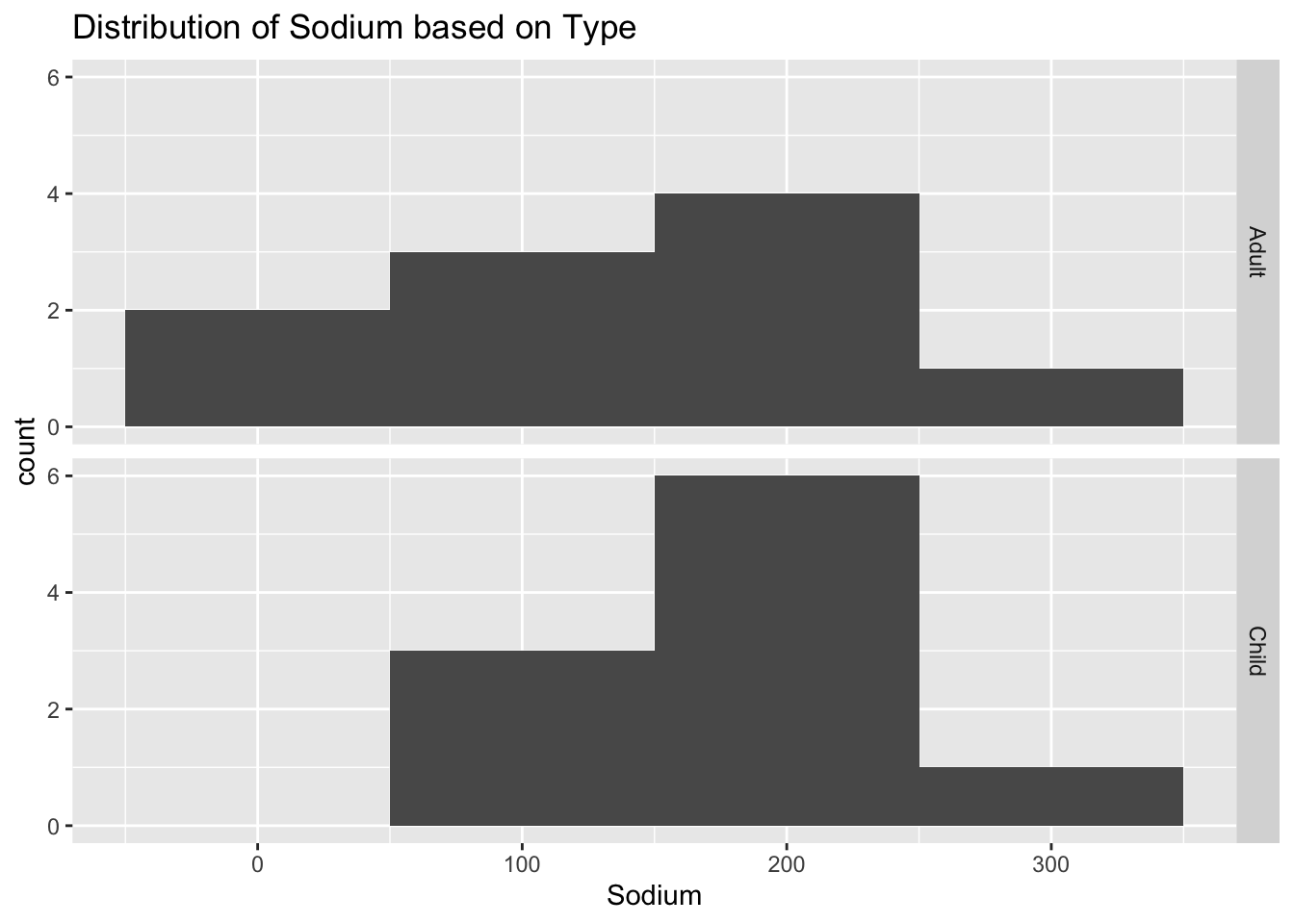
# Create a histogram for the distribution of Sugar based on Type
sugar_plot <- ggplot(cereal, aes(Sugar)) +
  geom_histogram(binwidth = 5) +
  facet_grid(vars(Type)) +
  labs(title = "Distribution of Sugar based on Type")

# Display the Sugar histogram
print(sugar_plot)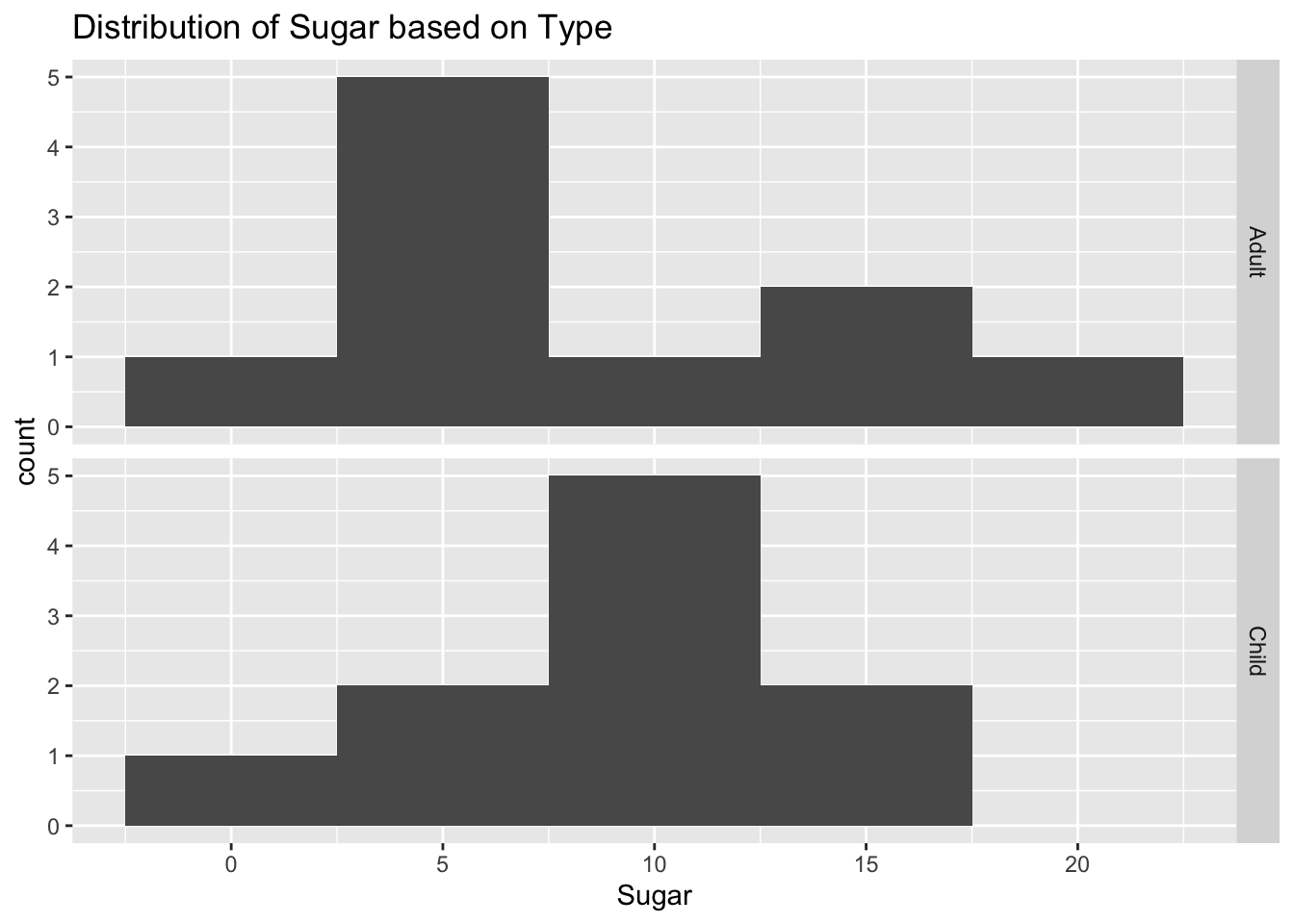
Because we are dealing with univariate, continuous data, I chose histograms. I wanted to compare things by type, so I used a facet grid.
Bivariate Visualization(s)
# Create a boxplot for the amount of Sugar in Cereal by Type
sugar_by_type_plot <- ggplot(cereal, aes(Type, Sugar)) +
  geom_boxplot() +
  labs(title = "Amount of Sugar in Cereal by Type")

# Display the boxplot
print(sugar_by_type_plot)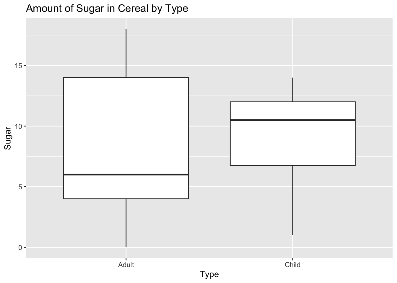
We can see that, on average, children’s cereal contains more sugar than adult cereal. Because the data is so sparse, I went with a box plot.