library(tidyverse)
library(ggplot2)
library(readxl)
library(lubridate)

knitr::opts_chunk$set(echo = TRUE, warning=FALSE, message=FALSE)Analysis of Mortage and Overall Debt trends
challenge_6
fed_rate
debt
Visualizing Time and Relationships with focus on mortages debt how it rose till 2008 and where it is heading
debt_raw <- read_xlsx("_data/debt_in_trillions.xlsx")
head(debt_raw, 5)
# A tibble: 5 × 8
`Year and Quarter` Mortgage `HE Revolving` Auto …¹ Credi…² Stude…³ Other Total
<chr> <dbl> <dbl> <dbl> <dbl> <dbl> <dbl> <dbl>
1 03:Q1 4.94 0.242 0.641 0.688 0.241 0.478 7.23
2 03:Q2 5.08 0.26 0.622 0.693 0.243 0.486 7.38
3 03:Q3 5.18 0.269 0.684 0.693 0.249 0.477 7.56
4 03:Q4 5.66 0.302 0.704 0.698 0.253 0.449 8.07
5 04:Q1 5.84 0.328 0.72 0.695 0.260 0.446 8.29
# … with abbreviated variable names ¹`Auto Loan`, ²`Credit Card`,
# ³`Student Loan`Briefly describe the data
This dataset provides a quarterly overview of various types of debt in the United States from Q1 2003 to Q2 2021. The columns represent the following:
- Year and Quarter: The time period in which the data was collected, formatted as year and quarter (e.g., ‘03:Q1’ for the first quarter of 2003).
- Mortgage: The total outstanding mortgage debt in trillions of US dollars.
- HE Revolving: The total outstanding home equity revolving debt in trillions of US dollars.
- Auto Loan: The total outstanding auto loan debt in trillions of US dollars.
- Credit Card: The total outstanding credit card debt in trillions of US dollars.
- Student Loan: The total outstanding student loan debt in trillions of US dollars.
- Other: The total outstanding debt from other sources in trillions of US dollars.
- Total: The total outstanding debt, including all the above categories, in trillions of US dollars.
The dataset provides valuable insights into the trends and composition of debt in the United States across different loan types and time periods.
Tidy Data (as needed)
# Tidying the data
debt_tidy <- debt_raw %>%
  rename(year_quarter = `Year and Quarter`) %>%
  separate(year_quarter, into = c("year", "quarter"), sep = ":") %>%
  mutate(year = as.integer(year) + 2000,
         quarter = as.integer(substr(quarter, 2, 2))) %>%
  gather("debt_type", "amount", Mortgage:Total)

head(debt_tidy, 5)
# A tibble: 5 × 4
year quarter debt_type amount
<dbl> <int> <chr> <dbl>
1 2003 1 Mortgage 4.94
2 2003 2 Mortgage 5.08
3 2003 3 Mortgage 5.18
4 2003 4 Mortgage 5.66
5 2004 1 Mortgage 5.84The data has been cleaned up. The “Year and Quarter” column has been divided into “year” and “quarter” columns, with the year transformed to four digits.
The debt types are now kept in a single column named “debt_type,” and the amounts are stored in the “amount” column.
This format facilitates better data analysis and visualization.
Time Dependent Visualization
# Filter the data to include only Mortgage debt
debt_mortgage <- debt_tidy %>%
    filter(debt_type == "Mortgage") %>%
    select(year, quarter, amount)

# Time Dependent Visualization for Mortgage debt
ggplot(debt_mortgage, aes(x = year + (quarter - 1) / 4, y = amount)) +
    geom_line(size = 1) +
    scale_x_continuous(breaks = seq(2003, 2021, 2), limits = c(2003, 2021)) +
    scale_y_continuous(labels = scales::comma) +
    labs(title = "U.S. Mortgage Debt (2003 - 2021)",
         x = "Year",
         y = "Debt Amount (Trillions of US Dollars)") +
    theme_minimal()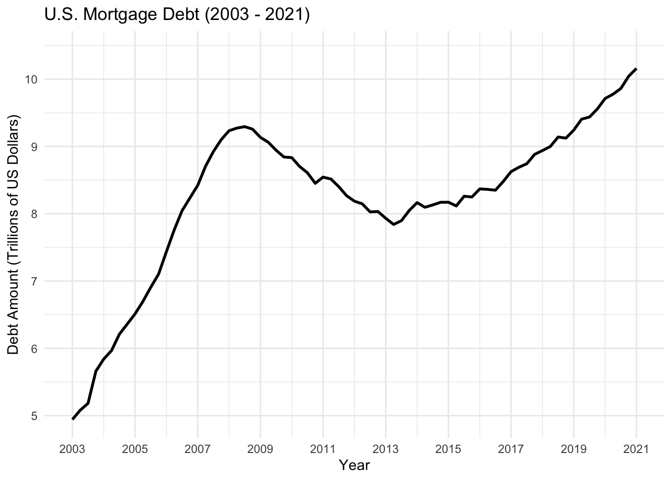
I have created a time-dependent visualization for mortgage debt. I wanted to analyze how has the mortage debt been evolving, as I remeber that the financial crisis of 2008, sent global shockwaves through out the world economy. I first filter the data to include only mortgage debt and select the relevant columns (year, quarter, and amount). Then ggplot2 is usedd to create a line chart that shows the trend of mortgage debt from 2003 to 2021.
The line chart is chosen because it effectively shows the trend of mortgage debt over time, making it easy to identify patterns or changes in the data.
From my analysis we can clearly see that the mortgages reached a peak during 2008 and they started coming down till the first quarter of 2013. The debt surpased the earlier peak of 2008 around the last quarted of 2018 and has kept going up, which shows that the mortages have kept on increasing and is a bad sign for the overall economy.
Visualizing Part-Whole Relationships
debt_tidy %>%
  filter(debt_type != "Total") %>%
  mutate(debt_type = fct_relevel(debt_type, "Mortgage", "Auto Loan", "Credit Card", "HE Revolving", "Other", "Student Loan")) %>%
  ggplot(aes(x = year + (quarter - 1) / 4, y = amount, fill = debt_type)) +
  geom_area(position = "stack", alpha = 0.8) +
  theme_bw() +
  scale_y_continuous(labels = scales::comma) +
  labs(title = "Debt Type Breakdown by Quarter (Stacked Area Chart)",
       x = "Year",
       y = "Debt Amount (Trillions of US Dollars)",
fill = "Debt Type") 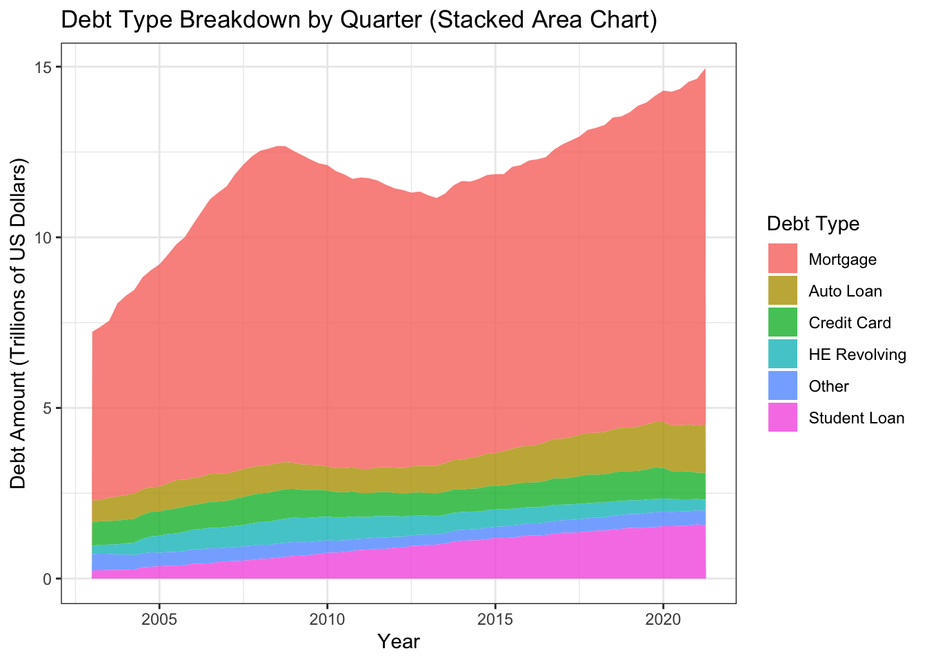
I stacked area chart to visualize the part-whole relationship between different debt types over time.
First,the data is filtered to exclude the “Total” debt type and reorder the debt types according to their contribution to the total debt.
The stacked area chart was chosen because it is an effective approach to display the part-whole relationship between debt categories, allowing us to quickly visualize each debt type’s contribution to the overall debt over time. This graphic also helps in spotting data trends and patterns, such as the growth or reduction of each debt kind over time. We can see that mortage loans are the biggest debt type, which is keeping on increasing.