library(tidyverse)
library(ggplot2)
library(lubridate)


knitr::opts_chunk$set(echo = TRUE, warning=FALSE, message=FALSE)Challenge 7
challenge_7
eggs
Visualizing Multiple Dimensions
Read in data
eggs_data <- read_csv('_data/eggs_tidy.csv')
head(eggs_data)
# A tibble: 6 × 6
month year large_half_dozen large_dozen extra_large_half_dozen extra_lar…¹
<chr> <dbl> <dbl> <dbl> <dbl> <dbl>
1 January 2004 126 230 132 230
2 February 2004 128. 226. 134. 230
3 March 2004 131 225 137 230
4 April 2004 131 225 137 234.
5 May 2004 131 225 137 236
6 June 2004 134. 231. 137 241
# … with abbreviated variable name ¹extra_large_dozenBriefly describe the data
Given the month and year, this dataset describes the average price for a carton of eggs. Carton sizes are as follows: big half dozen, large dozen, extra large half dozen, and extra large dozen.
Tidy Data (as needed)
I’ll rearrange the dataset utilizing pivot functionality to aid in visualization. Following that, divide the egg carton type into two columns: one for the size and one for the number (half or full dozen). This allows us to plot each attribute independently. The “between extra_large and half_dozen will be removed to maintain only one” in the name, separating size and quantity. These will be divided into two columns. Furthermore, lubridate will be used to transform the date into the right format.
eggs <- eggs_data %>%
    pivot_longer(cols = c(`large_half_dozen`, `large_dozen`, `extra_large_half_dozen`, `extra_large_dozen`), values_to = "Price ($)") %>%
    mutate(name = str_replace(name, "extra_large", "Extra Large"), name = str_replace(name, "half_dozen", "Half Dozen"), name = str_replace(name, "dozen", "Dozen"), name = str_replace(name, "large", "Large")) %>%
    separate(name, into = c("Size", "Quantity"), sep = "_") %>%
    mutate(Date = ym(paste(`year`, `month`, sep = "-")))
head(eggs)
# A tibble: 6 × 6
month year Size Quantity `Price ($)` Date
<chr> <dbl> <chr> <chr> <dbl> <date>
1 January 2004 Large Half Dozen 126 2004-01-01
2 January 2004 Large Dozen 230 2004-01-01
3 January 2004 Extra Large Half Dozen 132 2004-01-01
4 January 2004 Extra Large Dozen 230 2004-01-01
5 February 2004 Large Half Dozen 128. 2004-02-01
6 February 2004 Large Dozen 226. 2004-02-01Visualization with Multiple Dimensions
ggplot(eggs, aes(Date, `Price ($)`, col = Size)) +
    ggtitle('Cost Evolution for Different Types of Egg Cartons') +
    geom_line() +
    facet_wrap(~Quantity, scales = 'free_y')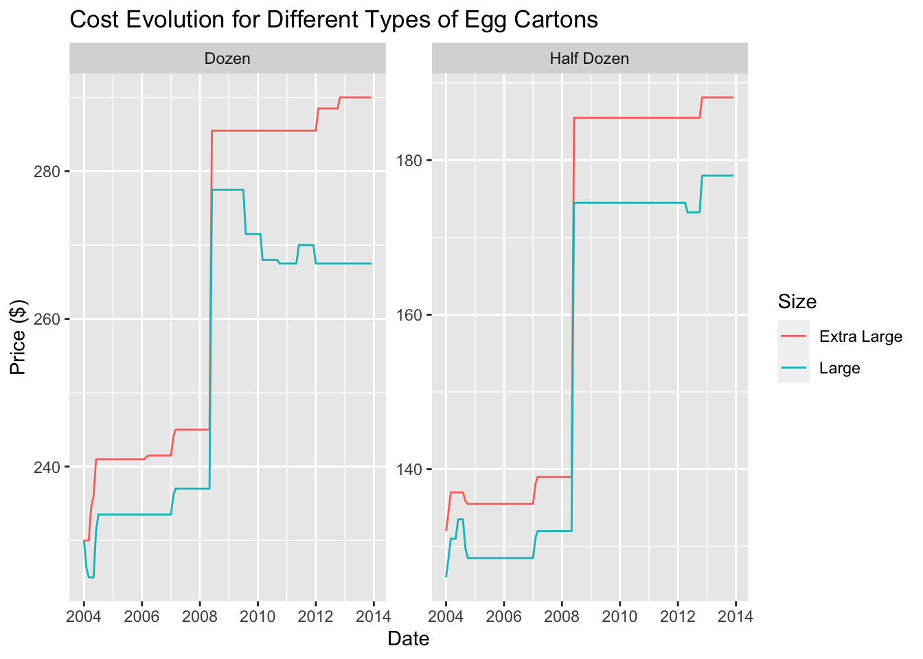
The above graph type was chosen to illustrate the price variation for extra large and large eggs over the course of time. I divided the graph based on the carton size since the prices vary accordingly. The graph reveals a decrease in prices for large eggs sold by the dozen and an increase for those sold by the half dozen.
ggplot(eggs, aes(Date, `Price ($)`, fill = Quantity)) +
    ggtitle('Price Variations Based on Egg Size') +
    geom_bar(position = "stack", stat = "identity") +
    facet_wrap(~Size)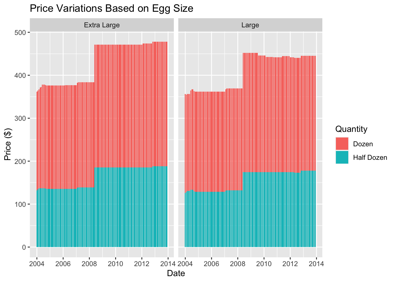
In the second graph, I replaced the grouping variable with the egg size and then stacked the prices of both quantities. This visual representation allows us to observe the cumulative price changes depending on the size of the eggs. It’s evident from this visualization that large eggs are consistently cheaper than extra large ones and that both egg sizes follow a similar trend over time.