library(tidyverse)
library(ggplot2)
library(RColorBrewer)

knitr::opts_chunk$set(echo = TRUE, warning=FALSE, message=FALSE)Challenge 5
challenge_5
Shaunak Padhye
air_bnb
Introduction to Visualization
Read in data
For this challenge, I will be using the following dataset:
- AB_NYC_2019.csv ⭐⭐⭐
airbnb <- read_csv("_data/AB_NYC_2019.csv")

glimpse(airbnb)
Rows: 48,895
Columns: 16
$ id <dbl> 2539, 2595, 3647, 3831, 5022, 5099, 512…
$ name <chr> "Clean & quiet apt home by the park", "…
$ host_id <dbl> 2787, 2845, 4632, 4869, 7192, 7322, 735…
$ host_name <chr> "John", "Jennifer", "Elisabeth", "LisaR…
$ neighbourhood_group <chr> "Brooklyn", "Manhattan", "Manhattan", "…
$ neighbourhood <chr> "Kensington", "Midtown", "Harlem", "Cli…
$ latitude <dbl> 40.64749, 40.75362, 40.80902, 40.68514,…
$ longitude <dbl> -73.97237, -73.98377, -73.94190, -73.95…
$ room_type <chr> "Private room", "Entire home/apt", "Pri…
$ price <dbl> 149, 225, 150, 89, 80, 200, 60, 79, 79,…
$ minimum_nights <dbl> 1, 1, 3, 1, 10, 3, 45, 2, 2, 1, 5, 2, 4…
$ number_of_reviews <dbl> 9, 45, 0, 270, 9, 74, 49, 430, 118, 160…
$ last_review <date> 2018-10-19, 2019-05-21, NA, 2019-07-05…
$ reviews_per_month <dbl> 0.21, 0.38, NA, 4.64, 0.10, 0.59, 0.40,…
$ calculated_host_listings_count <dbl> 6, 2, 1, 1, 1, 1, 1, 1, 1, 4, 1, 1, 3, …
$ availability_365 <dbl> 365, 355, 365, 194, 0, 129, 0, 220, 0, …Briefly describe the data
The dataset contains approximately 49,000 observations representing Airbnb rentals in New York City during 2019. Each observation corresponds to a rental unit and includes 16 variables. These variables provide information about the unit (ID and name), hosts (ID and name), location (neighborhood, city borough, longitude, and latitude), room type, price, minimum nights required for a reservation, review details (number of reviews, date of last review, and average reviews per month), a calculated host listings count (likely indicating the number of listings by the host on Airbnb), and availability (presumably indicating the number of days the unit is available in a year).
The dataset appears to be well-organized, and no changes or additions to the variables are currently required.
Univariate Visualizations
Lets draw a pie chart displaying the distribution of Airbnb units among the five NYC Boroughs.
# Calculate frequencies
freqs <- table(airbnb$neighbourhood_group)
percentages <- freqs / sum(freqs) * 100
percentages[percentages < 5] <- NA

ggplot(data = data.frame(freqs = freqs, labels = names(freqs)),
       aes(x = "", y = freqs, fill = labels)) +
  geom_bar(stat = "identity", width = 1) +
  coord_polar("y", start = 0) +
  theme_void() +
  scale_fill_manual(values = brewer.pal(n = length(freqs), name = "Set2")) +
  geom_text(aes(label = ifelse(!is.na(percentages), paste0(round(percentages), "%"), "")),
            position = position_stack(vjust = 0.5)) +
  ggtitle("Distribution of Airbnb units between NYC Boroughs")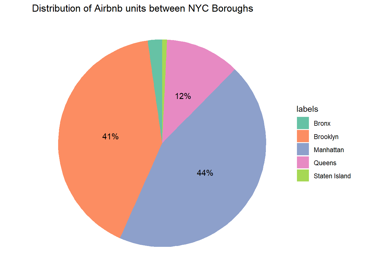
Seems like Manhattan and Brooklyn contain the majority of the Airbnb units. A Pie chart is the right tool for visualization as we can view the distribution as part of a percentage using the Pie chart.
We can check the count of each unit type using a bar chart.
ggplot(airbnb, aes(x = room_type, fill = room_type)) +
  geom_bar() +
  theme_classic() +
  scale_fill_brewer(palette = "Accent") +
  xlab("Room Type") +
  ylab("Number of Units") +
  ggtitle("Number of Units of each Room type")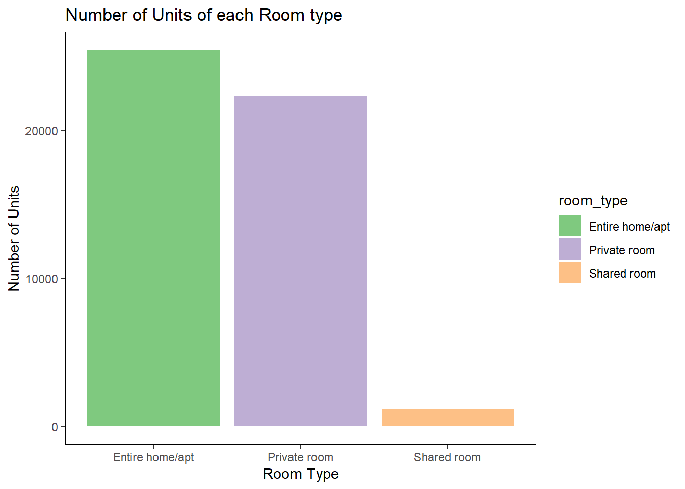
Looks like, most units available are either entire apartments or private rooms.
Bivariate Visualization(s)
Lets plot a bar graph to compare the average price of units for different room types.
airbnb_room_price <- airbnb %>%
  group_by(room_type)%>%
  summarise(Avg_price = mean(price))
airbnb_room_price
# A tibble: 3 × 2
room_type Avg_price
<chr> <dbl>
1 Entire home/apt 212.
2 Private room 89.8
3 Shared room 70.1ggplot(airbnb_room_price, aes(x = room_type,y = Avg_price, fill=room_type)) +
geom_bar(stat = "identity") +
theme_classic() +
scale_fill_brewer(palette = "Paired") +
labs(title = "Average price for Room Types",
x = "Room Type",
y = "Average Price")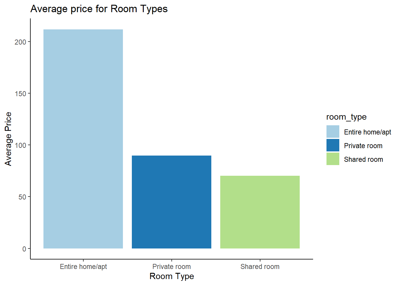
It is interesting to see the difference between the average price of entire apartments and private rooms, considering that the number of units of either types were relatively close.