library(tidyverse)
library(ggplot2)
library(RColorBrewer)

knitr::opts_chunk$set(echo = TRUE, warning=FALSE, message=FALSE)Challenge 7
challenge_7
Shaunak Padhye
air_bnb
Visualizing Multiple Dimensions
Read in data
For this challenge, I will be using the following dataset:
- air_bnb ⭐⭐⭐
airbnb <- read_csv("_data/AB_NYC_2019.csv")

glimpse(airbnb)
Rows: 48,895
Columns: 16
$ id <dbl> 2539, 2595, 3647, 3831, 5022, 5099, 512…
$ name <chr> "Clean & quiet apt home by the park", "…
$ host_id <dbl> 2787, 2845, 4632, 4869, 7192, 7322, 735…
$ host_name <chr> "John", "Jennifer", "Elisabeth", "LisaR…
$ neighbourhood_group <chr> "Brooklyn", "Manhattan", "Manhattan", "…
$ neighbourhood <chr> "Kensington", "Midtown", "Harlem", "Cli…
$ latitude <dbl> 40.64749, 40.75362, 40.80902, 40.68514,…
$ longitude <dbl> -73.97237, -73.98377, -73.94190, -73.95…
$ room_type <chr> "Private room", "Entire home/apt", "Pri…
$ price <dbl> 149, 225, 150, 89, 80, 200, 60, 79, 79,…
$ minimum_nights <dbl> 1, 1, 3, 1, 10, 3, 45, 2, 2, 1, 5, 2, 4…
$ number_of_reviews <dbl> 9, 45, 0, 270, 9, 74, 49, 430, 118, 160…
$ last_review <date> 2018-10-19, 2019-05-21, NA, 2019-07-05…
$ reviews_per_month <dbl> 0.21, 0.38, NA, 4.64, 0.10, 0.59, 0.40,…
$ calculated_host_listings_count <dbl> 6, 2, 1, 1, 1, 1, 1, 1, 1, 4, 1, 1, 3, …
$ availability_365 <dbl> 365, 355, 365, 194, 0, 129, 0, 220, 0, …Briefly describe the data
The dataset contains approximately 49,000 observations representing Airbnb rentals in New York City during 2019. Each observation corresponds to a rental unit and includes 16 variables. These variables provide information about the unit (ID and name), hosts (ID and name), location (neighborhood, city borough, longitude, and latitude), room type, price, minimum nights required for a reservation, review details (number of reviews, date of last review, and average reviews per month), a calculated host listings count (likely indicating the number of listings by the host on Airbnb), and availability (presumably indicating the number of days the unit is available in a year).
The dataset appears to be well-organized, and no changes or additions to the variables are currently required.
Visualization with Multiple Dimensions
We can check the distribution of the various Boroughs for each room type in NYC.
ggplot(airbnb, aes(x = room_type, fill = room_type)) +
  geom_bar() +
  aes(color = neighbourhood_group, fill = neighbourhood_group) +
  theme_minimal() +
  scale_fill_brewer(palette = "Set1") +
  xlab("Room Type") +
  ylab("Number of Units") +
  ggtitle("Number of Units of each Room type") +
  labs(color = "Neighbourhood Group") +
  guides(color = FALSE)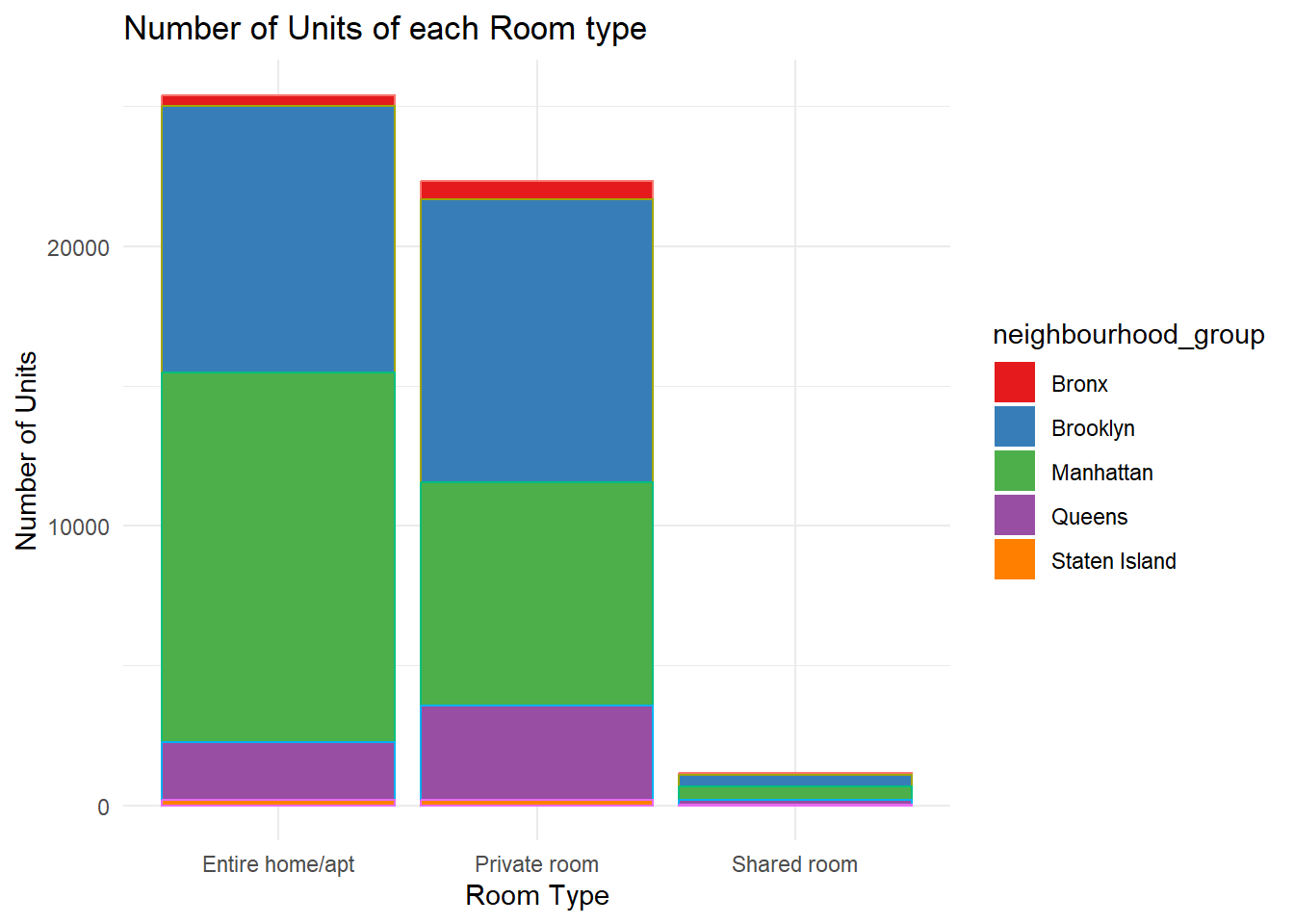
We can check the distribution of the various room types for each neighborhood in a Borough in NYC. Lets take Manhattan as an example. We can visualize which neighborhoods are most popular and the distribution of room types for those neighborhoods.
airbnb %>%
  filter(neighbourhood_group == "Manhattan") %>%
  ggplot(aes(x = neighbourhood, fill = room_type)) +
  geom_bar() +
  labs(x = "Neighbourhood", y = "Number of Units",
       fill = "Room Type", title = "Number of Units of each Room type") +
  scale_fill_brewer(palette = "Set1") +
  theme_minimal() +
  theme(axis.text.x = element_text(angle = 45, vjust = 1, hjust = 1))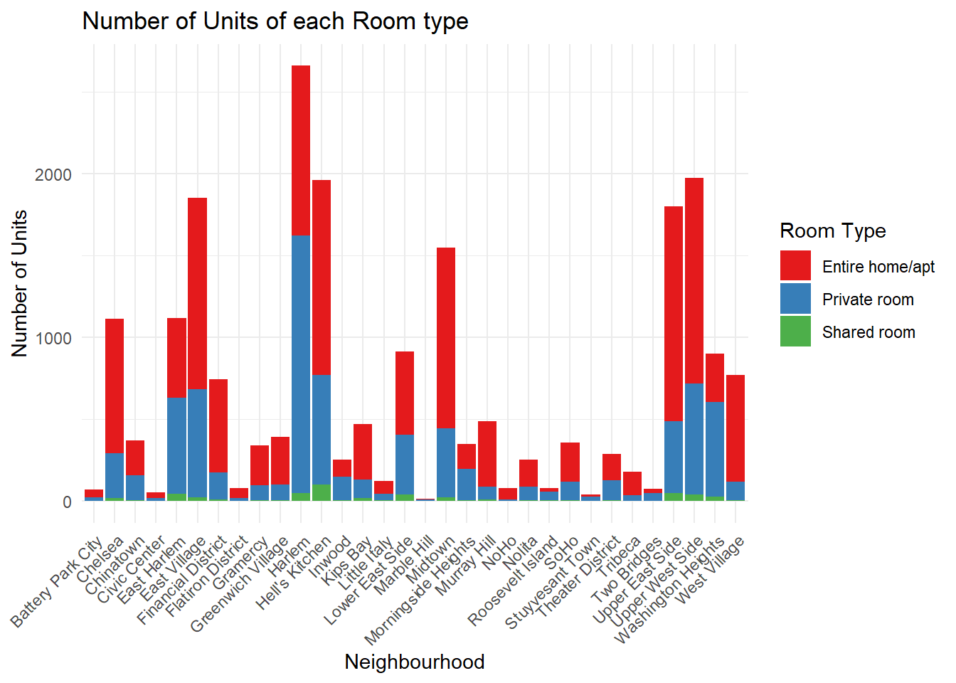
Harlem and Hell’s Kitchen seem to be the most popular neighborhoods in Manhattan.
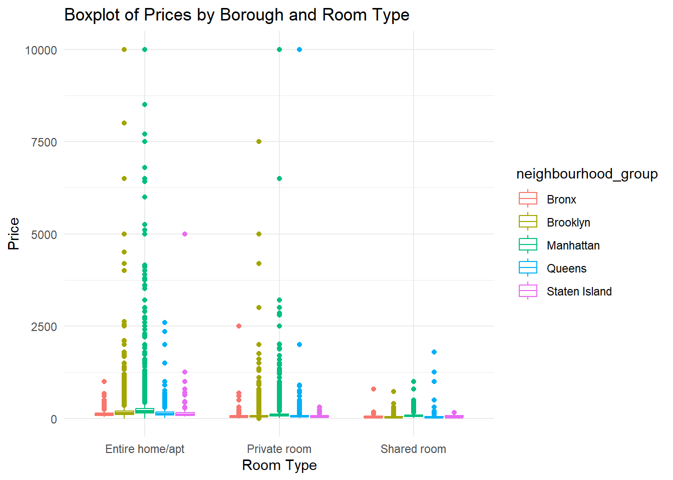
We can create a boxplot of average price and room type and see the variation across the Boroughs for each Room Type.
ggplot(airbnb, aes(x = room_type, y = price, color = neighbourhood_group)) +
  geom_boxplot() +
  scale_fill_brewer(palette = "Dark2") +
  labs(title = "Boxplot of Prices by Borough and Room Type", x = "Room Type", y = "Price") +
  theme_minimal()