library(tidyverse)
library(ggplot2)
library(treemap)
library(treemapify)

knitr::opts_chunk$set(echo = TRUE, warning=FALSE, message=FALSE)Challenge 7 AirBnB Data with Modified Maps
challenge_7
air_bnb
Sue-Ellen Duffy
Visualizing Multiple Dimensions
AirBnB Listing Data in New York City 2019
This dataset shows AirBnB listings in NYC in 2019 with 48,895 rows (listings) and 17 columns (data for each listing). We see different types of observations including NYC neighborhood and neighborhood group, type of rental (entire home, private room, shared room), their prices, the minimum required number of nights, and number of guest reviews. Additionally we can see how many listing each host has on AirBnB, how many days a listing was available throughout 2019, and the date of the last guest review.
Read in the Data
I chose not to pivot this data because each listing was unique, even if a host had different listings, each had different price points, neighborhoods, room types, and names.
mydata <- read.csv("_data/AB_NYC_2019.csv", na.strings=c('','  ','   '))
tibble(mydata, 10)
# A tibble: 48,895 × 17
id name host_id host_…¹ neigh…² neigh…³ latit…⁴ longi…⁵ room_…⁶ price
<int> <chr> <int> <chr> <chr> <chr> <dbl> <dbl> <chr> <int>
1 2539 "Clean &… 2787 John Brookl… Kensin… 40.6 -74.0 Privat… 149
2 2595 "Skylit … 2845 Jennif… Manhat… Midtown 40.8 -74.0 Entire… 225
3 3647 "THE VIL… 4632 Elisab… Manhat… Harlem 40.8 -73.9 Privat… 150
4 3831 "Cozy En… 4869 LisaRo… Brookl… Clinto… 40.7 -74.0 Entire… 89
5 5022 "Entire … 7192 Laura Manhat… East H… 40.8 -73.9 Entire… 80
6 5099 "Large C… 7322 Chris Manhat… Murray… 40.7 -74.0 Entire… 200
7 5121 "BlissAr… 7356 Garon Brookl… Bedfor… 40.7 -74.0 Privat… 60
8 5178 "Large F… 8967 Shunic… Manhat… Hell's… 40.8 -74.0 Privat… 79
9 5203 "Cozy Cl… 7490 MaryEl… Manhat… Upper … 40.8 -74.0 Privat… 79
10 5238 "Cute & … 7549 Ben Manhat… Chinat… 40.7 -74.0 Entire… 150
# … with 48,885 more rows, 7 more variables: minimum_nights <int>,
# number_of_reviews <int>, last_review <chr>, reviews_per_month <dbl>,
# calculated_host_listings_count <int>, availability_365 <int>, `10` <dbl>,
# and abbreviated variable names ¹host_name, ²neighbourhood_group,
# ³neighbourhood, ⁴latitude, ⁵longitude, ⁶room_typeDate Tidying
The date was originally characters, I used transform and as.date to mutate last_review into date format.
mydata <- transform(mydata, last_review=as.Date(last_review))Visualization with Multiple Dimensions
In this series of graphs I was intentional about matching colors in neighborhood groups. I believe this will give the reader an easier time making connections between neighborhood groups.
ggplot(mydata, aes(longitude, latitude, color = neighbourhood_group), group = neighbourhood_group) + geom_point() +
  labs (size = "Price of Property", color = "NYC Neighborhoods", title = "NYC AirBnB by Neighborhood Groups")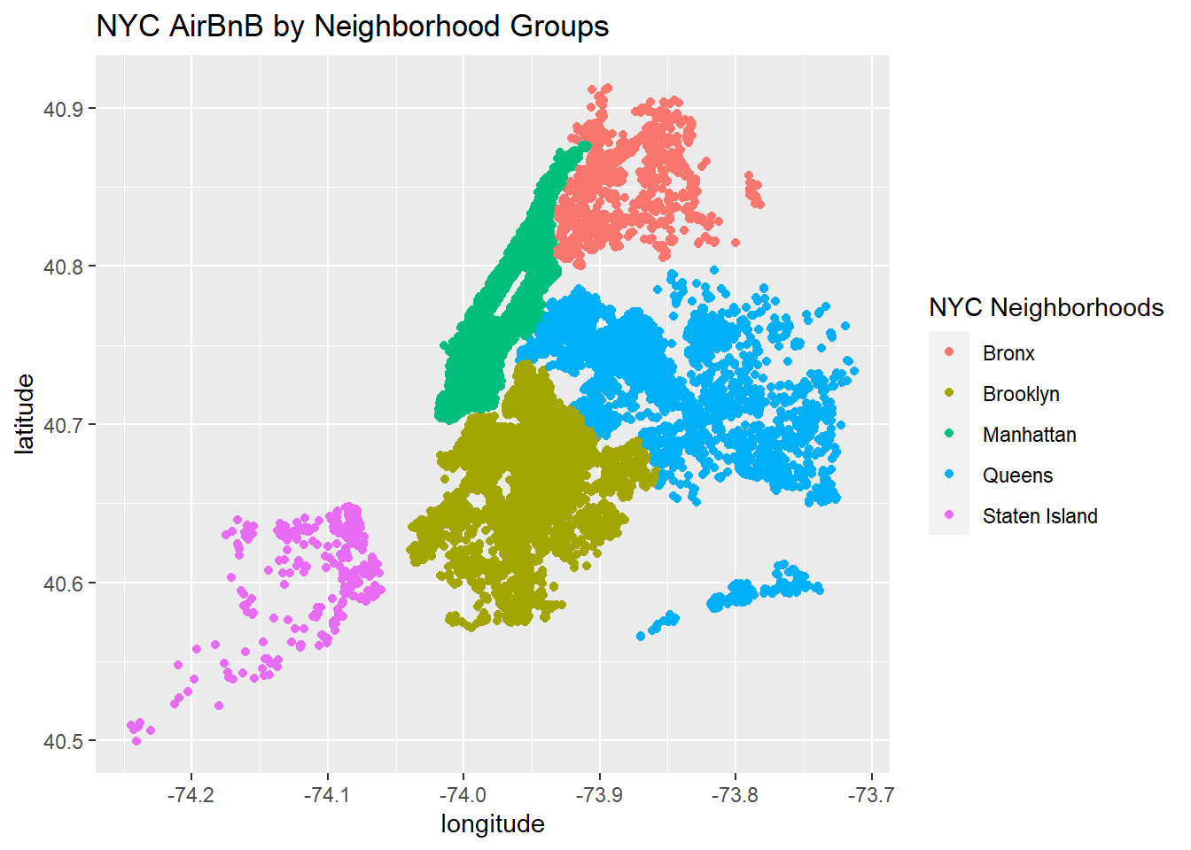
The above map gives us an overview of where the units are mapped, and below we can see that while, Brooklyn and Manhattan have similar amounts of Airbnb units, Staten island and Bronx have very few comparatively.
mydata %>%
  count(neighbourhood_group) %>%
  ggplot(aes(area= n, fill= neighbourhood_group, label = neighbourhood_group)) +
  geom_treemap() +
  labs(title = "Airbnb Units by Neighborhood Group") +
  scale_fill_discrete(name = "Neighborhood Group") +
  geom_treemap_text(colour = "black",
                    place = "centre")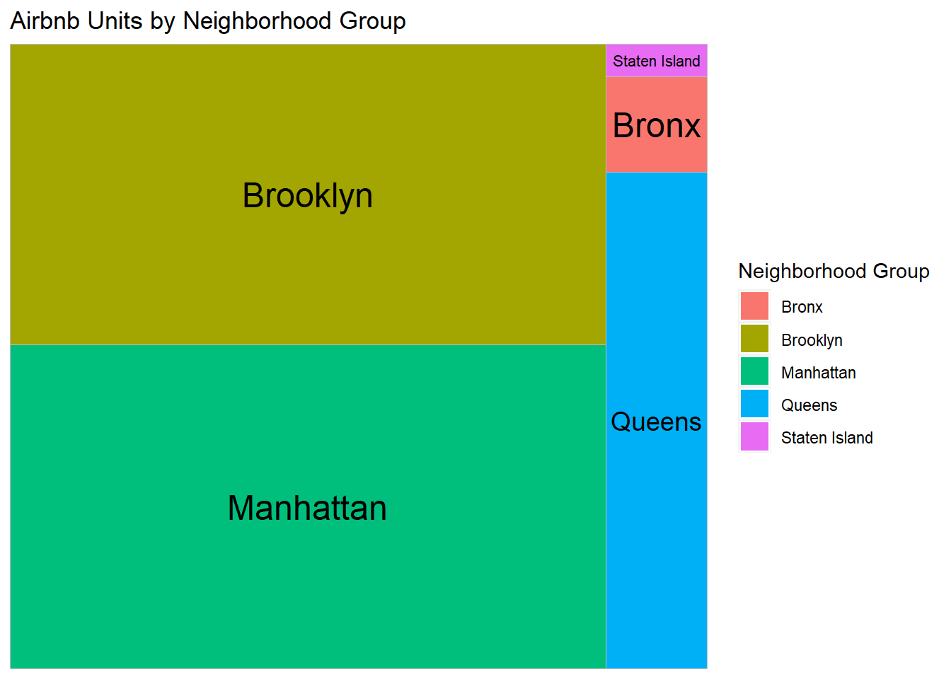
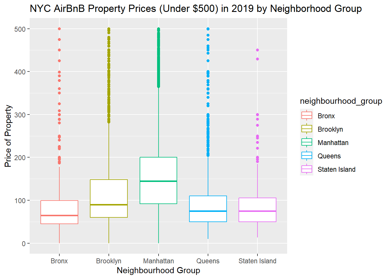
In order to get a better sense of the price, I removed outliers of +$500.
gg<- ggplot(mydata, aes(neighbourhood_group, price, color = neighbourhood_group)) + geom_boxplot() + ylim(0, 500) +
  labs (x = "Neighbourhood Group", y = "Price of Property")
plot(gg) + labs(title = "NYC AirBnB Property Prices (Under $500) in 2019 by Neighborhood Group")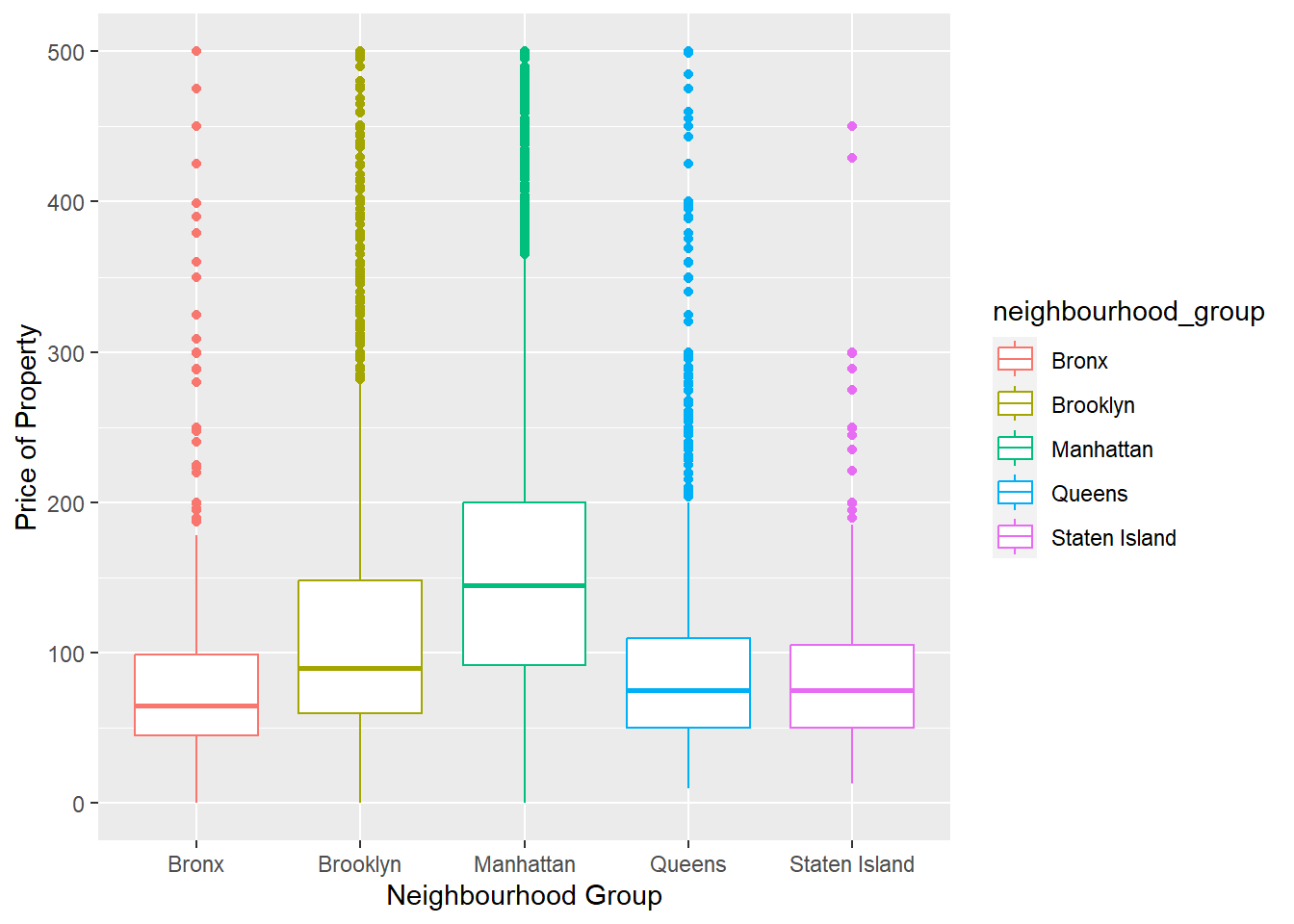
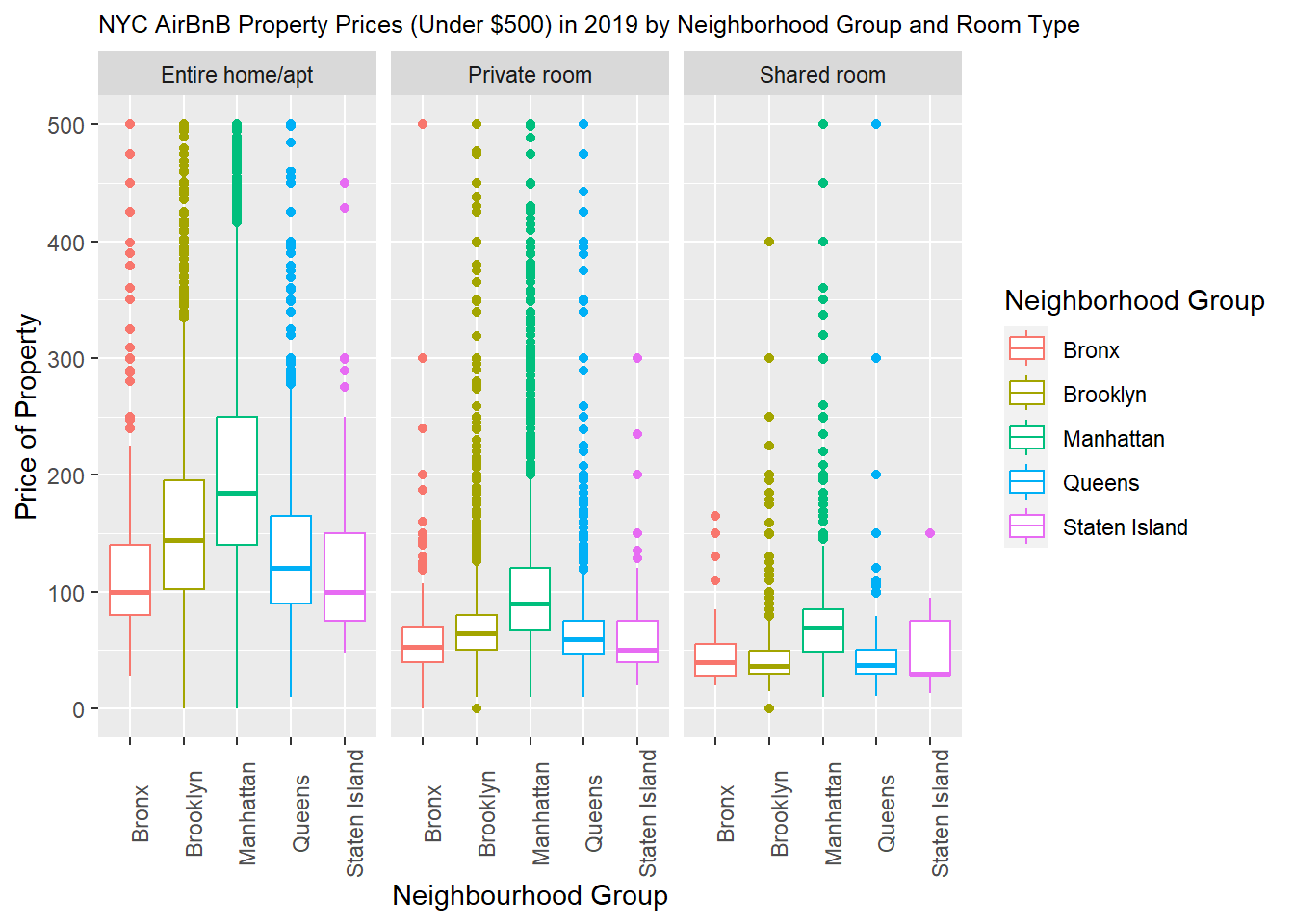
Here we can see the average price per neighborhood group and room type, giving us an understanding of how each neighborhood group prices their units. For example we can see here that a private home in Manhattan is roughly the same price as an entire home/apt in Bronx and Staten Island.
gg + facet_wrap ( ~ room_type) + labs(title = "NYC AirBnB Property Prices (Under $500) in 2019 by Neighborhood Group and Room Type", color = "Neighborhood Group" ) + theme(axis.text.x = element_text(angle = 90), plot.title = element_text(size = 9.5))