library(tidyverse)
library(ggplot2)

knitr::opts_chunk$set(echo = TRUE, warning=FALSE, message=FALSE)Visualizing cereal dataset
challenge_5
cereal
readr
Introduction to Visualization
Challenge Overview
Today’s challenge is to:
- read in a data set, and describe the data set using both words and any supporting information (e.g., tables, etc)
- tidy data (as needed, including sanity checks)
- mutate variables as needed (including sanity checks)
- create at least two univariate visualizations
- try to make them “publication” ready
- Explain why you choose the specific graph type
- Create at least one bivariate visualization
- try to make them “publication” ready
- Explain why you choose the specific graph type
R Graph Gallery is a good starting point for thinking about what information is conveyed in standard graph types, and includes example R code.
(be sure to only include the category tags for the data you use!)
Read in data
Read in one (or more) of the following datasets, using the correct R package and command.
- cereal.csv ⭐
library(readr)
cereal_data <- read_csv("_data/cereal.csv")
View(cereal_data)
# Preview the first few rows of the dataset
head(cereal_data)# A tibble: 6 × 4
Cereal Sodium Sugar Type
<chr> <dbl> <dbl> <chr>
1 Frosted Mini Wheats 0 11 A
2 Raisin Bran 340 18 A
3 All Bran 70 5 A
4 Apple Jacks 140 14 C
5 Captain Crunch 200 12 C
6 Cheerios 180 1 C # Understanding the dimensions of the dataset
dim(cereal_data)[1] 20 4# Identifying the column names of the dataset
colnames(cereal_data)[1] "Cereal" "Sodium" "Sugar" "Type" # Identifying the data types of the columns
sapply(cereal_data, class) Cereal Sodium Sugar Type
"character" "numeric" "numeric" "character" table(sapply(cereal_data, function(x) typeof(x)))
character    double
2 2 sapply(cereal_data, function(x) n_distinct(x))Cereal Sodium Sugar Type
20 15 15 2 Briefly describe the data
Based on the above, we can say that the cereal dataset has 20 different cereals describing the amount of sodium, sugar present in it and a type(category) assigned to each cereal. There are total 20 rows and 4 columns, out of which two columns(cereal, type) are of class character and two coulmns(sodium, sugar) are of class numeric. We can also observe that each cereal is categorized into two types(A, C). ## Tidy Data (as needed)
Is your data already tidy, or is there work to be done? Be sure to anticipate your end result to provide a sanity check, and document your work here.
The data looks tidy enough to use for various analyses and data visualizations. We can convert the sodium into grams and compare it with the sugar, we can pivot longer the dataset to use it for visualizations.
cereal_data <- cereal_data %>%
  arrange(Cereal) %>%
  mutate(Sodium = Sodium/1000)
View(cereal_data)
cereal_pivot_data <- pivot_longer(cereal_data, cols = contains("S"),
names_to= c("additive"),
values_to = "quantity")
View(cereal_pivot_data)The two columns- additive and quantity have been added at the end. Additive column has two values- Sodium, Sugar and the respective value of these two additives are present in quantity column.
Univariate Visualizations
Based on the above cereal data, we can analyze how much sodium is present in a particular type of cereal.
# Visualization showing sodium levels in type C cereal
cereal_data %>%
  filter(Type == 'C') %>%
  arrange(Sodium) %>%
  ggplot(aes(x=Cereal, y=Sodium)) + geom_segment(aes(xend=Cereal, yend=0)) + geom_point(color='blue', fill='black',shape=20, size = 3) + theme_minimal() + coord_flip(expand = TRUE) + labs(title = "Sodium levels in Type C cereals", y = "Sodium in mgs", x = "Cereal Name")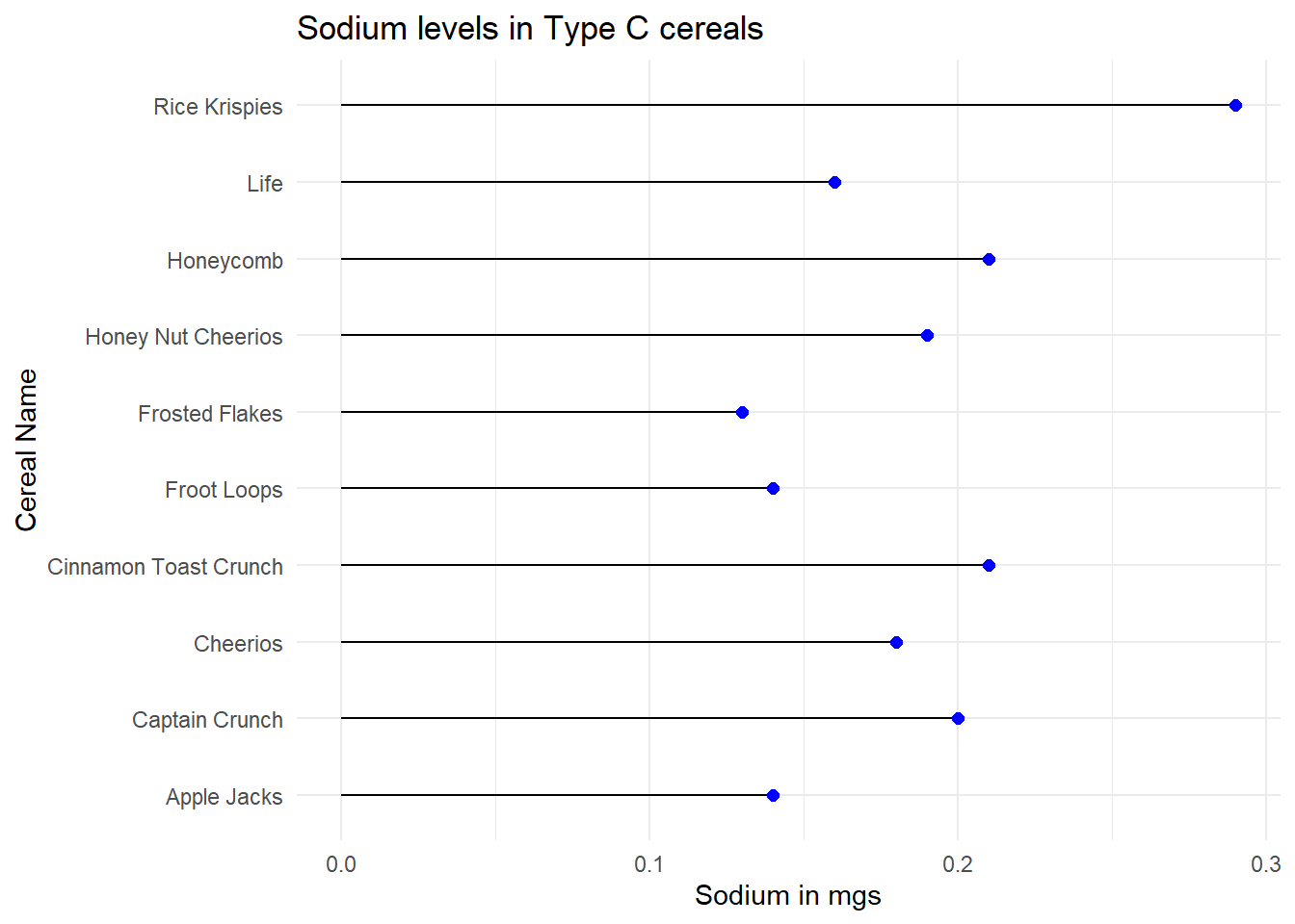
# Visualization showing sodium levels in type A cereal
cereal_data %>%
  filter(Type == 'A') %>%
  arrange(Sodium) %>%
  ggplot(aes(x=Cereal, y=Sodium)) + geom_segment(aes(xend=Cereal, yend=0)) + geom_point(color='blue', fill='black',shape=20, size = 3) + theme_minimal() + coord_flip(expand = TRUE) + labs(title = "Sodium levels in Type A cereals", y = "Sodium in mgs", x = "Cereal Name")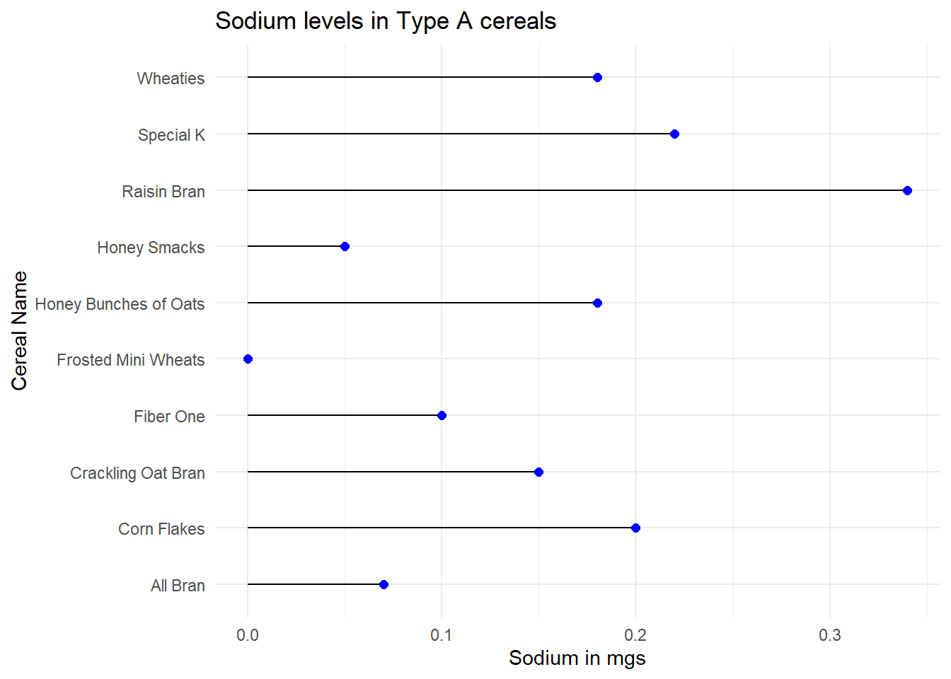
Bivariate Visualization(s)
Now I want to construct a stacked bar chart to compare the sodium and sugar levels in a particular type of cereal.
cereal_pivot_data %>%
  filter(Type == 'A') %>%
  mutate(Cereal = fct_reorder(Cereal, desc(quantity))) %>%
  ggplot(aes(x=Cereal, y=quantity, fill=additive)) + geom_bar(stat = "identity", position="stack", width = 0.75, color = "red") + theme_minimal() + coord_flip(expand = FALSE) + labs(title = "Additive levels in Type A cereals", y = "Additives", x = "Cereal Name")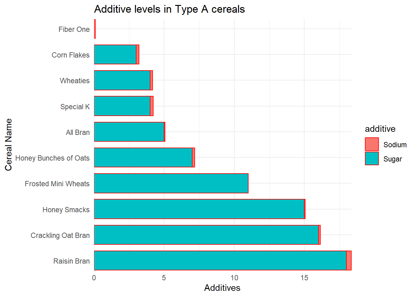
Based on the above visualizations, the users can understand which cereals are better to consume for a healthier lifestyle and can also use this as a reference for various other analyses.