Code
library(tidyverse)

knitr::opts_chunk$set(echo = TRUE)
library(readr)
library(dplyr)
railroad <- read_csv("_data/railroad_2012_clean_county.csv", show_col_types = FALSE)library(tidyverse)
knitr::opts_chunk$set(echo = TRUE)
library(readr)
library(dplyr)
railroad <- read_csv("_data/railroad_2012_clean_county.csv", show_col_types = FALSE)This data set shows the total number of railroad employees per county in the United States in the year 2012. Running the head() function displays the first 6 rows of the data set.
head(railroad)# A tibble: 6 × 3
state county total_employees
<chr> <chr> <dbl>
1 AE APO 2
2 AK ANCHORAGE 7
3 AK FAIRBANKS NORTH STAR 2
4 AK JUNEAU 3
5 AK MATANUSKA-SUSITNA 2
6 AK SITKA 1dim(railroad)[1] 2930 3The dim() functions shows us that the data set contains 2930 rows (2930 counties) and 3 columns (state, county, and total_employees).
The very first item lists a state code of “AE” and a county of “APO” with 2 employees for the year 2012. Since this is different from the state codes and county names that follow, I want to clarify that this is for overseas military. Besides “AE,” the other overseas military “state” abbreviations are AP and AA. Let’s check for all of these state codes in the data set.
# Filter the state column through a vector of overseas military state codes
overseas <- railroad %>%
  filter(
    state %in% c("AA", "AE", "AP")
  )
overseas
# A tibble: 2 × 3
state county total_employees
<chr> <chr> <dbl>
1 AE APO 2
2 AP APO 1Filtering the original data set by states in a vector of military overseas abbreviations shows that only Armed Forces Europe (AE) and Armed Forces Pacific (AP) appear in this data set; Armed Forces the Americas (AA) does not.
# How many unique values are in the state column?
railroad %>%
  select(state) %>%
  n_distinct(.)
[1] 53So apparently there are 53 unique values under the ‘state’ column. There’s 50 states, and the two overseas military codes we found before make 52. What’s the other one?
unique(railroad$state) [1] "AE" "AK" "AL" "AP" "AR" "AZ" "CA" "CO" "CT" "DC" "DE" "FL" "GA" "HI" "IA"
[16] "ID" "IL" "IN" "KS" "KY" "LA" "MA" "MD" "ME" "MI" "MN" "MO" "MS" "MT" "NC"
[31] "ND" "NE" "NH" "NJ" "NM" "NV" "NY" "OH" "OK" "OR" "PA" "RI" "SC" "SD" "TN"
[46] "TX" "UT" "VA" "VT" "WA" "WI" "WV" "WY"Looking through the unique listings of the ‘state’ column, we find ‘DC’ hiding in there, being sneaky and upping our “state” count to 53.
We can use a horizontal bar graph to show which areas had the most railroad employees in 2012. Because we know from the dim() function that this data set includes 2930 different counties, a bar graph of the number of state employees by county would be super long and overwhelming. So let’s instead opt to use employee counts by state instead of county. Using states will still give us a graph with 53 bars, so let’s add some color to distinguish consecutive bars from each other.
# Access ggplot2 and set up a horizontal bar graph to display employees by state
library(ggplot2)

st_emp_viz <- ggplot(railroad, aes(x=state, y=total_employees, fill=state)) +
  geom_bar(stat = "identity") +
  coord_flip() +
  theme(legend.position = "none")

# Add a title as well as labels for the x- and y-axes
st_emp_viz <- st_emp_viz + ggtitle("Railroad Employees by State (2012)") + xlab("State") + ylab("Total Employees")
st_emp_viz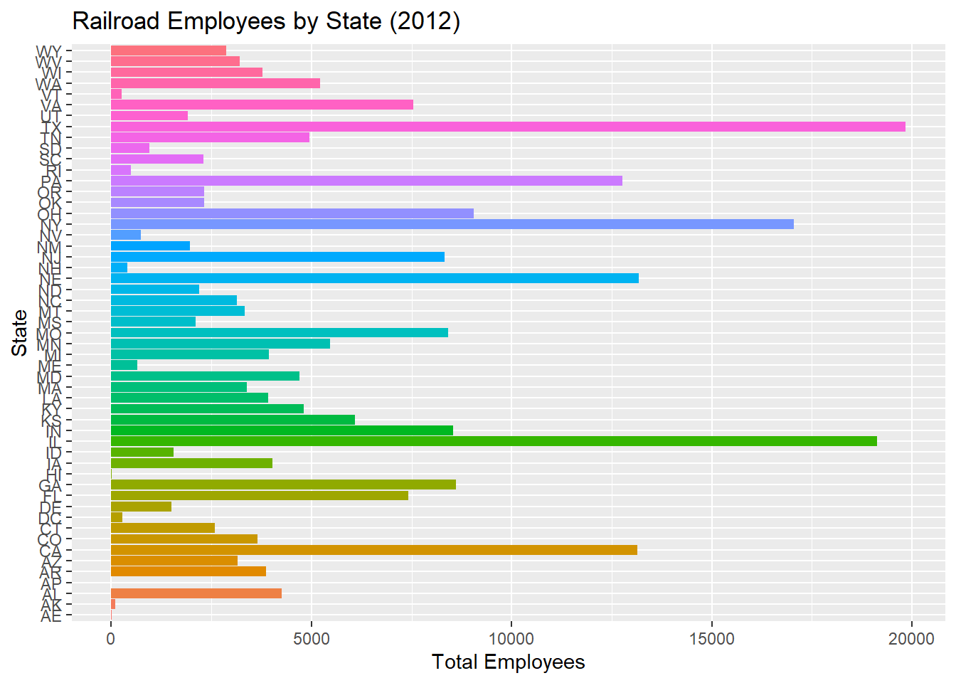
The horizontal bar graph shows that the 3 states with the highest number of railroad employees in 2012 were Texas, Illinois, and New York, which all surpassed 15000 employees. Nebraska, California, and Pennsylvania have the next highest values, with all 3 states surpassing 12500.
Let’s do a little bit of sorting to see how the data set reflects or differs from our bar graph.
# Arrange the data set in descending order so the counties with the most employees appear at the top
sorted_by_county <- railroad %>%
  arrange(-total_employees)

head(sorted_by_county, 15)
# A tibble: 15 × 3
state county total_employees
<chr> <chr> <dbl>
1 IL COOK 8207
2 TX TARRANT 4235
3 NE DOUGLAS 3797
4 NY SUFFOLK 3685
5 VA INDEPENDENT CITY 3249
6 FL DUVAL 3073
7 CA SAN BERNARDINO 2888
8 CA LOS ANGELES 2545
9 TX HARRIS 2535
10 NE LINCOLN 2289
11 NY NASSAU 2076
12 MO JACKSON 2055
13 IN LAKE 1999
14 IL WILL 1784
15 PA PHILADELPHIA 1649Since there are so many counties in this data set, I’ve expanded the head() view to the top 15 values. We can see that each of the top 6 states from our bar graph is represented in the top 15 counties. Several counties in other states also had particularly high numbers of railroad employees in 2012.
This data set shows that at the state level, the states of Texas, Illinois, and New York had the highest total number of railroad employees in the year 2012. At the county level, the highest number of railroad employees were based in Cook County, Illinois (8207); Tarrant County, Texas (4235); and Douglas County, Nebraska (3797). Considering the data set describes data from the year 2012 specifically, the data was likely gathered via local census.