library(tidyverse)
library(ggplot2)
library(readr)
library(dplyr)

knitr::opts_chunk$set(echo = TRUE, warning=FALSE, message=FALSE)Challenge 6: ADR Visualizations for Hotels
challenge_6
Teresa Lardo
hotel_bookings
Visualizing Time and Relationships
Read in data
I’ll read in the CSV for hotel bookings.
hotel_bookings <- read_csv("_data/hotel_bookings.csv", show_col_types = FALSE)Briefly describe the data
This data set describes nearly 120,000 bookings (both canceled and fulfilled) at two hotels over the course of July 2015 to August 2017.
dim(hotel_bookings)[1] 119390 32Tidy Data (as needed)
I want to work with the Average Daily Rate (adr) variable, and there are some observations with values of 0 or less. In order to avoid these freebies skewing calculations, I want filter() out these rows. I also want to focus on cases where the bookings were fulfilled (i.e., not canceled), so I will also filter to control for these.
hotel_bookings <- hotel_bookings %>%
  filter(adr > 0) %>%
  filter(is_canceled == 0)
Mutations
In order to create a time dependent visualization, I want to mutate() the columns describing the arrival date into a single, cohesive date column.
library(lubridate)
hotel_bookings <- hotel_bookings %>%
# Use mutate and case_when to change the month values from names to numbers
    mutate(month = case_when(
       arrival_date_month == "January" ~ 1,
       arrival_date_month == "February" ~ 2,
       arrival_date_month == "March" ~ 3,
       arrival_date_month == "April" ~ 4,
       arrival_date_month == "May" ~ 5,
       arrival_date_month == "June" ~ 6,
       arrival_date_month == "July" ~ 7,
       arrival_date_month == "August" ~ 8,
       arrival_date_month == "September" ~ 9,
       arrival_date_month == "October" ~ 10,
       arrival_date_month == "November" ~ 11,
       arrival_date_month == "December" ~ 12,
     )) %>%
# Use the year, day, and new month columns to create a new column showing the entire arrival date
    mutate(arrival_date = make_date(arrival_date_year, month, arrival_date_day_of_month)) %>%
# Use select to remove the extraneous date columns
    select(-c(arrival_date_year, arrival_date_month, arrival_date_day_of_month, month, arrival_date_week_number)) %>%
# Use select to move the new arrival_date column closer to the left side of the data set
    select(hotel, is_canceled, lead_time, arrival_date, everything())
Time Dependent Visualization
I want to see how the average daily rate (ADR) shifts over time at each hotel. I will create 2 different visualizations - one for each hotel - so that we can get a quick visual representation of when each hotel was more or less expensive over the course of the 2 years of data that we have.
city_bookings <- hotel_bookings %>%
  filter(hotel == "City Hotel")

p <- ggplot(city_bookings, aes(x=arrival_date, y=adr)) +
  geom_line(color="navy") +
  scale_x_date(date_labels = "%b %Y") +
  ylab("Average Daily Rate ($)") +
  xlab("Arrival Date") +
  ggtitle("ADR at City Hotel")

p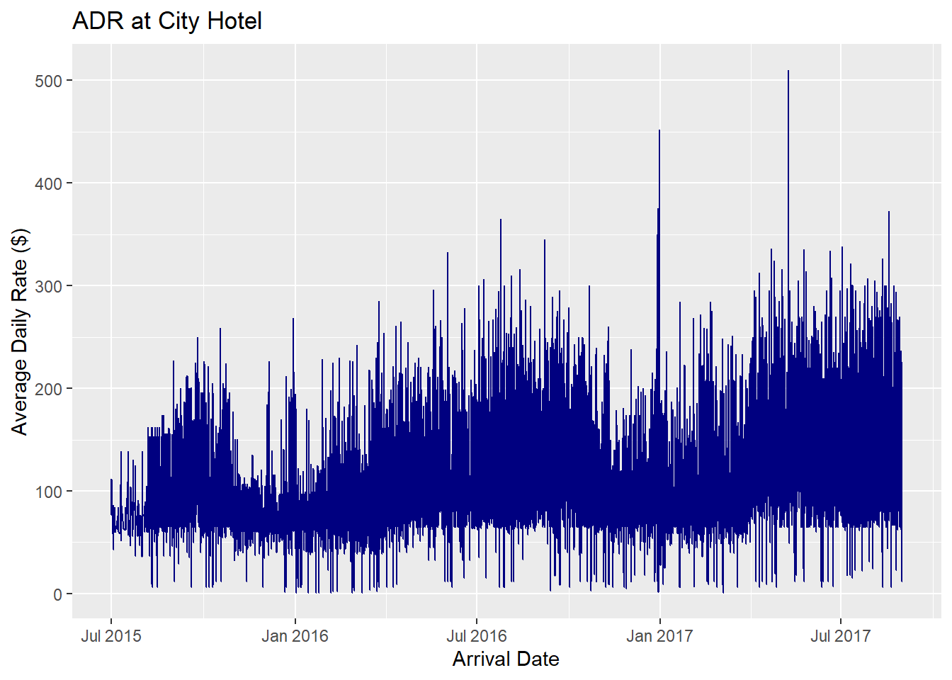
This graph shows the ADR at City Hotel from July 2015 to August 2017. From looking at this graph, we can see that the average daily rate for rooms at City Hotel increased over the course of two years, but the ADR is relatively low during late autumn. January 2017 shows a spike in the average daily rate, so there may have been some in-demand event happening during that time.
Next, I’ll generate the ADR graph for the Resort Hotel to compare.
resort_bookings <- hotel_bookings %>%
  filter(hotel == "Resort Hotel")

h <- ggplot(resort_bookings, aes(x=arrival_date, y=adr)) +
  geom_line(color="darkgreen") +
  scale_x_date(date_labels = "%b %Y") +
  ylab("Average Daily Rate ($)") +
  xlab("Arrival Date") +
  ggtitle("ADR at Resort Hotel")
h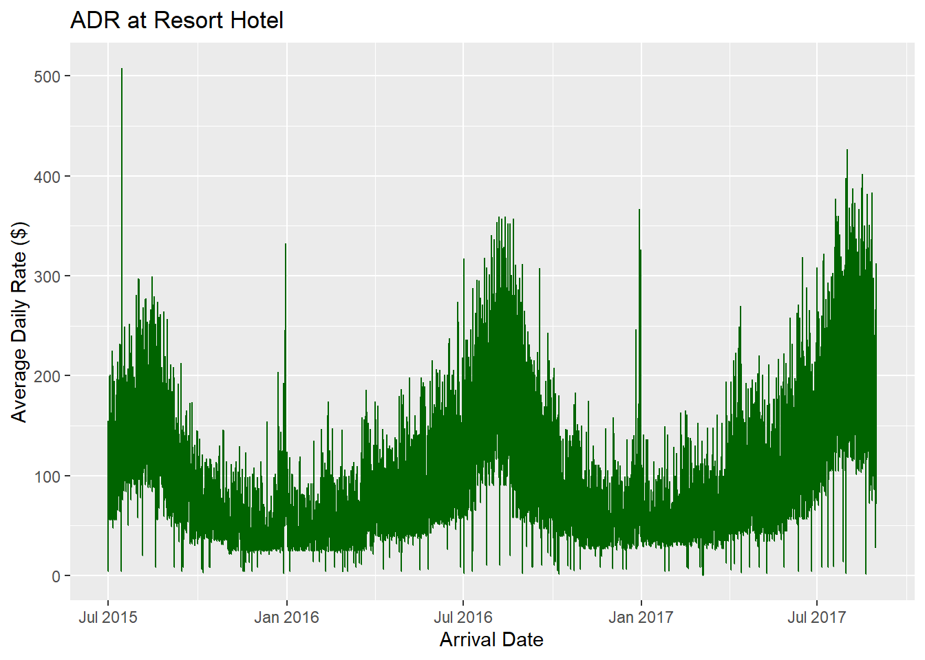
This graph for the ADR at Resort Hotel shows that the ADR for this hotel changes more reliably on a seasonal basis. The ADR is reliably the highest of the year around August, and then decreases until January, when it gradually rises again until it hits the ADR high in August again.
Visualizing Part-Whole Relationships
I want to see how the average daily rate (ADR) compares between different room types at the two hotels. For this, I’ll use a bar chart where the two hotels are represented by different colors.
room_bookings <- hotel_bookings %>%
  select(hotel, assigned_room_type, adr) %>%
  group_by(assigned_room_type) %>%
  mutate(mean_adr = mean(adr)) %>%
  ungroup()


room_adr_viz <- ggplot(room_bookings, aes(fill=hotel, y=mean_adr, x=assigned_room_type)) +
  geom_bar(position = "dodge", stat="identity") +
  labs(x = "Assigned Room Types", y = "Average Daily Rate ($)", title = "Ave Daily Rates by Room Type")
room_adr_viz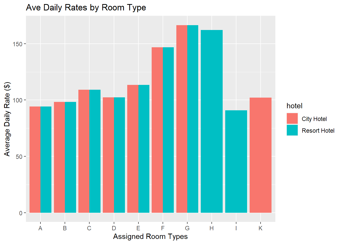
This graph shows that the most expensive room types are types G, H (only available at Resort Hotel), and F. City Hotel does not offer room types H or I, and Resort Hotel does not offer room type K. The cheapest room types offered by both hotels are types A, B, and D.
While I could not find what each room type specifically means, the similarity of the costs for room types A, B, and D suggests to me that those room types are similar - perhaps these rooms are the most pared-down or basic with smaller capacity (i.e., 1-2 guests per room).
The most expensive room type - G - may be suite-style with multiple rooms, perhaps a kitchenette, with unique amenities and/or a greater capacity for guests (i.e., more suitable for larger families or groups).
The room types that are unique to only one of the two hotels may reflect amenities that only exist at one hotel. For example, the visualization shows that Room Type H only exists at Resort Hotel and it’s very close to the level of expense for Room Type G. Room Type H might be a large-capacity room or suite with a water view, or a detached guesthouse near a pool.