Attaching package: 'lubridate'

The following objects are masked from 'package:base':

    date, intersect, setdiff, union
Code
library(here)
Warning: package 'here' was built under R version 4.2.3
here() starts at C:/Users/polat/OneDrive/Documents/GitHub/dacssqa/601_Spring_2023
Code
source(here("posts","umass_colors.R"))
Warning in file(filename, "r", encoding = encoding): cannot open file
'C:/Users/polat/OneDrive/Documents/GitHub/dacssqa/601_Spring_2023/posts/umass_colors.R':
No such file or directory
Error in file(filename, "r", encoding = encoding): cannot open the connection
create at least one graph including time (evolution) try to make them “publication” ready (optional) Explain why you choose the specific graph type Create at least one graph depicting part-whole or flow relationships try to make them “publication” ready (optional) Explain why you choose the specific graph type
Dataset Description
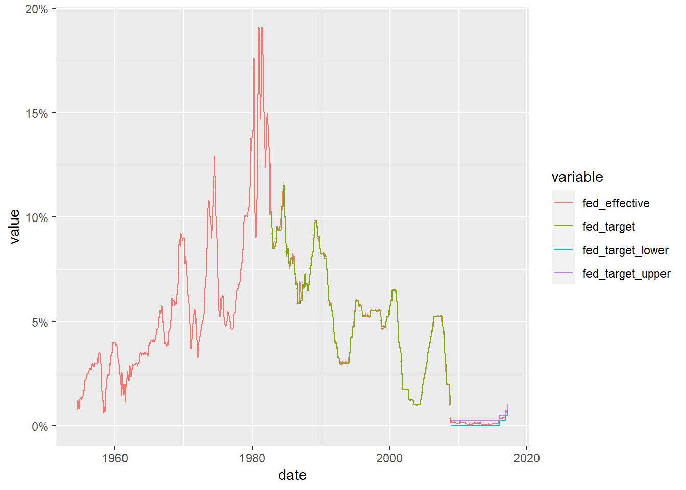
The dataset spans from July 1954 to March 2017 and comprises daily macroeconomic indicators associated with the effective federal funds rate. This rate refers to the interest rate at which banks lend money to each other to fulfill mandated reserve requirements. In addition to the date column, the dataset contains seven variables, four of which pertain to the federal funds rate (target, upper target, lower target, and effective). The remaining three variables represent macroeconomic indicators such as inflation, GDP change, and unemployment rate.
Next, we aimed to visualize the evolution of the macroeconomic indicators and federal funds rate over time, while carefully handling the issue of missing data.
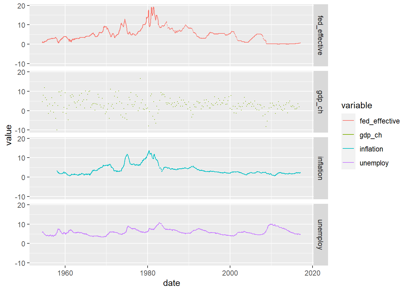
By analyzing the plotted data, it becomes apparent how closely the effective rate follows the target rate, and how the Federal Reserve adjusted its approach to target rate setting in response to the 2009 financial crisis. To gain additional insights, we explored the relationship between the effective rate and one of the other macroeconomic indicators.
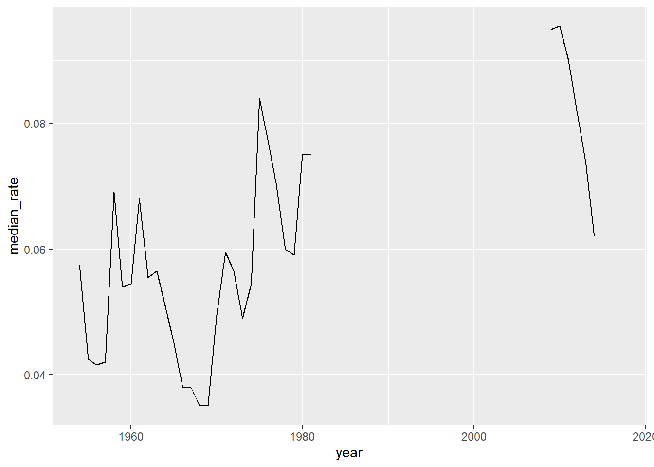
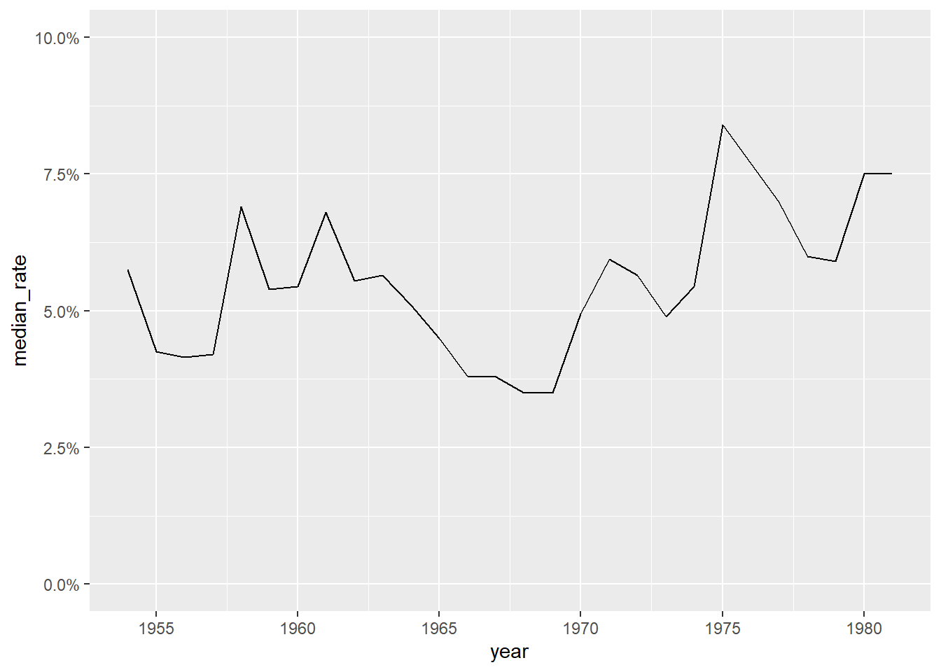
---title: "Challenge 6"author: "Thrishul"desription: "Visualizing Time and Relationships"date: "04/05/2023"format: html: toc: true code-fold: true code-copy: true code-tools: truecategories: - challenge_6 - fed rates - debt---```{r}library(tidyverse)library(ggplot2)library(readxl)library(lubridate)library(here)source(here("posts","umass_colors.R"))knitr::opts_chunk$set(echo =TRUE, warning=FALSE, message=FALSE)```# Challenge OverviewToday’s challenge is to:create at least one graph including time (evolution)try to make them “publication” ready (optional)Explain why you choose the specific graph typeCreate at least one graph depicting part-whole or flow relationshipstry to make them “publication” ready (optional)Explain why you choose the specific graph type## Dataset DescriptionThe dataset spans from July 1954 to March 2017 and comprises daily macroeconomic indicators associated with the effective federal funds rate. This rate refers to the interest rate at which banks lend money to each other to fulfill mandated reserve requirements. In addition to the date column, the dataset contains seven variables, four of which pertain to the federal funds rate (target, upper target, lower target, and effective). The remaining three variables represent macroeconomic indicators such as inflation, GDP change, and unemployment rate.```{r}fed_rates_vars<-here("posts","_data","FedFundsRate.csv") %>%read_csv(n_max =1,col_names =NULL)%>%select(-c(X1:X3))%>%unlist(.)names(fed_rates_vars) <-c("fed_target", "fed_target_upper","fed_target_lower", "fed_effective","gdp_ch", "unemploy", "inflation")fed_rates_orig<-here("posts","_data","FedFundsRate.csv") %>%read_csv(skip=1,col_names =c("Year", "Month", "Day", names(fed_rates_vars)))fed_rates<-fed_rates_orig%>%mutate(date =make_date(Year, Month, Day))%>%select(-c(Year, Month, Day))fed_rates <- fed_rates%>%pivot_longer(cols=-date, names_to ="variable",values_to ="value")```Next, we aimed to visualize the evolution of the macroeconomic indicators and federal funds rate over time, while carefully handling the issue of missing data.```{r}fed_rates%>%filter(str_starts(variable, "fed"))%>%ggplot(., aes(x=date, y=value, color=variable))+geom_point(size=0)+geom_line()+scale_y_continuous(labels = scales::label_percent(scale =1))```By analyzing the plotted data, it becomes apparent how closely the effective rate follows the target rate, and how the Federal Reserve adjusted its approach to target rate setting in response to the 2009 financial crisis. To gain additional insights, we explored the relationship between the effective rate and one of the other macroeconomic indicators.```{r}fed_rates%>%filter(variable%in%c("fed_effective", "gdp_ch", "unemploy", "inflation"))%>%ggplot(., aes(x=date, y=value, color=variable))+geom_point(size=0)+geom_line()+facet_grid(rows =vars(variable))``````{r}year_unemploy <- fed_rates %>%pivot_wider(names_from = variable, values_from = value) %>%mutate(year=year(date)) %>%group_by(year) %>%summarise(median_rate=median(unemploy)/100) %>%ungroup()year_unemploy``````{r}year_unemploy %>%ggplot(aes(year,median_rate))+geom_line()``````{r}year_unemploy %>%filter(year<=1981) %>%ggplot(aes(year,median_rate))+geom_line()+scale_y_continuous(labels=scales::percent_format(),limits=c(0,.1))+scale_x_continuous(breaks=seq(1955,1980,5))``````{r}labs(x="year",y="median unemployment rate")```