my_packages <- c("tidyverse", "ggplot2", "treemapify", "scales", "knitr") # create vector of packages
invisible(lapply(my_packages, require, character.only = TRUE)) # load multiple packages
knitr::opts_chunk$set(echo = TRUE, warning=FALSE, message=FALSE)Challenge 6
challenge_6
hotel_bookings
Visualizing Time and Relationships
Read in data
I chose to read in hotel_bookings.csv. My high school computer science teacher taught us that laziness is the key to quality computer science. I read in the hotel bookings data in Challenge 2. Therefore, I get to reuse my code from that earlier lesson. Quality computing!
#| echo: true
hotelbks <- read.csv(file = "../posts/_data/hotel_bookings.csv") # read in data
hbrows <- prettyNum(nrow(hotelbks), big.mark = ",", scientific = FALSE) # Apply comma-separated format
hbcols <- prettyNum(ncol(hotelbks), big.mark = ",", scientific = FALSE)Plus, I learned about the quarto format option df-print: paged. Much nicer!
hotelbksBriefly describe the data
The hotel bookings set includes 119,390 observations under 32 variables. It shows operational business data from multiple hotels in multiple markets and countries, managed by multiple companies. The data is likely the product of market research produced by a third-party analyst or management consultant.
I’m going to use plots to see how ADR changes over time, and to see how countries and market segments rank in terms of ADR.
Tidy Data (as needed)
I need to mutate the three date variables into a single Arrival Date variable. The original month variable uses full month names. By displaying the distinct values in that column, I confirm all rows are spelled correctly, and there are 12 distinct values.
hotelbks %>%
distinct(arrival_date_month)Without additional tidying needed, I can mutate to convert month names into an integer before piping to the lubridate make_date function.
I also convert Market Segment variable to a factor, filter out canceled reservations from the resulting subset, filter out observations with 0 ADR (average daily rate), and filter out any reservations where both the Stay in Weekday Nights and the Stay in Weekend Nights are 0.
hotelsub <- hotelbks %>%
mutate(
arrival_date_month = as.integer(factor(arrival_date_month, levels = month.name)),
arrival_date = make_date(year = arrival_date_year, month = arrival_date_month, day = arrival_date_day_of_month),
arrival_month = floor_date(arrival_date, unit = "month"),
market_segment = factor(market_segment)) %>%
filter(is_canceled == 0 & adr > 0 & (stays_in_weekend_nights > 0 | stays_in_week_nights > 0)) %>%
subset(select = c(arrival_date, arrival_month, stays_in_weekend_nights, stays_in_week_nights, adr, country, market_segment))
hotelsubTo see information about ADR, we don’t need observations of canceled reservations, stays with no ADR, or stays with 0 nights.
Stays with no ADR could be the result of a discount or other compensation – either way, we can omit these from the totals.
Stays with 0 nights could refer to stays where a guest checked in and checked out in the same day, but it could also be an error. We can omit these from the totals.
My resulting subset has no NA values.
# count unique and missing values
hotelsub %>% summarise(
#dateDist = n_distinct(arrival_date),
dateNA = sum(is.na(arrival_date)),
#weekendDist = n_distinct(stays_in_weekend_nights),
weekendNA = sum(is.na(stays_in_weekend_nights)),
#weekdayDist = n_distinct(stays_in_week_nights),
weekdayNA = sum(is.na(stays_in_week_nights)),
#adrDist = n_distinct(adr),
adrNA = sum(is.na(adr)),
#countryDist = n_distinct(country),
countryNA = sum(is.na(country)),
#markDist = n_distinct(market_segment),
markNA = sum(is.na(market_segment)))Before I visualize, I’ll create two new dataframes: one grouped by Country, another grouped by Market Segment. I’ll arrange by adrMean from highest to lowest, and slice to include the top 8 highest adrMean values in the country dataframe. This is not necessary in the market segment data frame, because there are only 7 segments.
hotelByDay <- hotelsub %>%
group_by(arrival_date) %>%
summarise(weekendSum = sum(stays_in_weekend_nights),
weekdaySum = sum(stays_in_week_nights),
adrMean = num(mean(adr), digits = 2)) %>%
subset(select = c(arrival_date, weekendSum, weekdaySum, adrMean))
hotelByDayhotelByMonth <- hotelsub %>%
group_by(arrival_month) %>%
summarise(weekendSum = sum(stays_in_weekend_nights),
weekdaySum = sum(stays_in_week_nights),
adrMean = num(mean(adr), digits = 2)) %>%
subset(select = c(arrival_month, weekendSum, weekdaySum, adrMean))
hotelByMonthhotelByDaySegment <- hotelsub %>%
group_by(arrival_date, market_segment) %>%
summarise(weekendSum = sum(stays_in_weekend_nights),
weekdaySum = sum(stays_in_week_nights),
adrMean = num(mean(adr), digits = 2)) %>%
subset(select = c(arrival_date, market_segment, weekendSum, weekdaySum, adrMean))
hotelByDaySegmenthotelByMonthSegment <- hotelsub %>%
group_by(arrival_month, market_segment) %>%
summarise(weekendSum = sum(stays_in_weekend_nights),
weekdaySum = sum(stays_in_week_nights),
adrMean = num(mean(adr), digits = 2)) %>%
subset(select = c(arrival_month, market_segment, weekendSum, weekdaySum, adrMean))
hotelByMonthSegmenthotelByCountry <- hotelsub %>%
group_by(country) %>%
summarise(weekendSum = sum(stays_in_weekend_nights),
weekdaySum = sum(stays_in_week_nights),
adrMean = num(mean(adr), digits = 2)) %>%
subset(select = c(country, weekendSum, weekdaySum, adrMean)) %>%
arrange(desc(adrMean)) %>%
slice_head(n = 8)
hotelByCountryhotelBySegment <- hotelsub %>%
group_by(market_segment) %>%
summarise(weekendSum = sum(stays_in_weekend_nights),
weekdaySum = sum(stays_in_week_nights),
adrMean = num(mean(adr), digits = 2)) %>%
subset(select = c(market_segment, weekendSum, weekdaySum, adrMean))
hotelBySegmentTime Dependent Visualization
With just two years of mean average daily rate (meanADR) data we glimpse patterns of annual ADR peak in August and the EOY holiday season. A geom_smooth line shows the upward linear trend in mean ADR during this two-year period, with shading around the blue line to indicate the 0.95 confidence level.
By day:
ggplot(hotelByDay, aes(x=arrival_date, y=adrMean)) +
geom_line() +
geom_smooth(method=lm, level=0.95, show.legend=TRUE) +
labs(title = "Change in mean Average Daily Rate (ADR)",
subtitle = "Plot of all observations grouped by arrival date",
caption = "Data source: hotel_bookings.csv",
x = "Arrival Date", y = "Mean ADR",
) +
theme(axis.text.x = element_text(face="bold", color="#993333",
size=12),
axis.text.y = element_text(face="bold", color="#993333",
size=12)) +
scale_x_date(date_breaks = "3 months" , date_labels = "%b-%y")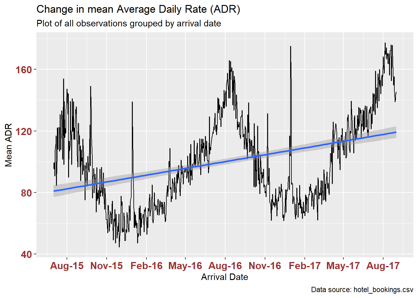
Grouping and plotting by month makes it easier to interpret the trend. However, grouping by month means that we lose sight of the EOY holiday spike.
ggplot(hotelByMonth, aes(x=arrival_month, y=adrMean)) +
geom_line(size=3) +
geom_smooth(method=lm, level=0.95, show.legend=TRUE) +
labs(title = "Change in mean Average Daily Rate (ADR)",
subtitle = "Plot of all observations grouped by arrival month, year",
caption = "Data source: hotel_bookings.csv",
x = "Arrival Month", y = "Mean ADR",
) +
theme(axis.text.x = element_text(face="bold", color="#993333",
size=12),
axis.text.y = element_text(face="bold", color="#993333",
size=12)) +
scale_x_date(date_breaks = "3 months" , date_labels = "%b-%y")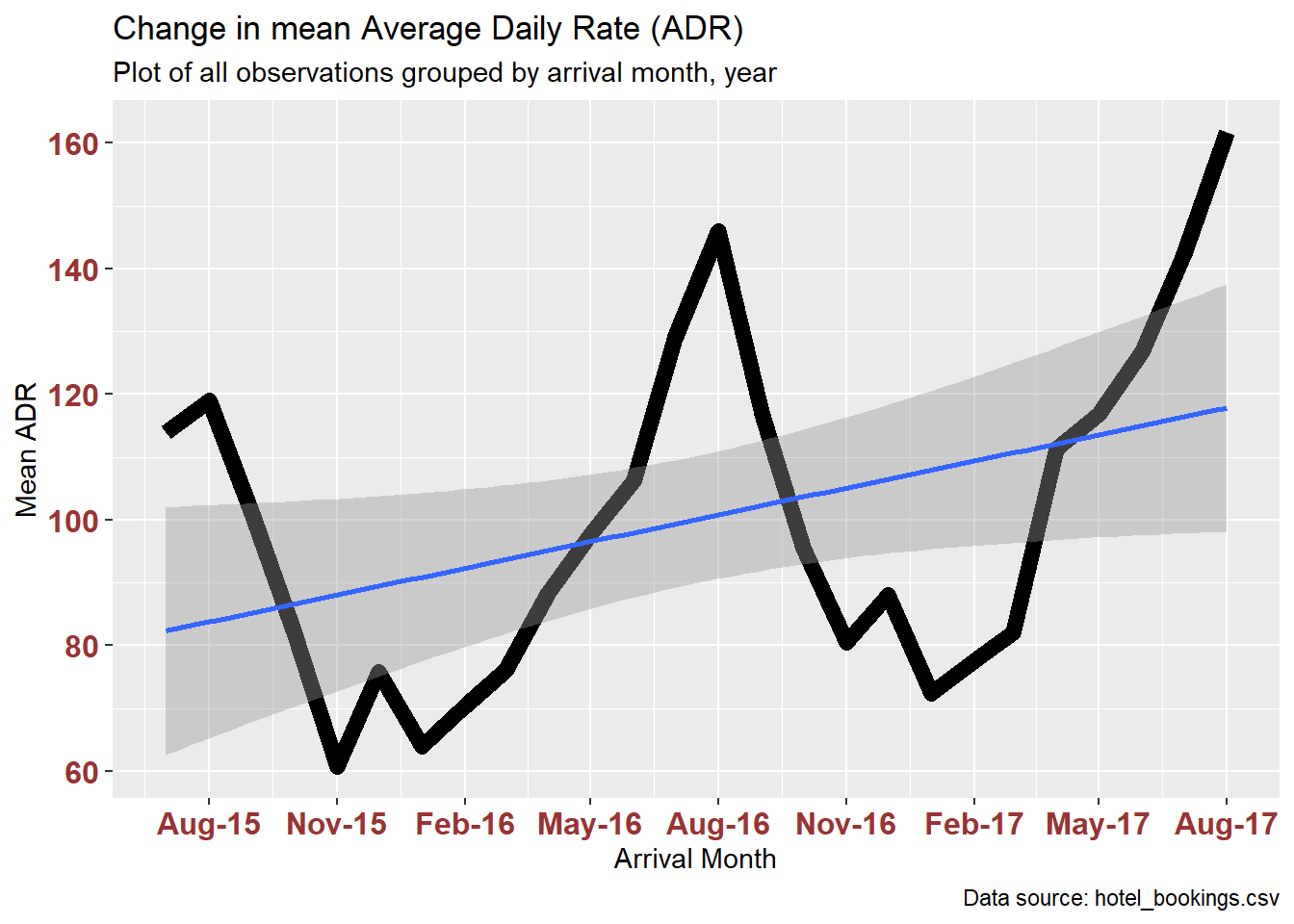
Visualizing Part-Whole Relationships
I can use additional grouping to update the plot of mean ADR change over time by coloring according to market segment (which I mutated to a factor a few code blocks ago).
ggplot(hotelByDaySegment, aes(x=arrival_date, y=adrMean, fill=market_segment)) +
geom_bar(position="stack", stat="identity"#, colour = "black", size = .2, alpha = .4)
) +
scale_fill_brewer(palette = "Dark2") +
labs(title = "Change in mean Average Daily Rate (ADR)",
subtitle = "Plot of all observations stacked by Market Segment",
caption = "Data source: hotel_bookings.csv",
x = "Arrival Date", y = "Mean ADR",
) +
theme(axis.text.x = element_text(face="bold", color="#993333",
size=12),
axis.text.y = element_text(face="bold", color="#993333",
size=12)) +
scale_x_date(date_breaks = "6 months" , date_labels = "%b-%y")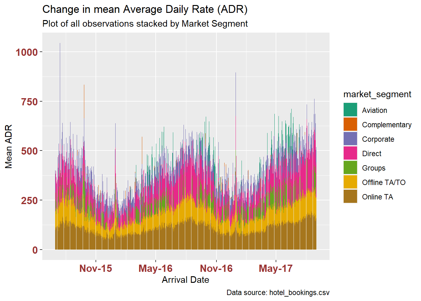
We begin to see the proportion of mean ADR attributed to each segment, how that segment changes over time, and when segments go against the annual pattern – such as the apparent absence of the Aviation Segment before 2016.
However, it’s difficult to make out the trends. It helps to group by month:
hotelByMonthSegment %>%
ggplot(aes(x=arrival_month, y=adrMean, fill=market_segment)) +
geom_bar(position="stack", stat="identity") +
scale_fill_brewer(palette = "Dark2") +
labs(title = "Change in mean Average Daily Rate (ADR)",
subtitle = "Plot of all observations grouped by arrival month, year, and stacked by market segment",
caption = "Data source: hotel_bookings.csv",
x = "Arrival Date", y = "Mean ADR",
) +
theme(axis.text.x = element_text(face="bold", color="#993333",
size=12),
axis.text.y = element_text(face="bold", color="#993333",
size=12)) +
scale_x_date(date_breaks = "6 months" , date_labels = "%b-%y")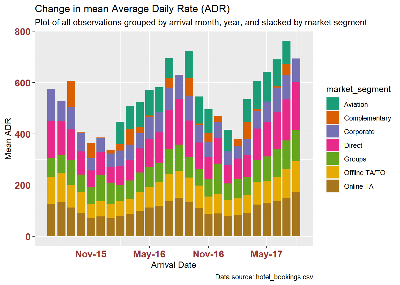
Reordering the market segment factor by their share of adrMean (using the mean of each segment’s monthly means) isn’t helpful, in this case.
hotelByMonthSegment %>%
mutate(market_segment = fct_reorder(market_segment, adrMean, .fun='mean')) %>%
ggplot(aes(x=arrival_month, y=adrMean, fill=market_segment)) +
geom_bar(position="stack", stat="identity") +
scale_fill_brewer(palette = "Dark2") +
labs(title = "Change in mean Average Daily Rate (ADR)",
subtitle = "Plot of all observations grouped by arrival month, year, and stacked by market segment",
caption = "Data source: hotel_bookings.csv",
x = "Arrival Date", y = "Mean ADR",
) +
theme(axis.text.x = element_text(face="bold", color="#993333",
size=12),
axis.text.y = element_text(face="bold", color="#993333",
size=12)) +
scale_x_date(date_breaks = "6 months" , date_labels = "%b-%y")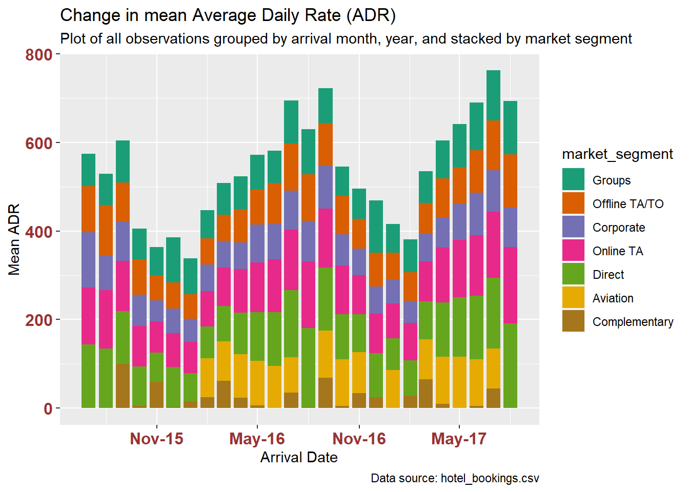
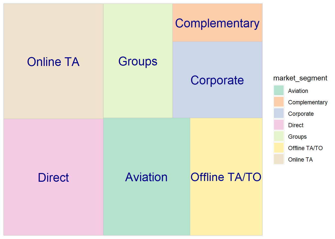
The treemaps below compare the mean ADR for the top 8 countries, and for all 7 market segments.
ggplot(hotelByCountry, aes(area=adrMean, fill=country, label=country)) +
geom_treemap() +
geom_treemap_text(color = "beige", place = "center") +
scale_fill_brewer(palette = "Dark2")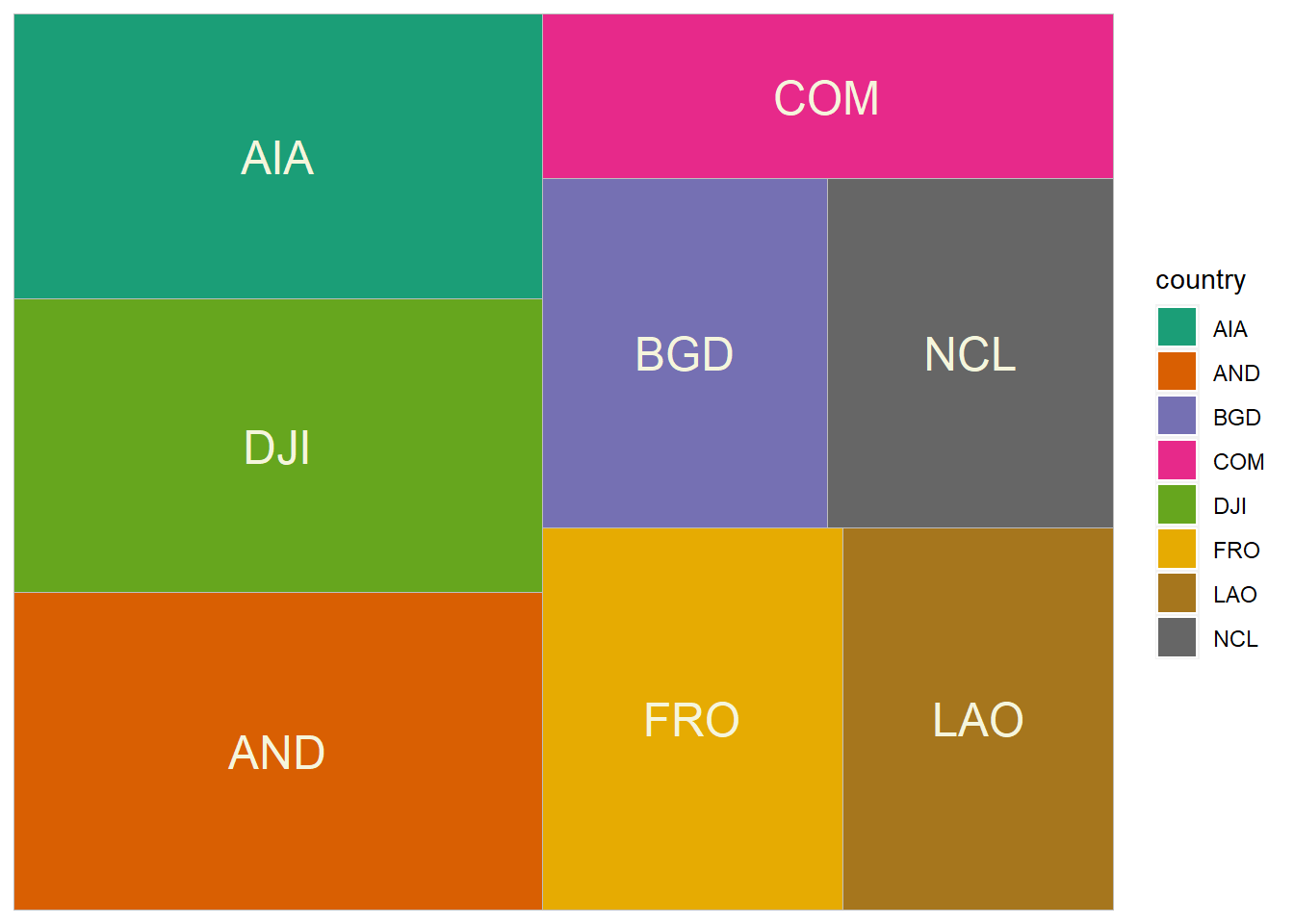
ggplot(hotelBySegment, aes(area=adrMean, fill=market_segment, label=market_segment)) +
geom_treemap() +
geom_treemap_text(color = "darkblue", place = "center") +
scale_fill_brewer(palette = "Pastel2")