Code
my_packages <- c("tidyverse", "readxl", "ggplot2", "knitr") # create vector of packages
invisible(lapply(my_packages, require, character.only = TRUE)) # load multiple packages

knitr::opts_chunk$set(echo = TRUE, warning=FALSE, message=FALSE)my_packages <- c("tidyverse", "readxl", "ggplot2", "knitr") # create vector of packages
invisible(lapply(my_packages, require, character.only = TRUE)) # load multiple packages
knitr::opts_chunk$set(echo = TRUE, warning=FALSE, message=FALSE)I mustered up the courage to take on the USA Households Excel spreadsheet for Challenge 7. I needed more mutation practice, and with extra table headers, multi-row column headings, a ton of footnotes, changes in labeling over time, and several columns for totals and spread around the center, that spreadsheet demands mutation.
df_USHouseholds <- read_excel("../posts/_data/USA Households by Total Money Income, Race, and Hispanic Origin of Householder 1967 to 2019.xlsx", na = "N") # the Excel workbook has one worksheet to read in. Empty values are represented by cells with character "N".It looks downright ugly.
df_USHouseholdsAs described in the table header, USA Households shows Households by Total Money Income, Race, and Hispanic Origin of Householder: 1967 to 2019.
For additional detail, the header refers to a report described as Current Population Survey, 2020 Annual Social and Economic (ASEC) Supplement conducted by the Bureau of the Census for the Bureau of Labor Statistics. – Washington: U.S. Census Bureau [producer and distributor], 2020.
The Current Population Survey (CPS) is the source of official US Federal Government statistics on employment and unemployment. This program interviews tens of thousands of households every year (I have visualized the number of households over time at the bottom of this page). For each year, the USA Households data represents household summaries by race, Hispanic ethnicity, and income bracket.
My approach to tidy this data set begins by slicing off the extra header and footnote rows.
Then I make three copies of the first column, because the first column contains three variables:
I separated those three variables using a piped series of mutations with regex patterns. When year == NA, it indicates a junk row left over from the subheaders, so I filter those out.
I also filter out a row with NA number of households, convert race/hispanic values to factor, and convert variables to numeric where appropriate.
  # capture info from header and footnotes in a separate df
df_footnotes <- df_USHouseholds %>%
  slice(1:2, 358:n()) %>%
  setNames(c("dataHeaderAndFootnotes"))

  # the big tidy and mutation spree on the primary df
df_USHouseholds <- df_USHouseholds %>%
    # don't need the header
  slice(-(1:2)) %>%
    # renaming just to make the next line of code easier to read
  rename(hh_yrh_origin = 1) %>%
    # by making 3 copies of this column, I can more easily tidy up values
  mutate(year = hh_yrh_origin, hh_RaceHisp = hh_yrh_origin, footnote = hh_yrh_origin) %>%
    # moving my new columns to the beginning
  relocate(c("year", "hh_RaceHisp", "footnote")) %>%
    # erase end notes
  mutate(across(c("year","hh_RaceHisp","footnote"), str_replace, '^Note:.+$|^Source:.+$|^N\\s.+$|^\\d{1,2}\\s.+$', '')) %>%
    # erase text labels
  mutate(across(year, str_replace, '^[[:alpha:]]+[[:alpha:],()\\d\\s\\\\]+$', '')) %>%
    # erase commas
  mutate(across(year, str_replace, '[,]', '')) %>%
    # erase superscript digits
  mutate(across(year, str_replace, '\\s[\\d\\s]+$', '')) %>%
    # erase year and space
  mutate(across(c("hh_RaceHisp","footnote"), str_replace, "^\\d{4}\\s?", '')) %>%
    # erase superscript digits
  mutate(across(hh_RaceHisp, str_replace, "\\d{1,2}", '')) %>%
    # erase superscript digits with comma
  mutate(across(hh_RaceHisp, str_replace, ",\\s\\d{1,2}", '')) %>%
    # erase \r\n
  mutate(across(c("hh_RaceHisp","footnote"), str_replace, "\r\n.*$", '')) %>%
    # replace empty values with NA
  mutate(across(c("year","hh_RaceHisp","footnote"), ~ifelse(.=="", NA, as.character(.)))) %>%
    # populate hh_RaceHisp column with values
  fill(hh_RaceHisp) %>%
    # omit unnecessary columns
  select(-c("hh_yrh_origin","...3")) %>%
    # tidy up column names for the rest of the table
  rename(
    hh_numInThousands = ...2,
    est_medIncomeInDollars = ...13,
    margErr_medIncomeInDollars = ...14,
    est_meanIncomeInDollars = ...15,
    margErr_meanIncomeInDollars = ...16
  ) %>%
    # remove rows where year is NA
  filter(!is.na(year)) %>%
    # one observation (ASIAN AND PACIFIC ISLANDER, 1987) is missing a number of households. I remove to prevent summarization errors below.
  filter(!is.na(hh_numInThousands)) %>%
    # convert data types
  mutate(
    hh_RaceHisp = factor(hh_RaceHisp),
    year = make_date(year = year, month = 1, day = 1),
    across(hh_numInThousands:margErr_meanIncomeInDollars, as.numeric)
    )

df_USHouseholdsdf_rows <- nrow(df_USHouseholds)I handle the rest of the variables and pivot longer by converting the income bracket columns to a single income factor variable.
df_USHouseholds <- df_USHouseholds %>%
    # make it long for better normalization
  pivot_longer(
    cols = ...4:...12,
    names_to = "income",
    values_to = "percentDistribution"
  ) %>%
    # Update the income text to match the original data headers
  mutate(
    income = case_match(
      income,
      "...4" ~ "Under $15,000",
      "...5" ~ "$15,000 to $24,999",
      "...6" ~ "$25,000 to $34,999",
      "...7" ~ "$35,000 to $49,999",
      "...8" ~ "$50,000 to $74,999",
      "...9" ~ "$75,000 to $99,999",
      "...10" ~ "$100,000 to $149,999",
      "...11" ~ "$150,000 to $199,999",
      "...12" ~ "$200,000 and over"
    ),
    # Convert income to factor and set levels to match numerical order
    income = factor(income, levels = c("Under $15,000", "$15,000 to $24,999", "$25,000 to $34,999", "$35,000 to $49,999", "$50,000 to $74,999", "$75,000 to $99,999", "$100,000 to $149,999", "$150,000 to $199,999", "$200,000 and over"))) %>%
    # put this at the beginning
  relocate(c("income", "percentDistribution"), .after = footnote) %>%
    # sort
  arrange(year, hh_RaceHisp, income, footnote)

incomeBracketCount <- n_distinct(df_USHouseholds$income)
Sanity check: before pivoting, df_USHouseholds had 339 rows. Pivoting 9 columns by 339 rows should give us 3051 observations in the new table. Indeed, it does:
df_USHouseholdsFor reference, I loaded the header and footnote values in a separate data frame. As I show below, a couple years have duplicate values that are explained by footnotes.
df_footnotesI summarized data in search of NA values that may foul up my analysis. There are many missing footnote values, but those are not important for summary and plotting. There are NA values in the margin of error for estimated mean incomes … important to note, however I am not looking at these margin of error estimates in my plots below.
# count unique and missing values
df_USHouseholds %>% summarize(
  yearNA = sum(is.na(year)),
  hh_RaceHispNA = sum(is.na(hh_RaceHisp)),
  footnoteNA = sum(is.na(footnote)),
  incomeNA = sum(is.na(income)),
  percentDistributionNA = sum(is.na(percentDistribution)),
  hh_numInThousandsNA = sum(is.na(hh_numInThousands))
)# The second set is less important to my analysis and has a lot of NAs
df_USHouseholds %>% summarize(
est_medIncomeInDollarsNA = sum(is.na(est_medIncomeInDollars)),
margErr_medIncomeInDollarsNA = sum(is.na(margErr_medIncomeInDollars)),
est_meanIncomeInDollarsNA = sum(is.na(est_meanIncomeInDollars)),
est_meanIncomeInDollarsNA = sum(is.na(est_meanIncomeInDollars)),
margErr_meanIncomeInDollarsNA = sum(is.na(margErr_meanIncomeInDollars))
)# filtering with NAs in play is tricky... I tried to filter these out in the big mutation pipeline above, but it doesn't work. So I run two separate filters here.
# remove duplicate rows for 2013. Footnote 3 indicates that 2013 interviewees were eligible for a second interview after redesign of questions to do with income and health insurance. Observations for year 2013 that have footnote 4 are from the redesigned interviews. Therefore, I remove all observations for 2013 footnote 3.
df_USHouseholds <- df_USHouseholds %>%
filter(is.na(footnote) | (year != '2013-01-01' | footnote != 3))
# remove duplicate rows for 2017. Footnote 2 indicates a second set of observations for 2017 after the update of a data processing system. Therefore, I remove all observations for 2017 with no footnote.
df_USHouseholds <- df_USHouseholds %>%
filter((is.na(footnote) & year != '2017-01-01') | (!is.na(footnote)))
yearCount <- n_distinct(df_USHouseholds$year)
hhRHCount <- n_distinct(df_USHouseholds$hh_RaceHisp)
yearhhRHCount <- n_distinct(df_USHouseholds$year, df_USHouseholds$hh_RaceHisp)Sanity check: How many observations should we end up with when grouping by year and hh_RaceHisp?
There are 53 distinct years and 12 distinct race/Hispanic categories. However, the use of race/Hispanic categories changed over time, so it’s not as simple as multiplying the number of years by the number of hh_RaceHisp categories.
In the previous code block, n_distinct(year, hh_RaceHisp) gave us the number of unique combinations of year and hh_RaceHisp: 323. We should see that in the grouped table – indeed, we do:
# sanity check the results

df_USHouseholds %>%
  group_by(year,hh_RaceHisp) %>%
  summarize(
    countIncome = n(),
    sumPD = sum(percentDistribution),
    numMean = mean(hh_numInThousands)
    ) %>%
subset(select = c(year, hh_RaceHisp, countIncome, sumPD, numMean))#define function to calculate mode
find_mode <- function(x) {
u <- unique(x[!is.na(x)]) # unique list as an index, without NA
tab <- tabulate(match(x[!is.na(x)], u)) # count how many times each index member occurs
u[tab == max(tab)] # the max occurrence is the mode
mean(u) # return mean in case the data is multimodal
}My first plot shows the change over time in number of all households interviewed. This is summarized in the table. The plot shows a line of change over time with a transparent box plot of the summary table. I’m not sure this works well, but it’s a communication device that I’d like to keep experimenting with.
# how many households for all races each year?
df_USHouseholds %>%
  filter(str_detect(hh_RaceHisp, "ALL RACES")) %>%
  summarize(
    meanHH = mean(hh_numInThousands, na.rm = TRUE),
    modeHH = find_mode(hh_numInThousands),
    minHH = fivenum(hh_numInThousands, na.rm = TRUE)[1],
    lowHingeHH = fivenum(hh_numInThousands, na.rm = TRUE)[2],
    medianHH = median(hh_numInThousands, na.rm = TRUE),
    upHingeHH = fivenum(hh_numInThousands, na.rm = TRUE)[4],
    maxHH = fivenum(hh_numInThousands, na.rm = TRUE)[5],
    count = n()
)ggplot(filter(df_USHouseholds, str_detect(hh_RaceHisp, "ALL RACES")), aes(x = year, y = hh_numInThousands)) +
geom_line() +
geom_smooth(method=lm, level=0.95, show.legend=TRUE) +
geom_boxplot(alpha = 0.4) +
labs(title = "Number of Households interviewed over time",
caption = "Data source: USA Households [...] 1967 to 2019.xlsx",
x = "Year", y = "Number of Households Interviewed") +
theme(axis.text.x = element_text(face="bold", color="#993333", size=12),
axis.text.y = element_text(face="bold", color="#993333", size=12)) +
scale_x_date(date_breaks = "10 years" , date_labels = "%Y")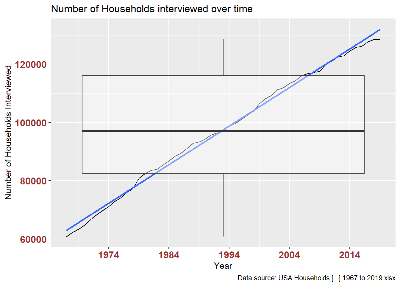
This table verifies the data plotted above: number of ‘all races’ households interviewed each year.
df_USHouseholds %>%
  filter(str_detect(hh_RaceHisp, "ALL RACES")) %>%
  select(year, hh_numInThousands) %>%
  arrange(year) %>%
  distinct()
This plot breaks out the above by each race/Hispanic category. It’s difficult to read, although it makes clear that White households are predominant in the interview sample.
# how many households for all races each year?
ggplot(filter(df_USHouseholds, !str_detect(hh_RaceHisp, "ALL RACES")), aes(x = year, y = hh_numInThousands, color = hh_RaceHisp)) +
  geom_line() +
  labs(title = "Number of Households interviewed over time",
       caption = "Data source: USA Households [...] 1967 to 2019.xlsx",
       x = "Year", y = "Number of Households Interviewed") +
  theme(axis.text.x = element_text(face="bold", color="#993333", size=12),
        axis.text.y = element_text(face="bold", color="#993333", size=12)) +
  scale_x_date(date_breaks = "10 years" , date_labels = "%Y")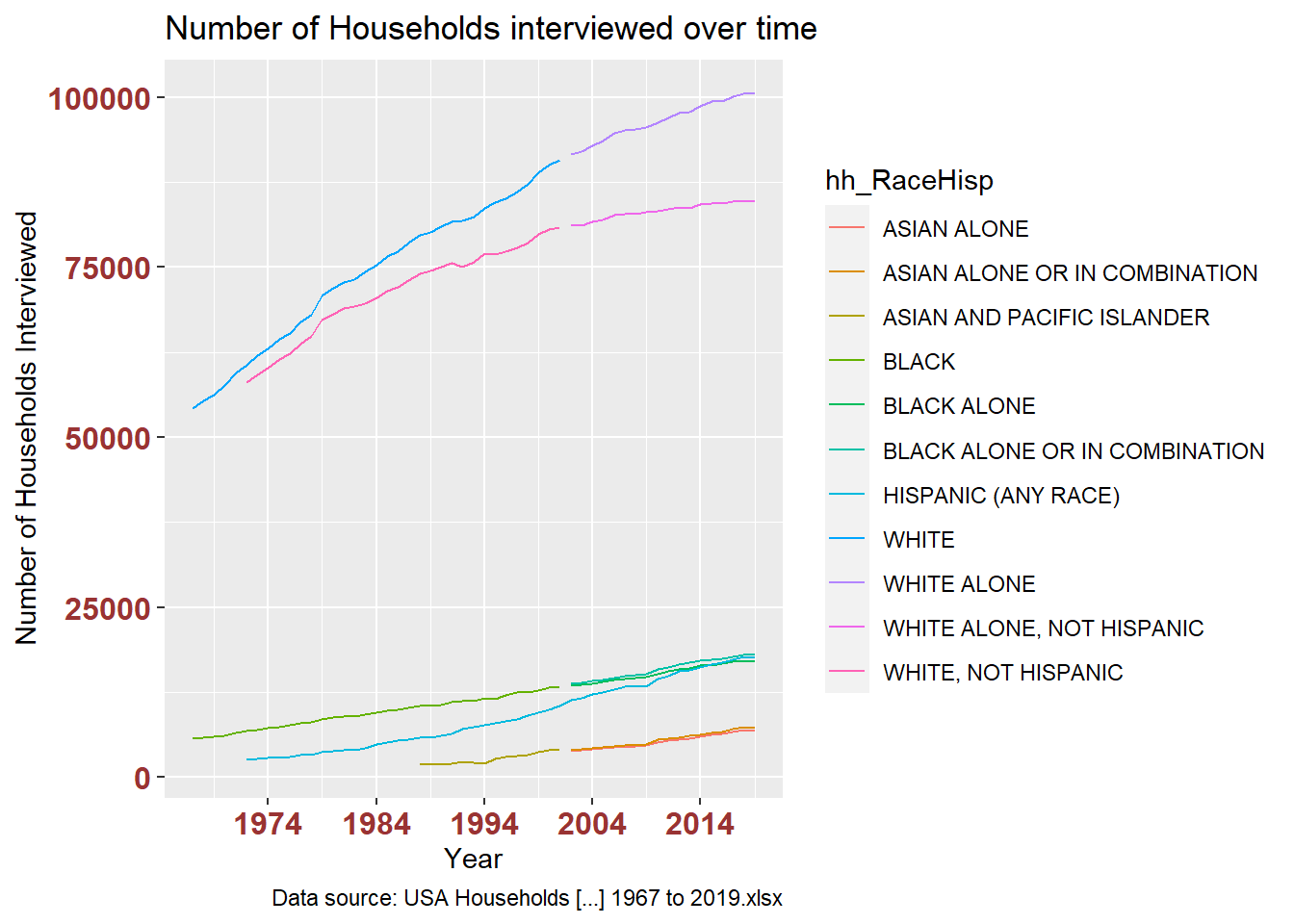
To make a more readable plot, I used separate_wider_regex to pull the first word from each hh_RaceHisp value, creating larger race/ethnicity groups ASIAN, BLACK, HISPANIC, WHITE.
df_USHouseholdsRHGROUP <- df_USHouseholds %>%
  filter(!str_detect(hh_RaceHisp, "ALL RACES")) %>%
  separate_wider_regex(hh_RaceHisp, c(hh_RHGroup = "^HISPANIC|[[:alpha:]]{5}"), too_few = "debug") %>%
  group_by(hh_RHGroup, year) %>%
  summarize(
    hh_numInThousandsSUM = sum(hh_numInThousands),
    est_medIncomeInDollarsMED = median(est_medIncomeInDollars)
  )

df_USHouseholdsRHGROUP
This grouping makes it easier to differences in long-term change of representation in this research and of income between racial and ethnic groups in the US.
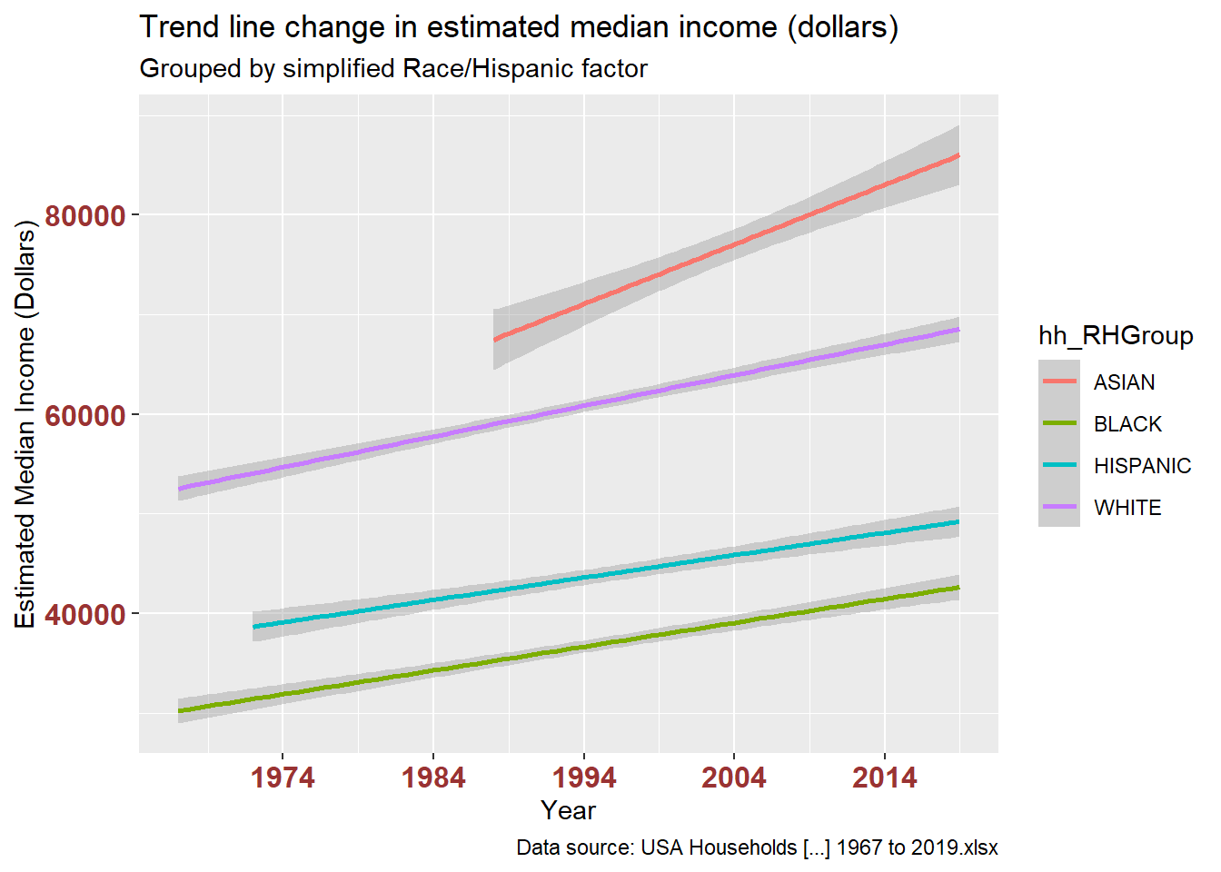
The stacked bar charts are interesting, but I found that showing the trend line alone revealed possible disparities in both variables. The first pair of plots shows number of households. The second pair shows estimated median income.
# how many households for all races each year?
ggplot(df_USHouseholdsRHGROUP, aes(x = year, y = hh_numInThousandsSUM, fill = hh_RHGroup)) +
  geom_bar(position="stack", stat="identity") +
  labs(title = "Number of Households interviewed over time",
       subtitle = "Grouped by simplified Race/Hispanic factor",
       caption = "Data source: USA Households [...] 1967 to 2019.xlsx",
       x = "Year", y = "Number of Households Interviewed") +
  theme(axis.text.x = element_text(face="bold", color="#993333", size=12),
        axis.text.y = element_text(face="bold", color="#993333", size=12)) +
  scale_x_date(date_breaks = "10 years" , date_labels = "%Y")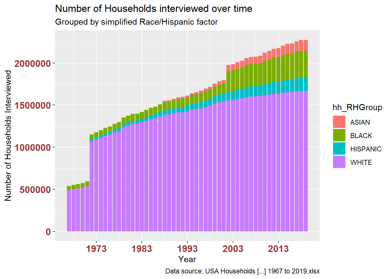
ggplot(df_USHouseholdsRHGROUP, aes(x = year, y = hh_numInThousandsSUM, color = hh_RHGroup)) +
  geom_smooth(method=lm, level=0.95, show.legend=TRUE) +
  labs(title = "Trend line change in number of Households interviewed over time",
       subtitle = "Grouped by simplified Race/Hispanic factor",
       caption = "Data source: USA Households [...] 1967 to 2019.xlsx",
       x = "Year", y = "Number of Households Interviewed") +
  theme(axis.text.x = element_text(face="bold", color="#993333", size=12),
        axis.text.y = element_text(face="bold", color="#993333", size=12)) +
  scale_x_date(date_breaks = "10 years" , date_labels = "%Y")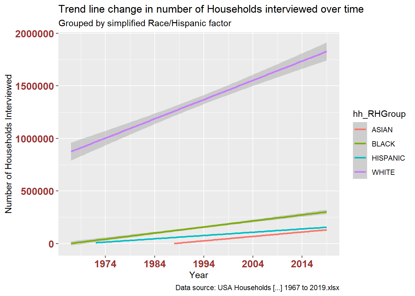
# change in estimated median income for all races each year?
ggplot(df_USHouseholdsRHGROUP, aes(x = year, y = est_medIncomeInDollarsMED, fill = hh_RHGroup)) +
  geom_bar(position="stack", stat="identity") +
  labs(title = "Change in estimated median income (dollars)",
       subtitle = "Grouped by simplified Race/Hispanic factor",
       caption = "Data source: USA Households [...] 1967 to 2019.xlsx",
       x = "Year", y = "Estimated Median Income (Dollars)") +
  theme(axis.text.x = element_text(face="bold", color="#993333",
                           size=12),
          axis.text.y = element_text(face="bold", color="#993333",
                           size=12)) +
  scale_x_date(date_breaks = "10 years" , date_labels = "%Y")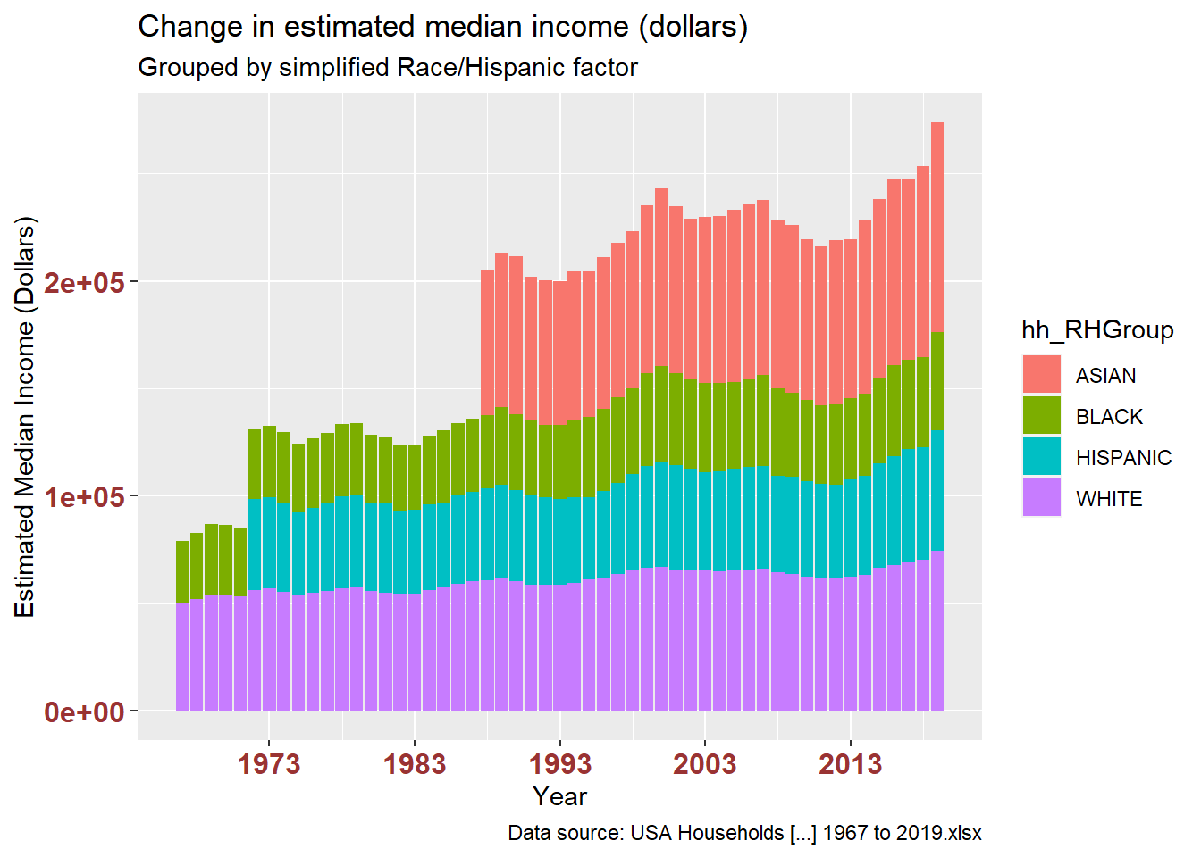
ggplot(df_USHouseholdsRHGROUP, aes(x = year, y = est_medIncomeInDollarsMED, color = hh_RHGroup)) +
  geom_smooth(method=lm, level=0.95, show.legend=TRUE) +
  labs(title = "Trend line change in estimated median income (dollars)",
       subtitle = "Grouped by simplified Race/Hispanic factor",
       caption = "Data source: USA Households [...] 1967 to 2019.xlsx",
       x = "Year", y = "Estimated Median Income (Dollars)") +
  theme(axis.text.x = element_text(face="bold", color="#993333",
                           size=12),
          axis.text.y = element_text(face="bold", color="#993333",
                           size=12)) +
  scale_x_date(date_breaks = "10 years" , date_labels = "%Y")