library(tidyverse)
library(ggplot2)
library(dplyr)
library(readxl)

knitr::opts_chunk$set(echo = TRUE, warning=FALSE, message=FALSE)
Challenge 5
challenge_5
air_bnb
Introduction to Visualization
Challenge Overview
Today’s challenge is to:
- read in a data set, and describe the data set using both words and any supporting information (e.g., tables, etc)
- tidy data (as needed, including sanity checks)
- mutate variables as needed (including sanity checks)
- create at least two univariate visualizations
- try to make them “publication” ready
- Explain why you choose the specific graph type
- Create at least one bivariate visualization
- try to make them “publication” ready
- Explain why you choose the specific graph type
R Graph Gallery is a good starting point for thinking about what information is conveyed in standard graph types, and includes example R code.
(be sure to only include the category tags for the data you use!)
Read in data
Read in one (or more) of the following datasets, using the correct R package and command.
- cereal.csv ⭐
- Total_cost_for_top_15_pathogens_2018.xlsx ⭐
- Australian Marriage ⭐⭐
- AB_NYC_2019.csv ⭐⭐⭐
- StateCounty2012.xls ⭐⭐⭐
- Public School Characteristics ⭐⭐⭐⭐
- USA Households ⭐⭐⭐⭐⭐
airbnb_data <- read.csv("/Users/rahulsomu/Documents/DACSS_601/601_repo/posts/_data/AB_NYC_2019.csv")
head(airbnb_data)
id name host_id host_name
1 2539 Clean & quiet apt home by the park 2787 John
2 2595 Skylit Midtown Castle 2845 Jennifer
3 3647 THE VILLAGE OF HARLEM....NEW YORK ! 4632 Elisabeth
4 3831 Cozy Entire Floor of Brownstone 4869 LisaRoxanne
5 5022 Entire Apt: Spacious Studio/Loft by central park 7192 Laura
6 5099 Large Cozy 1 BR Apartment In Midtown East 7322 Chris
neighbourhood_group neighbourhood latitude longitude room_type price
1 Brooklyn Kensington 40.64749 -73.97237 Private room 149
2 Manhattan Midtown 40.75362 -73.98377 Entire home/apt 225
3 Manhattan Harlem 40.80902 -73.94190 Private room 150
4 Brooklyn Clinton Hill 40.68514 -73.95976 Entire home/apt 89
5 Manhattan East Harlem 40.79851 -73.94399 Entire home/apt 80
6 Manhattan Murray Hill 40.74767 -73.97500 Entire home/apt 200
minimum_nights number_of_reviews last_review reviews_per_month
1 1 9 2018-10-19 0.21
2 1 45 2019-05-21 0.38
3 3 0 NA
4 1 270 2019-07-05 4.64
5 10 9 2018-11-19 0.10
6 3 74 2019-06-22 0.59
calculated_host_listings_count availability_365
1 6 365
2 2 355
3 1 365
4 1 194
5 1 0
6 1 129Briefly describe the data
Tidy Data (as needed)
Is your data already tidy, or is there work to be done? Be sure to anticipate your end result to provide a sanity check, and document your work here.
# Check for duplicates
duplicated_rows <- airbnb_data[duplicated(airbnb_data),]
if (nrow(duplicated_rows) > 0) {
  airbnb_data <- unique(airbnb_data)
  cat(paste("Removed", nrow(duplicated_rows), "duplicates\n"))
}

# Check for missing values
missing_values <- sum(is.na(airbnb_data))
if (missing_values > 0) {
  airbnb_data <- airbnb_data[complete.cases(airbnb_data),]
  cat(paste("Removed", missing_values, "missing values\n"))
}
Removed 10052 missing valuesAre there any variables that require mutation to be usable in your analysis stream? For example, do you need to calculate new values in order to graph them? Can string values be represented numerically? Do you need to turn any variables into factors and reorder for ease of graphics and visualization?
Document your work here.
airbnb_data <- airbnb_data %>%
  mutate(total_price = .$price * .$minimum_nights)

airbnb_data <- airbnb_data %>%
  mutate(review_season = case_when(
    month(last_review) %in% 1:2 ~ "winter",
    month(last_review) %in% 3:5 ~ "spring",
    month(last_review) %in% 6:8 ~ "summer",
    month(last_review) %in% 9:12 ~ "fall",
    TRUE ~ "unknown"
  ))

airbnb_data$last_review <- as.Date(airbnb_data$last_review, format = "%Y-%m-%d")

airbnb_data$new_variable <- ifelse(airbnb_data$availability_365 >= 180, "Available More Than Half the Year", "Available Less Than Half the Year")

airbnb_data$new_variable <- airbnb_data$price / airbnb_data$minimum_nights
Univariate Visualizations
Bar Chart of Room Types: A bar chart is suitable for visualizing the distribution of a categorical variable, such as room type. The bar chart allows us to see the frequency of each category and compare them easily. we can see from the chart that the majority of listings are for entire apartments/homes, followed by private rooms and shared rooms.
# Create histogram of price distribution
#ggplot(airbnb_data, aes(x = price)) +
#  geom_histogram(bins = 50, fill = "#69b3a2", color = "#e9ecef") +
#  labs(x = "Price ($)", y = "Count") +
#  ggtitle("Distribution of Airbnb Prices in NYC") +
#  theme(plot.title = element_text(hjust = 0.5))

# Create bar chart of room types
ggplot(airbnb_data, aes(x = room_type)) +
  geom_bar(fill = "#69b3a2", color = "#e9ecef") +
  labs(x = "Room Type", y = "Count") +
  ggtitle("Number of Airbnb Listings by Room Type in NYC") +
  theme(plot.title = element_text(hjust = 0.5))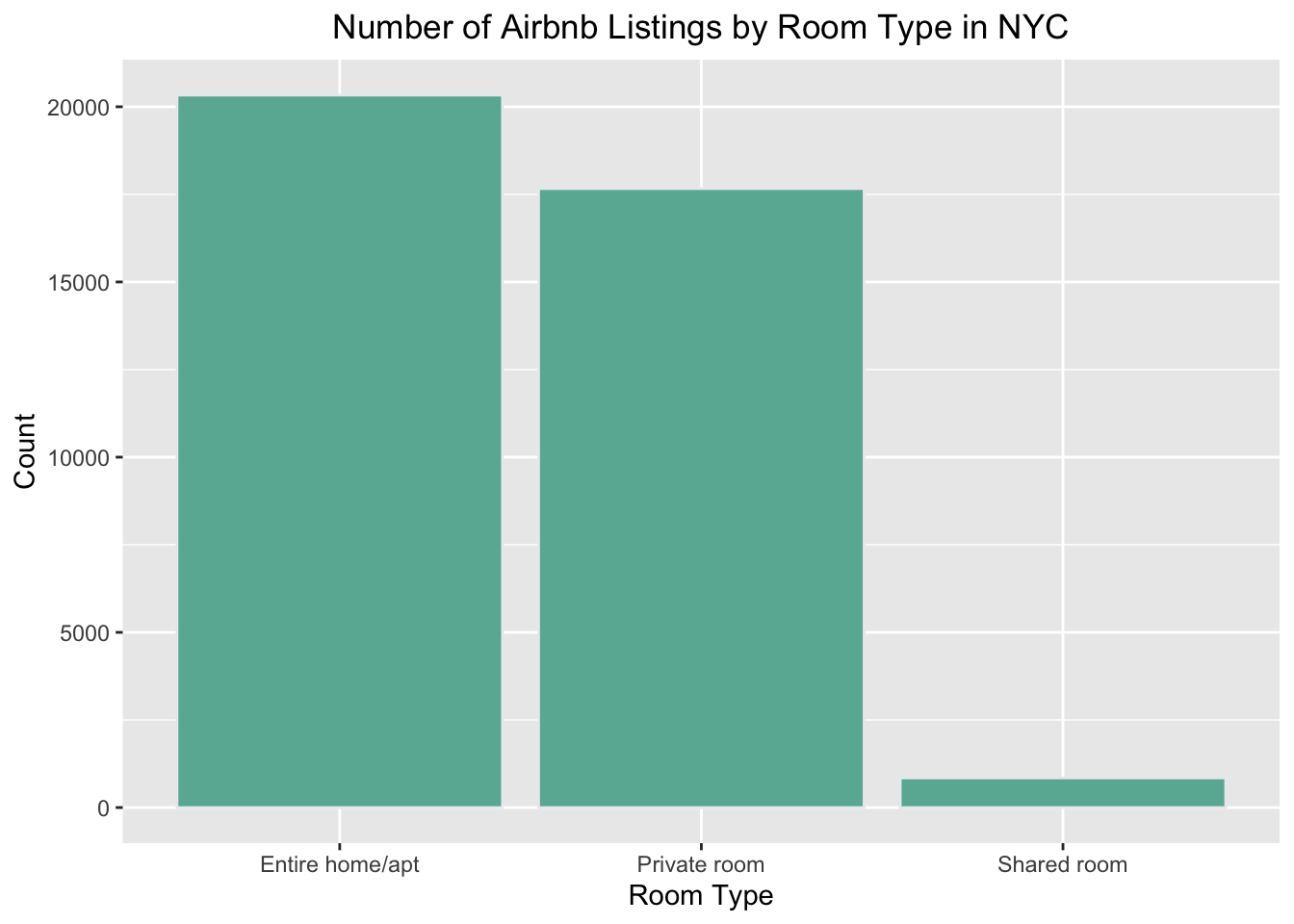
ggplot(data = airbnb_data, aes(x = neighbourhood_group, fill = neighbourhood_group)) +
  geom_bar() +
  labs(title = "Number of Airbnb Listings by Neighborhood in NYC",
       x = "Neighborhood",
       y = "Count") +
  theme_bw()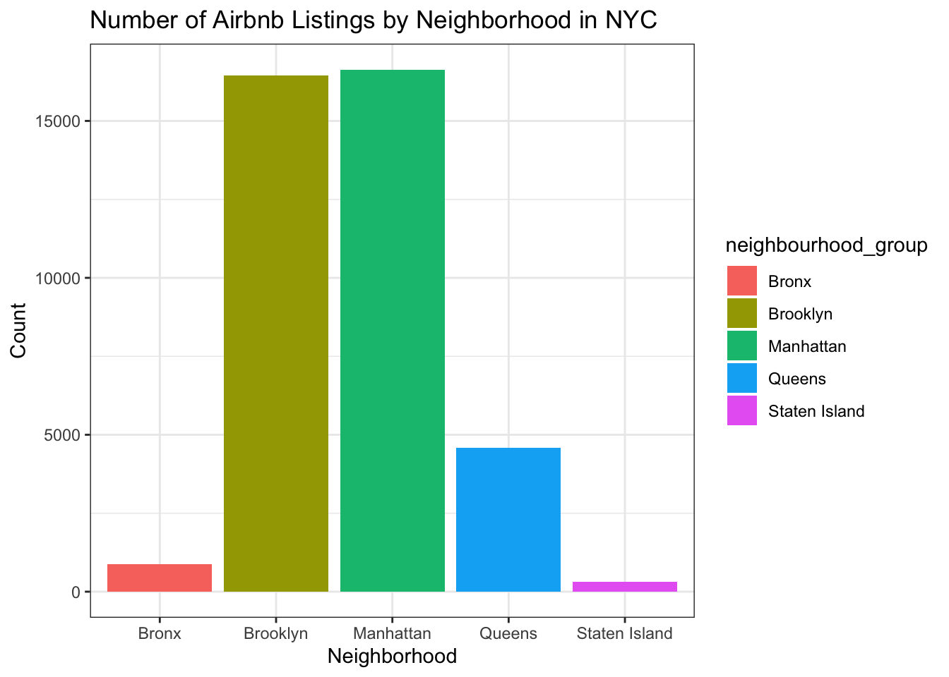
airbnb_data_subset <- airbnb_data %>%
  select(price, number_of_reviews)

ggplot(airbnb_data_subset, aes(x = number_of_reviews, y = price)) +
  geom_point(alpha = 0.5, color = "#2E86C1") +
  labs(x = "Number of Reviews", y = "Price") +
  theme_classic()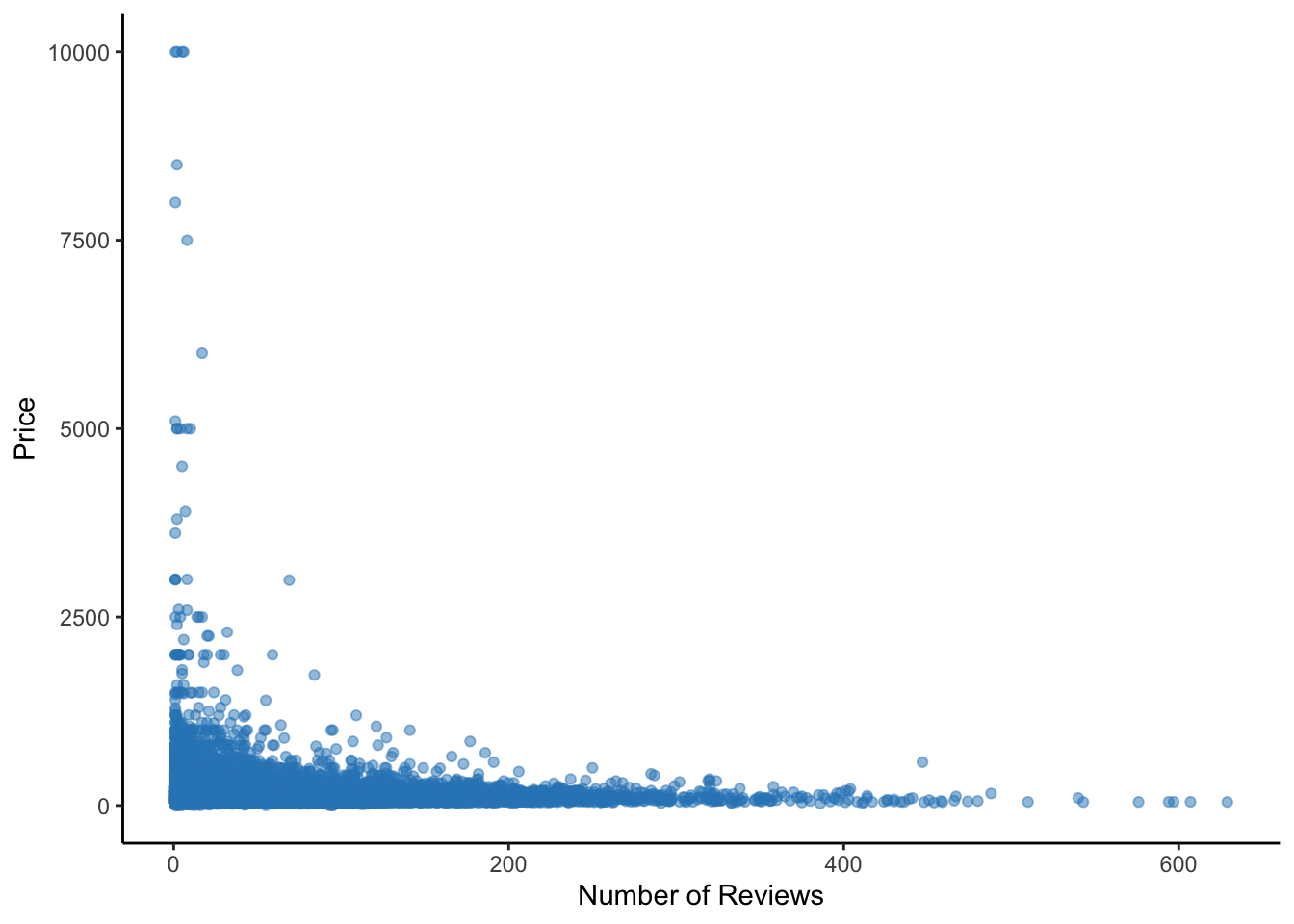
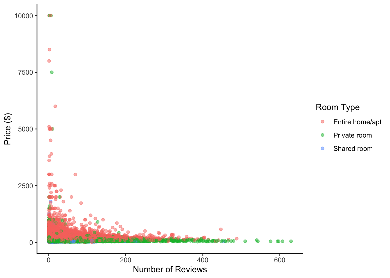
Bivariate Visualization(s)
The scatter plot has been used for this bivariate visualization to show the relationship between two continuous variables, number of reviews and price. The alpha transparency is set to 0.5 to prevent overplotting, with labels as “Number of Reviews” and “Price ($)”. A legend is added to indicate the room type for each color.
ggplot(data = airbnb_data, aes(x = number_of_reviews, y = price, color = room_type)) +
  geom_point(alpha = 0.5) +
  labs(x = "Number of Reviews", y = "Price ($)", color = "Room Type") +
  theme_classic()