library(tidyverse)
library(ggplot2)

knitr::opts_chunk$set(echo = TRUE, warning=FALSE, message=FALSE)
Challenge 6
challenge_6
hotel_bookings
air_bnb
fed_rate
debt
usa_households
abc_poll
Visualizing Time and Relationships
Challenge Overview
Today’s challenge is to:
- read in a data set, and describe the data set using both words and any supporting information (e.g., tables, etc)
- tidy data (as needed, including sanity checks)
- mutate variables as needed (including sanity checks)
- create at least one graph including time (evolution)
- try to make them “publication” ready (optional)
- Explain why you choose the specific graph type
- Create at least one graph depicting part-whole or flow relationships
- try to make them “publication” ready (optional)
- Explain why you choose the specific graph type
R Graph Gallery is a good starting point for thinking about what information is conveyed in standard graph types, and includes example R code.
(be sure to only include the category tags for the data you use!)
Read in data
Read in one (or more) of the following datasets, using the correct R package and command.
- debt ⭐
- fed_rate ⭐⭐
- abc_poll ⭐⭐⭐
- usa_hh ⭐⭐⭐
- hotel_bookings ⭐⭐⭐⭐
- AB_NYC ⭐⭐⭐⭐⭐
library(tidyverse)

hotel_bookings <- read_csv("_data/hotel_bookings.csv")
Briefly describe the data
Tidy Data (as needed)
Is your data already tidy, or is there work to be done? Be sure to anticipate your end result to provide a sanity check, and document your work here.
#str(hotel_bookings)

hotel_bookings <- hotel_bookings %>%
mutate(arrival_date = paste(arrival_date_year, arrival_date_month, arrival_date_day_of_month, sep="-"))


#str(hotel_bookings)
Are there any variables that require mutation to be usable in your analysis stream? For example, do you need to calculate new values in order to graph them? Can string values be represented numerically? Do you need to turn any variables into factors and reorder for ease of graphics and visualization?
Document your work here.
hotel_bookings <- hotel_bookings %>%
mutate(total_nights_stayed = stays_in_weekend_nights + stays_in_week_nights)

hotel_bookings <- hotel_bookings %>%
mutate(average_daily_rate = adr / total_nights_stayed)

hotel_bookings <- hotel_bookings %>%
mutate(total_cost = adr * total_nights_stayed)

hotel_bookings <- hotel_bookings %>%
  mutate(is_canceled = factor(is_canceled, levels = c("TRUE", "FALSE")))

#str(hotel_bookings)
Time Dependent Visualization
most_popular_months <- hotel_bookings %>%
  count(arrival_date_month) %>%
  arrange(desc(n)) %>%
  head(10)

ggplot(most_popular_months, aes(x = arrival_date_month, y = n)) +
  geom_bar(stat = "identity") +
  ggtitle("Most Popular Months for Hotel Reservations") +
  xlab("Month") +
  ylab("Number of Reservations")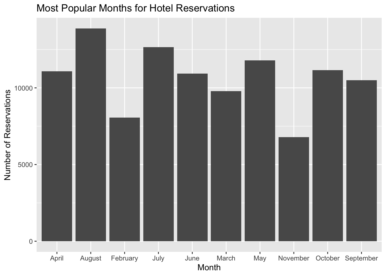
average_adr_over_time <- hotel_bookings %>%
  group_by(arrival_date_year) %>%
  summarize(average_adr = mean(adr))

ggplot(average_adr_over_time, aes(x = arrival_date_year, y = average_adr)) +
  geom_line() +
  ggtitle("Average ADR Over Time") +
  xlab("Year") +
  ylab("Average ADR")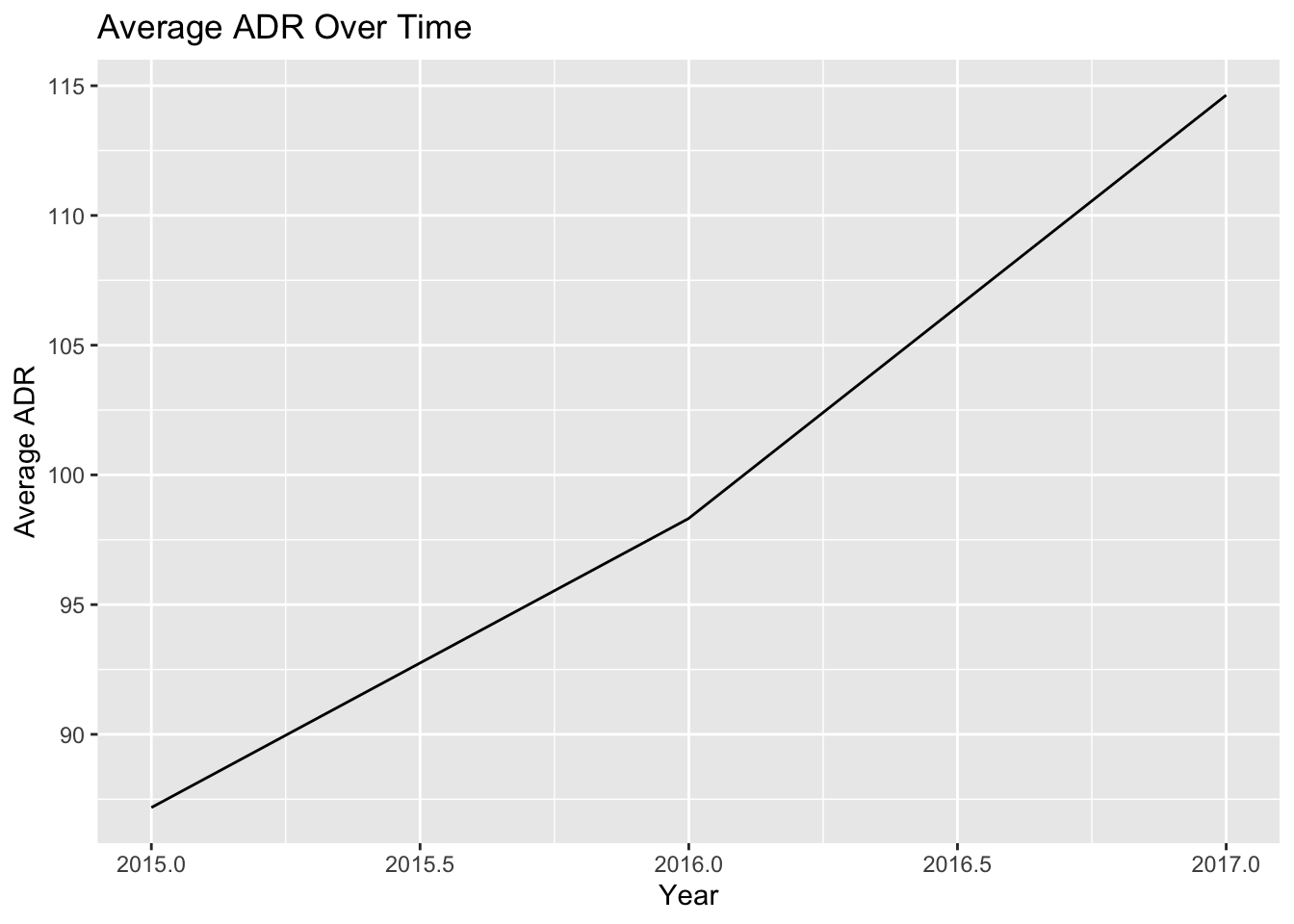
most_popular_market_segments <- hotel_bookings %>%
  count(market_segment) %>%
  arrange(desc(n)) %>%
  head(10)

ggplot(most_popular_market_segments, aes(x = "", y = n, fill = market_segment)) +
  geom_bar(stat = "identity", width = 1) +
  coord_polar("y", start = 0) +
  ggtitle("Most Popular Market Segments for Hotel Guests") +
  xlab("") +
  ylab("")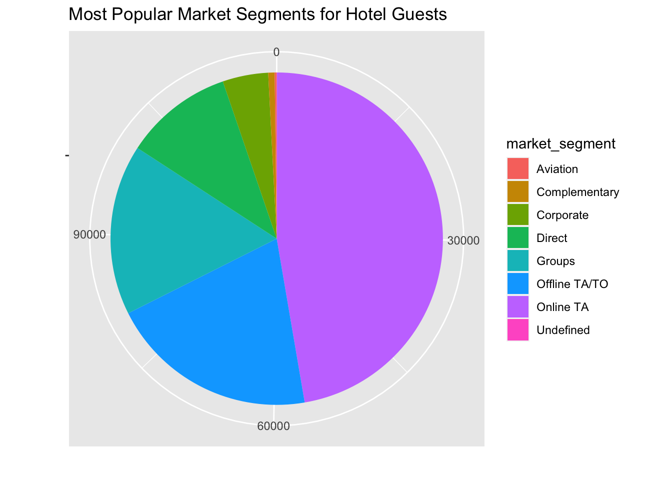
Visualizing Part-Whole Relationships
library(ggplot2)
library(treemap)
library(treemapify)

average_adr_by_market_segment <- hotel_bookings %>%
group_by(market_segment) %>%
summarize(average_adr = mean(adr))

ggplot(average_adr_by_market_segment, aes(x = "", y = average_adr, fill = market_segment)) +
geom_bar(stat = "identity", width = 1) +
coord_polar(theta = "y") +
ggtitle("Average ADR by Market Segment") +
xlab("") +
ylab("")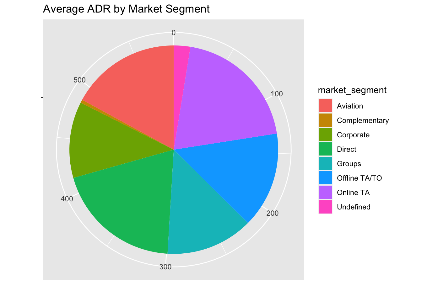
number_of_bookings_by_month_and_market_segment <- hotel_bookings %>%
group_by(arrival_date_month, market_segment) %>%
summarize(count = n())

ggplot(number_of_bookings_by_month_and_market_segment, aes(x = arrival_date_month, y = market_segment, fill = count)) +
geom_tile() +
ggtitle("Number of Bookings by Month and Market Segment") +
xlab("Month") +
ylab("Market Segment")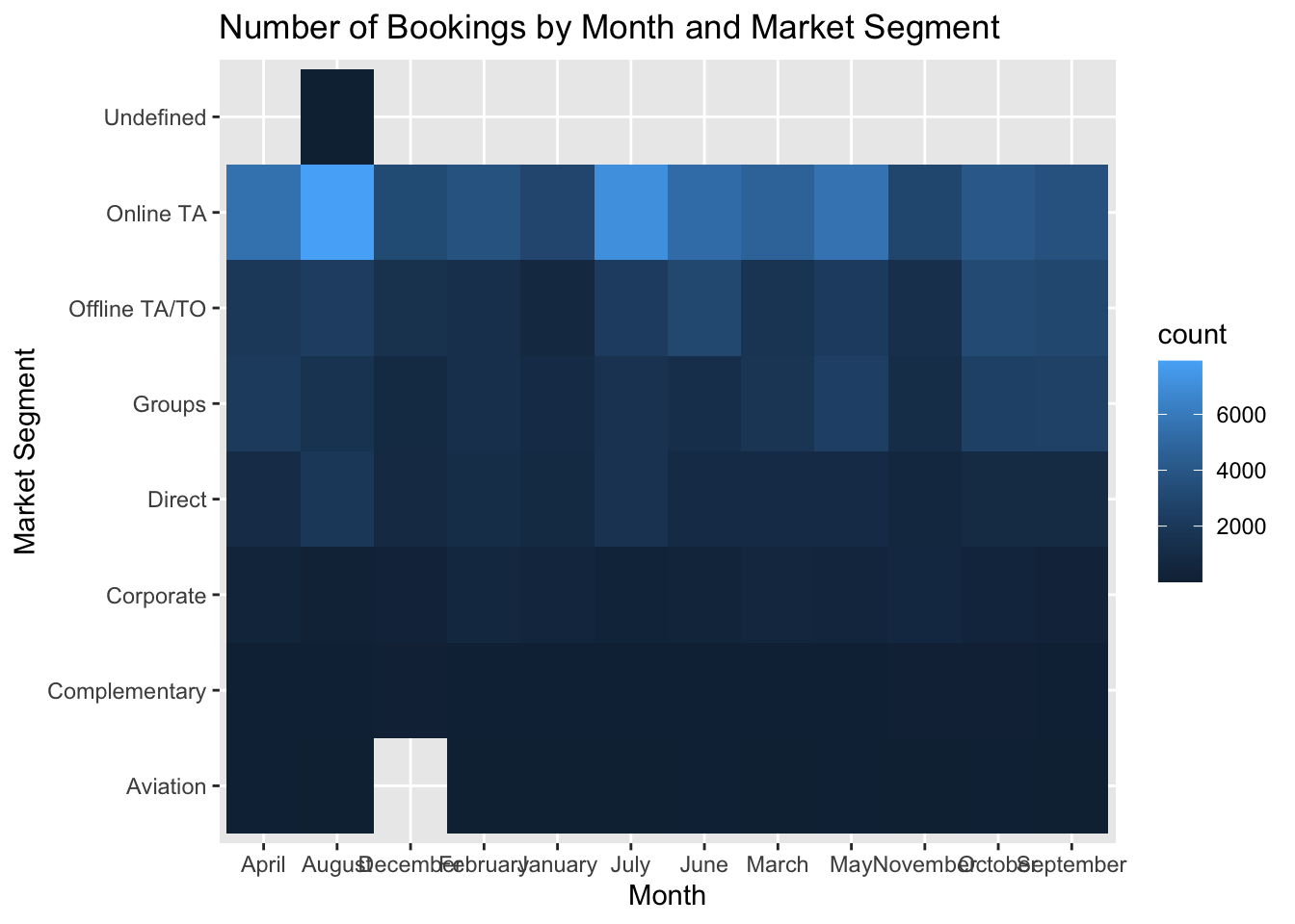
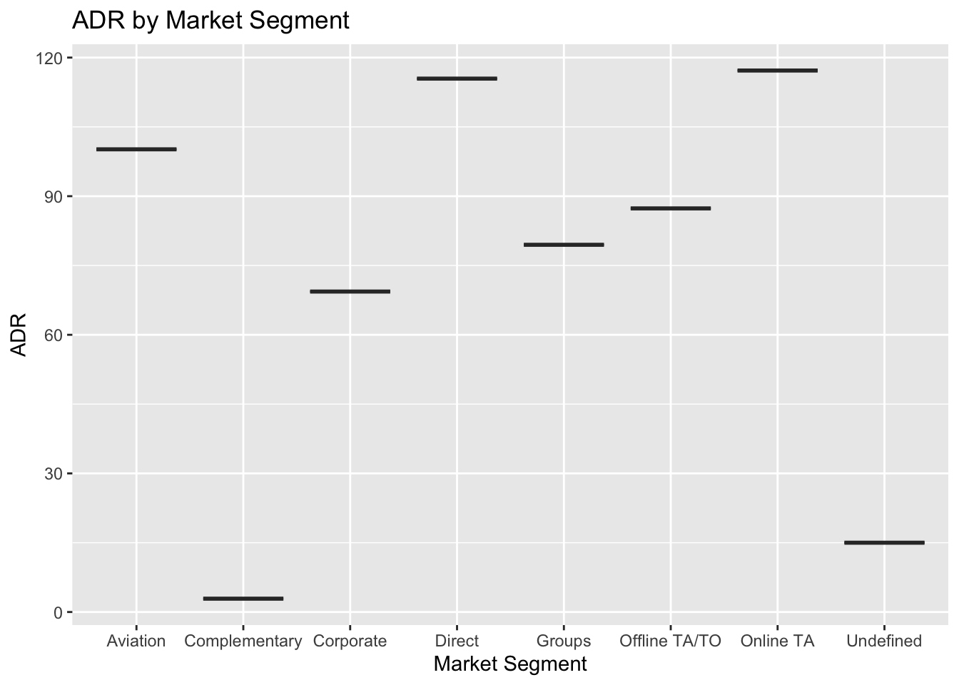
adr_by_market_segment <- hotel_bookings %>%
group_by(market_segment) %>%
summarize(adr = mean(adr))

ggplot(adr_by_market_segment, aes(x = market_segment, y = adr)) +
geom_boxplot() +
ggtitle("ADR by Market Segment") +
xlab("Market Segment") +
ylab("ADR")