library(tidyverse)
library(dbplyr)
library(maps)
library(ggplot2)
library(lubridate)
library(hrbrthemes)
library(purrr)
library(usmap)
theme_set(theme_bw())
library(gapminder)
library(sf)
library(rnaturalearth)
library(rnaturalearthdata)
knitr::opts_chunk$set(echo = TRUE, warning=FALSE, message=FALSE)Final Project for DACSS 601_Kris Smole
final_Project_assignment_1
final_project_data_description
Postsecondary Characteristics and Students Who Receive Pell Grants
Dataset Introduction: College Scorecard
The dataset for this project was obtained from the U.S. Department of Education website. It is called the College Scorecard, and came into being during the Obama administration. The intention of the College Scorecard is to allow students and parents to “search and compare colleges: their fields of study, costs, admissions, results, and more” (https://collegescorecard.ed.gov/). During the Trump presidency, a number of features of the Student Scorecard were removed from the dataset. At the beginning of the Biden administration, the features of the College Scorecard removed in the Trump administration were restored.
The dataset used in this project is the most up-to-date College Scorecard, being released on April 25, 2023, with new variable columns added since the previously published edition. The Scorecard is updated several times a year with new information from the various data sources it contains. The data within the Scorecard includes data collected from various U.S. Department of Education areas, including Federal Student Aid (FSA), Integrated Postsecondary Education Data System (IPEDS), of the National Center for Educational Statistics, National Student Loan Data System (NSLDS), and the Office of Postsecondary Education (OPE), or the U. S. Department of Treasury, combined with data from IRS tax records or data from the U.S. Census Bureau, or the U.S. Department of Labor (DOL). Please refer to the College Scorecard Data Dictionary for more information of the origin of data provided within the College Scorecard.
The College Scorecard provides important information about institutions and their students, socioeconomic demographics of the enrolled students and their families, federal loan borrowing, Pell Grant recipient percentage of the student body, type of institution (highest degree awarded, public/private/for-profit control, racial demographics, persistence and retention of students, among additional information such as institutional endowment balances, if any. More information is being added to the Student Scorecard with each release.
The College Scorecard was initially designed to be used by students and their families to explore postsecondary education options. The Department of Education has a user-friendly search tool for public use of the College Scorecard at its website. Many think-tanks, higher education policy making bodies, higher education researchers, student financing organizations, news organizations and ____ utilize the Student Scorecard. When used by researchers and policy analysts, it is often paired with other large, federal department-developed postsecondary student and institution databases. For example, it is often studied in conjunction with student loan datasets, given the significant increase of student loan debt concerns of the past 20 or so years.
Research Question
What characteristics of postsecondary institutions influence what institution low socioeconomic status (low SES) students choose to attend?
So from this initial research question, additional questions launch:
Do low SES students tend to enroll at public, private or for-profit institutions?
Do low SES students tend to enroll in postsecondary institutions that primarily offer certificate programs, associate’s degrees, or baccalaureate degrees?
Do low SES students attend institutions that are well-funded, indicated by large endowment fund balances, with the resources possible to augment the small federal Pell grant and avoid student loan borrowing?
Why these questions interest me and some background to the research questions:
My introduction to the College Scorecard occurred shortly after its creation by the Obama administration, during my first master’s program in postsecondary education leadership and policy. My specific scholarly focus centers around student access (including financial aid) and student success of low socioeconomic students, first generation college students, and underrepresented students. Intersectionalities of individuals can involve all three of these characteristics in any one individual, or some other combination of one or more of these characteristics. For example, 1) not all first generation college students are of low socioeconomic status, 2) nor are all underrepresented students of low socioeconomic status; Low socioeconomic status students may or may not be first generation college students or may or may not be underrepresented students. At the heart of my scholarly interests are: 1) How these student characteristics lead a student to postsecondary education, 2) what deters them, 3) what supports they need most to obtain access to postsecondary education that best fits their personal academic and extracurricular achievements, and 4) what are the most effective resources and supports to their success and persistence to graduation once enrolled.
Attending a data bootcamp that focused on large college student and postsecondary institution datasets, including the College Scorecard, was one of the prompts that led me to enroll in DACSS coursework. The College Scorecard was chosen as the dataset for this project because of the variables it contains specific to the research questions of this project, the reliability and legitimacy of the data because of its source (U.S. Department of Education), and the availability of the dataset to the public. Its public availability also provides support to its legitimacy and validity, as the dataset is likely reviewed by representatives of the postsecondary institutions included in the dataset.
The FAFSA, in addition to opening the door to federal student financial aid, is often used by postsecondary institutions for their own institutional funding awards, or scholarships that are based on need. Many well-funded postsecondary institutions that are highly selective do not award merit scholarships, but rather need-based scholarships, and for this scholarship selection, the FAFSA is required, in addition to a specific application developed by or used by the institution, such as the CSS Profile.
The original College Scorecard data set from the Department of Education is rather unwieldy and provides information that is beyond the scope of this final project and the research question being pursued here, but provides excellent data for postsecondary researchers and policymakers. observations: postsecondary institutions). A subset of the original data set will be created by selecting columns based on the variable name, which is an abbreviation of the descriptive column names. A student scorecord codebook was referenced for the original data set, from which the descriptions of the columns will be taken to rename the variable ID for labeling within data visualizations to better identify the content of the information within the graph or map.
Reading in the College Scorecard Data Set
library(readr)
ss<-read_csv("Student_Scorecard_Variable_Headers.csv")The College Scorecard contains 6544 rows or observations, and 3214 columns or variables. The first row of the data is a textual descriptor of each variables, added to enable choosing variables for use in the project. This first row will be removed shortly in the tidying of the data. The College Scorecard contained 6543 rows or observations upon download, prior to adding the textual descriptor.
Before we look at the descriptive information of the project subset, the specific variables to be examined will be selected from the College Scorecard to provide a curated subset. Selection of variables essential for inclusion in analysis and data visualization is determined based on the relevancy of the variable to the research questions. Most fundamentally, the variables relevant to identifying low SES students and characteristics of institutions commonly considered indicators of quality education (regardless of education level), as well as variables central to the admission process and cost of education have been chosen.
The dataset subset used in this project includes 13 variable columns of the original data set’s 3,214 variable columns. Each row or observation represents a postsecondary institution within the United States and its territories . The variables (columns) for each observation represent characteristics of the institution, including the types of degrees offered, organizational control of the institution (public, private, for-profit), subject matter areas of degrees offered, tuition and net cost, admission testing, endowment balance, faculty statistics, as well as many characteristics of the student enrolled in their institution. The student characteristics span socioeconomic data, continuing enrollment data, financial aid and household income data, racial, gender and age data, among hundreds of other more detailed characteristics.
The variables chosen for the subset being examined include the following:
Unit ID for institution = UNITID,
Institution_name =INSTNM,
City = CITY, State postcode = STABBR, State = ST_FIPS Latitude=LATITUDE, Longitude=LONGITUDE, Flag for currently operating institution, 0=closed, 1=operating = CURROPER,
Highest degree awarded =HIGHDEG, Control of institution=CONTROL,
Enrollment of undergraduate certificate/degree-seeking students=UGDS, Percentage of undergraduates who receive a Pell Grant=PCTPELL,
Value of school’s endowment at the beginning of the fiscal year=ENDOWBEGIN
For each observation, in addition to the institution identifying information such as name and location, the variables chosen center around identifying low socioeconomic status students within the various institutions’ student populations. No individual student information is contained in the College Scorecard - in fact, many columns of the original dataset contain cell values indicating suppression of the data due to privacy - meaning, the data of the variable represents such a small number of students that relative to the specific institution, the individual students could possibly be identified through the variable data, thus violating the privacy of the students included within that data cell value. The variables chosen for this project’s subset do not contain the privacy suppression indicator.
Selection of one of the most important variables for the project subset is based on the type of student we want to examine - the low socioeconomic status (SES) student. The most reliable identifier for a low SES student is if the student receives a Pell grant from the Federal Student Financial Aid department of the US Department of Education. Receiving a Pell grant involves completing a Free Application for Federal Student Aid (FAFSA), and through determinations involving family income verified through previously filed federal income tax returns via the U.S. Internal Revenue Service. (Qualifying for a Pell grant using the FAFSA excludes low SES students who choose not to complete a FAFSA, which is noted for exploration and examination in future studies). What makes a student eligible to receive a Pell grant is a relatively complex question, determined through various pieces of data provided in the FAFSA. However, perhaps a simplified, and one of the most reliable predictors of a Pell grant award is a student’s Student Aid Report (SAR) resulting from a submitted FAFSA with an estimated family contribution (EFC) of 0 or a very low amount. Typically, family incomes of less than 30,000 result in a student having an EFC of 0 or very low amount, although more factors are involved in computing the EFC and awarding a Pell grant. Identifying students as low SES through the receipt of a Pell grant is a reliable, verified, and federally determined measure of their socioeconomic status, which provides standardization across the national dataset of what constitutes a low SES student. So, we begin with the PCTPELL variable, which represents the proportion of students receiving Pell grants within the specific institution’s student population.
The remaining variables were chosen to identify the characteristics of the institutions, including the type of institution (public, private, for-profit) and what type of certification or degree the institution awards (technical college, community college, 4 year college, 4 year plus/graduate degree awarding institution), the institution’s enrolled student population, adn the institution’s endowment fund balance at the beginning of the year.
More variables could be examined in relation to the research questions posed in this project. However, a more comprehensive and exhaustive analysis of the relationship between institutional characteristics and student college choice based on socioeconomic status goes well beyond the scope of this project, and warrants substantial study parameters.
#create data frame of student scorecard subset based on a curated selection of 14 variable columns of the original 3214 column data set
ss_subset<-select(ss,UNITID,INSTNM,CITY,STABBR,CURROPER,HIGHDEG,CONTROL,LATITUDE,LONGITUDE,ST_FIPS,UGDS,PCTPELL,ENDOWBEGIN)
ss_subsetcolnames(ss_subset) [1] "UNITID" "INSTNM" "CITY" "STABBR" "CURROPER"
[6] "HIGHDEG" "CONTROL" "LATITUDE" "LONGITUDE" "ST_FIPS"
[11] "UGDS" "PCTPELL" "ENDOWBEGIN"The subset has 6544 observations and 13 columns, as expected.
Descriptive Information of the College Scorecard
#2. descriptive information of the original student scorecard file, as downloaded.
dim(ss_subset)[1] 6544 13length(unique(ss_subset))[1] 13head(ss_subset)tail(ss_subset)13 variables remain with 6543 institutions (observations) of the original Student Scorecard, and again, the first row of the data subset being a textual descriptor that will be removed before analysis and graphing begin. Removing the textual descriptor row will, at that point, clean the data so the data includes only observations within the data subset.
Tidy the Data
What needs to be done to tidy the data?
Based on the few tibbles and heads the data set, a number of tidying operations must be performed prior to creating data visualizations and performing analysis on the data, including:
Change certain variable columns to numeric data type Remove row 1 (textual descriptor) Remove observations that are no longer in operation, denoted by variable CURROPER with a value of 0 Remove NAs from PCTPELL variable (variable most central to project research question), which represents proportion of institutions enrolled students receiving Pell grants
A quick check is run on one of the more frequently used variable columns, the latitude coordinate of institutions,. We want to ascertain if it is in numeric form to allow analysis and mapping to occur. A quick check on the LATITUDE column is to sum the data of all of the observations of the column. If the sum is 0 (zero), we know the column does not contain a numeric data type for its values, and it then needs to be changed to a numeric data type.
sum(is.na(ss_subset$LATITUDE))[1] 0…And we find the column sums to 0.
The sum of zero for the column LATITUDE reconfirms for us that the column has as character data type, since the coordinates are expressed in numbers and would have totalled more than 0 had the character type been numeric. Along with other columns, LATITUDE (and LONGITUDE) must be changed to numeric data type in order for ggplot mapping functions to plot the coordinates of latitude and longitude on the maps we want to use for data visualization of the locations of the various postsecondary education institutions within the United States. Other variables (columns) of the subset of data contain numeric information and must also be changed to the numeric data type so the data can be analyzed and utilized in graphs.
Tidying the Data: Change column data type from character to numeric data type for most-used columns of subset
#Tidying the data by changing character data type columns to numeric data type columns
#Change selected columns containing numeric data from character data type to numeric data type.
ss_subset<-ss_subset%>%mutate_at(c('UNITID','CURROPER','HIGHDEG','LATITUDE','LONGITUDE','CONTROL','UGDS','PCTPELL','ENDOWBEGIN'), as.numeric)
ss_subsetA tibble of the ss_subset indicates that the 9 variable columns selected in the mutate function now contain numeric data type values. For example, see in the most recent tibble for ss_subset that many of the variable columns are now denoted as
6544 observations/rows remain, with the selected columns now being numeric data type to facilitate efficient and effective analysis and data visualization. Because we will evaluate observations of many of the columns as numerical data, we chose to change many of the variable columns to a numeric data type character. Columns with textual data such as the institution name, city, and state were left untouched and remain the character data type, as is appropriate.
Tidying the Data: Removing Row 1, the Textual Descriptor
Removal of the text descriptions of the variables in row #1 to tidy the data and avoid erroneous data analysis or visualizations, or incompatibility with rStudio functions that cause processing errors. Another change occurred in this most recent tibble: we can see from the heading of the tibble that some of the data in the cells of row 1 have become NAs and no longer provide a textual descriptor because the column changed to numeric data type. The full textual descriptors of the variables will be added to graphs and maps (if the variable names are not explanatory enough) through labeling, using the same descriptors removed from row 1.
ss_subset<- ss_subset[-1, ]
ss_subset tail(ss_subset)The head of the College Scorecard subset, containing 13 variable columns, no longer has the row of textual descriptions as row # 1. The original subset count of 6544 included the one row of textual description; the subset of the dataset is now 6543 lines/rows of data, as expected, which is one fewer lines/rows than the row count in the initial load of the College Scorecard.
Tidying the Data: Remove NAs
The next step in tidying the data is to remove observations with the NA value. Before we begin to remove the NAs, some review and discussion of the occurrences of NAs throughout the dataset is necessary.
For this dataset, only one variable, ENDOWBEGIN, or Endowment Fund Beginning Balance, has NA values. It appears random, in that it is likely due to institutions not being required to report this information within one of the various channels through which the College Scorecard data is collected. The occurrence of NAs appears to be random within the variables retained in the project subset.
A variable indicating if an institution remains in operation is indicated by the variable ID CURROPER. Institutions that are no longer operating may remain in the College Scorecard due to cohort comparisons, which are not relevant for this project. A value of 1 for this variable indicates it is continuing operation. All institutions for which this variable value is not 1 will be removed from the subset, so that we examine data only for institutions that are in operation.
Tidying the Data: Removing Postsecondary Institutions No Longer in Operation
How many observations have a variable value of 0 for CURROPER?
#rows with 0 value in “CURROPER”' column
ss_subset_notop<-ss_subset%>%
filter(CURROPER<1)
ss_subset_notopThe subset contains 135 observations with the variable CURROPER = 0. These must be removed as these institutions are no longer operating, and we want to analyze and graph only viable postsecondary institutions.
#remove rows with 0 value in “CURROPER”' column
ss_subset_operating<-ss_subset%>%
filter(CURROPER==1)
ss_subset_operatingThe subset now has 6408 remaining observations (institutions) after removing all postsecondary institutions no longer operating (CURROPER=0). All remaining observations in the subset have variable CURROPER equal to 1, representing operating institutions.
Preparing the Variable ”Proportion of Undergraduates Who Receive Pell Grants” for Analysis and Graphing
To analyze variables related to the proportion of students receiving Pell grants, a new subset will be created that removes observations or institutions that have NA values of only the PCTPELL variable column from our most previous subset. Institutions with a PCTPELL value of zero (0) will also be removed, since we are looking at institutions that have students who receive Pell grants, so a 0 value translates to no Pell grant recipients at that institution, so we do not want to include those institutions in our analysis of institutions that do have Pell grant recipients. Institutions without Pell grant recipients are irrelevant to analyses or graphs examining Pell grant recipient populations.
#remove rows with NA value in 'PCTPELL' column
ss_subsetmap_pell<-ss_subset_operating%>%
filter_at(vars(PCTPELL), all_vars(!is.na(.)))%>%
filter(PCTPELL>0)
ss_subsetmap_pell5,551 institutions remain after removing NAs and 0 (zero) values for PCTPELL variable. The ss_subsetmap_pell will be the foundational subset from which all further analysis and data visualization will be done.
Given that this project’s research question centers on students who receive Pell Grants and this variable’s NAs and 0 values have been removed, the data subset’s summary statistics can now be reviewed.
Summary Statistics of the Project Subset Variables with Comments
The summary statistics of the subset reviews all 13 of the variables, and provides insight to the count of NAs for the varible, if any.
We’ll look at 5 variables in particular, which have numeric values and are not institutional identifiers such as location or name.
summary.data.frame(ss_subsetmap_pell) UNITID INSTNM CITY STABBR
Min. :100654 Length:5551 Length:5551 Length:5551
1st Qu.:168426 Class :character Class :character Class :character
Median :218690 Mode :character Mode :character Mode :character
Mean :280477
3rd Qu.:444206
Max. :497329
CURROPER HIGHDEG CONTROL LATITUDE LONGITUDE
Min. :1 Min. :0.000 Min. :1.000 Min. :-14.32 Min. :-170.74
1st Qu.:1 1st Qu.:1.000 1st Qu.:1.000 1st Qu.: 33.92 1st Qu.: -97.41
Median :1 Median :2.000 Median :2.000 Median : 38.64 Median : -86.22
Mean :1 Mean :2.356 Mean :2.046 Mean : 37.27 Mean : -90.26
3rd Qu.:1 3rd Qu.:4.000 3rd Qu.:3.000 3rd Qu.: 41.28 3rd Qu.: -78.89
Max. :1 Max. :4.000 Max. :3.000 Max. : 71.32 Max. : 171.38
ST_FIPS UGDS PCTPELL ENDOWBEGIN
Length:5551 Min. : 0 Min. :0.0037 Min. :0.000e+00
Class :character 1st Qu.: 121 1st Qu.:0.2813 1st Qu.:4.619e+06
Mode :character Median : 534 Median :0.4118 Median :2.018e+07
Mean : 2530 Mean :0.4376 Mean :2.554e+08
3rd Qu.: 2165 3rd Qu.:0.5802 3rd Qu.:8.185e+07
Max. :119248 Max. :1.0000 Max. :4.189e+10
NA's :1 NA's :3086 # We see the summary of the subset indicatesonly variable ENDOWBEGIN has NAs.Earlier in the project work, the summary of the data frame was helpful in identifying which variables would be of most value to the project. The NA counts for each variable provided quick decision-making on which variables were realistic for use in analysis and data visualization. Certain variables’ min, max, median and mean provided insight to the distribution of each variables’ values across the observations. Some values, with unexpected values of these particular statistics prompted further exploration of a variable.
#Highest degree awarded by Institution
min(ss_subsetmap_pell$HIGHDEG,na.rm=T)[1] 0max(ss_subsetmap_pell$HIGHDEG, na.rm=T)[1] 4mean(ss_subsetmap_pell$HIGHDEG, na.rm=T) [1] 2.355792median(ss_subsetmap_pell$HIGHDEG,na.rm=T)[1] 2Highest degree awarded is an indicator variable, telling us the highest level degree an institution awards. The mean and median gives us some hints on the number of institutions that do not award 4 year or graduate degrees, and with CONTROL variable, combine to provide some foreshadowing of the last graphs of the project.
#Control of institution (1-Public, 2-Private nonprofit, 3-Private For-Profit
min(ss_subsetmap_pell$CONTROL,na.rm=T)[1] 1max(ss_subsetmap_pell$CONTROL, na.rm=T)[1] 3mean(ss_subsetmap_pell$CONTROL, na.rm=T) [1] 2.045577median(ss_subsetmap_pell$CONTROL,na.rm=T)[1] 2Although the statistics for control/type of institution is not particularly meaningful, given the variable is an indicator with values of 1,2 or 3, it gives us some insight to the larger than expected occurrence of for-profit institutions within the dataset, creating a mean and median of approximately 2.
#Enrollment of undergraduate certificate/degree-seeking students
min(ss_subsetmap_pell$UGDS,na.rm=T)[1] 0max(ss_subsetmap_pell$UGDS,na.rm=T)[1] 119248mean(ss_subsetmap_pell$UGDS,na.rm=T)[1] 2530.29median(ss_subsetmap_pell$UGDS,na.rm=T)[1] 534The mean and median of enrolled undergraduate population by institution of 2530 and 534, respectively, are borne out in the graphs examined. Despite the very large max of 119,248 undergraduate students, we see that relatively few institutions have enrolled student populations of more than 50,000 students.
#Percentage of undergraduates who receive a Pell Grant
min(ss_subsetmap_pell$PCTPELL,na.rm=T)[1] 0.0037max(ss_subsetmap_pell$PCTPELL, na.rm=T)[1] 1mean(ss_subsetmap_pell$PCTPELL, na.rm=T) [1] 0.4376042median(ss_subsetmap_pell$PCTPELL,na.rm=T)[1] 0.4118A mean of .438 comports with the approximation of less than a 50% proportion of Pell grant recipients for many institutions within the graphs, and is further confirmed with the median of .414. The max of 1.00 was examined in several graphs.
#Value of school's endowment at the beginning of the fiscal year
min(ss_subsetmap_pell$ENDOWBEGIN, na.rm=T)[1] 0max(ss_subsetmap_pell$ENDOWBEGIN, na.rm=T)[1] 41894380000mean(ss_subsetmap_pell$ENDOWBEGIN, na.rm=T)[1] 255373283median(ss_subsetmap_pell$ENDOWBEGIN,na.rm=T)[1] 20177594The max endowmenet beginning balance of 41,894,381,000 is rather eye-popping (41.894 Billion with a B), and is an easy guess: Harvard University. The median tells us the reality of most postsecondary institutions in this dataset, with an amount of 20,072,160. The mean of 254,470,946 is indicative of the low number of extremely large endowment fund balances.
Data Visualization of the College Scorecard Subset: MAPS & GRAPHS
United States Map of PostSecondary Institutions
#Map of United States plotting all Postsecondary Institutions in College Scorecard with Coordinates & are Operating as of 4/2023, including Alaska, Hawaii and territories/protectorates
world <- ne_countries(scale = 'medium', type = 'map_units', returnclass = 'sf')
usa <- world %>%
filter(name == "United States")
ggplot()+
geom_sf(data = usa)+
theme_light() +
geom_point(data = ss_subsetmap_pell, aes(x = LONGITUDE, y = LATITUDE), pch = 19, size=0.00005)+
coord_sf(xlim = c(-180, -65),
ylim = c(20, 70))+
ggtitle("Geographic Representation of PostSecondary Institutions of the United States")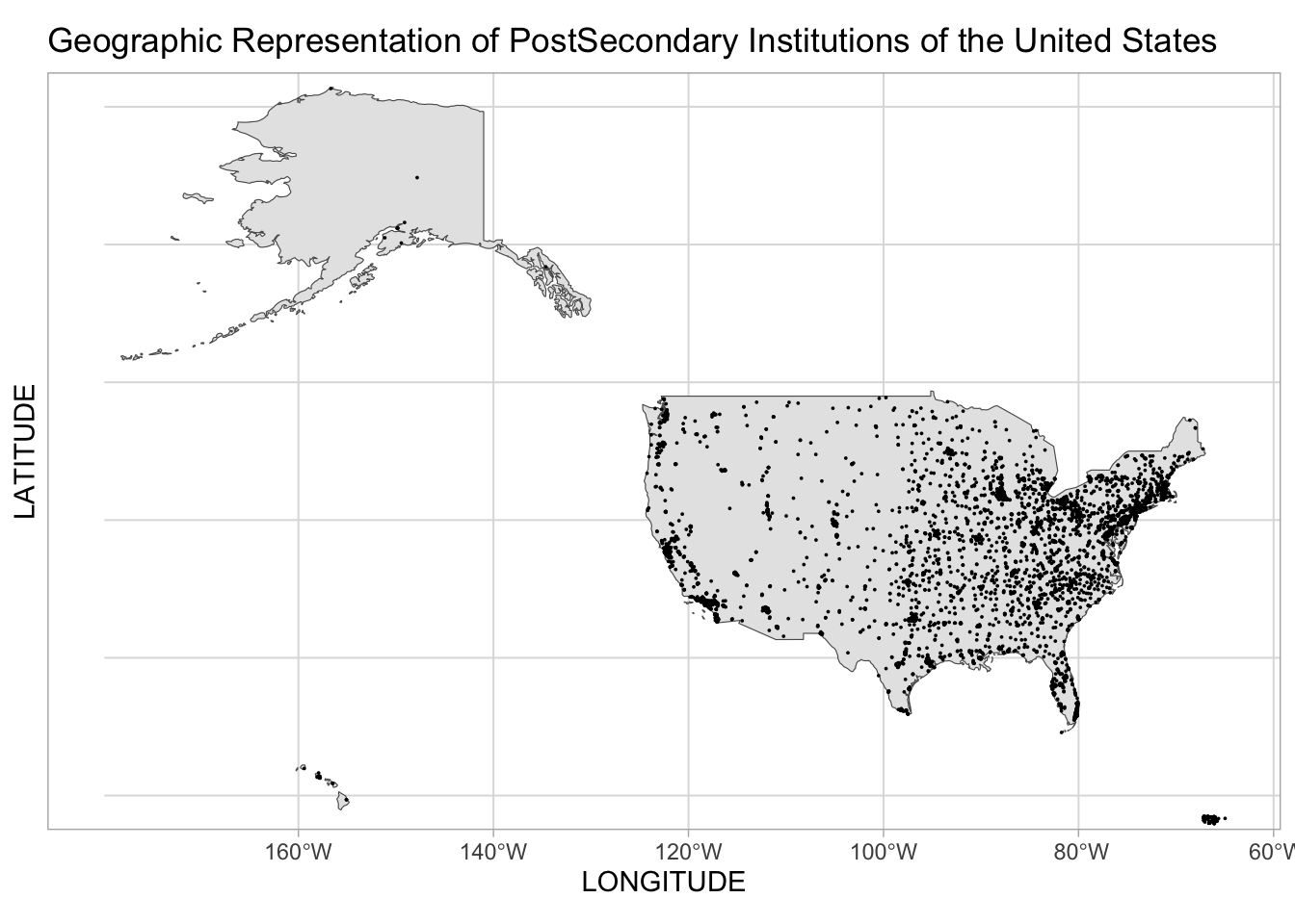
The project subset contains all U.S. states, territories and protectorates, to allow for comparison of the entire U.S. to further subsetting of regions of the U.S. For the remainder of the project analysis and data visualization, the project subset will contain only observations (institutions) located within the contiguous U.S.
It’s great to see all the postsecondary institutions plotted for all of the USA, but the persepctive of the map is askew due to the actual size of Alaska, which is accurately depicted in this map, unlike most maps of the image of Alaska that is much smaller than its actual size. To view the lion’s share of the postsecondary institutions in the US, which are located within the contiguous US, the maps used going forward in this project will only include the states of the contiguous US, to maintain perspective in mapping, and allow better viewing of the plots of the contiguous US.
# Code for # of institutions outside contiguous US
US_outside_contiguous_states<-subset(ss_subsetmap_pell, ST_FIPS %in% c(2,15,60,64,66,69,70,72,78))
US_outside_contiguous_states#Print count of postsecondary institutions outside of contiguous states that are a part of the US.156 postsecondary institutions exist outside the contiguous US of the original 6543 institutions. States and territories outside of the contiguous United States that have been removed from the subset include Alaska, Hawaii, American Samoa, Federated States of Micronesia,Guam,Northern Mariana Islands,Palau,Puerto Rico,and US Virgin Islands.
The number of postsecondary institutions outside of the contiguous US is relatively small in number compared to the number within the contiguous US, so we will reduce our dataset and mapping to include only the states that make up the contiguous US. Reducing the dataset to the contiguous US allows us to maintain perspective when mapping the contiguous states, and also allows our analysis and visualization to focus upon the lion’s share of the postsecondary institutions of the US. (Going forward, we can look at Alaska, Hawaii and Puerto Rico individually if we choose). Viewing specific subregions of the U.S. is outside the scope of this project, although worth of study.
Create Subset that Provides only Contiguous US states’ data & Tidy Subset Based on Specific Variables Used
Going forward in this project, the subset will include only states within the contiguous US (ie: not Alaska, not Hawaii, not territories or protectorates)
contiguous_us_map<-subset(ss_subsetmap_pell, ST_FIPS %in% c(1,4,5,6,8,9,10,11,13,15,16,17,18,19,20,21,22,23,24,25,26,27,28,29,30,31,32,33,34,35,36,37,38,39,40,41,42,44,45,46,47,48,49,50,51,53,54,55,56))
contiguous_us_mapContiguous US subset contains 5098 observations, or postsecondary institutions.
Let’s take a closer look at the US map - focusing on the contiguous states:
ggplot()+
geom_sf(data = usa)+
theme_light() +
geom_point(data = contiguous_us_map, aes(x = LONGITUDE, y = LATITUDE), pch = 19, size=0.00005)+
coord_sf(xlim = c(-125, -69),
ylim = c(20, 50))+
ggtitle("Contiguous US Postsecondary Institutions")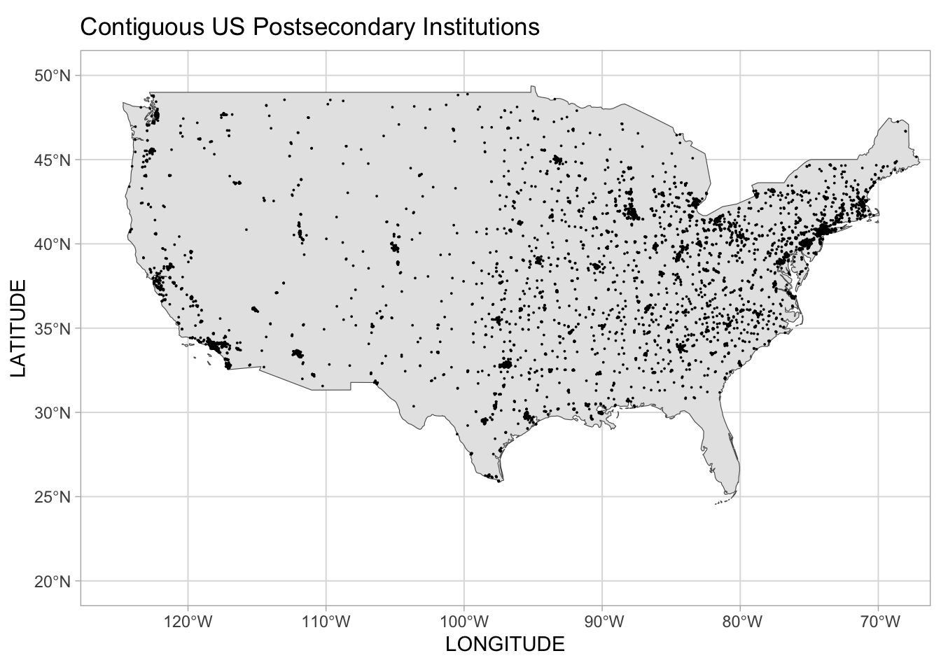
Many interesting observations are possible of the map plotting of the US institutions that have latitude and longitude coordinate information within the data subset and are within the contiguous US states. The contiguous US map provides greater clarity in viewing the smaller regions and states overall, while viewing the contiguous states together. We see postsecondary institutions tend to be located in areas of higher population density (ie: northeast US, and metropolitan areas across the contiguous US). The locations also follow the historic patterns of settlement by the peoples who arrived in the post-Columbian time period: generally, settlement from east to west, although west coast and southern settlement preceded some or all of the migration east to west.
Among many observations to be made of the map of the contiguous United States, I am reminded of the struggles to pursue higher education by low socioeconomic status and rural students due to limited accessibility to postsecondary institutions in some areas of the United States, as well as the distance that may exist between a student’s college of choice and their home locale. Given the necessity (and costs) to travel and/or relocate to be physically present at an institution of the student’s choosing outside of the locale where they have lived with their family, low socioeconomic status students’ and rural students’ obstacles to pursue postsecondary education become more evident in viewing the map and the locations of postsecondary institutions. Federal student financial aid allows use of the federal student financial aid funding for travel to and from their postsecondary institution. However, given the small amount of the Pell grant, sometimes the only student financial that need not be paid back, many students may have to use student loans or their limited student earnings to fund this travel - which can also become prohibitive in amount when travel involves airline flights, etc. Some well-funded private institutions provide travel funding within their institutional financial aid packages (in addition to any federal financial aid a student may be awarded), which can be essential to low socioeconomic students who attend institutions outside of their immediate locale. For some students, the institution where they enroll may not be of their choosing for any reason other than due to its proximity to the locale where they were raised. Student access to postsecondary education includes many factors, of which proximity to the institution and high travel costs are some.
To graph the contiguous US postsecondary institutions, we’ll add 2 more variables along with the proportion of Pell students, so we’ll remove the NAs for the 2 variables we’re adding before we graph:
#remove rows with NA value in 'PCTPELL' 'CONTROL' & UGDS' columns for graphing these two variables
ss_pell_control<-contiguous_us_map%>%
filter_at(vars(PCTPELL, CONTROL, UGDS), all_vars(!is.na(.)))
ss_pell_controlAfter removing NAs from 2 additional variables to be used in the next graph we plot, [PCTPELL (Proportion of Students who receive Pell grants), CONTROL (Ownership/organization/control of institution: 1. Public, 2. Private, 3. For Profit), UGDS (count of undergraduate students enrolled at institution)], the remaining observations in the graph subset is a count of 5098 observations, or 5098 postsecondary institutions.
Initially, we’ll use a bar graph to visualize the postsecondary institutions. Why a bar plot? We can quickly and easily see a variety of characteristics of the institutions in plotting a bar plot using the variables of the institutions such as count of enrolled undergraduates and whether the institution is public, private or for profit. In this bar plot, we suppress the institution’s name on the x-axis to avoid unintelligible labels, due to the volume of institutions plotted, which would cause overlapping and garbled institutional names. The institutional names are not the focus in this plot, so we suppress them. We are looking at the array of institutions: the sheer number of institutions, their undergraduate enrollment, and their organizational type: public, private or for profit.
Barplot of the Count of Enrolled Undergraduate Students at Postsecondary Institutions in the Contiguous United States
# Bar plot of UGDS
ggplot(contiguous_us_map, aes(x=UNITID, y=UGDS, color=CONTROL)) +
geom_bar(stat = "identity")+
xlim(95000,250000)+
labs(title = "Undergraduate Student Population by Type of Institution", y = "Count of Enrolled Undergraduate Students Enrolled", x = "Postsecondary Institutions in the Contiguous United States",subtitle = "Data set(U.S. Dept of Ed Student Scorecard)")+
theme(axis.text.x=element_text(angle=0))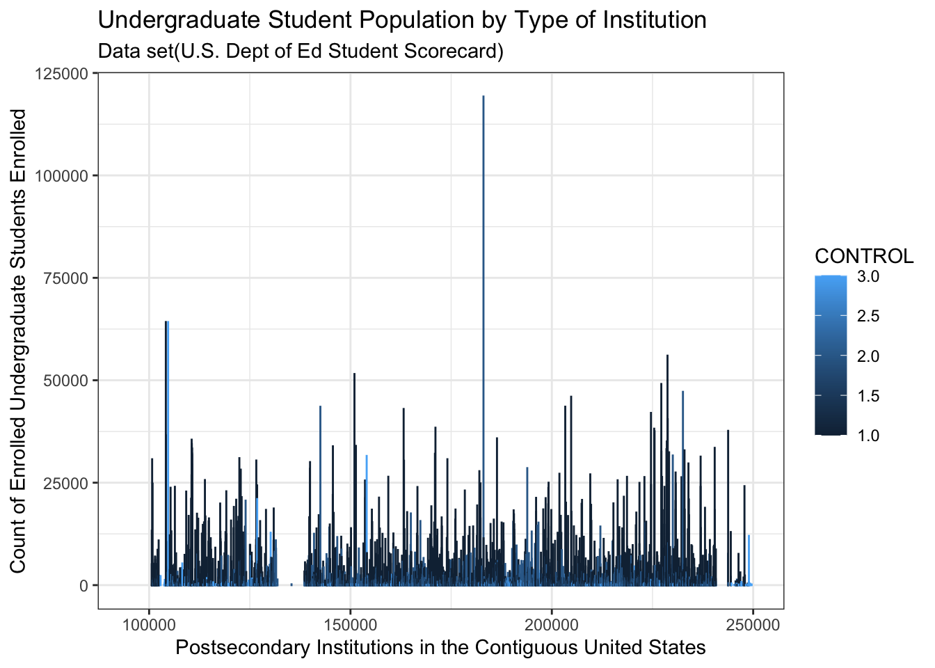
(Because the x-axis is plotting unit identification numbers, after much trial and error, it seems there is a gap in the identification numbering system, versus a plotting error). I would venture that most people in the US do not realize the actual number of postsecondary institutions that exist in their country, and may typically think only of the colleges and universities most familiar to them because of their proximity to those campuses, or because of some other affiliation such as collegiate sports teams. This barplot lays out the volume, and size by enrollment, of institutions - quickly and with impact. Again, the map of the entire US was also impactful, but due to space constraints in map presentation due to the span of longitude involved, a map of the contiguous US can be more meaningful to view. Ideally, differentiating the size of the institutions indicated by undergraduate enrollment with bubble plot features on the contiguous US map would have been a great data visualization, yet with the concentration of postsecondary institutions within areas such as the northeast region of the US, an unclear map will result due to plots overlapping. (Again, examining individual regions of the US is beyond the scope of this project). The barplot provides a quick and clear view of size by enrollment and type of institution of the entire contiguous US.
Now that we’ve visualized a general overview of the geographic dispersion of postsecondary institutions, as well as the number, size by enrollment, and type of institutions in the US, let’s move on to looking at some student population characteristics of the institutions - specifically, Students Who Receive Pell Grants
Histogram of the count of postsecondary institutions in the contiguous United States illustrating the distribution of the proportion of students receiving Pell Grants:
# histogram plot of PCT PELL
histogram_pell <- contiguous_us_map %>%
filter(PCTPELL>0) %>%
ggplot( aes(x=PCTPELL)) +
geom_histogram( binwidth=.005, fill="#69b3a2", color="#e9ecef", alpha=0.9) +
ggtitle("Bin size = 15") +
labs(title = "Distribution of the Proportion of Students receiving Pell Grants Across All Postsecondary Institutions", y = "Count of Enrolled Undergraduate Students", x = "Proportion of Enrolled Students Who Receive Pell Grants",subtitle = "Data set:U.S. Dept of Ed Student Scorecard")+
theme(axis.text.x=element_blank())
histogram_pell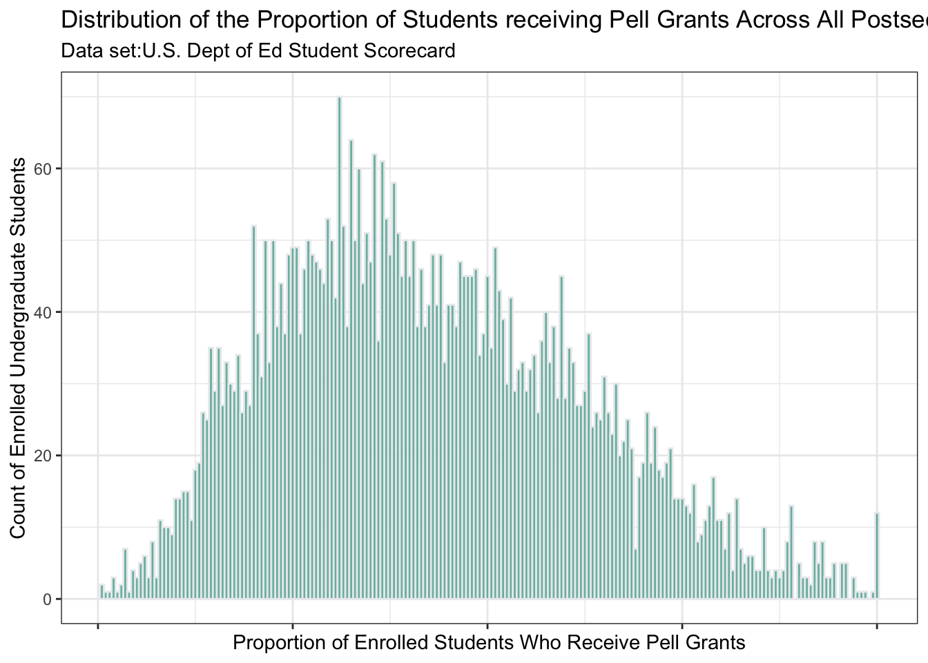
This histogram shows the size of the student populations of institutions on a spectrum of the percentage of Pell grant recipients of the institutions plotted. (The histogram is not showing the count of students receiving Pell grants across all institutions).We can see the student populations get smaller as the percent of Pell grant recipients increases to 100%. In this plot, the lower the percent of students who receive Pell grants, the larger the overall student enrollment population. As the student populations of campuses become smaller, the percentage of students who receive Pell grants do not necessarily reduce.
So, we see a number of postsecondary institutions in the contiguous US with a 100% proportion of students who receive Pell grants. How many exist, and what are the names, locations and types of institutions?
List of postsecondary institutions in the contiguous US with a 1.0 proportion of students who receive Pell grants.
ss_pell_all <- contiguous_us_map%>%
filter(PCTPELL==1.0)
print(ss_pell_all)# A tibble: 12 × 13
UNITID INSTNM CITY STABBR CURROPER HIGHDEG CONTROL LATITUDE LONGITUDE
<dbl> <chr> <chr> <chr> <dbl> <dbl> <dbl> <dbl> <dbl>
1 369686 Northwest Ed… Hous… TX 1 1 3 29.8 -95.5
2 373456 Blalock's Pr… Shre… LA 1 1 3 32.4 -93.8
3 377193 UCAS Univers… San … TX 1 1 3 29.4 -98.5
4 430795 Carver Caree… Char… WV 1 2 1 38.3 -81.6
5 451307 The Salon Pr… Batt… MI 1 1 3 42.3 -85.2
6 457192 Washington B… Litt… AR 1 1 3 34.7 -92.3
7 476559 Vogue Colleg… San … TX 1 1 3 29.5 -98.6
8 480693 Columbia Ins… Silv… MD 1 1 3 39.1 -77.1
9 481571 Belle Academ… Wate… CT 1 1 3 41.6 -73.1
10 483948 Bos-Man's Ba… Shre… LA 1 1 3 32.4 -93.8
11 495165 Royal Learni… New … NY 1 1 3 40.7 -74.0
12 496663 Riggins Urba… San … CA 1 1 3 32.7 -117.
# ℹ 4 more variables: ST_FIPS <chr>, UGDS <dbl>, PCTPELL <dbl>,
# ENDOWBEGIN <dbl>We see 12 postsecondary institutions whose proportion of students who receive Pell grants is 100%. Eleven of these institutions are for-profit (“3” value in the CONTROL variable column), and the one institution that is not for-profit (“1” in CONTROL) is located in West Virginia.
Endowment Fund Balances of Institutions with Proportion of More Than .75 of Enrolled Students Receiving Pell Grants
#remove rows with NA value in 'ENDOWBEGINL' 'CONTROL' & UGDS' columns for graphing these two variables
ss_pell_endow<-contiguous_us_map%>%
filter_at(vars(ENDOWBEGIN, CONTROL, UGDS), all_vars(!is.na(.)))
ss_pell_endowss_pell_75 <- ss_pell_endow%>%
filter(PCTPELL>.75)
print(ss_pell_75)# A tibble: 24 × 13
UNITID INSTNM CITY STABBR CURROPER HIGHDEG CONTROL LATITUDE LONGITUDE
<dbl> <chr> <chr> <chr> <dbl> <dbl> <dbl> <dbl> <dbl>
1 100690 Amridge Univ… Mont… AL 1 4 2 32.4 -86.2
2 101675 Miles College Fair… AL 1 3 2 33.5 -86.9
3 106546 Baptist Heal… Litt… AR 1 2 2 34.7 -92.4
4 107600 Philander Sm… Litt… AR 1 3 2 34.7 -92.3
5 139719 Fort Valley … Fort… GA 1 4 1 32.5 -83.9
6 140720 Paine College Augu… GA 1 3 2 33.5 -82.0
7 156295 Berea College Berea KY 1 3 2 37.6 -84.3
8 158802 Dillard Univ… New … LA 1 3 2 30.0 -90.1
9 159009 Grambling St… Gram… LA 1 4 1 32.5 -92.7
10 176318 Rust College Holl… MS 1 3 2 34.8 -89.4
# ℹ 14 more rows
# ℹ 4 more variables: ST_FIPS <chr>, UGDS <dbl>, PCTPELL <dbl>,
# ENDOWBEGIN <dbl>The one private institution has a relatively sizeable beginning endowment fund balance of 1,222,167,100 is Berea College located in Berea, Kentucky. This institution is well-known for serving low SES students, and has a very well known professor named bell hooks (she does not capitalize her name).
ss_pell_75 <- contiguous_us_map%>%
filter(PCTPELL>.75)%>%
ggplot(., aes(x=PCTPELL, y=ENDOWBEGIN, color=CONTROL)) +
geom_bar(stat = "identity")+
labs(title = "Endowment Fund Beginning Balance by Type of Institution: Public or Private", y = "Endowment Fund Beginning Balance", x = "Postsecondary Institutions in the Contiguous United States",subtitle = "Data set(U.S. Dept of Ed Student Scorecard)")+
theme(axis.text.x=element_text(angle=0))
ss_pell_75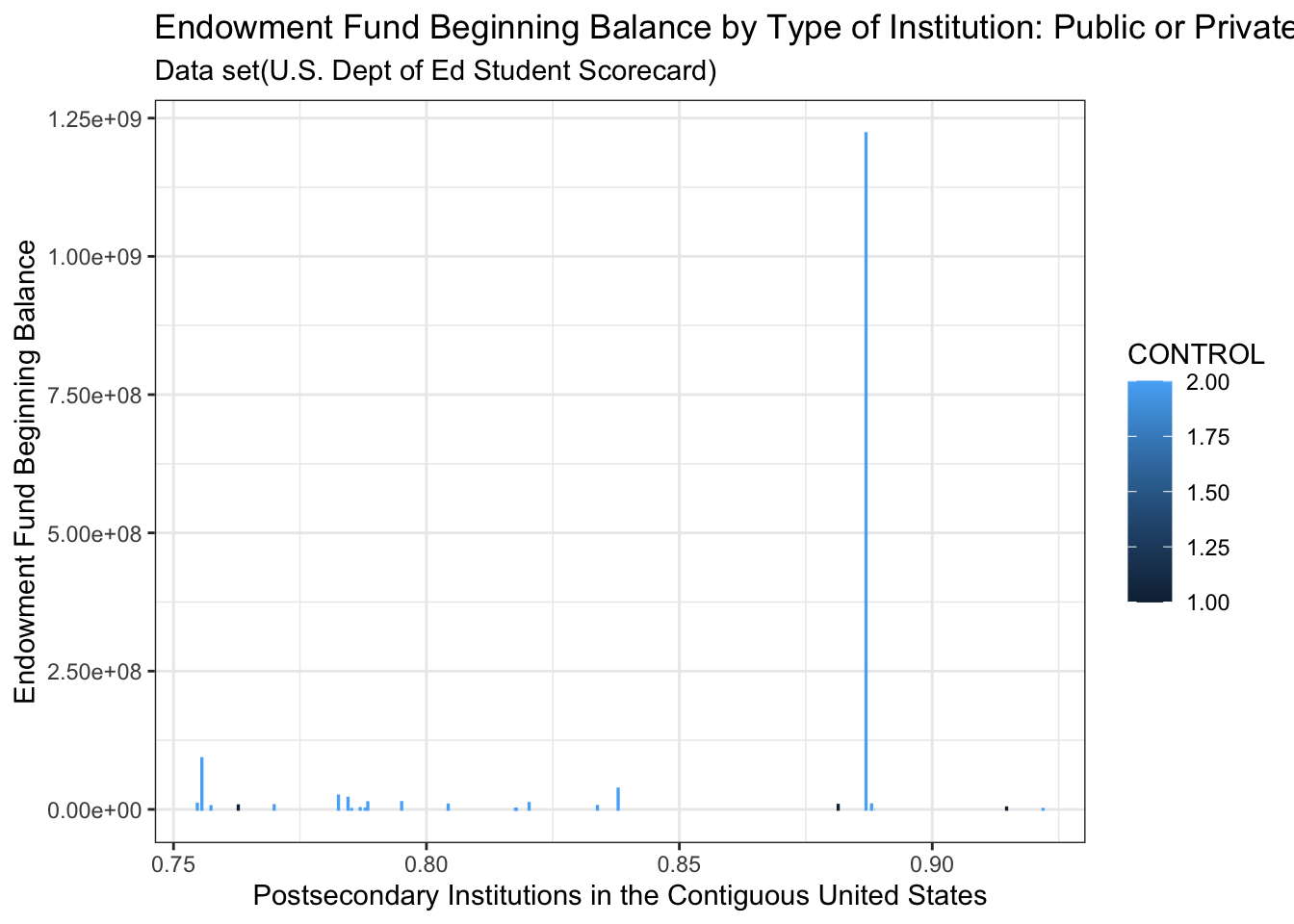
No For-Profit institutions have endowment fund balances if their enrolled student population has more than a .75 proportion of students receive Pell grants. Only one private institution has a relatively sizeable beginning endowment fund balance, and it has close to .90 proportion of students receiving Pell grants. We will now see the list of institutions that this graph represents….
Boxplot of Institutions by Public, Private or For Profit Showing Concentration of Enrolled Student Populations
contiguous_us_map%>%
filter(UGDS<50000 & UGDS >0)%>%
ggplot(aes(x=as.factor(CONTROL), y=UGDS)) +
geom_boxplot ()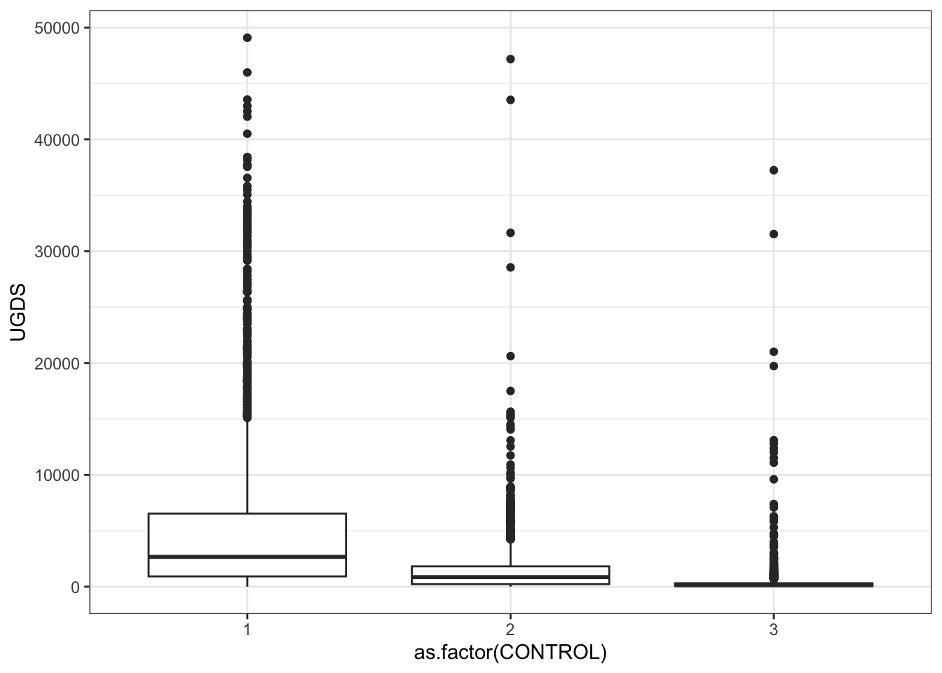
Public, private non-profit, and private for-profit institutions are plotted in this barplot graph with their respective student populations. The private for-profit line near the bottom of the graph indicates the enrolled undergraduate student populations tend to be smaller than the other two types of institutions, and the largest of for-profit institutions is between 35,000 to 40,000 students, with the bulk of the student populations being near the bottom where the horizontal line lies above the # 3 on the x-axis. Private non-profit institutions, denoted by the 2 on the x-axis, has a slightly varied distribution of the student populations of most of its institution, creating a thin, rectangular box near the bottom of the graph above the # 2. The largest student populations of private non-profits lie near 45,000 - just hovering below and above the 45,000 mark. Public institutions have the widest distribution of student populations, going beyond the scope of this graph. The scope of the graph was reduced to 50,000 to make the visual more meaningful, as the number of institutions with student populations above 50,000 was not significant. The wider rectangular box above the # 1 on the x-axis indicates the slightly wider distribution of the greater concentration of the public institutions’ student populations, and like private non-profits and private for-profits, is below 10,000 students.
Curiosity and full transparency propels the need to see a list of the institutions with greater than 50,000 students, of which there are 8 institutions. To maintain graph perspective, institutions with over 50,000 students will not be featured in graphs, so we will view them in this list.
List of postsecondary institutions with a count of enrolled undergraduates of more than 50,000
ss_ugds <- contiguous_us_map%>%
filter(UGDS>50000)
print(ss_ugds)# A tibble: 8 × 13
UNITID INSTNM CITY STABBR CURROPER HIGHDEG CONTROL LATITUDE LONGITUDE ST_FIPS
<dbl> <chr> <chr> <chr> <dbl> <dbl> <dbl> <dbl> <dbl> <chr>
1 104151 Arizo… Tempe AZ 1 4 1 33.4 -112. 4
2 104717 Grand… Phoe… AZ 1 4 3 33.5 -112. 4
3 150987 Ivy T… Indi… IN 1 2 1 39.8 -86.2 18
4 183026 South… Manc… NH 1 4 2 43.0 -71.5 33
5 228723 Texas… Coll… TX 1 4 1 30.6 -96.3 48
6 433387 Weste… Salt… UT 1 4 2 40.7 -112. 49
7 484613 Unive… Phoe… AZ 1 4 3 33.4 -112. 4
8 495767 The P… Univ… PA 1 4 1 40.8 -77.9 42
# ℹ 3 more variables: UGDS <dbl>, PCTPELL <dbl>, ENDOWBEGIN <dbl>The tibble lists 8 postsecondary institutions with a count of enrolled undergraduates of more than 50,000. 2 of these institutions are for-profit, and grant baccalaureate and graduate degrees. 2 of these postsecondary institutions are private, non-profit institutions and grant baccalaureate and graduate degrees. 4 of these institutions are public, with 3 granting and grant baccalaureate and graduate degrees and only 1 public institution granting degrees of 2 years or less and/or certificates.
Bar Plot: All postsecondary institutions in the contiguous United States by count of enrolled undergraduates with Public/Private/For-Profit Shown by Color Shade
barplot_all<-contiguous_us_map%>%
filter(UGDS<50000)%>%
ggplot(., aes(x=INSTNM,y=UGDS, fill=CONTROL)) +
geom_bar(stat = "identity")+
labs(title = "Undergraduate Student Population by Type of Institution", y = "Count of Undergraduate Students Enrolled", x = "Institutions",subtitle = "Data set: U.S. Dept of Education College Scorecard)")+
theme(axis.text.x=element_blank())
barplot_all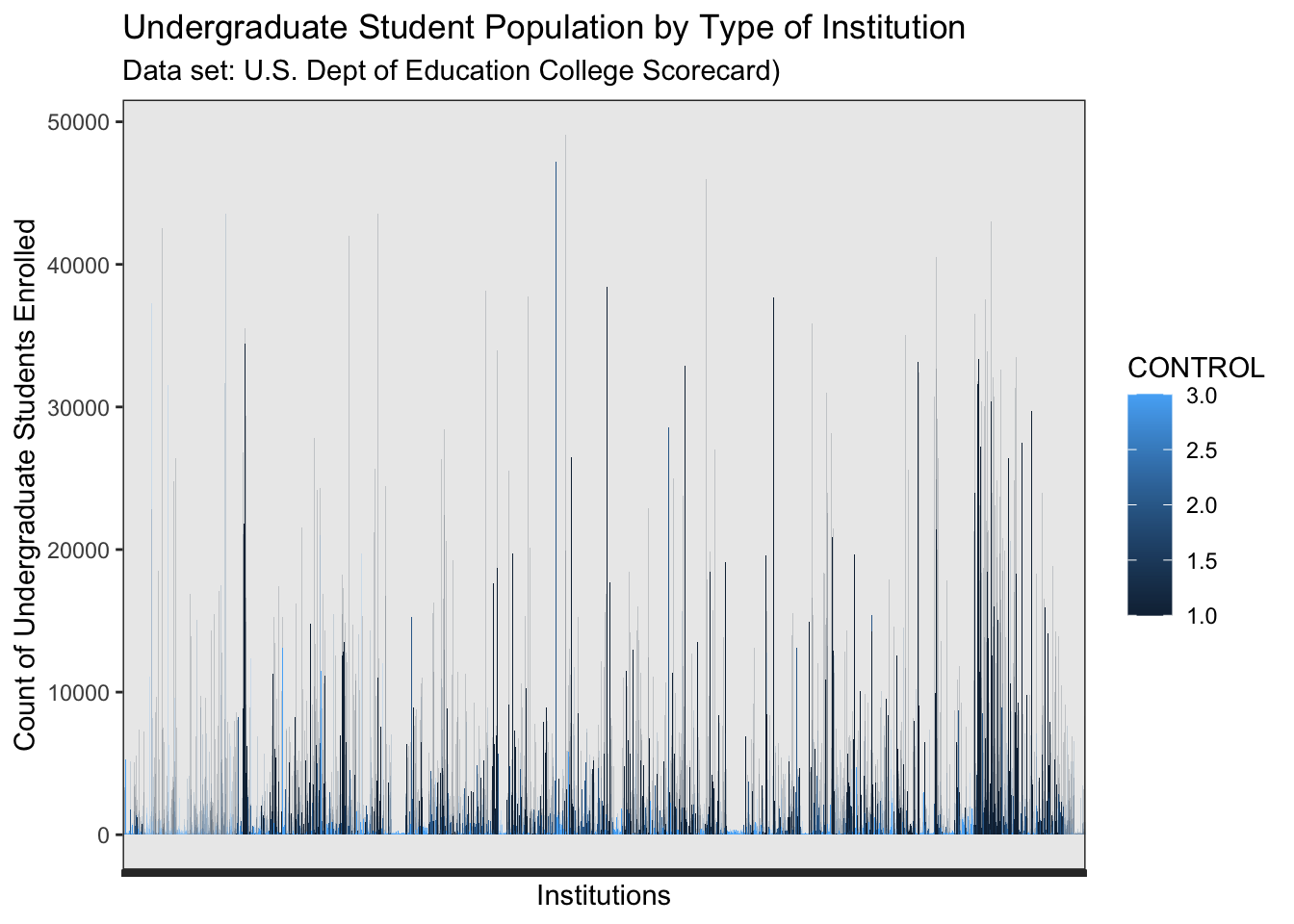
Denoted by the almost black-blue bars, we see that most enrolled undergraduates in the contiguous United States attend public institutions. Color of the bar indicates the individual institutions’ type of control: public, private or for-profit (see key to right of graph for shading levels). As the shade approaches medium blue, private institutions in the contiguous US are represented. The very lightest blue bars, are for-profit institutions.
What do we glean from this graph?
The distribution of the three types of institutions (public, private, for-profit) are distributed throughout the graph, with the largest institutions in terms of enrolled student undergraduate populations appear to be public institutions.For profit institutions appear to be the smallest, with light blue bars appearing closest to the x-axis, signifying student populations well under 25,000. The medium blue bars represent private institutions and hover midway up in comparison to the public institutions and below. This is a quick and easy view to understand that public institutions tend to be larger, private institutions are less large and for-profit institutions tend to be smallest in terms of enrolled student populations.
Bar Plot of All Postsecondary Institutions in the Contiguous United States Showing the Count of Enrolled Undergraduates and Institutions by Proportion of Students Who Receive Pell Grants
ggplot(contiguous_us_map, aes(x=PCTPELL,y=UGDS, color=CONTROL)) +
geom_bar(stat = "identity")+
labs(title = "Undergraduate Student Population by Type of Institution", y = "Count of Undergraduate Students Enrolled", x = "Percentage of Students Received Pell Grants",subtitle = "Data set(U.S. Dept of Ed Student Scorecard)")+
theme(axis.text.x=element_text(angle=0))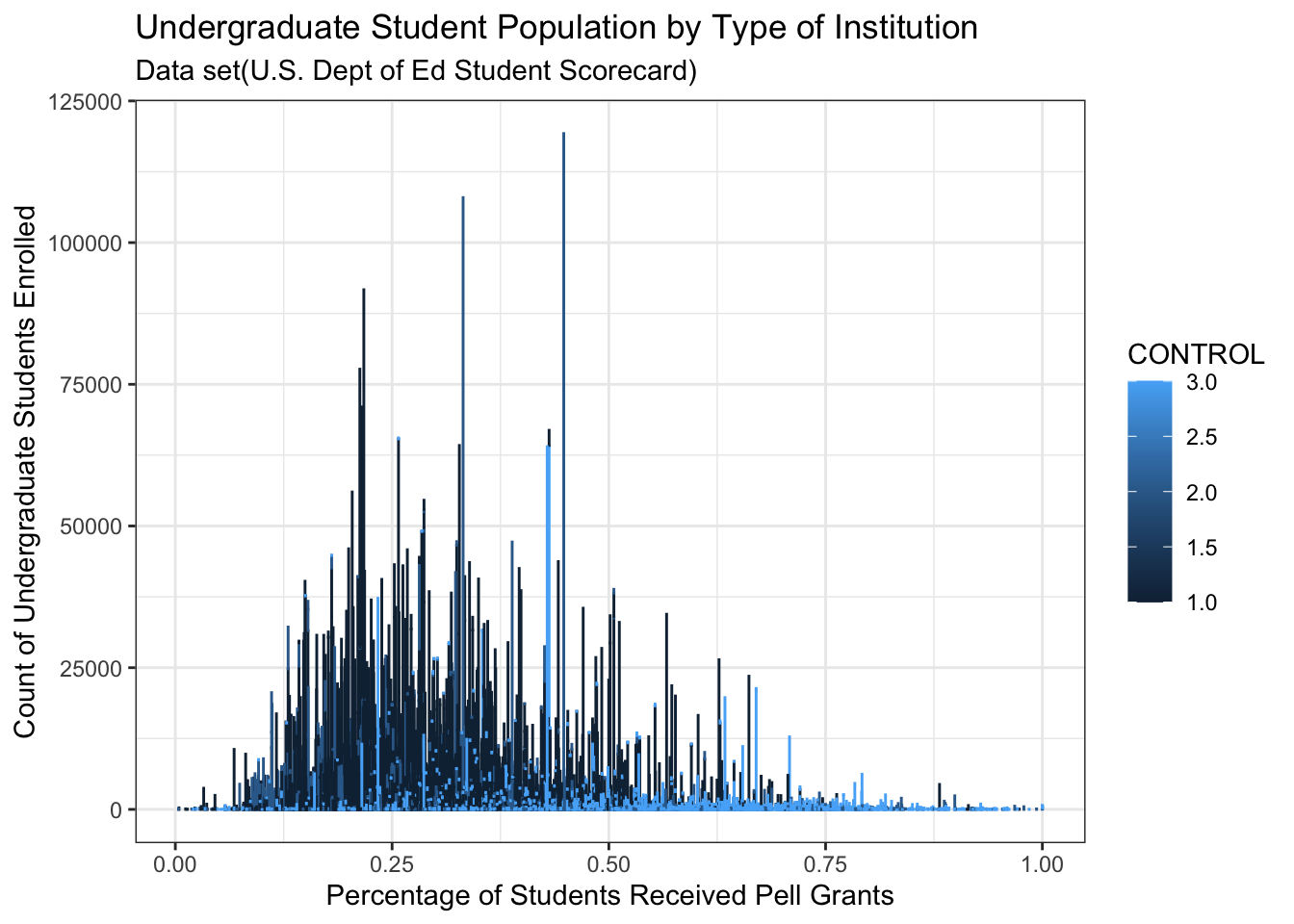
As the percentage of students who receive Pell grants goes up above 50%, 1) smaller student populations exist, and 2) fewer institutions appear. The concentration of public institutions lie to the left of the .75 proportion of students receiving Pell grants, while the concentration of for-profit institutions lie to the right of .50 proportion of students receiving Pell grants. Private institutions seem to lie amidst the distribution of the public institutions or lower in proportion levels.
We see the barplot depicts the ownership of postsecondary institutions by count of total enrolled undergraduates and the proportion of students who receive Pell grants at those postsecondary institutions in the contiguous US. The count of undergraduates who receive Pell grants at these institutions is not depicted in the graph. Rather, the bars depicting the count of enrolled undergraduates represents an indication of the undergraduate populations of the institutions.Small institutions also have less than 50% of students who receive Pell grants. As the percent of students who receive Pell grants increases towards 100%, the control of the institutions continue to include all three types (Public, private, for-profit), although as the proportion appears to increase past 60%, more of the institutions are for-profit than not. Most public institutions have a proportion of students of less than 75% who receive Pell grants, although some public institutions do appear above the 75% mark. For-profit institutions seem to make up more of the institutions with student populations with more than 50% of the students receiving Pell grants.
Focus upon Percentage of Students Who Received Pell Grants making up >65% of undergraduate student count
contiguous_us_map_65<-contiguous_us_map%>%
filter(PCTPELL>.65)%>%
ggplot(.,aes(x=PCTPELL,y=UGDS, color=CONTROL)) +
geom_bar(stat = "identity")+
labs(title = "Undergraduate Student Population by Type of Institution: Institutions with 65% to 100% Students Who Receive Pell Grants", y = "Count of Undergraduate Students Enrolled", x = "Percentage of Students Received Pell Grants",subtitle = "Data set: U.S. Dept. of Education Student Scorecard")+
theme(axis.text.x=element_text(angle=0))
contiguous_us_map_65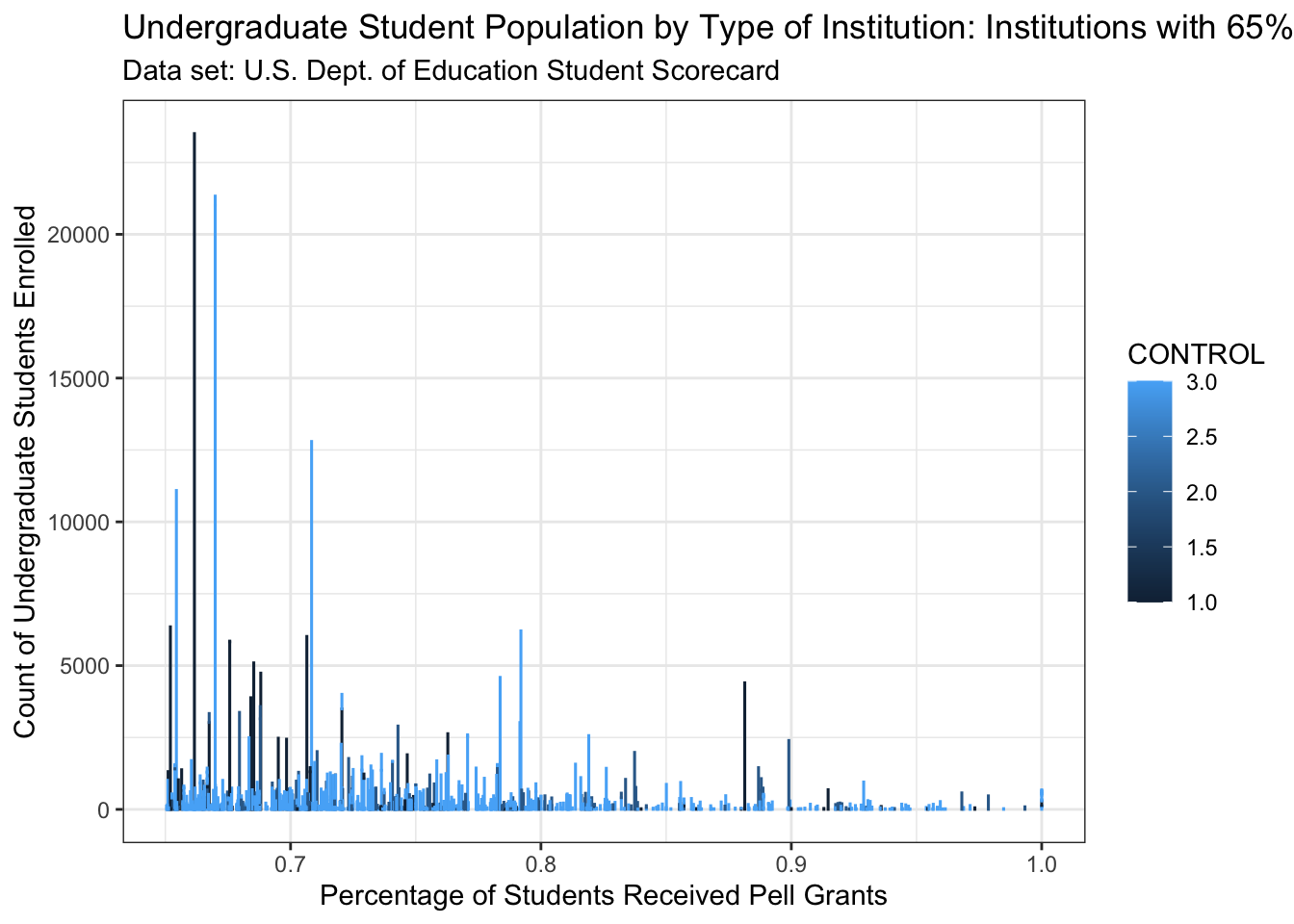
As the proportion of students receiving Pell grants increases, the size of the institutional student population becomes smaller overall.
What color of bars appear most frequently in the range where the proportion of students who receive Pell grants is more than 65%, in institutions with enrolled undergraduate counts of more than 0? I see mostly blue bars, which represented for-profit institutions, and more red bars below 75% than above 75%. Green bars appear to be more frequently seen below 90%. Let’s look at the range of 80-99% now. We saw the list of institutions that report 100% of students being recipients of Pell grants.
A Tighter Focus: Proportion of Students Who Received Pell Grants making up >80% of undergraduate student count
contiguous_us_map_80<-contiguous_us_map%>%
filter(PCTPELL>.80)%>%
ggplot(.,aes(x=PCTPELL,y=UGDS, color=CONTROL)) +
geom_bar(stat = "identity")+
labs(title = "Undergraduate Student Population by Type of Institution", y = "Count of Undergraduate Students Enrolled", x = "Proportion of Students Received Pell Grants", subtitle = "Data set: U.S. Dept of Ed Student Scorecard")+
theme(axis.text.x=element_text(angle=90))
contiguous_us_map_80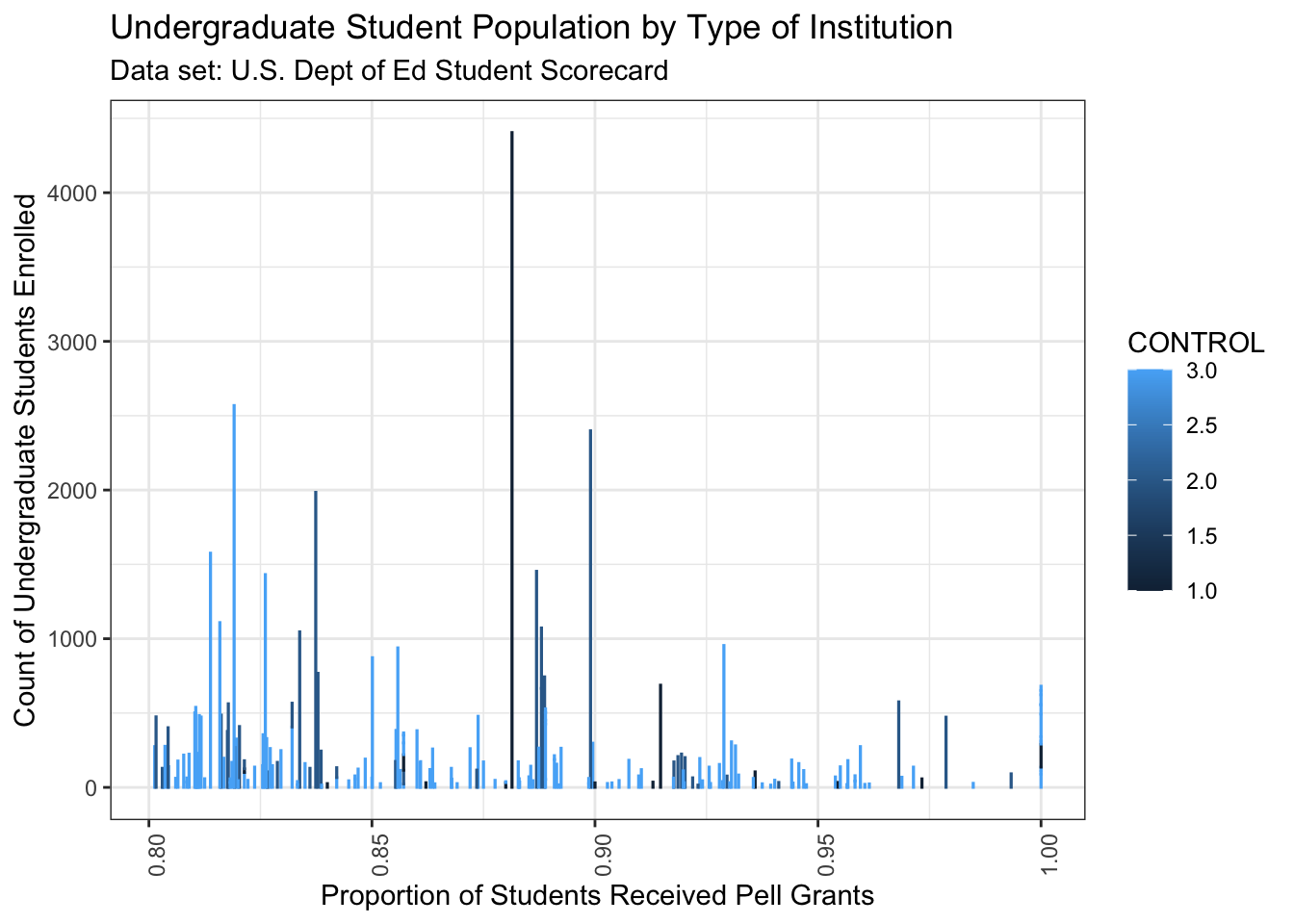
The scale of the institutional student population is now less than 5,000 students in this graph. Most institutional student populations are below 1000 students in this distribution more than 80% of students receiving Pell grants. We may conclude that institutions with high proportions of students receiving Pell grants tend to be less than 5000 students, and more likely are lowere than a count of 1000 students.
What shade of bars appear most frequently, in the range where the proportion of students who receive Pell grants is more than .80? Mostly light blue bars appear, which represent for-profit institutions. Several navy blue/balck shaded bars representing public institutions appear as the propportion nears approximately .86-.87, .91-.92, and a few more navy blue/black shaded bars are scattered above .90. Medium blue shaded bars, representing private non-profits appear throughout the range of 80-100%.
Bar Plot of the Type of Degrees Awarded by Institutions with 80% to 100% Students Who Receive Pell Grants by Organization Type (Public, Private, or For-Profit)
contiguous_us_map_80<-contiguous_us_map%>%
filter(PCTPELL>.80)%>%
ggplot(.,aes(x=CONTROL, y=UGDS, color=HIGHDEG)) +
geom_bar(stat = "identity")+
#scale_y_continuous(labels = scales::label_number())+
labs(title = "Undergraduate Student Population by Type of Institution: Certificate or Degree Awarding by Institutions with 80% to 100% Students Who Receive Pell Grants", y = "Count of Undergraduate Students Enrolled", x = "Type Of Institution: 1:Public, 2: Private, 3: For Profit",subtitle = "Data set: U.S. Dept. of Education Student Scorecard")+
theme(axis.text.x=element_text(angle=0))
contiguous_us_map_80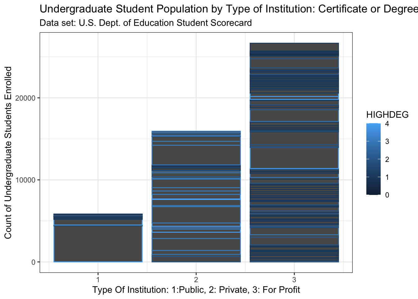
The bar plot graph depicts the number of undergraduate students enrolled at the three types of institutions with more than 80% of students receiving Pell grants and the type of degree granted by institution type (public, private, for-profit). With the lighter blue shades denoting degrees of 4 years or more, the graph tells us that for institutions with student populations with 80-100% percent Pell recipients, very few institutions award 4 year degrees or more. The type of certificate or degree awarded for these institutions lies in the 0 to 2 year range for all types of institutions.
Of the three types of institutions with more than 80% Pell recipient student populations, For-Profit institutions have the highest count of students who receive Pell grants. For-profit institutions have nearly four times the number of Pell grant students than the public institutions with more than 80% Pell grant students, and just under double the number of Pell grant students than the private institutions with more than 80% Pell grant students.
The highest degree awarded by the institutions is denoted by the dark to light shades of blue, with nearly black blue color being institutions awarding certificates and less than a 2 year degree,and lighter blue shades denoted as institutions awarding degrees of 3 and 4 years or more. For-profit institutions award more certificates and 2 year or less degree, with more enrolled undergraduates than public and private institutions in this group. It appears that Pell grant recipients tend to enroll with for-profit institutions that award certificates and 2 year or less degrees moreso than public and private institutions, when the student population has over 80% Pell grant recipients.
Now, let’s see the 80%-100% institutions plotted onto a map. Why look at a map of this? To see the geographic location of the institutions that have high percentages of students who receive Pell grants, and consider questions to pursue that may influence why certain institutions have these characteristics. Are the institutions in rural areas? Are the locations metropolitan? What states hold the most or least of these institutions? Why might that be?
#filter for student populations over 80% Pell recipients to then map in next code chunk
contiguous_us_map_80<-contiguous_us_map%>%
filter(PCTPELL>.80)
print(contiguous_us_map_80)# A tibble: 194 × 13
UNITID INSTNM CITY STABBR CURROPER HIGHDEG CONTROL LATITUDE LONGITUDE
<dbl> <chr> <chr> <chr> <dbl> <dbl> <dbl> <dbl> <dbl>
1 106546 Baptist Heal… Litt… AR 1 2 2 34.7 -92.4
2 107840 Shorter Coll… N Li… AR 1 2 2 34.8 -92.3
3 109730 Associated T… San … CA 1 1 3 32.8 -117.
4 140003 Gwinnett Col… Lilb… GA 1 2 3 33.9 -84.1
5 144883 East-West Un… Chic… IL 1 3 2 41.9 -87.6
6 150853 PJ's College… Clar… IN 1 1 3 38.3 -85.8
7 155353 Old Town Bar… Wich… KS 1 1 3 37.7 -97.3
8 156295 Berea College Berea KY 1 3 2 37.6 -84.3
9 156310 PJ's College… Bowl… KY 1 1 3 37.0 -86.5
10 156754 PJ's College… Glas… KY 1 1 3 37.0 -85.9
# ℹ 184 more rows
# ℹ 4 more variables: ST_FIPS <chr>, UGDS <dbl>, PCTPELL <dbl>,
# ENDOWBEGIN <dbl>Map of Institutions With Student Populations with > 80% of Students Receiving Pell Grants
ggplot()+
geom_sf(data = usa)+
theme_light() +
geom_point(data = contiguous_us_map_80, aes(x = LONGITUDE, y = LATITUDE), pch = 19, size=0.1, )+
coord_sf(xlim = c(-125, -69),
ylim = c(20, 50))+
ggtitle("Contiguous US institutions with more than 80% Pell Grant Recipients")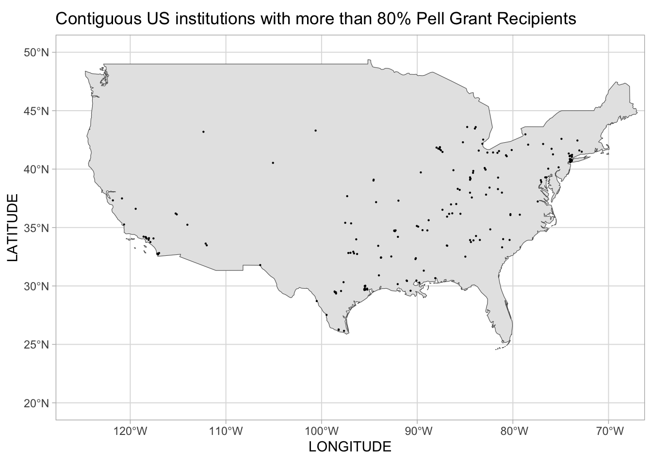
The institutions with 80-100% of their students receiving Pell grants tend to be located in the southern and eastern half of the contiguous US, from roughly eastern Texas flowing northeast to New York. Although some are located in California, Arizona, and sparsely throughout the Plains states and Rocky Mountain States, most of these institutions lie in a swath of the contiguous US from eastern Texas, Oklahoma, Louisiana and Arkansas moving eastward and northward to Ohio, Pennsylvania and New York, but excluding Florida.
The location of these institutions with high Pell grant recipient populations bring questions around the education policies of and educational funding by these states. Additional questions center around the state policies of these states directly related to supporting people of lower socioeconomic status. The existence of policies that lend to systemic racism and classism in these areas, that then leads to lower socioeconomic status, and thereby, potentially a higher prevalence of Pell grant recipients within these areas, seem to be important areas of inquiry, as well.
CONCLUSION and DISCUSSION
What characteristics of postsecondary institutions influence what institution low socioeconomic status (low SES) students choose to attend?
It seems a few characteristics seem to influence low SES students. For-profit institutions and institutions offering certificates and degrees of fewer than 4 years seem to be chosen by low SES students. Few institutions of these two characteristics have endowment fund balances of size. Many for-profit institutions offer only certificates and degrees of fewer than 4 years.
Do low SES students tend to enroll at public, private or for-profit institutions?
Low SES Students tend to enroll at all three types of institutions. Accurate total counts of Pell grant recipients (students) are not readily available to indicate the counts of Pell recipients by public, private and for-profit institutions, but could be approximated with multiplying each institution’s population by their own institution’s proportion of Pell grant recipients and total for the data subset. More reliable counts are likely avaialble in other US Dept of Education datasets, and would be pursued for a more reliable count.
Do low SES students tend to enroll in postsecondary institutions that primarily offer certificate programs, associate’s degrees, or baccalaureate degrees?
As seen in the bar plot of enrolled undergraduates by institutions type, Low SES students tend to enroll in for-profit institutions that tend to award cerificates and less than 4 year degrees.
Do low SES students attend institutions that are well-funded, indicated by large endowment fund balances, with the resources possible to augment the small federal Pell grant and avoid student loan borrowing?
Low SES students tend to enroll with institutions will little or no endowment fund balances, as seen in the _______. A few exceptions exist, with one noteable institution in Kentucky, Berea College.
Like many experiences of study and exploration, this project’s conclusion suggests (and nearly demands) further analysis and research. To know more from the Student Scorecard about which postsecondary institutions have students from lower-income families, more variables of the Scorecard can be examined. These variables include:
Number of Title IV students (public institutions)
Number of Title IV students (private for-profit and nonprofit institutions) Average cost of attendance (academic year institutions) Net tuition revenue per full-time equivalent student The number of Title IV students will provide insight to how many students avail of US Federal funding, but it does not specify the exact type of federal financial aid the students obtained. Families of relative means can avail of federal student loans, a type of Title IV funds. The average cost of attendance can indicate the cost of the institution and the financial choice students chose in their college choice. Net tuition revenue per full-time equivalent student can provide some insight to the amount of tuition discount provided to students who attend that institution, but it does not differentiate among the various discounts provided to individual students through institutional grants or programs, or the reason for the discounted tuition, regardless of the socioeconomic status of the student.
Additional variables for review that impact the college student experience include:
Instructional expenditures per full-time equivalent student
Average faculty salary Proportion of faculty that is full-time
Test score requirements for admission
The College Scorecard allows one to deduce and infer information about what characteristics of postsecondary institutions influenced the groups of already enrolled students to choose to attend that particular institution. It does not provide information around the influences on an individual basis, nor does it provide information about the pre-enrollment decision-making influences of the student who chose that particular institution, nor what other institutions they were considering and for what reason. It does not tell us to which institutions the students applied to and were not accepted, or other institutions to which they were accepted and what, if any, student financial aid offers were made by other institutions (federal and/or institutional aid).
This dataset also does not provide adequate insight to students who are low SES and choose not to apply for federal student financial aid. Some students may not have the cultural and social capital around college pursuits to know how to obtain federal or institutional financial aid. They may have confounding reasons for not applying for aid, such as being a DACA student, having mitigating issues related to their parents providing information For these questions. The FAFSA, as well as the college admission testing services, can begin a process of sharing the student’s information with institutions that then influence the student’s decision-making. For students who do not take admission tests or do not complete the FAFSA prior to enrollment, some of the influence by postsecondary institutions is foregone - for good or ill, depending on one’s perspective of that information-sharing process. Additional federal datasets would be necessary to inform these queries, as well as qualitative data obtaining the insights of the individuals and their decision-making and actions taken towards college admission and college choice, which occurs prior to enrollment.
What has been found in the exploration of for-profit institutions, is that the information related to a student’s Pell grant elgibility is availble to all postsecondary institutions. Some for-profit institutions specfically pursue students with Pell grant eligibility. For students and student families unfamiliar and perhaps intimidated by the college-going experience, the marketing and “advising” efforts of the for-profit institutions can seem helpful and encouraging. A relationship of sorts can form with the “advisors” of the for-profit institution, which then begets enrollement by the student who is Pell grant eligible. That student may not have a complete understanding of the costs involved for education with the for-profit institution, nor the amount of loans involved in covering the tuition and living expenses that the Pell grant does not cover. The student enrolls with the for-profit institution with a very limited understanding of the educational experience ahead of them, and an obscured view of the financial implications, due in part to the marketing efforts that verge on predatory behavior. As we saw in the institutions that had more than 80% of student enrollment of Pell grant recipients, those institutions were for-profit. Exactly how and why this occurs is not revealed in this data, yet conjures signigicant questions about the for-profit institutions’ motives and tactics - and the potential damage to unsuspecting students who may not realize the game in play until they are tens of thousands of dollars in student loan debt. Should the profit for individuals (ie: privately owned for-profit institutions) be an outcome of one’s education towards a career? This is an on-going debate. I believe postsecondary education delivered without profit to an individual or organization is not only for the those pursuing scholarly endeavors in public or private non-profit graduate research universities, but also for low SES undergraduate students who may not be savvy about college-going and college funding.
For students who enroll with for-profit institutions, they “pay more for their education, drop out without completing their program, can’t find an in-field job after graduation, struggle to pay their student loan debt, or can’t transfer academic credits to reputable schools” (Masschusetts Office of the Attorney General, https://www.mass.gov/service-details/for-profit-school-advisory). For-profit institutions seem to hold influence with students of low socioeconomic status, and the relationship creates outcomes that are in direct conflict with the mission and objectives of most, if not all postsecondary institutions.
For those students who are included in this dataset, questions remain about their choice to attend the institution where they are enrolled. Was the campus close to home? Was it the most affordable of their choices? Was it their only choice (ie: did they only apply to one school?) Was it the least stressful option to the student in terms of the student’s family’s opinions about postsecondary education? Was it an institution that did not intimidate a first generation student and the student’s family? These questions cannot be answered with only quantitative data, like the Student Scorecard. Qualitative data in qualitative research studies must be involved to ascertain the individual perspective of students.
The College Scorecard does allow its user to pursue further questions with foundational information about the postsecondary institutions provided by the variables within the dataset. Given the College Scorecard’s large number of variables, examining the information within this dataset involves an exhaustive study with susbtantial performance of data analytics to explore the many factors of the known data, and is beyond this project. To truly begin to understand and obtain valid evidentiary conclusions, qualitative research must be performed to gain insight to the individuals intimately involved in the experience: the students. Qualitative research, using questions originating from examining the data of the Student Scorecard, can provide conclusions to the questions posed in the previous paragraph. Paired with qualitative research, which allows study of individual student perspectives, the Student Scorecard becomes a partner in a researcher’s powerhouse of data and individual student perspective.
REFERENCES
Center for Analysis of Postsecondary Education and Employment (2018).For Profit Colleges by the Numbers.https://capseecenter.org/research/by-the-numbers/for-profit-college-infographic/#
Grinnell College. n.d. Financial Aid and Cost of Attendance, Making a Grinnell education possible:Cost of Attendance https://www.grinnell.edu/admission/financial-aid/cost-attendance
Grolemund, G., & Wickham, H. (2017). R for Data Science. O’Reilly Media.
Massachusetts Office of the Attorney General. n.d., For-Profit School Advisory. https://www.mass.gov/service-details/for-profit-school-advisory
RStudio Team (2020). RStudio: Integrated Development for R. RStudio, PBC, Boston, MA URL http://www.rstudio.com/.
Cory Turner (2015-09-12). “President Obama’s New ‘College Scorecard’ Is A Torrent Of Data : NPR Ed”. NPR. https://www.npr.org/sections/ed/2015/09/12/439742485/president-obamas-new-college-scorecard-is-a-torrent-of-data
Cory Turner. “Obama’s New College Scorecard Adds New Dimension to Existing Rankings”. The Atlantic. 2015-09-15. https://www.theatlantic.com/education/archive/2015/09/obamas-new-college-scorecard-flips-the-focus-of-rankings/405379/
U.S Department of Education. (2023, April 25). College Scorecard:Most Recent Institution-Level Data. https://collegescorecard.ed.gov/data/
U.S Department of Education. (2023, April 25). College Scorecard: Data Dictionary. https://collegescorecard.ed.gov/data/documentation/
U.S Department of Education, Federal Student Aid. n.d., Complete the FAFSA Form. https://studentaid.gov/h/apply-for-aid/fafsa
U.S Department of Education, Federal Student Aid. n.d., Pell Grant. https://studentaid.gov/understand-aid/types/grants/pell
Yale University. n.d. Travel costs for students included in institutional financial aid awards: Understanding the Student Share. https://finaid.yale.edu/costs-affordability/understanding-student-share