library(tidyverse)
library(lubridate)
library(dygraphs)
library(ggplot2)
library(dplyr)
library(xts)
library(grid)
library(gridExtra)
library(htmltools)
library(viridis)
library(hrbrthemes)
library(gganimate)
library(extrafont)
library(plotly)
library(ggthemes)
library(leaflet)
library(animation)
library(cowplot)


knitr::opts_chunk$set(echo = TRUE, warning=FALSE, message=FALSE)Final Project: Susmita Madineni
final_Project
Global Internet users dataset from 1980-2020
Global Internet users dataset from 1980-2020
Introduction
The internet users have grown exponentially since the time of its inception in the late 1960s. It is one of the most transformative inventions of the modern times. In the early days, primarily scientists, researchers and academics used the internet to share information across on the collaborated projects. But, later on due to the technological advancements, many people started to use internet for various activities. It evolved into a platform that connects people from all over the world for various reasons. Here, with the help of the GlobalInternetUsers dataset which has the internet usage data of the world, I am excited to learn about the trends of the internet usage.
There are a number of factors that has contributed to the growth of internet, such as faster and more reliable connections, the development and increase in usage of smartphones and other mobile devices. Due to the internet’s increasing accessibility and user-friendliness, the usage has risen exponentially over the years.
Background
Internet usage has become an integral part of a person’s life today. From communication and entertainment to education and commerce, billions of people utilize the internet on a daily basis. As the internet continues to develop and new technologies are emerging, it is foreseen that its use will continue to grow and transform our way of living, working and interacting with the world.
Many organizations can benefit with the help of these data visualizations. For example,
Market research companies can understand consumer behavior, trends and preferences in different parts of the world.They can make informed decisions while marketing the products, in product development and target the suitable demographics.
Advertising agencies will be able to identify the most popular and effective advertising channels and strategize accordingly to reach their target audience.
E-commerce companies can also benefit from this. They can understand the customer behavior, trends and preferences in different parts of the world. It will help them create a better experience for their customers and offer targeted promotions and discounts.
Government agencies can use these to monitor the usage patterns and identify any potential security threats, gain insights to what the public wants and also understand the sentiment of the public regarding various issues.
Social media platforms can use it to understand trends and preferences and improve user satisfaction and engagement.
Educational institutions, can understand how students are using the internet for research and learning, and to develop more effective online education tools and platforms.
Research Questions
The dataset consists of country-wise internet users from 1980 to 2020. Each row in the dataset represents- for a particular country and an year, the mobile phone subscription per 100 people along with percentage of internet users using the internet, number of people using the internet and number of fixed broadband subscriptions per 100 people.
As part of this, I am investigating the following questions:
How the general trends of internet usage(via mobile phone and broadband subscriptions) has been over the years from 1980 to 1920 for the countries? Are we observing a general pattern of user growth based on the telecommunication mode?
What does the relationship between the mobile phone subscriptions and internet users looks like over the years? Are they strongly correlated to each other? Does increase in mobile phone subscriptions has an effect on the usage of the internet?
Similarly what does the relationship between the fixed broadband subscriptions and internet users looks like over the years? Are they strongly correlated to each other? Does increase in fixed broadband subscriptions has an effect on the usage of the internet?
What is the average number of people using different modes of internet connections and how is it varying from 1980 to 2020?
Which countries has the most number of internet users in the last 10 years? How much percentage population of internet users are being occupied by the top 10 countries?
Describing the data set
library(readr)
globalInternetUsers <- read_csv("C:/Users/SUSMITA/OneDrive/Documents/Spring23/Courses/DACSS_601/DACSS_601/posts/SusmitaMadineni_FinalProjectData/Final.csv")
This dataset consists of 227 countries internet usage data, where each row represents the mobile phone subscription per 100 people(Cellular Subscription) along with percentage of internet users using the internet(Internet Users(%)), number of people using the internet(No. of Internet Users) and number of fixed broadband subscriptions per 100 people(Broadband Subscription) for a particular country(Entity) and an year. The dataset has the above mentioned information from the year 1980 to 2020 for all the 227 countries.
Presenting the descriptive information of the dataset below:
#Previewing dimensions of the dataset before removing the observations where Entity = World and Upper middle income
dim(globalInternetUsers)
[1] 8867 8# removing the observations where World is considered as an Entity in the globalInternetUsers dataset
globalInternetUsers <- subset(globalInternetUsers, Entity != "World" & Entity != "Upper middle income")
# Preview the first few rows of the dataset
head(globalInternetUsers)# Understanding the dimensions of the dataset
dim(globalInternetUsers)[1] 8785 8# Identifying the column names of the dataset
colnames(globalInternetUsers)[1] "...1" "Entity" "Code"
[4] "Year" "Cellular Subscription" "Internet Users(%)"
[7] "No. of Internet Users" "Broadband Subscription"# Identifying unique values for column - entity
length(unique(globalInternetUsers$Entity))[1] 227# Identifying the data types of the columns
table(sapply(globalInternetUsers, function(x) typeof(x)))
character    double
2 6 sapply(globalInternetUsers, class) ...1 Entity Code
"numeric" "character" "character"
Year Cellular Subscription Internet Users(%)
"numeric" "numeric" "numeric"
No. of Internet Users Broadband Subscription
"numeric" "numeric" There are originally 8867 rows and 8 columns(“…1” , “Entity”, “Code”, “Year”, “Cellular Subscription”, “Internet Users(%)”, “No. of Internet Users”, “Broadband Subscription”) in total in the dataset. I have omitted the observations where World, Upper middle income is also considered as an Entity along with others. After removing the observations, where Entity = World, there are 8785 rows in total. There are 2 character datatype columns - “Entity”, “Code” and there are 6 numeric columns - “…1” , “Entity”, “Cellular Subscription”, “Internet Users(%)”, “No. of Internet Users”, “Broadband Subscription”.
Conducting the summary statistics of the dataset: especially showing the basic statistics (min, max, mean, median, etc.) for the variables I am interested in.
# Summary statistics of the datasets

summary(globalInternetUsers$`Cellular Subscription`)
Min. 1st Qu. Median Mean 3rd Qu. Max.
0.00 0.00 5.49 40.02 82.24 436.10 summary(globalInternetUsers$`Internet Users(%)`) Min. 1st Qu. Median Mean 3rd Qu. Max.
0.0000 0.0000 0.8482 17.0496 25.4070 100.0000 summary(globalInternetUsers$`No. of Internet Users`) Min. 1st Qu. Median Mean 3rd Qu. Max.
0.000e+00 0.000e+00 1.012e+04 5.823e+06 8.548e+05 1.003e+09 summary(globalInternetUsers$`Broadband Subscription`) Min. 1st Qu. Median Mean 3rd Qu. Max.
0.000 0.000 0.000 4.440 1.921 78.524 Based on the summary statistics, for the cellular subscription per 100 people, we can say that average is 40.02 with a maximum value as 436.10. The average value for the percentage of internet users is 17.0496% across all the years for the countries with a maximum value as 100%. The average value for the number of internet users is 5.823e+06 across all the years for the countries with a maximum value as 1.003e+09. The average value for the fixed Broadband Subscription per 100 people is 4.440 across all the years for the countries with a maximum value as 78.524.
Analysis and Plan for each Visualization
With the help of time series, the evolution of the variables can be studied through time. In this dataset, to understand general trends of the different modes of internet connection(mobile phones and broadband subscriptions) in the past 4 decades can be depicted using the time series visualization in R. With year on the X-axis and the different mode of internet connection on Y-axis, a person not from a technical background can also understand the visualization and can make accurate observations.We can plot the evolution using dygraphs package and build an interactive time series chart.
The data is tidy enough to conduct these visualizations. I have removed the unwanted observations where Entity is given as World, Upper middle income instead of a valid country name. There are no null data and outliers in the dataset, which makes it easy to use it for data analysis and visualization. I would perform mutations on the dataset to conduct the visualizations.
I would like to perform pivot on the dataset to visualize the general trends between different modes of internet connection throughout the years. I would use the pivot_longer to make it more readable and easy for analysis.
The relationship between the mobile phone subscriptions and internet users over the years can be visualized using scatterplot. As both are numeric columns, scatterplot is the best visualization to understand the correlation between the variables throughout the years.
To depict the correlation between the mobile phone subscriptions and internet users over the years, I would perform group_by() based on the year as every country’s data is recorded for all the years. I would then calculate the mean for the variables and visualize the data using a scatterplot and also display a trend line.
To understand the general trends between the number of internet users and different modes of internet connections across the years, progressive line chart showing different modes of internet connections would be a very good option.
Similaryly, the relationship between the fixed broadband subscriptions and internet users over the years can be visualized using scatterplot. Scatterplot is the best visualization to understand the correlation between the variables throughout the years, as both are numeric columns.
And I would depict the correlation between the fixed broadband subscriptions and internet users over the years, by performing group_by() based on the year as every country’s data is recorded for all the years. I would then calculate the mean for the variables and visualize the data using a scatterplot and show a trend line.
Progressive line charts would be a very good option to understand the general trends between the number of internet users and different modes of internet connections across the years. So, a line chart for broadband subscription really shows how the trend looks like.
Moreover with the use of interactive Choropleth map with leaflet package we can build an interactive map in R to understand the number of internet users across the world. The leaflet package allows us to build an interactive map.
Moreover, to understand the trends of average number of people using different modes of internet connections and how is it varying from 1980 to 2020 I will mutate the dataset. I will compute the number of people using different modes of internet connection and group the columns based on Year and perform pivot_longer on the mutated dataset.
For identifying the average number of internet users across all the countries in the past decade, and in the past 4 decades, I grouped the dataset based on country and code and performed the visualizations. I have used a bar chart to depict the top ten countries with most number of internet users in the past decade.
Visualizations
Like we have seen above, the dataset consists of internet usage data for 3 modes of internet connection from the years 1980 to 1920 for 227 countries. Each mode of internet connection data is present in a different column. There are a total of 8785 rows(not considering World, Upper middle income as a country according to the dataset, which has the data for the world internet usage) and 8 columns.
To answer the first question, I would like to first pivot the dataset longer to make it more readable and easy for analysis of general trends of internet access across the years. I want to make two columns, one showing different modes of internet connection(Cellular Subscription, Internet Users(%), Broadband Subscription) and the second one recording the respective internet usage in it. Below, I am calculating the expected number of rows and columns in the pivoted dataset.
#existing rows/cases in the given dataset
nrow(globalInternetUsers)
[1] 8785#existing columns in the given dataset
ncol(globalInternetUsers)[1] 8#expected rows/cases in the pivoted dataset
nrow(globalInternetUsers) * (ncol(globalInternetUsers)-5)[1] 26355# expected columns in the pivoted dataset
2 + 5[1] 7From the above we can say that the expected final dimensions of the pivoted dataset are expect 26355 observations and 7 columns in the dataset. After pivoting each observation will contain details of the row number(“…1” ), country(“Entity”), country code(“Code”), Year(“Year”), mode of internet connection (“Cellular Subscription”, “Internet Users(%)”, “Broadband Subscription”), Percentage of internet users for the respective mode of internet connection, and number of internet users(“No. of Internet Users”). With this we will be easily able to analyze the data. We can understand how the internet usage is distributed across different modes of internet connection throughout the years from 1980 to 2020.
#Pivoting the dataset longer

globalInternetUsers_pivot_data<-pivot_longer(globalInternetUsers, cols = c(contains('Subscription'),'Internet Users(%)'),
                              names_to= c("Internet_Connection_Mode"),
                              values_to = "Internet_users_percent")
# Preview the first few rows of the pivoted dataset
head(globalInternetUsers_pivot_data)# number of rows/cases in the pivot dataset
nrow(globalInternetUsers_pivot_data)[1] 26355# number of columns in the pivot dataset
ncol(globalInternetUsers_pivot_data)[1] 7As expected above, after pivoting the dataset, we can see that there are 26355 observations and 7 columns in the pivoted dataset and the new columns are added at the right most end of the dataset. Now, we will use this pivoted dataset to perform our analyses and visualizations.
Second, we have to calculate the mean values for internet connection modes based on the year and connection mode present in the data and use these new values for visualization. So, in each year - for 3 different modes of internet connections, we will calculate these average values.
# Mutating the dataset based on the different modes of internet connection and year
global_mutate <-globalInternetUsers_pivot_data %>%
  group_by(Year, Internet_Connection_Mode) %>%
  select(c(Internet_users_percent)) %>%
  summarize_all(mean, na.rm = TRUE)

# Formatting the date for the purpose of analysis and visualizations
global_mutate$Year <- ymd(paste0(global_mutate$Year, "-01-01"))
#View(global_mutate)

# dimensions of the mutated dataset
dim(global_mutate)
[1] 123 3The dimensions of this dataset will be 123 rows and 3 columns( each year has 3 different modes of connections, so 41 * 3 = 123 and 3 columns - Year, Internet Connection Mode and respective internet users percentage value)
# Performing Time Series Visualizations for different modes of internet connections through out the years

# Writing a function for passing different modes of internet connections and returning a plot
internet_mode_fun <- function(df, col_name, col_value) {
  filtered_df <- df %>%
    filter({{col_name}} == col_value)
  don <- xts(x = filtered_df$Internet_users_percent, order.by = filtered_df$Year)

graph <- dygraph(don, main = paste("Time series showing internet usage for",col_value),
        ylab = "Percentage of users", xlab = "Year") %>%
  dyOptions(labelsUTC = TRUE, fillGraph=TRUE, fillAlpha=0.1, drawGrid = FALSE, colors="#69b3a2") %>%
  dyRangeSelector() %>%
  dyCrosshair(direction = "vertical") %>%
  dyHighlight(highlightCircleSize = 5, highlightSeriesBackgroundAlpha = 0.2, hideOnMouseOut = FALSE)  %>%
  dyRoller(rollPeriod = 1) %>%
  dyOptions(fillGraph=TRUE)

  return(graph)
}

# Passing values to the function above
plot1 <- internet_mode_fun(global_mutate, Internet_Connection_Mode, "Cellular Subscription")
plot2 <- internet_mode_fun(global_mutate, Internet_Connection_Mode, "Broadband Subscription")


# Arranging the dygraphs plots
plots_list <- list(
  plot1, plot2)
htmltools::browsable(htmltools::tagList(plots_list))
I have used Time series- area chart to visualize the general trends between percentage of users accessing the internet via cellular subscriptions, percentage of users accessing the internet via broadband subscriptions over the years.
Based on the two visualizations, I have made some key observations. In the time series visualization of percentage of users accessing the internet via cellular subscriptions vs year, on Y-axis, the value has reached almost 120 in the last decade, showing that there are people who have more than one subscription to a mobile service. The highest percentage of users accessing internet via cellular subscription is 109.56 in the year 2018. Until late 90’s there were hardly any people accessing the internet via cellular subscription, but this rate has exponentially started increasing from 2000’s. Mobile phones came into the picture and penetrated the market around the same time, so we can consider that this is one of the reasons for increase in the usage of internet via cellular subscriptions.
Likewise, in the time series visualization of percentage of users accessing the internet via broadband subscriptions vs year, on Y-axis, the value has reached almost 16 in the last decade. The usage has slowly increased since the time broadband subscriptions first came into picture in the early 2000’s. The highest value is 16.1% in the year 2020.This value is comparatively less than the cellular subscriptions for obvious reasons like, how handy and easy having a cellular subscription is.
In the above two visualizations, we can observe that there is a rapid growth in internet usage due to increase in adoption of mobile phones and broadband subscriptions. Based on the observed trends and impacts of internet in the real world, I would definitely say that the internet usage will steadily increase in the future as well. Overall, time series visualizations has provided a comprehensive view of how internet usage has changed over time. It helps in identifying patterns, understanding seasonal variations, detecting anomalies(identifying dips), and making informed predictions about future usage trends.
To depict the correlation between the mobile phone subscriptions and internet users and the relationship between the fixed broadband subscriptions and internet users over the years, I would perform group_by() based on the year as every country’s data is recorded for all the years. I would then calculate the mean for the variables and visualize the data using a scatterplot.
Likewise, the relationship between mobile phone subscriptions and internet users and the relationship between the fixed broadband subscriptions and internet users over the years can be depicted using scatterplot and line chart.
To answer these two questions, we have to perform mutation of the dataset. First we need to group the dataset values based on the year and compute the mean values for different internet connection modes(Cellular, Broadband subscriptions) first and the number of internet users over the years. We will use this updated dataset for analysis and visualization.
# scatter plot - Cellular Subscriptions Vs Internet Users
global_cellularsub_scatter_plot <- globalInternetUsers %>%
  group_by(Year) %>%
  select(c(`Cellular Subscription`, `No. of Internet Users`))  %>%
  summarize_all(mean, na.rm = TRUE)


df <- global_cellularsub_scatter_plot

p <- df %>%
  ggplot(aes(x=`Cellular Subscription`, y=`No. of Internet Users`, color = Year)) +
  geom_point() +
  geom_smooth(method = "lm", se = FALSE, color = "red", linetype = "dashed",
              aes(color = "Trend Line")) +
  scale_y_continuous(labels = function(x) format(x, scientific = FALSE, big.mark = ","))+
  labs(x = "Cellular Subscriptions",
       y = "Internet Users",
       title = "Scatter Plot- Cellular Subscriptions Vs Internet Users") +
  theme_bw()


ggplotly(p)
Based on the scatterplot visualization with a trend line for cellular subscriptions vs No. of internet users, I can say that there is a positive correlation between both variables- number of internet users and cellular subscriptions percentage. Over the years, as the cellular subscriptions increased, the increase in number of internet users also increased. The most number of cellular subscriptions are present in the year 2018 like we have seen in the previous time series visualization and most number of internet users are present in the year 2020. The trend line demonstrates a steady increase in both number of internet users and cellular subscriptions over time. This indicates a consistent growth pattern where the number of internet users and cellular subscriptions have been increasing together. The potential factors that may have attributed to this growth is most probably because of the adoption of mobile phones at an exponential pace. The increasing availability and affordability of mobile devices, advancements in cellular technology, improved internet access in various regions, and the growing importance of digital connectivity in daily life.
# scatter plot - Broadband Subscriptions Vs Internet Users

global_broadsub_internet_scatter_plot <- globalInternetUsers %>%
  group_by(Year) %>%
  select(c(`No. of Internet Users`,`Broadband Subscription`))  %>%
  summarize_all(mean, na.rm = TRUE)

df <- global_broadsub_internet_scatter_plot
p <- df %>%
  ggplot(aes(x=`Broadband Subscription`, y=`No. of Internet Users`, color = Year)) +
  geom_smooth(method = "lm", se = FALSE, color = "orange", linetype = "dashed",
              aes(color = "Trend Line")) +
  scale_y_continuous(labels = function(x) format(x, scientific = FALSE, big.mark = ","))+
  geom_point() +
  labs(x = "Broadband Subscriptions",
       y = "Internet Users",
       title = "Scatter Plot- Broadband Subscriptions Vs Internet Users") +
  theme_bw()

ggplotly(p)
Similarly, the scatterplot visualization for broadband subscriptions vs No. of internet users, clearly depicts that there is a positive correlation between both variables- number of internet users and broadband subscriptions percentage. The most number of broadband subscriptions and most number of internet users are present in the year 2020. Like in the above scatterplot, the trend line demonstrates a steady increase in both number of internet users and broadband subscriptions over time. This indicates a consistent growth pattern where the number of internet users and broadband subscriptions have been increasing together. Advancements in technology, increased accessibility to internet services, government initiatives, or changes in consumer behavior could be driving the simultaneous growth in internet users and broadband subscriptions. This growth has impacted various stakeholders, such as internet service providers, policy-makers, businesses, and individuals.
#calculate number of people using different modes based on the respective percentage and number of internet users
globalInternetUsers_mutate_numpeople <- globalInternetUsers %>%
  mutate(Cellular_Sub_count = `Cellular Subscription` * `No. of Internet Users`,
         Broadband_Sub_count = `Broadband Subscription` * `No. of Internet Users`)


# Grouping based on year
globalInternetUsers_mutate_numpeople_year <- globalInternetUsers_mutate_numpeople %>%
  group_by(Year) %>%
  select(c(`Cellular_Sub_count`, `Broadband_Sub_count`)) %>%
  summarize_all(mean, na.rm = TRUE)

# Plotting Progressive line plots
df<- globalInternetUsers_mutate_numpeople_year
# Pivot data into long format
df.pivoted <- pivot_longer(df, cols = -Year, names_to = "Mode_of_Connection", values_to = "value")


# Creating the plot
p <- ggplot(df.pivoted, aes(x = Year, y = value, color = Mode_of_Connection)) +
  geom_line() +
  scale_y_continuous(labels = function(x) format(x, scientific = FALSE, big.mark = ",")) +
  labs(x = "Year",
       y = "Number of internet users",
       title = "Global Internet Users for different \nmodes of internet connection",
       color = "Variable") +
  theme(axis.text.x = element_text(angle = 45, hjust = 1))

# Set breaks on x-axis
p <- p + scale_x_continuous(breaks = seq(min(df$Year), max(df$Year), by = 4))

# Rotate x-axis labels
p <- p + theme(axis.text.x = element_text(angle = 90, hjust = 1))

# Adding transition
p <- p + transition_reveal(Year)

# Add labels and y-axis name
p + labs(x = "Year", y = "Number of internet users", title = "Progressive Line Charts - Global Internet Users for different \nmodes of internet connection", color = "Variable")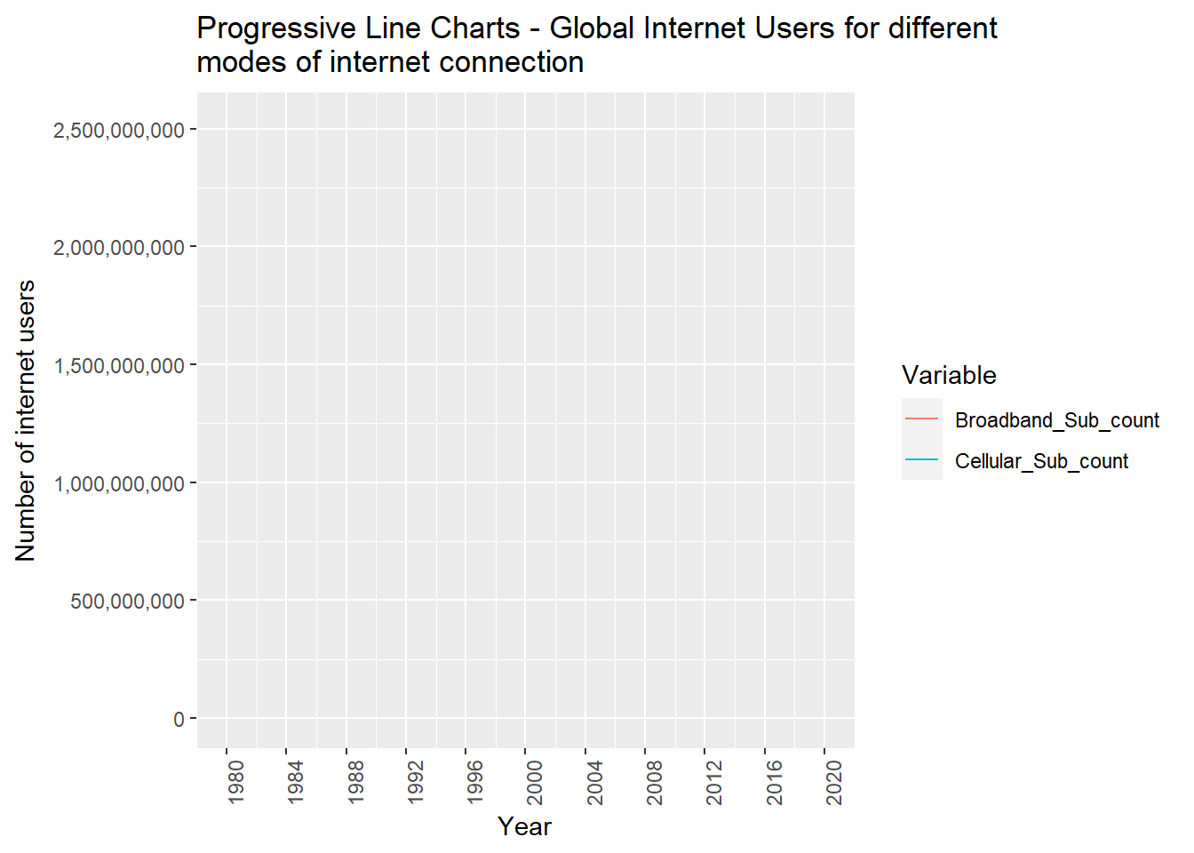
Now, to visualize the trends between average number of people using different modes of internet connections and how is it varying from 1980 to 2020, we need to perform mutation of the dataset. First, we have to compute the number of people using internet via cellular subscription, broadband subscription and other internet users using the respective percentage and number of internet users in total present in that particular year. I have added these 3 columns at the end of the dataset. I have grouped the dataset based on year and pivoted the dataset. This pivoted dataset has Year , mode of connection and the number of people using that particular mode of connection in each year from 1980 to 2020.
I have used the pivoted dataset to visualize the data with progressive line charts. This progressive line charts displays the cumulative progress of the number of internet users over time. The line starts from the baseline (usually zero) and progressively increases as each new data point is added. This allows viewers to easily track and understand the cumulative growth in internet users using different modes of connection.
The visualization clearly depicts that the number of internet users have exponentially increased in case of cellular subscriptions, steadily increased in case of internet users(%) and slowly increased in case of broadband subscriptions. With progressive line charts, its easy to compare different modes of connection. Here, the users can observe and compare growth changes and respective number of internet users over the years.
Progressive line charts can be extended beyond the available data to visualize potential future growth scenarios. By extrapolating the line into the future, viewers can estimate the expected growth in internet users using cellular or broadband subscriptions, aiding in forecasting and decision-making processes.
In order to identify the most average number of internet users across all the countries, I grouped the dataset based on country(Entity) and code and computed the average value for number of internet users . To understand and show how the number of internet users have increased in general, I have performed the following visualizations as part of this question:
- What is the number of internet users in the year 2020 for all the countries ?
# World map visualization displaying number of internet users in the year 2020

global_avg_Users <- globalInternetUsers %>%
  filter(Year == '2020') %>%
  group_by(Entity, Code) %>%
  select(c(Entity, Code, `No. of Internet Users`)) %>%
  summarize_all(mean, na.rm = TRUE)

# plotting World map visualization
map_print <- plot_geo(global_avg_Users,
                      locationmode = "ISO-3") %>%
  add_trace(locations = ~ Code,
            z = ~`No. of Internet Users`,
            zmin = 0,
            zmax = max(global_avg_Users$`No. of Internet Users`),
            color = ~`No. of Internet Users`) %>%
  layout(title = "Average value for Number of Internet Users \nfrom 1980-2020")%>%
  config(displayModeBar = FALSE)

map_print
To this, I have grouped the dataset first based on the country and code and calculated average of number of internet users. For geographical representation, I have used plot_geo() function which allows us to plot data on a map, with each country represented by its geographic boundaries. This provides a visual representation of the average number of internet users across different countries. I have assigned a color scale to the map, and mapped the average number of internet users to different colors. This helps the users to quickly identify the countries high or low average internet user counts. I have added an interactive feature as well, so the users can hover over any country and see specific information. This interactive capability enhances the user experience and facilitates the exploration of data at a more granular level.
- How are the number of internet users changing over the years for all the countries?
# World map visualization from 1980 to 2020 for average number of internet users

global_Users_allyears <- globalInternetUsers %>%
  group_by(Entity, Code) %>%
  select(c(Entity, Code, Year, `No. of Internet Users`))


global_graph = plot_geo(global_Users_allyears, locationmode = "ISO-3", frame = ~Year) %>%
  add_trace(locations = ~ Code,
            z = ~`No. of Internet Users`,
            zmin = 0,
            zmax = max(global_Users_allyears$`No. of Internet Users`),
            color = ~`No. of Internet Users`) %>%
  layout(font = list(family = "DM Sans"),
         title = "Number of Internet Users \nfrom 1980-2020")%>%
  config(displayModeBar = FALSE)

global_graph
Similarly, I have grouped the dataset first based on the country and code. For geographical representation, I have used plot_geo() function in the above fashion to plot data on a map. This provides a visual representation of the number of internet users across different countries. I have assigned a color scale to the map, and mapped the number of internet users to different colors. This helps the users to quickly identify the countries high or low average internet user counts.
I have added the animation to the map over different years. I have used a play button, so when it is clicked, viewers can observe how the number of internet users change over time for various countries. With the help of the animation, the users can identify and understand the trends and general pattern of internet usage. There is an an interactive feature as well, so the users can hover over any country and see specific information.
By leveraging plot_geo, you can create an engaging and informative visualization that showcases the average number of internet users over the years for different countries. It allows viewers to explore the data geographically, observe temporal trends, compare countries, and gain a deeper understanding of internet usage at a global or regional level.
# Average number of users in top 10 countries - printing and mapping this number on map for all countries

global_Users_topten <- globalInternetUsers %>%
  filter(Year >= '2011') %>%
  group_by(Entity, Code) %>%
  select(c(Entity, Code, `No. of Internet Users`)) %>%
  summarize_all(mean, na.rm = TRUE) %>%
  arrange(desc(`No. of Internet Users`))


global_Users_topten_subset <-
  head(global_Users_topten, 10)

print(global_Users_topten_subset)
# A tibble: 10 × 3
# Groups: Entity [10]
Entity Code `No. of Internet Users`
<chr> <chr> <dbl>
1 China CHN 735788672
2 North America Region 397131044.
3 United States USA 262656000.
4 India IND 254983883.
5 Brazil BRA 126587469.
6 Japan JPN 112434244.
7 Russia RUS 105756656.
8 Indonesia IDN 73895560.
9 Germany DEU 70381589.
10 Mexico MEX 67182526.# Displaying bar chart- plotting for top 10 countries with most average number of internet users
df <- global_Users_topten_subset
df$index <- seq_len(nrow(df))
# Create initial bar chart
p <- ggplot(df, aes(x = reorder(Entity, -`No. of Internet Users`), y = `No. of Internet Users`, fill = Entity)) +
geom_bar(stat = "identity") +
scale_y_continuous(labels = function(x) format(x, scientific = FALSE, big.mark = ","))+
labs(x = "Country", y = "Number of Internet Users", title = "Internet Users by Country") +
theme_minimal() +
theme(axis.text.x = element_text(angle = 45, hjust = 1),
text = element_text(family = "Arial", size = 14, color = "black", face = "italic"))
# Animate the bar chart
p_animated <- p + transition_states(index, transition_length = 2, state_length = 1) +
shadow_mark()
# Display the animated bar chart
animate(p_animated)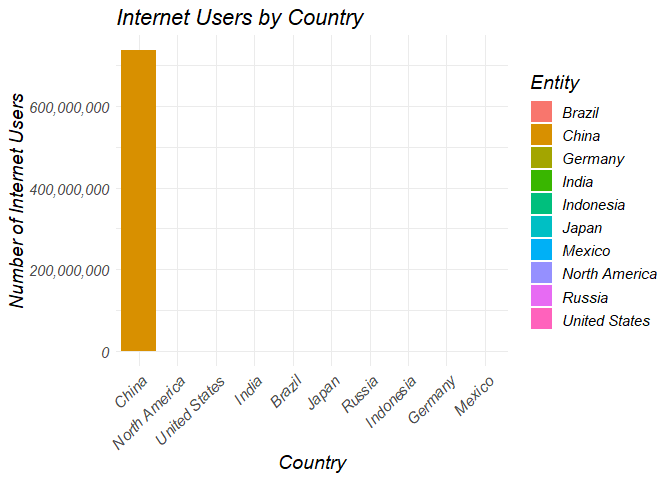
I have used a bar chart to depict the average number of internet users for the top ten countries. Each country is represented by a vertical bar, the names of the countries are on X-axis and the respective average number of internet users are on Y-axis. The viewers can easily understand what is the position of each country as the height of the bar indicates the average number of internet users. The length of each bar in the chart directly represents the average number of internet users for a specific country. This visual representation makes it easy for viewers to perceive and compare the magnitudes of the average internet user counts among the top ten countries. I have limited the bar chart to only top ten countries, to highlight the most significant players in terms of internet user counts.
Brief Conclusion and Reflection
The time series visualizations, scatterplots, progressive line charts, the world maps and the bar charts have all demonstrated that the internet usage has increased over the last 4 decades due to increase in cellular, broadband subscriptions and also the internet users. Although I have expected that the trend will be increasing and that the cellular subscriptions and increase in internet are strongly correlated, I am surprised by the exponential increase in values of the number of internet users along with cellular subscriptions. I have expected that broadband subscriptions number will be somewhat more than half of the cellular subscriptions, but that is not the case. But we can understand that many external factors come into play with these numbers. Like, mobile phones are more affordable, handy for anyone, so there is an increase in usage of the cellular devices which also effected the increase in internet usage via cellular subscription. When it comes to broadband connectivity, alot more things come into play.
Internet usage has increased via different modes of connection and it will continue to increase in the future. Like, we have observed that the number of users have consistently grown over the years, this indicates that there is a rising demand for internet services. Many external factors have played a crucial role in this increase in demand. Mainly, the widespread adoption of smartphones, and advancements in network infrastructure has made internet accessible to billions of people across the world. Considering the observed trends and the continuous integration of technology into various aspects of our lives, we can definitely expect a further increase in internet usage in the future. The growing demand for online services, e-commerce, remote work, and digital communication suggests that the upward trajectory of internet usage is expected to persist.
Despite all this, there might be possible limitations and challenges that may affect the growth of the internet usage. There might be infrastructure constraints, affordability issues, and cyber security concerns which can limit the availability and affordability of internet services. It is important to address these concerns and limitations surrounding internet access to ensure that everyone can benefit from the opportunities provided by the digital age. As per the dataset, the dataset did not provide the infromation about population of the countries to understand the percentage of internet users are present in a particular country for an year. If it has been present, we would depict another time series visualization and understand the trend of percentage of internet users against year. Nonetheless, we have observed that internet usage has increased since the time of its inception.
Supplemental Visualizations
I have provided supplemental visualizations for few of the research questions for the users. These provide additional evidence for the trends we have observed above in the primary visualizations.
I have provided an animated scatterplot visualization below to show the relationship between cellular subscription and internet users. With the help of the animated scatterplot, the user can view the values present in each year from 1980 to 2020.
# Plotting animated scatter plot displaying cellular subscription vs users from 1980-2020

global_internet_scatter_plot <- globalInternetUsers %>%
  group_by(Year) %>%
  select(c(`Cellular Subscription`, `No. of Internet Users`))  %>%
  summarize_all(mean, na.rm = TRUE)

df <- global_internet_scatter_plot

# Creating an empty scatter plot
p <- plot_ly(df) %>%
  layout(xaxis = list(title = "Cellular Subscriptions"),
         yaxis = list(title = "Internet Users"),
         title = "Animated Scatter Plot",
         showlegend = FALSE)

# Adding initial scatter plot trace
p <- p %>% add_trace(
  type = "scatter",
  mode = "markers",
  x = ~`Cellular Subscription`,
  y = ~`No. of Internet Users`,
  marker = list(size = 10, color = ~Year, colorscale = "Viridis"),
  frame = ~Year
)

# Setting animation options
p <- p %>% animation_opts(frame = 100, transition = 0, redraw = FALSE)

# Rendering the animated scatter plot
p
I have showed the average number of internet users in the past decade for all the countries present in the dataset in the world map. During the last decade, there is a boom in usage of cellular and broadband subscriptions, so I have picked that period to show how the number of internet users have increased since early 90’s.
global_graph = plot_geo(global_Users_topten, locationmode = "ISO-3") %>%
  add_trace(locations = ~ Code,
            z = ~`No. of Internet Users`,
            zmin = 0,
            zmax = max(global_Users_topten$`No. of Internet Users`),
            color = ~`No. of Internet Users`) %>%
  layout(font = list(family = "DM Sans"),
         title = "Total Number of Internet Users \nfrom 2011-2020")%>%
  config(displayModeBar = FALSE)

global_graph
To answer this, I have first filtered the dataset to get rows of the last decade. I have grouped the dataset first based on the country and code and calculated average of number of internet users. I have arranged the dataset in a descending order based on the average of number of internet users and printed the top ten countries.
I have then plotted the data containing average number of internet users over the past decade using plot_geo() function. I have assigned a color scale to the map like above, and mapped the average number of internet users to different colors. This helps the users to quickly identify the countries high or low average internet user counts over the past decade. I have added a similar interactive feature as well, so the users can hover over any country and see specific information.
Bibliography
https://www.kaggle.com/datasets/ashishraut64/internet-users
https://r-graph-gallery.com/index.html
https://bookdown.org/yihui/rmarkdown-cookbook/
https://freyasystems.com/how-to-create-tabsets-using-quarto-r/