library(tidyverse)
library(ggplot2)
library(readxl)
library(lubridate)

knitr::opts_chunk$set(echo = TRUE, warning=FALSE, message=FALSE)Challenge 6 Instructions
challenge_6
Visualizing Time and Relationships
Read in data
data <- read_xlsx("_data/debt_in_trillions.xlsx")
view(data)
Briefly describe the data
This data set contains records for various types of debts in trillions. The loan types included are - Mortgage, HE Revolving, Auto Loan, Credit Card, Student Loan, and other. The first column contains time which includes year and quarter.
Tidy Data (as needed)
Here I’m creating a new column called Date which parses date and quarter column into a single Date column. Q1, Q2, Q3, Q4 will be mapped to 01, 04, 07, and 10 respectively.
data <- data %>%
mutate(Date = parse_date_time(`Year and Quarter`, orders="yq"))
view(data)
Time Dependent Visualization
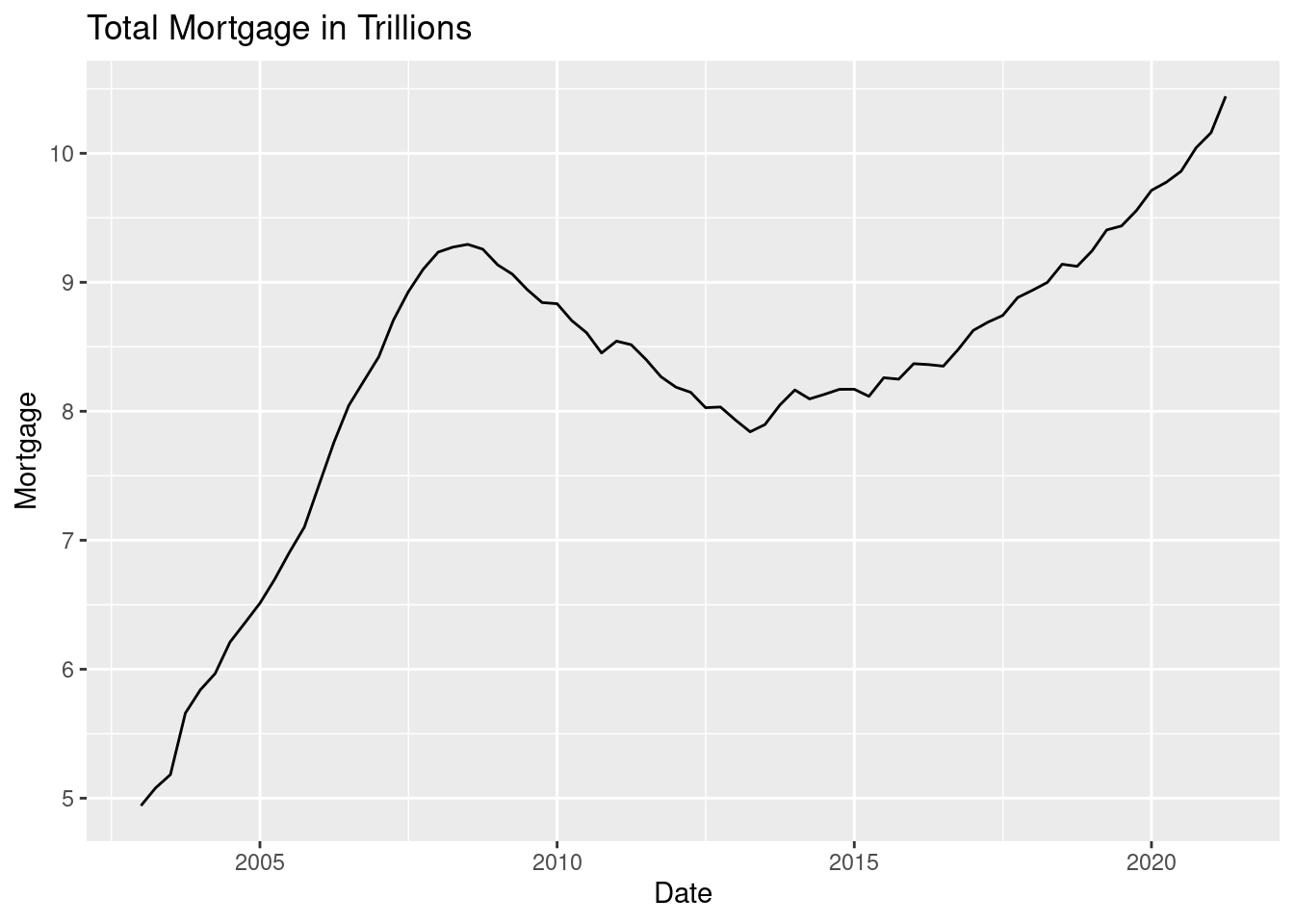
Now that we have a date column to represent time, I’m plotting a graph between date and Mortgage in trillions.
ggplot(data, aes(x=Date, y=Mortgage)) +
ggtitle('Total Mortgage in Trillions') +
geom_line()
Visualizing Part-Whole Relationships
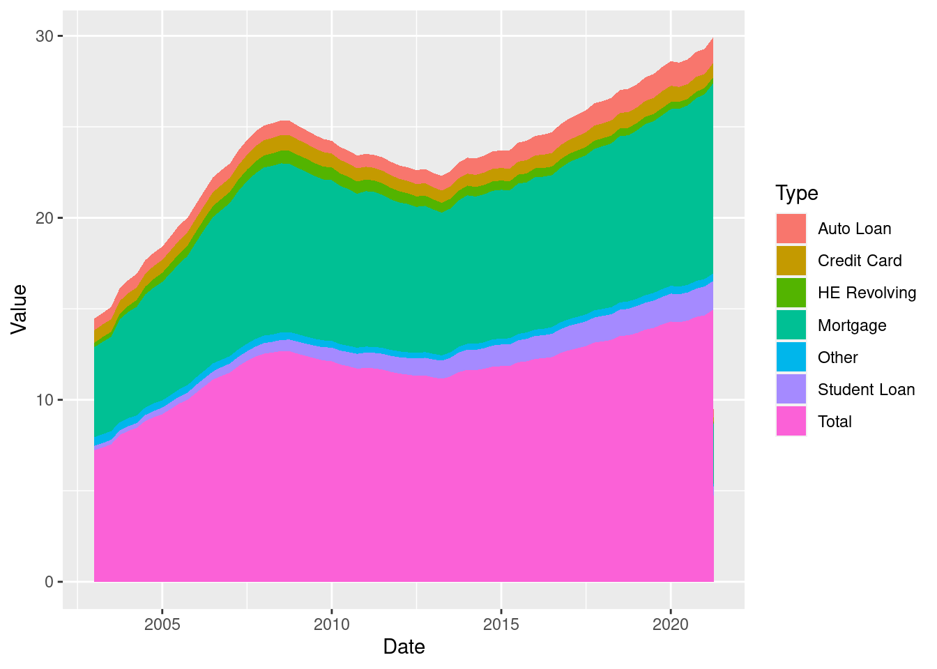
In order to create an area plot for visualizing part-whole relationship we first pivot the data so that one column represents the type of loan and the other column represents value.
 data <- data %>%
     pivot_longer(
         cols = c(`Mortgage`, `HE Revolving`, `Auto Loan`, `Credit Card`, `Student Loan`, `Other`, `Total`),
         names_to = "Type",
         values_to = "Value"
) ggplot(data, aes(x=`Date`, y=`Value`, fill=`Type`)) +
geom_area()